Curated by Fay de Haan -- creative octopus | industrial designer | package developer | biodesign & sustainability enthusiast
Don't wanna be here? Send us removal request.
Photo

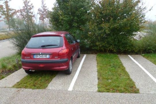

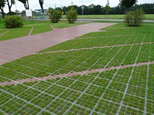
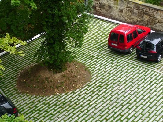
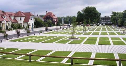
Aesthetic: green parking lots
They improve infiltration of water to the soil, thus reducing floods by excessive drainage from soil-sealed land, and contribute to environmental and human health! Also they look pretty.
#green architecture#architecture#green parking lots#parking lots#parking#design#sustainability#sustainable design
80K notes
·
View notes
Photo
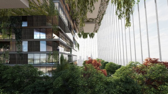
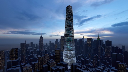
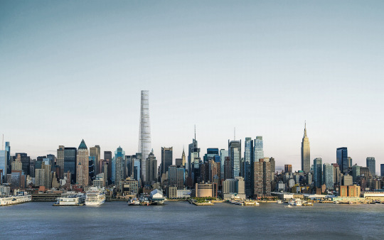
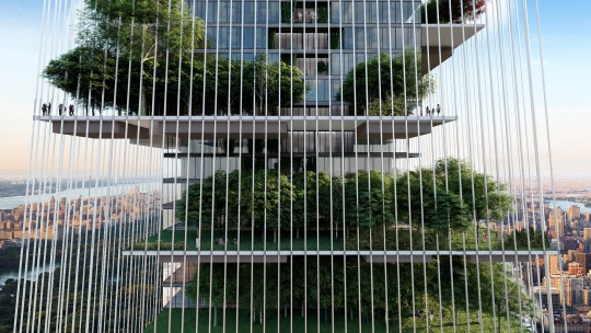
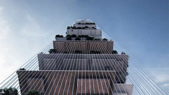
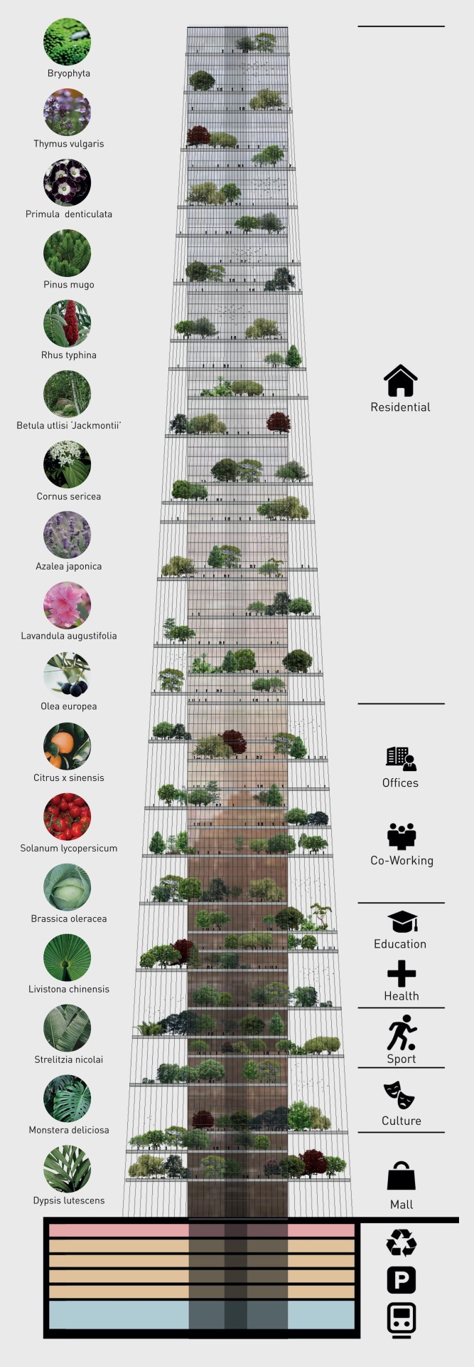
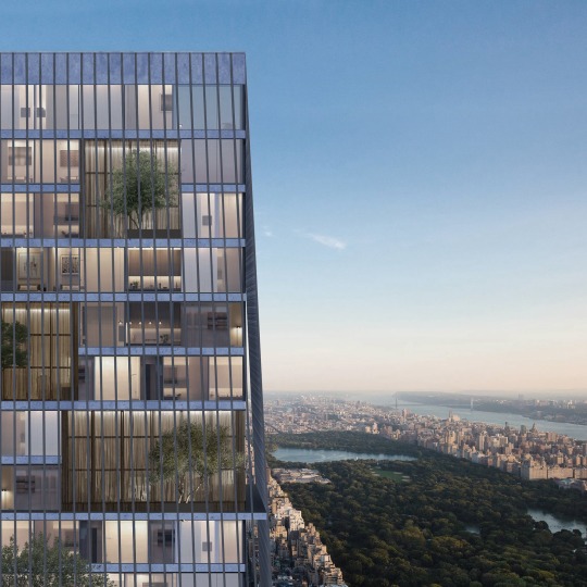
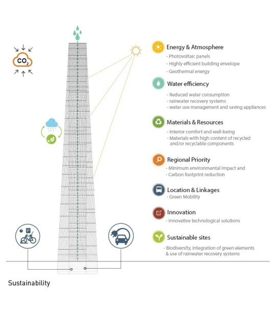
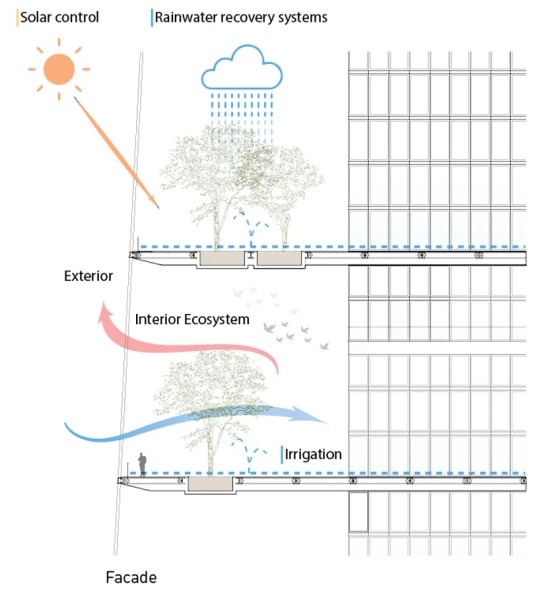
‘Skylines,’ New York, United States,
Lissoni Casal Ribeiro for Skyhive 2020 skycraper Challenge
Inspired by nature, the concept proposes a complete, self-sufficient ecosystem. the multi-use tower collects rainwater and gathers energy from the sun and the wind, transforming it from its tensioned cables into electricity to be used by inhabitants.
#art#design#architecture#self-sufficiency#sustainability#skycraper#gardens#landscaping#new york#concept#cgiart#lissoni casal ribeiro#ecosystem#tower#rainwater#solar energy#clean energy#solar power
11K notes
·
View notes
Photo


Industrial Design - “Roots” (2011) by Alberto Sánchez, for Mutdesign.
78 notes
·
View notes
Text
Armstrong
The design of this unique luminaire is by the designer Constantin Bolimond. The inspiration of it is the surface of the moon and the result definitely reminds it. However, this luminaire is not only about design it is also about efficiency and technology.


The switcher works by turning on when one of the corks piece is removed and off when it is back at its place.


The light source is a energy efficient warm white LED that gives a very soft light. Each cork piece can be removed to control the amount of light desired.
The design of Armstrong is interesting for its technology, concept and use of materials. The cork is not only an user friendly material but also environmental friendly.
44 notes
·
View notes
Photo


Shared Lady Beetle by LUO studio,
A Micro Movable Library for Kids
500 notes
·
View notes
Link

IKEA has released open source plans for The Growroom, which is a large, multi-tiered spherical garden that was designed to sustainably grow enough food to feed a neighborhood. The plans are made with the hope that members of the public will invest their time and resources to create one in each neighborhood, if not in every person’s backyard.
799 notes
·
View notes
Photo

I am dubbing 2018 the year of floating wetlands… I am super excited by these new Biohabitats babies launched last fall!
505 notes
·
View notes
Photo

It is easy to take for granted the work that goes on behind the scenes at a museum. Because of the Brooklyn Museum’s diverse and important collection of art objects, the museum is often lending this artwork to other museums and organizing traveling exhibitions for people around the world to enjoy. This means that every single object must be carefully packed and crated to prevent objects from incurring damage during transit.

The Brooklyn Museum’s Fine Arts Packer, Paul Speh, is the mastermind behind this important job. He shows great pride in his creative strategies to secure objects, no matter their size, shape, material, and fragility. Now to think… how much packing material in a year Paul must go through in order to safely pack the hundreds of objects that leave the museum to visit other museums? Due to Paul’s commitment to sustainability and the reuse of materials, there is not as much waste as you may imagine.
“My entire job is sustainability,” says Paul proudly, as he tours you around his packing and shipping room. He points to a pile of lumber and exclaims that he has not bought any new lumber since the day he started working at the museum nearly 10 years ago. The rigid white foam you see in many of his packages, Ethafoam, is also recycled and Paul has been able to go his full time at the museum without purchasing any more. Metal hardware such as screws is also easily recycled. Foam core is the one packing material he does find himself having to purchase due to its fragile nature.

Paul is creative with how he keeps his supply levels where he needs them. When exhibitions in the museums are being deinstalled, Paul is right there hoping to collect the wood from temporary walls coming down. He also tries to reuse materials from all of the crates that return to the museum. Not only is this a wonderful way to keep prices down, but it is even better news for our planet and our collaborative effort to minimize waste. Great job Paul!
Posted by Melissa King
1K notes
·
View notes
Text
Harvesting water with Aquatecture

Photo credit: Angeline Swinkels - photographer
By Shardell Joseph
A new aquatic design captures and harvest rainwater, allowing people in drought-stricken areas to catch utilise their own water. Design Academy Eindhoven Graduate, Shaakira Jassat, showcased the Aquatecture panel at Dutch Design Week last month.
Designed to fit on the outside of buildings in dense urban environments, the panels collect rainwaters as it filters through the openings in the structure. The water is then pumped into a grey-water system connected to the specified building.
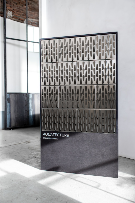
‘The main goal was to create a water harvester that would fit in dense urban spheres through its compactness, visual identity and ability to integrate into architecture,’ Jassat said.
‘It consists of a modular panel designed to harvest rainwater. When integrated with technology, it has the ability to harvest moisture from the air,’ she added.
‘Instead of sliding off the surface, the panel permits water to be collected through a punctured, geometric surface. Aquatecture makes water conservation both visible and engaging.’

The panels are made from stainless steel, utilised for the materials durability and rust resistance. The steel was then studded with perforations in a slim, rounded funnel shape. Jassat tested the pattern, and other patterns, by making prototypes and showering them with water to simulate the rain.
Once the rainwater has been captures, the Aquatecture panels would allow residents to channel the rainwater into the building grey-water system, which can then be recycled along with the wastewater from sinks, washing machines and other appliances.
While the primary purpose of the panels is to catch rainwater, Jassat says that, if hooked up to other equipment, they could potentially also pull water from the atmosphere via condensation.
As part of her research into aquatic design, Jassat has also designed the Tea Drop tea machine, which has the ability to condense water vapour from the surrounding atmosphere. Jassat claimed that it could initiate an alternative for daily rituals, adding an element of sustainability to day to day routines.
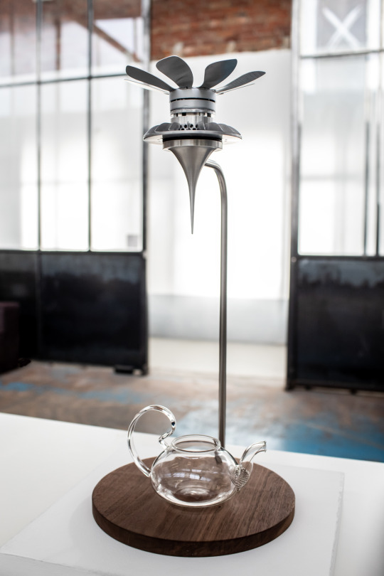
‘It functions on its own time frame, so one has to wait for the tea vessel to be filled up with water, before it can be boiled and ready for making tea,’ she said.
Jassat conducted her research on tea farms in Asia, discovering that water is a large by-product of processing tea and harvesting tea leaves, which are dependent on weather and time.

Jassat’s next step will be to test the design in situ on a building facade. She has also recently conducted research into air plants – the tillandsia and bromeliad species – which draw all their water needs from the air.
853 notes
·
View notes
Text
This is an interesting challenge:
What alternatives could we design to make fruit available to people with a disability without having to resort to plastic prepacks?
Possible ideas off the top of my head:
> PRODUCT SOLUTION: design one or more fruit peeling aids
> PRODUCT HACK: 3D printable, customisable aids for regular forks/knifes!/... Database of previously created and tested aids.
> SYSTEM CHANGE: make it possible to get your fruit peeled at the supermarket (a la meat/fish counter where you ask for filets) & bring your own reusable containers.
What would you think is a good idea?


I love the smell of fresh ableism in the evening 🙄
2K notes
·
View notes
Photo
This is SUCH a great idea!
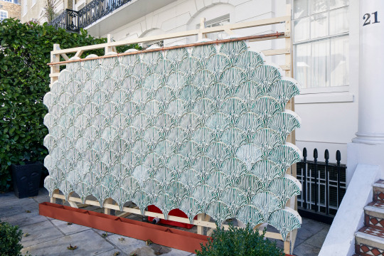
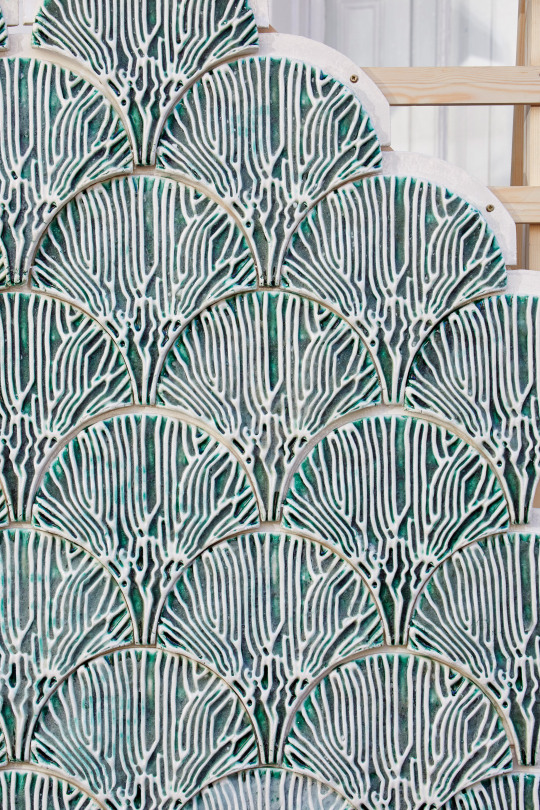
Shneel Malik Creates Indus Tiles to Purify Rainwater Using Algae “The Bio-Integrated Design Lab at the Bartlett School of Architecture has created a modular system of tiles inlaid with algae that can filter toxic chemical dyes and heavy metals out of water. […] “Each tile is made simply by pressing clay – or a similar low-cost, local material – into fan-shaped moulds with a series of ‘vein-like channels’. “These mimic the structure of leaves and their ability to distribute water evenly to every part of a plant. The ravines are then filled with micro-algae which are suspended within the ‘biological scaffold’ of a seaweed-derived hydrogel. This keeps the algae alive while also being completely recyclable and biodegradable. […] “’Through our site visits, we realised that the artisan workers had no space available for westernised high-tech water treatment solutions,’ said Malik. “’Neither did they have the economic capacity to get additional support. So we needed a system that was spatially compatible and could be constructed and maintained by them.’ “Hence the idea of moulding the tiles via templates which, once the project is rolled out, would be custom-made by the Bio-ID Lab with a different system of channels to correspond to different contaminants.”
3K notes
·
View notes
Text
“But ultimately a regulation is a signal of design failure. In fact, it is what we call a license to harm: a permit issued by a government to an industry so that it may dispense sickness, destruction, and death at an ‘acceptable’ rate. But as we shall see good design can require no regulation at all.”
— Michael Braungart, William McDonough Cradle to Cradle
12 notes
·
View notes
Text
“In the end, the term ‘circularity’ may just be one way to make us aware that we need a more encompassing, integrated and restorative sustainability path that includes people as much as technology and nature.”
— Michiel Schwarz, A Sustainist Lexicon
12 notes
·
View notes
Photo


Tamed Digital Project by Sf-So Studio
Today’s technologies try to be intuitive to the user, but touch screens and different approaches make it confusing for people to recognize the intended way of use. The Designers of the San Francisco and Seoul based Sf-So design studio created the Tamed Digital range of products that go back to a physically intuitive way of usability to catch the user at his most basic instincts and go to a more joyful haptic experience.
234 notes
·
View notes


