if-it-lights-up-my-eyes
130 posts
they/any // this is where we make edits and stuff // main: @thegeekcollective
Don't wanna be here? Send us removal request.
Text
ᯓ WEBSITES you've been looking for ୨୧
!!! % for editing: 𖥻
★ canva (there's a lot of different templates)
★ photopea (alternative to photoshop)
!!! % for gif making/editing: 𖥻
★ ezgif (a very complete tool to create and edit gifs)
★ bloggif (different old school gif editing effects)
★ picmix (to create blingee type of gifs)
★ glitterfy (to put glitter all over your chosen image)
!!! % for gif text: 𖥻
★ cooltext (burning, glittery and glowy text generator)
★ bloggif text (glitter text generator)
★ gigaglitters (glitter text generator)
★ glitterfy words (glitter text generator)
!!! % for fancy fonts: 𖥻
★ messletters
!!! % to remove background: 𖥻
★ remove.bg
!!! % to pick colors and swatches from a picture: 𖥻
★ image color picker
!!! % for aesthetic symbols and kaomojis: 𖥻
★ amino post
★ emoji combos
★ emoji db
★ kaomoji
!!! % for blinkies, dividers, gifs and stamps : 𖥻
★ blinkies generator
★ @animatedglittergraphics-n-more (blog that posts said content)
★ @graphics-cafe (blog that posts said content)
12K notes
·
View notes
Text
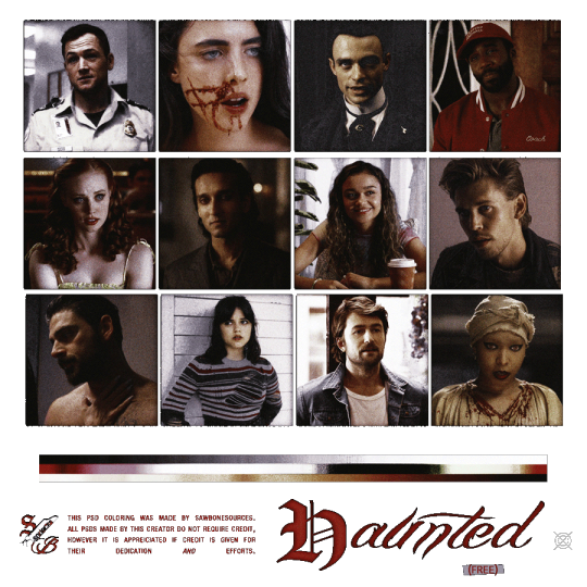
⠀▍ㅤ 𝙷𝙰𝚄𝙽𝚃𝙴𝙳 ⠀𓍯𓂃 ⠀𝙿𝚂𝙳 𝙲𝙾𝙻𝙾𝚁𝙸𝙽𝙶
𖤐. ⠀𝗳𝗿𝗲𝗲⠀ .ᐟ ⠀ 𖤐. ⠀credit is 𝙖𝙥𝙥𝙧𝙚𝙞𝙘𝙖𝙩𝙚𝙙 but not necessary. CLICK TO DOWNLOAD
124 notes
·
View notes
Text

quick self-indulgent userbox we made ! still not opening requests right now (low motivation ....) but you can have this as a treat! it's free to use ✌️
#the collective's chatters#the collective's arts and designs#☆ self-indulgent#☆ userboxes#userboxes#plural#pluralblr#pluralgang#plural userboxes#system userboxes#endo safe#writeblr#writing userboxes
8 notes
·
View notes
Text
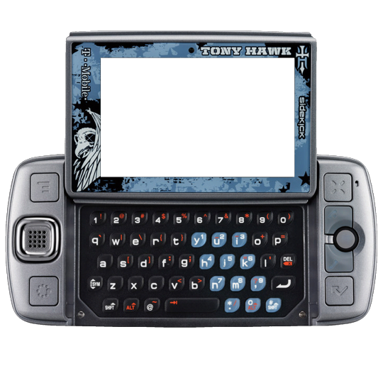
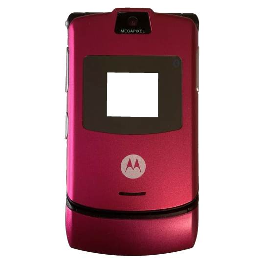
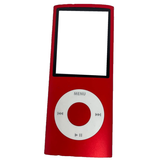
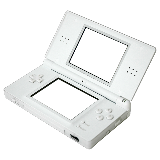

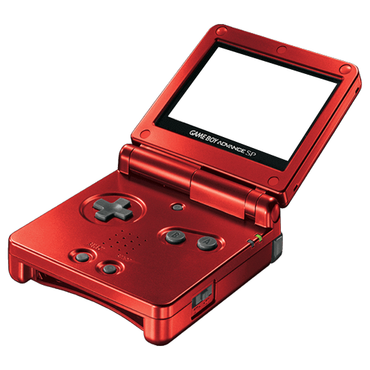
Y2K TECH ICONS (transparent screens!) -2000x2000px -use as you see fit.
3K notes
·
View notes
Text

television glow
made with the trans flag colors
made in photopea, may look different in photoshop
♡ / ↺ if you like it, this is not needed if you are using. credits are appreciated but not required!!!
download on media fire
76 notes
·
View notes
Text
im tired of having to make this frame by frame so i just made a gif version of the shiny button thing 👍


^ 834x100 pixels (transparent version on the right ^)


^ 150x18 pixels (transparent version on the right ^)

put it on soft light and tadaaa. you can also toggle the speed if you want
780 notes
·
View notes
Note
hi ! can i ask what overlay you used for your layout /pinned graphic that makes it look like it’s been printed/painted >_<
i used these two together!
(the first one set to multiply, the second one soft light at full opacity or color burn/linear burn at low opacity)


i also recommend duplicating the image you're going to use, put it on top of the original image, gaussian blur it to around 1px-2px and set the layer mode to darken so you can mimic ink bleeding

you can also add a noise filter on the blurred image to give it more texture
i hope this helped :D
18 notes
·
View notes
Text


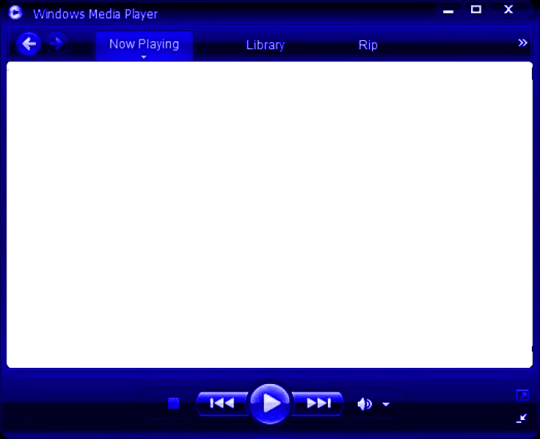
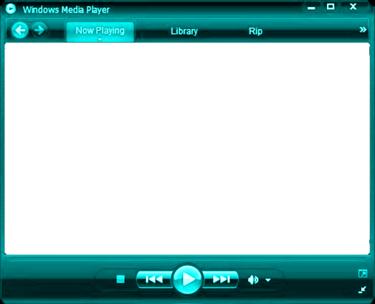
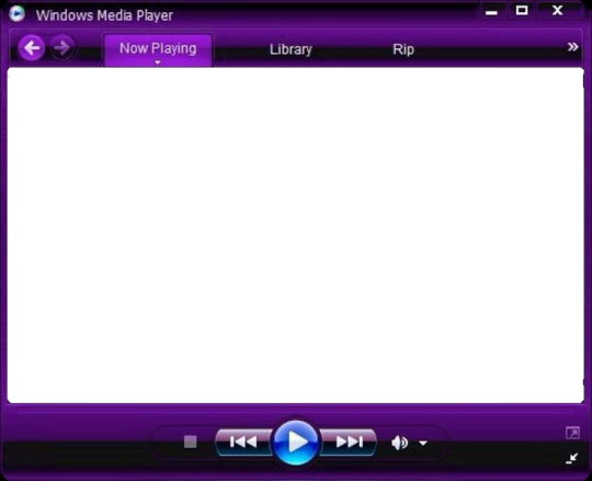


F2u old web/red pngs/frames!!
Mega sorry for being a wee bitt inactive im posting something else after this too lol
No credit needed ^_^

3K notes
·
View notes
Text

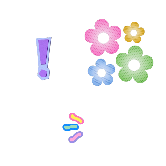


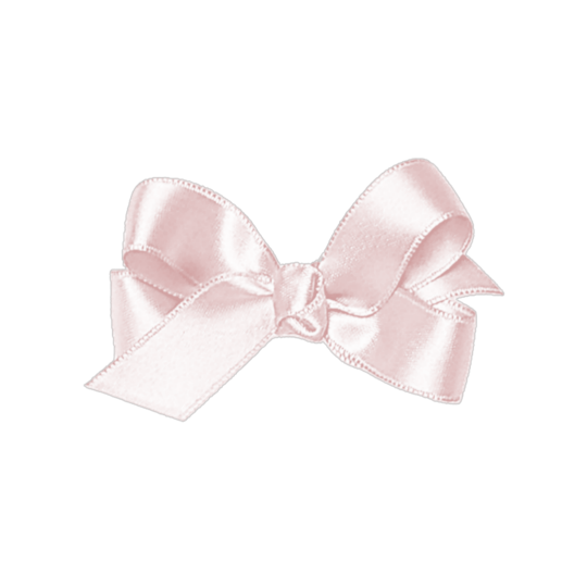
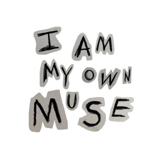
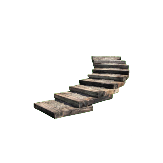
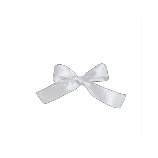
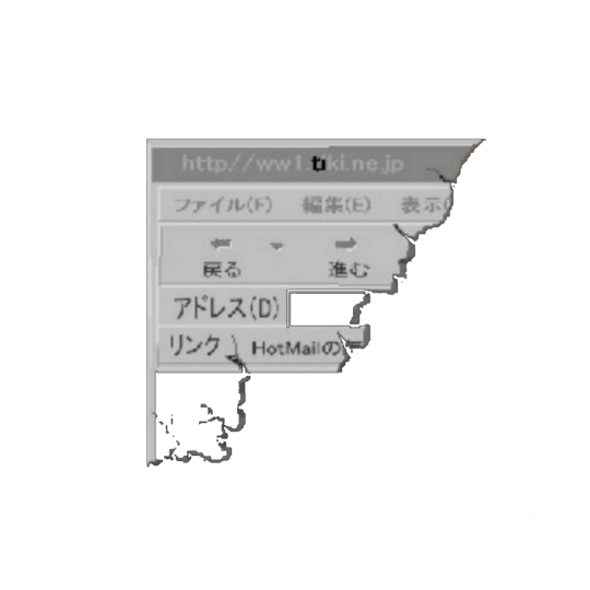
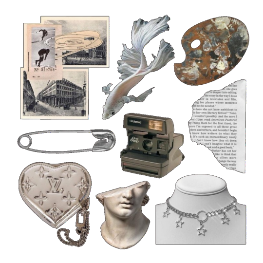

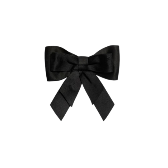
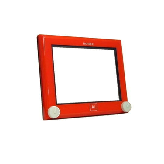
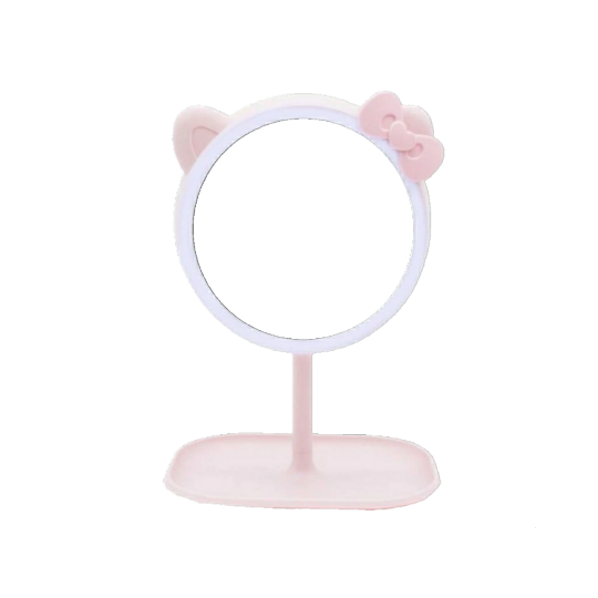
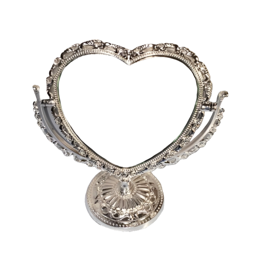

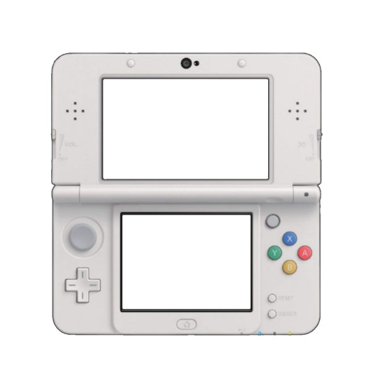
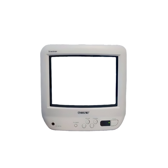
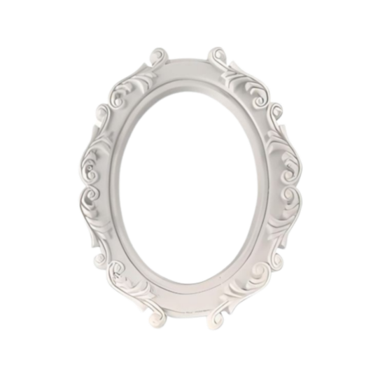
Misc png dump
Frames ~ overlays ~ bows transparent pngs
3K notes
·
View notes
Text

⠀ ⠀ 𓏵 ⠀ misc stuff . . . 〖 made by me 〗


♡ f2u w/o credit if personal use ! ⠀ 、 credit if reposting⠀。 recolors encouraged
𓎟 like + rb if using ⠀ > <。 ) ⠀ the divs at the top and bottom are not f2u !!
1K notes
·
View notes
Note
:) hi!! can i request some vhs stickers? like 'be kind, please rewind' 'horror' 'bargain bin' that kind of thing? its kind of a weird question but yeah >_< also ur blog is soooo cool and thanks for making a bunch of art possible. u rock !


94 notes
·
View notes
Text

"How do I make userbars?"
yes, its true..i have returned to provide my exquisite and rare information on how to make things once more, just as the legends foretold! oh, rejoice, my dear followers..!!
☆ TL:DR~
export layer provided below to canvas
add picture/gif/video to the layer beneath the top layer
add text
download
if you didnt get that, then its okay, i also kinda struggled with it the first few times.. but first,
☆ what even is a userbar?
ah, to be honest.. im not totally sure myself /ᐠ –ꞈ –ᐟ\ .. i was never totally into web decor when i was younger, and since userbars were more of a -2010s–2015s thing i was too busy getting scammed on animal jam to really care about stuff like that ;;
but if i had to take a little guess, id reckon they were like shiny buttons and such used as a lil form of self expression, with the added bonus of being able to be used as dividers, lolol~
☆ how to make userbars~
first things first, youre gonna need this premade layer:

...

did u..expect something more than that? like..complex layers and stuff..? so did i when i was first trying to learn what they were and how to make 'em, but actually what youll find is that userbars are srsly like the easiest possible web decor to make..well, maybe theyre on par with userboxes, which i'll end up covering in another tutorial, but my point still stands..!!
anyway, now that you have that special layer, you need to make another layer underneath it with either a color, image, gif, video..webp file, mp3, sonic.exe.. you get the point, create a new layer underneath & add whatever you'd like the background to be!
pro tip: because the canvas size doesn't really allow much room, horizontal photos are better than vertical ones—youll get more of the shot in the background, and it'll be less blurry since you didnt have 2 zoom in or out as much to make it fit ^-^

and now.. you've reached the final stage..! ah, i remember teaching you what userbars are all those years ago..how time flies ;;

alright alright, the usual font i use is called visitor and can be downloaded through the link here[link],
the font size is 20 and, if ur on ibis, the stroke size is 5 ^-^
usually, i put the text on either side of the userbar, but u can also put it in the middle if ur feeling brave and bold~

˚₊‧ ta-da! ˚₊‧
[PT: ta-da!]
now you should have your very own specially made userbar, wasnt that easy..? hehe, go forth with this newfound knowledge my peon, create all that you desire with the magic inside your fingers (or stylus..) 🎉🎉🎉

well, that was another successful tutorial, huh? if you agreed with that, then thank you~ and if you disagree, my askbox is always open for any other questions (=´∇`=)
nyan-nyax3 out, meow meow~!

240 notes
·
View notes
Text
how to load psds on ibispaint!
this was made with coiners in mind but will work with p much every psd so no worries if you wanna use a base or a sticker pack in a psd file (note, since its important, psd files meant to change the color of an image only load as intended through photoshop and photopea, so youll need either of that for them, not any other drawing programs.)
first of all: where to find files?
honestly, there isnt a clear answer. you can find some for most of them through just seeing if the coiner has linked any. most of them will be linked through file hosting sites, most common is drive or deviant art, but I used catbox for a while then switched to filegarden personally. the user @daybreakthing has took upon solself to turn a lot of more complex flags into psd files, so you can find a lot of them on sols old and current deviantart page (linked in their pinned)
the only downside for deviantart is you HAVE to log in to download the files. it is free however and you dont have to do much else.
for this tut Ill be using the nonhuman x for x flag psd by daybreakthing, (original flag by I believe @eldrorian )
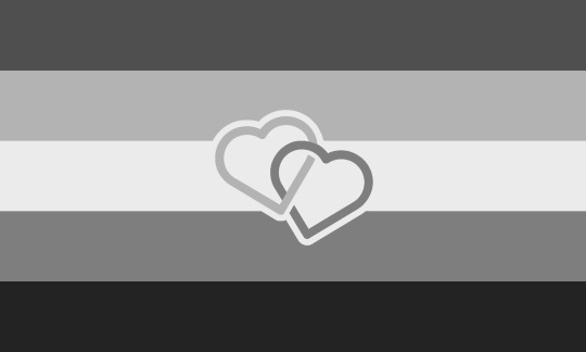
^^^ this guy
now onto the actual tutorial:
youre here likely because you already tried it, but its good to go over what not to do, and the results, anyway.
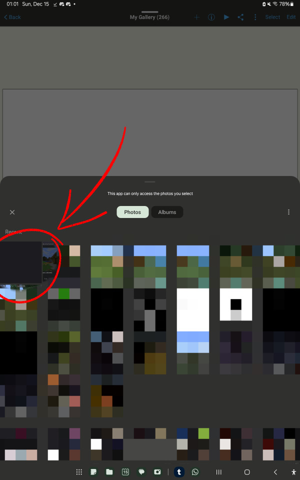
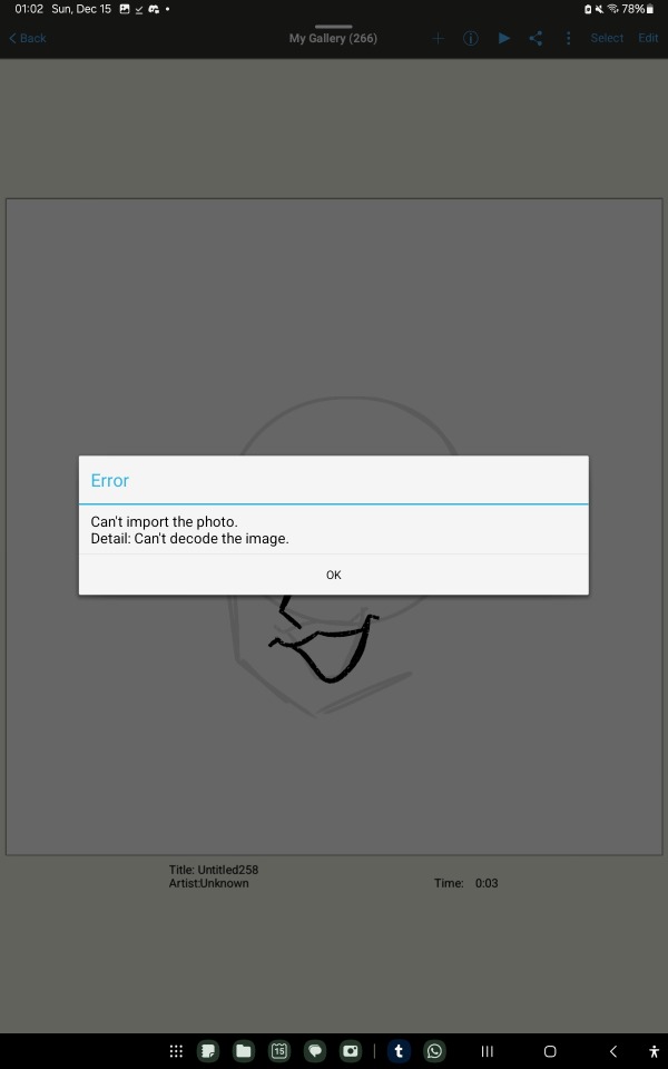
if you try to open it like a regular file, you will get errors, often more than one.
its important to note that psd files, while still considered image files, have no previews (except on drive) so they will look blank or empty. no worries about that, they will load properly.
here is what to do (or what I do, anyway)
go to your gallery, google photos, or another file manager (like just files or an external file manager)
Im using google photos bc my device's gallery wont let me share psd files
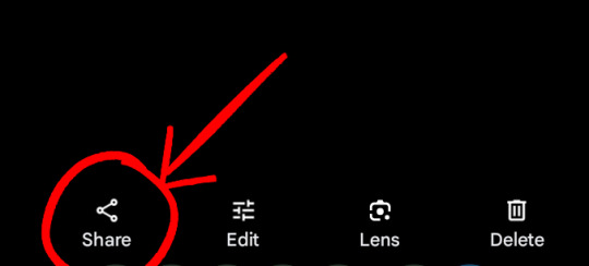

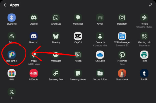
select the image, go to 'share', and pick ibispaint. theres a chance it wont pop up in the first screen, so just press the more option.
if ibispaint is not an option, try another image or file manager!
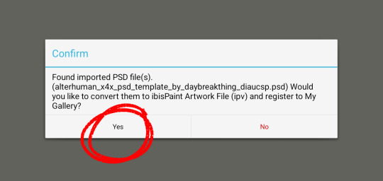
it will ask if you want to convert the file to ipv, select yes!
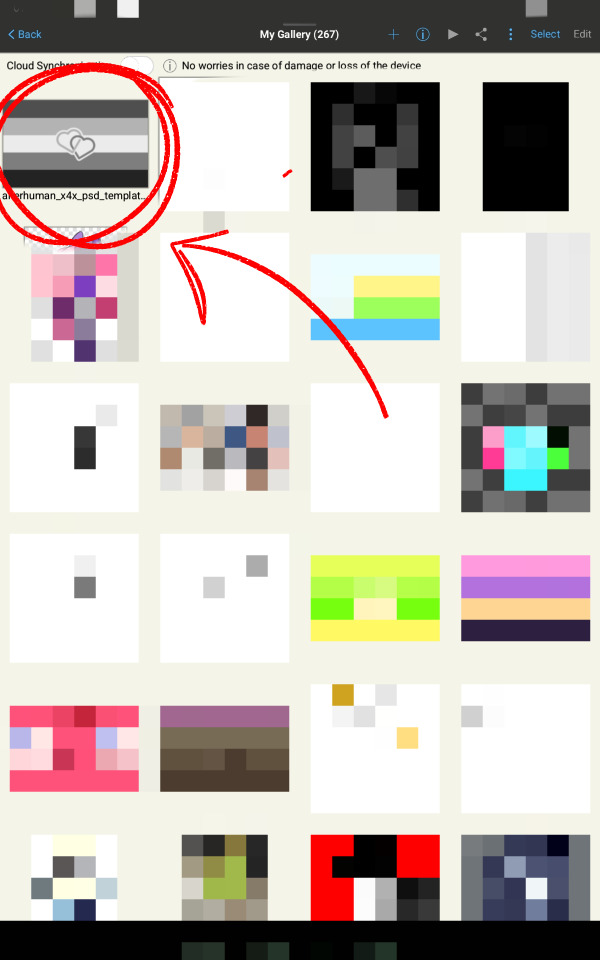
and thats all!! if all goes well it should be in your gallery when you open ibispaint. keep in mind it may crash once or twice when you first try to open it, just clear your app history cache thing and try again! (ibis paint is held together by duct tape and prayers)
I hope that helps!! if you have questions or problems, never be afraid to ask, I love to help!
tagging @idwl since their anon had a question related to this and I was directed to, to help :3
sorry about the amount of clutter with the red arrow and circles and pixelated stuff, I wanna obscure irrelevant or personal stuff while making sure people dont miss anything important.
60 notes
·
View notes
Note
could i please request a user box that says "this user doesn't feel human due to a disconnect with their body and other humans" with the autism symbol on a starry background for the image and everything else a dark blue? if the text could be white and in comic sans that would be cool too, im so sorry this is a lot to request. thank you so much if you decide to take this req, but if you dont thats also totally fine as well. please have a great day and take care of yourself ^w^
it's fine! don't worry about it ^_^ here you go! hope this works for you!

0 notes
