Don't wanna be here? Send us removal request.
Text
TOWERS IN LOCKDOWN PT 1
Structure of the human body is something that had crossed my mind when thinking of ideas for this project. Essentially as human beings we are moving towers/structures in the grand scheme of things. Compared to a lot of thing and organisms on this planet we skyrocket in size compared to them.
For instance an ant vs a human being, somewhat similar to me (a human) standing next to one of biggest buildings in the world. Another point is our muscles, joints, bones all holding us together not to mention the organs inside of us, vital to keep us going, and yet another comparison; would a building be a building without people (organs) in them? no, Just a shell of something yet to be occupied by us humans.
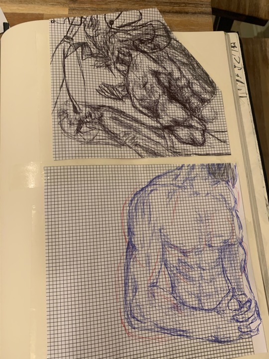
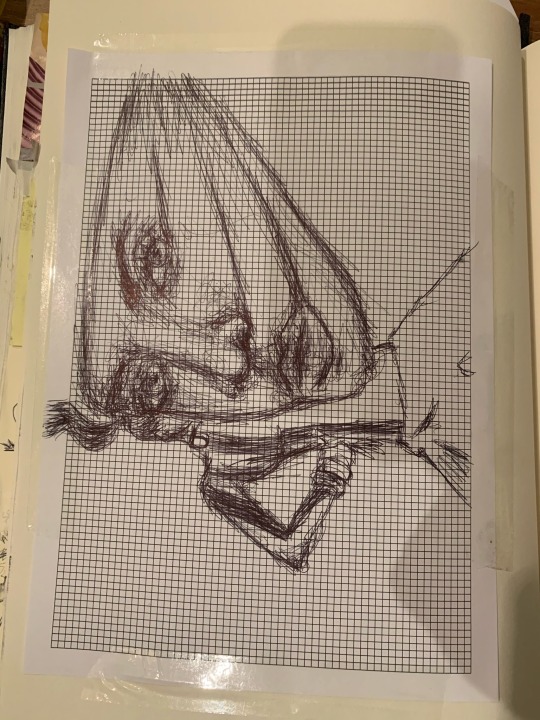
Structure of the human face.
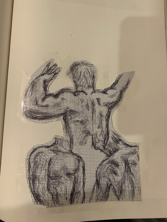
Believe it or not the images above are myself. These drawings all came from reference images, and in those images I was nowhere near as toned as I am in these drawings, but that's what so fascinating, I really went extra to magnify and bring out each bit of bulk on my skin, each muscle, strain, shadow.
At first I was sceptical but upon more work I realised how relevant this was.
I am not comparing my self or my physique to that of the sculptures made by the ancient greeks, but in the images I tried my best to pose in positions like how they would back then. These poses really help bring out the tone and deffiniton in ones body, they’re somewhat poetic.
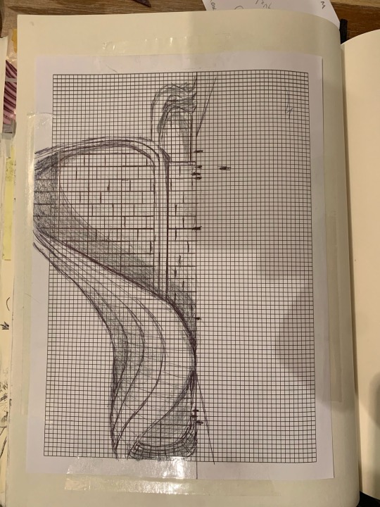
This is my landscape study of the Zaha Hadid in Singapore. When going into research to find buildings and structures with great style I had found that Singapore have some the most breathtaking buildings and architecture. Its as if they dont even filter their ideas and I love that!
The buildings have so much expression and individuality. Incredible.
I was planning on sketching this freehand which something I am more used to doing considering I dont really draw these kind of things, but I considered how bad the quality would be if I didn't use a ruler which I am so glad I used and it went really well. Something I really like about what I did in this piece is how I translated the curve of the building to paper, something that I thought I would really struggle with. I think the mixture of using biro pen and graphite really compliment each other. The biro giving a strong outline and presence and then the graphite really bring that extra element of reality and real life accuracy .
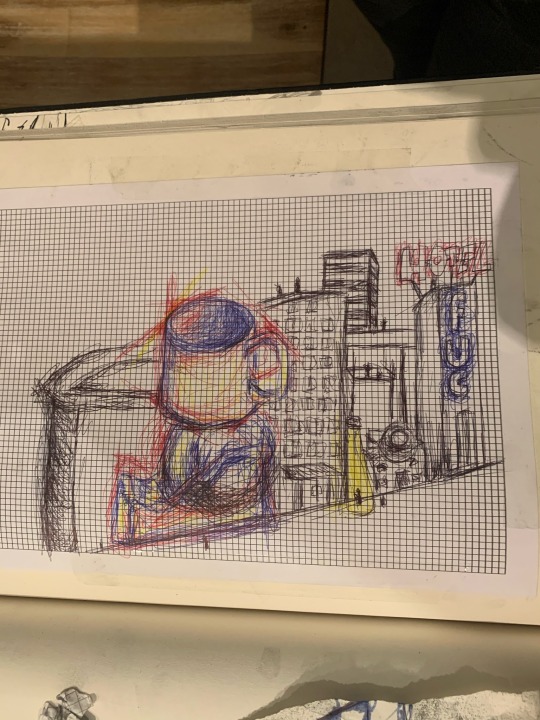
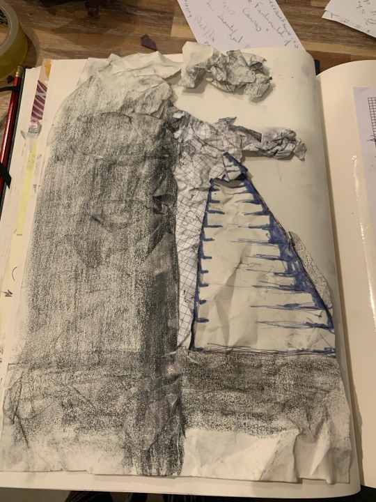
the two images above are a bit more abstract but was willing to experiment and push myself and that what I did. In the first image it mostly an experiment with colour and how, even if not accurate to the reference, I could create that 3d element and make it pop. Also I wanted to create a contrast with this weird structure amongst all these ordinary square buildings and to then add colour to make it really stand out. I was heavy on the blue because I wanted that to be my back bone and the yellow and red I used to create highlights and shade. I also feel as if this piece was very free flowing and kinda just let my brain take control to do the rest.
Now with the second image your probably wondering ‘okay.. this doesn't look 3d just looks like scrappy paper?’ and yes that's exactly what it is. I wanted destruction and chaos to ensue the page with multi media paper I wanted it to seem out of place, and there, to the side, still scrappy but distinguishable as a stair case still stable and still standing. My inspiration for this is when buildings and such are being demolished and they look like this unidentified rubble area until there would still be a wall with a window, or a door frame standing, untouched, or a staircase. There are ghosts of what was once there standing proud before their final moments, an ode to the building/structures time when it was standing. I call stairway to wherever you want.
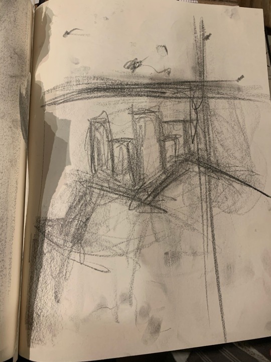
CHOAS IN THE CITY OF PALMS
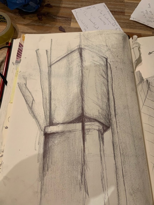
BISCUIT TINS : THE SEQUEL!
A biro plus graphite piece, I wanted these two tins to have allot of power. I wanted them to have an edge to them, in the reference they aren't the sharpest tins but I just thought they looked so cool just standing there glaring down everyone.
I wanted them to have a skyscraper feel to them, I think I somewhat achiechevd that but upon review I think something I couldve done was just to go more in with the graphite especially in those darker areas, but instead I used biro which doesn't work as well, its a bit more scratchy and less natural compared ti its rival graphite
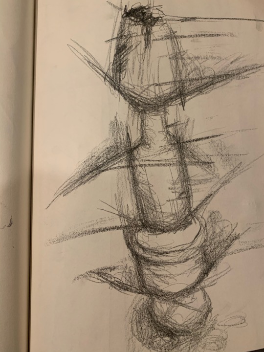
I call this one BANNANA TOBASCO ITALIAN HERBS AND SEASONIG AND SALT. I must say it was difficult to balance all these things on top of each other and once I did I just had to use it as one of my pictures because I really wanted to draw it. In this I used graphite only and I must admit I found it hard to grasp the idea of scale considering this was a Birdseye view picture. What I knew was that the top had to appear larger than the bottom, it is definitley something that needs work but im glad that I did it anyway .
0 notes
Text
The creative art industry
Seven arts may refer to: The traditional subdivision of the Arts, being Architecture, Sculpture, Painting, literature, Music, Performing, and Film stories. The Seven Liberal Arts, being grammar, logic, rhetoric, arithmetic, geometry, music, and astronomy. As you can already tell the art industry is very vast, spanning over some of the most profitable industries therefore making itself one of the biggest money making industrys in the world.
in 2020 the following of these industrys made in revenue:
Film - 35-40 billion US dollars
Music - 9-12 billion US dollars
These statistics may be a little dated but it really does give a perspective on how much influence is in the market
The global art market was valued at over 67 billion U.S. dollars in 2018, up from almost 64 billion the previous year. This increase is also shown in the volume of global art sales which reached approximately 40 million transactions in 2018, up from 39 million the previous year.
A JOB IN THE INDUSTRY I WOULD LIKE
I think a job I would like is the job of a Gallerist. A gallerist is a person who owns an art gallery or who exhibits and promotes artists' work in galleries and other venues in order to attract potential buyers. I like the idea of this because the thought of being able to control what people see in your gallery, especially how you structure it. Another aspect is the lighting of the Gallery, you can't just slap some art on the wall with some normal headlights, this would completely discredit the art and artists work, the lighting itself would have to be ‘art’, essentially your gallery is just one massive piece of art! An extra point would be the flow of art constantly coming through, the amount of variation which would be seen. It would give me such a grasp on the industry as a whole, with people coming to my gallery I would be able to network and create relationships (I would not take these relationships for granted, I would pay my dues) therefore elevating me and anyone with me. Why settle. there's a bigger picture which I would like to see. It would all depend on my target audience and who buys from my gallery but gallery owners on average earn about $50,000-100,000 (£30,000-70,000) but its all in the gallery owners hands I could be making nothing or I could be making millions, that's why I like the idea of gallerist because in a sense there's no cap on how much you can make. sky is the limit.
0 notes
Text
Evaluation
-3 pieces of artist research that has impacted my work.
Katrien De Blauwer
her unique collage style gave me a new perspective on the impotence of construction and selection.
Mike Mignola
such a unique and relaxed art style which resonates with me.
MF DOOM
A rapper who I researched. His godlike ability to rap with the most unique flows ever. Has created his own universe with lots of different characters played by him. He really was the prime example of doing what you want to the best possible standard.
-ideas behind my work
Ideas behind my work generally come from everyday life, I tend to stick to my own and although I do have respect for other artists I would like to consider my work individual, and as an insight to my mind and imagination. Absurdity, as an artist I would like to challenge whoever looks at my work with I would like to do a lot of things. I like using colours but I do find it hard sometimes because there are two parts of me, one that likes a flamboyant black and white sketch with lots of Character and the other wanting to go off the rails a bit more but in a sense when I'm drawing in my head I am imagining the colours as I create my art.
-new techniques ive used/experimented with
photoshop. I have had brief experiences with photoshop in the past but I had never really seen it use for the arts until recently. In the lessons with charlotte it has been really fun to manipulate my work in a way I never have before. I enjoyed having to figure out how to compose all the different layers on photoshop. I discovered a new found appreciation for digital artists who use programs like photoshop because it does take a lot of time and attention to detail, all things I will be looking forward to learning.
-most successful piece of work
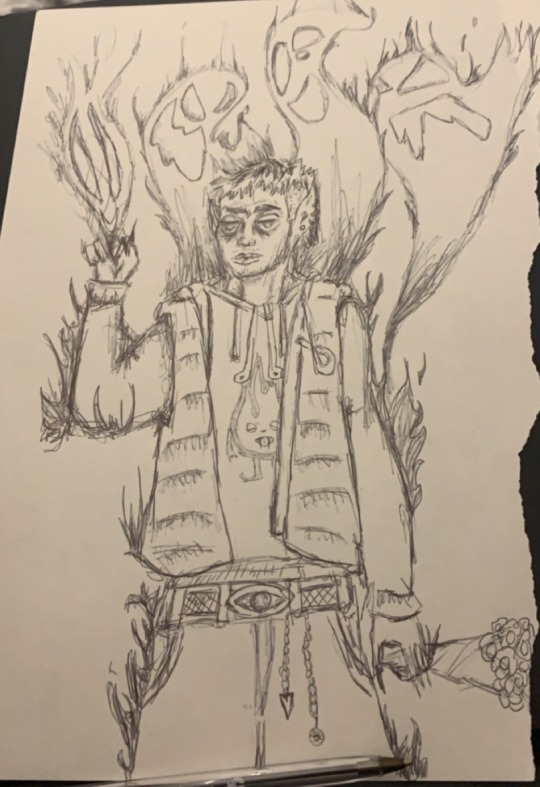
This is my most successful as well as my favourite. It was a freestyle but I had a reference for the base. Its a self portrait of myself, in my work something I've noticed is that I like to give my characters demon/evil attributes. For example my 3 favourite motifs : long sharp dark nails, pointed ears, smoking.
Its a representation of human struggle. Its similar to the term ‘I have demons’. Obviously there's no way to tell we have demons. The demons are in reference to mental health struggles. I guess my characters are humans who just let their demons show, and there's nothing wrong with that. As you can see by the character above, he has fire coming from his body, but he is unscathed, he is smoking and has the pointy ears. Its a representation of self destruction and numbness although chaos ensues all around him his nonchalant expression says everything about how he's feeling. Im very proud of it.
-Write about the journey from initial ideas/experimentation to final outcome making. What have you learnt? Are you pleased with your outcomes? Why?
-If you could display your work from this project anywhere in the world…or at any time in history…..where would it be and why?
This is a very good question. in a perfect world I would choose everywhere simply because I could be everywhere at the same time, but that's not realistic so I guess id go with my ancient relatives. I would be interested to see if they would take a liking to my work and find a sense of familiarity. It would be interesting to see if like me, my ancient relatives were also artists.
-List 10 words to describe your final outcome – and include an image of it.
-If you needed a soundtrack/music to go with your outcome from this project what would it be and why?
vomitspit - MF DOOM
accordion - MF DOOM
fastlane - King Geedorah
crosshairs - DANGERDOOM
tammys song (her evils) - Kendrick Lamar
crepuscolo sul mare - Piero Umiliani
All the songs are incredibly good and tasteful just like my work. JOKING.
I would choose these songs because its the type of music I would listen when creating so if people were to see my work I would like to accompany them with this selection of songs because that way hopefully they would understand the headspace I was in when creating my work.
-What space do you work in at home/elsewhere?
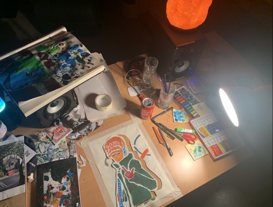
I work from home and im lucky enough and grateful to have my own study area where I do most of my work. Its an inspiring place because although it may sound silly I arranged all the furniture in the room, this has helped to create a comfortable space to work in. It also doubles as a music studio, it is a very amateur setup but I love it. Its a creative space with plants, lava lamps and salt lamps, creating a comfortable atmosphere.
-What can you do now that you could not do at the start of this project
Improvise. I find it hard to create something even if I do have a reference or inspiration on the spot. I would consume a lot if valuable time thinking of the idea instead of bringing it to life. But now I feel as if, as an artist I can just get started a lot quicker compared to how I used to be therefore giving me less time to try and make it ‘perfect’ nothing is perfect and that is a good thing, a lot of time as human beings we find beauty in peoples so called ‘flaws’.
0 notes
Text
Post its from MY BIG BRAIN!!!!


This a collection of post it notes I put together, the idea was to put a lot of time into something small, each piece averaged about 30-40 mins and to get all of them done about a month or 2 . Some are straight from my imagination others I have used references BUT NO TRACING that's cheating (in my eyes, only way to perfect your craft is without safety measures)
In these mini bits I wanted it to be absurd, magical, crazy, violent, warming I really just wanted to do what I wanted to do and thats what I did.
In school I was easily distracted, not by others but by myself, class banta is fun but there's no point being disruptive, im not a prick. I would find myself drawing in my books, my hands, sometimes the desk but rarely. this is a tribute piece you could call to my younger self, drawing on the post its like I would in class, but this time trouble free, no consequences.
0 notes
Text
SCREEN PRINTS! HIS SATANIC MAJESTY, HORNS, HEAD, TAIL AND ALL.

In this I wanted a simple but strong design. Something that's easy to look at but with enough elements to it to make it pop out. It took a while to get a final design. I had to make sure I was including his horns head and tail as well as something that linked to being royal or majestic for instance a crown. I wanted my character to be very relaxed and composed, holding the skull is his hand nonchalantly as id expect a ‘satanic majesty’ to do.
for the background I used my planning and design page. I feel with all the drafts in the back it adds more character and emphasis to the main design.
SMOKE THE REST OF THE BODIES FOR FUTURE USE.

In this I wanted it be to funny somewhat. The quote “smoke the bodies for future use” when taken out of context is a really weird thing to be said. In my head from reading it the first thing I imagined was someone smoking a cigarette with a smaller human being inside the cigarette being smoked. At first I wanted to go crazy with the design and put lots of detail in it but realised that would be a lot harder with with the screen and that the stencil would be too hard to do.
So instead I went backwards and tried to make the design as simple as possible and it worked! As long as I could depict a figure with two arms a head and a cigarette with someone inside it would be good. Its very much a stickman style which is something im happy with, its good not to over complicate things.
One thing I would change is the clearness of the print and the layout, maybe even the size, the same print in a smaller scale.
0 notes
Text
Interdimensional Collages


In these collages I wanted each one to have its own unique atmosphere. I wanted them to be separate and completely different from each to emphasise the fact that they are from different “dimensions/worlds”.
If I'm being honest I really wasnt a fan of the embroidery/sewing aspect, it really just didn't match my style which is fair enough and im all for new experiences but in my opinion instead tying up the piece it just looks like one big mess. One thing I would change differently is maybe the colour of string and thickness of it also the placement.
Out of the 4 my favourite is probably 1 and 3.
1 has a really trippy and delusional feel to it, with the stairs and the person hanging on it really gives of a sense adventure and risk as they look down as they about to take the plunge into wherever they are going.
3 is very simple and that's why I love it, the simplicity and very normal nature, the human body and the phone, a very normal gesture with a hand as a face and neck. The normality and absurdity clash and with the white background to really bring out in your face.
0 notes
Text

Original piece made by me.
A take on losing control of a situation which doesn’t necessarily need to be controlled.
In this I used cardboard from some Amazon packages as the canvas. I like the raw element it brings and also the fact that its a good middle ground with its ligh brown tone allowing the white and black to both pop.
I used a stencil to get a rough silhouette of the features of the eyes nose and mouth and spray painted with white spray over the stencil. I didn’t want it come out defined because once again I wanted to incorporate that raw/rough element. I then proceeded to go over the white with a sharpie. I once again stuck to the theme of it being rough and unregulated. I wanted the features to have a unsettling atmosphere which I think I achieved especially with the eyes.


0 notes
Text
Logan Sylve
Logan Slyve is an artist I have come across recently, I found him on instagram and instantly loved his work. his colourful, eccentric full of life work is something that I would like my style to see my style steer towards in the future.


His style and use of showing movement in his characters are just so compelling and really tell their own story just by looking at them.

0 notes
Text
Norman Ackroyd

Norman Ackroyd was born 26th march 1938 in Leeds. He studied at the Royal College of Art. Widely regarded as one of today’s finest printmakers his Public collections include the Tate Gallery, the British Museum and the Arts Council in London, the National Galleries of Canada, Norway, England, Scotland, South Africa and the USA, his work is pretty global. He was elected RA in 1988, made Senior Fellow of the Royal College of Art in 2000 and awarded the CBE for Services to Engraving and Printing in 2007.

Ackroyd does a series of prints, etchings and water colours. A well decorated artist who has been prominent in the scene for decades. His work is so detailed some of his work in my opinion could be mistaken for an actual photograph. In the image below its as if I'm looking at an old photograph of a landscape. Ackroyd use of black is done so so incredibly well, the amount of tones of white, black, grey etc is extensive.

With the amount that's going on in his work it's clear that everything has been carefully placed, constructed and composed to create these very natural pieces. The reason I chose the word natural is because him being a landscape artist and capturing nature everything seems and looks very harmonic, like nature. I guess I could refer his work and it having comparisons to ying and yang , black and white, the dark but light nature of his work the chaos and the beauty creating a harmony, a perfect middle ground.

1 note
·
View note
Text
Katrien De Blauwer
Katrien de Blauwer was born in the small town called Ronse in Belgium. being someone with a troubling up brining she moved to Ghent (a city in northwest Belgium) at a young age to study painting. Later on she studied fashion at the Royal Academy in Antwerp which she would then leave. It was at that time she made her first collage books, actually studies and moodbooks for fashion collections. At a later age she began collecting, cutting and recycling images as therapeutic self investigation.

Katrien De Blauwer calls herself a "photographer without a camera". She collects and recycles pictures and photos from old magazines and papers.

From my point of view and from looking at her work I've found it fascinating. Such simple collages which just work so well together even though you might not think it. Its deceptively simple. Katrien De Blauwer’s work reminds me of the saying “less is more” which shouldn't make sense but it does. Her composition skills make her work very attractive to look at. from looking at her work its evident that her personal history becomes the history of everyone. The collages being easy to digest and with its descriptive elements makes her work, in a sense, relatable. The neutral nature combined with her own descriptive elements are what makes her work so good.

A motif which is noticed in her work is her use of black and white imagery giving it a simple and easy going tone as well as a nostalgic atmosphere and then her use of colour which is noticeable but smooth. Sometimes the textures vary.
What makes her work pop is the geometric element, with the collages and images she chooses they are almost all rectangular or square but varying in size, another aspect which adds to her “deceptively simple” style.
0 notes
Text


These were my initial bases for scanning. I was happy with the designs being a bit sketch like and having a relaxed edge to them. I thought it would work well as in photoshop I wanted to explore how I could refine them digitally in a new media/style .
In the edits I was very focused on trying to bring out strong and sharp colours which when together would help the image pop out. In the first image I was very happy with my use of green and yellow , both being bright colours and the greens strong outline presences really compliments the work, especially with the red and yellow.


1 note
·
View note
Text
David Foldvar

David Foldvari was born in Budapest, Hungary, but has lived in the UK for the last 20 years. His work often tackles issues of alienation, identity and belonging, formed by a preoccupation with his eastern European roots, combined with his experience of growing up in the UK.
David’s work is bold, darkly humorous and often political in tone, his considered and energetic draftsmanship having led to a prolific output both personally and commercially. Some of his previous clients include the New York Times, Greenpeace, Random House, Penguin Books, Dazed & Confused and Island Records. In 2007 he earned a D&AD award for involvement on Nike Run London and for his input on Beck’s The Information.

in this piece I am perceiving a message that if you are to shoot someone and take their life, you may as well be taking your own, hence shooting yourself.

Upon first looking at David Foldvari’s I was confused, but confused in a nice way. his twist on modern adding his own over exaggerated features often leads to me thinking if there is message or meaning behind his work which I believe there is.

I especially love this, as someone who didn't necessarily enjoy school or benefit of it, despite my teachers efforts this resonates with me strongly. with all the background knowledge , listening to it, writing everything down, to only not understand, hence all this information is “Blah”.
0 notes
Text
Mike Mignola
Mike Mignola is an American artist who began his career in the early 80s, he began by illustrating for The comic reader which was a non official non professional magazine which was created by comic book enthusiasts. he then graduated from California college of the arts with a BFA in Illustration. HE then went on to work big comic book names such as Marvel and DC, he worked on comics such as Daredevil , The Incredible Hulk and Batman “a death in the family”. Mike Mignola’s claim to fame is that he is the creator of the very successful comic book which has had multiple live action adaptations, HELLBOY. The idea of Hellboy is that in the world war 2 he was summoned from hell to earth as a child by nazi scientists. Hellboy works for the B.P.R.D., an international non-governmental agency, and for himself against dark forces including Nazis and Witches, in a series of tales that have their roots in Folklore, Pulp magazines, vintage adventure, lovecraftian and horror fiction. In earlier stories, he is identified as the "World's Greatest Paranormal Investigator".

from looking art Mignola's work I am feeling a very minimalistic vibe, with the image above Hellboy only has 3 colours to him, black and red and some blends between the red and black on his belt area. The tentacles and claws which are all contorted and reaching out very much reminds of zombies reaching out of their graves, Mignola's use of tentacles further adds to his unique style and the absurdity of his work.


I absolutely love Hellboy’s characters design. His resting nonchalant expression with his unusual but human body apart from the horns, his massive right hand, yellow eyes and red skin. Looking at Hellboy its clear that Mignola style is very relaxed but at the same time very thoughtful. something which I'm not sure if he's done this on purpose but Mignola's use of background colour which usually would be dull on their own partnered with his style compliment each other very well giving of this morbid or dystopian atmosphere. but going back to his use of background colour , to then add Hellboy in the picture, the contrast is very sublet but strong as well which really gives Hellboy this main character presence.
0 notes


