Hi all. Welcome to my tumblr! Here you'll find the random premades I do from time to time or the ones you request. You'll also find links to other things as well. Also, if you're from the Starcourt server or the gif junkies server, please react if using anything. Thanks! Nance.
Last active 2 hours ago
Don't wanna be here? Send us removal request.
Text
I made a beginner coding resource! 👩🏾💻💗


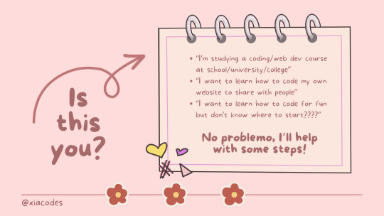
Hiya! 👩🏾💻💗
I made a coding infographic/slideshow for anyone getting into coding and are stuck! I'm seeing a lot of new codeblr blogs coming up recently and they're all beginners and I have been getting a lot of asks which basically all ask "I'm new to coding, how do I start?", so I decided to make this at 1am in the morning real quick! 🥲😭
I genuinely hope that this resource proves beneficial to someone out there. And remember, if you find yourself still facing challenges or need assistance with anything else, please don't hesitate to reach out. I'm here to help! ✨
Link to the PDF: LINK
2K notes
·
View notes
Text

As a thank you for so many new followers, here's a brand new edition of my editing resources masterposts ✨ (you can find the previous editions here). Make sure you like or reblog the posts below if they’re from other blogs to support their creators! A friendly reminder that some of these are free for personal use only, so be sure to read the information attached to each resource to verify how they can be used.
Textures & Things:
Collage Kits from @cruellesummer that I find myself using basically every single day
Taylor Swift Wax Seals from @breakbleheavens that I also use literally every day
Rookie Magazine Collage Kits (1, 2, 3, 4, 5, 6, 7, 8, 9, 10)
Scribble Textures & Cross-Outs (1, 2, 3)
GIF Overlays (1, 2, 3)
Film Grain & Noise Textures (1, 2, 3)
Paper Textures (1, 2, 3, 4, 5, 6, 7, 8)
PNG Overlays (Paper, Flowers, Clouds, Stickers, Lips, Vintage Paper, Misc. Symbols)
Halftone, Scan Line, & VHS Noise Textures (1, 2, 3, 4)
VHS Tape Textures by @cellphonehippie
Misc. Texture Packs (1, 2, 3, 4, 5, 6, 7, 8)
Photoshop Effects (Halftone Text Effect, Chrome Effect, Glitch Effect, Ink Edge Effect, Photo Morph Effect)
Fonts:
Badass Fonts (free fonts designed by womxn 🤍)
Open Foundry Fonts
Free Faces
Uncut Free Typefaces
Some Google Fonts I Like: Instrument Serif, DM Sans, EB Garamond, Forum, Pirata One, Imbue, Amarante
Some Adobe Fonts I Like: New Spirit, Ambroise, Filmotype Yukon, Typeka, Big Caslon CC (TTPD Font!)
Some Pangram Pangram Fonts I Like: Editorial Old, Neue World Collection, Eiko, PP Playground
Fonts In The Wild (font-finding resource)
Tutorials & Resources:
Comprehensive Rotoscoping Tutorial (Photoshop + After Effects, great for beginners!) by @antoniosvivaldi
Rotoscoping & Masking Tutorial (After Effects) by @usergif
Texture Tutorial for GIFs by @antoniosvivaldi
Color Control PSD by @evansyhelp (to enhance, isolate, or lighten specific colors)
Cardigan Music Video PSD by @felicitysmoak
Picspam Tutorial by @kvtnisseverdeen
Moving GIF Overlay Tutorial by @rhaenyratargaryns
GIF Overlay Tutorial (+ downloadable overlays!) by @idsb
Icon & Header Tutorial by @breakbleheavens
GIF Blending Tutorial by @jakeperalta
Split GIF Tutorial by @mithrandirl
Guide to Coloring Yellow-Tinted Shots by @ajusnice
Slow Motion After Effects Tutorial (useful for GIFs!)
Gradient Map Tutorial by me!
Misc:
How to Make Your Own Textures by @sweettasteofbitter
How to Report Tumblr Reposts of Your Work by @fatenumberfor
Tips for Accessible Typography
#reblogged#overlays#textures#fonts#masterposts#tutorials#masterpost#resources#photoshop resources#customwork
768 notes
·
View notes
Text
Photopea Tutorial
Shoutout to the other Broke Giffers on the Merlin Fic Server! This is a tutorial on how to do overlay gifs specifically for Photopea. It might work for Photoshop, I have no idea.
This tutorial is made on the assumption that you already know how to make a gif and have a rough grasp of how to use Photopea.
So first and foremost, we’re going to choose our gifs. You want to make sure the gifs you choose have different colors. As in, one is dark and the other is light. You can make it work with two gifs of the same coloring and manually recolor one of them, but it’s going to be extra work and more mb’s on your gif. It really just depends on how much work you want to put in and the vibe you’re going for.
Then, you need to actually make the gifs. The gifs need to have the same amount of frames or it might not work quite the way you want. You can use two gifs with different amounts of frames, but there’s always the chance it may not align quite the way you want. The gifs I’m using for this tutorial have 22 frames each.
After making them and opening them in Photopea, I’m going to select all the layers and sharpen them. Then, with all the layers still selected, I’m going to go to Image > Adjustments and adjust my gif as normal using Curves, Selective Color, Hue/Saturation, and Vibrance.
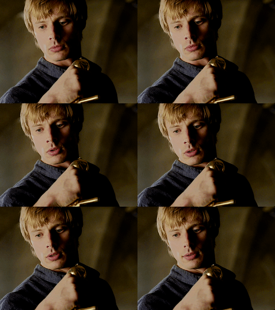
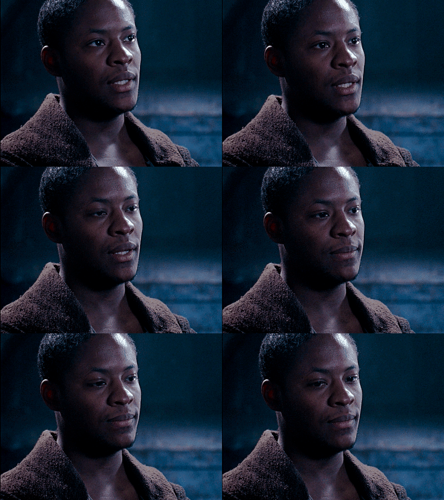
The most important thing to remember when blending gifs together in Photopea is that Photopea will only merge frames. If you have any adjustment layers in, even if they’re invisible, it will not work. This is why you do it through Image Adjustments. If you don’t want to do this for whatever reason, you can add in your adjustments after you combine the gifs.
Next comes putting both gifs into the same project.
On Gif One, you’re going to right click on the name of the gif in the frame/layers list. Choose Duplicate into… In the dialogue box that pops up, click the drop down arrow and choose New Project.
Go back to Gif Two and do the same thing, only this time you’re going to duplicate the gif into same project as Gif One. Now both gifs are together.
Scroll to the bottom and delete the Background Layer.
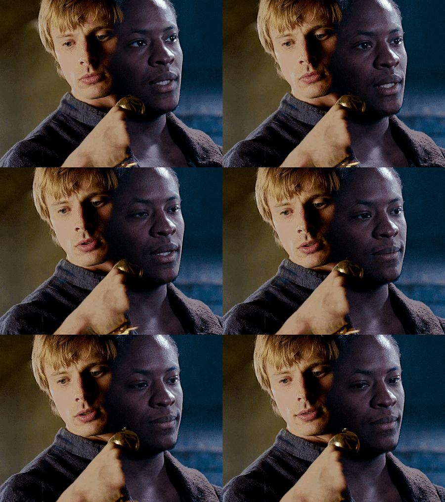
This works better if you place the darker gif, in this case Elyan, on the bottom. So just drag and drop the gif folder underneath the other. It should look like this:

Highlight the top gif and click on the Blending toolbar. Select Lighten. You can also adjust the Opacity if you would like, but I haven’t done that in this example. Then, after ensuring that all of the layers of the gif you want to move are selected, move the gif to your desired spot using the Move tool. Your gif should now look like this:
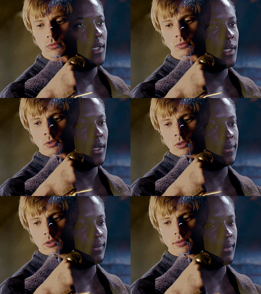
There are plenty of giffers who would leave this as is, and there’s no problem with that! However, for my personal preference, I’m going to clean things up.
To clean up the overlays, I’m going to select the top gif and add a Rastor Mask. Next, I’m going to select the Brush tool and use the Mechanical Pencil, size 24. Make sure you’ve changed the brush color to black, then I’m going to color on the gif itself to erase the extra bits from the bottom gif.
Then, I’ll do the exact same with the bottom gif and erase the junk from Gif One. It should look like this (click to enlarge):
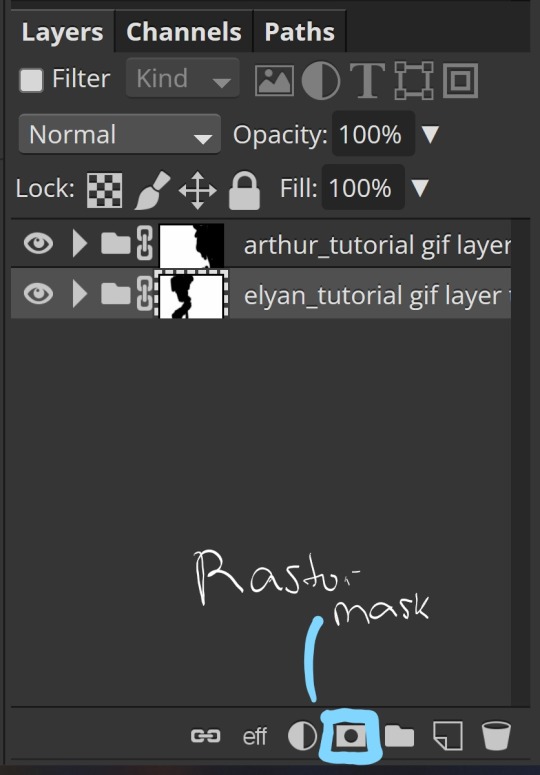
Lastly, we’re going to merge the two folders together. At the top of the screen, select Layer and look to the bottom to find Animation > Merge. The gifs should now be in a single folder together. Congratulations! You’ve now made an overlay gif.
This is perfectly fine to post, but you can always add more. For this gif, I’m going to add a little more color and some text.
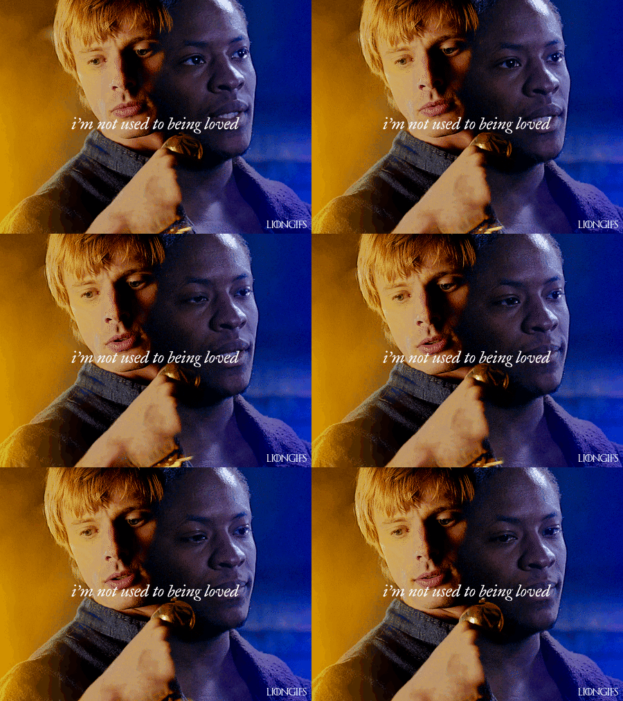
I also slowed the gif down to about 60% of its original speed and added my watermark. This gif is part of a set I’m working on and just haven’t quite been ready to post it.
If you have any questions, you’re welcome to reach out and ask!
You can see my Anti-White Washing Tutorial here
248 notes
·
View notes
Text


Hi all! I made a PSD for the Upside Down scenes in season four since they're so dark and ridiculous. You don't need to credit me if you use them, although a reblog would be nice :] You may need to adjust the level setting depending on the scene but for the most part it works well! You can download it here!
237 notes
·
View notes
Note
Hi, I’m new to gif making and I was wondering if you would please post a colouring tutorial for any gifset you’re working on right now?
sure!
this is the set i used these for
I was thinking about giving you a psd to look at as well but tbh its better if you learn to do the process yourself instead of relying on psd's made by other people. I'm a little old school in that regard, repetition is the key to remembrance and practice makes perfect and all that.
So I'm working on an OPLA Zoro/Luffy set right now which I guess kind of works out for you since I have to do more work recoloring live action scenes.
So I've made my gifs, I've cropped them to 540x540.
Each gif will get two Smart Sharpen (Filters>Sharpen>Smart Sharpen) smart filters. It's important that you do them in this order or it will look different. The first and second filter, respectively -
Amount: 500% Radius: 0.3px Amount: 10% Radius: 10px
You can adjust these as you'd like, but I personally don't do that. I know some giffers add Gaussian Blurs or Surface Blurs, but I like my gifs to be as crisp and clean as possible, I don't want any blur on them.
From that you can start to color. Since I'm doing overlays for this set, I'm going to get that set up first and then I'll start on the coloring. I'm not going to explain how to do overlays in this tutorial just because it's a long explanation. I do have a tutorial for Photopea that I will link at the bottom. The process is mostly the same with some minor variances.
So the first gif I'm recoloring is pretty dark. Both gifs on it are dark, so I'm going to relight them separately with a Curves layer. When using Curves, I use the eyedroppers to show PS which two points of white and black I want the gif balanced between. So with the white eyedropper selected, I click on a white point of the gif and with the black eyedropper I click on a dark point of the gif. This is going to relight your gif and is one of the most important steps in coloring gifs.

I don't always get it right the first try and I usually click around a bit and try different points of white/black before I find something I like the best.
Next I'm going to add a Hue/Saturation layer with the Saturation at 10 and a Vibrance layer with the Vibrance at 30. I use these as base points and I'll recolor the rest of my gif after doing these.

I don't love how red Mackenyu is now so I'm going to add a Hue/Sat layer and switch to the Red panel and set the Saturation to -10 and the Lightness to -5.
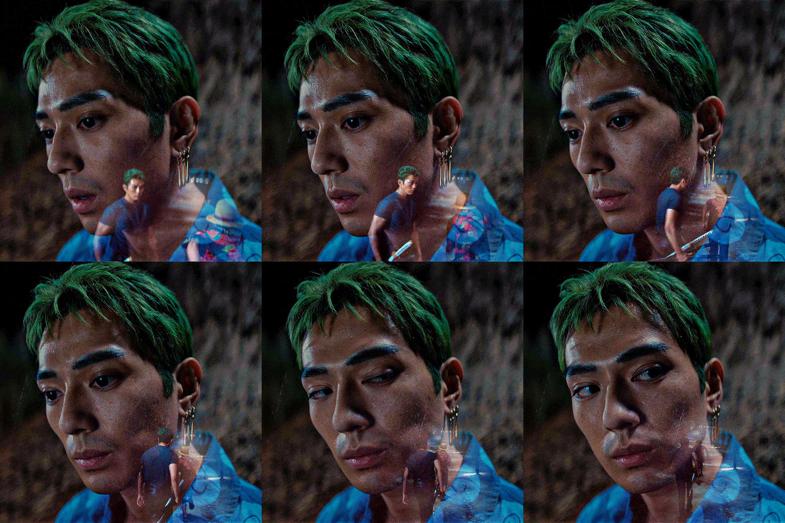
My personal rule of thumb when adjusting the skin tone of my actors and characters of the Global Majority is to do it in increments with the H/S no more than -30 and I usually set the Lightness to half of whatever the H/S is. But of course this is just what I do and if something else works better for you, please do that.
From here I'm going to do the rest of the heavy adjusting:
Color Balance > Tone: Shadows Cyan / Red: +10
Selective Color > Red Cyan: +50
Selective Color > Black Black: +5
Brightness/Contrast Brightness: +10
Selective Color > Magenta Magenta: -50
Vibrance Vibrance: +30
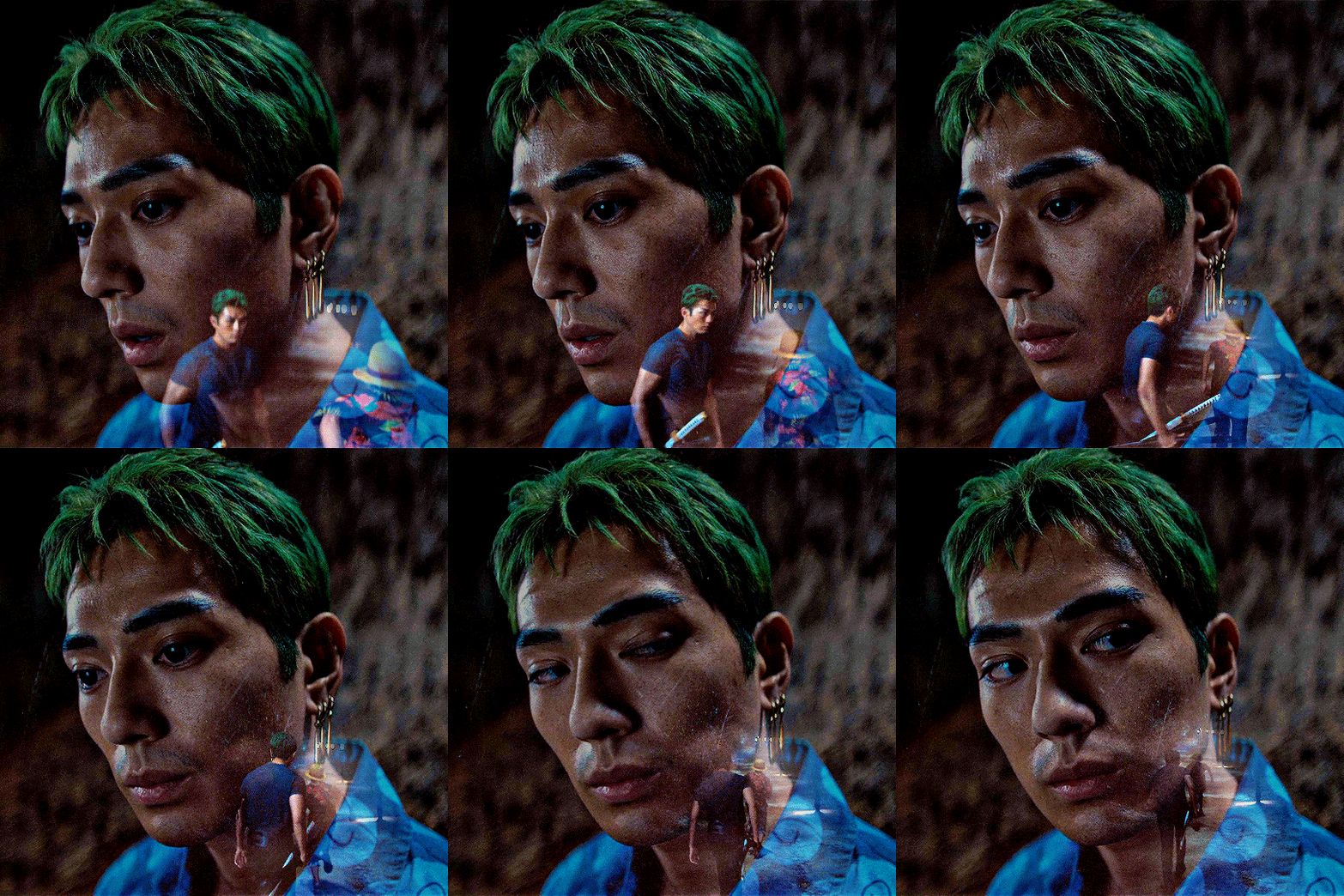
And for now, I'm done with this gif and I'm going to move on to the others in the set.
One of the other gifs is really bright, its made up of a day time scene. My coloring on this will be really different than the night scenes.
The same base layers: Curves, Hue/Sat, Vibrance I'm also going to put the same Hue/Sat red adjustment layer here because I don't want Kiki and Mack to be too red.
Color Balance > Shadows Cyan - Red: +10 Yellow - Blue: +10
Selective Color > Cyan Cyan: +50 Yellow: -50
Selective Color > Black Black: +10
Brightness/Contrast Brightness: -10
Selective Color > Yellow Yellow: -20
Vibrance +30

Honestly anon, once I got more comfortable with PS my coloring process is more varied. I go by vibes more often than not. And actually, I did all this work and then changed my mind once I got all the gifs done and ended up making most of them black and white.
But I hope this helped you! If you have any more questions you're welcome to ask.
My DMs are also open, I can help a little more specifically that way, and you can ask for my Discord and we can chat there if it's easier.
Good luck anon!
Overlay Tutorial with Photopea
19 notes
·
View notes
Note
hi i'm sorry to bother you but do you have any tips on giffing dark indoor scenes? yours always look so good!
hi there! not a bother at all :) i can definitely try to explain the steps i usually take under the cut!
this tutorial will assume that you already know the basic steps of gif-making — if you don't, there are lots of great tutorials floating around on this site that can help you out! :)
here's the gif i'll work with to explain my steps, the bottom being the original and the top being the coloured/brightened version.
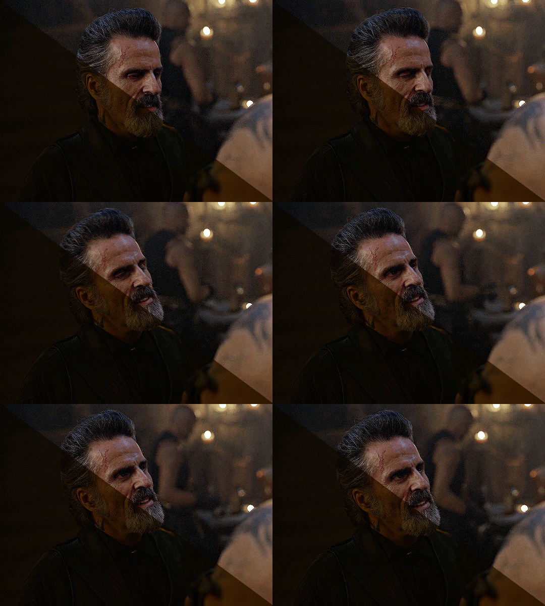
before we start, a general tip i recommend keeping in mind: if you want to brighten a dark scene, you'll want to get your hands on the highest quality download you can find. 1080p is decent, but if your laptop can handle 2160p 4k hdr files* without sounding like it's about to explode, that'll get you even better results!
(*colouring hdr 4k files requires a different set of steps — the scene will appear washed-out on photoshop, so you need to make sure that you don't end up whitewashing anyone if you do choose to work with this type of file.)
since most of my downloads are 1080p, i'll use this type of file in this tutorial.
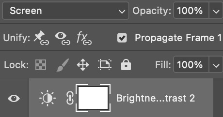
the first step of my gifmaking process with 1080p files is almost always the same no matter what scene i'm giffing. i make a brightness/contrast layer and set the blending mode to screen:
now my gif looks like this:
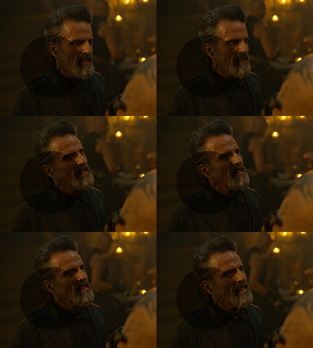
depending on the scene and how washed out it looks after this layer, i'll play around with the opacity. for this gif, i didn't touch the opacity at all. use your best judgement for this, because every scene is different!
i find that dark indoor scenes are usually tinted in yellow or green. one of my first goals is to try to fix the undertone of this scene before focusing on brightening it any further. i go to colour balance for this, and play around with the midtones, shadows, and highlights.
again, every scene is different, so the amount to which you use colour balance will differ, but for this specific scene, my goal was to neutralize the yellow. i focused particularly on the midtones and shadows of the colour balance layer, moving the scales to the opposite of the reds.
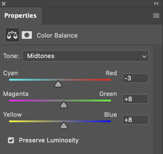
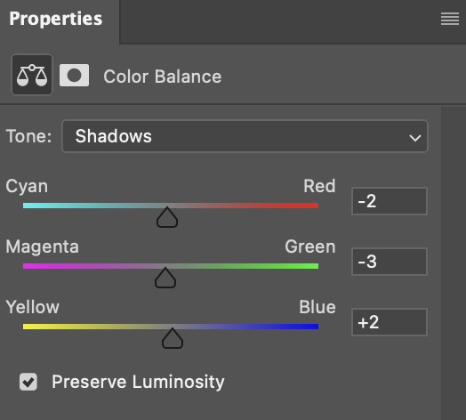
doing so will help with neutralizing the yellow. the only reason i moved the scales towards magenta and blue (therefore making it a bit more red than less) rather than green and yellow in shadows was because i wanted a darker contrast in the blacks. moving them to green and yellow made the overall scene more yellow since there were so many dark spots that shadows affected. (you'll see what i mean when you start experimenting with your own gif — this part of the process really just depends on your preferences!)
our gif might not look that much better yet, but it will soon! our best friend channel mixer is gonna help us out. for an in-depth post about how to use this adjustment layer, i recommend checking out this tutorial.
i'm someone who prefers to make more than one layer for the same adjustment layer for a reason i can't even explain (i just find that it helps me stay more organized). so don't think of this process like i can only use this layer once so i MUST fix it NOW. you can create multiple layers of the same adjustment layer, because every layer on top will affect the ones underneath it.
since my priority is getting rid of the yellow tint, i went to the Blue section of the channel mixer and increased it in all of the scales:
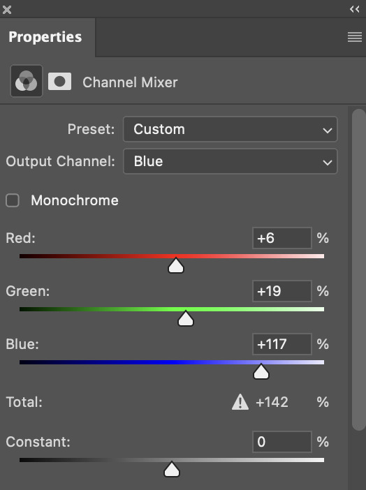
this step alone has helped us out so much, because look at our gif now!
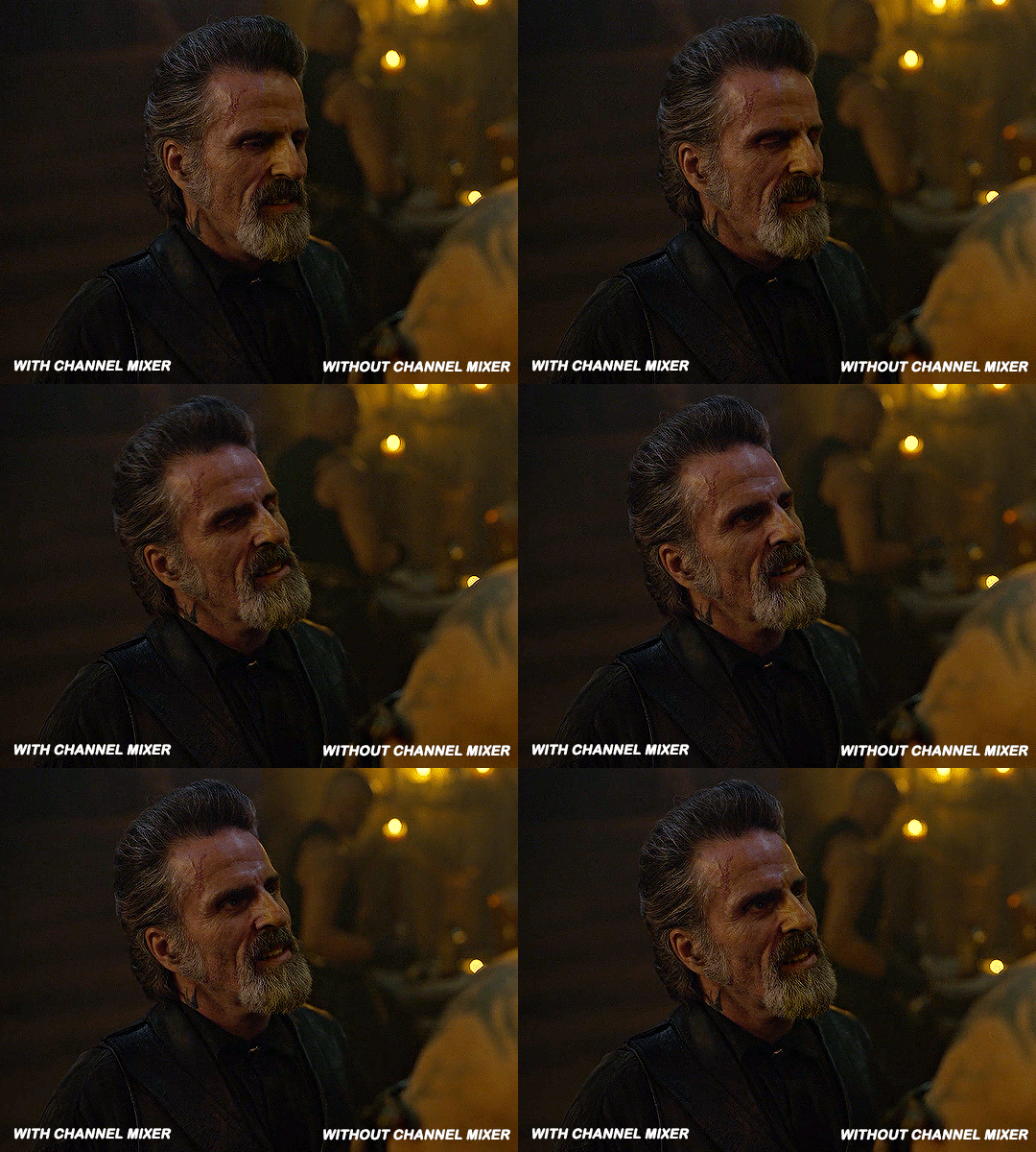
not only does the background look less yellow, but so does izzy's skintone.
now i'm going to focus on trying to brighten the scene even more without destroying the quality. the levels layer can actually help out a lot with this.
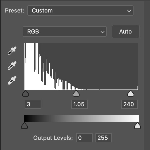
the amount to which i move each toggle differs per scene, and i think experimenting depending on your gif works best for this layer.
side note: i prefer not to use the ink droppers on the side because the contrast in the result usually ends up feeling too strong for my preferences, but if you find that this works better for you, then go for it! basically, the first dropper with the black ink should be clicked before you select the darkest part of the scene that you can find, and vice versa for the third dropper with the white ink — click it, and then select the brightest part of your scene.
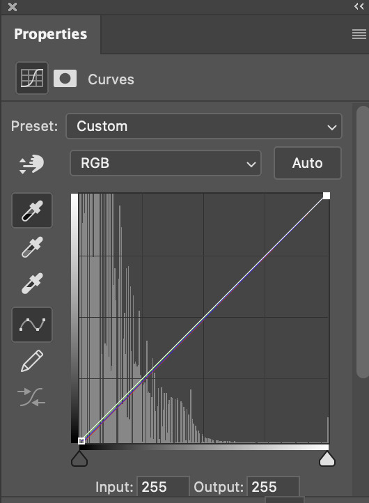
curves is the next layer that does fantastic work! unlike the levels layer, i do actually use the ink droppers for this. it's the same concept, with the first dropper being used on the darkest part of the scene, and the third dropper on the brightest.
try to think of curves as something that not only further brightens your scene, but also helps with the colour neutralizing process.
i grab the first dropper, then click the darkest parts of the gif that i can see. depending on the undertone of the blacks that you're clicking on, the tint of your gif might actually change significantly. this is why i prefer to click once, then undo the action if i don't like what it gives me. izzy's leather jacket was the sweet spot for this gif.
when i'm satisfied, i make another curves layer and use the third dropper to click the bright/white parts of the scene. for this gif in particular, the lights in the background were a good fit because they carried a yellow undertone — this meant that my curves layer actually helped to further neutralize the yellows in the scene as a whole!
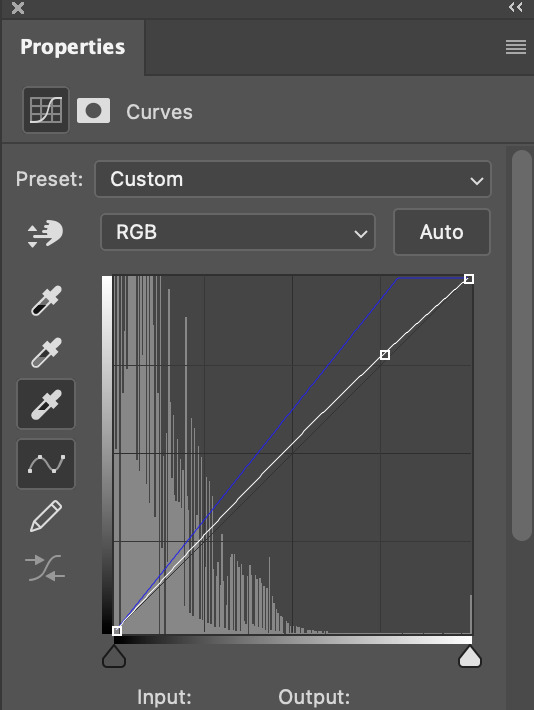
(i manually dragged the curves graph upwards for the third dropper to make it brighter. i don't need to do this if the dropper does this for me automatically, but since the lights were pretty bright, it only changed the tone of the scene and didn't increase the brightness — hence the manual step.)
pat yourself on the back, because this is what our gif looks like now!
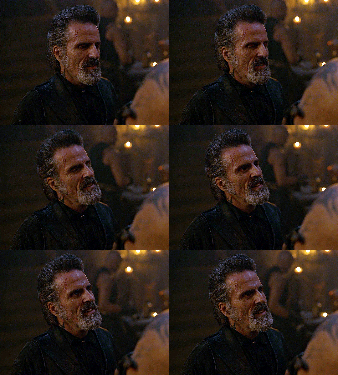
this is good, but it's not great — there's still just a bit too much yellow in the scene for my liking (sorry, i'm picky! :P)
i created another channel mixer layer and played with the toggles until i was satisfied:
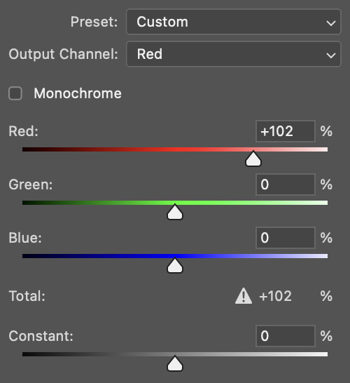
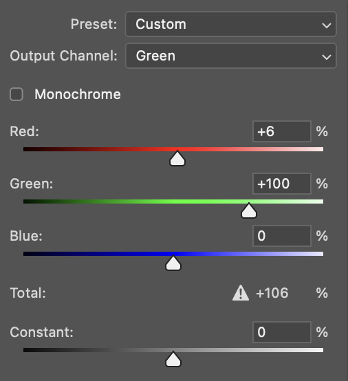
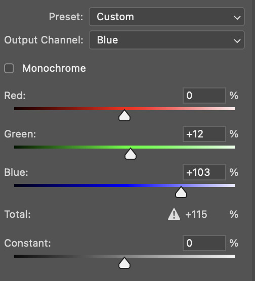
ta-da! the gif as a whole is much less red/yellow now:
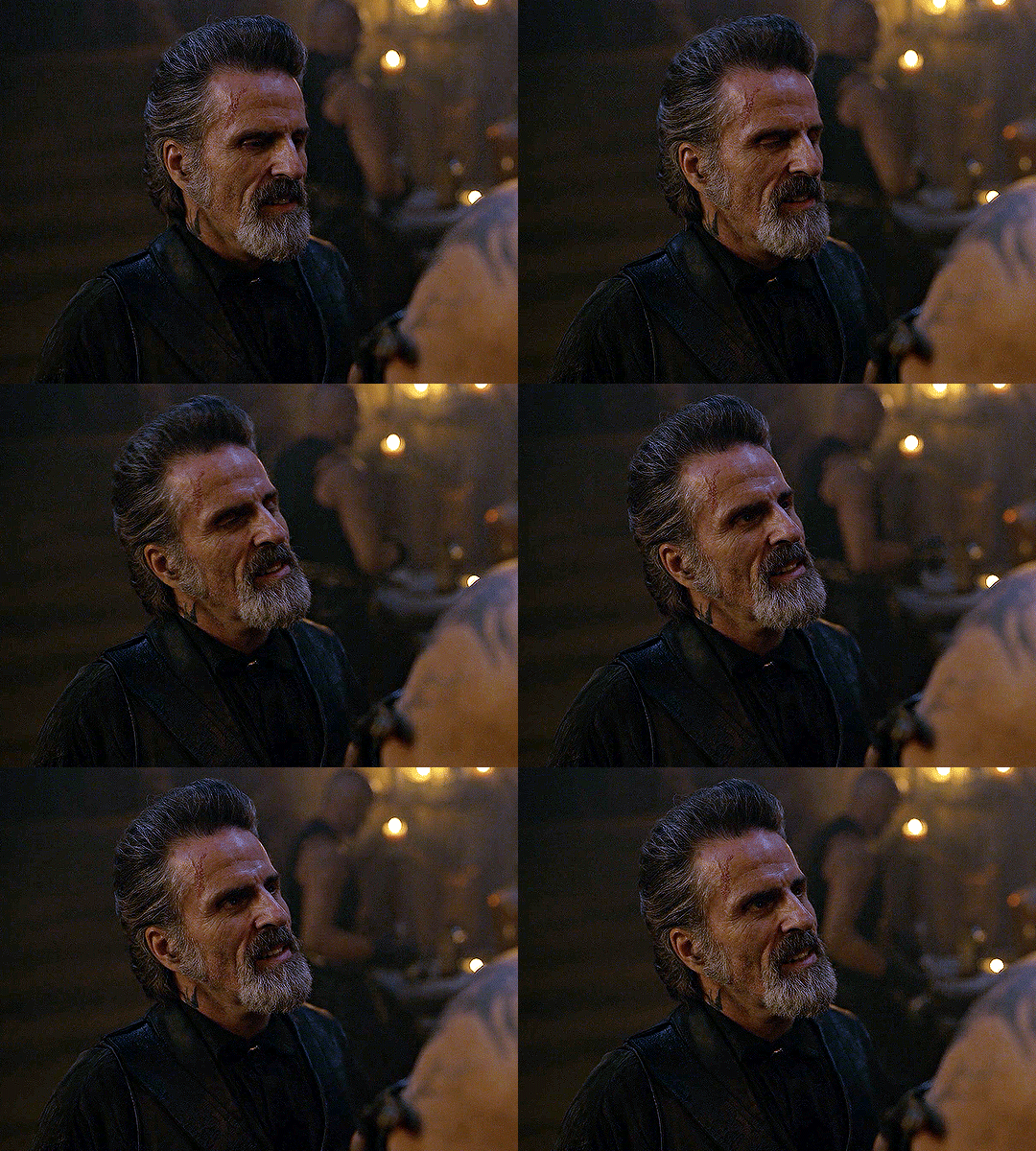
this is when i start fixing the colouring now — namely, his skin tone. selective colour will be your best friend here. i wanted to make his face just a tad brighter and less of a yellow-ish magenta shade, so i focused on the reds and yellows.
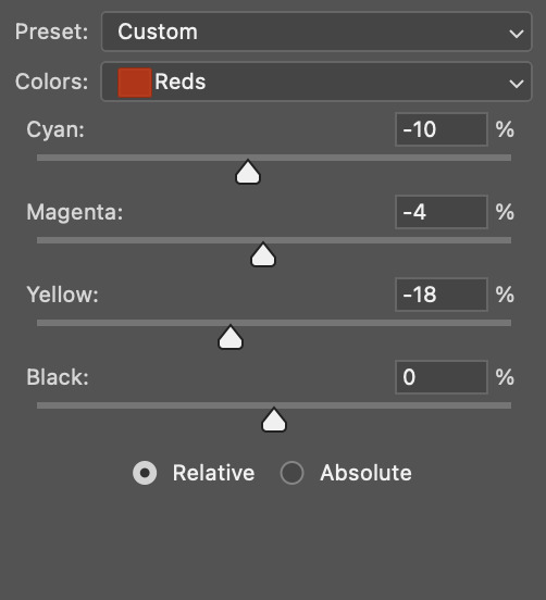
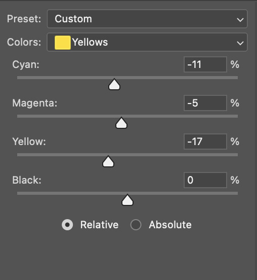
then, out of habit, i created another selective colour layer and took out more of the "yellow" in the whites to make them whiter, and increased the black (just by +1, since the contrast is pretty good enough already).
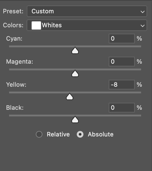
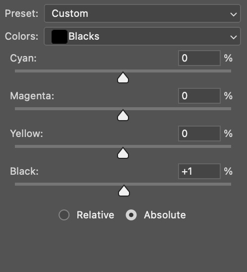
note: i switched to "absolute" for these two colours. basically, relative = less vibrant colour manipulation, and absolute = more vibrant/stronger colour manipulation. i prefer to stick to "relative" for fixing skin-tone since "absolute" can be a bit too strong for that.
our gif looks like this now!

his face looks brighter and much less yellow, so i'm satisfied!
this next step is not mandatory at all — again, i'm just picky and despise yellow-tinted scenes. i personally believe that indoor scenes that are yellow/green tinted make them look more dark than they actually are, so i do my best to get rid of these colours.
i also don't always do this, but for this gif, i just simply went to hue/saturation, selected the yellows from the drop-down menu and decreased its saturation.
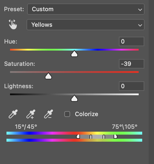
be careful not to do this too much. depending on the quality of your download, this can significantly decrease your gif quality. i tend to worry less about this when i'm working with 2160p files, but again, those files require an entirely different set of steps when it comes to brightening/colouring.
since this was a 1080p file download (and one that was actually less than 1GB, oops, don't do that), i played it safe and decreased it by -39 only.
note: you also want to be cautious of colour-washing skintone when it comes to this step. i find that another selective colour layer can help perfect the skintone in case the yellow drains out of it too much, but skip the hue/saturation step if it's too difficult to work with — better to be safe than sorry.
anyway, this is the final gif!
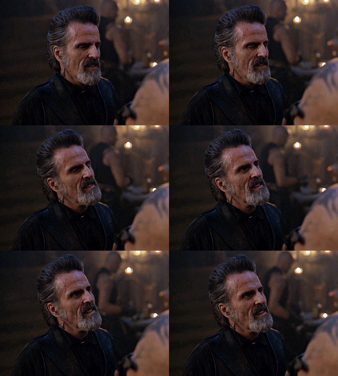
that's usually what i do when it comes to colouring dark indoor scenes! i hope this tutorial makes sense, and if you have any further questions, don't hesitate to reach out! :)
732 notes
·
View notes
Text
Automatic 30 % off everything on my payhip until 7\31 https://payhip.com/gunpowderleadx
There’s also been some new content added since my last update here.
0 notes
Photo

╰┈➤Premium texture pack
• Batty for you.
•Eight 1200x1200 px textures featuring bats
•Can be used for paid custom work
•$4.50 USD
•Can be purchased for a flat $4 through gifjunkies server. Purchase: Payhip
5 notes
·
View notes
Photo

Stranger things premuim texture pack $8.00 USD
purchase: payhip
0 notes
Photo

Floral premuim texture pack
$5.00 USD
Purchase: payhip
0 notes
Photo

Death Cure premuim psd coloring
$3.00 USD
purchase: payhip
0 notes
Photo

We all float premuim psd coloring
$3.00 USD
purchase: payhip
0 notes
Photo

princess peach premuim photoshop coloring
$3.00 USD
purchase: payhip
0 notes
Photo

Nightmare premuim psd coloring
$3.00 USD
purchase: payhip
0 notes
Photo

love, robin premuim psd coloring
$3.00 USD
purchase: payhip
0 notes
Photo

psd 10 premuim psd coloring
$3.00 USD
purchase: payhip
0 notes
Photo

Crazy Angels premuim psd coloring
$3.00 USD
purchase: payhip
0 notes