Don't wanna be here? Send us removal request.
Text
How I made my game a Survival Horror?
During the development of the game the question of am i really making a survival horror rpg kept coming up- every team meeting we would ask if we are on the right track and did we achieve our goals of creating a survival horror game- first of i believe we really did make the survival portion of the game, for example once the player reaches low sanity they die- we took an element of survival games that being resource management and turn the players sanity into this sort of resources and it turned out even better then expected- it allowed us to create the foundations of a sanity that would fundamentally change the course and gameplay of the game, everything from restoring health to panic events and easier enemy detection of the player it all links back to the survival portion of the game- we also made a system where the player can’t fight back its just running away and hiding from the enemies we really wanted the player to feel weak and powerless and with all of these survival systems in place i really think we managed to create that- another system we took from survival games was the inventory system, this inventory system is the crux of the sanity system without it the player would never be able to get that resources back and without it the player would just have a finite resource of sanity until eventually they would die from it. next we get to the part we really couldn’t make the horror aspect, cause of the pixel art choice and especially the low pixel type of it we really could not get anything to feel scary, cause of the artstyle we basically made a RPG puzzle game with survival elements but nothing in the game really screams horror the main issue we came across when doing this project was the colour palate it was unsustainable for the horror game we envisioned it was very bright and cutesy and really didn’t help us create the theme of a survival horror game, lastly another thing that really didn’t help us when creating this horror game was that we never actually had any enemies walking around chasing the player like if you took the enemies out of the resident evil games then you just have a walking simulator puzzle game and thats kinda what we ended up with cause nothing in the game is an actual danger to the player and hopefully the next time we do something like this we will actually work on the most important aspects of the survival horror element- especially if we have the time to create and refine this aspects.
0 notes
Text
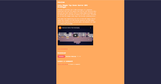
Sanctum Video
https://www.youtube.com/watch?v=DMpnbY2UvxM
youtube
0 notes
Text
Level Design Second Attempt
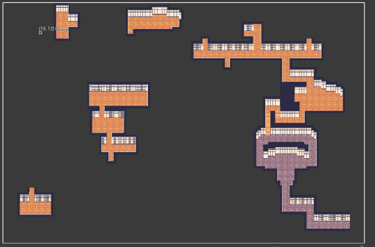
After getting a lot of feedback on the level design i started working on a new level that took in account all the different feedback i got but still keeping all the parts i thought were good and blending them into a new level that i think will solve all the problems the first level had and still making it fun to play and explore.
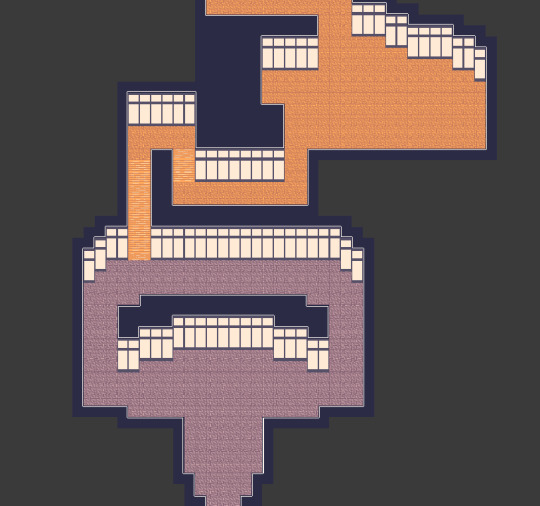
First area i worked on is the reception area- this is where the player is gonna meet the first NPC and be guided towards the baths- i wanted this area to have a sort of illusion of choice by having the two arches to get to the stairs even know there really isn’t a difference but i thought that taking the longer way the player could find an item or talk to another NPC just so the player is rewarded and yet has consequences for the choices they made- short way quicker towards the main objective but miss out on world building or an item/ i want the player to feel like the game has many choices and this is one of them and to teach the player that each choice has a positive and negative associated with it. I kept the original arch design i had from the first design but people complained it was way too bigt and just had a weird shape so i decided to squareify the box a bit more until i got this simple design, i kept the design cause i didn’t just want the game to be straight corridors, i wanted so sort of varety and unqiue shapes in the level so i decided to combine both styles to create this.
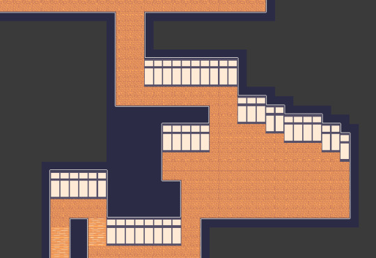
After the reception i used the stairs assets we had to simulate like the player is walking up a set of stairs and we changed the floor paneling so that the player knows that different coloured floor means different floor level they are on- this also allows me to show the player that they are progressing like switching the colour of the floors shows the player that they have entered the proper game and they can explore and do anything in the limits of the level without the restrictive design of the intro part, i also decided to have a lot of sharp turns in the design here so the player isn’t just holding D while walking so they can actually do something yet still feel like an actual building would have these turns. The room is suppose to be kinda like a common room where some characters would be hanging out for the player to talk to so i needed quite a bit of space for some decorations and space for NPCs, i also created a little bend in left side this is where the first save station will be- it will be taught by an NPC going about how this caligraphy is cool and you should try it- having tutorials be dynamic in the actual world instead of a pop up that brings you out of the gameplay is a better way of communicating i think in games and will be really good for the player to stay in the immersion while learning how the gameplay mechanics work.
This design i took from how bathhouses are actually designed- i wanted some sort of realisim in the design so the first room would be where the people would get changed and you would see NPC changing and putting clothes in baskets and stuff someone would stop you if you went into the baths fully clothed these will basically be little areas to ask the player are they done with exploring cause there isn’t going back if they haven’t- next room is the washing room where the people wash their face hair and body before going into the public baths here people will be washing feet body and hair in specific cubicles like they have in real bathhouses, we wanted these to feel and act like real bathhouses where the tendents have to be clean before entering the relaxing baths plus its another way of dynamically creating another “you sure you want to continue” area since after this you will enter the bath and the demo will end.
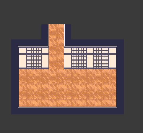
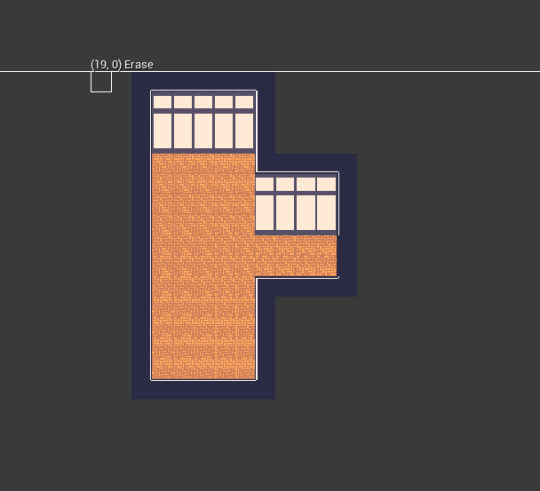
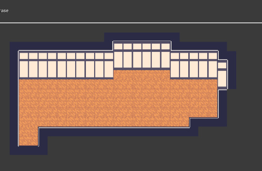
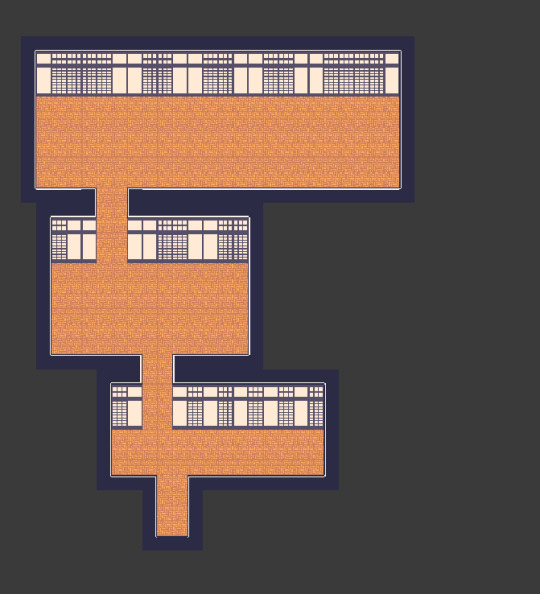
These three rooms are just different room designs i wanted the player to explore different living quarters and i wanted to kinda represent the different classes of people that would enter the bath houses- the top/management would have the largest room and the richest members would have access to this room- so i would fill this room with decorations and features to show the class divide that these bathhouses would have- also its a good place to have the player interact with different types of guest and see how they view this place. next we would have the medium room i made this a tall room so that- well mostly so it would be easier for the dialogue system since with the height it would move the camera and player much easier if the room is a bigger height but also i wanted to represented like how the middle class are rising in status but still don’t have the life of luxury as the top rooms have with their more laidback design. the last room we had some discussion and we thought instead of a bedroom it would be like a storage closet with workers or something- we could have one of the other characters be there trying to find a clean towel and being able to talk to them just having more sense of this being a bathhouse with rooms for storage and equipment to add to that world building.
0 notes
Text
Main Menu
One of the main features of any game is the main menu- now this main menu will be functionally working but all the actual art and prettiness of the screen will be done by fin which will make all the flashy bits for it as im here only to code it in to make it work
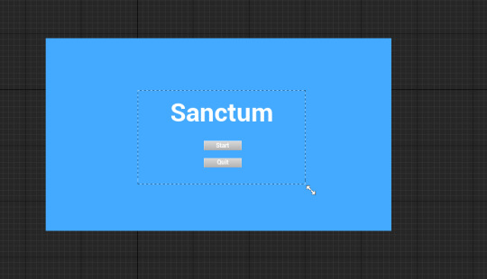
First i wanted a basic screen nothing fancy since i thought that we don’t have time or need to create any option menus or save and loading screens so a simple start and quit will be enough for the player- I did it this way so that the player can just quickly start playing or quit the game if they want too we don’t have the first screen of the game be to complicated or detailed we should just have two buttons that represent if the game wants to play it or not.
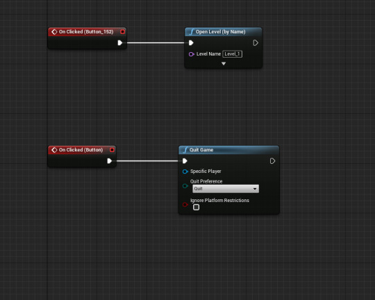
since how simple our button selection is we get to do very minimal work for creating the main menu for starting the game- we first start with a on clicked for both bottons that do specific things once that happens- for the start button we are going to open the first level and for quitting the game we use the quit game function once the player presses the quit button

before the main menu can actually show up on the screen we have to actually create it in the level so in the level blueprint we create a small little code function that event beginplay we set the player controllers mouse cursor so that the player can actually press buttons and interact with the main menu- once that has been set we get to the main menu part- all we have to do is create the main menu widget and add it to the viewport- we don’t even have to remove it once the level starts cause the main menu is on a completely different level that the actual game so less work for us then and makes the code much more efficient and easier to manage and make
0 notes
Text
Fixing the Character Animations for NPCs
When making the animations for the characters i kinda just copied and pasted the code i had for the main character since reusing the code would of be much easier and basically all the system are in place just telling how the character should move was the only thing we needed to do but i found an issue- when ever i choose the sprite for the NPC it would keep resetting to the player character no matter what i did
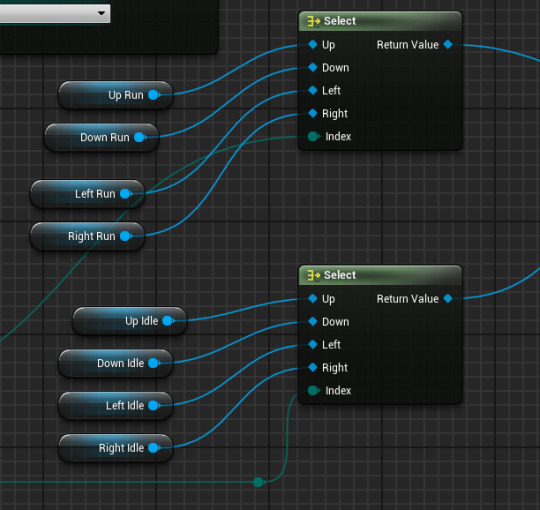
I discovered that where the game detects what direction its facing to pick the correct sprite that it was constantly selecting the main characters sprite because thats how it is in the main characters code- what i thought a good solution would be is to promote all the selections to variables and then exposing them, this would allow me to have multiple characters by just having to change the sprite and nothing else creating a dynamic system where i can have many different npcs walking around- basically its kinda like programming a characters closet and each of the variables is the type of outfit they wear for different days of the week and the game selects that outfit for when its idling or walking etc.
0 notes
Text
Alien Isolation Research
Alien Isolation
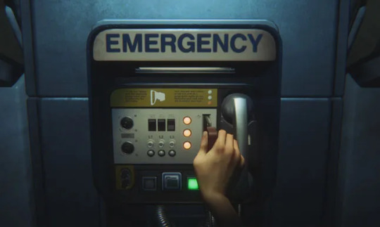
Alien Isolation is one of the most unique survival horror games i’ve played in the recent decade, it combines the Alien setting with a slow hard as nails and brutal experience that incapsulates the entire feeling of dread yet a slight chance of survival. First want to start with the way saving works in this game- there are no autosaves just save stations that don’t take you out of the game- you can still move the camera and see if something is coming after you and even then you can’t actually cancel the save you have to manually sit there and just be in the most vulnerable position imaginable as a trade off for having the ability to save and not suffer an immense set back due to your mistakes- i really like this system it causes the most tense ridden gameplay to be just sitting there blind and powerless while an enemy hunts you down and if they catch you- you better pray that the save is done right before it kills you but even then i like that sort of mechanic that you can die in the process of saving and yet if it completes then you saved- i really would like that sort of thing in our game where the saving is really restrictive to certain points and to waiting but is still very lenient so it doesn’t feel like a pain to safe every single time but a genuine fear instead so players have to fix before they safe or check to make sure everything is safe, or the player could rush every save point system just so they could save without needed anything or anyone.
another thing i really like about the game is how there really is only one real enemy to deal with- the alien, there are other enemies that can and will kill you like the android and other humans but the alien is the only one that can really kill you and or is the only enemy that can’t be killed- i really like this sort of concept for our game having this one big enemy that always patrols and looks for you and you can’t do anything about it that creates such immense fear and panic without even having to do anything- the player can be “scared shitless” without the enemy even being in the room or anywhere near since the fear of it might being right around the corner, i want to have that sort of vibe in our game and i think they way of doing that would be to create one enemy that constantly hunts for you and having other enemies only like lower your sanity or appear when your sanity is low so that the player always has to wonder what is real and what isn’t, having an enemy play with its food like the alien does is something truly terrifying since we as humans are the top of the food chain so having something above us is kinda incomprehensible to modern humans and i want to create that sort of fear in our game be using what alien isolation did- and with that i want a major component to our game to be sound like in alien isolation- sound can be used to detect the player- distract the enemy or to even be used as a gameplay tool to move the enemy from one place to another place or plan ahead if you can hear them crawling in the vents and stuff- i really like using sound to help with how to detect and use the AI of the game but im not sure if the top down view would help that much since you have way more of a view to look at then in a FPS view but we can still use sound like if you hear a sound coming from a certain area then you know thats where the enemy is and to not go into that room-
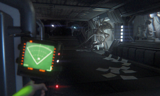
In alien isolation to even detect the enemy you need to use a loud device that detects the enemy so they go to that sound. i want stuff like that to detect the enemy but also using it attracts it to your location so that items that help you always have some sort of trade off i think all the items in the game should have such trade offs so that the player never has some god tier item that will just help them win the game- everything you do in this game should have consequences nothing should be free or without consequences cause i think that will make the game boring and give the game no stakes so having items like this in our game is something i really want to have and i believe will be really effective for the overall experience of the game
0 notes
Text
Adding Borders to Cameras
cause of how the current level design was made we had the problem of seeing other parts of the level when you weren’t suppose to- basically if you entered a room we want only that room to be seen but since all the rooms are so close together you get to see stuff outside of it and its quite immersion breaking so we started thinking of different things we could do fix this problem.
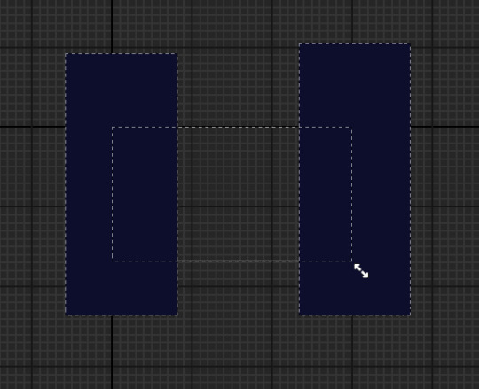
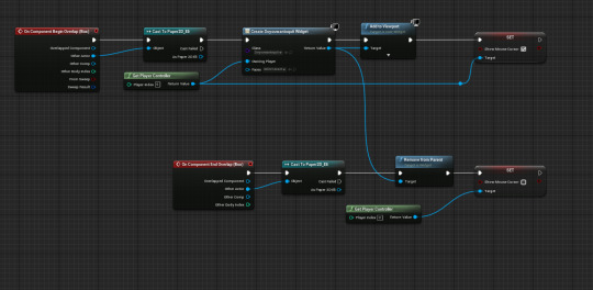
Me and fin come up with an actually simple solution we would basically just spawn in some bars that are the same colour has the background and spawn them in rooms that show other parts of the level and this way we get to cover the level up and keeping the immersion intact and since we don’t have moving cameras and whatnot we can just make them into widgets and spawn them in only specific areas of the game where they are needed. this plan was really quick and easy to think of and implement and cost absolutely nothing to get working.
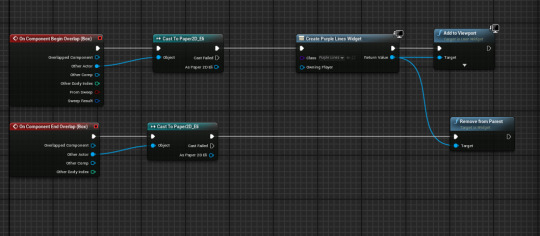
The code for this solution is quite simple we start by having component collisions that detect if we began overlap or ended overlap- starting with the begin overlap we first create these widgets and add them to the viewport- we do this so that the moment the player crosses a specific line then we get to spawn them in without the player even noticing them we really want this so we can keep the best performing and most immersive experience we can have without making it noticeable to the player that something is changing. next we walk on the end overlap this is much simpler after the casting to the player we simply trigger the remove from parent function- this returns the widget we just created and removes it from the viewport and the player is none the wiser.
0 notes
Text
Creating a Resident Evil 1 Style Camera
Through out this project me and Fin discussed multiple ways of how to deal with a camera first i decided to make a system where depending where the player moved the camera would move in that direction but after doing some research on different games we decided for a bit more of a unique system to the camera- we decided that having a sort of static camera like in resident evil original games and how a lot of rpg maker games do it
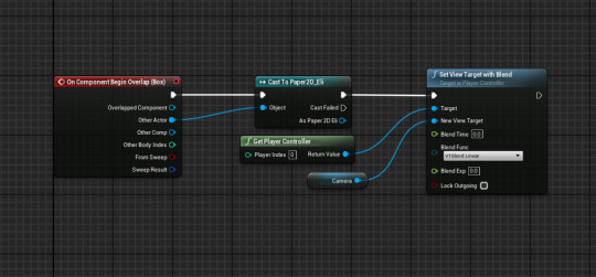
the actual code is pretty basic but thats what i really wanted out of this system a really basic but dynamic system that would allow me to create the best resident evil camera system in unreal engine in under like 10 mins and i did. first we box collision we have this since we need to detect if the player needs to switch cameras or not, once we have done that we do a cast so that any information we changed is directed at the player and not at anyone else, lastly we use a set view target with blend this code basically asked for our current camera and then asks where should the new target be or where it is, we can also change how it blends or how quickly it takes to blend we just use a 0.0 so its an instant snap like the original resident evil games but here is where we make the system dynamic, we set the target as player controller but create a new camera variable and plug that into the new view target this will allow us to have multiple cameras in the level, we expose the variable so that we can have multiple of these running and the moment the player interacts with the collision box we trigger this code blending the camera. This system was really easy to make and a lot of fun to get working and i believe it has made the game look even better cause of it, its definitely way more unique cause of it.
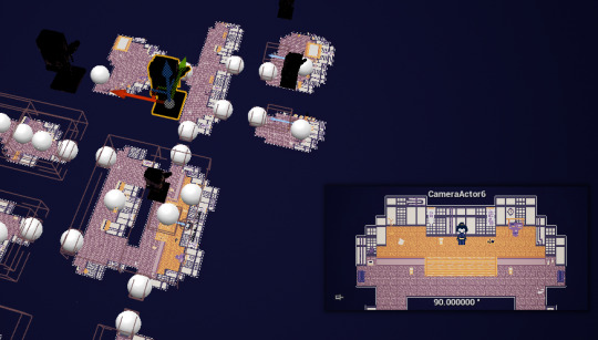
Here we see the different collisions and cameras we set up- all the player has to do is walk into those spaces and the code will blend regardless of anything else happening.
0 notes
Text
Inventory Doesn’t work In Packaged version but Does in Editor

Once we packaged the game and started testing the new version we found a little problem, the inventory would not display the items you picked up we thought i changed something in the code accidently or something but while testing it in the editor as seen on the right it just worked no issues no nothing i could use them and everything but not when packaged- we have no idea why this is happened but we have no time to fix any of this or even find out what the problem is- cause we really have no idea how to fix this problem since it works in the editor like how am i suppose to fix something that works so right now we are gonna just leave it and if we have time im gonna look over it but for now we are going to have to have a broken yet working inventory. its so strange both version you can pick items up and everything but once you open the inventory its just gone i know for a fact the player isn’t using the items they collect since the player has full sanity so nothing should happen and i checked that it doesn’t when player has full sanity.
0 notes
Text
End Game
to make the game complete we wanted to have a way to actually end the demo or level or whatever this turns out to be- so the original plan was the player to enter a bath and then they would wake up in a new level that was a corrupted version of the bathhouse but since the time problem we have we are going to have to just have the game quit or return to the main menu.
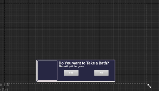
So the way i’ve done this is to have a widget that asks the player if they want to enter the bath or not, this widget has two options that either quits the game or removes its self from parent and allows the player to move around again i did this way so the player wouldn’t just quit the game the second they interacted with the Collison box i wanted the player to know that this is the end of the game and they have the choice to explore or not i think this is pretty good games design since it gives a player an objective but at the same time allows the player to do whatever they want before they complete that objective. to actually make this code work we first start by a cast so that only the player can access this and get this widget, we then create this widget but to actually get the player to be able to interact with it we are going to have to get the player controller since this code is all in the widget so we have to tell that the controller will have access to interact with this widget- next we add it to the viewport since without this it will not appear in the game just create it- the last thing that we really need in this is to create the mouse curser or more specifically show the curser to the player so that the controller can use it and select the two options, we do this with the set variable of “set mouse cursor” we set this to true since we want the cursor to be seen and used by the player- later we are going to have to set this to false. Once we player says no to quitting the game we are going to use the on component leave on the collision box with this code we just repeat what we did but instead of creating an widget we remove from parent and connect the target to the widget- this removes all the instances of the widget and prevents the player from interacting with it, we did this cause like it would look really dumb and annoying to just have a text box trying to ask if you wanna quit the game constantly so we remove it, lastly we put the mouse on false so that the curser is hidden.
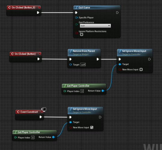
This code is quite simple its just the interactable code that tells the game what it should do when the player interacts with that button- so if they click the yes button they will just quit the game- once we have a main menu we are going to change it to just an open level but right now its a quit game- next we have a the onclicked on the button no- this removes from parent and se ignores move input this allows the player to walk around again since when they first interact there movement is restricted before they can make a decision i did it this way since we didn’t want the player to just walk around in this decision since its kinda important plus it puts all the focus on this which decides if the player continues playing or not. lastly we have the event construct the moment this event is called we make the player immovable this links back to the previous thing where we don’t want them to move when this widget is being played.
0 notes
Text
Level Change
We wanted a sort of transition to happen when going into rooms- we first thought of just making new levels and opening them when crossing into specific collision boxes but we realized that once you would open a level it would open it from the start so going out of the room would mean that the first level would reset and we didn’t want that at all- so we figured out another way to do it. what we did was to create the rooms in the same level away from the main area and teleport the player to them but it would look really unnatural and stuff to just set the actor location there, so we decided to use a transition that would like fade or something for a second or two to simulate that effect of walking in a room or coming out of it.

To do this i created this simple piece of code so once the player interacted with the collision box they are teleported to the rooms and the way we set it up makes it dynamic so that each different actor allows the player to teleport to different locations not to just the same location. so first we cast to the paper2d_eli we did this so only the character is teleported but if we had AI we would of also casted to enemy characters so that they would be allowed to follow the player into rooms and stuff but that would only be done if we had enough time to make AI like that. We then create the black screen pop widget- this creates our transition effect giving the player the feeling of the character walking to other rooms- i really like the effect it makes i honestly couldn’t tell we are being teleported even doe i wrote the code like i honestly feel like we are actually walking into rooms. We lastly set the actor location this is what actually teleports the player we do this last so that the actual teleporting is done while the transition plays- we actually first create a variable called new location and set it as exposed this will allow us to set the location to whatever and how many times we want just depending on how many actors we have- this really helps when we have a lot of transitions and rooms to explore

0 notes
Text
Time Problem (Team Meeting)
Since we have two weeks left on this project i did a quick analysis on what really needs to be done and what we have to scrap from the release of this project. the first main thing i think both me and fin agreed is that we will not have enough time to create an actual first level, since we have two weeks left this will def not be enough time to plan out an entire level and fill it with puzzles and what not- so the solution we decided to take is that we are just gonna create the introduction level that features all the mechanics we have already put into the game from stamina to inventory and dialogue so that we basically have oh look this is what the game is currently but it can be and will be way more- basically we decided to create the best most presentable game we can make for now using everything we already have to since with this time problem me and fin will not be able to create all the assets and mechanics we want to. For example we wanted to create some mechanics like hiding but with the time constraint i would need like another week or so to work on this mechanic and fin would need like a week or two to create all the animations of like the player going into the hiding spot- getting caught and dragged and this wouldn’t even work right now since we don’t have any AI or enemies for the player to be chased around or to be hunted which is another thing we will not be able to create- the AI right now of the enemies and their behavior like if they hear the player sprinting they go and investigate or if they spot the player they start a chase like none of this will be able to be in the final outcome- the closest we can prob try to do is having the AI just randomly move about the room and stuff and we will try to do this if we have time to complete this. Another thing that was discussed is the Save system- I don’t think we will have time to do that but if all the “DONE RIGHT NOW” tasks are finished then i might have time to create a very basic save system but from what i’ve seen its a quite a bit of effort and time to make an effective one so i might not actually have time or it honestly just might not be worth it in the long run to create a save system since we don’t have anymore more levels and you will be able to complete the demo in like 5mins at most so it would be a nice feature but its not instrumental or really that needed so we might have to scrap that mechanic. Lastly we discussed the Main Menu this is something that i 100% really want in this game this will make it feel like a game without this it will not really feel like a completed level game thing so no matter what we are going to have a main menu- if anything im just gonna use the stock Unreal assets and once fin is done with making the art i will give him the file and allow him to change all the art in the game to whatever is needed for the project- but having a really basic main menu will make all the difference to having a presentable final product
0 notes
Text
Fixing the Collision Problem
Since i made the level i saw that the player was just able to constantly move through walls, it felt like the player was walking in the air like their was some kind of layer above the tilemap and it took weeks to figure out what the problem was but i realized what the problem was, so the inital problem was that the player seemed to be walking on top of all the layers, so we went into the player collision view to see if the collision or the layers were wrong- as you can see in the image the collision seemed all fine like you can clearly see that it was detecting what was a floor and what was a wall.
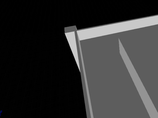
so this really confused us since if the collision is all fine why didn’t it detect any of it, this is where we went into the character since we starting thinking maybe the character is like big enough to step on things and basically no matter where they were they kept trying to like step on things.
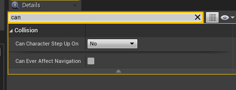
So we figured out that the player was actually allowed to step on things- this is really not helpful at all in a topdown 2D game since this will just cause many problems and makes really not sense since its topdown like what perspective would you have if you could step on things and how would you even know if you could- so we set the character to step up on stuff as a no.

We also changed the collision capsule of the character since we thought that stuff like that would also help with the keep the player in the level and making sure that half the character isn’t just phasing through walls and stuff- this actually helped quite and bit and has allowed for the player to feel like they are actually in a building and that the walls and barriers we put in are realistic and the player understands that they can’t walk into these places or over them.
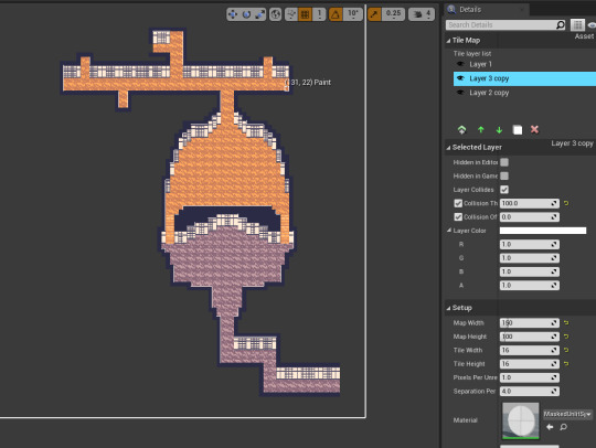
Lastly we changed the some of the tiles since we really didn’t need the whole level covered in tiles since that would just make the game run slower and since its nearly the end of the project we started thinking of ways to optimize the experience.
0 notes
Text
Dialogue System
For this game we wanted a sort of very simple dialogue system, where the player is mostly spoken at and you don’t really get to react- we wanted this sort of system cause we thought it would be the most simplest system to implement and would allow us to create it in the time frame we have- it is also designed to be very adaptable and dynamic so we can change a lot of things about it or add new things if we want to, we also made it so that we can create multiple npc dialogues with just this one code by making it as before mentioned dynamic
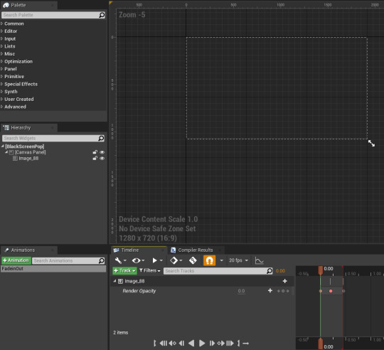
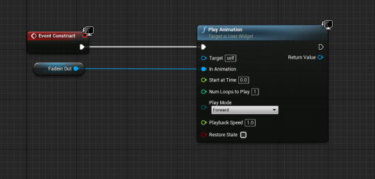
First we wanted to created this sort of pop in effect, so the screen would flash and then the character would be in this sort of conversation camera but to do this we needed to create that animation first- so we decided to use the widget animator- this timeline would allow us to fade in and out whenever the player starts the conversation and ends the conversation. we’ve done this by just turning down the render opacity from 0 to 1 and then back to 0 to simulate that screen fade or pop.
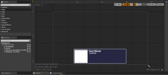

here is the actual dialogue widget we gonna use for our conversations- we have multiple elements that will be changed during the coding process so that instead of text box it will say whatever we want it too- we also have a big white box in the portrait area, by using an event tick we can change that to any texture we want but i set it as a exposed variable so that each copy of this will have a different face and i can just set it in the code and not have to have a million dialogue widgets each for that specific speaker.
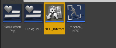
This NPC_Interact Function basically tells the player that if you interact with something and it has this NPC_Interact then you will be able to speak to them and this will also allow the code to trigger so if this isn’t present the dialogue will not show up
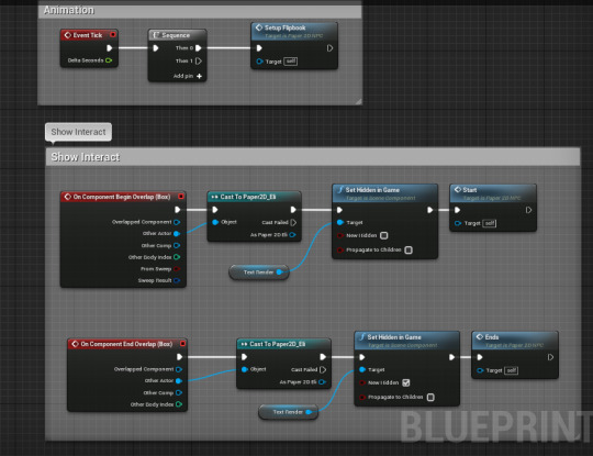
This code is pretty simple this basically tells the player that you can interact with the dialogue- basically if the player steps into the collision box then we set a press e to interact and if that e is pressed we trigger the start- once the player leaves the collision box we delete the press to interact and we trigger the end if e was pressed. we also have a constant event tick that plays a flipbook mostly the idle flipbook.

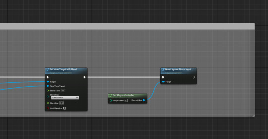
This code basically starts or ends the dialogue boxes, it creates the widgets and if the correct event is triggers it deleted the widgets, we start with the start custom event that plays when we interact with the npcs, this leads to a create dialogue widget this creates the dialogue UI of the dialogue system, we then set it so that we can add it to the viewport. adding it to the screen is quite easy but a couple more steps need to be done when removing it from the viewport. first we check the if dialogue ui is valid or not, if yes then we continue with the code if not, then we leave it, we have done this so that if the ends event fires before it needs to we can have it check to see if its still valid so it doesn’t delete itself mid dialogue, we then remove it from parent. next we basically set the player controller input back to normal since during the dialogue we are gonna set it so that the player can’t move around, we then set a target blend so that an instant change between the talking camera and the normal player camera happens and finally we set a reset ignore move input so that we can finally walk around again.
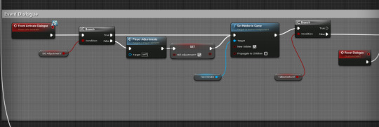
Next we start working on the Event Dialogue system, this entire code is whats gonna spawn the dialogue and change all the different aspects of it and play the next line of dialogue if we have more then one. first we start with a branch, if the did adjustments is false then we trigger the player adjustments functions which we will comeback to in a second, but if true then we can actually start making the dialogue. we go to a set hidden in game text render so that for a couple of seconds we don’t see the text that is gonna show up in the dialogue boxes, i put this here cause without it i had the problem of having the dialogue show up before the box was created so for a spilt second you could see the text on the screen so the way i fixed it is making it hidden for a bit before making it visible later.
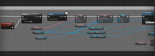
next we do a Do Once and have it reset with the reset dialogue event, we are doing this so that if we have more then one line of dialogue we can play the reset dialogue to repeat this entire line of code and once all of the lines are completed it will continue on. next we have a series of sets that are connected to exposed variables that will allow me to change what i want them to show the player for example, i will be able to change the character name, the faces that show up in the portrait and what they are actually saying due to having them be exposed variables.
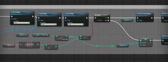
Next we basically take all of that information we just got and make it visible, we have it be invisible for the reason that it kept showing up before i wanted it to so this was one of the ways to have it show up during the correct time. here is also when we calucalte what textrow is being played, this is done by taking the length of NPCtext and - 1 and if that lesser then the textrow then that leads to a true branch, this side of the branch plays when everything is done, all the dialogue is has been written and we don’t need anymore. while the false sets the new textrow and resets the dialogue basically playing the next line of dialogue.
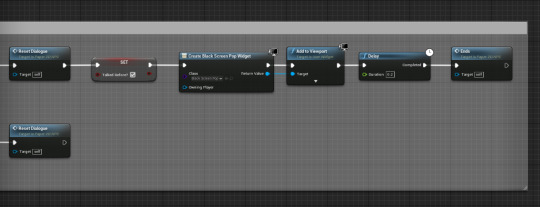
this part of the code is pretty simple it basically plays the pop fade in and out and triggers the Ends event code so that the player is exited out of the dialogue system.
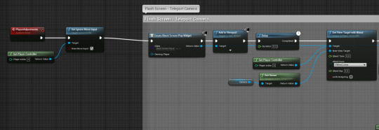
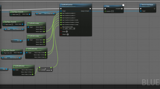
This code is the start of how we transition the player from normal camera to this dialogue camera, it also controls how and where the player is teleported to stand and what he can and can not do during it. we begin by triggering the playeradjusments event, without it we would not be able to trigger the players camera change, we first play a set ignore move input, this is done so the player can’t just move about during dialogue and such. nextwe go to the teleport camera codem we first start with the widget pop fade in being created so that the effect seems believable and adds a sense of immerse that pressing e clearly changes something. we lead to another set view blend this is done so that the camera transitions from the player to this new camera that we have set up in the actor, we make it instantous since we are already hiding the camera change with a fade in, next we set the worldtransform of the root component of the player, we mostly just get teh current players worldlocation but also by using a cone we can set where we want the new location to be so we get that cones worldlocation so that we can easily set the transform. we also get the players worldrotation so that the player is always rotated the right way aka facing the NPC they are talking to and finally we remove the widget of the fade in from the parent.
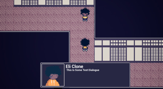
Example of how the dialogue system works
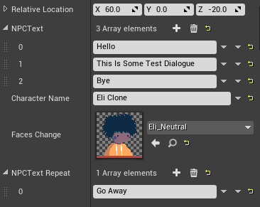
This is how we change all the variables for the dialogue, we have the NPCtext for what they gonna say, the faces texture and the character name, we done it this way so everytime we want a new NPC we don’t have to create new actor for it we just copy and paste the old one and change these varaibles.
0 notes
Text
Diegetic Vs Non-Diegetic UI
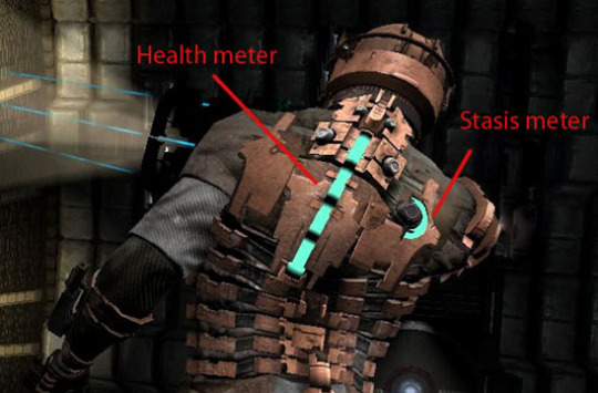
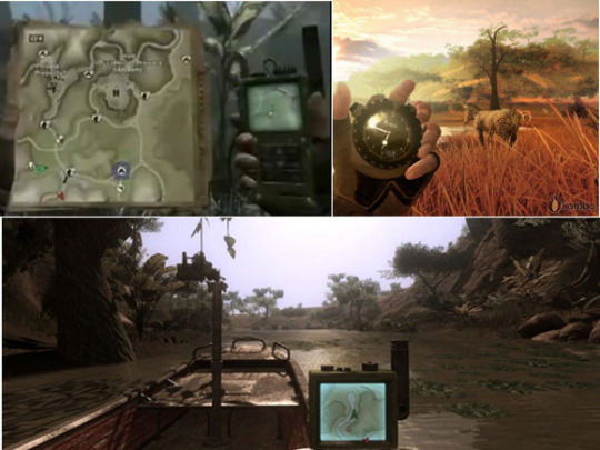
There are two types of UI to consider while researching and desiginging the perfect user interface, Diegetic UI or Non-Diegetic Ui. Diegetic basically means its UI thats in the game world and other characters can see and hear it for example the Pip-boy In fallout or the Interface in Dead space. Non-Diegetic Interface is when the UI is rendered outside the gameworld, and the other characters can’t see or hear it and its only rendered to us the players playing the game. One of the Best Diegetic UI i have ever experienced is in Far cry 2 where you basically don’t have a non-diegetic Ui all the information you need such as location, time etc is presented through items on your person like the MAP, you have to go through an entire file cabinent of files to get access to the right map but thats what makes it feel real, it adds to the immerse and makes the player think since they have to look at the map and drive around around making sure they don’t start any skirmishes by running someone over, this is what i really liked about diegetic makes it makes checking something that would normally just be on your mud into a mechanic making the player have to go through something like openeing a bag to check what kind of items you have or selecting a map to see where they are is something genius to me and something really immersive that can add to our horror game too since the game still goes on when checking something on diegetic UIs so in a survival horror game you might be checking something then you get attacked by some monster getting the player to start panicking. Far Cry 2 also does Diegetic UI visually really good like instead of clicking a bandage item and you are healed you actually see the players character dig out bullets out of their arm a sort of novelty factor, that will be a bit more difficult to implement into our game since i can’t really think of any game mechanics that would require that but we can have it that if the player has certain item in their inventory they don’t have to go into it and selected it, they just press a button, play a animation and thats done. The One thing Far Cry 2 doesn’t do well it seems to have an identity crisis since it uses both Diegetic and Non-Diegetic and from all the games i’ve seen its kinda happens everywhere no game can be strickly one or the other, one can cause no immersion and the other will cause most players to think its broken cause no prompts and stuff are showing up on the screen. though games like Dead Space manage to be completely Diegetic with everything being presented in the game world from health to inventory to menus and everything, its all diegetic so depending on the genre our game could have both or one, but currently Diegetic is prob the best for a Survival horror game. Non-Diegetic UI is when the elements of the UI only exists for the player to see they are not actually part of the game world, they are not acknowledge or witnessed by the game characters but only by the player, this is basically all the HUD stuff you see in like FPS games or RPG games where the screen is filled with all these toolbars, health, mana spells etc. Most people playing games feel more comfortable with a Non-Diegetic UI since thats how most games do it, they always have some sort of prompt or hint, or in the corners you would see the players icon and health so stuff like this doesn’t make it feel foreign to them more comforting allowing the player to easily understand all the information- this is kinda the opposite of what i think the theme of the game should be since we want the player to feel powerless and weak and to not know anything so this will cause the player to feel like they have all the information in the world and we just don’t want that, if we have to have Non-Diegetic UI then I would do the Far cry 2 thing of having both and having the Non-D Ui fade in an other of the game world depending on the situation, i think this would prob be the best for our game so we can have the player always be immersed into the game while knowing the information they needed when needed.
0 notes
