Don't wanna be here? Send us removal request.
Photo
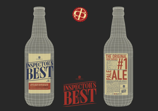
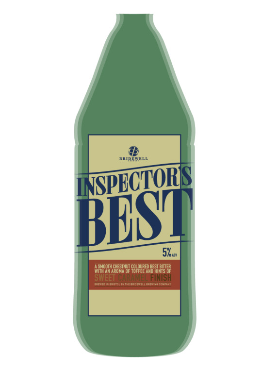
Product Preview Mock Design:
Here I have made a quick mock product design view, of what the finished product should look like. I think making product preview pages is a good way to present a finished product as it makes it look more finished, and shows the client a rough idea of what the design will look like when placed on a 3D object, in this case a Bottle. This will be a nice page to place in my portfolio to show. I have also added a bottle cap preview on this page, to show an extra detail of the product, as bottle caps are an important part of the design.
0 notes
Photo
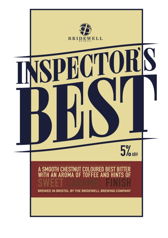
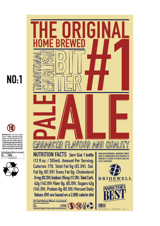
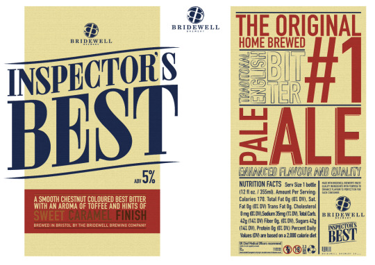
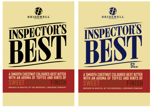
Final Label Designs:
Here are my final designs for my Inspector's Best Label. To finalise the front I rearranged the layout of where I was placing the ABV 5% alcohol limit information. I also extended the type design of Inspector's Best, to bring it out of the label's area, allowing it to become a lot larger and more forward. This attracts the type inspector's best to your eyes more making it become the first main impact you have with the design.
For the back design I went with the typographic approach once more, however I had to bring in many more aspects of type for this one, including the ingredients, legislations needed and government health warnings that have to appear on alcohol packaging by law. This meant I would have to use the space on this label more wisely, to be able to fit it all in and still make the design readable and at the same time, well designed. However I feel that the final outcomes from this project have turned out very well and I am proud of my final designs. I think these would work as a official product, and that I have applied the design which would have been wanted taking the brief specifications into consideration. I would like to present this design however differently, taking a more practical approach and apply these designs onto a actual ale bottle, when it comes to presenting for my end of year show. This will be something I will need to continue working on and possibly create a presentation of photographs also, that I will be able to use in my portfolio. I reckon this will allow me see the design work better and also put a more professional finish to this project.
0 notes
Photo
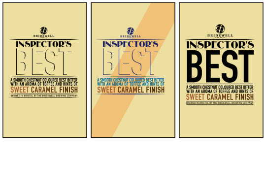
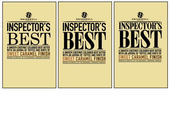
These are my designs for the front label for Inspector's Best. I wanted to create design that focused on using a style of pleasing typography to attract attention from customers. I feel that these designs progressed nicely, showing a clean development of transformation from my first design to last, showing how and what I have changed each time.
I chose to use a colour way of warm colours but not too bright as I knew it had to suit the style a traditional ale design.
0 notes
Photo
This is the final design for my logo. I added a stroke effect to the ring around the logo and a further distressed look to the logo, which gives the idea that finalised traditional look to it that was stated in the brief.
0 notes
Photo
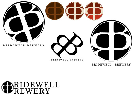
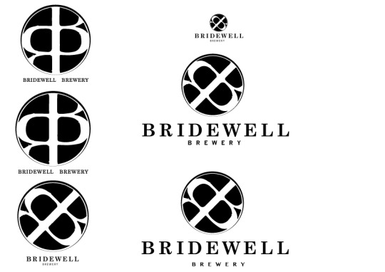
I now had to find a suitable typeface to use for my logo, and find a layout that allowed my logo to work. Eventually through a joinery of trial and error I managed to come up with a design that did exactly this. When placing the type Bridewell at largest, it balanced out the logo and type of brewery evenly and made a nice look to the logo. I also felt that using a more simple looking typeface for the Brewery type allowed Bridewell, and the logo to have the most attention drawn to them, which is what is intended.
0 notes
Photo
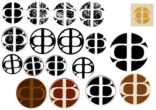
Here I had taken the logo stamp idea I am working with and tried to create a traditional letterpress look to it. To do this i used the albion press machine, along with a inked up piece of wood to print off some wood engraving prints, that I was able to scan into illustrator and begin to play around with to create a look that worked.
I preferred the look that wasn't so obvious, and left more black space inside the print, however did like the rough look it gives the shape.
0 notes
Photo
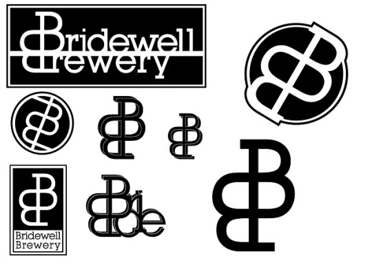
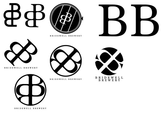
More Bridewell brewery logos.
Here I am trying to play with the idea of using the double B's that are in the name, Bridewell Brewery, and creating a logo that represents this. I started off with a very basic looking design, using Lubalin Graph as the typeface, the idea was quite cool, but it didn't really suit the traditional style the brief has asked for, or the look of a brewery either.
I then used a much more traditional, serif looking typeface, and even began to experiment with some type below the logo, using all caps as i feel it works a lot stronger. I also liked the look of these letterforms as the negative space, when placed inside a circle as it makes the logo look like a stamp, which works as quite a cool effect.
0 notes
Photo
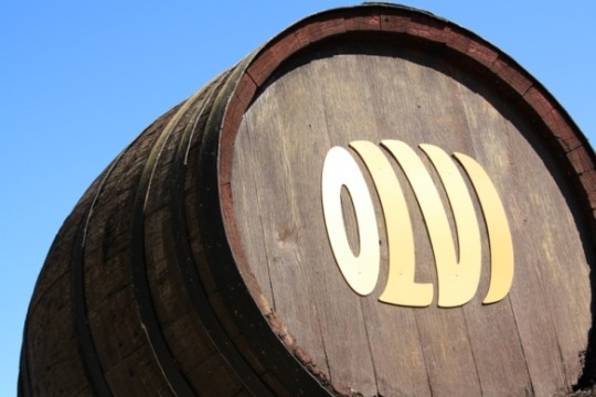
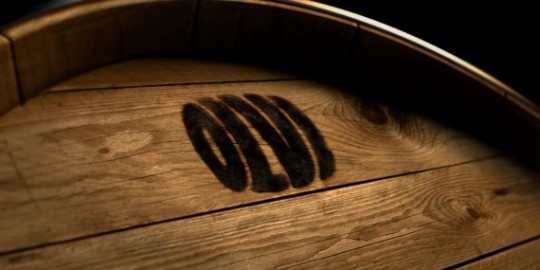
Here i began to look at barrel imagery, a few barrel influenced logos, that have a similar idea to my own. These had a better look to them, in the sense that they resembled the look of a barrel a lot more, i don't intend to copy any of these ideas but to try and gain influence from these designs when creating my own barrel idea, I also think that i need to alter the typography used in my barrel logo as it doesn't really suit the logo style much.
0 notes
Photo
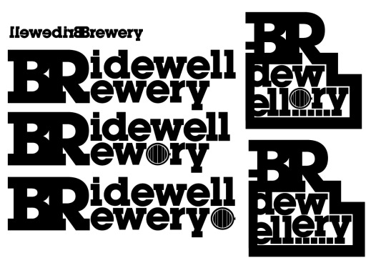
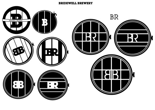
Bridewell Brewery Logo: This was my attempt at creating a logo for the bridewell brewery, I started off with some quick typographic ideas, however i wasnt very pleased with them and began to scrap that idea. The type was not easily readable, and did not have a traditional style to it, or the look which i wanted. However I decided to take the barrel idea from the first logo and advance it into trying to develop a logo out of that. I thought it would suit the style of a traditional brewery as it uses old wooden barrels to brew the product. I was trying to create a interesting look to the barrel, so started to play with lines across it and a bit of type, but it did begin to ruin the barrel look slightly.
0 notes
Photo


Beer Labels: For this current project we have to work on branding a brewery company, and produce designs for a new home brewed beer. The beer will carry out a traditional style, with influences from the victorian era, however it does not need to be entirely traditional looking, the design can have a modern take on the style which is what i intend to do. Firstly i started to search for interesting label designs from beer and ale companies already out there. including labels and brewery logos, as I will be needing to design both of these for my own project.
I was sort of drawn to more typographic logos, rather than illustrative, with very traditional style typography designs through them, I also do like the look and designs of very traditional style type, especially from 20-50s era, this may be a type era i look at for inspiration when designing my label.
0 notes
Photo
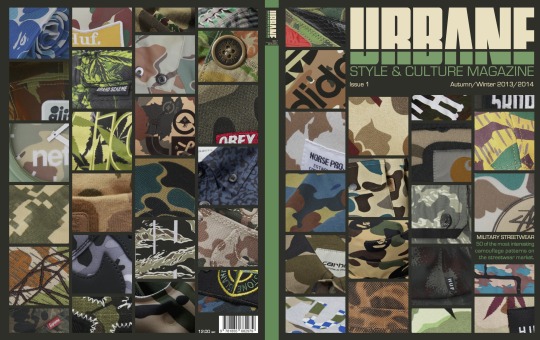
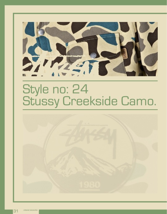
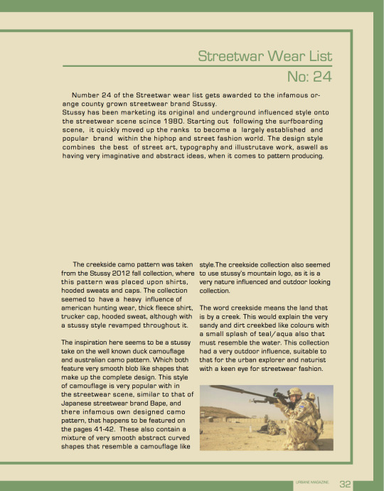
Edited magazine. After I and received my crit review on for the magazine project, I went back to amend all things that needed touching up on to improve the strength of my design. Starting with the cover, I altered the colour scheme of the masthead and then eventually the cover background and spine to suit the mastheads style more. i also enlarged the masthead and subheadings, but not only that i even changed the masthead design slightly to put the subheading below the type and not through it.
I feel it works stronger as the splits in the masthead design and cover design are a lot more visible and noticeable, which allows the design to be appreciated a lot more.
For the inside spread I had to slightly alter the colour scheme to again suit the magazines style, this works a lot smoother with the page design anyway so i am happy that I went back to edit that. I also removed a few irrelevant pieces of design like the split that was in the middle of the border at the top, because it was drawing attention away from the design. Not only that but i made the justification of the columns more smoother and neater looking, playing with the point size and track leading on the typography to fill space inside the columns. and also aligned the lower page number boxes with the border so they become a lot more pleasing to look it when reading the page.
0 notes
Photo
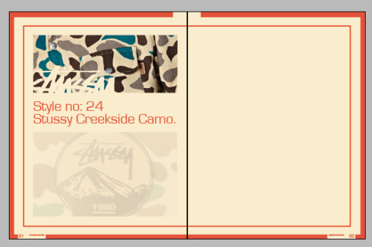
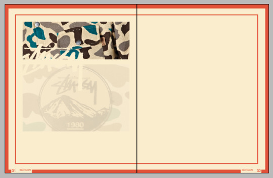
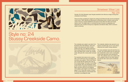
Magazine inside spread:
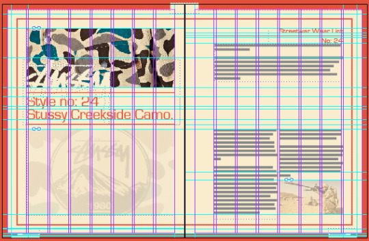
This is my inside spread for the urbane magazine. I chose to write an article myself on the specific stussy creekside camouflage pattern. Stating its influences and a short info about that collections details. I chose to keep the design quite simple, only using three photographs, a few headings and short amount of text. The largest photograph i chose to make transparent as that way it won't draw too much attention from the pages main interest which is the above camouflage pattern. My double spread had a 8 column layout with 2mm margins between each column, making it have plenty space to fit in the images and text neatly, and helping me be able to to line things up evenly.
I chose to keep the colour scheme of the masthead as it gives the magazine a specific style throughout it. At the bottom of each page corner i split the border, to insert the magazine name and page number. The typeface used throughout this article was Eurostile, the same font used for the magazine sub heading in the masthead, and front cover design also.
0 notes
Photo

Magazine Front Cover Spread:
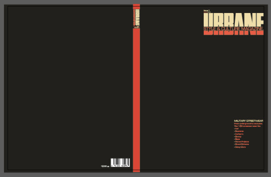
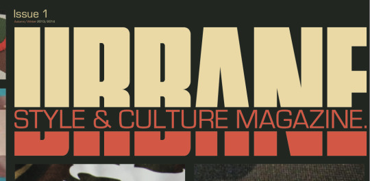
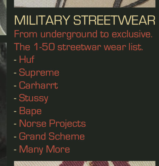
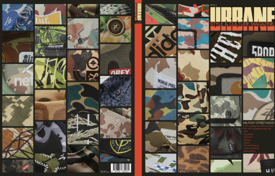
This is my front cover spread for my urbane magazine. I chose to make it a full back and front cover design, rather than having different content on the back and front. The magazine content is on military influence on street wear and this particularly addresses camouflage patterns. As there is a large use of camouflage patterns that are used in the street wear fashion scene. I chose a range of patterns throughout many different brands that interest me, from the exclusive premium, high market, style brands to some local underground brands that all resemble a similarity in their camouflage interest, however all seem to use different types of camp designs.
I had the layout idea in my head and thought it would look pretty cool wrapped around the cover as it gives a very interesting and attention seeking look to the magazine, making readers want to grab it from the shelves and try and make out the number brands that surround the cover. For this reason i have also only put certain parts of logos and garments inside each square, as it will make the audience wonder more about what brand, or garment that pattern is taken from, hence making them interested and possibly purchase the issue to find out.
I am quite proud of this design as I feel it does work and also gives of a nice look. if i saw this magazine on the shelves myself then I would be intrigues into what the articles were going to be about.
The design features patterns from brands such as, bape, stussy, huf, carharrt, stone island, nike, dope chef, and many more. I searched for brands which I am interested in, and chose garments with the most interesting pattern design styles.
#magazine#magazine cover#magazine layout#masthead#carharrt#stussy#norse projects#huf#bape camo#a bathing ape
2 notes
·
View notes
Photo
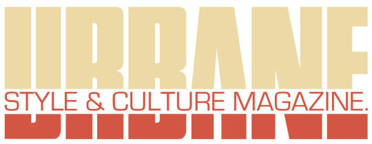
This is the chosen colour way for my magazine issue. i chose this subtle contrast of colours as they work well together, not too light or dark, still allow the masthead to be clearly read and they also work with the logo making it look nicer in my opinion.
0 notes
Photo
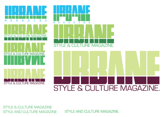
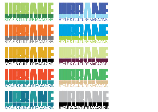
Urbane Masthead Final Choice:
This is my final chosen masthead for the urbane magazine. Now i have just generated a range of colours to test out with the design and see which one is suitable to use. However I may even choose the colour of the masthead to suit the colour way of the magazine issue.
0 notes
Photo
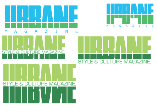
Here are some more developed ideas of my masthead design. I really only played with the subheading, 'style & culture magazine' and tested out where i could place it on the design. I think changing the subheading also makes the masthead design look better as its not as spaced out with just magazine underneath. I also feel that it defines the magazines content more.
0 notes
