Text
Thank you anon! l made some small examples of how l do folds and I’m going to try my best to explain it as best as l could.
When drawing clothing, it’s best to use a cylinder as a guide on how the fabric would look being wrapped around it. The folds of the fabric should be following the same direction of the cylinder’s form with round strokes. The first mistake from the example below, straight lines can takes away the form and leaves a flat unnatural feeling. Remember to think 3D!

Creases and folds should be drawn on tension areas, as in when the fabric gets tighten or fold together. Think of the direction on where the tension is going or coming from. The more tension there are, the longer and straighter the crease is. When the object bends, fabric tends to make a oval-ish looking hoops with overlapping folds (Do not over do them or it will look tedious).

There are more to it for drapery, this is just the basic idea of what to look out for when drawing clothing. BUT most important of all is USE REFERENCE!! I know it’s the most used excuse, but for sure use it because it will be super super helpful!
3K notes
·
View notes
Photo
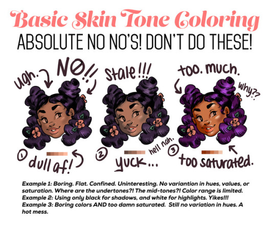
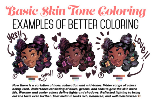
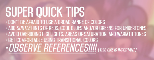
Someone asked for a few tips regarding coloring skin tones so I threw this together real quick lol.
Obviously not an end all, be all — and in NO WAY covers the plethora of info regarding this topic. Just a quick guide from my perspective. One day I’ll make a tut more extensive and organized with way better examples 😭
33K notes
·
View notes
Note
Hello, if you have the time, could you explain how hair lines work?? specifically on men because I am struggling :-(
Well, I can give you some tips based on how I do it. Your mileage may vary.
I mainly figure out where my dudes’ hairlines are supposed to be based on the physical landmarks of the head. Here’s a generic head I drew up that highlights those parts. It’s not realistically accurate since these are TF2-ish proportions, but it does involve knowledge of actual anatomy, which isn’t as scary as it sounds.

1-3 are self-explanatory. 4 is that slight bony ridge around that little depressed area behind your forehead on the sides. 5 is the bump of the base of your skull where it meets your neck muscle.
Also, notice where things line up, since these are clues to help you lock things in place and keep facial features from floating around too much. For example, the top of the ear generally lines up with the eyeline and the bottom with the mouth. There are lots of little tricks like that.
And here’s a generic hairline based on these landmarks.

Of course, reference is also going to help you out a bunch here. The above approximation is just meant to give a basic idea of where a hairline would be. Like fingerprints, everyone’s hairline is unique. Depending on your character, you should feel free to mix it up!

These are just a few slight variations, to give you an idea of what I mean: rounded, pointy, and receding. Once I have my hairline roughed in, I pick where the hair part is (if there is one) and sketch in the hair, following the natural growth pattern of hair.

You can get nearly infinite variations! Get wacky with it! And there’s no one 100% correct way to draw a hairline (or anything else, for that matter) so don’t get too hung up on not doing it wrong. Practice until you’re comfortable, and you’ll be winging it in no time.
7K notes
·
View notes
Text
apparently ppl don’t know about waifu2x??? despite its… concerning name it’s literally the most convenient website i’ve ever come across as an artist
it allows you to resize artwork without it becoming pixellated. this is a MASSIVE help if you, for example, make lineart too small or something. it works best with things that 1. have no textures 2. have smooth lines 3. have cel shading, but it still works really damn well for things that don’t fit that profile
here’s an example:

normal size

2x in paint

2x in waifu2x
so like, there’s that. go wild
237K notes
·
View notes
Photo

commissions!
so my work has cut back my hours severely and i’m finding myself in need of money! so i’m just reminding everyone that my commissions are open, with some updated pricing!
feel free to shoot me an ask or message here about commissions! :^>
38 notes
·
View notes
Photo


mirre lavellan ! i painted an old sketch!
3 notes
·
View notes
Photo

a moment of repose
a self indulgent little doodle of my fable/thief oc sibyl and her husband, king logan! i haven’t drawn her in forever and i really have missed drawing her !! :^>
20 notes
·
View notes
Text
i’m gonna drop an art tip here
i think an important thing to learn, especially if you start out with drawing anime, is that faces don’t necessarily have to narrow from top to bottom
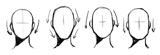
i like to think of wide top, wide middle, wide bottom, and rectangle-like as the 4 main face shapes
what you should keep in mind about them:
you’re only halfway done: the jawlines, the width-length ratio, the amount of fat in the cheeks, the intensity or subtlety of the face’s curves are all important components you still have to decide on after choosing the shape itself
none of these shapes are exclusively feminine or masculine, don’t hesitate drawing them on any gender
most people in real life have some variation of the wide middle type
if you are trying to draw real people, getting the shape of their face down is the first step
i’ve seen tutorials say the shape of the face can tell a lot of the character’s personality - you don’t necessarily have to live by that rule. as long as you aren’t unrealistically drastic about their proportions, their face shape determines their inner qualities as much as it would in real life (not at all)
73K notes
·
View notes
Note
How do you draw hands..? Like a guide kinda?
i don’t actually have a good guide because i kinda just wing it but here’s how i kind-of approach it. the best advice i have is to look at lots of real life reference and also your own hands if it helps!

964 notes
·
View notes
Note
do u have any tips on how to paint that fluorescent skin effect??
sorry im not quite sure what you mean but im assuming youre talking about the rainbow shit
i dont know all the art terms so bear with me
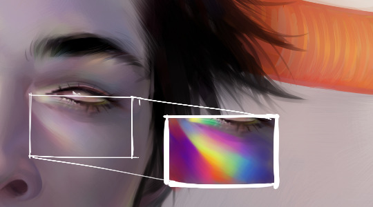
to add to this post, i start by just putting some random colours down then blending them out. for trolls i use lots of green blue and purple cos i guess my ocular cones n rods tell me cool colours are closer to grey than warm ones are

then i pick a colour for the high points and blend out with adjacent colours to get that rainbow effect
yellow is a good colour cos you can blend from yellow to red or yellow to blue and it will look nice + allow you to include lots of different colours which adds to the holographic/iridescent/whatever effect and still give an impression of depth without having to add heaps of black and muddying up the colours

you dont have to use yellow though, i just reckon its the easiest jumping off point. below i just changed the hue in photoshop n got cyan. it still looks like its got depth and all that but now are colours are limited, we missing yellow and orange. try different shit out though. pink is nice too
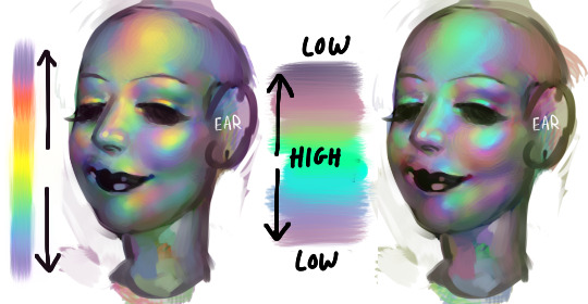
these are like fairly bad pics but below are some ways to do this with yellow as the colour of your high point/bits where the most light is bouncing off
think of the arrow going from the highest to lowest points. i like doing it the way i have in the middle pic cos i reckon its a bit more fun and dynamic. but yeah dont limit yourself to yellow! plenty of other colours out there in the big wide world. and dont worry if it looks garish you can always edit it later on
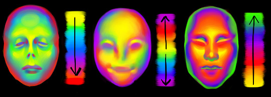
anyway you dont have to think too long and hard about like colour order or anything though. the main thing is just putting the right colours next to one another, so if youve got a green patch and a red patch blend them together with some yellow, orange/red goes between yellow and purple, etc etc
sometimes its better not to plan things too much
19K notes
·
View notes
Photo


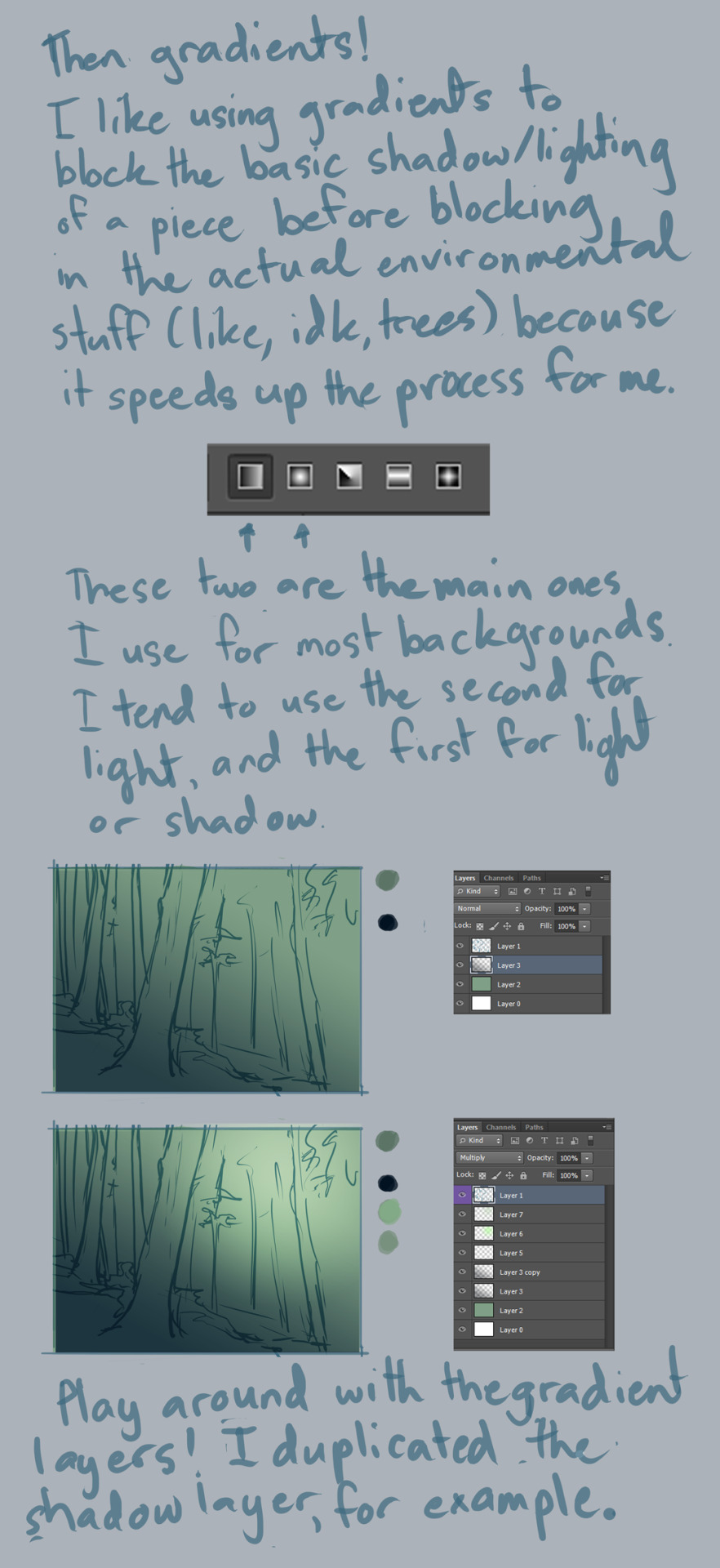


Background Tutorial
requested by ion4ever. sorry it took me so long to do this for you but hopefully I was of some help?
Notes:
I use CS6, and this was mostly done with default hard round brush at around 50% opacity or higher, 100% flow, and size pressure on. I made some random brushes for the greenery by modifying the default ones.
always use a large canvas. I go about 3000px x 3000px.
with enough practice, painting backgrounds like this will be a fairly quick affair. this one, for example, took about 30 minutes? it’s just a matter of time/experience. :)
So yeah, good luck doing backgrounds, and have fun!! :D
32K notes
·
View notes
Text
shading colour tips
hey yall its me the Art Mom™ to help you shade pretty
rule 1: DO NOT SHADE WITH BLACK. EVER. IT NEVER LOOKS GOOD.
red- shade with a slightly darker shade of purple
orange- slightly darker and more saturated shade of red
yellow- i think like..a peach could work but make it a really light peach
green- shade with darker and less saturated shade of blue or teal
blue- shade with purple
purple- a shade thats darker than the purple you’re using and maybe a little pink (MAYBE blue)
pink- darker shade of red
white- a really light lavender or blue..or i guess any really light colour??
black- okay listen dont use pure black to colour anything unless you want to leave it with flat colours because you cant really shade black lol
grey- a slightly darker shade of purple or blue (less saturated)
brown- slightly darker and less saturated shade of purple or red
aaaaand thats all i got lol. let me know if there is anything i should add to this list!!
469K notes
·
View notes
