
An archive blog for disability pride flags, symbols, terms, etc <3
Don't wanna be here? Send us removal request.
Statistics
We looked inside some of the posts by disabilitypride and here's what we found interesting.
Average Info
Notes Per Post
758
Likes Per Post
510
Reblog Per Post
244
Reply Per Post
4
Time Between Posts
4 days
Number of Posts By Type
Text
16
Note
1
Last Seen Tumblr Blogs


Fun Fact
The KCSC sent more than 20K requests to delete posts related to prostitution and porn to Tumblr from January to June 2017.
Text
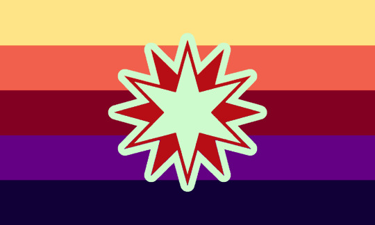
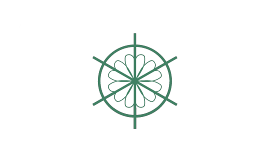
Functional Seizures Flag / Psychogenic Nonepileptic Seizures Flag
[Pt: Functional Seizures Flag / Psychogenic Nonepileptic Seizures Flag end pt]
A flag to represent those who have Psychogenic Nonepileptic Seizure *also known as functional seizures.*


The purple and teal colors represent PNES (Psychogenic Nonepileptic Seizure). Since they symbolize resilience, I used orchids as a symbol in the center. The background is the disabled pride flag but altered to be purple, teal, and a darker gray.
[Pt: The purple and teal colors represent PNES (Psychogenic Nonepileptic Seizure). Since they symbolize resilience, I used orchids as a symbol in the center. The background is the disabled pride flag but altered to be purple, teal, and a darker gray. End pt]
Plain symbol under cut

Requested by @theadhdace
Any of our terms or flags or posts may be added to archives, wikis, other sites, etc. Archives are important! I do not mind where you use my terms
Anyone may use my terms; I will not police your usage.
MAD Taglist (DM OR SEND AN ASK TO BE ADDED OR REMOVED!) :
@c1rcus-of-silliness @themogaidragon @madtrender @mad-pride @disabilitypride @disabilityflagsarchive
#seizures#neurological disabilities#neurological disability#mad pride#diagonal design#purple aesthetic#has alt text#submissions
16 notes
·
View notes
Text
Atonic Seizures Flag / Drop Attack Seizures Flag
[Pt: Atonic Seizures Flag / Drop Attack Seizures Flag end pt]
A flag to represent those who have atonic seizures *also known as drop attack seizures.*


The purple colors represent seizures. Lavender flowers are the international flower of seizures, so I used this as a symbol in the center. The background is the disabled pride flag but altered to be purple and a darker gray.
[Pt: The purple colors represent seizures. Lavender flowers are the international flower of seizures, so I used this as a symbol in the center. The background is the disabled pride flag but altered to be purple and a darker gray. End pt]
Lavender Symbol credit
Plain symbol under cut

Requested by : @theadhdace
Any of our terms or flags or posts may be added to archives, wikis, other sites, etc. Archives are important! I do not mind where you use my terms
Anyone may use my terms; I will not police your usage.
MAD Taglist (DM OR SEND AN ASK TO BE ADDED OR REMOVED!) :
@c1rcus-of-silliness @themogaidragon @madtrender @mad-pride @disabilitypride @disabilityflagsarchive
#seizures#neurological disability#neurological disabilities#diagonal design#purple aesthetic#has alt text#submissions#ty for tagging
6 notes
·
View notes
Text
I made a smell disorder flag and I'm pretty proud of it, here it is with the plain stripes and color meanings:


[ID: two seven striped pride flags with identical colors. the one on the right labels their meanings, from top to bottom, as: purple for phantosmia, blue for dysosmia, teal for parosmia, rose red for smell, white for hyperosmia, grey for hyposmia, and black for anosmia. End ID.]
and here's some versions with a rose in the middle because I think that makes it look incredible:


[ID: the same flags as above, but with a rose in the center, which is the same color as the rose red center stripe. the rose on the left has black lines and the one on the right has dark red lines. End ID.]
this means a lot to me so I gave it my best shot, any advice and/or feedback would be appreciated.
#horizontal design#has colour meanings#cool aesthetic#smell disorders#smell disorder#olfaction#sensory disabilities#sensory disability
33 notes
·
View notes
Text
Functional Neurological Disorder Flag


This isn't what we usually post, but we wanted a flag for functional neurological disorder (FND) and couldn't find one, so we made one ourselves!
The orange is for agitative symptoms, like pain and seizures, while the blue is for depressive symptoms, like fainting and lethargy.
The cream-colored middle stripe is for the good days in-between the bad, with the purple being low-symptom periods.
The flowers are there because FND is just... very flowery, to us. With wellness blooming and wilting in a continuous cycle. Here's a version without flowers as well:

15 notes
·
View notes
Text


AACPUNK
AACpunk is a movement that challenges ableism and promotes the acceptance and inclusion of all forms of communication. It stands for the inclusion of individuals who rely on Augmentative and Alternative Communication (AAC), including nonverbal individuals, neurodivergent people, and those with various communication challenges, whether temporary or permanent. It works to break down barriers such as prohibitive costs, restrictive protocols, and social stigma, ensuring that all individuals have equal access to AAC tools.
Flag meaning
The top blue is representing communication in all its forms
The red is for breaking of barriers, stereotypes and ableism
The light tan-brown for neurodivergence
The gray for self-determination
And the cobalt for free access
Flags by @kpopwerewolf
Person with AAC symbol by @blackholemojis
ALT FLAG
Core Beliefs of AACpunk:
• Communication is a right, not a privilege. No one should be denied access to AAC tools of any kind.
• All communication is valid. Whether someone uses text-to-speech devices, symbol boards, writing, gestures, or any other form of AAC, their voice matters.
• Rejecting ableism in communication. Society often devalues nonverbal and AAC users, treating them as lesser. AACpunk stands against this by demanding equal treatment and respect.
• Breaking barriers to AAC access. Many AAC users struggle to get the tools they need due to cost, medical gatekeeping, or stigma. AACpunk fights for free and open access to communication tools.
• Neurodivergent and disability pride. AACpunk is inherently tied to neurodivergent and disabled liberation, embracing identity without the need for “fixing” or forced conformity to verbal speech norms.
AACpunk is inherently supportive of:
• All individuals with verbal communication challenges, no matter how they express themselves.
• No-tech, low-tech, and high-tech AAC users.
• Individuals who are neurodivergent, disabled, and who choose AAC as their primary means of communication.
• Self-determination in communication choices, without societal pressure to conform to verbal norms.
• Accessible education, workplaces, and social spaces for all individuals, regardless of communication style.
• The ability to communicate anything, even content deemed controversial or inappropriate, including through symbol-based AAC.
• Free access to AAC tools, ensuring that economic barriers do not prevent communication.
AACpunk is inherently against:
• Speech supremacy and verbalism, the belief that spoken language is superior.
• Medical and educational systems that gatekeep access to AAC, preventing people from receiving the tools they need.
• Forced speech therapies and practices that demand conformity to verbal communication norms.
• The infantilization of AAC users, treating them as less than or incapable of making their own choices.
• The exclusion of AAC users from conversations about accessibility, rights, and inclusion.
• Dehumanizing attitudes toward nonverbal individuals and those who use AAC.
286 notes
·
View notes
Note
I saw your recent ‘invisible’ flag and think it’s really cool!
Could you possibly make a term that’s the opposite of that? As in, feeling that everyone is watching you and judging you due to neurodiversity?
Absolutely! Here you go! It shocked me how well people took Invisible as a coined term, actually..

PERCEIVABLE

-> Perceivable is a term for folks who feel as if their neurodivergency causes them to stand out, leading to the belief that others are watching you and judging you for the way you behave.
CURRENTLY NO SPOONS FOR ID - WILL RETURN TOMORROW!!

95 notes
·
View notes
Text


flag id: a flag with 4 stripes, which are golden yellow, green, dark blue, and cool purple. end id.
banner id: a 1600x200 teal banner with the words ‘please read my dni before interacting. those on my / dni may still use my terms, so do not recoin them.’ in large white text in the center. the text takes up two lines, split at the slash. end id.
moodshifter flag for anon!
i used the colors i saw most commonly in bipolar i, bipolar ii, and cyclothymia flags when searching through @/mad-pride — yellow/orange, green, blue, and purple.
yellow represents mania and hypomania; green represents hope, health, and the cycle between moods; blue represents depression; purple represents strong emotions in general!
tags: @radiomogai, @dragonpride17, @mad-pride
dni link
21 notes
·
View notes
Text
Walking Cane User Flag


A flag for cane users! This can be for all cane users. Half-time, full-time, young, old, etc.
47 notes
·
View notes
Text


Personality Disorder—Trait Specified pathological personality trait domains. Negative Affectivity(first), Detachment(Second), Antagonism(third), Disinhibition(fourth), Psychoticism(fifth).
Based on this Personality Disorder—Traits Specified flag
Negative Affectivity includes: Emotional lability, Anxiousness, Separation insecurity, Submissiveness, Hostility(also present in antagonism), Perseveration, Depressivity(also present in detachment), Suspiciousness(also present in detachment)
Detachment includes: Withdrawal, Intimacy avoidance, Anhedonia, Depressivity(also present in negative affectivity), Restricted affectivity, Suspiciousness(also present in negative affectivity)
Antagonism includes: Manipulativeness, Deceitfulness, Grandiosity, Attention seeking, Callousness, Hostility(also present in negative affectivity)
Disinhibition includes: Irresponsibility, Impulsivity, Distractibility, Risk taking
Psychoticism includes: Unusual beliefs and experiences, Eccentricity, Cognitive and perceptual dysregulation
May make flags for multiple trait domains later, but there is a lot of different combinations.
32 notes
·
View notes
Text
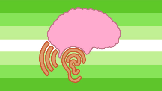

⟡ ┄ ⟡ ┄ ⟡ ┄ ⟡ ┄ ⟡ ┄ ⟡ ┄ ⟡ ┄ ⟡ ┄ ⟡ ┄ ⟡ ┄ ⟡
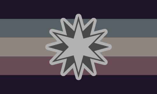
CAPD/APD Awareness Flag : Central Audio Processing Disorder Awareness Flag.
—> Flag coined/created by me !! [The-Bat-Collective]
☆ please give credit!
ID : one 7 horizontal striped flag with colors that go in this order, top to bottom : alien green, kiwi green, light sage, white, light sage, kiwi green, and alien green! In the center is a hand drawn brain outlined in dusty rose. Below the brain is an ear outlined in whisky and outlined again in ruddy brown. On the left of the ear is a sound wave outlined in whiskey and outlined again in ruddy brown.
END ID
#central audio processing disorder#capd#apd#audio processing disorder#green aesthetic#horizontal design with symbol
9 notes
·
View notes
Text

So I couldn't find a Schizoaffective Disorder flag... so like any good person with schizoaffective disorder can do is to create one.
Purple - Hallucinations
Pink - Delusions
Gray - Disorganised Thinking
Green - Manic Episodes
Blue - Depressive Episodes
Gray is the awareness colour of schizoaffective disorder so I felt like I had to fit it into the flag.
You are free use this flag. Manipulate it, and change its shapes and colours. No attribution required. No one can copyright blocks/bars shapes with different colours.
13 notes
·
View notes
Text
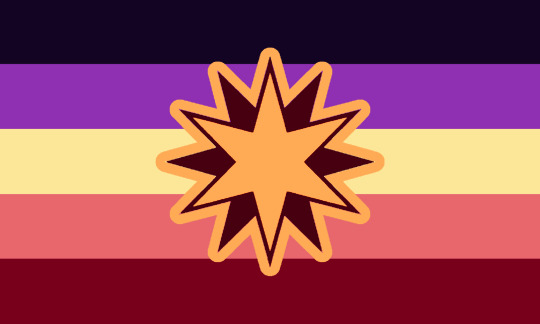
Infrequent Paralysis Flag

For those with some type of primary or secondary periodic paralysis. It is also for those who can't get a diagnosis due to a lack of doctors or lack of care from doctors. And mental and physical disabilities that causes infrequent paralysis.
Edit: Oh yeah!
Dark purple is for paralysis.
Red is for physical disability.
White is for invisible disability.
And the gold heart is for those who take care of you in your moments of weakness.
14 notes
·
View notes
Text
Even more autism pride flag options
After my latest autistic pride flag post, @pride-cat messaged me suggesting a mashup of the red-orange-yellow-lime-green (ROYLG) flag with the Autistic Pride Day logo. Here's what I came up with:


The top one uses the grey from the disability pride flag and the colours from the ROYLG flag. Bottom left uses a white background like the neurodiversity flag. Bottom right uses disability pride colours.
(At pride-cat's suggestion, I tried putting the APD logo on the ROYLG flag but felt like it blended into the background - you can see pride-cat's version here.)
@posting-stuffies tagged me about @ryanyflags's gold infinity icons, so here are two flags putting the gold infinity first on a plain white background then on the grey background:


While on the idea of "plain symbol for autism on a white background" I figured I'd make use of the aufinity symbol by @palpablenotion:


And then finally, this post by @spaghettimakesflags and this post by @themogaidragon inspired some more flag ideas that led to:


These are all free to use and remix! I hope this helps for moving people away from autistic flags that have Metis style infinity symbols in them (such as the original ROYLG design). 🧡
Code used to generate flag combinations is on github. SVGs here.
In the near future I'm thinking of putting out a survey of autistic flag options. I'm assembling a list of options here, so if you know of any autistic flag designs that don't use a solid white infinity that aren't in the document please let me know! 🧡
Tagging for archival: @radiomogai @liom-archive @disabilityflagsarchive @disabilitypride
57 notes
·
View notes
Text
For archiving: what's under the cut is the middle symbol on its own.


Obsessive-Compulsive Personality Disorder(OCPD)/Anankastic Personality Disorder(AnPD) flag
So we'll level with you, we aren't 100% sure we actually have OCPD, we do have a lot of symptoms of it but we don't know for sure. If that makes not want to use the flag that's fine
Flag meaning:
It has 6 stripes because 6 is a perfect number. The symbol consists of a symbol the is sometimes used to represent the control key on keyboards, and the white flower with six petals is for perfection.
White is for need for perfection, but also for awareness
Yellow rigidity, as well community
Green is for comorbidity, and solidarity
Blue is for order, as well acceptance
Burgundy is for need for control, also symptom management
Black is for underlining anxiety and insecurity, but also recovery
Also here's just the symbol in case you want it
#Obsessive Compulsive Personality Disorder#Obsessive Compulsive pd#ocpd#mad pride flag#mad pride#persodivergent#has colour meanings#has alt text#symbol
31 notes
·
View notes
Text

anemia and low iron pride flag
41 notes
·
View notes
Text

I haven’t seen a flag for Ménière’s Disease anywhere before, so I made my own! Feel free to use. Credit is appreciated but not required, and anyone with Meniere’s can use it!
IMAGE ID - The flag in the center has nine evenly-spaced stripes. In the center of the flag is a simple white icon of a side-view of a person's head with a black spiral where their brain would be. From top to bottom, the colors are saturated medium blue, medium fern green, desaturated greenish-yellow, light yellowish-red, and off-black. The colors are mirrored below that strip, starting with light yellowish-red. The flags on the left and right are the same, but without the icon of the head in the center. /END ID
Color meanings below:
Blue represents hearing loss, and is colorpicked from the Deaf flag.
Green represents tinnitus, and is colorpicked (with slight variation) from this tinnitus flag.
Yellow represents vertigo.
Red represents inner-ear dysfunction and endolymph buildup.
Black represents sound sensitivity, and is colorpicked from the misophonia flag.
#ménière's disease#ménière's#sensory disability#has alt text#has colour meanings#horizontal design#tw eyestrain
24 notes
·
View notes
Text

allodynia flag
18 notes
·
View notes