Don't wanna be here? Send us removal request.
Text
Check out my Website, click the link above!
1 note
·
View note
Text
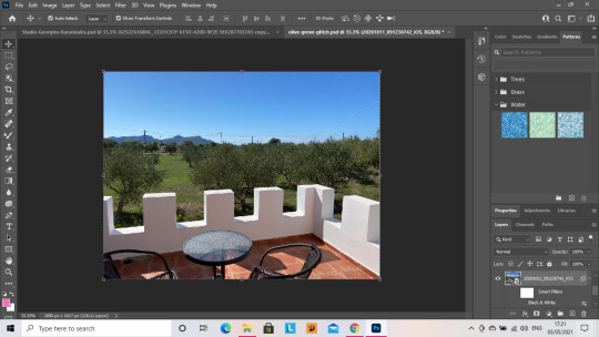
Olive Grove (Methoni, Greece) Glitch Edit
The first image is the base image that I used, an image that I took in October 2020. I Auto-Toned, Auto-Coloured and Auto-Contrasted this image, Image a copy of the Image for the next layer before using a standard Black and White Filter on the original base image, in the Black and White filters option in Image, under the Adjustments Section.
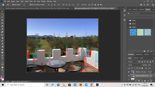
I then went to the copy of the original that I made, before applying the black and white filter and made a huge bunch of random selections, that I distorted using the wave filter in the filters section, in the distort menu and had the shape set to square and leaving all remaining pre-sets of the filter as they were. I applied this filter 3 times, following this step I applied a motion blur filter of 92 pixels in distance, before going to the Blending Options and removed the R value from the RGB settings, to give the first glitch picture (Pic 3.) its colouring of blue and red. Finally, I pulled the layer away to the right and then stretched it across all the way to the left, encompassing the whole image.
I did the same again with another copy of the original base image before black and white, and followed all the same steps, except instead of removing the red in the RGB settings I removed the Green, giving the top layer (Pic 4.) its green and purple hues. This layer is also stretched all the way across.
Photos in the next post.
0 notes
Text


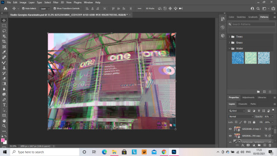
GLITCH EDIT STEPS: STADIO GEORGIOS KARAISKAKIS, PIRAEUS, GREECE
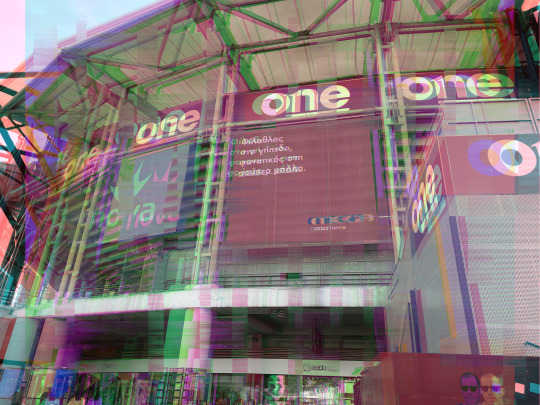
This is my edit of the Olympiacos Stadium, in Piraeus, Greece.
The first image is the base image that I used, an image that I took in October 2020. I Auto-Toned, Auto-Coloured and Auto-Contrasted this image, Image a copy of the Image for the next layer before using a high resolution Red Filter on the original image, in the Black and White filters option in Image, under the Adjustments Section.
I then went to the copy of the original that I made, before applying the black and white filter and made a huge bunch of random selections, that I distorted using the wave filter in the filters section, in the distort menu and had the shape set to square and leaving all remaining pre-sets of the filter as they were. I applied this filter 3 times, following this step I applied a motion blur filter of 92 pixels in distance, before going to the Blending Options and removed the R value from the RGB settings, to give the first glitch picture (Pic 3.) its colouring of blue and red. Finally, I pulled the layer away to the right and then stretched it across all the way to the left, encompassing the whole image.
I did the same again with another copy of the original base image before black and white, and followed all the same steps, except instead of removing the red in the RGB settings I removed the Green, giving the top layer (Pic 4.) its green and purple hues. This layer is focused purely on the centre of the image, to make the glitch layers look stacked up.
These Steps gave me my final image, which is below.
0 notes
Text
Check out my Website, click the link above!
1 note
·
View note
Text

Blog Post 7: Branding and Consistency
Here's the Style Sheet for my Logo!
0 notes
Text
Blog Post 7: Branding and Consistent Design (Cont.)
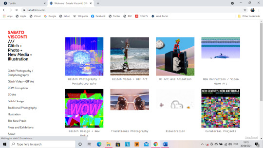
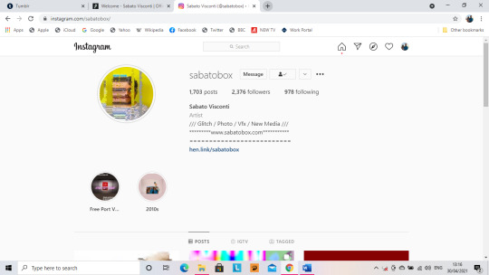
The above screenshots demonstrate the lack of branding consistency across Visconti's website and Instagram.
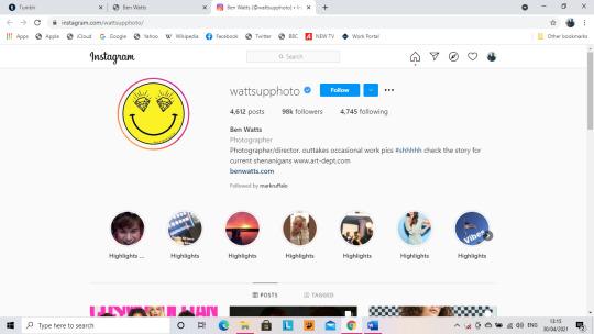

In contrast to Visconti, these screenshots above are from the Instagram and website of United States based photographer Ben Watts, and these screenshots show that the logo given on his Instagram, is also shown in the bottom right corner of the landing page of the website of Ben Watts, and this is branding consistency.

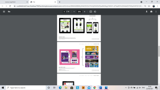


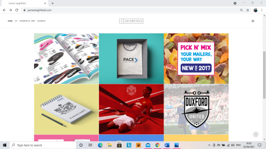
This final set of pictures are the branding consistency of Graphic Designer and recent graduate James Leighfield.
As can be seen across all the screenshots, the branding can be very cleanly seen across all work, making it obvious that it is all James's work
0 notes
Text
Blog Post 7: Branding and Consistent Design
Consistency is important because if you hand someone a CV with one logo, and your social media has another then it shows that you can’t keep your brand consistent and keeping ones brand consistent is important. If you aren’t consistent then it immediately gives a bad impression of you to an employer.


The range of images above are the logo iterations that I have created. There are varied iterations but the first set with the shapes and spray paint effect aren’t bring used.
Having a background on a logo can make it very difficult to read, even with a clear font face. This is shown in the evolution of my logos to show that I have transitioned to a logo with a transparent background.
The logo on the bottom left of the second set of iterations, is what I have opted for in terms of my name in my logo. I have produced a range of glitch photography and so I wanted this style of digital art to influence some of my logo. I designed the top half of my logo on Adobe Photoshop. I created three text layers of my name and the blue and red layers were made by making changes to the blending options, removing the R value to make the blue hue, and removing the G value to make the red hue. Both of these separate layers then had the motion blur filter applied to them make them blurry, in accordance with the glitch art style.
Originally in the logo explained above, I had the words “Digital Art | Photography” written underneath, and this was in the glitch style, however, upon showing my tutors, it was bought to my attention that this did not look good and was illegible, meaning I needed more logo iterations.
Upon suggestion from my tutors, I removed the “Digital Art | Photography” from the style of how my name is written in the logo and write that particular part in a plain text.
This is the first set of these I designed. As seen below I did another 4 iterations of my logo, all using different typefaces, however, upon further critique and advice from my tutor, I made a further set in this style as the type faces were not suitable and nor was the placement of the wording.

My tutor sent me an example to follow of trying plainer font faces and off centre placement of the words, to see how it made a difference.
This is the set I created, however the placement was too far off centre, so below you’ll see that I selected a single iteration to make the placement changes to and go ahead and use across all of my work.

The iterations above are all using different type faces to the first set and the bottom left hand iteration is the iteration that I decided to use as a final iteration, one the placement changes to the plain text had been moved so it was slightly off centre and not hugely off centre, as can be seen below. The text in this final iteration is all very legible, and the text explaining my role is clearer and in a less graphical font, as I am not a graphic designer.
This final iteration of my logo gives the perfect balance of the glitch art style and plain but legible text, so I have a great mixture of a digital art logo and a photography logo.
In contrast to the original iteration of my final logo, below, I went in to Adobe Illustrator and moved the text explain my role into a better position, to give the text more balance.

Initial Research and tutor examples

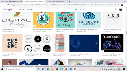


After my very first set of iterations, which look more like the logo a make-up artist or nail technician would use due to the use of the bright colour backgrounds and the graphical shapes, I sought help from my tutor with regard to making a text-only logo, like the final iteration I came to, the right hand set on the top is the first set of iterations she sent me, which gave birth to the set of iterations in the very top right hand corner, I then decided I wanted to incorporate some glitch art into my logo, and so I researched it and the examples above are just a few of the various examples I found and went ahead and began designing the final iterations of my logo, right up until the one that is in use now. The final iteration of my logo is now in use across all of my work, in terms of consistency and the theme of my logo features in a large amount of my work with regard to glitch art/photography. My Website features a collection of different Glitch Photography pieces that have been created out of my own photography and they all have very specific colour schemes that envelope pinks, blues, reds and purples, and even some hints of green, colouring a vast amount of primary and secondary colours, keeping the colour scheme basic, like the use of red and blue in my logo, keeping it as consistent as possible to a simple colour scheme.
This also goes for my CV, ensuring that my CV has the correct logo and branding like my social media and my website. If these are not consistent then it shows that I haven’t worked hard enough to ensure that I have all the right branding. On my CV, my logo can be as big as I need it to be, however on social media platforms such as Instagram, my logo has to be a certain size. This is achievable through ensuring that there is a scaled version for clarity, and for use on my website and CV, but a zoomed out version that can be used on social media profiles such as Instagram.
If I have different logos across my platforms and pieces of work, then that shows inconsistency not only in my branding but the themes I am trying to convey through my work.
An example of inconsistent branding is Mixed Digital Artist Sabato Visconti.
(Images to follow in a follow up blog post)
On his website he uses his logo in the top left corner of his side navigation menu, but on his Instagram, his logo is nowhere to be seen. Instead, he uses a portrait of him that has been glitched, making his face very unrecognisable.
This shows complete inconsistency in the branding of himself as a Mixed digital artist because his website logo is pure text, and example of which will be shown in a follow up post, alongside the photo he uses on his Instagram account.
This is in contrast to American Based photographer Ben Watts, who has an all text logo, and an insignia that he uses on his Instagram, and it features in the bottom right corner of his website, showing the consistency. (Images to follow in a follow up post)
Recent Graduate and Graphic designer James Leighfield also shows consistency throughout his website and PDF Portfolio, which also includes his CV, which has the same branding as the rest of his work. (Visual Examples will follow in the next post.)
0 notes
Text
Blog Post 6: Content
Content is KING in any digital discipline, if you can keep giving followers juicy and engaging content, then followers will stay interested. This is not just in terms of social media but this would encompass ones website as well, ensuring that the content on ones website stays up to date.
If you can’t keep providing juicy content then you won’t keep people interested.
Is my content relevant to my Industry?
I describe myself as a digital artist and photographer, and a lot of my digital art focusses on Glitch Photography, and my photography focusses on landscapes, such as The Acropolis in Athens, Greece and Methoni Castle, in Methoni, South Western Greece.
In this sense, my content is very much relevant to my chosen industry. In terms of software for creating Glitch Photography and other Digital Art pieces, as well as ensuring my photographs are correctly edited, then Adobe Photoshop is used as I can use an all manner of corrections on images before putting them out on social media. Ensuring that photographs are correctly enhanced before hitting Instagram or my website, is more than just slapping a filter on them. Through the use of the Auto Tone, Auto Contrast and Auto Colour settings on Adobe Photoshop, then the image is correctly enhanced, either for further editing or immediate output to social media and the website that displays my work.
In terms of Glitch Photography, then these three steps on Adobe Photoshop would be undertaken first before creating the Glitch piece. Then all of the tools I need to create the Glitch piece can be found throughout Adobe Photoshop. A full tutorial on creating Glitch Art can be found here: https://www.youtube.com/watch?v=anDvD_qzbOM
Content Relevance- Ben Watts and Sabato Visconti
https://art-dept.com/photography/ben-watts_6/5224/555/?sid=96200/#viewall
https://www.sabatobox.com/
If you click the links above then you’ll be able to see the relevance of content on the websites of Photographer Ben Watts, and Glitch Artist, New Media Artist and Photographer Sabato Visconti. These two members of the Digital Art and Photography Industry are two excellent examples of the kind of content relevance needed from my own work.
Making sure that I have relevant content is of the top priority because I want to ensure that people are engaged in the work I produce. Relevant work for me includes a range of photography, digital art, and glitch art as well as a range of behind the scenes work so how my work is made can be seen by others, hopefully just to inspire them into hopefully following in my footsteps. I want to produce works that inspires others, even if it’s just to try their best to produce something, even slightly similar, or in the style of my work, all I want is to inspire.
If my work can inspire others, then I know that I will be a successful digital artist, because the most meaning that anyone’s work should have is inspiration, if work can’t inspire people to try and follow in your footsteps, then it’s practically meaningless, apart from just social media use and likes, which is not much of a pure meaning of one’s work.
Visual Examples: Sabato Visconti


Recent Graduate Work
James Leighfield
https://jamesleighfield.com/ James Leighfield is a recent graduate whose main industry role is Graphic Design. All of the work on his website is on the landing page and is completely relevant to his field. There are 12 pieces selected to showcase on the opening page of his website which are all of a strong quality and complete relevance to his field. Screen Shots from James Leighfield. James Leighfield’s CV and Landing page on his website


Other Professional Work
Ben Watts
https://art-dept.com/photography/ben-watts_6/5224/555/?sid=96200/#viewall
Ben Watts is an American based Photographer. All of the work on his website is on the landing page and is completely relevant to his field. There are a range of different categories, containing various pieces selected for his page on artdepart.com, which are all of a strong quality and complete relevance to his field.
Screenshots of Ben Watt’s work from the above link
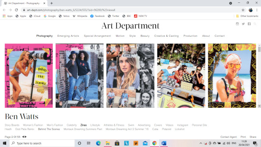

More of Ben's Work can be found on his Instagram @wattsupphoto
0 notes
Text
Blog Post 5: Mock-Up’s of Work
Work Mock-up’s are a key piece in the design process, to be able to show a client just how you intend to fulfil the brief they have asked for.
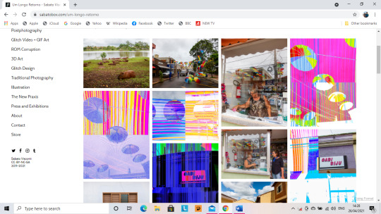
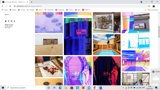
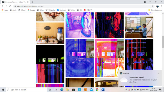
Sabato Visconti is a Glitch Artist, New Media Artist and Photographer and he organises his work on his website categorically, by this I mean, what group does his work fall in to, how is it styled and categorised, in line with what Visconti says he does?
The layout and categorisation of his work can be checked out on www.sabatobox.com as well as Visconti’s Instagram which is @sabatobox.
On his Instagram, there is no real organisation to his work, he gives it a really good mix up in organisation so that a snapshot of all of his work can be seen, all of his work is dated by year as well, depending on when he created it. His style of glitch photography is inspiring and captivating as it can be used to create some very psychedelic pieces of work, as base images can be edited themselves before the glitch layers are applied, which can give for some really striking images.
The level of organisation within Visconti’s website and the true mixture of his work on his Instagram page is something that I am looking to aim for as there are a range of different styles used throughout my work.




Templates
Templates are important because they can give a fantastic grounding for pieces of work, but they cannot look exactly like the template if they are being used to towards work, they need to be edited to your kind of style and give a good message along with other pieces of work displayed in your showcase.
If you’re using a package of programmes such as Adobe Creative Cloud, then it comes with a large number of editable templates that can be used in Adobe Photoshop, Adobe Illustrator, and Adobe InDesign. By way of editing them, it is more than just adding your work into the placeholders on the items in the mock-up template like the laptops and the iPhones. To make the work your own, then the background can be changed to fit your work, things can also be removed from the template so it is not he same as when it was downloaded, things can be rearranged.
This can be done alongside adding effects to parts of the image to make them look hand drawn or painted and make for a really different look.
Mock-up Importance
Mock-up’s are important for amateur’s as they aid in progression for future projects and further general development within the chosen field of work. Mock-ups also show development from the first pieces of work devised all the way through to the best pieces of work you’ve produced. Mock-ups show the journey that you have taken as a digital artist from amateur to highly skilled.
Mock-Up’s also show the development of your own style as an artist, mock-ups allow you as the artist to make your stamp as an individual. This way you can show you strength in your style and really go ahead an make your mark on your industry as well as just an individual.
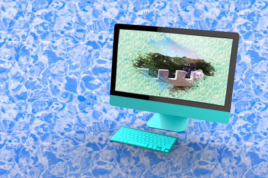
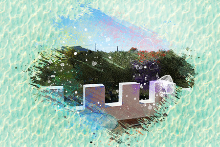
The Mock-Up's below are from templates that I have edited and layered effects on, with a water background theme to begin to make my mark on the digital art industry.
0 notes
Text
Blog Post 4: Industry Software
A key tool in the digital industry is the software being utilised, no matter the digital discipline that your work falls under. The most recognisable software set for any digital discipline is Adobe Creative Cloud which includes:
· Adobe Photoshop
· Adobe Illustrator
· Adobe Dreamweaver
· Adobe Animate
Alongside a whole host of other programmes that can be used across the creative industry.
Which pieces of software are most relevant to a digital artist and photographer?
The most relevant pieces of software for my industry role are Adobe Photoshop, for Glitch Art and Photo Editing. Adobe Photoshop comes with a whole host of various artistic, sketch and distortion effects that can be used for general photo manipulation, As explained in a previous blog post, Adobe Photoshop is a Bitmap application, and it is commonly referred to as a painting application.
Illustration Software
There are two main types of application that are used for Digital Illustration:
· Bitmap Applications- Adobe Photoshop
· Vector Applications- Adobe Illustrator
Bitmap Applications:
Bitmap Applications are usually referred to as painting applications. With a bitmap application, the content is stored digitally in fixed rows and columns of pixels, which can be transformed into separate layers which can be isolated for easier manipulation of different parts of the image.
A bitmap image contains information regarding the hue, luminance, and saturation of each pixel. When the pointing device moves over a pixelated area of the image, new colours and values are applied to the underlaying pixels. Painting tools allow for the simple creation of “fuzzy” imagery, including glow or soft shadow effects and textures such as fur, velvet, stone, and skin and these are hugely used in photo retouching.
Vector Applications:
The second kind of digital illustration application is a Vector Application. Vector applications are more commonly referred to as drawing applications. It is referred to in this manor due to the differences in appearance of final products between the two applications, with regard to the look and feel.
Within vector based tools, the content is stored digitally as a resolution independent mathematical formula describing open paths (lines), closed paths (shapes), as well as colour fills, strokes, and gradients. Vector paths are built up of anchor points and paths segments by using the pointing device to click and move. Many vector graphics are readily available from internet databases which are editable and can be used for larger projects. Drawing tools can draw precise lines, shapes and patterns with well-defined edges and are great for working with big constructions such as maps and typography.
Digital may include both vector and raster graphics in the same work. A bitmap file may be saved in a format which embeds a layer of vector information, and a vector image file may include imported bitmap images.
Digital Techniques:
Photo bashing is a technique that is mostly used by Concept Artists. The process involves the artist blending and merging photographs and/or 3D Assets as well as painting, so they can create a composite art piece. This technique is similar to the process of compositing in video editing. Concept artists use this technique to increase the accuracy of the piece but also to aide their productivity.
(Wikipedia.org, 2021)
These pieces of software are what can be best used for my industry. As well as all of the features listed above all the Adobe programmes come with a package of tutorials to get users acquainted with the tools that the package provides, and to help them whip up quick projects for themselves. Then the user can build on these skills and go ahead and make larger project.
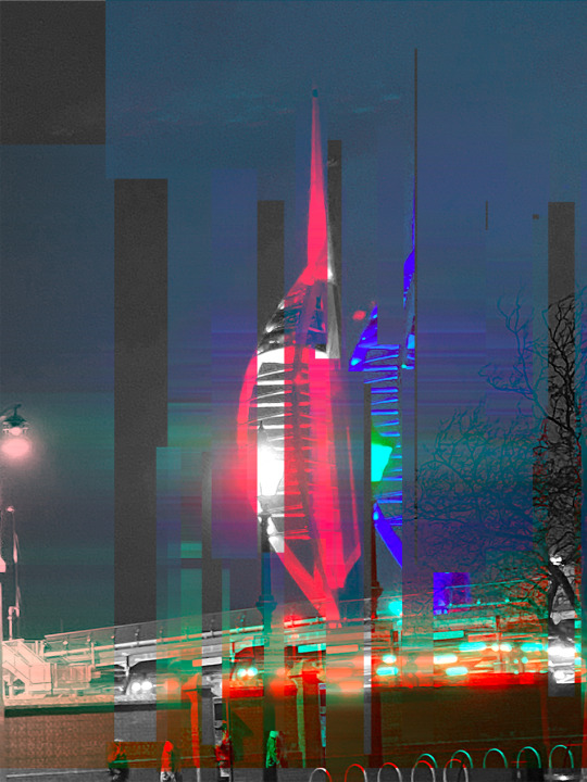
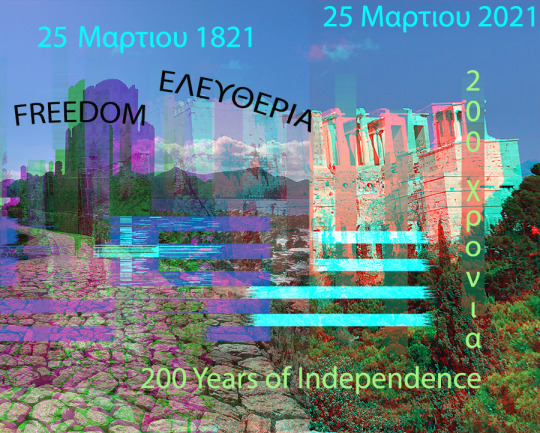
YouTube is also full of tutorials that can be utilised to make pieces of work. For example, in a piece of work that I have produced, I followed a YouTube tutorial step by step, in order to produce the piece of work. The piece of work below was produced following a tutorial to the letter, and the tutorial has paid off as can be seen below.
The creation of this piece was done step by step.
Step One: Open the desired image and create an animation timeline
Step two: Create a copy of the image being used and make random selections and ensure that the selections can be seen on the same layer. Apply the Wave distortion to the selections and set the edges to square, then alter all remaining presets to whatever you like.
Step Three: Go back to layer one and make a copy to have in between the effects.
Step Four: Apply Motion Blur
Step Five: Go back to layer one and make a copy to have in between the effects.
Step Six: Make another layer copy and go to blending options and remove the R value from the RGB settings, pull away to the left.
Step Seven: Go back to layer one and create a copy to have in between the effects.
Step Eight: Repeat the process of step four but pull the layer away to the right.
Step Nine: Create one final layer, a plain layer.
Following this kind of process, I have created a number of pieces, making them all different by adding different effects to them all.

0 notes
Text
Blog Post 3: Websites
My Website
In order to secure my domain, which is digitalartbycorrah.com, and subsequent email address, I used 1&1, and paid a small fee of just £1.20. I was then able to port my domain over to Adobe Portfolio, the website builder that I am using.
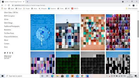
Website 1: Sabato Visconti (www.sabatobox.com)
Sabato Visconti covers a range of different Digital Art Themes such as:
· Glitch Art
· New Media
· Photography
· Illustration
Visconti displays his work by what theme is work comes under:
· Glitch Photography/ Post-Photography
· Glitch Video and GIF Art
· 3D Art and Animation
· ROM Corruption and Video Game Art
· Glitch Design and New Media
· Traditional Photography
· Illustration
· Curatorial Projects
At the bottom of the navigation list for this website is:
· About
· Press and Exhibitions
· Contact
· Store
Interface Features of Sabato Visconti’s Website:
Visconti sets out his website in a 4 row and 3 column display, however he doesn’t have a header bar in his website, instead he utilises the side navigation, and on mobile, the button of the hamburger menu that opens up on the left hand side of the screen, sits on the right.
The website does not harness a bottom navigation and Visconti’s social media links are listed in the side navigation, he also lists the insignia of the Creative Commons and the dates for when his website was founded and when it was last updated, being 2011-2021.
Pages and Collections
I studied two of the collections on this website, I studied the layout to check for continuity, as well as other features. The first of the collections that I decided to study is Glitch Photography and Post Photography.
At the top of the page, Visconti uses too much text to explain the section, and doesn’t not utilise a legible font face, the text actually takes up half of the collection page. The amount of text at the top of the page could actually drive people to look away for Visconti’s website.
The Ghosts of Brimfield Collection
All images used in this collection have the Red hover-overs with magnifying glasses on them in order to zoom in on the images in the collections. The grid system in place across the rest of the website is in place on this page, giving consistency to the general CSS of the website the grid System in place for the collections as a great mixture of sizes to display all the different parts of Visconti’s work. This gives a good sense of dimensionality and depth to Visconti’s collections.
Illustration Collection
In the Illustration collection, the same features regarding layout and also shows a huge depth in collection, there is no set theme for example, in this collection has aminated illustration as well as standard illustration.
Throughout Visconti’s website, formal language is used, giving the correct kind of tone and desired level of professionality. The layout of the website is exceptionally good and has a fantastic structure, and this structure gives a grounding for a huge amount of content to be displayed on the website, proving that content is king.


Website 2: Kelly Cooper Photography (www.kellycooperphotography.com)
This website is not as well laid out as Sabato Visconti’s website. There is not a huge amount of structure to the website.
A particularly good example of this is the fact that the website has a header, but it is not a sticky header, meaning that there is not constant navigation through the website. In the header, the logo is placed centrally in the header and below it, the other pages of the website are listed as follows:
· Gallery
· Business (ABOUT ME)
· Fashion & Editorial
· Photo Blog
This website has the contact details of the photographer listed at the bottom, however a huge similarity to Visconti’s website, is that both of them have no link to the CVs of either Cooper or Visconti. She has not listed her phone number in the 5-3-3, meaning it is not clearly listed.
The Photographer has not listed a professional email, e.g., an “info@_________________.com”, a Gmail email address has been listed, which is not hugely Professional.
They have used a small social media icon in order to list a link to the Instagram account associated with the website.
On the home page, the photos used are in a grid, but they need to be downsized, so as to make more room for content or so the page is not as vast.
About Page:
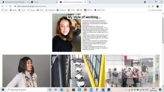
She uses a profile photo of herself and it is a good photo of her. Her about me section however is far too long. A good and catchy about section should be around 30-50 words, rather than 3 paragraphs. However, in the navigation in the header bar, the about me section is actually listed as business.
She lists her experience and location in the Business/About Me section. However, in fitting style to the rest of the website, all of the pictures used in the Business/About Me Section are overly large yet perfectly aligned. The size of the pictures causes too much space to be taken up by the photographs. However, the contact details and social media account are listed in the footer.

Full Site Critique
Across almost the whole website, all of the photograph’s used are far too big and could do with a downsize, so as to make more room for more content…. Unlike Visconti’s website, the space hasn’t been used wisely and content in this website is not king. Content being king in this website is non-existent, what this website does is show off a few pictures, in a neatly aligned grid, but it needs to show off more in the neatly aligned grids that she has used, not just 3 or 4 in a row. However, these grids give for fantastic organisation.
In a difference to nearly the rest of the website, the photo blog page actually uses a decent grid, and all of the photographs are all of a decent size and there is room for more on the page. The blog also carries relevant posts, with the surrounding theme being the work of the photographer.
The overall CSS of the website is pure white and is not hugely aesthetically pleasing, there are also no user interface features, not like Sabato Visconti’s website, where he has colour hover-overs implemented on all images and there are colour changing hovers on all of the titles on the navigation. In Kelly Cooper’s website, on the header navigation, there are white hover overs on the page headers.
The Gallery is no where near as organised on Kelly Cooper’s Website, as it is on Sabato Visconti’s website. Even though Kelly Cooper’s website does not hold as much content as Sabato Visconti’s website, but it requires the same level of organisation.
The way in which Sabato Visconti organises his website, is how I should aim to organise my own as my work comes under many different themes and can’t just smash them all together in to one page, I have to ensure that all of my work is organised in to the right theme so that it is clear that my work encompasses a myriad of different things, not just one. I need to show my versatility throughout my website and not just make myself look like a boring cookie cutter digital artist.
0 notes
Text
Blog Post 2: CV's
CVs are self-promotion documents, and you must ensure that you stand out from the crowd on a first glance. If you take a far glance at your own CV and it doesn’t stand out to you, then it won’t stand out to an employer. When an employer looks at my CV, they need to look at it and think “wow, I want her to work for me” and not think “She’s just another generic person, there are others that are better.” An employer has to want me in their company more than anyone else on their pile of CV’s.
The design of the CV also has to be relative to your industry/industries and not just a generic CV that someone would use to apply for a permanent part time job.
PHOTOGRAPHY CV’S
Features of the Photography CV posted Below:
· Name, Role, Phone, Website, E-Mail, and LinkedIn are all listed at the top.
· Brief personal statement listing some experience and current professional goals
· There is a list of all relevant experience and the dates this experience was earned.
· ONLY lists University Education, not all education
· Uses Progress bars to discuss hard and softskills. Progress Bars are a no go for use.
A photography CV like the one listed below are considerably basic and not cluttered, they are not too brightly coloured either.
If I were to look at the below CV as an Employer?
If I was an employer and I looked at the Photography CV below, then I would possibly show an interest due to the level of experience but the CV itself is very bland and would not necessarily catch my eye straight away.
Digital Design/Graphic Design CV
The second CV below is for Graphic Design, which shows a huge contrast to the Photography CV. However, there are some differences between the two styles of CV. The biggest difference between the two CVs is that the graphic design CV is very brightly coloured and has some patterning to make it stand out.
The features that are the same on the CV’s are:
· Name, Role, E-Mail, and are all listed at the top.
· Personal statement space at the top but too much space is left for it.
· There is space for a list of all relevant experience.
· All Education can be briefly listed
· Uses Progress bars to discuss skills. Progress Bars are not suitable for a strong CV.
The differences of the Graphic Design CV are:
· A Date of Birth has been listed
· A location has been listed
· A contact number has been provided
· There are drawn and coloured graphics to show that the person is a graphic designer, as well as the listed role.
General Comparison
Comparing these CVs has to be done carefully as photography and digital design are two hugely different disciplines.
The digital design CV is vibrant and stands out really well as it is vibrant and colourful, and shows strong skill in the discipline, with regard to the design and layout of the CV. The Photography CV is quite bland and boring compared to the Digital Design. For my CV to stand out, I need to have a good balance of CV Styles as I am looking at both industries, my CV needs to stand out but also be understated as well.


0 notes
Text
Blog Post 1- Industry Research
AMATEUR PHOTOGRAPHY
Photography is the art, application, and practice of creating long lasting images through the recording of light, either electronically or chemically using a light sensitive material like photographic film. Photography is employed in a range of scientific fields, as well as manufacturing and business, and of course its direct uses, such as art, film and video production and recreational uses, such as a hobby or as a directive of mass communication.
Photography typically uses a lens to focus the light that has either been emitted or reflected from objects that then make a real image on the light sensitive surface inside the camera during a timed exposure. With an electronic image sensor, an electronic charge is produced with each pixel and these are then processed electronically and digitally stored in a digital image file, for either future display or further processing.
Photographic emulsion gives the result of an invisible, but latent image which will later be chemically developed into a visible image, either positive or negative, depending on a couple of factors, and they are the purpose of the photographic material, and the processing method. A negative image on photographic film is traditionally used to create a positive image on a paper base. This is usually referred to as a print, and this is created using an enlarger or through contact printing.
WHAT DOES AN AMATEUR PHOTOGRAPHER DO?
An amateur photographer practices photography as a hobby or as a passion, not necessarily to make money. The work of some amateur photographers can be compared to that of many professional photographers and will either be highly specialised or eclectic in subject choice. Amateur photography is sometimes pre-eminent in the subjects being used as they have very minute commercial use prospects or any prospects of monetary gain for the photographer.
The growth of Amateur photography began in the late 19thCentury following a meteoric rise in popularity of hand-held cameras. In the present times, photography is so widely spread through social media and this has been aided by the evolution of photography equipment and platforms as well. The change in the equipment used for photography, like mobile phones with cameras that have also aided the progression of actual photo quality, have meant that photography has had its accessibility blown wide open.
(Wikipedia.org, 2021)
DIGITAL ART
Digital Visual Art consists of either 2D visual information shown on an electronic visual display or 3D information that has been mathematically translated from 2D information, which is then viewed through perspective projection on an electronic visual display.
The simplest form of this is 2D Computer Graphics which may be a basic reflection of how one may draw with a pen or pencil and a piece of paper. In the instance of 2D Computer Graphics, the image is on the screen and the drawing implement is either a tablet stylus or a computer mouse. What is then generated on the screen has the appearance of a pencil, pen, or paintbrush.
The second kind of computer generated digital art is 3D computer graphics, in which the screen is the window into a virtual setting, and this becomes where objects are arranged to be “photographed” by the computer.
Typically, 2D computer graphics are comprised of raster graphics, their primary means of source representation, differentiating from 3D computer graphics which make use of vector graphics in order to create immersive VR installations. A third and final possible variation is the generation of 2D or 3D art through the sole use of algorithms that are embedded in computer programmes. This can be considered as the native form of computer art and the introduction to the history of computer art. This introduction can be found in an interview with the pioneer of computer generated art, Frieder Nake (Wikipedia.org, 2021).
Fractal Art, Data moshing, and algorithmic art, alongside real-time generative art are a few other examples.
(Wikipedia.org, 2021)
DIGITAL ILLUSTRATION
Digital or Computer illustration is the use of digital tools to create images that have been directly manipulated by the artist. This is usually done through the use of a pointing device like a tablet stylus or a computer mouse. Digital harness mathematical models that are created by the artist. Digital Illustration can be separated easily from digital photo manipulation, what that means is that it is constructed from original designs and photos. Photographs are not usually the main base for Digital Illustration.
Illustration Software
There are two main types of application that are used for Digital Illustration:
· Bitmap Applications- Adobe Photoshop
· Vector Applications- Adobe Illustrator
Bitmap Applications:
Bitmap Applications are usually referred to as painting applications. With a bitmap application, the content is stored digitally in fixed rows and columns of pixels, which can be transformed into separate layers which can be isolated for easier manipulation of different parts of the image.
A bitmap image contains information regarding the hue, luminance, and saturation of each pixel. When the pointing device moves over a pixelated area of the image, new colours and values are applied to the underlaying pixels. Painting tools allow for the simple creation of “fuzzy” imagery, including glow or soft shadow effects and textures such as fur, velvet, stone, and skin and these are hugely used in photo retouching.
Vector Applications:
The second kind of digital illustration application is a Vector Application. Vector applications are more commonly referred to as drawing applications. It is referred to in this manor due to the differences in appearance of final products between the two applications, with regard to the look and feel.
Within vector based tools, the content is stored digitally as a resolution independent mathematical formula describing open paths (lines), closed paths (shapes), as well as colour fills, strokes, and gradients. Vector paths are built up of anchor points and paths segments by using the pointing device to click and move. Many vector graphics are readily available from internet databases which are editable and can be used for larger projects. Drawing tools can draw precise lines, shapes and patterns with well defined edges and are great for working with big constructions such as maps and typography.
Digital may include both vector and raster graphics in the same work. A bitmap file may be saved in a format which embeds a layer of vector information, and a vector image file may include imported bitmap images.
Digital Techniques:
Photo bashing is a technique that is mostly used by Concept Artists. The process involves the artist blending and merging photographs and/or 3D Assets as well as painting, so they can create a composite art piece. This technique is similar to the process of compositing in video editing. Concept artists use this technique to increase the accuracy of the piece but also to aide their productivity.
(Wikipedia.org, 2021)
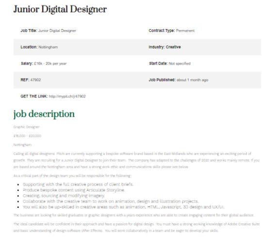
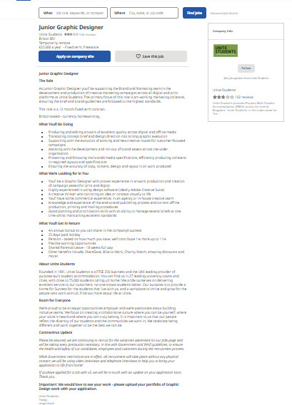
JUNIOR DIGITAL DESIGNER JOBS
To fulfil a job such as a Junior Digital Designer, I need to have a range of skills such as:
· Animation
· HTML
· JavaScript
· 3D Design
· UX/UI Design
As a part of a team of designers I’d have to share the collective responsibility of:
· Client support during the creative process
· Produce bespoke content using articulate storyline
· Creating, sourcing, and modifying imagery
· Collaborative with the creative team to work on animation, illustration, and design projects.
I’d need to have a strong working knowledge of Adobe Creative Suite and a basic knowledge of design software such as After Effects.
I’d need to be a graduate or graphic designer with one year experience and be able to create engaging content for a global audience. I would work collaboratively in a team with an eagerness to develop my skills.
1 note
·
View note
