
Essay blog of VaryuPon. Discussion, analysis and demonstrations for fun, and to start conversations or answer questions. I use this blog to dump information boiling in my head, and to demonstrate what I've learned in my education and how to apply it.
Don't wanna be here? Send us removal request.
Statistics
We looked inside some of the posts by dialogue-with-varyu and here's what we found interesting.
Average Info
Notes Per Post
5K
Likes Per Post
3K
Reblog Per Post
2K
Reply Per Post
10
Time Between Posts
1 month
Number of Posts By Type
Text
8
Photo
2
Last Seen Tumblr Blogs


Fun Fact
Tumblr’s website traffic is steadily declining.
Text
You know, I view myself as an “animator.” But it’d be inaccurate to call me an “animation fan/connoisseur”.
I feel like I have to make this distinction, because there is a big difference and yes, you can exist as a person who can be one or the other, neither, or both in tandem.
I dip into Disney/Miyazaki/big production named titans of the industry because it’s worth learning from. But you can do this without being a junkie.
It’s not that I’m detached from other creators--but I am willing to admit that I really dislike looking at things/having been shown things just because it’s “animated.” Like with anything else, I have standards for what can grace my eyeballs. Do you eat anything that calls itself “food?”
While there is a lot of good stuff out there, THERE IS ALSO A LOT OF CRAP.
And in this case, my definition of “crap” can range from things I’m simply disinterested in, or actual honest to god really bad stuff.
The point I’m making here is that what media you consume DOES influence you in one way or another, whether you like it or not. It can affect your subconscious, to the point where what you have consumed has become a part of you.
Especially when you’re young, you’re highly impressionable. I understand this about myself, so I have to exercise my own self-restraint and cultivate the ability to sift through the things that can potentially influence me.
“Art advice” half the time isn’t even really “advice” anyway. Artists can have biases without hurting others based on tastes. Artists can spare their biases without charging it with rhetoric and mislead people into thinking a certain way. It can happen. But only if you’re willing to let your pride GO.
What I’m trying to get at is the whole “writers vs. artist” war I’ve seen around is bullshit. The “conversation” around visual style is also bullshit. The investment in perfect “originality” and “being unique” is also bullshit.
And I say this because I always counter these “issues” that are brought up with a single question:
At what point in your life when you were young, when you were told “you could do anything in art” suddenly turned into *insert issue here.*
At what point in your life did that change?
Oh, right.
You read that bullshit on the internet. Or you were told.
Stop. Sift that crap out with the sieve of education, your own self worth, your own biases and your own critical thinking skills.
Question fucking everything. Question this post even! I don’t care! YOU DO YOU!
3 notes
·
View notes
Photo

4K notes
·
View notes
Text
KINGDOM HEARTS: BO PEEP THEORY

(Went a little nuts after cruising some KH posts on @mheartz‘s blog lmao) Oh and spoilers for kh dream drop distance.
OK so this is more of a theory on the plot of Toy Story 4 than Kingdom Hearts bUT HEAR ME OUT FOR LIKE 5 SECONDS
when the D23 trailer dropped I didn’t get what was so hype about Toy Story.
As in, why the Toy Story world being CANON in Kingdom Hearts III matters at all. (Courtesy to KHInsider.com/@khinsider)

But then I read the current revealed plot synopsis of TOY STORY 4:
In March 2015, Pixar president Jim Morris stated that the film will not be a continuation of the third film but will instead be a stand-alone sequel.[25][26] ...In August 2015, at the D23 Expo, Lasseter stated that the film would focus on the romance between Woody and Bo Peep.[29] Its story will be built on the fact that Bo Peep was absent from the main story in Toy Story 3, with Woody and Buzz trying to find and bring her back.
Knowing Pixar, there are about a million ways to string a plot around from a premise like this. To be honest though, having the Bo Peep as we know it from TS 1 & 2 being the focus would be...kinda bland.
They’d have to make some sort of obstacle to keep a 1-2 hour long movie fresh. There’s no way an entire movie would be made without a change like this. It would’ve just been just been a Toy Story short then.
So I’m betting my money Bo Peep might be the antagonist of the movie.
Disney properties love their twist villains nowadays anyway.
But here’s the kicker:


We never saw what became of her between Toy Story 2 & 3.
But KH3 is right inbetween the Toy Story 2 & 3 canon!
Can it be that we may find out what happened to her? Maaaaybe include the fact that a little someone is interested in maybe breaking a few toys????

listen, we never saw all the identities of the 13 norts in KH3D, and as we know, even other people can be part of Xehanort


I’M CALLING IT: BO PEEP IS LOST DURING THE EVENTS OF KH3 AND QUITE POSSIBLY GOT NORTED LEADING TO THE EVENTS OF A POSSIBLE ARC THAT WILL SET UP THE EVENTS OF TOY STORY 4.
LOOK I EVEN GOT HER NORTED STATS ALL UP

AND UNTIL SQUARE ENIX STOPS BEING A CHICKENSHIT AND ACTUALLY GIVES US THE DAMN GAME THIS THEORY MAY AS WELL BE CANON
ESPECIALLY SINCE DISNEY IS INTERESTED IN A KH CINEMATIC MOVIE:


Thus ends my very plausible crack theory.
11 notes
·
View notes
Text
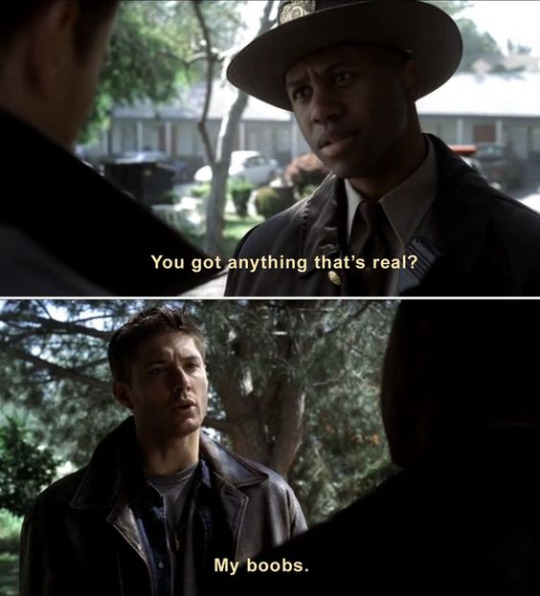
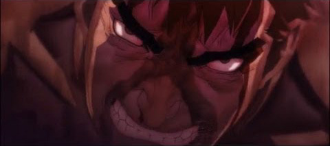
SUPERNATURAL THE ANIMATION: A Dissection of Dean's Failed Characterization & Design (Part 3- The REALLY Funky Shit)

...I can’t believe I’m going to have to explain this oddity, but here goes.

There is this moment in this episode of the Supernatural anime titled “What Is and What Should Never Be” that is so off that a small thread of reactions like these occurred

These are not YouTube comments over exaggerating in the slightest. Compared to YT hell, these comments are pretty tame.
“What could they possibly referring to” the blissfully ignorant may ask.
I, the traumatized victim of awful directorial choices would like to present these lovely screencaps as well as my candid reaction of the time of first viewing:


NOOO WHAT THE HELL!!!!!

NOOOO DON’T DO A CLOSE UP THAT IS LITERALLY THE WORST THING YOU CAN DO HERE!!!!!

I KNOW SPN IS ALSO KNOWN FOR MELODRAMATIC CLOSE UPS BUT THIS ISN’T ONE OF THEM!!!

IS THIS SEQUENCE DONE YET????

OH THANK GOD OH THANK GOD IT’S OVER OH SWEET BABY JESUS.
Now, someone go gif that sequence for me for science.
Alrighty, so...I have some sort of semblance of an explanation for this...
Because yes, this sequence actually had logic behind it--but that logic won’t make it a better sequence. But it WILL at least quell the mind of wondering about it’s origin.
Before I can explain what went down, I first have to explain how anime is handled. Not made. HANDLED.
My first essay of this series was mostly about anime in a production standpoint. But what I’m covering today is mostly on technical conventions of animation as a whole and how anime relates to these techniques. Western animation established 12 key principles.
The thing is, I can dump exposition on animation basics but I am going to ignore that. Why? Because anime by in large ignores most key principles of animation.
The main point is, if Western animation is drawn with fluid movement in mind conveyed with simplified and exaggerated designs, anime is somewhat the opposite. Japanese animation built their industry by creating shows with striking visuals over well-animated sequences. This is a limitation that permeates the industry today.

Meaning, with such limitations, techniques to express emotions visually rather than through movement is somewhat trademark to anime.
When you ask why the hell anime uses weird marking over expressions, it is due to just that: Anime is highly dependent on symbolic techniques that suggest emotion rather than portraying them.

But times are changing, and animators in Japan have recently conveyed a want to break away from these norms.
This is the kind of reasoning which led to the drastic changes in character design these past few years

youtube
Animators in Japan WANT to start implementing kinetic motion by sacrificing character design!
youtube
The thing is, this is more recent news when it comes to the anime industry and the voices of concern.
These voices were mostly quiet up until now. The Supernatural anime aired in 2011--meaning the show was made by in large around 2010. These concerns weren’t voiced much as far as the West is able to get translated info on, and the transition of change seem to be rolling in more recent times than any time else in the past 5 years.
And with this scary odd sequence we have, yes, I am suggesting this sequence in the episode was indeed INTENTIONAL. The art did not melt on it’s own. Someone deliberately drew this, and someone deliberately approved of it to be colored and composited on film.
However, this is not exactly a sequence that best describes squash and stretch.
But with what can be discerned from this information, a not entirely far-fetched but unpleasant answer is provided:
This
youtube
This sequence is an example of industrial cynicism. Of misguided techniques.
This sequence is what you get when you attempt to compromise two polarizing conventions and they are:
“What would happen if we squashed the face to insinuate the idea of squash and stretch while also distorting the facial imagery to convey the feeling of crying instead of just actually drawing him crying with adequate emotion?”
Or basically:
Let’s not draw adequate emotions
but you’re free to distort the face to symbolize the emotion via squash and stretch techniques
While this may be all conjecture, it’s still a pretty close hypothesis in tackling this weird scene.
But if anyone else has a better theory, I’d love to hear it.
40 notes
·
View notes
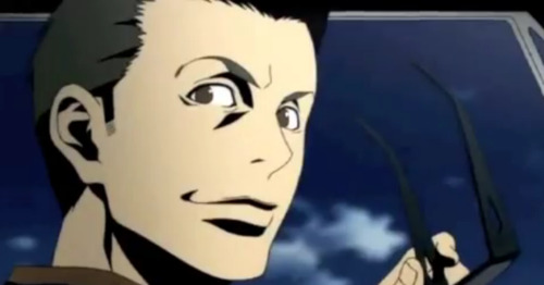
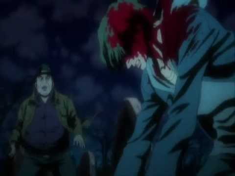
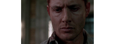
Photo

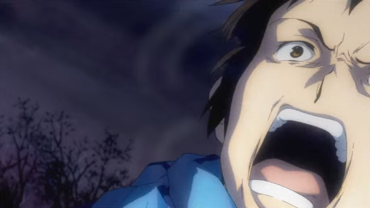
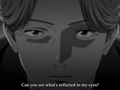
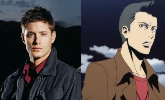
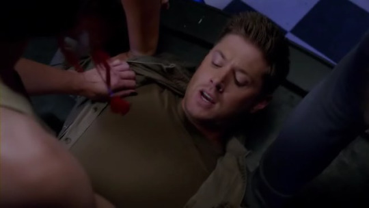
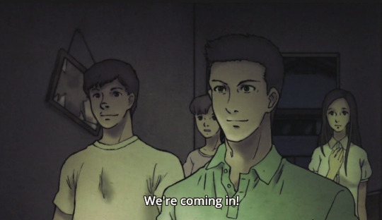
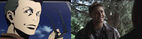
The supernatural anime won’t allow me to sleep for shit like this.
Did no one look at this and think to themselves, “hey, Dean with wet hair looks like...actual Jensen Ackles here where did we go wrong?”
10 notes
·
View notes
Text
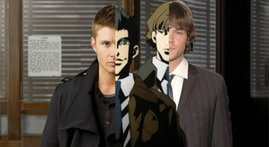
SUPERNATURAL THE ANIMATION: A Dissection of Dean’s Failed Characterization & Design (PART 2 - The Dream Team)
In part one of this dissection, I covered the technical/cultural aspects of Dean’s character designs and the failures of the nuances.
In the essays I wrote about the character designs prefacing this dissection, I claimed that the spn anime’s design look is not a bad one. Generic as fuck, but not without technique.
In this essay, I’ll cover how anime can still achieve favorable characteristics in character designs despite cultural limitations. This will be a breakdown on comparing other existing designs that could’ve been referenced to enhance the believably of the character designs in the Supernatural anime.
As a disclaimer, I am only using a combination of my personal tastes in anime and the interpretation of the original character designer of the spn anime and how the designs can be built upon further to appear more tasteful/closer to the original soul of the live action Supernatural series.
You can totally disagree with how I may literally draw out my conclusion as an “improvement” of these character designs--but the purpose of these essays is to hopefully add some educational merit through retrospective research when talking about the Supernatural animated series.
Mostly because I think it’s very unfair for people to rag on a show that clearly could’ve had even LESS effort put into it.
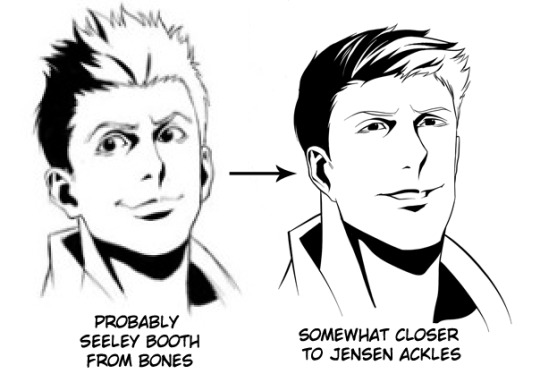
Here’s my dream team of existing character designs that could’ve easily been referenced in order to translate Supernatural characters into anime.
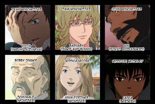
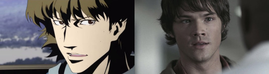
Dean


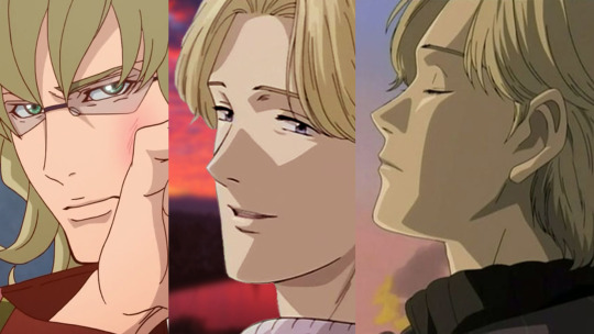
My influences for making an improved Dean character design would draw from Kyon from The Melancholy of Haruhi Suzumiya, Guts from Berserk, and Kotetsu from TIGER & BUNNY.
I used Guts at length as an example in my last few essays, so if you want a breakdown on why he’s a good choice to reference, please read those.
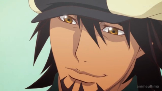
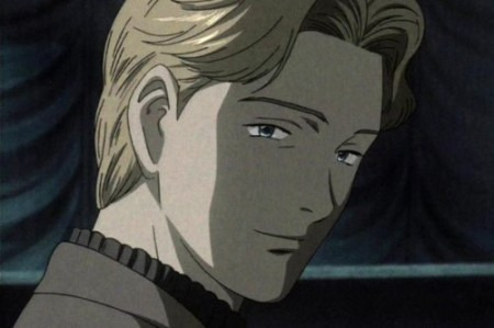
Kotetsu’s design stuck out in my head since, especially when paired to Barnaby (my pick for Sam), looks fairly close to what I infer the character designer of the spn anime wanted Dean to look like. I know that TIGER & BUNNY aired later than the spn anime despite being released in the same year, (2011) but that just makes it all the more ironic.
Because it’s the same style. ( Especially if you look at the way his smile is drawn.) Yet the execution of the spn anime leaves much to be desired, amazingly enough.
Kotetsu appears much more cool and suave (instead of thuggish) while still exhibiting the same sort of attractive easy-going personality as well as having an air of mystery to him.
It’s an ideal design for showcasing Dean’s fake bravado persona established in season 1, but really only that.
This brings me to Kyon
Who’s design can definitely embody Dean’s own insecurities or the more “real” version of the hunter we know. (As clued in by later episodes.)
Kyon’s a great fit for the flip side of the emotional spectrum--serving as the cold and tortured side to Dean against the warmth that Kotetsu’s design can bring to Dean.

Also I’m totally choosing him outta spite towards those who believe that “moe” anime with the stereotypical big googly-eyes can’t be overtly expressive visually. Sorry MADHOUSE, but there are other ways to show a character of Dean’s nature than using a highly exaggerated version of the “cool rebel thug dude.” KyoAni strikes another win here.
Not to mention his body features are closer to Dean’s than Kotestu’s.
Kotetsu may hold the merits of the spn snime’s style, but if I wanted a true Dean Winchester interpretation, I’d choose Kyon to draw inspiration from.
Sam
While the spn anime did Sam decently there’s still room for improvement. If anything, there really isn’t much deviation from Barnaby’s design from TIGER & BUNNY and the original. But again, this style is much more sleek and non-threatening in it’s visual tone leaving room for variation if the color design calls for it.
Which leaves Johan from Naoki Urasawa’s MONSTER.
I just really prefer the hair in Johan’s design which of course is instrumental in making Sam, SAM. But more so, especially since the spn anime is adapting season 1 & 2 where Sam has special telekenetic abilities, it’d be nice if they could instigate the threat of that visually in Sam’s design.
Just looking at Johan clues you in that something’s up despite doing the contrary of his true intent. Any masterful design is able to communicate complexities like this, even at their most blatant.
A great question that every character designer should aspire to answer, honestly.
At this point, I can see Sam and Dean theoretically through other character designs.

John Winchester

John’s design mishap never fails to amuse me. Because you know

...That’s not John, that’s Benny.

Even without the hat it’s still Benny.
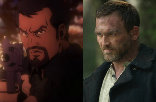
I laugh forever and will never ever recover from this like ever.
Gin from Tokyo Godfathers is a much closer match save the mullet but hey it ain’t Benny at least.
Bobby Singer
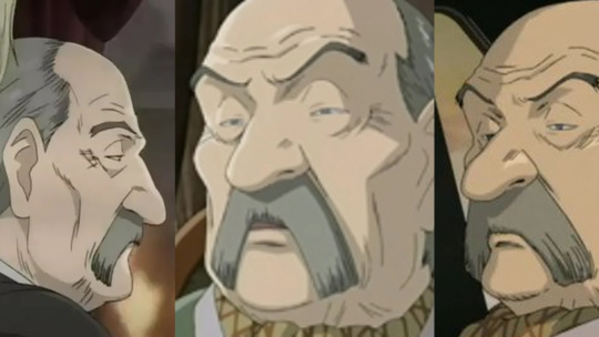
...Bobby’s design mishap is less amusing by a whole lot.
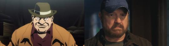
Anything, literally anything could’ve been better. I didn’t have to find an anime doppelganger but I did it anyway because....because there needs to be SOME justice in the world.
I’m so sorry Bobby.
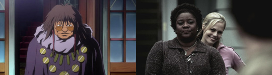
Jessica Moore
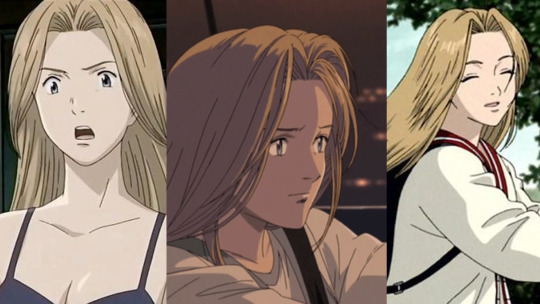
I mean just look at her.

I don’t know who this purple-haired chick is, but it’s not Jessica. Nina Fortner from MONSTER is pretty much Jessica all the way, down to being a university student.
Missouri Moseley
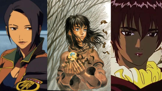
Missouri’s design is the most tragic out of all of them. It’s not like we see a lot of black women in anime if at all. This was their chance to really change that. And what did they do?
Just.
Again, anything would’ve been better. Elvy from Rahxephon has the attitude and Casca from Berserk 1997 has the heart and a face that conveys the sharpness the original Missouri had, which is what I’ll be looking at towards improvements.
From here, I’m going to focus more on key design traits/techniques and how they affect visual narrative and overall emotion and how these aspects can be translated into the BL character design of the spn anime.
NOW IT’S TIME FOR REDRAWS!!!!!
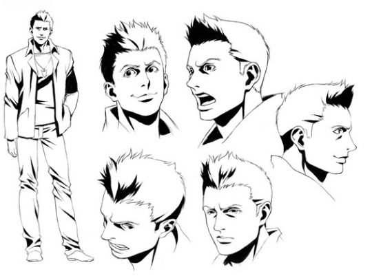
DEAN

SAM


BOBBY

MISSOURI
I did my best voila.
I’ll reorganize these in a better master post later.
83 notes
·
View notes
Text
SUPERNATURAL THE ANIMATION: A Dissection of Dean’s Failed Characterization & Design (PART 1 - The Technicals)
I have a lot on my chest about the anime that I couldn’t really get into in both of my last posts since the topic of what makes the anime series so cringe-worthy is a very intricate one, making the explanation of it all become a SERIES OF ESSAYS. So please read my previous installments before getting into this one because I will be referencing those a lot:
SUPERNATURAL THE ANIMATION: A THESIS OVERVIEW ON JAPANESE ANIME PRODUCTION & CHARACTER DESIGN
SUPERNATURAL THE ANIMATION: THE IMPORTANCE COLOR DESIGN BRINGS TO VISUAL TONE
But anyway, let’s talk about Dean. I’m gonna talk about Dean.
I will talk about Dean because Sam was portrayed pretty okay in the anime and it’s really Dean’s characterization that strikes a chord with a lot of fans of the original Supernatural series. (However I will consider a separate Sam essay to those in favor of it.)
But I haven’t really seen a lot of people put into words about makes them feel the way they do. So what’s the problem with Dean?
Refresher:
While I understand this distinction, I think that we can all agree that the overall interpretation of Dean suck balls and I’d like to argue that:
rather than misinterpreting Dean’s character, the writers were more focused on one of Dean’s major facades and ran with it.
But I’m getting ahead of myself.
First, I’d like to address the elephant in the room: Why an anime series?
Why did Supernatural garner enough attention to GET an anime series? What is so special about Supernatural AND anime that a large group of creatives and investors were willing to marry the two?
Honestly, that question is big enough for another essay on it’s own. But the bottom line is:
Anime is watched for the melodrama.
Nuance and subtitles are more akin to live action film since the culture around the different intricacies of a story have larger factors that contribute to it. (i.e, it doesn’t matter what’s written because an actor may just ad-lib it, Murphey’s Law, etc.)
So basically, when you have an animated show what you see is what you get by convention. There really is no use arguing over what is canon and what is not because, unlike an actor, decisions and change of mind can’t be attributed in the moment when it comes to character performance. People are more likely to question the mindset of a decision behind a scene when it’s animated more often than leaving it to the death of the author.
But it’s because of this that anime often has namely traits of exaggeration: screaming characters crying about their passion in the heat of battle, long ass internal monologues, “-dere” archetypes, the works.
Which means that anime characters are usually walking talking hyperbolic symbols. (Whether or not you enjoy this is usually the deciding factor between anime fans and those who are not.)
And this ties directly into Dean.
Because Dean in the anime series is an exaggeration of himself from the original show.
Rather, an exaggeration of one specific facade:
The facade Dean pulls up in season one episode 1. The fake Dean that tends to overcompensate his insecurities with bravado.
WHY this scene in particular is one that actually makes sense.
Mostly because this scene IS a if not THE root scene that cemented Dean Winchester’s starting point launching endless possibilities of character traits to be explored for seasons to come. It’s a highly impacted scene that’s very memorable, both in it’s first impressions and as a point of reference for his development.
I infer that the writers of the anime series saw this and built upon their own impressions of it. Namely, they saw this facade and thought this was the True Dean Winchester. (Which, to those who have watched past season 2, know is very far from the truth.)
So how did they write Dean Winchester?
Dean Winchester is perceived to be like a generic anime bad boy
(I say “perceived” since by all means the Supernatural anime is a reinterpretation with very deliberate changes.)
What I’m talking about are those “thug” type bullies in every school centered anime show.
And while I make the claim that the writers may have built off of the scene from the pilot in painting a picture of Dean’s character in their heads, I’m also led to believe that this decision to have Dean come off as a “thug” is less of a conscious choice...
...and more of a conventional one.
Because nothing fits Fake Bravado Dean like Generic Anime Thug Dude when it comes to a script laden with anime-like tropes.
(To make a more compelling dissection of the writer’s true interpretation of Dean SPECIFICALLY would require me to rewatch and analyze ALL of the anime’s original standalone episodes.
...for the sake of brevity and the fact that I don’t want to rewatch any of the anime’s episodes in it’s entirety because I can’t stand even 5 seconds of this animated drivel I Am Not Going to Do That unless a lot of people ask about it or if people just wanna see me suffer.)
But okay, it’s sort of weird to gauge the errors of Dean’s characterization when this anime series nearly follows the original show’s 1st and 2nd season’s storylines verbatim.
Now that I think about it, it’s even weirder to be so allergic to an interpretation of a character when the source material is being 99.9% faithfully adapted--especially with the same lines and set up. So what gives?
What makes anime Dean’s characterization so off from the original to a drastic degree?
The “mischaracterization” is greatly tied into Dean’s character design and the way he emotes--which affects him greatly on the narrative of the anime series as a whole.
I already criticized the character designs in the lack of coherence in color design as well as execution narratively, but the latter still stands to be a huge major problem since it does just that.
Affect the narrative.
Which means it also affects the characters and the themes.
Which ties back again to Dean being perceived as an anime thug.
And I know this because Dean makes the same goddamn faces as an anime thug.
(In this case I’ll be referencing Space Dandy since I can’t find generic anime examples of side characters that embody this profile despite this stereotype and it’s mannerisms invading vast amounts of shows. However anyone who has seen enough anime will know what I’m talking about. And again, the “look” given by the artistic nuances/techniques of the character design of the anime series is not very original.)
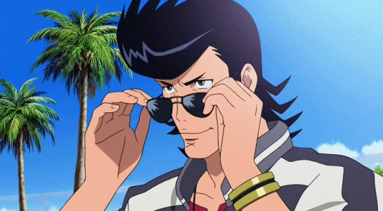
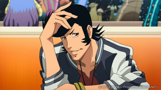

You know what, as an aside I’m just going to throw in the fact that Space Dandy’s “look” is very similar to to the spn anime down to the BL shadows in which Dandy is compared with Redline
And that Jessica is totally generically designed
Anyway, this extends further than Dean’s facial expressions alone.
It extends to his wardrobe which totally starts to unhinge Dean’s persona. oddly enough.
So here’s a round of nit-picking
Why in god’s name is Dean wearing sunglasses indoors? He already went through an entire spiel about ineffectiveness at night
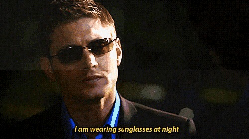
and it’s not like having it indoors makes it any less ridiculous. And yes, he does wear them again in later seasons both unironically and ironically
But these cues of character insight (that people have written far better meta for) is in the context of later seasons and I highly doubt the anime production team could’ve predicted any of this so I’m just going to have a giant ????? over this.
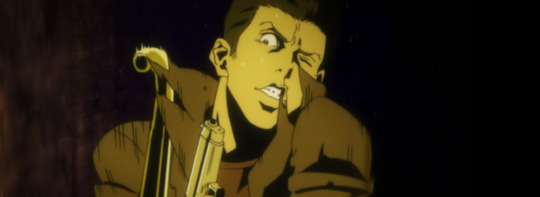
Back to this awful screenshot again.
But seriously, anyone shirtless in the snow deserves to die of hypothermia.
Dean is the last person to feel comfortable with minimal clothing due to years of sexual harassment/assault from CREATURES more often than not
Even more so whenever Dean is naked, it’s used more for vulnerability over titillation:
I hate this stupid screenshot.
It is awful, why? Because anime characters rarely stray from their trope mannerisms unless the story calls for it, or the animators dedicate some time to create impressive sakuga for novelty’s sake. If Dean has body language like this now, that mean’s he’s likely going to exhibit it again no matter what the context is in terms of story or character.

Leading to this abomination.
I know what you are doing. I get it. I KNOW.
I KNOW YOU’RE DRAWING DEAN THIS WAY BECAUSE APPARENTLY TO YOU DEAN IS AN ANIME THUG WHICH MEANS ANIME THUGS EXHIBIT THIS KIND OF UNCARING BODY LANGUAGE BUT NEED WE FORGET THAT DEAN LOVES HIS CAR MORE THAN LIFE ITSELF
HAVING HIS SHOES AGAINST THE SEAT OR ANYWHERE NEAR THE LEATHER IS THE SAME AS DEFECATING ON IT. ARE YOU SERIOUS RN??? THAT’S LIKE THE ONE THING DEAN WINCHESTER IS ALL ABOUT AND IS SOMETHING THAT SHOULD NOT BE FORGOTTEN ESPECIALLY WHEN IT CAME TO DEVELOPMENTS OF DEMON!DEAN
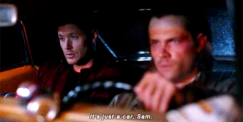
This...this shit I can’t forgive. This is so absent-minded it physically hurts me. I can’t be the only one bothered by this.
Addendum: I don’t even really care if that’s NOT the impala (in this episode of the anime Sam and Dean were thrown into the backseat of a police car.) I still don’t think Dean would EVER exhibit this sort of body language in any car.
It also still doesn’t excuse the lack of variety in Dean’s emoting and body language as a whole. You could do so much storytelling in his body language (since Jensen Ackles is a master at that) but they instead chose to stick with a template of a character and never strayed from it.
But...I digress.
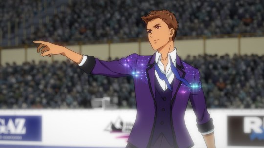
Incidentally of all places Yuri!! On Ice has closer character designs of Sam and Dean that for some virulent reason exists (Also incidentally, if you so much as breathe the title of YOI you will be immediately blocked I am not joking around. Don’t test me.)
As does Yami Shibai
So it’s not like a competent/more modern design tailored to anime is impossible.
It is very possible. So if you have your defense that the character designs of the spn anime are inherently horrible BECAUSE it’s supposed to “look anime” you’re probably just suffering from media illiteracy.
However, again, I made claim that the “style” of the Supernatural anime character designs are not what make it fail.
It’s the execution of nuances that killed it--both visually and narratively. And I still stand by that.
To form examples, that means more design redraws!!!
However, the redraws this time around will have it’s own separate post since the inner working of what can make or break a design will be discussed and demonstrated there.
SEE YOU IN PART 2!!!
57 notes
·
View notes
Text
“Brigadoon: Marin to Melan” IS A PASSION PROJECT: An Overview of What the Show Collectively Is

I don’t believe that anyone who wanted to get invested in Brigadoon (presently, or back when it first aired) took the show for what it could achieve on a technical level, but more on what it ultimately is at heart. (The one thing that has expanded Brigadoon’s longevity IS it’s central heart between the main characters.)
And the one thing that isn’t often addressed when it comes to discussing this show is Brigadoon being a passion project of the /creator director–Yoshitomo Yonetani. And this essay is a breakdown of what Brigadoon ultimately IS in the eyes of it’s creator. And to shed some light on what else can be appreciated about this show beyond technical achievements.
Brigadoon is simply an amalgamation of Yonetani’s interests and his interests alone.

By watching the series and the bonus material around it, you can most definitely pin-point Yonetani’s interests. One of the bigger ones being:
#1 Yonetani is a mecha otaku.
It’s kind of a no-brainer since Brigadoon itself has mechs in it. But even more so when you realize that his other directorial works have been on works such as Betterman, King of Braves: GaoGaiGar, and TIGER & BUNNY.


And I mention that he’s an otaku because he’s pretty flamboyant when it comes to his interests especially when it comes to his wardrobe choices, like when he donned beast-eyeball glasses in the Brigadoon featurette. (as well as the pic above.)

Yonetani certainly doesn’t hold back when it comes to his interests, and Brigadoon continues to be testament to that.
#2 He’s a pervert
It’s sort of an odd thing to mention since perversion is wide and diverse and nearly trademark to anime content, but perversion is often a consistent aspect of Yonetani’s work, only because it’s a big part of his personality and tastes.
Anyone who has watched the show will consistently ask WHY is there so much panty shot from a 13-year-old girl in this show?

WHY are there so many suggestive and often times off-putting scenes used for comedic effect among any other form of comedy?


WHY does Poikun seem to be this huge walking innuendo?

Really, all you need to understand is that being a pervert is one of Yonetani’s traits.
And honestly, when you read his body of directorial works, you will evidently see Food Wars! Shokugeki no Soma listed as his more recent work.
Because of course it is.

Yonetani just likes this sort of stuff. And everything starts to click from there…
#3 Yonetani is a huge fan of food.
Shokugeki no Soma notwithstanding, if you take a couple of seconds to scroll through his twitter, most if not all of his tweets are food blogging.

All of a sudden, it’s not at all hard to understand WHY there’s a character who eats in every single scene.

Yonetani sometimes makes direct reference to his favorite foods, like the hallucinogenic chocolate flavors in episode 15 were inspired by LOOK ala mode chocolates.


#4 Yonetani is a fan of obscure art techniques.
Claymation is definitely a favorite of his, which is what made him go an extra mile for the after credits extras:
youtube
And it’s no mistake that when he went on to show/create new material in dedication to the show 12 years later, he chose to make a clay sculpture:

In relation, he spoke once via twitter that even the art direction of Brigadoon’s case design (uses of transparency and color) is inspired by the Crimson Collection:


#5 Brigadoon is set in his hometown
It’s not uncommon to have real locations as settings for a show, but Brigadoon falls into an intimate category wherein Yonetani “wrote what he knows” because he’s lived there. (More location comparisons in the #trivia tag)


The Nezu Shrine in particular is a popular pilgrimage site among the Japanese fanbase as a classic location and commemoration where Marin and Melan first meet. Fans go out of their way to visit the location even today.

#6 He’s a mythology nerd
“Brigadoon” in and of itself is a reference

but Yonetani takes it a step further with the terminology used in the anime. Names are centered around Greek characters and once translated to Japanese they create the words we see here:
パスカ(Pasca) → “Easter"(復活祭)= [Πάσχα] クレイス(Creis) → ”Key“(鍵)= [κλείς] クロマ (Chroma) → ”Color“(色)= [χρώμα] サヴマトン・カラー (Submaton Color) → ”Wonder“(ふしぎ)= [χώρα θαυμάτων]メラン (Melan) → ”Black“(黒)= [μελαν] エリュン (Erin/Eryun) → ”Red“(赤)= [ερυθρον] パイオン (Pyon) → ”Ash“(灰)= [φαιον] ポイクン (Poikun) → ”Purple“(紫)= [φοινικουν] クシャトーン (Kushatohn) → ”Yellow“(黄)= [ξανθον] クストン (Kuston) → ”Maroon“(栗色)= [κάστανο] レウコン (Reikon) → ”White“(白)= [λευκό]
(Name origins post HERE.)
There honestly is no particular reason why the names are as they are, but if Betterman’s dense allusions are any indication, it’s that Yonetani simply enjoys various forms of mythology.

I can really go on on how many other aspects of Yonetani’s interests, personality and themes fill Brigadoon to the brim, but I’m sure I mentioned most of the big ones.
tl;dr version:
Brigadoon IS Yoshitomo Yonetani. It is a work dear to his heart and is considered to be his magnum opus when it comes to everything that makes him HIM.
And maybe instead of viewing the series as solely a mess of tropes, allusions, characters and genres, maybe step back and appreciate or try to understand that there are some bodies of work that were never meant to appeal to a wider audience, but to instead present what is dear to a single person.
That isn’t to say that passion projects can’t be revolutionary.
Neon Genesis Evangelion is one such example that has arguably changed the scope of anime forever, but never forget that Eva is a piece of work Anno wished to be a form of communication FIRST and revolutionary anime SECOND.


But one of the more defining work Anno has done would be DAICON III, which can’t explain what a passion project is any better:
youtube
The purpose of this essay is not to defend Brigadoon’s flaws necessarily, but to provide insight on certain body of work’s goal from the perspective of the creator over the perspective of the viewers or commercial value.
So that perhaps, maybe you can form an understanding why projects such as Kung Fury are made
youtube
Or why Star Wars was never truly made as a blockbuster in mind (and can probably help you understand why Lucas may have fucked up the prequels–because Star Wars was never meant as a lasting series in his head at the time of it’s creation.)
youtube
I hope that this essay can help consumers and creators alike understand that sometimes works are made purely for self-indulgence, NOT because creators wish to tailor to the widest audience available. If anything, fame and fortune are after thoughts when creating something.
So if you’re having a hard time recommending Brigadoon because it does NOT fit in any sort of “general consensus,” as most reviewers like to cater to, consider saying that maybe…Brigadoon is what it is.
Brigadoon is a neat little time capsule passion project of a pretty neat anime director that has boiled down all his interests into a deeply flawed, but also deeply moving story between a young girl and a a mecha swordsman.
It’s weird, but so is the creator.
But hey, it’s definitely worth checking out–maybe you’ll even learn something new. Have a fun time!

113 notes
·
View notes
Text
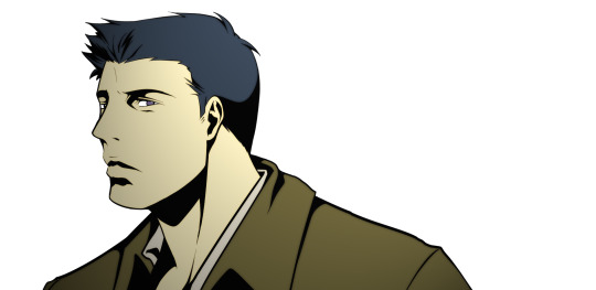
SUPERNATURAL THE ANIMATION: The Importance Color Design Brings to Visual Tone

So last post I mentioned that while the use of BL shadows is all good intentions, I really disagree with it’s execution.
I don’t think using BL shadows in the way that they did in the Supernatural anime conveys darkness as well as the anime’s staff thought it would.
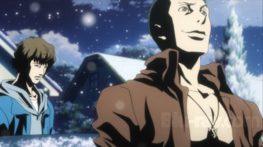
It’s a weird choice. A REALLY weird choice. Because it’s not like MADHOUSE is inexperienced with conveying western-like film noirs. They’ve actually pulled off this aesthetic really well in past shows before
Like Paranoia Agent

and Naoki Urasawa’s MONSTER
youtube
If anything, the tone and aesthetic set in MONSTER is a lot closer to the kind of tone appropriate for a show like Supernatural, minus the “anime-like stigma” that usually turns people off from watching anime in the first place.


If anyone wanted to transform Supernatural into an anime, there are closer works to compare to than turning the original Supernatural show inside out. (We have the original show to turn itself inside out, anyone else doing it is superfluous.)
And just because you’re making an “anime” doesn’t mean your character designs all have to look like Sword Art Online..
The misconception that all anime must have large eyes needs to be chucked out the window. Because while it’s a defining trait in the medium, it doesn’t have to be a driving force.
MONSTER certainly didn’t let itself be ruled by that–in the manga and the anime.


Thus, it also didn’t need to be ruled by darkness to convey horror.
Muted/bleached colors yes, but it’s not without variety.


The Supernatural anime does not have variety.
In trying to encompass darkness because it’s part of the horror genre, it shoots itself in the foot when it comes to the NON-HORRIFIC SCENES.


Looking at these is jarring as hell.
The context of which the characters are presently in clashes with the dark, thematic focus in their character designs. While it may intensify the more evil parts of the series, it makes all what should be beauty shots or scenes at rest unwelcome because it feels like the characters don’t belong in the setting.
The are only a few times where it’s not so jarring only because the scenes themselves reflect melancholy, not because of the color design’s strengths.


The Supernatural anime fails at tone because it fails with cohesive color design. In hamfisting darkness, they sacrifice any shred of light and beauty the series may want to convey.
In MONSTER, the scenes of darkness are part of darkness, and any scenes with beauty–no matter the context within the story–genuinely look beautiful despite being none the wiser about the premise.

The Supernatural anime is too colorful for it’s own good. And I mean that by it has no business in being that colorful if they can’t use the colors right.

I’ll fall back again on Berserk: The Golden Age Arc to explain, where the movies create beautiful scenes without sacrificing the elements of horror or tragedy:


But Berserk also makes use of all the colors of the rainbow WITHOUT losing the horrific edge AS WELL AS CONVEY LAYERS OF MEANING WITH EACH COLOR CHOICE.
I’ll start with the least used colors IN FILM and make my way down to the often overused colors when someone wants to convey darkness. Starting with
YELLOW (least used)

Yellow/orange is not often used to convey darkness or horror since it further away from the color black second only to white. Yellow connotes happiness, friendship, warmth, wealth, and overall happier things than any other color.
Berserk understands this, yet it juxtaposes this color within the context of betrayal. A character in distress often wants to quench their worries with warmth and comfort, which is exactly what this character does above

by macking a princess.
The spn anime uses yellow

To connote flashlights. It’s base, but overall unimpressive, with no deeper meaning other than the lights are turned on.
BROWN (least used)

Brown is another color not usually used or mentioned in horror, at least not outright. It symbolizes earth, stability, hearth, home, outdoors, reliability, comfort, endurance, simplicity, and comfort. Being close to the earth and earthly colors have a more spiritual connotation, even though brown can be a symbol of questionable trustworthiness–which is why you don’t wear a brown suit for an interview.
This guy is certainly as close to the earth as you can get when being tortured. There’s dirt and discomfort from the cave.
The spn anime uses brown in this way almost never. But when it does:

It’s because the character is colored that way. I will admit though, they did hamfist the mistrust in the brown-suited individual symbol.
DARK BLUE (moderately used)

Dark blue usually connotes knowledge, power, seriousness, etc, which is why many places permit you to only use blue or black ink/ Or how a blue suit is appropriate for an interview.
It’s no mistake in Berserk that the God Hand group are introduced under a blue color scheme for obvious reasons. But the color use proves to enhance the probability of their actions even when the audience has yet to understand their true nature.
The spn anime PRIMARILY uses dark blue to convey night scenes because the designs prevent it from using black or else the characters will be lost in the picture. (You can argue that in here it’s of better use since John’s word is pretty much god’s word to the Winchesters but since he’s barely present for each time dark blue is utilized, it’s fair to say this is coincidence.)

GREEN (most used)

Green in film usually connotes sickness, envy, fear, jealousy, misfortune, youth, and inexperience, renewal.
Berserk encompasses all of that within this scene, as well as it’s careful use of green within the context that this scene is a simulation. Much like how green is used in The Matrix

There’s also a reason why Disney uses this color for most of their villains.

And the spn anime uses green…when Mary comes back to them

Why green? Why green of ALL colors? Is this vision a simulation? The scene suggests she’s the Real Deal. That’s actual mommy Winchester talking to her sons. Is it renewal? Well, she’s not exactly going back into her body. (Save that for season 12.)
WHY? Why not white? Why green? This isn’t yellow, no, because a true, GOLDEN SORT OF YELLOW wouldn’t act like a dirtied highlighter. This is green all the way through.
But WHY?
PURPLE (most used)

Purple connotes royalty, nobility, spirituality, ceremony, mystery, transformation, wisdom, enlightenment, cruelty, honor, arrogance, mourning, temperance.
I don’t want to get into specifics on what is happening in this scene of Berserk because of just how traumatizing it is and by no means is that hyperbole. (And no, don’t watch these movies for curiosity’s sake. Do not.) Just trust my judgement when I say it encompasses every single aspect of purple’s symbolism.
Disney villains are colored purple for these reasons as well.

But purple in the spn anime’s case is just another color other than dark blue to connote darkness without much thematic context, just like it’s use of yellow or brown.

RED (most used)
Red connotes excitement, energy, passion, love, desire, speed, strength, power, heat, aggression, danger, fire, blood, war, violence

I haven’t mentioned it, but the caps I’ve used from Berserk are all in scenic order. The transitions between least used colors to most used colors were also applied intentionally within the movies to convey high points and low points within the natural flow of the story. When Berserk finally uses the color red, it uses it to it’s advantage by holding off on using it until the highest point of horror.
The point is there’s buildup, maximizing the impact.

And the spn anime uses it

because there’s a fire. Practicality aside, there’s not much reason why. You could easily use black and orange and it’s the same. But ok, red signifies danger–a better use than orange. Maybe the show’s smarter than it looks.
So what the hell is this?:

I don’t know.
BLACK (primarily used)

You can’t get any darker than darkness. Black connotes power, sexuality, sophistication, formality, elegance, wealth, mystery, fear, evil, unhappiness, depth, style, sadness, remorse, anger, anonymity, underground, good technical color, mourning, death.
It’s interesting that Berserk prides itself on it’s hero being “The Black Swordsman” despite all the negative connotations surrounding the color black. It has the trilogy end on this transitional color, having the black swordsman literally carry all things good as symbolized by the white background. The hero may do evil things, but for the right reasons.
Even more so, the series itself makes a point to have the color black to represent our hero and white to represent our villain.

the use of black in the spn anime is obvious, and I mentioned it’s usage already in my last post. So instead, I’ll focus on how the anime also tries to inverse horror conventions by using white:

Does it work?
No. As in, not for any symbolic use. The only reason why they used white here is to simulate shock factor.
This is a technique used primarily in anime. Here it is in Brigadoon:

It makes no sense for the spn anime to use so much white when they leaned so heavily on black unless it was for some other oddly-decided techniques.
I mean…it’s already shocking that Sam gets a fist through his chest why is this scene so needlessly violent? Supernatural isn’t Berserk and thank god for that. Even if this scene suggests maybe the anime’s staff was inspired by Kentarou Miura or something I have no clue. But I mean, there is a reason why I’m comparing this anime to Berserk in the first place.
If you’re going to have it all focus on darkness and nihilism, at least do your best to do it all the way as Texhnolyze did.
youtube
TO RECAP
It’s funny how much the Supernatural anime wants to emphasize the show’s horror as it’s priority. BUT UNLIKE BERSERK AND TEXHNOLYZE as much as the horror aspect of Supernatural is what makes the show enjoyable to watch, it’s the happier, more beautiful moments that makes people stick with the show. Especially since the horror just helps make those happy moments feel more than earned.

But the original Supernatural also knows how to draw out beauty in ugliness. Our heroes are not beautiful, therefore they are.

Even during seasons 1-2, it’s easy to understand that. Which makes the focus on darkness on the anime’s behest a very, very odd choice.

75 notes
·
View notes
Text
SUPERNATURAL THE ANIMATION: A Thesis Overview on Japanese Anime Production & Character Design


I read a post by @diminuel and wanted to segue into a topic I’ve been wanting to write about for a loooooong time and since I’m on vacation, here is
A thesis on analyzing the thought process and anime production of the anime series, and the masterful aspects of the final character designs.
I will be using the anime’s featurette “making of” documentary as part of the sources.
There are a lot of criticisms against the overall aesthetic and character designs regarding the Supernatural characters since, well, the interpretations of the characters differ a lot from their original source material/western counterparts.
Personally, I’m on the boat that agrees that the show is pretty hokey at it’s worst but the show isn’t without a huge level of painstaking detail put into it.
And while I don’t exactly agree with the series’ execution in the art department, I can wholeheartedly understand that the characters designs and it’s assigned aesthetic aren’t terrible in essence. And neither are the creative decisions behind capturing the tone of the original Supernatural TV series.
ANIME PRODUCTION
First, I have to address that the studio behind the Supernatural Animated series is a solid contender.
Studio MADHOUSE is an acclaimed studio usually known for how ballsy they are in creating original productions that may or may not garner the usual niche otaku market. But they are even more famously known for their adaptation work such as:
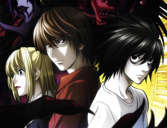
Death Note
Final Fantasy VII OVA (Last Order)

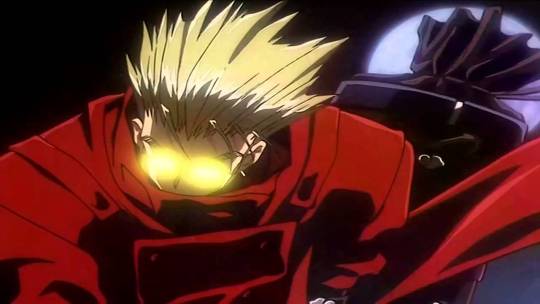
Trigun
MADHOUSE (if not also generally known for some of their work in the moe genre) can easily be regarded as one of the more mainstream, household studio names with a consistent list of anime shows with a gritty, film noir aesthetic. And while the conceptions of these aesthetics don’t exactly belong to the studio, or it’s contracted staff hands, MADHOUSE has proven time and again that they are generally able to adapt this sort of aesthetic really well.
However, it’s very misleading for me to mention the brand name since anime studios don’t usually have fixed staff, so while you can’t directly associate the studio name and the level of quality in their work since the people per production are never truly the same, you really have to pay attention to the names working on the project.
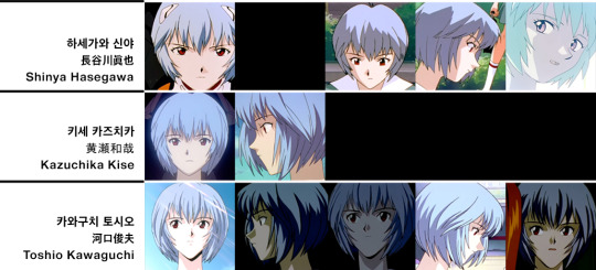
A strong director is usually the more general way to gauge a project’s quality with film in general. In the case of anime, some of the big directorial names out there would be Tetsuo Araki, (Attack on Titan, Death Note) and Akiyuki Shinbo (Puella Magi Madoka Magica, Monogatari series) as a small example.
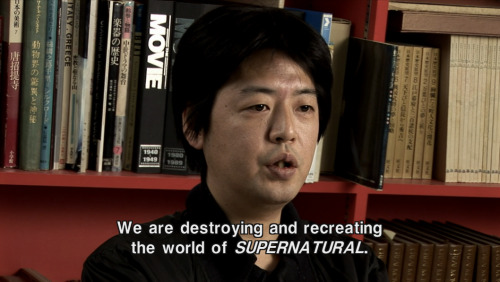
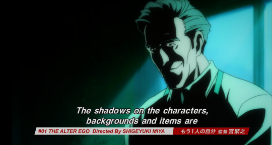
The in-house name usually associated with MADHOUSE productions is director/producer Masao Maruyama, who actually DID overlook the Supernatural anime project, so this is about as much as a classic MADHOUSE production as any:

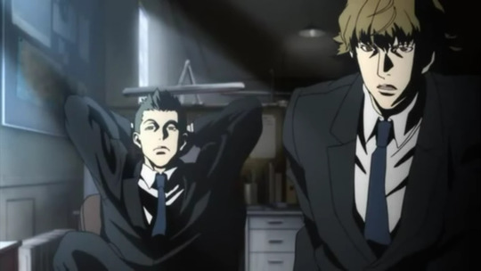
And Maruyama definitely has a solid understanding of the original Supernatural television series.
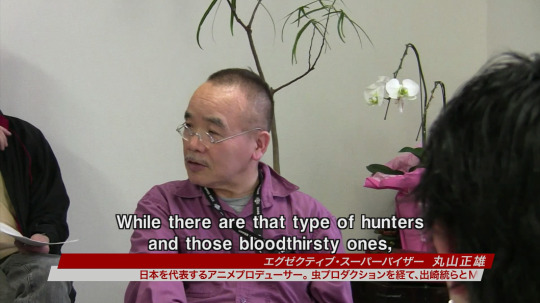

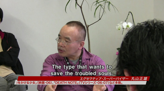
What is taking place here in this segment of the anime’s featurette is a production conference (制作会議 seisaku kaigi) — a meeting in which the line producer, production desk, groundwork department and production assistants gather to exchange progress reports and necessary notifications. (In the case above, discussing Maruyama’s pressing concerns of his interpretations of hunters within the story and how important it is to have them akin to the ones in the original TV show, with heroic hunters as the key focus.)
However, much like western tv shows, not every episode is penned by the same writer. So while directors/producers may have meetings to discuss how the overall work should feel/be, episode directors/writers have their own interpretations to display.
In the case of Supernatural the Animation, there were actually TWO story directors. It’s actually pretty uncommon to have two heads as a single unit in anime, and it really shows just how much effort was put into the interpretations of the anime characters of Supernatural the Animation:


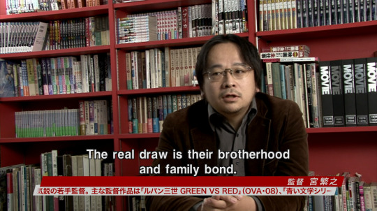

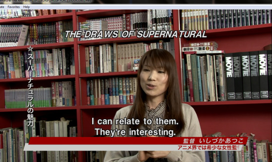
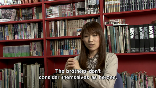
Good directors put every individual’s strengths forward and place them in a context where certain skills can fit best to move the product towards greatness. The same can definitely be said for both Atsuko and Shigeyuki.
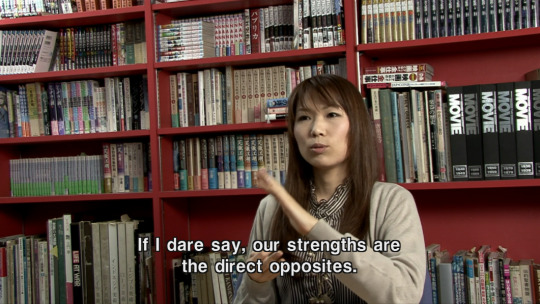
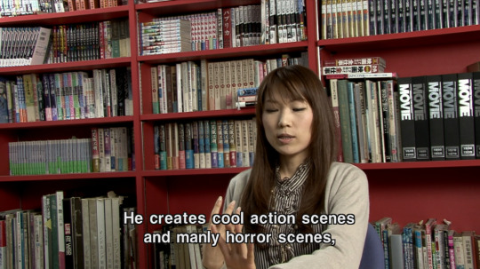


Personally, I couldn’t hope for a better dynamic in strengths when it comes to the overall appeal of Supernatural. The heart of the show is definitely understood, it just so happens the interpretations definitely have their own flavors because of this duality between styles of the directors, but there’s a lot of cultural differences tied directly to how Japanese anime is usually composed and their differing methods between anime production and western media.
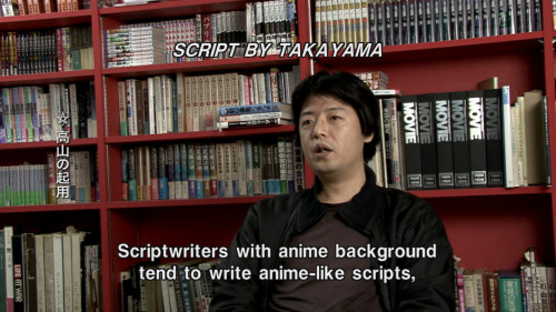
Each individual script writer have their own goals and interpretations put forward, and sometimes the style of writing definitely impacts the final product.


While the latter quote is hilarious considering the context of how western fans generally view the anime, it’s important to know that certain creative decisions were done intentionally.
What is being taken place here is the same sort of deconstruction as any fan willing to write crack fic or:

I also find it leagues interesting that Takayama mentions “anime-like scripts” since there is a huge key difference between general TV scripts and scripts tailored to anime audiences. Certain tropes exclusive to anime have been noted and satirized across various media forums.
But “anime-like” styles don’t just effect writing styles, but also illustration “drawing” styles.
Character Design

The first thing you’d notice in the final character designs are the intense values used in the shading.
There’s a name to this technique, as mentioned in the featurette:
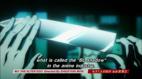
It is actually not uncommon to see BL shadows in nitty gritty anime shows. In a way, it’s become an obscure technique to see in more modern anime since the aesthetic of BL shadows are reminiscent of late 80′s to early 90′s anime shows like Vampire Hunter D: Bloodlust.

While it was more of a conventional technique in this era of anime, the use of BL shadows shifted to a more stylistic choice starting from the early 2000′s.
Cowboy Bebop is one of the more famous examples of using BL shadows in a more stylish, minimalist aesthetic in it’s opening, even though the harsh blacks aren’t used in most of the actual show in order to give it a more sleek, fresher look.


But BL shadows are still used in today’s current modern anime, even if they are used primarily for style purposes instead of convention.
March Comes in Like a Lion, a show that’s still currently airing as part of the Winter 2016 anime season, used this technique in well-directed sakuga (作画) (lit., "drawing pictures”) to encompass the chaos surrounding it’s protagonist Rei Kiriyama.


In a sense, the use of BL shadows in the Supernatural anime is pretty unique, even if it does hamfist the “noir” in “film noir.”
As for the actual DRAWING STYLE of the anime’s character designs, there has been a lot of hyper-focusing on how the design feels “wrong” in it’s interpretations.
Or that some of the scenes look really….weird….
Before I can really tap into the heart of why these designs don’t seem to work or don’t feel akin to the core of the original despite huge efforts explained above, I first have to get into a couple of things before diving into it.
#1: Anime Is Made As It Airs.
This isn’t exactly common knowledge, so it’s fair to point out just what may impact a show’s final product. Since anime is streamlined like this, no matter how much planning a production might make beforehand, every film project is subjected to Murphey’s Law despite.
While it’s true that a lot of TV shows are created as it airs (INCLUDING the original Supernatural TV series) ANIME tv production is much different from western live action, or even CARTOON production.
Shit happens. Which may result in delayed episodes on the air:

OR you get two different version of an episode as the show still airs. The most recent example would be that of Yuri!! On Ice, where they made corrections as they went with broadcasting:


Sometimes studios don’t find it prudent to make corrections as a show is airing, so what usually happens is that corrections are made on the DVD/Blu-Ray releases.


#2 The “Drawing Style” Isn’t the Problem
It’s difficult to explain the differences between the “drawing” style and the “animation” style of a show without showing it, but it stands to be mentioned since there’s a consistent misconception on the meaning of “style.”
Usually, “style” pertains to most usually the “look” of how a character is drawn in western media:

However in anime PRODUTION, “drawing” styles are very subtle and tend to be under harsh inspection when working on a production. There’s very little creative freedom when under strict rules based on the character design.
Basically, the character designer’s final designs are god. They pave the “look” of the characters, and the animators must adhere to the “style.”
In case animators fail to deliver, someone else will redraw it (Usually the animation directors.) or at make corrections to ensure the characters remain on-model.
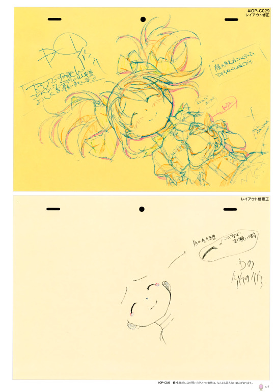
Above, the sketch on the yellow sheet is what was turned in to be checked, and the white sheet below it are the corrections.
However, this doesn’t prevent an artists’ stylistic interpretation of the same character from shining through:


Understanding these subtle differences is what sets apart newbie animators from master key animators/animation directors.
You can’t exactly blame the nuances and subtleties of a piece of animation on the animator, since the drawings go through a number of hands in the process, Especially since all artists have their own “style”/“approach/interpretation” or “look” on how they view a figure. Drawings can differ from line width, to just…simple placements of body parts (eyes, nose, etc, )
Just being a fraction of a millimeter off makes a HUGE difference.
How does this relate to the Supernatural anime character designs?
The “Supernatural the Animation” Character Designs Are Only One Redraw Away from Being Masterful.
(or closer to the original…)
I can only really say this because I’ve observed that the anime’s “drawing” style isn’t exactly unique. The same techniques used to accent body features in Supernatural The animation are akin to many anime shows that have used it for better or for worse.
A MASTERFUL example of the same “drawing” style is used in the Berserk: The Golden Age Arc Movie Trilogy (2013):

It bears a striking resemblance to the drawing style of the Supernatural anime.
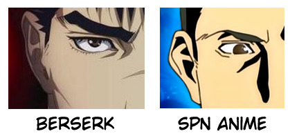
But since the Berserk trilogy was a huge theatrical release, the quality of the drawings between a movie and TV production are vast.
It’s here where I have to disagree with the creative staff’s (on the spn anime) decision to use BL shadows to convey a dark tone.
Berserk is often regarded as one of the most bleakest anime out there, and just from screencaps alone you can most definitely grasp a sense of hell even without harsh uses of black values and instead through careful color design:

Can’t really say the same for the spn anime, but maybe it’s because of the minimalist decision to have bleached/dull colors against harsh shadows:
Looking back, I really wish Studio 4 Degrees Celsius (studio that did production work on the Berserk Trilogy) did an OVA/series of Supernatural films instead of studio MADHOUSE. However, 4 Degrees Celsius is known for it’s anthology works such as The Animatrix and Batman Gotham Knight, and doesn’t really handle TV shows to begin with.
But I can’t help but feel that maybe a series of original Supernatural episodes packed in one OVA would’ve made a lot more sense than adapting two seasons of an ongoing TV show. Especially since the spn anime inserted their own original episodes anyway.
The actual “drawing” style of the spn anime only really suffers from a lack of proper emoting in the characters and lacks one last drafting session.
All artists are familiar with basic expression sheets. In which they are used as reference to exercise drawing a range of human emotions.

But humans aren’t as robotic as most beginner expression sheets imply.
There’s a lot of factors and complexities when it comes to expressing emotions and trying to communicate that through illustrations is often difficult. What some might not understand is that sometimes, we don’t know what exactly we’re feeling–but that’s only because some emotions are combinations of others.
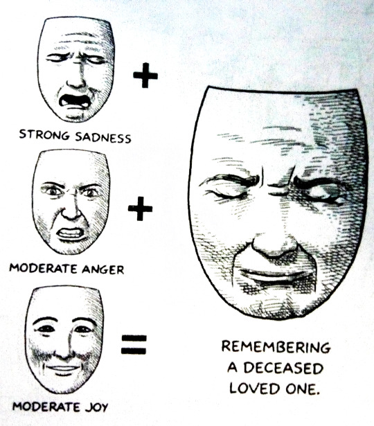
This is where I feel the anime creates a rift between fans of the original Supernatural from liking the interpretations of the anime series.
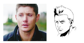
As in the anime is obtuse and flat at it’s worst–which is a far cry away from Jensen Ackles’ dense performance in the live action original show.
Which is why in drawings, you really have to know the differences between baseline “sadness” and “anguish.”
TO CAP IT ALL OFF:
I’ve made some pretty bold statements. Even with proper examples and citations, the best way for me to feel somewhat satisfied with this analysis is to provide personal demonstration.
I’m an animator. I study film and animation. It’s what I do.
As extra practice towards my studies, I’m going to use the knowledge I know off of this thesis to show whether or not I understand the weight of what I just said by “fixing” the Supernatural animation–or at least improve on it WITHOUT changing the artistic merits/stylistic choices of the anime’s staff.
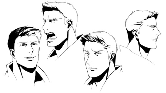
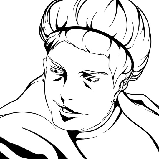
Looking at the model sheets as reference, here’s what Castiel would probably look like in the anime.
(it’s mentioned that the staff exaggerated Dean’s eyes and Sam’s hair as part of their unique traits–so for here, I exaggerated Cas’ lips.)
Fake screenshot bonus:

Now for some tweaking since all the designs need is a redraw:
This was super fun and I might redraw some Supernatural anime screencaps in the future. \0/
113 notes
·
View notes