Don't wanna be here? Send us removal request.
Statistics
We looked inside some of the posts by dannica-marnoch-blog and here's what we found interesting.
Average Info
Notes Per Post
53
Likes Per Post
47
Reblog Per Post
3
Reply Per Post
3
Time Between Posts
16 days
Number of Posts By Type
Photo
17
Last Seen Tumblr Blogs


Fun Fact
Tumblr Inc. is funded by 13 investors.
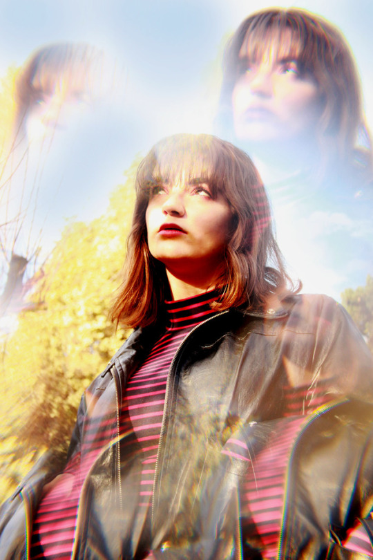
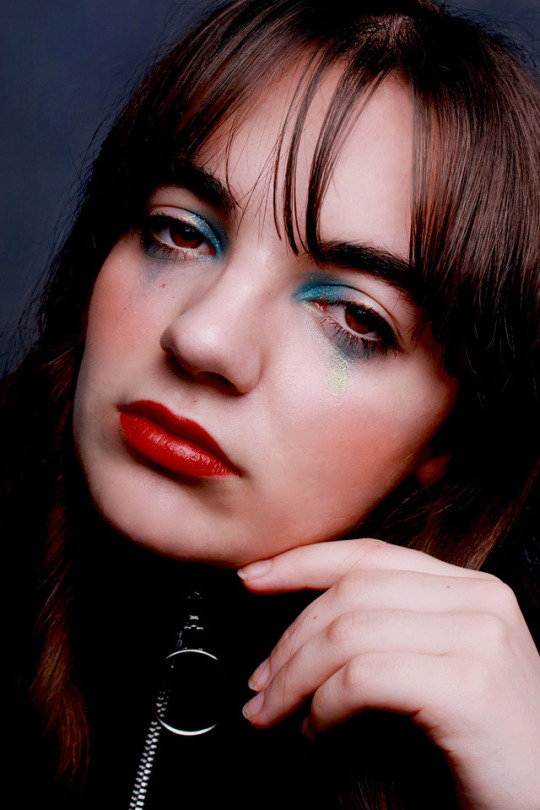
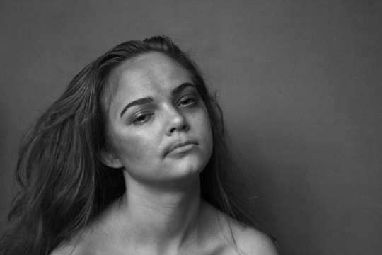
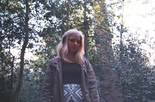
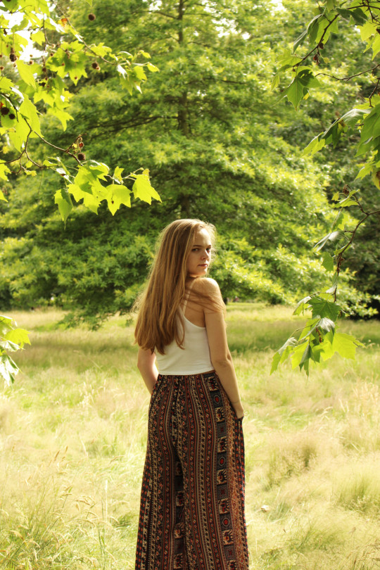
Photo

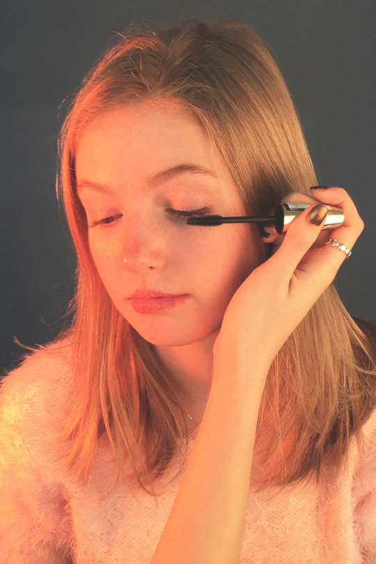
IN MY OPINION
In my opinion I think people are the most interesting subject matter to capture as they hold a variety of emotions and are very tangible, so make for some very interesting imagery. However a simple portrait can also be very effective at capturing one emotion, much like the ones here. I have employed technical skills of textures, which I have done by using film and digital as my two mediums, with film giving a grainy look and digital a more polished and sophisticated look which accentuates more of the surroundings. All these pictures required natural light at different times of the day to all achieve different atmospheres e.g. evening light creates a warm glow, yet low level daytime light casts interesting shadows. Overall I feel this is a successful shoot as I have managed to capture different emotions in each image, however I could improve technically by shooting the portraits with some using studio lighting for a professional look.
@esherphotography @photographystephen
3 notes
·
View notes
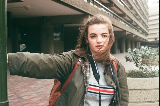
Photo


LONDON CITY
@esherphotography @photographystephen
For my own title, I chose to capture images of London (particularly the Southbank) on film seeing as I have spent most of my summer here. I chose to shoot on film, as I like to use it for documenting my days out as its quite simple to use, plus I like the nostalgic feel and grainy film look. The use of natural light adds calmness to the images whilst also keeping them casual. I feel this is a successful shoot as I have really achieved the film quality that I wanted and for the shoot overall to not look over edited.
1 note
·
View note
Photo


WHAT IS IT?
One technical aspect I have employed here is shooting through water, which created ripples distorting the objects that I had placed in it. I have used this technical skill as I wanted to create textures within my images. Overall I feel this is a successful shoot as the objects are clearly unknown, making it fit with the given title.
@esherphotography @photographystephen
3 notes
·
View notes
Photo


SAME SUBJECT, 4 ANGLES
@esherphotography @photographystephen
I decided to shoot these images in black and white so as to accentuate the model and make her the prominent focus of the images as she was wearing white, so the contrasts aided this. In addition I used a variety of wide and close up angles to capture the different poses the model presented. The subject of these images quickly became how the model works with the given props (hat and sunglasses) to create contemporary, yet slight boho inspired images. Overall I think it is a very successful shoot due to the composition and style of the images, however to improve technically I could of used a flashgun to brighten the images further.
1 note
·
View note
Photo

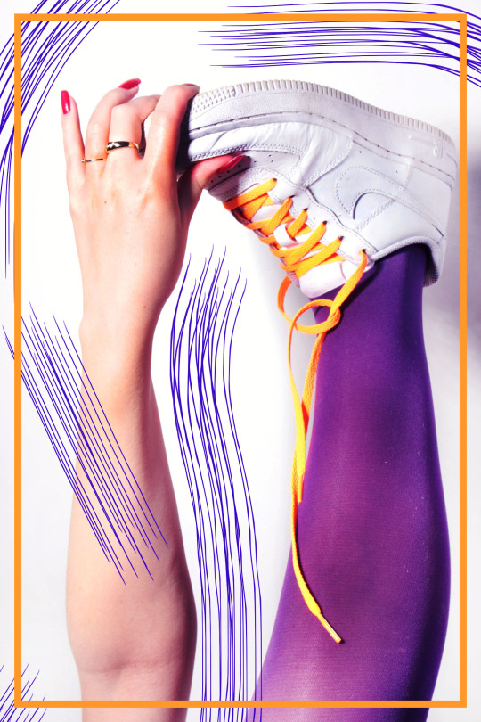

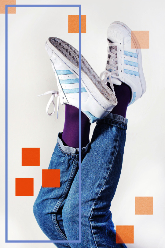
MY FAVOURITE
For the title of ‘My Favourite’ I chose to look at my favourite clothing item- shoes. My personal interest in fashion led me to shoot these images of two of my favourite pairs of white trainers, which I carried out using hard and bright light to achieve a slight over-exposed, editorial appearance. I digitally manipulated the images to further add to the fashionable look, but at the same time to add a slight quirkiness to the images through the bold colours and alternate poses, which overall enhances the images. I am very pleased with how the digital manipulation turned out and it is my favourite technical aspect, which I think makes for an overall successful shoot.
@esherphotography @photographystephen
9 notes
·
View notes
Photo


LOOKING UP, LOOKING DOWN
For the title of Looking up, Looking down I chose to interpret this into the model’s poses rather than alternating the camera angle. By doing this I think I have captured much more interesting subject content, particularly by combining the human form with natural forms to create quite tranquil atmospheres in my images. A technical skill I have used here is manual focus so as to achieve the blurred foreground which acts as a frame to the subjects. I have used natural lighting to keep a casual feel to the images to fit with the tranquil atmosphere. Overall I think this shoot is very successful, especially at capturing warm colours and at interpreting the title.
@esherphotography @photographystephen
5 notes
·
View notes
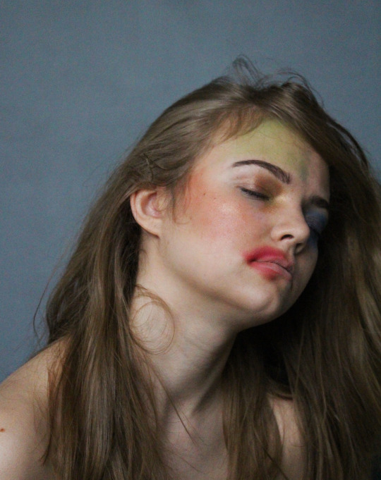
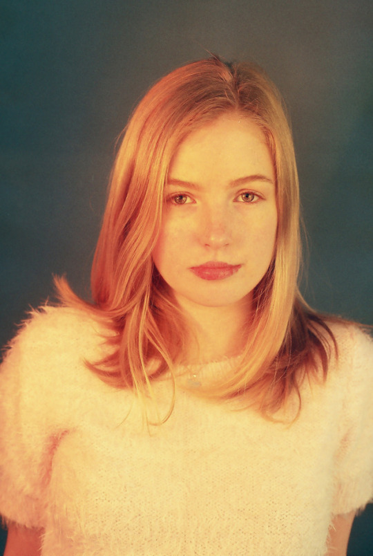
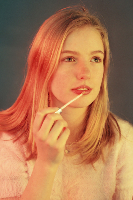
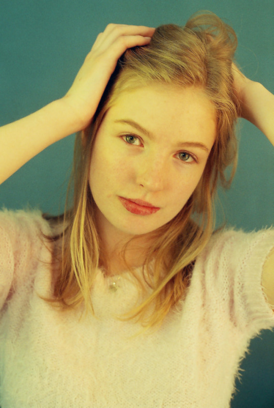
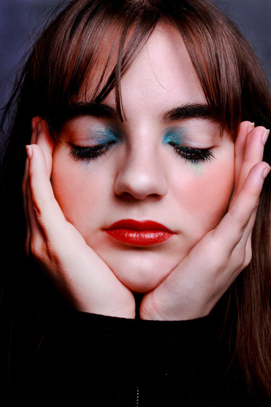
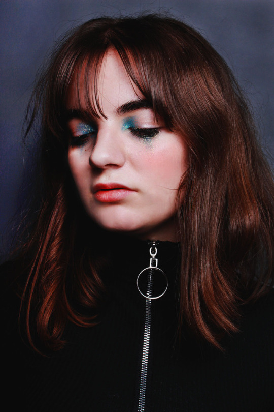
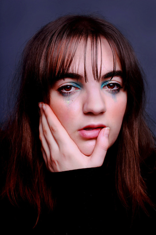
Photo

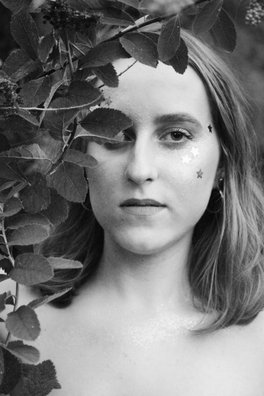


SELF PORTRAIT
For these self portraits I used a combination of natural and studio lighting to create alternating atmospheres, with the natural shot images having a more ethereal appearance and the studio lighting ones an editorial appearance. To change my appearance and to fit with the theme I used glitter, sequins and lots of makeup to enhance my appearance. I have digitally manipulated the images so that two are in black and white, and I feel this enhances the images as it gives them more contrast and depth, as well as a more mature style. Overall I think this shoot is very successful as it captures my creative personality.
@esherphotography @photographystephen
8 notes
·
View notes
Photo


FRAME YOUR SUBJECT
@esherphotography @photographystephen
For the title of ‘Frame your Subject’ I liked the idea of using natural forms in the environment to mimic a frame around the subject, however a small display at a recent gallery visit provided me with a solid geometric shaped frame (yellow circle) which I thought created quite a unique and contemporary image for the title. I have used natural light here as I wanted it to elicit a calming feeling and create and warm atmosphere to the images. The technical aspect I am most pleased with is the shallow depth of field I have captured in these images as it allows for more attention on the model. Overall I feel this shoot is successful at interpreting the title, however to improve technically I could use different lighting styles in my next shoot, e.g. harsher, bright lighting.
2 notes
·
View notes
Photo
1) Yes Georgia’s artist study (Solve Sundsbo) does reflect the title ‘dynamic black and white’ as they show movement through the use of a linear relationship between the shadows and model.
2) Although not made very clear in their artist study annotation, it is clear they know what it is about the images that has influenced their own e.g. the use of linear shadows.
3) Yes Georgia has understood the work of the artist study as she has incorporated the same style of lighting, although hers is not shot in a studio, and she has employed the same textures and poses as the artist study.
4) Yes Georgia’s shoot does reflect the artist study, as previously mentioned, she has taken on board the overall style and appearance of Sundsbo’s images.
5) Georgia’s work is original, although she clearly uses the same ideology as Sundsbo, she has employed his techniques in a very different way e.g. the use of natural light gives the atmosphere a softer look compared to the harshness of Sundsbo’s images.
6) In Georgia’s evaluation she has evaluated her success of the shoot stating she was pleased with the range of poses, however she would have liked to have created some other patterns that didn’t seem to work.
7) Georgia’s shoot does reflect ‘dynamic black and white’ as the images are black and white and also portray a lot of movement due to the varying patterns.
8) No seen repetition.
9) 14/16


Dynamic Black and White
The influence for my shoot was Solve Sundsbo use of light and dark projected onto models faces. In my work I have replicated this by using a spotlight then placing different patterns in front of the light so it would project different things onto the model which differs from Solve as he has used a projector. This has been done successfully as I got a wide range of patterns although some of them didn’t come up as sharp as I wanted them to. To improve this I could have shot it in a studio using a bright projector. In my shoot I have used a spotlight in a dark room to create the shadows. I used this technical skill as I wanted to make the contrast between the shadow and the light big so the viewer can easily see this on the models face. The lighting is bright yet the dark shadows created from the light give the photos a dark, gloomy mood. The subject of these images is the model as these photos are portraits. I placed the model in the centre of the photos close to the camera so they grab the viewers’ attention. Technically I am most pleased with the spot shadows in the last photo as they look the most sharp. I could have shot this in a darker room to make the shadows more detailed. I digitally manipulated these images in photo shop by putting them in black and white then making the contrast higher and brightness lower, then I played with the levels to bring out the lowlights and highlights which really brought out the shadows and gave it a more serious mood. Overall I think the shoot was quite successful as I thought wide range of models poses made it more interesting although the original patterns I wanted to create didn’t work. To improve technically for my next shoot I could use a more powerful light and use the studio more to make the photos look more professional.
2 notes
·
View notes
Photo


DYNAMIC BLACK AND WHITE
@esherphotography @photographystephen
1)The artist study for this shoot was Solve Sundsbo and how he created dynamic black and white portraits through the use of props. 2) I have replicated this in my work as I have also selected appropriate props and poses that mimic that of Sundsbo’s as well as keeping to the monochrome theme. 3) I feel I have done this successfully as it is obvious from my artist study images that Sundsbo was the key influence and I also feel I have selected the right props, location and composition to make the images successful. 4) To improve how well my images take influence from the artist study I could try different poses and adjust the studio lighting to create the same sort of soft atmosphere Sundsbo has captured in his images. 5) The technical skills I have employed in my shoot has been the use of different props to create different textures as well as considering colours that would have the most impact in black and white e.g. using white feathers and lace. 6) I have used these technical skills (colours and texture) as I wanted there to be a harsh contrast in my images, therefore I paired white props with a black background. I also used lots of texture within my images as I didn’t want them to appear flat and dull, however they also reflect the abstract element Sundsbo has in his own images. 7) I have used hard studio lighting for this shoot to demonstrate the professional quality of Sundsbo’s images. This type of lighting in particular has allowed me to create quite intimate and personal images, therefore making the viewer feel quite inquisitive. 8) The subject of my images is the model and their relationship with the props. I have positioned the props so that they are on the models face so as to create an obscurity to the face. 9) The technical aspect I am most pleased with in my shoot is the effect of using studio lighting as it has allowed me to create quite professional looking images. 10) To improve this shoot technically I could try shooting under soft studio lighting to diminish the harshness of the hard studio lighting and in turn reflect more of an intimate atmosphere. 11) I used slight digital manipulation when using Photoshop, simply just adjusting the images to black and white and then adjusting the colour balance so that the black and white contrast wasn’t too stark. I sharpened the images slightly and also adjusted the levels of the image to bring out the full potential of the black and white tones. 12) This shoot links to my title ‘Dynamic Black and White’ as I have taken the word dynamic and used it in the sense of it meaning energetic and innovative to create quite unusual looking black and white portraits that have quite a fine art quality. 13) The meaning behind this shoot is that it is trying to portray humans as an art form that can be enhanced by props (feathers and lace in particular) and as a result you end up with a product that is quite innovative and unusual to the human eye, even though the viewer is essentially looking at their own form. 14) Overall I feel this shoot has been very successful as I feel I have captured the elements of Sundsbo’s work, however I feel I have taken these ideas and replicated them in my own way i.e. slightly different studio lighting. 15) Action list to improve technically: -Experiment with different types of studio lighting. -Experiment with different props to create different textures. -Try out different compositions/poses to create alternate angles.
4 notes
·
View notes
Photo


Sølve Sundsbø:
Solve Sundsbo, 45, grew up in Norway, and however moved to London in 1995 to study photography at the London College of Printing. After college he worked as first assistant to British photographer Nick Knight. It is clear London and working under Nick Knight has been a key influence in Sundsbo’s work as you can see the high fashion/commercial elements of London being present in his aesthetic and style of photography. Sundsbo produces lots of high fashion/quirky work for major magazines including I-D and Vogue, as well as regularly shooting for high-end fashion brands such as Gucci and Dolce and Gabbana. All these influences appear to have a major influence in Sundsbo’s work as it can be described as very modern take on fashion portrayal, often with the images being very dynamic and extremely professional in appearance.
The images I have chosen are part of a series from a commissioned shoot Sundsbo did with LOVE Magazine, most probably to be aimed at young adults/adolescents due to their eccentric appearance, which younger audiences can relate more to and appreciate. The subject of this set of images is the model’s face and how it can be distorted through the use of props/ adjusting their own features. I feel Sundsbo has positioned the models with a close focus on their face and the props as much of the emotion and expression can be seen and captured through the face. I don’t necessarily feel there is a distinct meaning behind the images; rather they have been done for an appeasing and from fine art point of view. It is clear a studio set up has been used as these images feature hard lighting, which has aided in accentuating the shadows and tones as well as defining the contrast between the black and white.
Sundsbo relates to me personally as he focuses on fine art/fashion photography, which is a style that appeals to myself. I chose these images in particular as the use of props and close focus of the face drew my attention to them, as I liked how they made a dramatic impact considering there isn’t much going on in the photos. Sundsbo is helping to develop my idea of dynamic black and white images as he uses the monochrome colours to create exciting high fashion style images, so I’m going to take these elements and apply them to my own images, with dynamic meaning to me energetic and exploration of new ideas. I’m going to use the technique of studio lighting, as I like the feel and professional look it adds to the images.
@esherphotography @photographystephen
1 note
·
View note
Photo
1) Their artist study does reflect the title 'Faceless Portraits' as their is a clear focus on other elements of the human body instead of the face.
2) Yes their annotation does clearly state what they are being influenced by as they have mentioned how textures play a big role in their images and how they wanted the focus to be depicted by the hands.
3) Yes I do think they have understood the work of their artist study as they have incorporated similar elements of the artist's work into their own images e.g. the daisies and hand focal point.
4) Yes their shoot does reflect the artist study as they have the same subject matter as the focal point.
5) Their shoot doesn't copy the artist's too closely as their own shoot has a different colour scheme (shot in colour) and angles so their is a clear difference between the two.
6) They have evaluated how successful their shoot is and have mentioned that they met their intentions with the shoot. They have mentioned how they feel the colours have really been brought and how a shallow depth of field has kept the focus on the hands, ultimately making it successful.
7) The shoot does reflect 'Faceless Portrait' as their is obviously no focus on the face and rather the character that would be presented in the facial expressions of a face portrait, has rather been depicted through the focus on the hands.
8) There is slight repetition of the technical aspect of shallow depth of field throughout the second paragraph, however it still carries links with other comments within the text.


For my shoot, I wanted to look into the idea of using the hands as a representation of a person and as an indication of their characteristics and therefore researched into this style of photography where I found Benoit Courti. The way I replicated his style within my work was by solely focusing on the hands and by altering the depth of field on the camera, I was able to enhance the focus of the hands while still including interesting backgrounds. In my opinion, this has been done successfully within my shoot as the hands are obvious subjects of the shoot, however I feel it may have worked more effectively with an even more shallow depth of field to blur out the backgrounds. Also, I could’ve used darker locations with the use of artificial lighting to follow a similar style to my artist study which draws attention further.
Within my shoot, I have looked at using a shallow depth of field in order to bring out the main focus of my shoot. Additionally, textures were a major influence within my work, and therefore I chose contrasting locations to explore this. The lighting for my shoot was entirely natural as it was shot outside which gives it a natural look as well as bringing out the natural colours and details of each individual photo. Evidently, the hands are the main focus of my shoots which throughout my shoot I have placed centrally to each shot or towards the front of the image to ensure the viewer instantly looks at them before evaluating the other features of the photos. Overall, the technical aspect of my shoot that I am most proud of is the use of shallow depth of field which is particularly seen through the cigarette images due to the amount of attention it draws to my aimed focus of the shoot. To improve my shoot technically I could’ve altered the shutter speed of the images. I haven’t particularly manipulated the images as I wanted to keep the natural look within my images, therefore I enhanced the colours by editing the levels of the images.
My images don’t obviously link to the title of ‘faceless portraits’ due to human body being excluded from the shoot as a whole and only focusing on the hands was my way of interpreting the title as I felt they represented portraiture in a different way. As previously mentioned, the meaning behind my shoot is how small aspects of people, such as the hands, can be used to discover details and characteristics of a person before seeing and knowing the actual details. Overall, I feel that my shoot was quite successful as the colours were really brought out from the surroundings of my subjects, however by using shallow depths of fields and structured composition I was able to simply keep the focus on the hands. However, I could have looked at changing my images into black and white to bring out the details even more, or possibly using a studio location so that the definition and lighting could enhance the hands further.
2 notes
·
View notes