Don't wanna be here? Send us removal request.
Text
UCA - Diploma in Art & Design:- Artist Research
Artists who use Alternative Art Tools:
2 - Alexander McQueen:
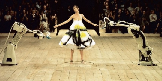
Fashion designer Alexander McQueen, throws model Shalom Harlow (above) in between these two robots, twirling and spinning majestically on a rotating turntable within the floor, as they spray-paint her body and dress to create this work of art, part of the ‘No.13’ show, 1999. I feel that this piece of art conveys the ideas of ‘Savage Beauty’, like it says in the title of the video, and so named for the V&A exhibition after McQueen’s death in 2010 (see footer for link). I couldn’t help but have the words “Savage Beauty” carved in my mind as I watched and listened to this art piece. The sheer emotion that Shalom Harlow portrays in her performance, as her world is spinning around is beauty at its finest. The music, Camille Saint-Saëns’s, ‘The Swan’, in my opinion, fits the piece perfectly, it’s part of the art, it emphasises the thought that she is under attack but an innocent, helpless victim. Maybe conveying her mental state as she cannot control the world around her. As the robots spray her with paint, she looks as though she is trying to defend herself, and then, after the robots desist, she walks off the platform, like she came out of an emotionally devastating tempest. The expression on her face says it all!
I feel that McQueen’s use of robots to paint this model and her dress was quite inspired. I have never seen anything like it, I feel like this has made a new link, for me, between fashion and art, putting them on a completely different level. Also, as a lover of literature and poetry, I am compelled to talk about the symbolism that is hiding within the crevices of this piece. At the beginning, Shalom Harlow’s dress is uncompromised, pure white. She is standing there with every ounce of perfection, that almost any woman would hope to achieve. She is pure and perfect, without flaw, but by the end of the performance, her white dress has been darkened and painted with imperfect colours (especially as black is not really a colour, but an abstract) and the model herself looks as though she has withstood a great, thunderous storm. The way that the paint has been splattered onto the dress and onto her skin, she and her dress are as one, and they have been tainted by the harsh, weathered surroundings.
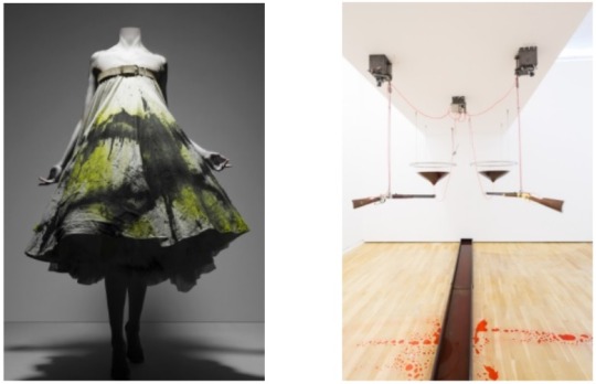
McQueen, always looking to bring as much artistic flair to fashion as possible, took inspiration from an art installation created by Rebecca Horn called ‘High Moon’, 1991 (pictured above right), where she mounted two shotguns to fire blood-red paint at each other and created a thought-provoking piece.
McQueen also took inspiration from the Arts and Crafts movement. To quote ‘Kate Bethune’ (writing for the V&A) “The sequence was perhaps intended as a counterpoint to William Morris’s anti-industrial ethic, provoking comment on the interaction between man and machine at the turn of the twenty-first century.”
I believe that Alexander McQueen created this particular work of art as a social comment on the fashion industry, how cut-throat and savage it can be. McQueen was well known as a non-conformist and rebel in the fashion industry, and, unlike other fashion designers, he didn’t want a celebrity front row at his No.13 show; in contrast, he valued the workers on the bottom-rung and mixed with them during the labour and creation of his designs. McQueen famously said in interviews “Fashion can be a very superficial business” and “There’s not a lot of dignity in high fashion”, not the general sentiments of most fashion designers.
The alternative use of robotic spray-painting arms to create this breathtaking piece of art, the grand finale of No.13, was a stroke of genius. I don’t believe the result could've been achieved by any other means, especially as the performance was part of the art.
________________________

https://www.youtube.com/watch?v=P13oZsD-t4s
https://www.theguardian.com/artanddesign/2015/mar/12/alexander-mcqueen-grab-attendees-v-and-a-victoria-albert
https://www.anothermag.com/fashion-beauty/9225/the-magnificent-impact-of-alexander-mcqueen-ss99
https://www.allure.com/story/alexander-mcqueen-shalom-harlow-runway-show
https://www.vam.ac.uk/articles/alexander-mcqueen-an-introduction
https://showmethewayofart.wordpress.com/2018/10/08/high-moon-rebecca-horn/
6 notes
·
View notes
Text
UCA - Diploma in Art & Design:- Artist Research
Artists who use Alternative Art Tools:
1 - Anish Kapoor:
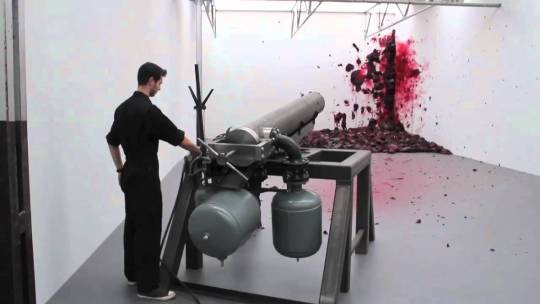
This art tool, created by Anish Kapoor, is a very interesting way of creating art, and also, is really fun and exciting; but at the same time, this art piece seems very brutal and violent to me. The tool is in effect a cannon replica, traditionally a weapon of war, designed to achieve maximum death and destruction. When the wax is thrust in a noisy, exploding manner into the corner of the walls, it looks like bodies have been blown-up, obliterated, like there is blood and organs, and parts of organs, flooding the area.
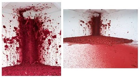
This piece, named ‘Shooting into the Corner’, screams war to me; the cannon, the blood-like effect oozing from the deathly red wax cannon balls. It’s so violent, although the technician shooting the cannon, throughout the whole video is calm and quiet. In my opinion, he is definitely part of the performance, he seems like the grim reaper, wearing black and bringing so much chaos and decay, whilst not batting an eyelid to the slaughterous scene.
I believe that Anish Kapoor chose to create this piece as an anti-war message. Kapoor is anti-violence and called the NRA’s promotional video, attempting to use his ‘Cloud Gate’ piece, abhorrent. Shooting into the Corner is distressing to watch online, I can only imagine that it is extremely unnerving to be at a live performance of the piece. The alternative form of creating this piece of art couldn’t be achieved with the same evocative feeling by more traditional means.
_______________________

https://www.youtube.com/watch?v=6EjtuxQWXsY
https://www.youtube.com/watch?v=CjcglOfWrv8
https://www.e-flux.com/announcements/38308/anish-kapoor-shooting-into-the-corner-exhibition-lecture-new-publication/
https://www.theartstory.org/artist/kapoor-anish/artworks/
https://www.theguardian.com/artanddesign/2009/sep/21/anish-kapoor-royal-academy
2 notes
·
View notes
Text
UCA - Diploma in Art & Design:- Alternative Art Tool Concepts
Brainstorming - Initial Ideas for Possible Tool Development:
1 - Fill the finger-holes in a bowling ball with three different colours of paint and then, maybe, place it on a tilting table that I can manipulate to create a nice effect.
2 - Fill some tennis balls, or other types of ball, with paint and throw them at a wall or other surface to create aesthetic designs.
3 - A tightly secured bracelet that has pencils or other art utensils attached, to decorate a blank sheet of paper, by wrist movements.
4 - Put body-safe paint on varying body parts and make prints and patterns.
5 - Wrap rope/string/ribbon/cable around a body part and dip in ink/paint and create contrasting designs. Using the human body, but with added textures and techniques for varying effects.
6 - Use tubing and straws, make little holes, so when they are hit or flicked against surfaces, paint sprays or spurts out and makes interesting patterns.
7 - Drip paint on a spinning-top when it spins and place paper strategically to be splattered. This idea would also work with a toy seaside-windmill.
8 - Fill a water gun with paint, and direct at a spinning board or at people holding boards whilst moving in various ways.
9 - Use a bunsen-burner, or flame-gun/blow-torch, to burn patterns into wooden boards.
10 - Bubble wrap injected with different coloured paint into each bubble, then used on a medium to create an abstract piece.
11 - Maybe, wrap a person or body-parts in large-bubble wrap (bubbles out), then paint the bubbles and create art with different techniques.
12 - Use old copper tubing/piping (from ripped-out plumbing) and attach a make-shift rubber grip. Then insert beach drift charcoal or natural beach chalk into the tube for drawing/sketching.
13 - A set of old toy wheels (from an old toy vehicle) attached to a handle/axle and rolled in drawing ink to create images.
14 - String, elastic bands, wool and wire tangled together to make interesting textures when used as an applicator.
15 - Feathers bunched together and attached to a handle to create a painting tool.
16 - An empty, large pepper pot (holes bored bigger) filled with mixed-coloured sand (using food colouring) sprinkled over glue patterns.
17 - Balloons filled, or part-filled, with paint and dropped from varying heights onto the selected surface to create splat effects.
18 - Iron filings placed on a strong piece of card, being shaped into images by magnets from underneath, then set by using glue-spray.
19 - Bubble mix or washing-up-liquid with added food dye or paint, to blow bubbles and create aesthetic patterns.
20 - Cocktail sticks pierced deeply into a soft ball, completely rolled in paint, then rolled onto the desired surface.
21 - Spray paint tied-up securely in material, pierce it and then let it go for random effects.
22 - Put a good amount of oil based paint in water. Swirl it around with a tool, then put a piece of paper on top for a few seconds then remove.
23 - Cut out six circular cardboard attachments (to make three pairs) using the same template for each one to ensure a size match. Cut out a central hole for each, then stick pairs together. Thread a stick through the central holes, add waterproof tape along the stick (but not directly onto the attachments) to secure the attachments in place for rolling. The tool can be rolled through ink or paint to create images.
24 - Sew some extra cut-up pieces of fabric onto some old clothes and spin them out onto paper. Like on a dress or on the sleeves of a shirt, etc. and create unique designs.
25 - Use some old electric curling tongs, attach shower puffs and electrical tape to create painted art with different swinging motions, by swinging the electrical wire; or the handle for a steadier second effect.
26 - Take a used veg/fruit produce net and half-fill with wonky shaped pebbles, then secure with an elastic band. The pebble filled net can be dipped into ink, paint or fabric dye to produce prints on paper, canvas or various fabrics.
27 - Take some rubber gloves, fill the fingers with different colours of paint until you have just enough paint or ink to trickle or squirt; then pin-prick holes into the fingertips to make artistic designs.
28 - Using plant/tree leaves, or artificial leaves, with paint, roll out onto a blank sheet.
29 - Maybe, place a plant/artificial plant in the middle of a large surface and have fans placed to disperse trickled mixed media, so they will get blown around the plant creating an interesting effect.
30 - Firm protective foam packaging (the type used for transporting electrical goods) could be cut into a handle shape and different kinds of applicators could be attached for use in art.
31 - Packaging foam could be cut up into shapes for use as applicators with various holders created from recycled bits.
32 - Repurpose used spray bottles to spray colouring, ink or paint and attach together with strong, waterproof tape to use as a singular tool with multiple application.

2 notes
·
View notes
Text
UCA - Diploma in Art & Design:- Sourcing Materials for Making Art Tools
Preparation:
Beachcombing: I spent a day beachcombing, looking for items that I could possibly use for my art tool development. I collected some seagull feathers, flint-pebbles, shells, beach chalk, driftwood and charcoal.
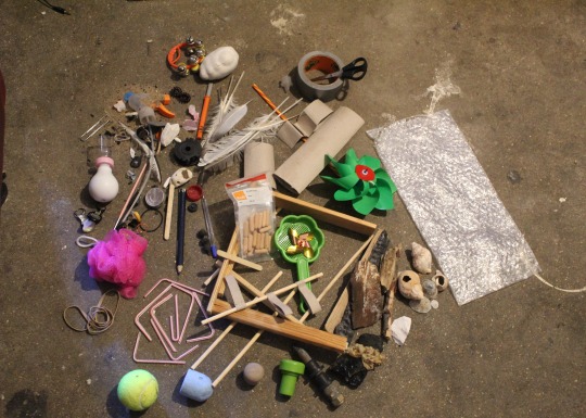
Recycling: Protecting the environment is very important to me, so I want to use recyclable items where possible. I also want the art tools that I create to be washable and reusable, having a minimal environmental impact. I will also be using miscellaneous items on an ad hoc basis, as-and-when I see the potential for their use.
Tools and Materials: I will be using my Dad’s tools and the existing arts and crafts materials that we already have at home. If I discover that I need any other tools or materials I will probably source them from the local shops.
1 note
·
View note
Text
UCA - Diploma in Art & Design:- Art Sketchbook Opening Page
Summer Project 2020:
Brief: To design and create six alternative art tools, and an accompanying sketchbook. The art tools should be functional and subjectively aesthetic. The sketchbook should document ideas, research, exploration, decisions, problem-solving and design development; illustrations or photographs should also be documented. Research should include analysis of ten selected artists, their work and innovation in this area, including images.
Personal Abstraction: This assignment is not as easy as it sounds. To design and produce six alternative drawing/mark-making art tools, not replicating any art tools that already exist, is not a simple task. Trying to invent and produce six different art tools is a big undertaking, and I hope that I can meet the brief. Throughout my entire life, I have never had to invent anything, as everything I use or need has already been invented.

“Necessity is the mother of invention.” - Plato
1 note
·
View note
Text
UCA - Diploma in Art & Design

Summer Project 2020 - Alternative Art Tools
For my pre-degree studies, I have been working on my assigned summer project: Alternative Art Tools. The assignment is to design and produce six alternative drawing/mark-making tools, not based on any art tools that already exist; and create a sketchbook to support my research, exploration, decision making, problem solving and design development.
This assignment is not as easy as it sounds. Trying to invent and produce six different art tools is a big undertaking, and I am desperately trying to meet the brief. Throughout my entire life, I have never had to invent anything, as everything I use or need has already been invented.
“Necessity is the mother of invention.” - Plato
So, I will be blogging about some of my work and errors as I go. The deadline is looming and I’m really feeling the pressure! 🤢
1 note
·
View note
Text
Bronze Arts Award - KaMCOP
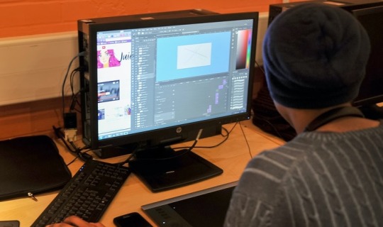
In February this year, I was introduced to Animation and Games Design techniques; including character-design, concepts, and walk-cycles, learning to use Adobe Photoshop. Through comprehensive workshops, I got the opportunity to create 2D pixelized animation, visit the cinema to see a CGI animated film and take part in a collaborative exhibition at UCA. I also had homework and research to do. This was all part of the Bronze Arts Award, facilitated by KaMCOP (Kent and Medway Collaborative Outreach Programme) and hosted by UCA Canterbury. Lunch and all art materials were provided each day. I had a fantastic time, learned a lot and made new friends. The Arts Award Advisers were all brilliant! ✨
The workshops were really enjoyable. The Arts Award Advisers were fun to be around, they were very encouraging and helpful. At the first workshop, we were given our brief to design a 2D character on paper and upload to, or recreate in, Photoshop to create a walk-cycle (making an animated character walk/move in a repetitive motion). So, as a group, we discussed how we were going to create and design our 2D cartoon characters and turn them into animation. We all got to work designing, some of us concentrated on the one character, but others drafted two or more characters before they decided on a final character.
We were taught how to use Adobe Photoshop to bring our characters to life. Some people had already used Photoshop before, but I hadn’t. It was very hard to get a grasp of some of the features of Photoshop at first, but I managed to get a hang of the basics. I’m so glad that I got the opportunity to learn some features in Photoshop, as I have only used MS Paint and GIMP at home. I really want to further develop my Photoshop skills in the future, and can’t wait to get another opportunity to learn more.
In our workshops, we were also introduced to Tumblr by the Arts Award Advisers. Again, some people had used Tumblr before, but I hadn’t. They explained how to use the features and create blogs (a kind of online journal) to record our activities. As you can see, I am blogging now. Hopefully, I have grasped the knack of it, and as I enjoy writing and social media, I am sure that I will keep improving my blogging technique.
On the final day of the Animation and Design course, we collaborated to produce an exhibition for family and friends at UCA Canterbury. Everyone who had created an animation had their layout-screens printed on A3 card and they were displayed as art pieces on the walls. Our moving animations were projected in sequence as large visuals onto a white blank wall. There was a long table for refreshments. Everyone who attended our exhibition had a really great time, and remarked on the high-level of work produced by the people on the course. I learned so much on the course and I’m really glad that I had the chance to attend. I wish the course had gone on a bit longer, at least one more day, it was so sad to say goodbye to everyone. 😢😢😢
To learn more about opportunities through KaMCOP, please click on the following links: https://www.uca.ac.uk/kamcop/ -- https://www.kmpf.org/about-us/about-us/
2 notes
·
View notes
Text
Planning and Design
Planning and designing a pixel animation in Adobe Photoshop and a tutorial to help beginners.
Originally, when I created my first animated characters, I designed a very basic walking silhouette-type stick figure and a simple outline of a standing man for my walking cycle project, because I tried to make it as simply as possible, but alas, the stick figures were a mess and it didn’t end as well as I had hoped. This experience taught me how easy it is to mess up a simple animation. So, I kept on thinking of other ideas to bring to life through animation. I discussed ideas with my friend, Jessica (another girl on the course), and she suggested that I create a ghost character, like the one I drew on the first day of the UCA Animation and Games Design Holiday Club, and I thought it was a brilliant idea. I instantly got out my original drawing of the simple ghost character, that we like to call Frank Sinatra. I scanned and uploaded my image, then I started drawing in Photoshop to ‘Frankenstein’ him to life.
When planning my animation character, I designed a ghost-like character on white card and then I traced the image onto an acetate plastic sheet, so that I could hand-animate it with ease by moving the two images independently. I decided to call my animated character Frank Sinatra, because, like the song, “I Did it My Way”.
Figure 1 - base character drawn on white card and overlaid character drawn on an acetate sheet.
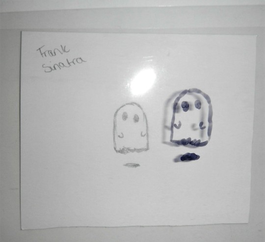
Figure 2 - the overlaid character has been moved into a new position by moving the acetate sheet over the base character on the white card, to give the appearance of movement.
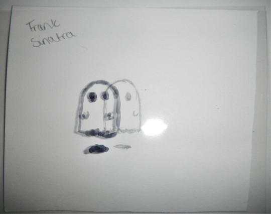
After creating my character by hand, I took several photos using the phone of one of the Arts Award Advisers, to use an animation app that they had installed. I chose a map background that could allow my character to travel the globe. The photos sequenced to create an animation that you could access by pressing play. The effect was amazing! Sadly, I don’t have a copy to upload for you to see, as it wasn’t my phone or app.
Moving on, the following tutorial will explain how to take a two-dimensional, hand-drawn image, or any other kind of image, to make an animation using Photoshop. To create your animation, you will need access to Adobe Photoshop (of course) and you will also need a rough-plan-sketch of what it is that you want to animate and what you want the animation to do, i.e. do you want to create a walk cycle, facial expressions, flying or hovering (like my character). You need to design your character, whether it is a cute ghost or a human being and so on.
To create my basic tutorial, I needed to learn the basics of Photoshop. I was very grateful to have been given the chance to attend the UCA Animation and Games Design Holiday Club; where I learned the basics of design and animation, I was also given the opportunity to access Adobe Photoshop for the very first time. I received a lot of help and support from the Arts Award Advisers; and met other people like me, who gave me a lot of encouragement. I was also introduced to Tumblr, where I am now blogging.
If you would like to follow my tutorial and create your own animation, you will need:
Access to an internet enabled PC/Mac or laptop/Macbook.
Access to Adobe Photoshop online.
A 2D image to upload to animate.
A plan, i.e. the action that you want your animation character to perform.
Time and patience.
This is a basic beginners, easy-to-follow tutorial, for anyone who is looking to start animating in Adobe Photoshop, for all ages. So, if you are a beginner and you want to try your hand at animation, then please, try my tutorial. I have tried to use simple language and instructions. I believe that everything I have explained, every instruction, is easy to understand. If not, please feel free to comment and I will do my best to help and rectify any problems. Your feedback posts will let me know if my tutorial has been a success or not. Anyway, I really hope that you find my tutorial useful.
Thanks to rai-smik for the feedback below:
5 notes
·
View notes
Text
My Photoshop - kind of - Tutorial
Skill-share (pixel animation tutorial)
Hello, I am sharing my new-found pixel animation skills that I learned using Adobe Photoshop, in the hope that I can help other people to learn how to make simple 2D GIF pixel animations. Some people out there may be wondering how to create their own GIFs to add to their social media sites, or to other sharing platforms. As I am new to Tumblr, I will also be using my new-found Tumblr blogging skills to create my very first tutorial blog-post for readers to follow. 😉
This post is a very basic, easy-to-follow tutorial, for anyone who is looking to start animating in Adobe Photoshop, suitable for all ages. So, if you are a beginner and you want to have a go at pixel animation, then please, follow my tutorial. I have tried to use plain language and instructions (no jargon). I believe that everything I have explained, every instruction, is easy to understand. If not, please feel free to comment and I will do my best to help and rectify any problems. Your feedback posts will let me know if my tutorial has been a success or not. Anyway, I really hope that you find my tutorial useful.
The basic knowledge and skills that I will be sharing are:
How to create, upload or select an image to develop (digital character-design).
How to use editing tools in Photoshop.
How to use ‘Layers’ in Photoshop to create frames.
How to use tabs in Photoshop.
How to use drop-down selection menus in Photoshop.
Animation concepts and how to create walk-cycles.
How to save and export created pixel animation GIFs.
Rule number one about Photoshop is that it is very hard. If you are using it for the first time, take it easy, don’t over complicate things because otherwise, you will most likely get very frustrated and may even quit before you begin your animated journey.
The first thing you are probably going to want to do, if you want to start animating in Photoshop, is to open the program and start a new document. Open the desired image file or create your own images from scratch. You can rearrange the details so it fits your needs perfectly; don’t worry, that part is fairly simple.
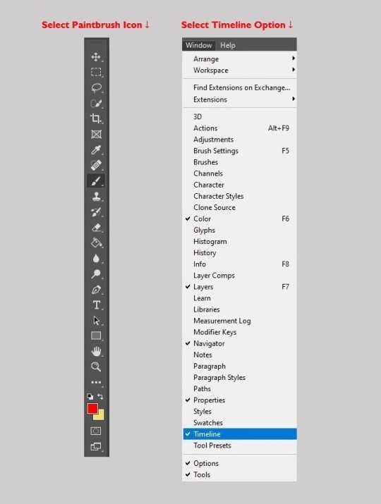
Next, select the ‘Paintbrush Icon’ from the toolbar, get out your brush-tool and start drawing! Keep trying to get the character to look how you desire. Remember, you can use the drawing tools to edit images you have uploaded or you can create images from scratch. It’s okay if it doesn’t look great immediately, you’ll get there, most good things happen with time.
‘Layers’, they are a thing and a very useful thing. If you layer-up your work, you can start to make your animation. Also, the useful thing about layers is that you can trace over other layers, so, they look the same and are in equal proportion. You start at the base layer and stack-up layers as you create your characters. The final layer will be the first visible.
Once you have some layers sorted out, you can look to the bar at the very top and see where the tab says “Window”, go all of the way down the drop-down selection menu list and click on “Timeline” and when you do, a bar will pop up at the bottom of your screen. You will see a button that says either “Create Frame Animation” (which is the one that I used) or “Create Video Timeline”, for the animation I would suggest using Frame Animation, as I don’t know yet what the other one does exactly. After you have clicked on Frame Animation, you can put all of your layers side-by-side and move them around, edit them. You can do whatever to make the animation how you want it to be. When you have finished creating, don’t forget to name and save your animation.
Once you export your finished animation, you can upload it to your blog, social media, any website or email messages.
Figure 1 - Adobe Photoshop Toolbar and Drop-Down Selection Menu
Simple Steps to Create a GIF:
Open Adobe Photoshop.
Upload and open your created image.
If you want to, you can edit your uploaded image or draw your own character using the drawing tools from the toolbar on the left.
Click on ‘Timeline’ in the window drop-down menu.
Click ‘Create Frame Animation’.
For every new frame, create a new layer.
Open the menu icon on the right, select ‘Make Frames From Layers’.
Under every frame, choose the time-span length for appearance before switching to the next frame.
At the bottom of the toolbar, select amount of times to loop.
Press the ‘Play’ icon to preview your GIF.
Name, save and Export Your GIF.
Upload your GIF to your blog, social media site or email messages.
Steps (from Adobe Photoshop) to Export Your GIF:
Go to File > Export > Save for Web (Legacy)...
1. Select GIF 128 Dithered from the ‘Preset’ menu. 2. Select 256 from the ‘Colors’ menu. 3. If you are using the GIF online or want to limit the file size of the animation, change Width and Height fields in the Image Size options. 4. Select Forever from the ‘Looping Options’ menu. Click the Preview... button in the lower left corner of the Export window to preview your GIF in a web browser. Click Save... and select a destination for your animated GIF file.
Now you have an Animation, I hope. If not, I am very sorry. Good luck!
Please let me know how you get on. If you encounter any problems or have any suggestions, I would really value your feedback posts. Thanks 👍

Thanks to rai-smik for the feedback below:
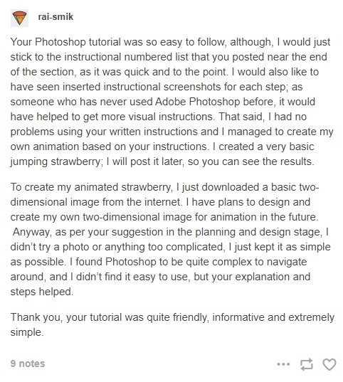
Basic Moving Strawberry GIF - from rai-smik
Created following my Adobe Photoshop Tutorial

Tutorial Review
First of all, I have to say that writing my first Adobe Photoshop pixel animation tutorial was not easy. Trying to explain and write instructions for other people to follow was quite hard. I really had to stretch my brain to try and formulate a comprehensive guide that other people would be able to understand and follow. Using Tumblr for my skill-share was a brilliant medium; it was easy to use and a great platform for sharing skills quickly.
So, after receiving clear feedback from rai-smik (as above) I am now able to reflect on how successful, or not, my skill share was.
I believe that I was able to convey all the necessary information to share my new skills in my tutorial, this is because the feedback from rai-smik reported a successful animation creation (bouncing strawberry GIF above) using my guide. The user said that they were able to understand my numbered instructional list, and they also found the tutorial language/tone simple and easy to understand. So, as the user was able to follow my step-by-step numbered list with no problems, and they managed to create their own GIF, I would say that my tutorial achieved what it was designed to do.
However, after reading my feedback, I realised that I should have taken screenshots in Photoshop of each step that I took to create my animated character, and I should have inserted the screenshots underneath, or above, its corresponding numbered instruction in my tutorial. It’s so obvious now that visual images should have been pasted in to complement the written instructions. I can’t believe that I overlooked such a simple thing. Next time I write a tutorial I will definitely insert screenshots to better convey my ideas to the audience.
Writing the tutorial also reinforced my own knowledge, and instilled a deeper understanding of the things that I had learned during the Photoshop training. I feel more confident about revisiting my new skills and moving forward with new projects. If I go wrong, I can always look back at my tutorial to remind me how to get it right. Also, now I know how to write a tutorial, I can apply this knowledge to other subjects and produce this kind of documentation when it is needed. It is a good skill to have and I know I will keep improving my technique.
Overall, I enjoyed writing my tutorial, it was a fun document to create. I had fun creating the jpeg that shows both the Photoshop toolbar and the drop-down menu. I also had fun searching for a thumbs-up GIF to add at the end of my document. It gave me the chance to look around Tumblr and see what’s going on out there. Mostly, I am so glad that someone was able to use my tutorial, understand it and get good results.
Summary: so, what did I learn from creating a tutorial? ✔✔✔✔✔✔✔
I learned how to share skills and knowledge through blogging, using Tumblr as a platform.
I learned that sharing skills reinforces learning.
I learned to hone my technical skills online and in programs.
I learned how to create a tutorial (transferable skills).
I learned how to write a review (transferable skills).
I learned how to add instructional screenshots (transferable skills).
I learned to consider my audience, beginners who might use my tutorial.
Critical Review - Skill-share (pixel animation tutorial)
Disappointingly, from creating my pixel animation tutorial, I learned that I am not as good as I would like to be at it, sharing skills that is, and I need more tutoring and practice. I also learned that I am not the best at writing a review. I tried so hard to create the tutorial, but I missed so many obvious factors (like lack of screenshots) that someone else who might want to learn how to use Photoshop (an absolute beginner) might not be able to follow my tutorial very well.
Summary: so, what do I need to improve? 🤦♀️
I need to learn how to explain myself better in writing; to convey better.
I need to include more detail and less waffle in what I am writing.
I need to practice and create more tutorials to improve.
I need to practice writing reviews to improve.
I need to include screenshots of every stage of animation.
I need to learn how to add instructional screenshots appropriately.
I need to be more critical of my own work.
I need to learn how to judge and edit my own work to get it right.
I learned that I need to get third-party feedback.
Considering my intended audience user-base (those who might use my tutorial); I wanted to share my new skills to try and help people like me, who lack education and access to good facilities. I was hoping that disadvantaged people, who are basic beginners, might be able to learn from an easy-to-follow tutorial, for anyone who is looking to start animating in Adobe Photoshop (for all ages). Beginners who might want to learn animation. I tried to use simple language and instructions. I believed that everything I explained, every instruction, was easy to understand. However, I now realise that my tutorial was not very useful for some people in society.
Crucially, one thing that I stupidly overlooked and have genuinely learned from, is that most disadvantaged people do not have Photoshop or access to Photoshop; I only know one person, in my whole association, that has access to Photoshop. I came to realise that once you’ve had access to something (like Photoshop) how easy it is to fall into the patronising bourgeois trap of “Let them Eat Cake” 🎂 -- so, that was very foolish of me! 😒😒😒
APOLOGY: the label ‘Disadvantaged’ is considered to be discriminatory. ‘So-called’ disadvantaged people find it insulting and patronising (I should know, I am labelled as disadvantaged).
“Once you label me, you negate me” - Søren Kierkegaard
This is a ‘Critical Review’ and I am criticising my own work and abilities. I apologise to any reader who is offended, it is not my intention to patronise, alienate or offend. 🤔
11 notes
·
View notes
Text
Rebecca Sugar

Rebecca Sugar is an animator for Cartoon Network; she is also a book illustrator, writer, producer and director. Adding to that, she also worked as a storyboard artist for the CGI film Hotel Transylvania. She was the first woman to create a series single-handedly on Cartoon Network, with her revolutionary series ‘Steven Universe’. She draws what the characters look like and gives them life through the show. She also helped out on ‘Adventure Time’, she wrote a lot of the songs for the series and also writes the songs for Steven Universe as well.
The way she expresses how her characters feel and develop are extraordinary; she made the show as a way to help people who are suffering with mental illness, and despite the people of Cartoon Network’s disapproval, she made her characters openly part of the LGBT+ community. I really admire her work, as an artist she has a wonderful flair in her drawings, the range of emotion held in one drawing seems very real.
Rebecca stated in an interview, that her main inspiration for Steven Universe was her brother and herself. See the quote of what she said at the following page: (http://www.animac.cat/magazine_en/entrevista-amb-rebecca-sugar-creadora-de-steven-universe) - what she wanted to do with the series was something that not many shows can achieve.
One of her goals when making Steven Universe was to show Steven as a child and then growing into a sort of miniature adult. There are so many things in the show that Steven doesn’t know about, because it all happened before he was born. What she tried to do was show how complex the world really is. She also said that the show was based on her and her brother, Steven Sugar, and what life was like for them when they were growing up. When they were young she wanted to make sure that he didn’t make the same mistakes that she had made when she was his age. She wanted to make sure that the show conveyed that very feeling, and make it so the audience was learning and growing with Steven as the show progresses. Rebecca showed that the world is the way it is for a reason and Steven has to learn the harsh truth that comes with that. In this way, the show is shifting from a self-centred universe to seeing how the world isn’t like that at all. Also, in that way they wanted to explore how each character acts with Steven and how they are as individuals.
I think that Rebecca is an inspiration to all aspiring animators; that their characters they design don’t have to be two-dimensional, they can feel and understand and grow. These characters can help people so much more than they initially realise. Rebecca is only 32 and she has already achieved so much in her line of work.
I’d say that Rebecca has inspired my own art and ideas with how I explore my characters, how they are as an individual, but also, how they interact with other characters. Trying to think outside the box and not falling into tried-and-tested formulas that are so tired and outdated. Also, her use of different shaped characters, some are designed to be more square, others more round, etc. It really has encouraged me to try and be more diverse with how I draw.

5 notes
·
View notes
Text
My Photoshop Pixel Art Thingy
Participating in the Arts (pixel animation workshops):
GIF 1 - My Final Animated Character
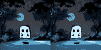
The creative pixel animation workshops at UCA (through KaMCOP) are an amazing opportunity for young people, who do not have access to good facilities; or may have poor future prospects, especially in terms of quality education. As a youth with aspirations, I wanted to take part in this activity because I hoped to learn how to create animation and GIFs in Adobe Photoshop. I personally cannot afford to buy Photoshop and have not been privileged enough to attend a school where it was available to use -- ACCESS DENIED! ⛔
So, I really hoped, that by partaking in the pixel animation workshops, that I would get the chance to learn how to animate and how to develop animated characters using the latest software, and to have access to University facilities. I hoped to learn how to navigate and use Photoshop to create pixelated GIFs, and therefore, improve my skill-set and knowledge, so that I could improve my chances of further education. I also wanted to get my Bronze Arts Award to add to my qualifications.
The Pixel Art/Animation workshops were extremely enjoyable and entertaining. Our brief was to create a 2D animated character in Adobe Photoshop. First, we practiced and drafted our characters on card and acetate. Then we uploaded into Photoshop and edited until we had the desired effect. We used layers and all the necessary tools available in Photoshop.
Using Photoshop is really hard. This was my first experience using Photoshop and I must say that I did learn a lot. I know that it isn’t much, but trying to make a person walk is very difficult, to try and move the arms and the legs in the right way to make them look like they are actually walking was so much harder than I thought it would be. However, I did learn to create a walk-cycle (thank goodness!). There are so many different Photoshop tools to use, and to fully utilise them would take forever to master. I hoped to learn as much as possible about animating, creating characters and to get a good grip on using Photoshop.
To pull off an accurate walking-cycle, you need to draw the person (or being) in the ‘Contrast and Passing’ poses, where their legs are apart and their arms are up to where their legs meet and their arms are down. I tried really hard, using the brush-tool, to draw a person walking and I could only manage the blurry silhouette in the second GIF (see GIF at the bottom of this section). I thought that if I created the walking cycle first, then, I could create a character around that frame; but soon after doing that, I realised that it was very hard. So, I stuck with a silhouette and I thought that (with some help) if I put in a drawing that I already had at hand into Photoshop, I could draw around them and animate them and it would look pretty cool. After tracing around the buff-man in the second GIF, I once again realised that animation is difficult and decided not to move him, but instead use the the silhouetted character to walk up to him (kinda).
With the Ghost GIF (at the top of this post), the idea came to me through advice, and that advice was to keep it simple with designs that I am used to drawing. They suggested that I draw a ghost, similar to the ghost that I drew and used for a very simple animation thingy that we did on the first day here at UCA. The idea to have the ghost stay still and have that hover effect was also suggested to me through advice; and I have to say that it worked out really well. I thought of using a ‘Scooby Doo’ type backdrop picture for the background behind my ghost character, because I thought that it went well with everything. Although I was fairly frustrated with using Photoshop, I still feel like it was really cool. I loved the software, I just wish that I knew how to use it better.
I very much enjoyed seeing my final animated characters and the GIFs that everyone else created; because it was an achievement for someone like me, and I was able to share the experience with other learners. I learned so much, I am so happy to have gained some Photoshop knowledge and skills, as I had never used it before, I hoped to learn how to use it, and I believe that I did. I also improved my drawing skills, by learning how to develop characters specifically for animation, using sequencing and storyboards. In the future, I would love to further develop my animating skills and I can’t wait to have access to Photoshop again. Attending the pixel animation workshops has raised my aspirations to continue with my education.
Summary: so, what did I learn from the pixel animation workshops?
I learned to navigate around Adobe Photoshop.
I learned how to use editing tools in Photoshop.
How to develop animated characters.
How to create, upload or select an image for editing.
I learned about sequencing and storyboards.
How to use ‘Layers’ in Photoshop to create frames.
How to use tabs in Photoshop.
How to use drop-down selection menus in Photoshop.
I learned about concepts and how to create walk-cycles.
How to save and export created pixel animation GIFs.
GIF 2 - My First Silhouette and Standing Man GIF
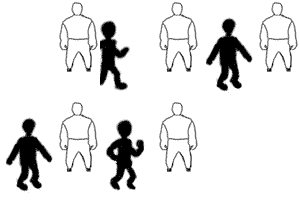
Previous Animation Experience:
When I was 10-11 years old, I was a member of the ‘Stop Frame LEGO® Animation Club’ 🐱🏍 -- this involved Stop Motion manipulation techniques of LEGO® pieces, using a digital camera with Windows based software to create animated films. This was my only previous experience of animation (other than watching it). So, I really wanted to partake in this activity (pixel animation workshops), because I hoped to learn more about new (new to me) animation techniques and how to use Photoshop. I wanted to gain experience of creating 2D GIF animation, improving on my current knowledge-base of stop motion animation.
In addition, I also wanted to learn Photoshop, so that I would be ready for UCA, as I am starting there in September for pre-degree studies. I am also an amateur photographer and learning how to navigate around Photoshop is the ‘Holy Grail’ of image manipulation, as I have only used MS Paint and GIMP at home and school. I feel that learning how to create animation in Photoshop, and having previous knowledge of stop motion animation will put me in good stead for my future studies. I am also interested in the BA (Hons) Illustration & Animation undergraduate degree course for the future.
For more details about the ‘Stop Frame LEGO® Animation Club’ click on the following link: https://kentfilmfoundation.co.uk/
11 notes
·
View notes
Text
Sonic Film Review: SPOILERS!
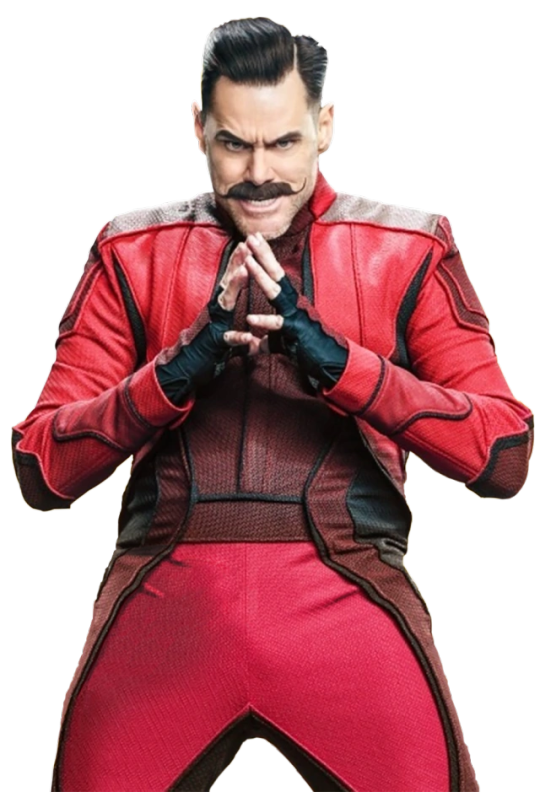
Sonic the Hedgehog
Rating: 👍👍👍👍👍 -- HIGHLY RECOMMENDED!
I really enjoyed the film and recommend it to people of all ages.
Initially, I walked into the cinema with very low expectations, I thought the film would be lowbrow and only fit for young children. Also, after the bad publicity regarding the production, I believed the film would be disappointing. I understood the cultural significance and I appreciated the fact that the story of a very weird space hedgehog that we all know and love, Sonic, would now be getting his own film, bringing joy to the newer, younger generations that are maybe less familiar with Sonic.
My low expectations were shattered! The film was extremely captivating in every way, it wasn’t a film just for young children. I absolutely loved the way that the animators showed Sonic’s powers, the electricity and pure power energy that radiated from him. The cinematography was fantastic, applying vivid colours and using different camera-angle techniques, like dutch tilt, and various other shots to capture the feeling scene-by-scene. I know that the project had some issues when creating him to begin with, causing a massive global panic on social media. Good thing that they decided to go in a different direction, to make him look more like Sonic from the Sega games, and not like the nightmares of children. I really liked how the eyes were shown in the film, they reflected so much and they were so detailed.
Another favourite part of this film was in the final duel of Sonic vs Robotnik. Sonic rises from the floor, electricity surging through his entire body and again in his eyes, challenging him, saying that he won’t use his powers to run away anymore. Robotnik’s response? He gives the blue shining Hedgehog a disgruntled look and puts on his goggles, and in this moment we see Sonic’s reflection in Robotnik’s goggles. The CGI for this was on point! Just that one moment gave me goosebumps.
Also, another thing I loved about the film was the excellent choice to cast Jim Carrey as the actor for Robotnik. He utterly crushed the role. The beloved actor used his charisma to make the audience chuckle, even in those moments when you least expect it. He brought that insane, intelligent supervillain to heights we could only imagine. Jim Carrey is definitely a master of his art, his skilled acting is truly an art-form.
The soundtrack was so fantastic, it was a well thought out compilation of tracks. The remix of ‘Blitzkrieg Bop’ by The Ramones with 90s game-SFX-sounds added was brilliant, so upbeat, what a great choice. Don't Stop Me Now by Queen was also an excellent choice. However, I have to say, the revelation of the soundtrack was Wagner’s ‘Flight of the Valkyries’ performed, or should I say whistled, by Jim Carrey, Dr. Robotnik himself. 👀
The least thing I liked about the film was the story-line, although it wasn’t bad. The script was pretty basic, nothing out of the ordinary, and it was predictable in parts. The scriptwriters, Patrick Casey and Josh Miller met the brief, they created a script within the expected formula. So, in that respect it was a job well done. If I could change anything about the film, it would be to add a few more dimensional layers to the story and a few more surprises.
The advertising for the film, I feel was not really as good as it could have been. In my opinion, due to the backlash that the earlier version of the CGI Nightmare Sonic had gotten, the people behind the project may have slightly panicked and tried to keep it minimal, so as not to get anymore bad publicity for the film. Of the adverts that I have seen, it has mainly been on children’s channels, which is targeting for children, so that they would instantly pester their parents to take them. However, despite this the adverts are very clever, they are very short snippets over the span of all of the adverts between films and shows. All of the snippets conveyed everything that they wanted to convey about Sonic, they showed speed, humour, everything. It keeps coming back, I think they appear three times in each load of adverts. In my opinion, this was a very smart move, they had the opportunity and they took it.
I feel like the director (Jeffrey Fowler) and the animator (Moving Picture Company) had a lot of love for the blue space hedgehog, and tried to put in everything they remembered from their childhoods, when they may have played the games. I think that this is well reflected in the credits. The credits were incredible! They were designed like the many games made of Sonic’s adventures, going through them as he hopped through the story in the style of his games, and also, he actually went through his old games, multiple different ones, going from level-to-level. I absolutely loved this added bit of spice to an already pretty good film.
Feedback welcome 👌
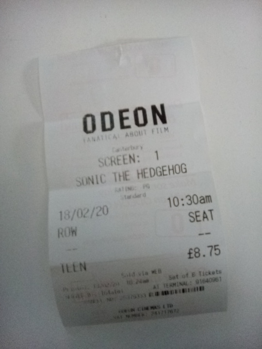
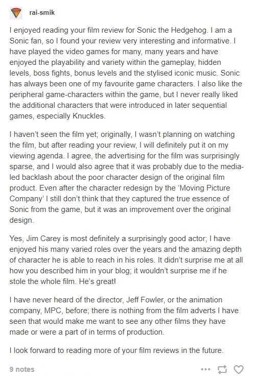
Thanks to rai-smik for the feedback below:
13 notes
·
View notes