Text
Dramatic lighting tutorial
https://www.instagram.com/relseiy/p/Bu7B638BVyd/?utm_source=ig_share_sheet&igshid=d5tlwz3tdtct
0 notes
Text
Conclusion
I intend to create a piece of concept art for my final project of a siren playing two harps. The theme will be synesthesia and I will be portraying this through colours and lights within the piece, along with musical notes. These lights will likely extend to the siren’s eyes, lips and fingertips glowing, the point of this being to show that she is the one ‘controlling’ the synesthesia and making those who hear her music see it also.
The essence of the piece is ‘reverse synesthesia’ - you see the colours and lights along with the instrument, and you are to guess, or imagine, what it would sound like. Level 2
There are a couple different levels of what I will potentially be doing in my final piece, as I may not find the time to do them all.
In this level, I will be adding in motion graphics to my concept art in After Effects. I will not just be illustrating coloured lights, I will have them move around the piece, fading in and out.
Level 3
Although not necessary, I could create a musical piece with digital harps to match the piece, complementing what the siren is meant to be playing.
Level 4
I could potentially add vocalise vocals into the piece to imitate that of the siren singing. This may be tricky with learning vocal clean up.
0 notes
Text
Sound Elements
As my siren character will be playing two harps, I figured it makes sense to have harp music to accompany this, if I do. Any music would be added in right at the very end. Since the concept art is to be portraying synesthesia, it is meant to be asking the viewer ‘what is she playing’ before they actually hear anything, so in a sense, it is reverse synesthesia here - you see the moving colours, but you don’t hear anything. You imagine it. Therefore, the musical piece is complementary but not necessary. I think whether or not I do add moving parts into the image depends on how the music shall be presented. It could be rendered along with rest of the ‘video’ or if I create only an image, I will have some way to play the music separately. The music and the motion graphics would not especially be matched to each other like in sound design, but the graphics would move in such a way that it would appear that they do move with the sounds - loosely. Sound Software
Last year, I was introduced to Pro Tools, and so I am fairly familiar with how to use this program. Native Instruments is a massive set of virtual instruments which can be used along with Pro Tools for musical compositions, this is how I will be creating my harp sounds. I could also use Sound Toys, which is similar to NI, but is a set of effects rather than instruments. Type of Sound
I would create a fairly simple, possibly looping, piece of music. I intend for it to be calming and soothing, but pretty, with a mystical touch. It is likely I will add a fair bit of echo onto the harp.
It was suggested to me to perhaps add an underwater filter to the music when it is done. I like the idea of this as it would match well with the siren, especially if I do portray the piece underwater.
Vocals
This is quite unlikely to happen unless I finish fairly early, but since my character is a siren, I could add some simple vocals to this. There is a ‘style’ of singing called vocalise, where you sing without words, just a melody.
I have been raised by a singing and piano teacher, so managing to sing like this would be no issue as I have been trained. However, I may need to make use of Izotope Rx in the studios to clean up my vocals once recorded.
youtube
I could layer the vocals in a way such as the above, making it appear to be several voices. This could be particularly interesting if I play with the dynamics of which ear the sounds appear in.
0 notes
Text
Art Style

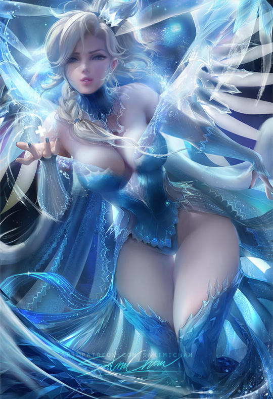
(Sakimichan, 2017) For my FMP, my focus will heavily be on improving my concept art skills for when I leave uni and following a lot of tutorials to do this. I am going to focus on improving my rendering, particularly in light and composition. My favourite artist is Sakimichan, who painted the above. Ideally, this is the style I will be trying to recreate, at least to a degree. Her style is largely ‘realistic’ in the rendering of skin, but the features themselves are stylised. Sakimichan herself has many tutorials and so, the fastest way for me to discover her methods is to follow those in particular.

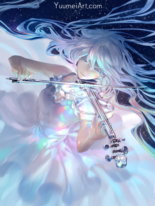
(YuumeiArt, 2017)
Another artist who is going to largely influence my piece is Yuumei. Many of her pieces focus on a character playing an instrument, which is my main reasoning for this. She tends to put across the emotion of the character feeling the music as they play their instrument successfully, which is an element I can try to portray also. Their focus on colour is also softer and more fantastical. From this particular piece, it has given me the idea to have the synesthesia lights potentially reflect back onto the skin of my siren, such as the lights do in this.
Layout
Depending on whether or not I do decide to add in moving elements or not in my piece may depend on the dimensions on the piece.
I would need to create an image with the dimensions of 1920x1080 to turn them into a ‘movie’ in After Effects, which I could then show on a screen for viewing. This would also mean that I would have to create the image in ‘landscape’ mode, wider on the sides than height, which would affect the layout of elements I include - such as, more of the harps would be visible on the sides. If I were to create the image without moving elements, I would be printing it out instead, so ideally I would be sizing it for A3 for the largest print. This would actually be larger than for After Effects, 3508 pixels x 4961 pixels with a dpi of 300. This could potentially slow down my computer and cause problems. Experimentation


I tried out the exact sizing I mentioned. More of the character’s bottom half would also be seen in the first, landscape mode. It could help to show more of her and show perhaps her siren tail, but I believe enough of it could be shown in portrait mode also. Landscape mode could also show what the harps are positioned on, which I imagine would be rocks while the character is half in the sea.
Colours
In my piece, I plan on having quite a soft colour palette, focusing on golds, blues and pinks.

This is a very quick palette I put together. It would need to softened out and toned down in the actual piece, but essentially these are the type of tones I am aiming for. I want the mood of the piece to be quite light and graceful.
0 notes
Text
Sirens/Mermaids Moodboard
I decided to look into siren designs so as to help me design mine in the second assignment. http://www.gomoodboard.com/boards/qP6o_oqL/share
0 notes
Video
tumblr
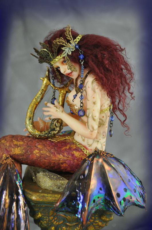
I did a short test with an image (Divine Designs, N/A) in After Effects with the snow tutorial to see how it would go and found it was indeed quick to do. For my actual project, I believe it would not be too much of a challenge to add some movement like this into my image, just with more fading in and out lights instead of straight snowfall. Although in a previous post I gave an image from one artist on how synesthesia appears to him, and I agree it is the most similar on how it appears to me, synesthesia has no real set appearance - so having fading lights can also be considered a valid interpretation.
0 notes
Text
Siren Character Development
So it was at this point I started to think more about who my character actually would be in this piece. It came to me a while back that they would not just be someone playing music for us to interpret how it appears for those with synesthesia, but rather the character has the ability to see sound herself. This idea developed a little when I started thinking about potentially adding vocals into the attached musical composition. Maybe the character does not only see sound, but maybe she controls the synesthesia and can make you see it, like a superpower where she hypnotises people with these colours while she plays her harps. It got me thinking, which type of person could do something like this? A siren. This idea solidified further as the character is already meant to be playing a couple of harps, which are often associated with mermaids, or rather the smaller version of them, lyres.
Harp Experimentation

In regards to whether to keep my original idea of harps or to use their original smaller version, lyres, I did test out how it would appear. I believe it wouldn’t make too much sense for her to being playing the lyres because she would need to both be supporting them in the air and playing them simultaneously.

So I did a little test of how it would appear to have them placed atop pillars of some sort to balance them. It could possibly look good to have them be smaller, as then the focus is directly on the siren.

However, I like how the harps appear to almost look like wings due to their shape and so having them large could further this effect. Also, since she is supposed to be in the sea, pillars would not make much sense, and rocks too high up may not be very aesthetic.

(SutherlandArt, 2010)
Sirens In Mythology
Modern sirens are portrayed more akin to mermaids - beautiful with half fish bodies, if perhaps a creepier version sometimes. This is more the appearance I will be aiming for, minus the creepiness, rather than the original version of them where they are portrayed with human heads on bird bodies. Both versions, of course, are known for their hypnotic singing voices which drive sailors to their deaths (Geller, NA). I believe the crossover association between mermaids and sirens in appearance began from some languages having only one word to describe both. Such as, in Spanish, ‘sirena’ means mermaid and siren. There is no separate, distinctive word (Pizarro, 2017).
0 notes
Text
Synesthesia Idea Development
Synesthesia Types Since by this point I knew that the ‘dissertation’ was to be a little different, I changed the theme from purely sound and image to the synesthesia theme, planning to research this instead. Synesthesia is essentially the cross over of senses - seeing colours, scents having textures, seeing numbers in colours, etc. and there are apparently over 80 different types. Each type has its own sub-name and some types are more common than others. For example, chromosthesia - seeing sounds and music in colours (Marc, NA). This is the type I wish to portray in my piece. Here is a quote which describes what it is like from a documentary: ‘It's not the same as a hallucination. It's not actually interfering with their ability to see, so in that same way, you could picture a giant orange pumpkin sitting in front of you, but that doesn't prevent you from seeing through that and past that.’ (Eagleman, 2009) So, in essence, chromosthesia is when you hear a sound and a visual image gets triggered from it.

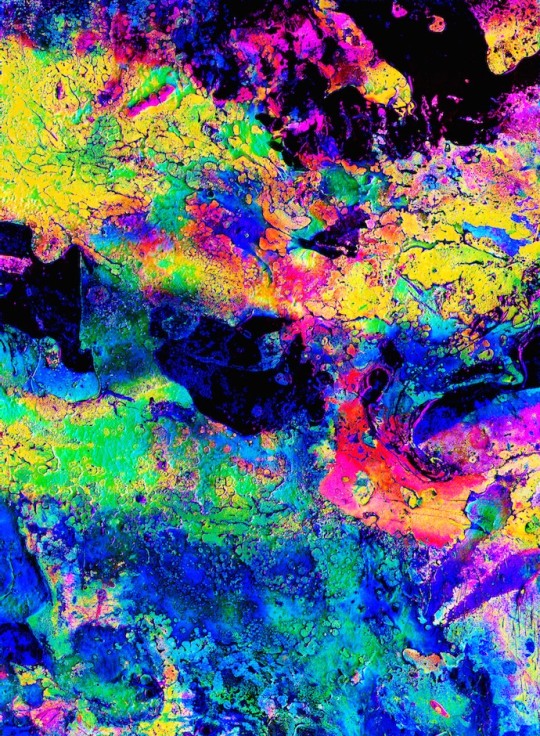
(Coulter, N/A)
One artist with synesthesia, Jack Coulter, attempts to recreate how it appears to him through abstract art, such as in the above. This piece in particular is very similar to how I see it myself.
Character Concept Addition Once I knew what theme I wanted to do for my concept art piece, I had to think what exactly I would be portraying. Since it would a concept piece, I figured that for it to be good for my portfolio, I should draw a character. This developed into the idea of a girl playing some music in the piece, and to separately compose a piece of music to be put with it, to sort of make a game of ‘guess what she is playing’ but wanted to find a way to show the theme more. I was given some feedback at this point on how to link this more to synesthesia by trying to portray that part with lights and colours. I figured this would work well placed in the background alongside some musical notes swirling around. It was at this point I found I could choose to simplify things by making purely an image with no sound and just portray synesthesia physically with what the girl plays, or I could choose to put a piece of music to it anyway as an additional touch. Project Layout Since we had been shown examples of people who had done massive projects where they flashed their work all over the side of a building and we were encouraged to ‘dream big’ also in our pieces, I went on to think just how much I could potentially add to a piece like this. At this point, I had more of an image of what I wanted the layout of the piece to look like. I figured a girl playing two harps simultaneously could look cool, with her hands crossed over. I wanted something with light, ‘beautiful’ colours (gold, pastels) and a touch of a class - something which would look good in a portfolio. Project Complexity For additional details here, I was thinking of taking the concept piece into After Effects and making the colourful lights subtly flash and move around the piece. This possibly could be fairly easy to do considering there are many ‘ready built’ motion graphics in AE which I have seen before, like adding falling snow to a scene. I could tweak this to have soft colours which appear and disappear, twinkling across the image. I would just have to create the image with the correct dimensions and render it as a video.
youtube
I also thought of having the musical notes weave between strands of her hair and circle around in a loop. This part would be a bit time-consuming, especially as to do this effectively I would have to change the angle of the notes, warping them as they circle about.

(NA/NA) I liked the idea of the notes moving like this, because if done correctly it could come across as the above, with an occult-like touch to it. This idea appeals to me as synesthesia does have a certain magical feel to it. Character Movements At this point, I was figuring perhaps I could have the character herself move a little in the piece.
youtube
This video was a massive influence for this thought process. I had seen this before and thought the colour changes were beautiful. I love the fluidity of the changes between the different modes. I figured perhaps I could add some minimal animation to my character also, with having her hair move subtly like in the video. I figured I could do this by painting the hair on different layers and subtly 2D rigging it in Photoshop or somewhere. With the ‘thinking big’ idea in mind, I thought over just how much I could do. I thought it would be great if I could have my character’s hands move a little on the harps, plucking the strings, but this would require any music I add to it to be accurate to the notes and to be very simple for it to match fully. I also figured perhaps I could have the character sing and animate her face (jaw) in Adobe Animate. I have always been interested in what I could do with this software, but realistically, maybe it would turn out so good, especially if I wish to create highly technical art. Animation Simplification: Cinemagraphs

(Burg & Beck, NA)
I thought to simplify things back down a bit by maybe only having some subtle movement in the piece, rather than going overboard with the hands, hair and mouth movements. I gained some inspiration from cinemagraphs, such as in the above.
Cinemagraphs are different to regular animated gifs in that they focus on the quality and artistry of the image. They are more like high definition photos with subtle movements. They also focus more on creating a believable loop, where you cannot see the cut-off point, and often only have one moving part in the image while the rest is still, done purposely for effect (Ana Gak, 2016).

(NA/NA) So from here, I figured I could go back to focusing on the background lights moving and if I were to make movements in the character, it could be that her eyes could glow and maybe her fingertips, or her open mouth if I do add vocals to the musical piece.
0 notes
Text
Idea Progression
Sound For this final project, I knew I wanted to do something to do with sound. Since I assumed we would be doing a massive, strict dissertation, I wanted something I’d be interested in to write about for it. I started from this and was planning to write it about ‘sound and image within films, games and animation’ so that I would cover a lot of ground by being broad with it, deciding on this over the summer before I found out the stats on the write up had changed. Project Linking I had then initially tried to find a project to do linking with the sound dissertation. I wanted to compose something using Native Instruments and make use of the sound studios. I figured if I were to do something linking with my course, then I could do an animation and somehow change the sounds in it for the ‘experimentation’ stages we were meant to show. The idea of doing one animation rendered with different types of music to give a different atmosphere was suggested to me. I liked this, as I could put across a spooky atmosphere, sad one, happy one etc., and just focus on the sound experimentation more than the animation. Project Changing After we had been given examples of what others had done, my mind started changing on what I wanted to do. I do not feel super confident in my animation skills, and while I may enjoy more than some others do, it is not what I get the most joy out of.

(NA, 2014)
It was at this point that others gave me feedback on what I could do, like coding a model to move to music like someone had done in the first year, or having a simple piece of ‘geometry’ move to sound, like a rippling piece of fabric, similar to the above. I felt coding was not my area at all and that the latter was too simplistic for me.
Concept Art I figured if I do something degree related after leaving uni, what I want to do is to be a concept artist. I started thinking that what I wanted to do was a piece of concept art, and focus heavily on developing my art during the experiments. Finding a way to link this to sound had me thinking outside the box, because I still wanted to write about sound, but how could just an image fit with this? It was suggested to me to purely make a sound piece, but I felt this was too far removed from my course, even if it would be fun. Theme Choice Since we had to focus on picking a theme, synesthesia came to me as one, giving me the link between the image and sound. I started thinking that somehow I could portray in a piece of concept art what synesthesia looked like.
0 notes
Text
YEAR THREE STARTS HERE
‘ANIMATION PROJECT’ FRIDAY CLASS BLOG STARTS HERE
0 notes
Text
Tumult Hype - Anxiety Theme
For the mini-game in Tumult Hype based on anxiety, here is the short plot I have in mind:
• The main character will be a sprite in the bottom centre in a hall.
• Greyed out other characters around her. • The other chars will be much less detailed; snowman-shaped and such. Laughter Main character will hear laughter and has to figure out who is laughing at her. • Possibly will have a ‘demon face’ flit across the greyed-out characters until she clicks on one to see if it is them laughing. Otherwise, she has to click on each character anyway to find out who is laughing. Click • When clicked, the greyed-out characters will turn into their colours, probably will all be coloured differently (pink, blue, etc.) • Chars may speak when clicked, saying ‘what is it?’ or something. • When all chars are clicked, all will be coloured. One Left
• After all are clicked, game will say there is one person left. • Only place left to click is on yourself. • Click > scene changes to a mirror • Face changes to laughing demon face. • Maybe zooms in on face, laugh gets louder, goes black.
0 notes
Text
Cubism Portfolio
These are photos I took at Tate Modern for primary sources of Cubism. I’ll add these both here and in my research document - in there they will have their references which I found by reverse searching the images.

Two Women Holding Flowers by Fernand Léger.

Weeping Woman by Picasso.

Bottle of Rum and Newspaper by Juan Gris.

Bust of a Woman by Picasso.

Still Life with a Beer Mug by Fernand Léger.
1 note
·
View note


