
Statistics
We looked inside some of the posts by chelseaappreciates and here's what we found interesting.
Average Info
Notes Per Post
219
Likes Per Post
135
Reblog Per Post
83
Reply Per Post
1
Time Between Posts
10 days ago
Number of Posts By Type
Text
6
Last Seen Tumblr Blogs


Fun Fact
Tumblr was attacked by a cross-site scripting worm deployed by the Internet troll group GNAA on Dec 3, 2012.
Text

Life is complicated.
via Dr. Heidi [Instagram]
218 notes
·
View notes
Text
Final Virtual Sketchbook Entry
Hard as it is to believe, it is time for my final project. I decided I wanted to do something based on my first virtual sketchbook entry for the semester, to give the coursework a cyclic feeling. I also wanted to include some fiber art, because it holds a special place in my heart. I love the folk tradition of punch-needling and embroidery so I’ve incorporated that in my piece as well. Weaving the photo also had a bizarre folk-reminiscent feel in my mind. The final product looks nearly pixellated, which I didn’t expect but kind of love. I love the juxtaposition of a digital-age component on a rough, organic, folk-reminiscent backdrop. I feel like it reflects modern life- forward-thinking but also rooted in the past. So, here it is, folks! This is my journey to my final project...


Homage to a Self-Portrait
Chelsea Peters, 2020
11 in. x 14 in., paper, cotton yarn, burlap coffee sack, & Portland Pin on canvas
Thanks for an eye-opening semester! Take care!
Chelsea
0 notes
Text
Virtual Sketchbook Entry #4
1) WRITING, THINKING, AND LOOKING CRITICALLY
Having only ever seen Jackson Pollock’s famous “drip” paintings, it seems hard to believe that he studied under Thomas Hart Benton. Their art is so different. While Benton’s work is beautiful, it shows restraint. Even though Benton’s own style shifted and changed, it wasn’t quite… free. Pollock said studying under Benton gave him something to react against. He must have yearned for that rebellion. As a chronic alcoholic, I imagine he must have had emotional baggage and demons that he felt he needed to express. Whether or not that expression found a good outlet in his life, expression in painting gave him a safe space. Restrained, technical painting would not have provided him with the same release as abstract painting would have. Pollock believed that there were no mistakes in his art- every drip represented his movements, so therefore it couldn’t ever be wrong. To be able to be express yourself in a “pressure-free” environment must have been an unmatched freedom. Pollock was a complicated man, definitely not all good- but not all bad either. His legacy in art is something that was new at the time and is still incredibly noteworthy today.
Source: https://www.artistsnetwork.com/art-history/thomas-hart-benton-jackson-pollock/
2) For this week’s sketchbook entry, I wanted to try ALL THE ART! For years there have been paintings that I have wanted to try but lacked the initiative and bravery to just go for it. Until this week. So, I tried a bunch of different things- oil pastels in the style of van Gogh and a drip painting somewhat in the style of Pollock. I threw in a gradient wash painting and random abstract piece for fun. All in all, I am glad I finally tried it and I had a lot of fun trying my hand at some new art styles!


0 notes
Text
Virtual Sketchbook Entry #3


The Syndics, 1662
Rembrandt Harmenszoon van Rijn
2790 mm x 1915 mm
Oil on canvas
The first time I saw this painting, I was wandering around the Rijksmuseum in 2015, staring up at the works of the Dutch masters with wonder. The glow of the faces, all whom were staring at me as if I had just interrupted their meeting, captivated me. The implied lines of their gazes made me feel as if I was there- included in the very painting I was studying. It is these same qualities that still entrance me. Rembrandt is one of the most famous baroque painters there is. It is said that his works are of the Northern Netherlands school of painting. The syndics of the Amsterdam’s draper’s guild were a group of men who oversaw the quality of a dyed felt-like woolen material called ‘laken’. They were the ones who commissioned a group portrait that would hang over the fireplace mantel in their guild conference room. Rembrandt took this into account. He adjusted the point of view so that eye level would coincide with the table. In order to avoid the portrait looking natural and dynamic, he had one of the guild members appear to be in the process of sitting down. The looser brushstrokes that he employed help add to the motion of the body (The Syndics, n.d.). We see the repetition of the black garb and hats (with the exception of the servant) and faces that help create a rhythm across the painting. The use of warm browns and reds behind and in front of the bodies helps to unify the composition. He achieves balance by stretching the highly contrasted figures out horizontally across the painting. I like that he uses the most intense shades of red in the corner of the table closest to the viewer; this illusion of protrusion helps to incorporate the viewer into the scene.
I love some of the details that I have found out about this piece. For one, it was commissioned at a time in Rembrandt’s life when he was still respected but no longer in high demand. He had overspent and had to go bankrupt- forcing him to sell of many of his works and downsize his home. It explains why someone who was considered a master of the Dutch Golden Age was painting a guild commission portrait. His finances never improved, unfortunately. He died less than ten years after this painting was finished and was given a pauper’s funeral with an unmarked grave on church property, despite his being an atheist. His remains were later dug up and destroyed (Molcard, 2019). This breaks my heart. It seems all too common for the most brilliant and artistic minds of the past- the ones who created the things that decorated the homes of the wealthy- to die relatively young, sometimes struggling with their mental health, and poor. How is that fair? Nevertheless, this painting is a testament to the skill of man whose career was in its twilight. He had the ability to take a simple group portrait and breathe life into it. He made it feel so much more alive than just a posed ensemble. He captured real men (whose names are still known (De waardijns, n.d.)) and showed them doing what they did best. I can only hope that they appreciated how special this luminescent snapshot really was.

Me, revisiting the Rijksmuseum virtually, among others (Ringling included)
References
Molcard, E. (2019, February 01). 21 Facts About Rembrandt. Retrieved July 10, 2020, from https://www.sothebys.com/en/articles/21-facts-about-rembrandt
De waardijns van het Amsterdamse lakenbereidersgilde, bekend als 'De Staalmeesters', Rembrandt van Rijn, 1662. (n.d.). Retrieved July 10, 2020, from http://hdl.handle.net/10934/RM0001.COLLECT.5217
The Syndics - Rembrandt Harmensz van Rijn - Google Arts & Culture. (n.d.). Retrieved July 10, 2020, from https://artsandculture.google.com/asset/the-syndics-rembrandt-harmensz-van-rijn/ZgHt6DZhk-6SVw
0 notes
Text
Virtual Sketchbook Entry #2
JOURNALING- The Principals of Design
- Unity and Variety- Contrasting principles where unity serves to unite the piece of work and variety strives to diversify the elements within it. In everyday life, we use these principles when picking out what to wear. We want the pieces of our outfit to perhaps have a certain degree of unity, so it has a cohesive look, but enough variety to not appear boring.
- Balance- The achievement of visual equilibrium, in so that the elements within a work appear well-matched. This can be achieved by repeating elements on both sides of the work or by asymmetrically balancing the sides with different elements of similar visual weight. In real life, I used this principle designing the wall my TV is on. I wanted it to appear balanced, so I have my TV on a stand in the center with tall, thin bookcases on either side. Small staggered bookshelves help balance the dark mass of the TV lower on the wall.
- Emphasis and Subordination- Emphasis is when the viewer’s eye is drawn to one specific focal point within a work. This can be achieved through light-dark contrast, size, and color intensity. Subordination is when the artist makes the other elements in the work less attention-grabbing so that we can focus on what they intended us to focus on. I like to think of setting a table for a dinner party. Your main feature (a roast turkey, or a ham etc.) is usually placed in the middle, maybe on a color placement to draw attention to it. Other elements on the tabletop will be smaller and dispersed so that your eye is focused on the main part of the meal.
- Directional Forces- This is how an artist directs our eye through their piece of work using actual or implied lines. Our mind connects the series of focal points as we are guided “through” the artwork. In a more practical setting, directional forces are used when designing homes. Is movement through the space achieved with a hallway? If it’s an open concept home, how is the flow of movement guided or directed? It could be through furniture placement or use of lines in the flooring, for example.
- Repetition and Rhythm- Repetition is the regular occurrence of certain elements in an artwork. This can be turned into a pattern (structured, all-over repetitions of elements) or rhythm (repetition of dominant and subordinate structures) within a piece of art. A real life example of using these principles is in landscape design. You can color block your flowers or you can use repeating focal point plants with subordinate ground coverings to create a rhythm as you visually travel along the front of the house, for instance.
- Scale and Proportion- Both related but slightly different, scale is the size of things in relation to one another, where proportion is the relative size of smaller parts to the whole. Scale might be thought of as the size of a room in relation to yourself, whereas proportion would concern what furniture you choose to put in said room, and how well it fits.
-------------------------------------------------------------------------------------------
WRITING AND LOOKING- KINDRED SPIRITS by Asher Brown Durand (Chapter 3.4, Figure 3.24 in textbook)
Recipe of elements within this painting:
- Depth from atmospheric perspective.
- Balance with the great space implied in the background by brightly illuminating details in the foreground and middle ground (the men’s figures, the rocks, the flora etc.).
- Unity is achieved through the use of an analogous color scheme.
- The painting appears more realistic by appropriate scaling of the figures in comparison to the broken tree in the foreground.
- Repetition of the colors and the shapes of trees (on the right side of the painting) help produce rhythm.
- Your eye also tends to move backward, up the stream to the waterfall, providing a directional force within the painting.
-------------------------------------------------------------------------------------------
CONNECTING ART TO YOUR WORLD
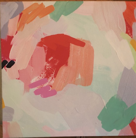
I have this one canvas print from Britt Bass Turner that I love. I can’t readily describe why it is that I love it so much. It’s nonrepresentational abstract- a smaller fragment of a larger work of hers. I was pretty broke when I bought it, but I so desperately wanted a piece of her work that I compromised with this piece from a scratch and dent sale she held. All I can tell you is that it makes me happy. I love her use of pastel tints alongside more intense bits of primary reds. The contrast of cool and warm hues. The dulled peaches and splashes of minty greens. Then there’s something about the punctuation-like twin marks of the deep shade of blue that I’m always drawn to. Needless to say, I will own another piece of Britt’s eventually. Maybe I’ll even save up for the real deal.
If I was to put a color scheme to my life, I think it would be various blues- from vapor tints to dark ocean shades- and deep greens. Calming and grounded. Dreamy yet earthy. Kinda along the lines of how I strive to be in my life.
-------------------------------------------------------------------------------------------
ART PROJECT- PAINTING
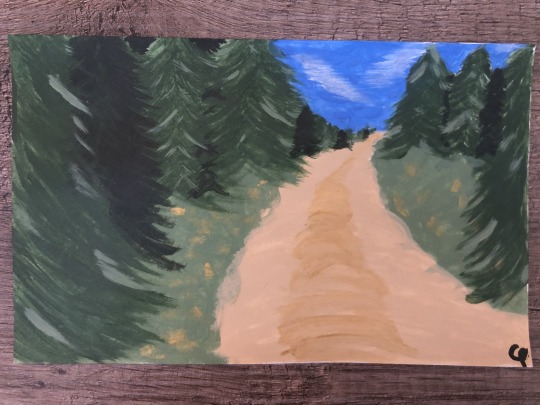
I’m fairly certain this is the first time I have painted anything other than a wall in over a decade. Probably since middle school art class- so maybe closer to two decades. This is not skilled art by any means, but it was fun. I’ve been wanting to do some abstract patterned pieces for our bedroom, so this was a good way to remind me what it was like to put a paintbrush to paper/canvas! I call this THE ROAD BACK HOME. 5” x 8”. Acrylic on index card.
-------------------------------------------------------------------------------------------
GROUP 5- PHOTOJOURNALISM- PHOTOGRAPHY AND SOCIAL CHANGE
These two photos, in my opinion, represent two very different time periods in American history that are very much interconnected. Although about 55 years separates these two photos (Bloody Sunday in Selma, AL- March 7, 1965 to the George Floyd Protest in Washington D.C.- May 30, 2020), they show a direct connect that spans time. Cause and effect. They represent a desperate need for social change- both then and now.
The second photo was taken May 30, 2020 at the George Floyd Protest in Washington D.C. I feel like this picture, along with hundreds of others will be iconic for the year we are living in. This is a time where issues like racial injustice, police brutality, and equal rights are cropping up after seemingly being put to rest almost 60 years ago. These protests have shown that we never got rid of these issues, we have just gotten good at suppressing them as a society. Despite this, we see a multiracial crowd there in support of the cause. Another detail I love about this shot is the fact that we see many wearing masks. The COVID-19 pandemic will be put into history books. This picture will stand as a witness for generations to come what a tumultuous year 2020 proved to be. And yet, in the face of injustice and isolation, qualities such as love and humanity still shone through.
0 notes
Text
Sketchbook Entry #1
Hello everyone! My name is Chelsea and I love my Pitbull as if he was my actual offspring. (His name is Rocky).

-------------------------------------------------------------------------------------------
- The Leonardo da Vinci painting, THE MADONNA ON THE ROCKS, is actually one of two nearly identical paintings. The earlier version, painted in 1483, is displayed in the Louvre in Paris. This version is hanging in the National Gallery in London.
- In 2019, scientists were able to uncover da Vinci’s original sketches for the piece underneath the paint due to the material containing zinc, and therefore being visible in macro x-ray fluorescence maps.
- This painting was in the style of the High Renaissance.
- Depicted here are Mary (as the Madonna of Humility), a young St. John the Baptist (to the left), the Christ as an infant, and an unnamed angel.
- The arrangement of the figures, as well as their interactions with one another, form a pyramid which helps to unify the composition. This unity was different from the Early Renaissance style where figures appear to be more isolated from one another.
The first time I looked at the painting I had both a vague feeling of reverence (because this was clearly a religious piece of work as seen in the cross, wings, and halos) and a feeling of somber moodiness from the use of the dull, earthy colors. After researching it some, I still feel that reverence but now in a more concise way. I enjoyed learning the significance of the arrangement of the figures and what was happening amongst them- Mary extending a protective hand over her child and the Christ blessing St. John, who is making a prayerful gesture toward him. I think da Vinci made an interesting artistic choice putting this somber yet intimate scene in the setting of a somewhat mystical seascape- it definitely creates visual interest between the foreground and background.
-------------------------------------------------------------------------------------------

This piece is acrylic on canvas, and it hangs on the wall of the bedroom that I share with my husband. One of my best friends painted it for our wedding three years ago and we love it just as much now as we did then. Our affection for The Lord of the Rings was something that we had initially bonded over before we started dating, so we knew that we wanted a piece of it to be incorporated into our wedding but in a way that we could continue to use it afterwards. I think it’s beautiful not only because I love the colors and the content but because of the nostalgic emotional ties that are associated with it.
-------------------------------------------------------------------------------------------
The quality of art is very much determined by the eye of the beholder. Who I am and what I have experienced colors my perception of every piece that I examine.
For instance,
- I am on the brink of turning 30.
- I identify as female.
- While I live in Florida, my heart will always remain in Maine- my true home.
- I am pretty much as white as you can get, unfortunately.
- I am a lover of British television, literature, landscapes, and beverages both hot and cold. I love Malcolm Gladwell podcasts, reading, and traveling. So for fun, I do things that combine any of those elements.
- I am one of Jehovah’s Witnesses and that is arguably the most defining feature of my life. It gives me a reliable community, friends around the world, and a firm hope for the future.
- I have been a surgical tech for the last decade- both in Maine and here in Bradenton. I have loved being able to help improve and make a difference in people’s lives in a tangible way.
- I am an odd combination of antisocial introvert and party-loving people person. I am also a huge homebody but constantly crave travel.
It is all of these things and much more that influence that way I look at art.
-------------------------------------------------------------------------------------------
The last year of my life has been an emotional rollercoaster. I have been fascinated by how truly complex life is. When I was completely at peace with my life, I found out that it could be turned upside down in an instant. Then when I was in my darkest times, I was amazed that I could find a reason to laugh or something bright to hang on to. Life can simultaneously be beautiful and terrible. Emotions can be conflicting and layered. How can this all exist within this one body?

1 note
·
View note