
Don't wanna be here? Send us removal request.
Statistics
We looked inside some of the posts by carlosandresvm-blog and here's what we found interesting.
Average Info
Notes Per Post
3
Likes Per Post
2
Reblog Per Post
0
Reply Per Post
1
Time Between Posts
5 days ago
Number of Posts By Type
Text
6
Last Seen Tumblr Blogs


Fun Fact
Forty percent of Tumblr users are between the ages of 18 to 25.
Text

Zachary Avenue Cafe & Coffee House
Typography
Carlos A. V. Mendoza (2020)
1 note
·
View note
Text
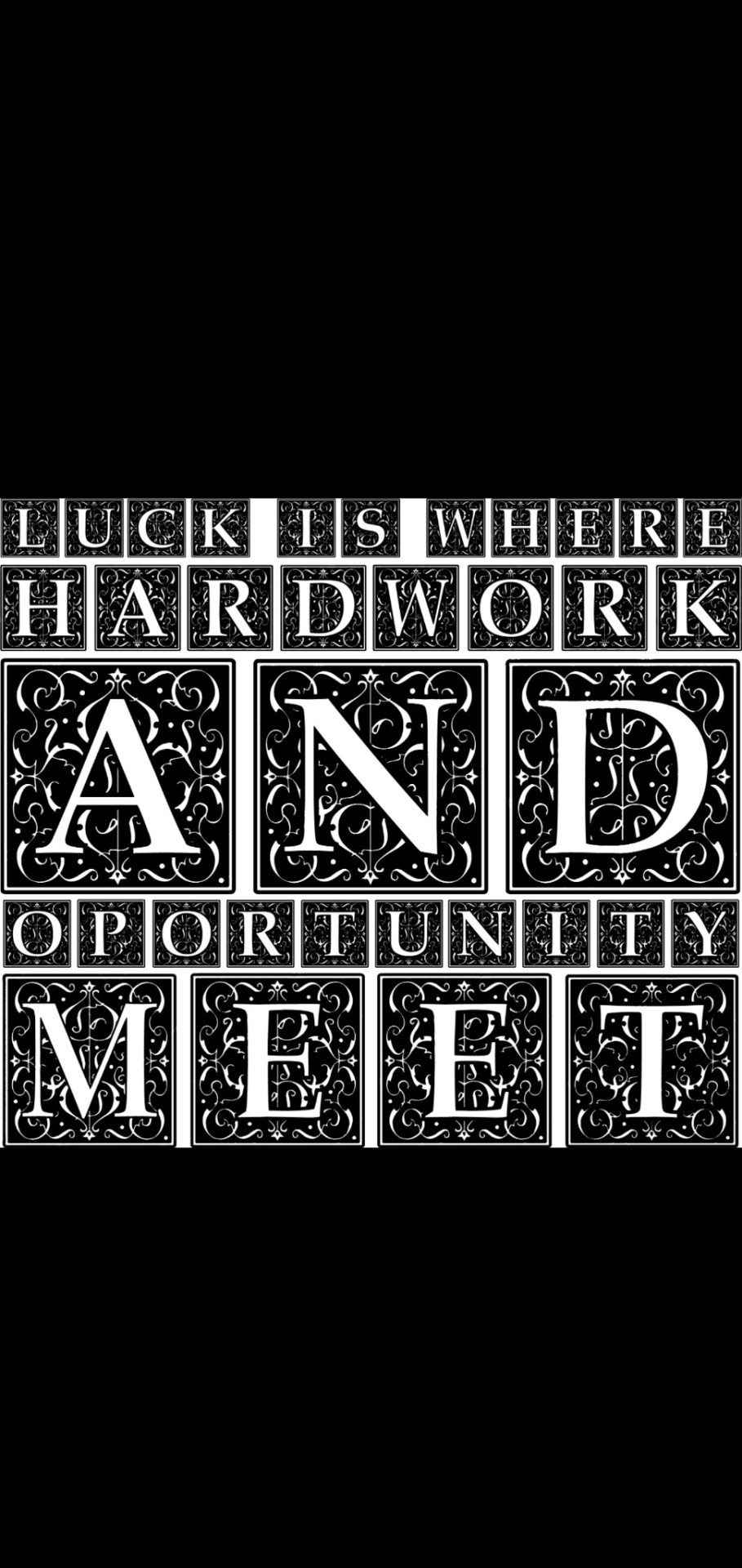


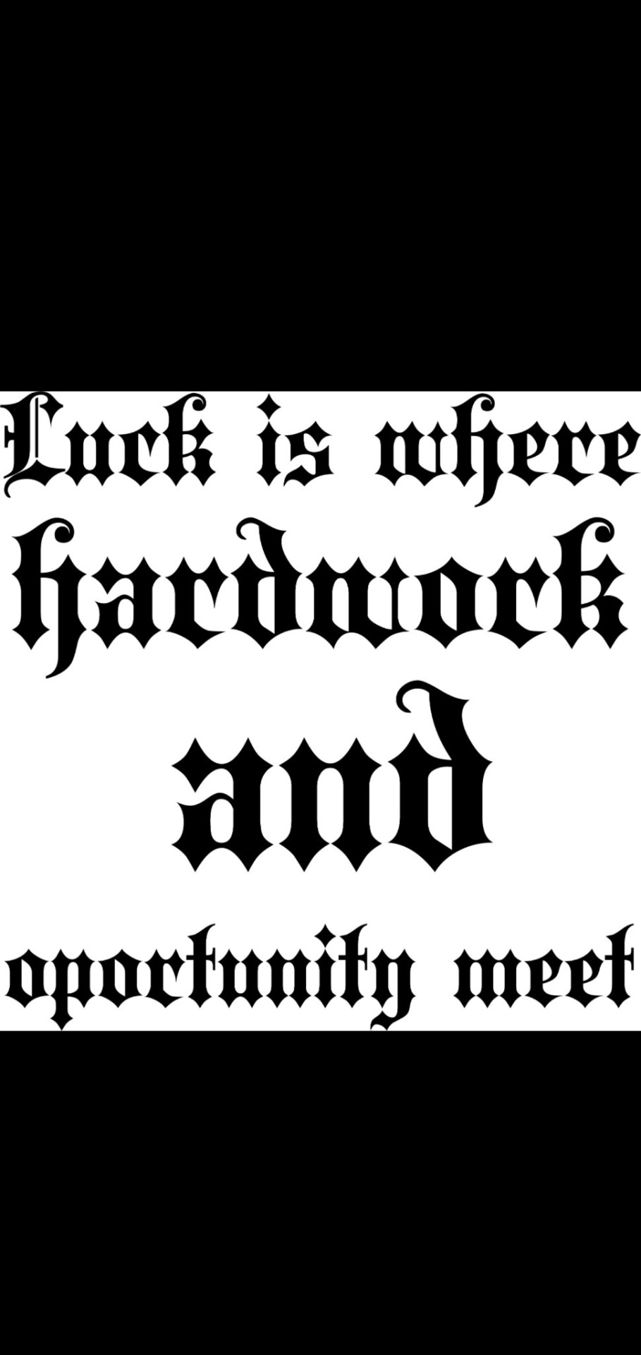
Typography class 2020, by: Carlos A. Villasenor Mendoza (#8203).
Blackletter: I decided to use this font because I am really enjoying working with old fonts, especially when creating posters, I really like it. This font is really hard to read and I don’t use it that much but the pointy concept is really interesting and I feel like it represents the extremist thought during this period and how people used to express during this time.
Humanistic: I feel like this font represents a transition of human culture and traditions, a lot of things are constantly changing and due to that we need to keep in mind that our way to see and react to things going to do it too, so basically I feel like this font represents it, the constant but secure change that human race experiment every day.
Roman: This is my favourite of the ones I did, it’s so cool because it’s the most famous way to start and old telling or story, and they use this kind of letters for the entrances on different movies, especially Disney so is a really used title that I see everywhere and therefor it’s appealing to use it.
Baroque: This is by far the most interesting of all, and it represents exactly hoe baroque period was, the mosaics and the extremely heavy designs, they make out a really interesting and creative design but also a really difficult one, love that is so geometric and symmetric, make me feel calm and relaxed.
0 notes
Text


Typography class 2020, by: Carlos A. Villasenor Mendoza (#8203).
Symmetric & Asymmetric description:
Asymmetric: I don’t enjoy doing asymmetric posters, I prefer symmetric but I do think is a good exercise to practice your memory and cognition and know how to work out of my comfort zone, so it was a good exercise, plus is harder to find a balance on asymmetric compositions but once you find it, it looks so good. Another thing that I enjoyed about this poster is that it’s a more effective way to practice how to create well organize compositions and how to experiment with more variants instead of just sticking to just one, since you’re obligated into thinking outside the box.
Symmetric: This is the kind of posters and composition that I enjoy working with, are more fluid and efficient to work with, don’t require too much thinking on the composition at least but the fun part about working with symmetric compositions Is that you get to experiment with more geometric and regular forms and that is something that looks good, especially on the kind of work that I do which is photography of buildings, street art, nature and things like that so its easier to relate to more regular and geometric compositions on a symmetric way.
0 notes
Text
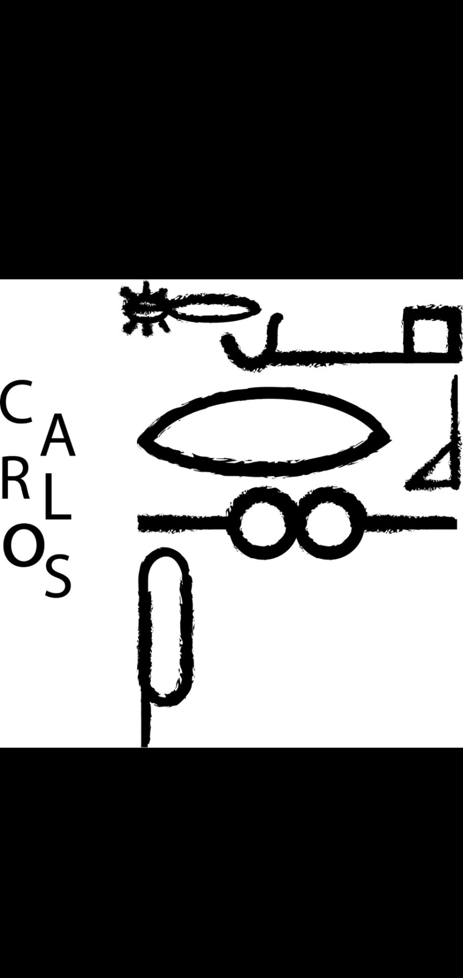
Name on gerogliphics, Typography class (#8203). By: Carlos A. Villasenor Mendoza (2020)
1 note
·
View note
Text

Meaning of words, by: Carlos A. Villasenor Mendoza (#8203) Typography class. 2020
- Disappearing: The letters are disappearing gradually like the word says, a gradually discoloration or light depravation of the object.
- Anaemia: A decomposition on the size mainly or other factors that can contribute to the overall perception of the object, on this case the letters are turn, changing the perspective of the reader into imagining a circle where there’s nothing.
- Ambiguity: There’s a lack of information on the object, almost as surrealism or deconstructivism, but in this case can be accidental or in purpose and its missing information for the better understanding of the object, on this case the letters are all bad written, even though the concept is there, its hard to understand thanks to the ambiguity of the typo.
0 notes
Text
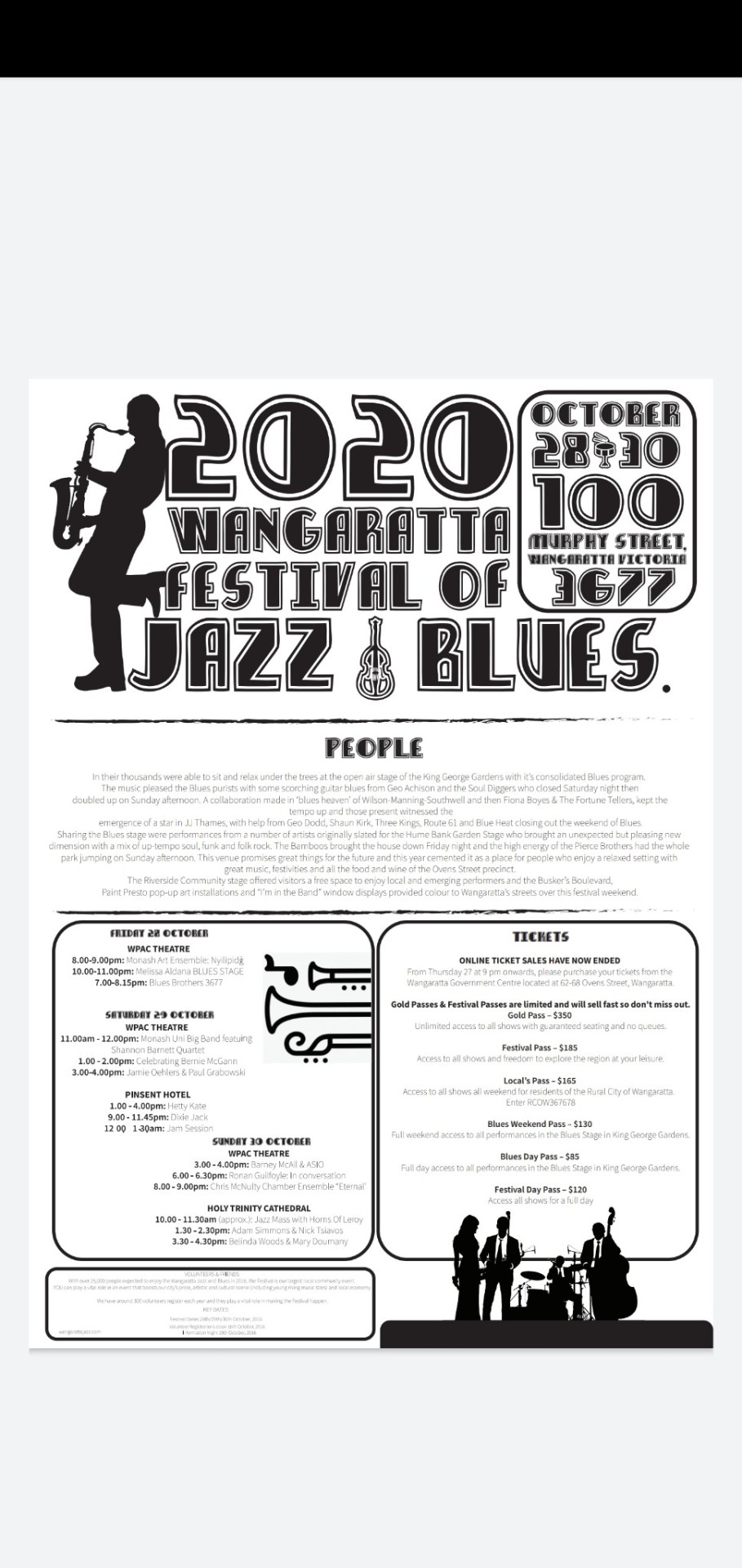
Jazz Poster for Typography class. By: Carlos A. Villasenor Mendoza (#8203).
1 note
·
View note