Link
Self Promotion / Behance
https://www.behance.net/callum_new4d96/projects
0 notes
Text
FMP Evaluation
When first starting out on my FMP, like many other projects I struggled to develop any solid initial ideas. A few of these were similar to previous projects and felt I may fall into the same habits. Once I found an area to explore, I found the research part engaging and interesting but when it came to producing any visual ideas I was pretty lost. The subject became quite complex for me to visualise in a clear and understanding way. Due to everything going on at the time, I was restricted with the programs I could use for my outcome. My initial thought was to produce an animation / video but in the end I decided to simplify my idea and explore an editorial outcome. This is an area that I hadn’t explored for a final outcome before however due to creating a number of process books in the past, it gave me confidence I could execute this successfully. I also learnt from past projects my weaknesses and to stay clear of certain practices.
Like a lot of my other projects, I didn’t get an idea for an outcome that I was happy and confident to produce until late on. My main sticking point was trying to figure the books content and how this could be successfully executed. This resulted in me falling behind and my final outcome not being completed to a satisfying level. The two main issues were the images and lyrics / intro pages. I would have liked to edit all the images used so they felt cohesive and part of the same source. With the lyric pages I wanted to explore colours and how I could relate and reference the lyrics. Also the intro pages I would have liked to re work. Overall this all comes down to my time management and how important it is to be organised. Once I had my idea I had a plan I followed through out, however I often fell behind my schedule and in result, it affected my outcome.
I definitely felt I put in a lot more work compared to other projects. Overall though, I’m a little disappointed with my submission, however I feel I've learnt a lot throughout my FMP and will continue to push myself. I feel there are areas that show potential so going forward I plan on making these adjustments to my final outcome as I think this will benefit my portfolio.
0 notes
Photo


Development / Book cover design
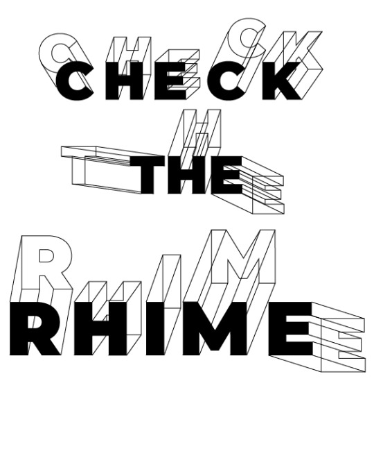
Few rough designs for a cover. I wanted to keep the cover simplistic. I don’t mind some of these however they feel a little flat. I need to think how I can relate the cover to music / rhymes / lyrics. I had the idea of a note book look as lyrics are often written onto paper first. I will continue to think of ways I could incorporate an idea onto the cover. I feel some of the type is working as it fits the theme of the rest of the books layout
0 notes
Photo


Research / Book Covers
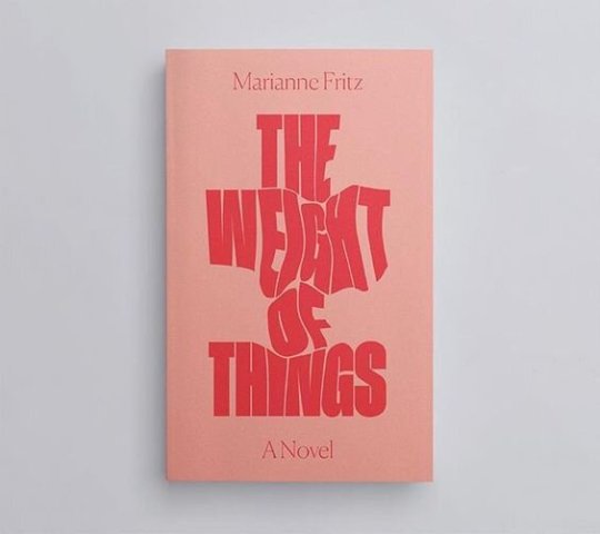
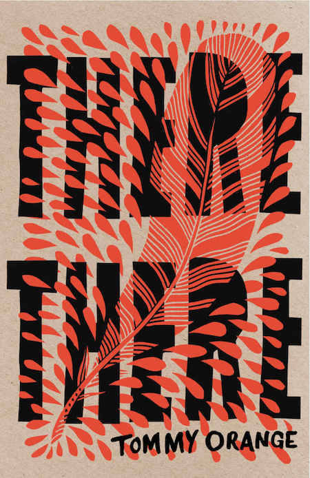
For the cover I plan on creating a simplistic cover that is typographically lead. I looked into a few cover that I think rely on simpler design but also use this to their advantage. From here I will be begin some experiments and tests.
0 notes
Link
Research / Book cover design
1. It’s exactly like the rest
Look at sites such as Amazon and browse through to see covers that are out already
2. The template screams self-published
“The top block generally has the title. The second block has a picture, and we top it off with the author’s name in the bottom block. Don’t be afraid to be bold or try something different. Look closely to what already exists in your genre and make the choice to look different even if it’s slightly uncomfortable and a bit nerve wracking to be the odd duck in your category”
3. You try to say too much
“Don’t be scared to make an impression. Take a look on Amazon and see how much tiny cover script you can actually read while scrolling through genres. Think simplicity and you’ll find the perfect balance.”
0 notes
Photo


Development / Lyric pages 1/3
These are the completed lyric pages that will introduce each line. From here I will start to experiment with colour and how I can reference the artist or song through this.
0 notes
Photo


Development / Lyric pages 3/3
These are the completed lyric pages that will introduce each line. From here I will start to experiment with colour and how I can reference the artist or song through this.
0 notes
Photo


Development / Lyric pages 2/3
These are the completed lyric pages that will introduce each line. From here I will start to experiment with colour and how I can reference the artist or song through this.
0 notes
Photo


Development / Book cover
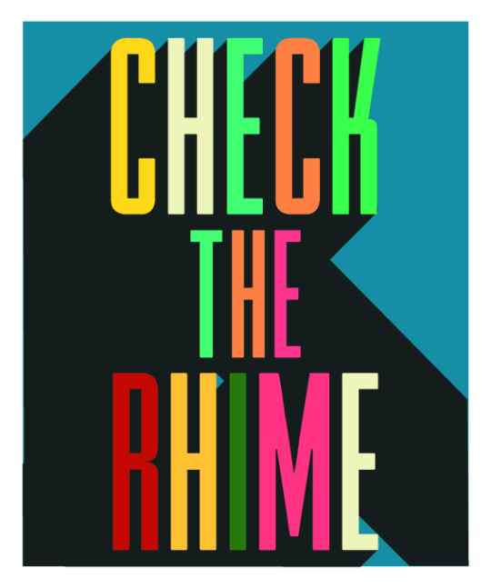
Created some experiments for the book cover. My original idea was to keep the cover very minimal and simplistic. However I feel that a more vibrant cover could also work, the book covers a wide variety of topics and content and feel this could reinforce this. I will continue to experiment. The layout of my book is quite simple so it may be better to keep in a coherent style
0 notes
Text
Book Name
As the book is shaping up I need to start considering a name. A couple ideas I had:
Lyrics To Go
Check The Rhyme / Check The Rhime
Both are references to hip hop songs.
Lyrics To Go, fits with the idea of a book can be picked up any time and how these can be read on the move / on the go. Anywhere, everywhere it’s got lyrics to go.
Check The Rhyme, fits with the idea of checking out the background and stories of these lyrics.
From here I will experiment to see which looks better on paper. I think i’m leaning toward Check The Rhyme. Unless I come across any other names .
0 notes
Photo


Development / Editorial layout 3
Developing the spreads further I decided to a little description section that gives a little background on the images. I feel this also helps balance out the page. Slowly getting there, A few more tweaks are still needed such as positioning and adjusting some of the body text.
0 notes
Photo


Development / Editorial layout 2
As previously mentioned I found a lot of the pages felt too overcrowded with too much text. I found a few videos and explanations that covered font size and spacing. I thought my font size was quite difficult ot read so I increased the size and spacing between lines. This has allowed me to space the content over multiple spreads as well as giving the page more room to breath. I feel the spreads are starting to get there. Once I have these down I need to focus on colour matching the images so they all feel cohesive and part of the same source.
0 notes
Photo


Development / Lyric page 2
Progressing further I began to incorporate different fonts that I felt worked together. Even though there are multiple fonts, I feel these still feel cohesive and part of a set. I’ve experimented with black and white at moment as I want to get the type face and positioning first. Once I have this I plan on exploring how I can add colour that reference the artist or lyric.
0 notes
Photo


Development / Lyric page 1
My first idea when creating the lyric pages was to add a subtle reference to the lyric.
Mind playing tricks on me I just switched around a letter to reinforce the meaning which I think works well.
Thinking of a a master plan I added small thought bubbles but feel this one looks a little awkward.
La Di Da Di I tried to transform the Y into a champagne glass to fit the theme of “party” I feel this one works as it’s very subtle
0 notes
Photo


Research / Book design
Really like the use of type and it’s relation to the image. Help this become the main focus. Simple but effective colour palette. Need consider front cover. This is effective as a cover and works well with the book as a whole. Fits the theme of the book, doesn’t look out of place
0 notes
Photo


Development / Editorial layout
As I had the intro pages almost there, I began working on the rest of the spreads. Looking at the pages now there is a lot of text overcrowding the pages. Currently can’t print tests so will looks into recommended font sizes and spacing as this may make a big difference
0 notes
Photo


Development / Lyric Page 5
Applied the layout to other lyrics. I feel this works well as a broad layout. It’s sort of like a chapter page. Will continue to develop this
0 notes