
Don't wanna be here? Send us removal request.
Statistics
We looked inside some of the posts by blogjordynartdesgin-blog and here's what we found interesting.
Average Info
Notes Per Post
7
Likes Per Post
3
Reblog Per Post
4
Reply Per Post
0
Time Between Posts
5 days
Number of Posts By Type
Text
9
Photo
8
Last Seen Tumblr Blogs


Fun Fact
Average visit duration of Tumblr.com is 10 mins and 25 secs.
Text
These videos were collated together to create the final video that was projected onto us!
In the end we covered the projector with red cellophane to emphasise the passage from the book and what it was describing.
2 notes
·
View notes
Photo
Artist Concept Statement
Contemporary art and design often looks at the ideas of constructed binaries. Considering the history of these pairs how can art and design interrogate these binaries and offer new insights?
Constructed binaries exist in the world today due to societal values and influences. A very prominent constructed binary is the idea of beauty, and either being real or fake. Beauty is defined by the time in question, the trends and attitudes are ever changing and always evolving. Over decades we can see trends in hair, makeup and fashion change from flared jeans and blue eye shadow to hair extensions and lip fillers.
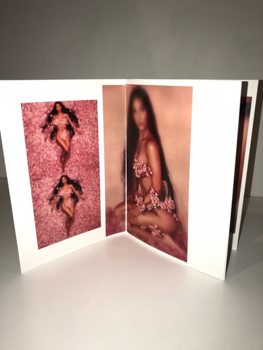
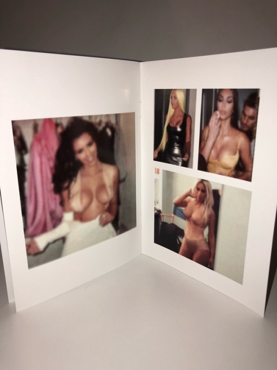
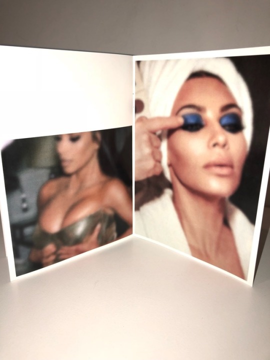
In regards to beauty it is important to take into account the influencers of the time, in this day and age a perfect example is Kim Kardashian and her family. The Kardashian family are all over social media, the easiest place to mass communicate and promote their brand. Kim Kardashian posts images of herself regularly often highly sexualised and exotic. Her photographs are perceived by audiences and are then generally turned into ideals of beauty. These ideals are what is considered to be beautiful, what it means to be beautiful and the expectations of society. The problem with this is, that celebrities such as Kim Kardashian are speculated to have medically enhanced her appearance, making it an unrealistic goal to look the way she does. Medical enhancements include, breast implants, bum implants, Botox, face-lifts, lip injections and so on. Has fake or enhanced beauty turned into true beauty?
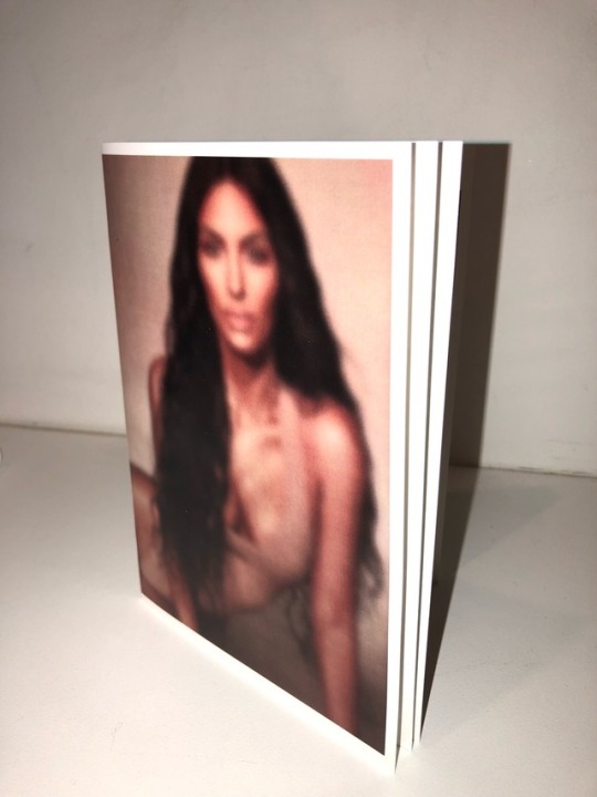
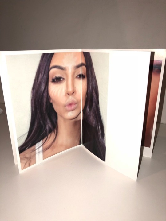
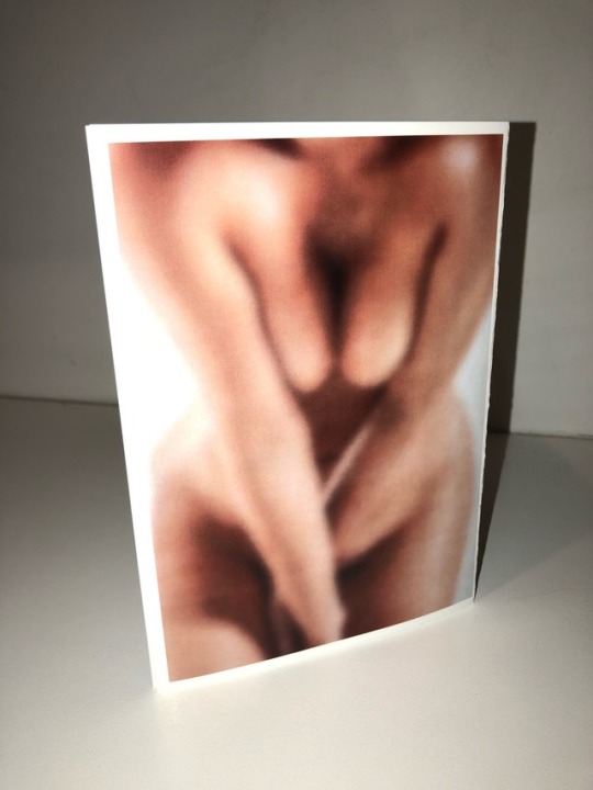
The idea behind my work is the concept of blurred beauty. In the Zine I have made I am trying to convey the blurred line between real beauty and fake beauty and how in today’s society it can be very hard to differentiate between the two as they are so closely entangled.
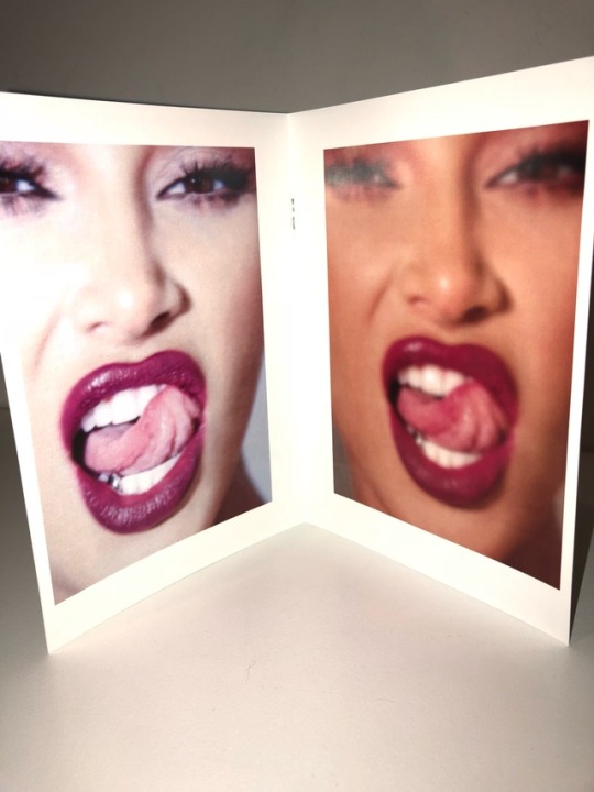
I made my work using Adobe Photoshop and InDesign. I began by manipulating images in different ways to give them new effects. I originally thought I would try and distort the pictures as much as possible, however through doing this I thought they lost all meaning and just became too far fetched, I wanted the audience to still be able to see the image, so they could take away meaning from the picture. After different manipulations, filters and techniques I came across the blur tool on Photoshop. I started by just blurring the background of photos, to highlight just one part of the image, such as a woman’s breasts. I did like the effect this had on the images, however I then experimented by blurring the whole image. When I did this, I really liked the overall visual effect and the metaphorical one two. The blurring can be perceived as the blurred lines between the real and the fake as well as how audiences are almost brainwashed – or their vision has been blurred, they are blind to the medical and digital enhancements and the falsity that is in the beauty world.
The medium in which I chose to present my work is a Zine. I have chosen this because celebrities are photographed and displayed in the glossy pages of magazines where their complexions have been airbrushed to perfection. Through presenting my work in a Zine, I think it makes a commentary on society and what we are fed and presented with constantly, who can blame people, especially women for being blind as to what real beauty should like and is. This Zine is challenging the norms of a typical glossy magazine by completely blurring the perfect images of a woman. Now the image has lost a lot of value, as there is no attention to detail and all the work that went into airbrushing and retouching has been diminished.
I have engaged with my chosen question differently over the two assessments, as I was not entirely happy with my first approach. In assessment one I took an environmental approach and explored the binary of organic vs. synthetic materials, after reflection and brainstorming I decided to take a different approach that was to of more interest to me. I think art and design interrogates the binary of real and fake beauty through challenging and highlighting the floors in society by allowing audiences to see faults that are right in front of them, such as false sense of realities and distorted images.
0 notes
Text


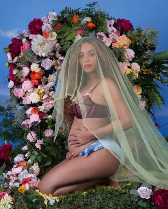

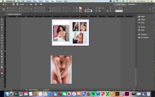
Experimentation: full Blur
I decided to try full blur effect on photoshop to see how the images would appear.
I have chosen a photo of Beyoncé and her pregnancy as this process is beautiful. She is photographed sitting in nature which represents purity and simplicity.
I really like what these images are conveying - however these photos are probably not the best for my concept as in these images Beyoncé hasn’t had cosmetic surgery or been digitally enhance (noticeable - very likely she was airbrushed).
If I continue this idea, I will need to choose images that are more ‘fake’.
0 notes
Text


Experimentarion:
I was playing around on and app called ‘body editor’ as that is what I thought might be a good approach to explore the differences between real and fake beauty as distortion is a great extreme of that!
However, upon reflection I thibk these images are too far gone, the audience can no no longer make out the image or see that there was a woman in the photograph. I think taking this approach would defeat the purpose of my concept.
From here I will continue to distort images however, I will do this in a way that is still legible!
0 notes
Photo
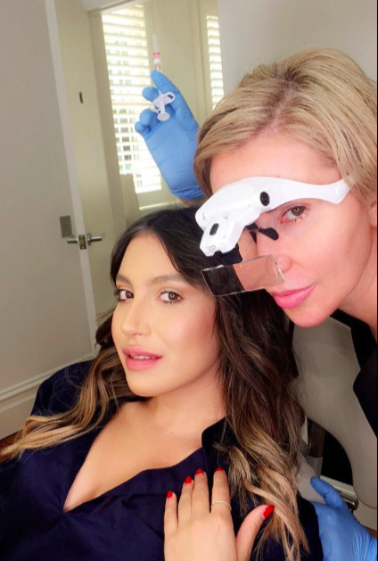
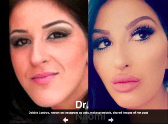
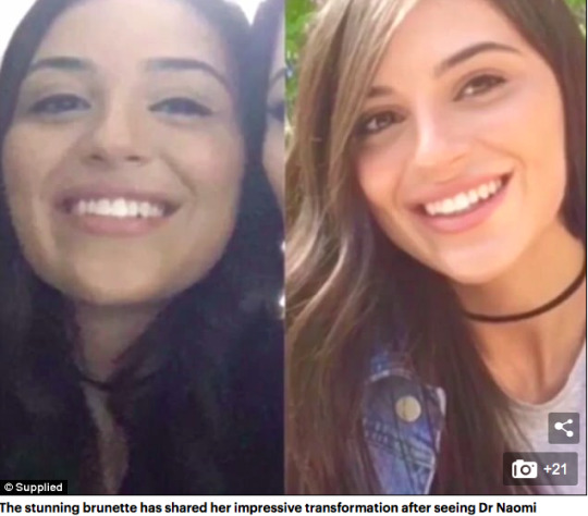
Sydney ‘Doll Maker’ - Dr Naomi McCullum
Dr Naomi sees up to 24 patients a day for injections, and of those treatments, around 10 include lips.
The renowned doctor said not only are her patients asking for the reality star's look, but she has had some rare requests, including a cartoon character's jawline.
Through this example it is clear the fake beauty can be found everwhere, and due to the influence of social media and celebrities everyday people also want to medically enhance their appearance.
Source:
https://www.dailymail.co.uk/femail/article-4400178/Sydney-doll-maker-gives-women-Kylie-Jenner-look.html
0 notes
Photo


Images of Frida Kahlo, wearing flower headbands.
When Brainstorming one of thoughts was of women and flowers, I think this is real beauty as well as being combined with nature.
Just an interesting thought to me
0 notes
Photo
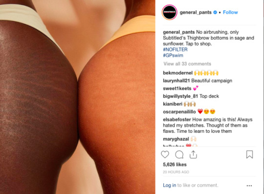
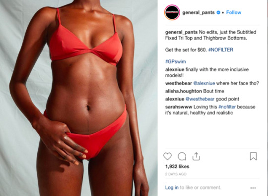
Research: Advertisement Campaign
This is a current advertising campaign by clothing store, General Pants #NOFILTER
In this campaign they are saying NO to filters and touching up images. A great message to send to young women.
Source: General Pants Instagram.
0 notes
Photo
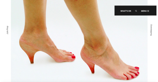
Overstepping by Julie Rrap, 2007.
“The morphing of shoe and foot that Julie Rrap has made in Overstepping exaggerate the implants, injections and surgical enhancements which have reshaped the female form today. Her high-heeled feet represent a possible endpoint for the idea of the malleable and fashionable body, aimed at the true fashion victim. For those who prefer comfortable shoes, this sci-fi melding of skin and stiletto is more mutilation that enhancement.” -MCA
This artwork by Rrap is extremely confronting and humorous, it explicitly shows the binary between real and fake and highlights how the beauty industry has potentially taken things too far... it is very interesting to explore a work like this as I think it showcases the craziness in the beauty world.
Source:
https://www.mca.com.au/artists-works/works/20089/
0 notes
Text


Midmapping / brainstorming intital ideas.
For my first assignment, the binary I chose was organic v synthetic. I did consider continuing with this, however I thought it was important to expand my thinking and see if I could come up with another idea that may have been more of interest to me.
From my brainstorming, I will look into beauty as a binary. I want to explore the relationship between real and fake beauty and work out a way to collate and present this idea and show to contrast.
0 notes
Photo
Class Activity / Changing Context.
2 notes
·
View notes
Photo


Poster progress - Originally I was going to make the poster by hand, So I was experimenting with the layout and design on a white board. I then decided it would be more effective to make the collage digitally because I wanted to include text. However I am glad I started the collage by hand as it gave me a good idea of the layout that I wanted and it meant I could hand cut the images in quirky shapes before scanning them and putting them in illustrator.
0 notes
Photo

FINAL POSTER -
Here is my final work ‘Don’t panic, its organic!’ In my poster I am exploring the relationship of the binaries; organic and synthetic.
The relationship between organic and synthetic can be thought about in various forms. There is major debate on just about anything on organic vs synthetic drugs, beauty products, chemicals, plant fertilizer and fragrances. The list is endless due to science and technology becoming more and more advanced and being able to mimic natural creations.
In my poster I have decided to explore organic and synthetic things that surround me. I find it interesting how often nature has been brought into our everyday lives as décor. My poster is a collage of various images exploring the relationship between both organic and synthetic that represents man made and nature. For example, in every lifestyle magazines the focal points are homes built around gardens or kitchens that have long glass windows exposing the vertical garden hanging outside…Humans build around nature and admire it so much, however we still destroy and change it all the time. Trees are chopped down to make decorative chairs and home are built in the middle of forests for aesthetics. I position this collage in the shape of a tree, so the viewer would immediately associate the poster with the environment and I have used a black background to allow the audience to see the irony in the slogan, ‘don’t panic, its organic!’
This simple message is supposed to be comic, it gently mocks society for building around nature, replicating and mass-producing. We are so passionate in the environment and living with in it that sometimes we can forget the damage that we are causing.
0 notes
Text
Existing Posters Design Research
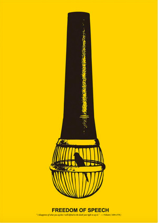
This poster by Pei-Ling Ou says a lot in a small yellow and black illustration. Freedom of speech is an essential human right, and yet so many people are stripped of it. It’s time for us to stand up and defend our right.
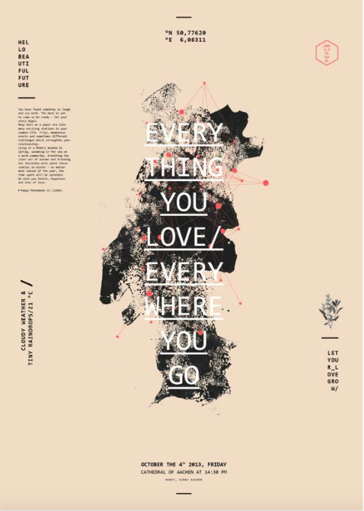
This poster is a wedding invitation designed by Lara Bispinck for a couple who love travelling. The map is of Portugal and the dots on it are the different places that they have travelled together.
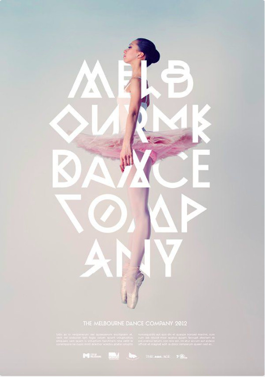
This poster by Josip Kelava was designed by Melbourne Dance School. I love the way the fonts combine with the picture!!
0 notes