Don't wanna be here? Send us removal request.
Photo

Arts 246 was a interesting class. We started with hand creating typography, researched a typeface and then we created our own type. And that isn't speaking on the other two projects we did, this being one of them. I believe the class makes you look at the type and the spacing you put into your own work a bit closer. You also get a appreciation for how font is made or in the very least, understand the pains publishers and creators go through to make the font readable and visually pleasing.
This being the second process book I've made, I wonder how much I improved since the previous iteration. I certainly remember more color in the last book but sometimes less is more. I felt the work in that passed book was more personal and that's because I put my personal art work into it; this book feels a bit like a detached presentation project. But I like the design of the book so far. The switch back and forth of black and white is a clear and visual way of showing change in chapter or project. Reporting on the book within the book is very meta but I see the value of stepping back and seeing your work at all angles. I want this to be a book I can look back on and believe it was a half decent attempt at creating something aesthetically pleasing. And maybe one day I could recreate it even better.
0 notes
Photo

There is no one correct process that will answer every design question posed. In that, we find the correct answer: try and try until something sticks to the wall. Being messy and being unafraid to try new things will pay in dividends and give you a far more expanded visual library. The designer comes more accepting of strange inspiration and can work more effectively inside of constraints like sizes and limited pallet options. And a lesser considered idea is the mental organization skill gained from exceptionally weird work with trail and error. Always keep concepts and thoughts together and organized to stream line your own process. What I have learned with just trying to create my book: design is subjective and difficult especially if you are critical of your own work. I went through a few designs for the cover using the pluses as the main accessory but there was too much happening on screen. I attempted different looks and position and what I wanted written on the screen. I cross referenced examples and decided on a simple title and my name but kept the crosses to add a bit more white on the page. I hazard to guess what other problems I will run into with the future pages.
0 notes
Photo

The rationale behind the designing of specific grids referenced to in chapter 10 gives a fair bit of insight to the function. In example the National Park Service magazine designs to focus on the content. I enjoy learning how authors and designers bend the grid to their needs to give their tale form. This, when manipulated probably can he used to guide readers and to explain detailed and packed information - forms that give ease of predictability and understandable to those unacquainted. One thing I wonder is if there is a theme or concept to complex to be illustrate in such manners such as cultures or theoretical ideas. The last time I did a book of all my book I used a lot of white space and color in the work but this time I am thinking about using blacks and whites with minimal color expect the blue. Or possibly depending on the week, change the outstanding color depending on the choices I made on my projects. Professor Chi is pushing for us to use more "white space" or rather just empty areas so not to crowd the page and I intend to create this project with that concept in mind. I also want to alternate between white and black pages or use the two colors in specific ways.
1 note
·
View note
Photo
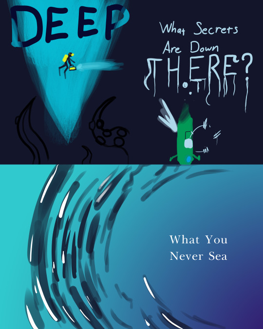
Listening to Gil Shuler was a interesting talk and I hear common topics that come up often in class. One of them is to not over complicate a design; often because signs or figures we make can end up on clothing or hats that can be seen from afar and be readable so simple isn't always bad. He also spoke on just making posters about anything he liked or thought of and that turned into something he could market and sell which shows people like originality still. Also not to be discouraged by negative feedback and have open communication with the client. Once you figure out the issues with the design, it will often lead to approved client work.
So I decided on a informational on the sea/ocean. We know a lot more about space than we do about the bottom of our own ocean and I thought that would be interesting to talk about. The two designs I decided on were either going to play up the unknown of the ocean or the closer to surface side of the ocean. For the text, I thought about using Baskerville just because I used it in the last project. I want to speak on the different sea levels and how that affects vision and what the fauna have to do to adapt and the biological changes.
0 notes
Photo
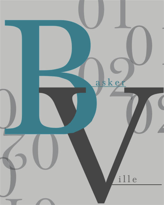
It's a novel idea to imagine how the first print makers had to decided on how to arrange pages and words in a book, especially important books like the bible at the time. The grinds and uniformed lines gave a great understanding of what the purpose of the document was trying to achieve. Even though you will always be delivering information through the pages, how many columns of text you put on the page can affect the readers interest. This is the idea that leads into breaking the established rules or in the least altering them to fit in more items like pictures or a page dynamic involving solid colors and large texts, as an example. It's a humbling experience when you think up a first design and then realize that the design wasn't working in the slightest. So then I started trying new colors and designs until something just clicked. I wanted to originally wanted a brighter design but when I realized the readability wasn't actually that good I tried darker colors and wanted to work the contrast. I like what I have so far. I also have to clean up the cover made for where the B and V crossed. By the end of this I will probably have changed the whole color scheme but it's important to be open to new options.
0 notes
Photo

You really have to appreciate the level of study and effort put into making simple text readable without making you uncomfortable or having the passage be considered inefficient. But at the same time, we break these rules to achieve a eye catching effect in hopes of expressing a idea that isn't necessarily written in said text. The colors section is quite important in this weeks reading. Understanding the affect that colors have on the mind is important and combining type size, line length, interline spacing and color brings the game to a new level. This does, of course, bring forth it's own set of problems like paragraph block placements and how much text can be stretched and distorted but that is just progress in motion. Learning about the history of the Baskerville font was interesting. The process has reinforced previous ideas I've had about how the future and the current type faces we have are build off the bones and forms of previous works. It brings to question if language and fonts will evolve to be indistinguishable from our present or something completely different? Deciding on a design for a information poster and for style poster is quite the challenge when it comes from a type font but there are many examples online, which as where is was used like in magazines or text. I did like exploring ideas though and choosing the color scheme and aesthetic.
0 notes
Photo
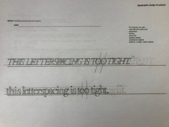
It's interesting to see how even in the earliest forms of writing, in their symbolic, how close in concept we have stayed; lines of text instead of just giant forms and pictures. We can really see when Europe began to centralize their language with the early gothic and then the big changes in the Renaissance period. I liked how type fonts were being made for special events from book covers to country changing events that were happening during the time. Once the printing press was made and literature was more readily available, it really helped spread literacy. And as we go further along to the present day, we can see how we presented the written word differently; odd angles and color changes. Ways to really drawn in the eye and change how you see text. I am very happy I went to school those three days in a row to finish the kerning project because doing it at home would have been a pain. I had to tape down the base paper and I still manage to have some letters misaligned. Using the french curves was a learning curve onto itself. I did not know how to line up the letters with the rules bends and I would over shoot it or it would be too small. My solution was to turn the tool with the letter as I was drawing it with varying results. I don't envy the masters of old.
0 notes
Photo
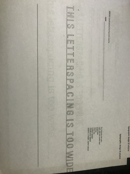
I watched the Maria Fabrizio video on freelance business. The questions she was given and answer were great; such as if to push a budget that a client gives you or when you decide to charge someone a hourly rate or give a flat rate and how that is going to effect how clients see you. From what I got from this is to really value your time and know what you situation is. Clients, friend, family or business, well try to get things as cheap as possible and you have to take that into mind and know when to say no, less you burn yourself out while getting paid almost nothing.
So I finally got my car back and had a chance after class to get to a light table at campus. City Art was closed by the time I got there so I had to use a straight ruler and go from there and I really found the curves as hard as you would imagine. Also the spacing of this first line. I had to cut off the end period so I am going to push the next line further back. I am going to acquire the curved rulers I need and clean up and finish the rest of these.
0 notes
Photo
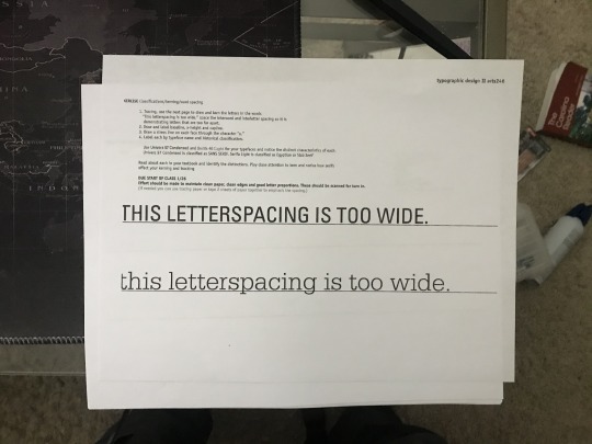
One thing to take from the chapter 2 reading is the amount of "math" it takes to make a type and the sheer terminology used to describe it, like the example we were given of the lower case "g". I find that when discussing about how type designers use different traits for their text, I esteemed that weight is the most important as it changes ratios and when used in literature, conveys a concept or size changes in said ratios can catch the eye very handily. In that same vein, spacing plays a larger roll. The third example on page 44 reminded me of a style you would see on a modern magazine for that sleek design without the need for posture work. It is no surprise the list of tools we have allow for sure variation and the breaking of previous rules. For work this week, I got the assignment printed and ready to go. I have not had a chance to get my supplies yet for a few at home reasons but I might be able to make something work. I also currently don't have a functioning car so a light table is something I will have to put together until it is repaired and I can utilize the equipment. Also had a little issue with my printer where it cut off part of my T in the work This so I will try to find a solution for that problem.
0 notes
Photo


Typo graphics and innovations are both questions with no simple answer. The term of "seeing what works" is often thrown around but that is also sort of vague. Typographic lettering and fonts change the expression of a piece; as Roberto de Vicq de Cumptich said, "the best indicator of the zeitgeist. Type is an imperfect version of ideal forms..." Lettering, like innovation, is expected to speak for itself when looked a upon and striking a balance to keep the work fresh and over shooting the idea is a fine line. Once again, as Roberto de Vicq de Cumptich says, "There are always several different solutions for any problem, but only one at a time."
The poster project was the simplest of all the projects thus far. Having a simple yet effective poster that says the few things it needs and conveys a feeling really all depended on the imagery. I considered making flat polar bears one a flat sheet of ice like the one they are sitting on but I found it was a bit harder to identify them so I like the bears to be the stars of the show so you could understand the message. I also dropped the National Geographic logo because I am certain that is copyright so I instead but a link on information and on how to decrease one's carbon footprint.
0 notes
Text
Week 2 ART245
Len P. Small and Susanna Shannon both talk about the combination of digital and paper as opposed to one be dead without the other but what they both talk about is the creation of content. One doesn't have to out weight the other but combined to form a better over all project. Michael Carabetta understands this point as well and blends them the best; he states that a book cover design is the last layer of marketing a book can do. "Judging a book by it's cover", and all that. One more common point touched on by most everyone featured spoke on is how do the staff handle the change or how do they themselves feel about the changing needs of the platform and they all mention that it isn't as bad as everyone thinks. It just takes a different tool to do the same job.
This weeks work was difficult. I wanted to create unique spreads because I didn't want to copy the examples given beat for beat. It felt lazy. So instead I suffered for a bit. I through out more ideas than I care to admit; they just didn't work or were poorly executed. That being said, the second set of spreads did come a bit easier. The grid did help with the layout a small bit but only just. The potential for any and all content is quite overwhelming. I decided on a informative content and having a theme made it a bit easier.
0 notes
Photo

5/21/2020 A simple experiment. Very subject to change.
0 notes
Text
Week 1
Michel Bouvet talks about how he wants to giveback from back he has been given; traveling all over the world and seeing artists and illustrators who's work would have ever been looked at.It's important to remember humility and raising up other artists you believe in in this competitive art world. Steve Brodner says that you have to be free and true to themselves if they want to succeed. This is important but to find your markets and work that angle. Striking a balance between what you want to make and work is a hard middle ground but always worth it in the end.
My work on the first project was done in about the first day. The longest part was opening Illustator and remembering the layout and how to navigate. I will Will Smith and felt he came a long way in his life from his TV series to the movies and I wanted to show that in the 6th square with the waved hair and mind and scrapped up skin. Squares 1, 7,8 and 9 were all done in photoshop with ease, I still use photoshop often but I did get to use tools I don't normally have a cause for and that was a fun experience. Setting up the grid was a bit weird though because how my numbers are displayed and how they were in the example video are different and I almost set the project up wrong.
0 notes
Photo

The final of what I had. I wasn’t sure if the BG was suppose to be black or not. It didn’t say it needed to be.
0 notes


