Just a collection of recources I like. You will find templates, themes and more. If I like to use something, you will find it here.
Don't wanna be here? Send us removal request.
Photo
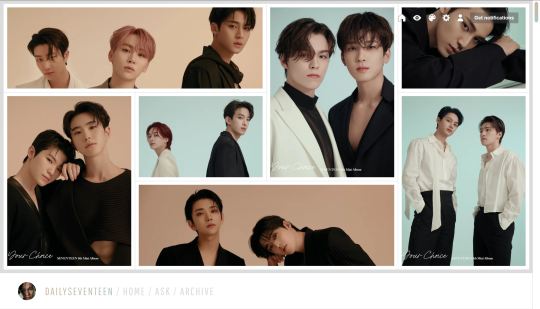
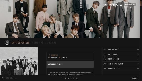
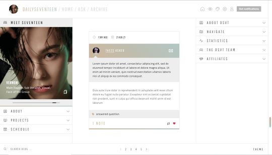

NEWSFLASH: Fansite theme by @taezs
Options/Inclusions:
Gallery header option
Full height header option
400px high header option
Sidebar carousel
Sidebar image
Three sidebar options (see previews)
Responsive for smaller screens
500px posts, but posts will shrink to fit a smaller screen
Search bar
All the usual fansite boxes - projects, links box, about box, affiliates, members etc etc etc, and you can move them from the left to right sidebar if you want (some html knowledge required)
NPF photoset fix (thank you HT @glenthemes 😭)
Credits: base code by @seyche, css photosets by @eggdesign and @annasthms, flickity carousel, phosphoricons.
Note: the carousel is the hardest bit to customise, but notes for everything is in the code. i’m on somewhat of a semi hiatus at the moment, so reach out if you need help but i’m awful at replying, sorry! If you do want to send me a message about this theme, send it to @taezsthemes.
Previews:
Gallery header, full fansite sidebar
400px header, reduced sidebar
No header, simple sidebar
Permalink page preview
Day page preview
Download this theme 🔗 | Tip jar ☕
558 notes
·
View notes
Photo


Page 02: “Crew” Character Page
Preview 1 | Preview 2 | Code
Hey! This is the second page by Themes by Pale, and the first of the type “character page”. The inspiration came with the animes One Piece and Bleach. (If you don’t see the gif in this post, you can right click the image and select “Load image”).
It’s easy to use, you don’t need a lot of coding or HTML knowledge to use it, but you will need to follow instructions very carfelly. See the full instructions/guide here.
Features:
Add characters to the list easily (can be infinite!).
Dynamic character generator, no need of HTML knowledge to add characters.
Side menu with custom avatar, custom song, custom description of the page and custom links.
Change the colors of the page and cards and the background image.
Responsive.
Notes:
Although the page is responsive and looks good on cell phones, viewing it on a computer is a better user experience due to the amount of information.
I hope the guide answers all your doubts, but if you have more questions feel free to send me a message. Hope you like this page!
Full credits in code.
1K notes
·
View notes
Photo

🌙
DAYBREAK: PSD ® @wiiintermoon
Don’t claim as your own
Do not remove credits
FREE Download : “Follow me + Ask (DAYBREAK) + Like or reblog this post”. I will send the link by message.
If you don’t want to do the steps, you have the choice to buy the effect on deviantart. I will simply ignore the message asking for the effect, without following the steps in the description.
⁑ DEVIANTART : @wiintermoon ⁑ TUMBLR ICONS : @skydiveicons and @elitekhh
86 notes
·
View notes
Photo

🌙
VISION: PSD ® @wiiintermoon
Don’t claim as your own
Do not remove credits
FREE Download : “Follow me + Ask (VISION) + Like or reblog this post”. I will send the link by message.
If you don’t want to do the steps, you have the choice to buy the effect on deviantart. I will simply ignore the message asking for the effect, without following the steps in the description.
⁑ DEVIANTART : @wiintermoon ⁑ TUMBLR ICONS : @skydiveicons and @elitekhh
97 notes
·
View notes
Text
Editing & Proofreading Cheat Sheet
– A lot of questions I receive revolve around editing and proofreading, so I decided to make an extensive guide to editing your own writing. I collaborated with some amazing friends on this post so this is dedicated to them as well as all of you. I hope you find it useful. Enjoy!
Know The Difference: Editing vs. Proofreading
Editing is about the content, proofreading is about the technical detail and accuracy. Once you know the difference and you separate the two into different tasks, going through and actually doing it will seem less daunting. Deciding which to tacking first depends on what you’re like when you edit, but if you struggling with focusing on actually improving the content because you get distracted by grammatical errors and spelling mistakes, then proofreading first may be a good idea.
Be Intentional With Your Vocabulary
Avoid adverbs
Be frugal with unique adjectives
Only use dialogue tags when absolutely necessary
Be mindful of overused words
Take the time to find the right words
The words you choose can make all the difference so pay special attention to them.
Just Keep Snipping
A basic rule to editing that people often forget it, if it doesn’t serve a purpose, you should cut it out. A short book that is amazing all the way through is better than a long book that is redundant. Don’t worry about leaving your readers in the dark or not having enough content. As you edit, you’ll find ways and places in which to input more information.
Flow & Rhythm
This is the part where you make sure the writing itself sounds how you want it to. It’s important to read your writing aloud during this stage. Some things to pay attention to regarding flow and rhythm:
sentence length/variation
sentence structure
syllables and how they fit together
how your writing sounds out loud
Eloquence
Say it once and say it clearly. Redundancy bores readers so quickly, so when putting information forward, be clear, concise, and don’t add fluff. You don’t need to write a whole paragraph about how a character feels in a situation. It’s important to give the reader just enough to read between the lines.
Grammar
Common Grammar Mistakes To Look For
Subject-verb agreement errors
Sentence Fragments
Missing Comma After Introductory Element
Misusing The Apostrophe With “Its”
No Comma In A Compound Sentence
Misplaced Or Dangling Modifier
Vague Pronoun Reference
Wrong Word Usage
Run-On Sentence
Superfluous Commas
Lack Of Parallel Structure
Sentence Sprawl
Comma Splice
Colon Mistakes
Split Infinitives
List from here x {Explains these further and more in depth}
Improper Use of Phrases
“could have” not “could of”
“My friends and I” not “me and my friends” {If you take away “my friends” or “I”, or one of the nouns in a sentence in general, the sentence should still make sense}
“I couldn’t care less” not “I could care less”. This should be a no-brainer.
etc.. I could go on.
Familiarize yourself with these common mistakes and avoid making them at all costs. It’s also helpful to have someone read over it and let you know when they find issues with phrases you used. Please be attentive to these mistakes because making them can destroy your credibility as a writer.
Utilize The Senses
If you’re describing something in your writing, you should be slipping in words and little details that appeal to the reader’s senses, When editing, look for opportunities to slip in how a place smells, how a food tastes, how something feels to the touch, etc. It’s unbelievable how much this enhances your story.
Punctuation & Format
Punctuation Rules In English
the period (or full stop in British English)
the comma
the exclamation mark
the question mark
the colon
the semicolon
the quotation mark
the apostrophe
the hyphen and the dash
parentheses and brackets
Source x
When proofreading and marking up your manuscript, it can save a lot of time and energy if you use marks instead of actually write out everything, so here is a little chart I found that may be useful to you:

Other Things To Look Out For
Make sure you know who is talking
Keep tense consistent
Vary the tone from scene to scene
Run-on sentences
Inconsistencies in story details
Plot holes
Causes and effects of events are explained
Facts and technical details {Make sure you’ve researched them well}
Deviations from established background (know your story really really well and make sure your reader does too)
General Tips
Go in assuming that your work is full of errors. Maybe it’s not, but it’s better to be prepared for the worst and solve the issues now rather than when it’s too late
DO NOT BE SENTIMENTAL. Yes, easier said than done, but it’s possible.
Make the text less recognizable to yourself in order to catch details you may not otherwise.
Print out your manuscript and physically write out the changes.
Read your writing out loud. Sometimes writing looks like it makes sense, but in reality sounds wrong.
Do it in short periods over time so that you don’t inevitably get lazy with paying attention to little details
Keep in mind that editing usually takes longer than actually writing the draft because it is less fluid and requires more thought and problem solving.
Don’t rely on spelling and/or grammar checking software; they’re not always correct and can easily misinterpret what you’re trying to get across.
Check for a single error at a time. It may be time consuming and tedious but it’s more effective than the alternative.
Give yourself time and read slowly through it multiple times
Split up large chunks of text to make it easier to handle. Don’t go through your whole manuscript page by page as if you were just reading it as a book. Go chapter by chapter or scene by scene or even sentence by sentence.
If something seems off, investigate it. Don’t take a chance and leave it be. If you’re stumped, highlight it and have someone else look over it.
Have a strategy. Maybe not at first, especially if you don’t extensively edit your work regularly, but with time you’ll find what works for you and what doesn’t. Create your own system and use it to save yourself some time and confusion.
Support Wordsnstuff!
Request A Writing Help Post/Themed Playlist/Writing Tips!
Send Me Poetry To Feature On Our Instagram!
Receive Updates & Participate In Polls On Our Twitter!
Like us and share on Facebook!
Read More On Our Masterlist & See our Frequently Asked Questions!
Tag What You Want Me To See With #wordsnstuff!
Participate in monthly writing challenges!
11K notes
·
View notes
Photo

* NO ME CONOCEN, a template by jeonqs.
─── 🌺 * information,
i made a similar template a while ago but i didn’t like how it looked, so i decided to play a bit more with it and came up with this! it’s at a basic level of editing as you only need to know how to work with clipping masks and changing layers’ colors here and there. the only font used is poppins with its medium, semi bold and bold variants. the icons used were gotten from flaticons.
─── 🌺 * terms of use,
please, refrain from taking parts of this template to put them in your own; using it as a base; or taking credit for it.
─── 🌺 * creator’s note,
i now have a ko-fi (/jeonqs), so please, if you can, consider donating if you enjoy my resources, it’d be very much appreciated! i hope you like it, and thank you for chosing to use my templates! if you need help with something, don’t be afraid to message me. as always, a reblog is appreciated to spread my work, thanks~
download on source.
302 notes
·
View notes
Photo

Dandelion — Preview / Code
Network page.
Avatars are 100px x 100px.
Description should be no longer than as shown in the preview.
Notes are included in the code itself for reference.
Fully responsive and compatible with mobile devices.
Please reblog/like if using.
Browse More: Free Themes / Premium Themes / Kconet
5K notes
·
View notes
Photo

Myriad — Preview / Code
Network page.
Avatars are 60px x 60px.
Keep the description the same length for all members.
Notes are included in the code itself for reference.
Fully responsive and compatible with mobile devices.
Please reblog/like if using.
Browse More: Free Themes / Premium Themes / Kconet
4K notes
·
View notes
Note
do you have a tutorial on how to color black parts in mangacap?
Hello, anon! So I didn’t have a tutorial and I tried to search for one to send you, but I couldn’t find any specific (?), so I made a simple one! I hope you find it helpful!
How to color black parts in mangacap:

Observations:
I’m going to explain how to color black parts without redrawing the lineart.
This is not a complete tutorial on how coloring manga panels.
If you are looking for a manga coloring tutorial from the beginning check out these great ones:
katsuke’s manga coloring
tanchirou’s manga coloring
sugawara’s manga coloring
aanyaforger’s manga coloring
gojosattoru’s manga coloring
So, let’s start!
1) Open the panel you are going to color, clean it, resize it, add your psd, well do all your basic stuff.

2) Choose the color for the black part you want to color, create a new layer > set it to screen or lighten (which one you prefer) and start to color it!
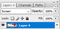
You’re gonna have something like this (I just made a basic color for the skin):


3) For the shadows, just color normally as you’d color the other parts!

Then:

The same process with the clothes and any other black part you’d like to add a color!

4) Complete your coloring and that’s all!

It’s really simple, right? I hope this is helpful and you can get it done, anon!
55 notes
·
View notes
Text
tanchirou’s coloring tutorial
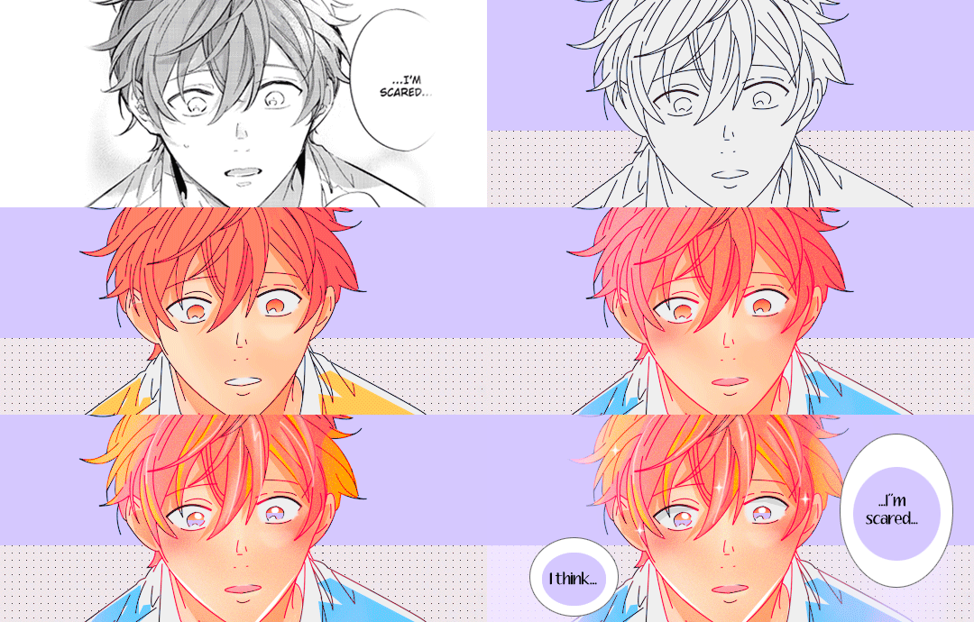
hello!! i was asked to make a tutorial showing how i color a while ago, so here it is! i’m honestly not the best at explaining at all so i’m very sorry if i lose you somewhere along the way ;; you can always come ask me to clarify anything, my dms are open to everyone :)
also a quick disclaimer: this tutorial will only be focused on coloring, so i won’t be showing you how to redraw lineart. however if you are interested in what programs i use, i use clip studio paint to redraw and photoshop to color
besides this tutorial, i also want to link some others that are great for tips & learning!!
katsuke’s coloring tutorial
sugawara’s coloring tutorial
dicennio’s coloring tutorial
and without further ado, let’s go goooo
Weiterlesen
553 notes
·
View notes
Photo
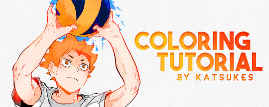
hey everyone! as asked by some people, here’s a tutorial and how i colour manga! thank you to anyone who’s ever liked my creations, i really appreciate it ♡
Weiterlesen
1K notes
·
View notes
Photo

coloring tutorial as requested by anon!
Weiterlesen
491 notes
·
View notes
Photo
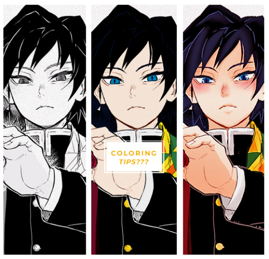
Here are few tips to color manga panels. This is not a tutorial bc I’m a loser but I hope it helps someone in someway~
Weiterlesen
494 notes
·
View notes
Photo

airmid | static preview & code
features:
a simple icon page
index + ask links
filters
80px icons
inverted tumblr controls
Some html knowledge is needed; several instructions are included in the code. Please do not steal any of this code & do not edit the credit. Like/reblog if using // thank you!
1K notes
·
View notes
Photo
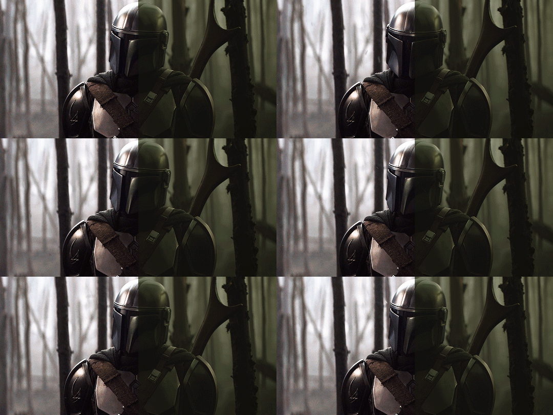

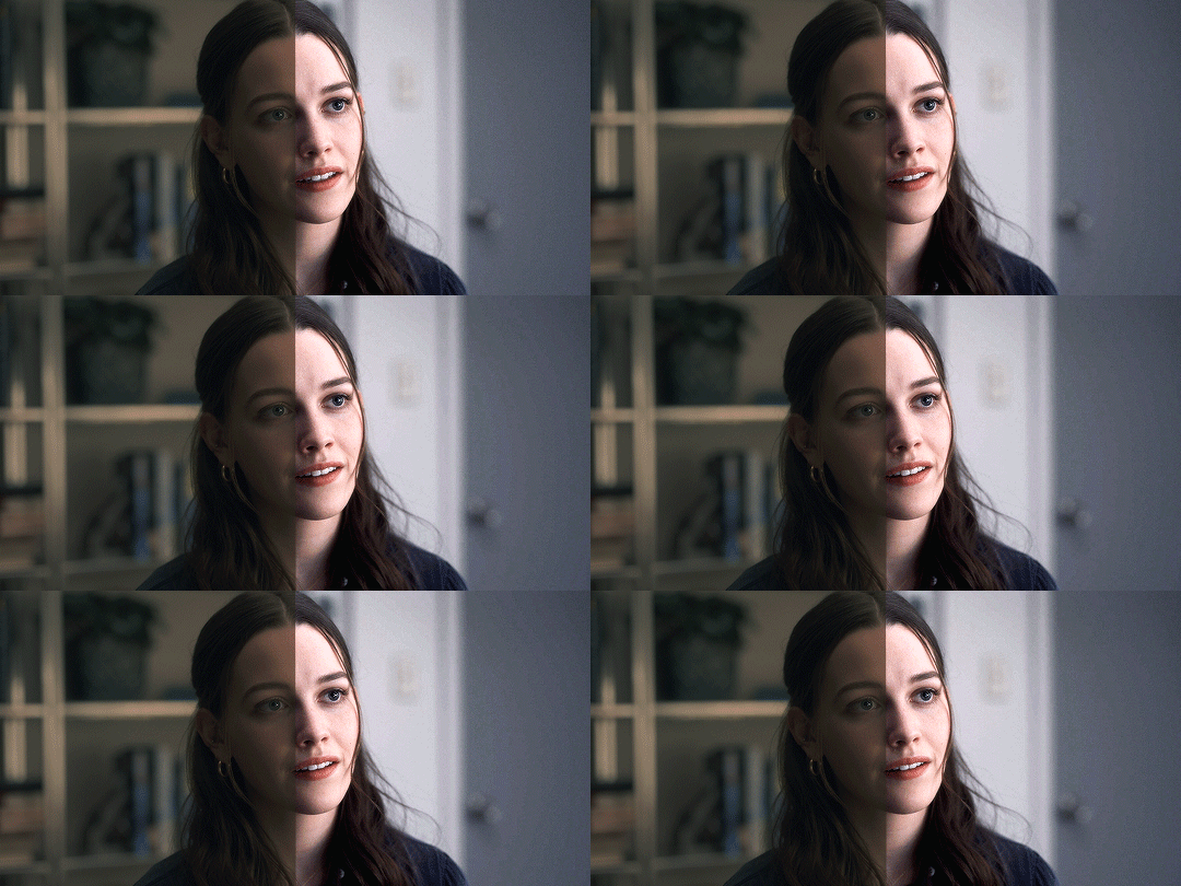
This post is a continuation to my gif-making tutorial. I’ve found that I often work with weirdly tinted scenes which are sometimes challenging to colour, so I’m here to share how I tend to work around them.
There is no one way to colour gifs, and something that works for me may not work for you! This post just contains some things I wish I’d known when I started making gifs years ago.
To understand this, you need to:
already know how to make gifs on Photoshop
have basic knowledge of different adjustment layers
I personally use Photoshop CS5.
Weiterlesen
2K notes
·
View notes
Photo



Tutorial by itsphotoshop.
I use Photoshop CS6.
Like/reblog the post if you find it useful.
Weiterlesen
2K notes
·
View notes
Note
📝 ok how do you add more than one gif/moment in one gif? like in some of your veronica in every episode gifsets or when you do the outfits one? i can't find a good tutorial also if you have a tutorial to how you did the side bar, that would be awesome. i am trying not to send you a 10000000 things bc you are so talented and i love you sfm!
okay, i’m going to do a little tutorial on how i use layer masks and clipping masks to get ‘multiple gifs in one’ and i hope that will answer your questions!
we’ll start with the basics of getting several smaller gifs together to make one:
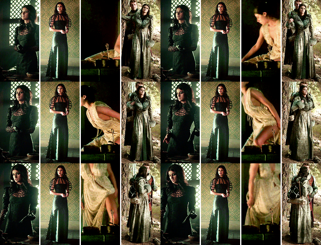
and then i shall build from that and explain how i use clipping masks in sets too to create something like this:
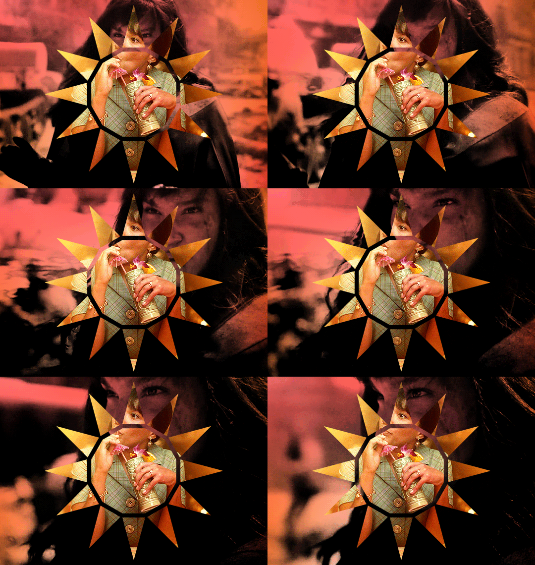
SEVERAL GIFS IN ONE:
so we’re going to use layer masks to create the four-in-one gif. you can apply this method for any square/rectangular gifs, so for example if you want to put five gifs in a line instead you can adjust the sizing and make that work.
the most important thing is to first work out what size you want each gif to be. i like to map it out with black rectangles first so i know exactly what size i’m using and that the spacing between each one still works (tumblr has a spacing of 4px so i just maintain that throughout my mapping). so these are a size of 132x275px:

now i know exactly what size i’m using, i can get started! first you’re just going to make your gif as you usually would with your usual colouring:
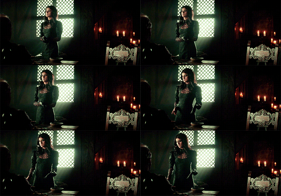
i’m then going to go to image > canvas size and resize this to the 132x275px size i decided on earlier:
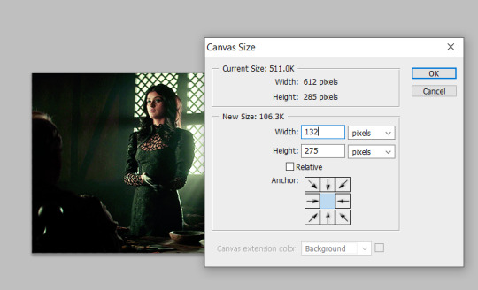
that’s then given me the size that i want! you can move this gif layer around to then sit nicely in your new canvas so it’s centred nicely, and then i put all of my layers into one single folder on the layers panel.
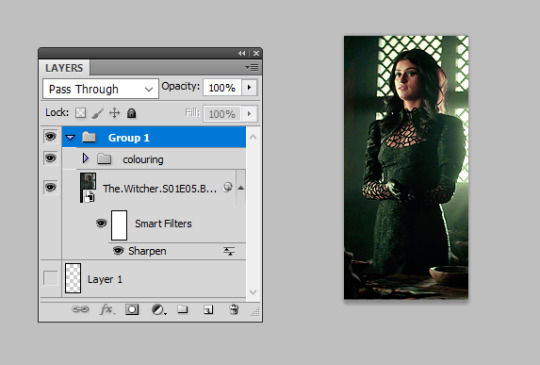
i’m then going to select the canvas using the rectangular marquee tool so that the entire canvas shape is selected (this is really important or the area you want to mask will not be defined), and then add a layer mask as so:
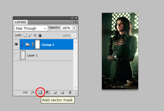
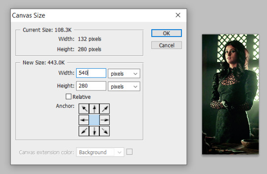
this will effectively ‘set’ your gif at those exact dimensions. i’m then going to go back to my image > canvas size and alter the canvas to the size i want the final gif to be at, for this one i’ll alter the width to 540px as that’s tumblr’s ideal width size:
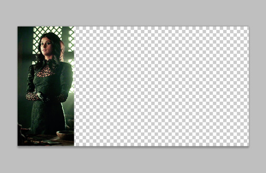
you can now move this gif along to place it where you’d like on this canvas, so i just repositioned this to the very left hand side so it’s the first gif in the row:
you can then repeat this for all your other gifs! top tip: make all your gifs the same length of caps for ease. it is possible to adjust your gif length using the timeline on the animation window if need be, but it’s a lot easier if you just make all your gifs the same number of frames. when all the other gifs are done, we get this:
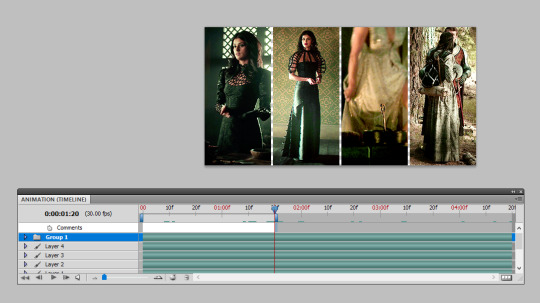
as you can see, i didn’t make all these gifs the same number of caps so i’ve just dragged the time bar at the top along to the place where my shortest gif runs out when i press play. then i can save and ta-da, all done!

USING OTHER SHAPES:
unfortunately the above technique only works when using rectangles/squares as other shapes do not have the exact sizes to enter in. so i’m going to introduce you to how i use other shapes to create several gifs in one, say hi to clipping masks!
i’m going to make my gif once again and colour it as i usually would:

then i’m going to insert a shape. now, there are two ways to do this! firstly, photoshop has custom shapes you can use under the ‘custom shape tool’ window, then going to shape and choosing from the options. you can then drag this onto your gif to insert the shape you want at the size you want:
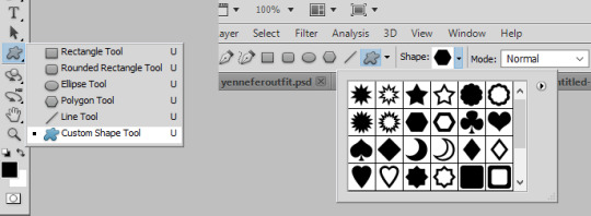
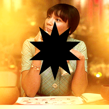
the other option is you can generally find good geometric shapes available for free use on the web. searching for ‘geometric sun’ for example brings up a lot of great shapes to play with, make sure you add ‘clear background .png’ to your search and it brings you to a lot of resource sharing sites that will allow you to save these shapes as cut-outs.
here i found the cut-out i wanted, re-sized it and pasted it on top of my gif like so:
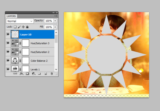
now for the fun part! you need to reposition this shape layer so that it goes at the very bottom of all your layers. make sure you have absolutely nothing within a folder as well (this is important for speedy clipping masks!).
once it’s at the bottom of everything, i’m going to right-click on the gif layer and then select ‘create clipping mask’ on the drop-down menu:
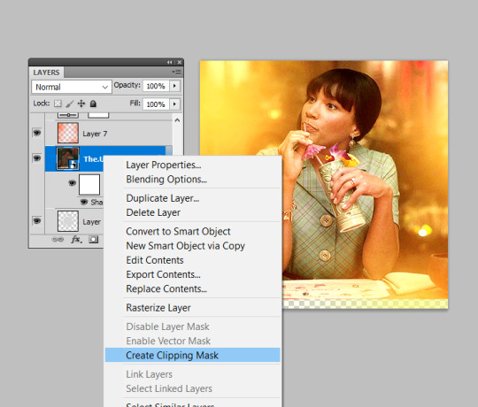
and this will clip your gif to the shape! you then need to select all your colouring layers (just control shift and click on the very bottom layer then very most top layer) and then also right-click and select ‘create clipping mask’ to clip it in the same way. this will not work if any of them are in folders, so remove any layers from folders first! you can then continue to make edits to these colouring layers (just double check any new ones you insert are clipped!) until you are happy with your shaped gif like so:
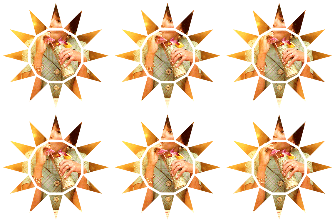
i then drag and dropped this gif on top of another gif i’d made (similarly to how i’ve outlined in the several gifs in one section) to create the shape as a statement on the gif:

to create gifs like my sidebar, i’ve just repeated this shaping several times over and dropped them onto a ‘background gif’ to create the overall pattern i wanted. it is really helpful to just have a play around with just plain shapes to get your layout sorted before you make them into gifs. for example, i made a template for my sidebar gif first so that the size and layout of all the triangles were exactly as i wanted before i giffed anything! you can then just copy and paste these shapes to use as your clipping masks.
THE END
i hope this makes sense and is helpful, layer masks and clipping masks can seem like complete wizardry when you first start using them but you’ll soon learn how to get your head around them and experiment. if you have any further questions as always, please do let me know :)
925 notes
·
View notes