Text
Character Design - Visual Family of Characters
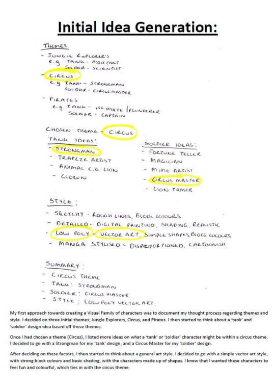
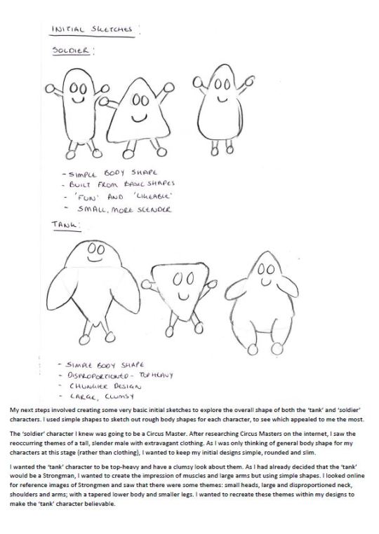
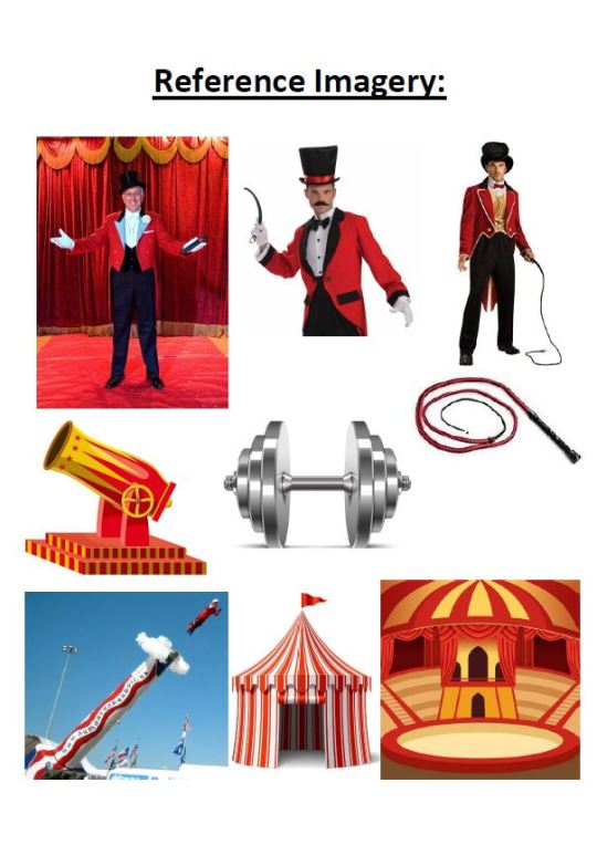
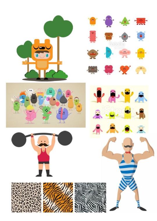
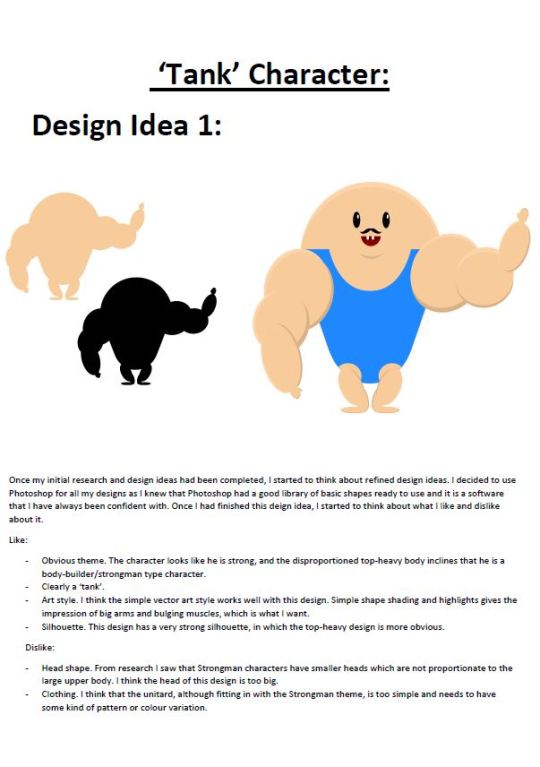
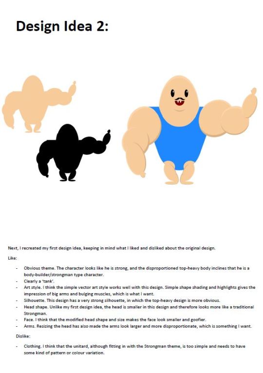
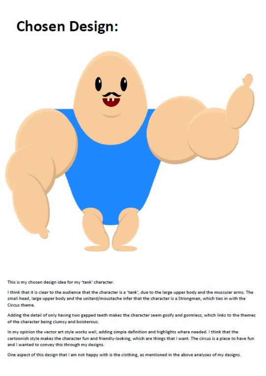
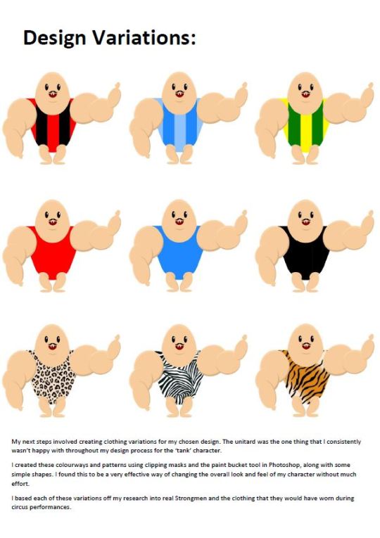
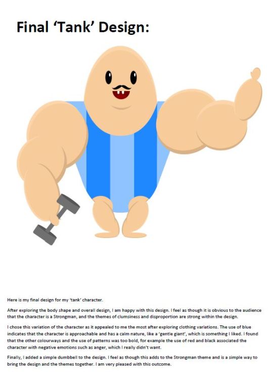
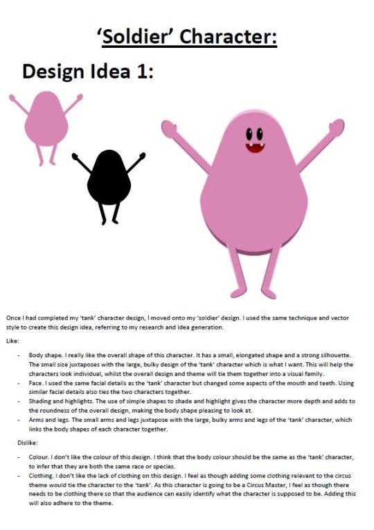
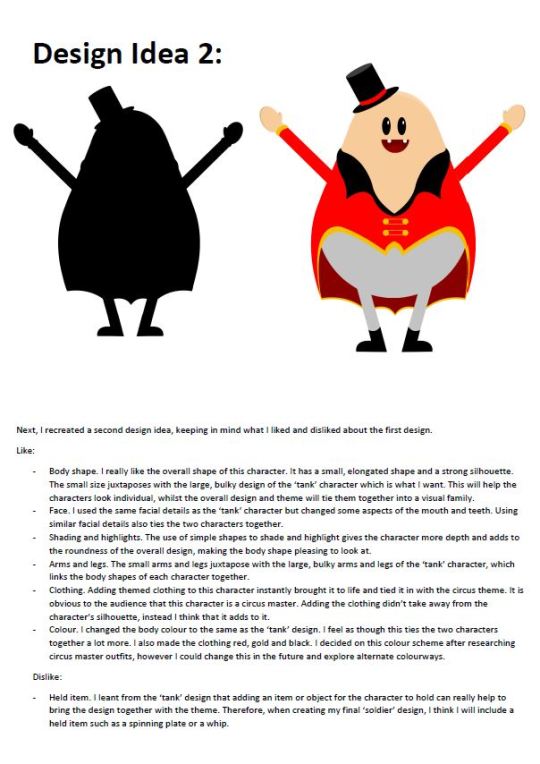
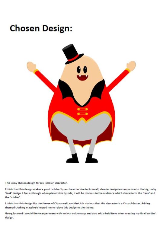
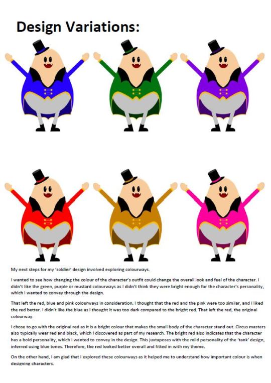
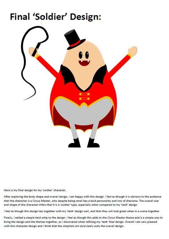
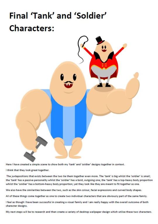
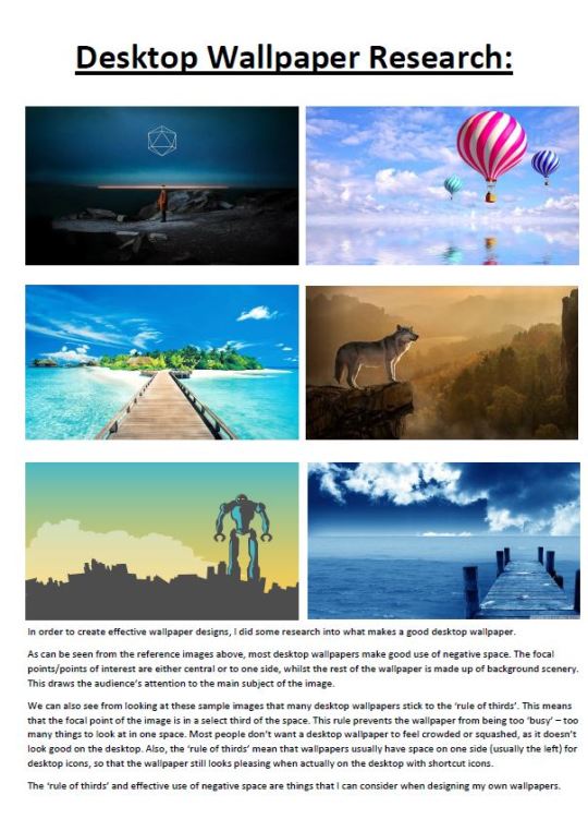
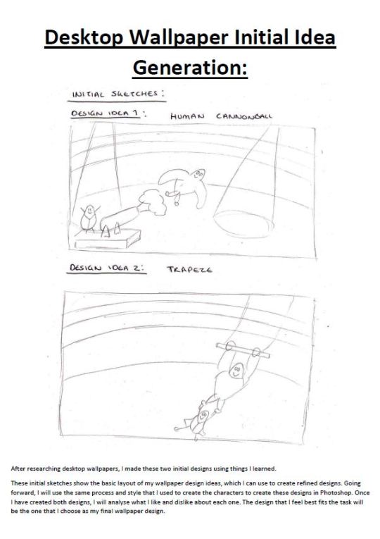
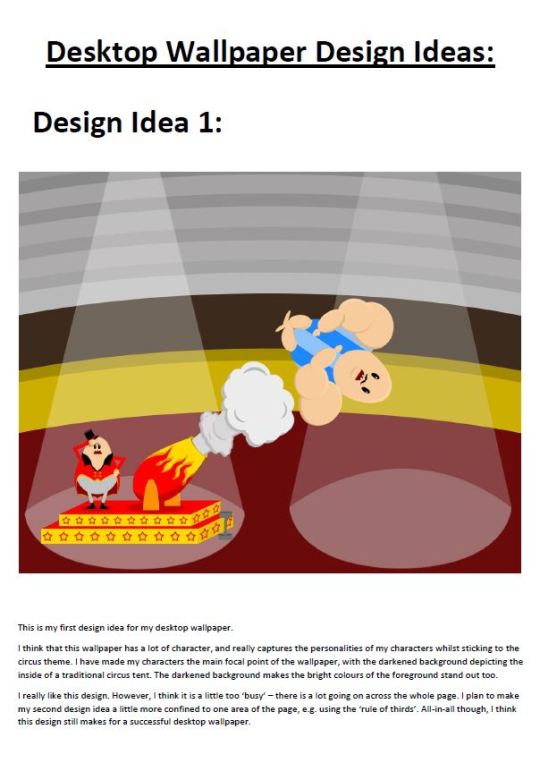
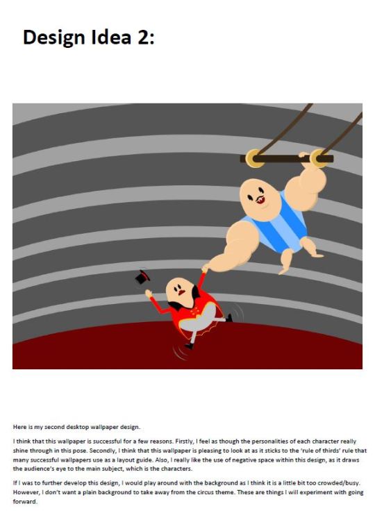
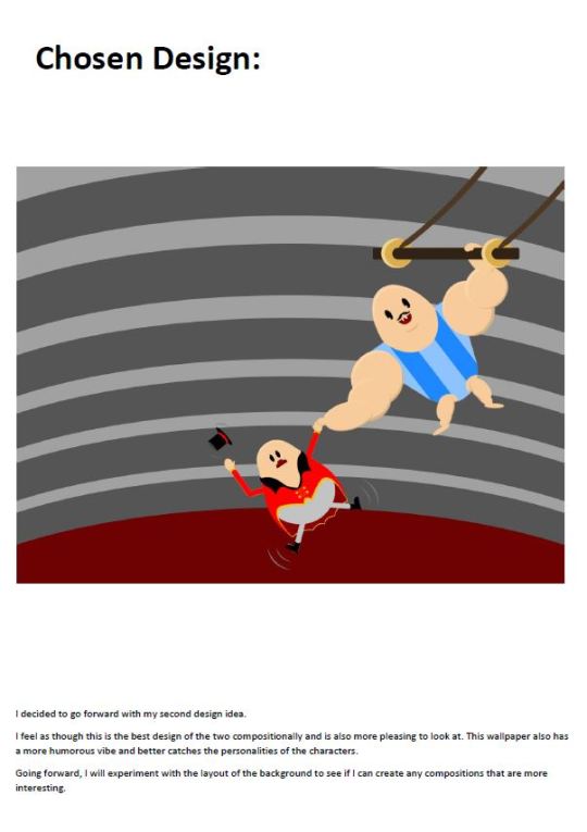
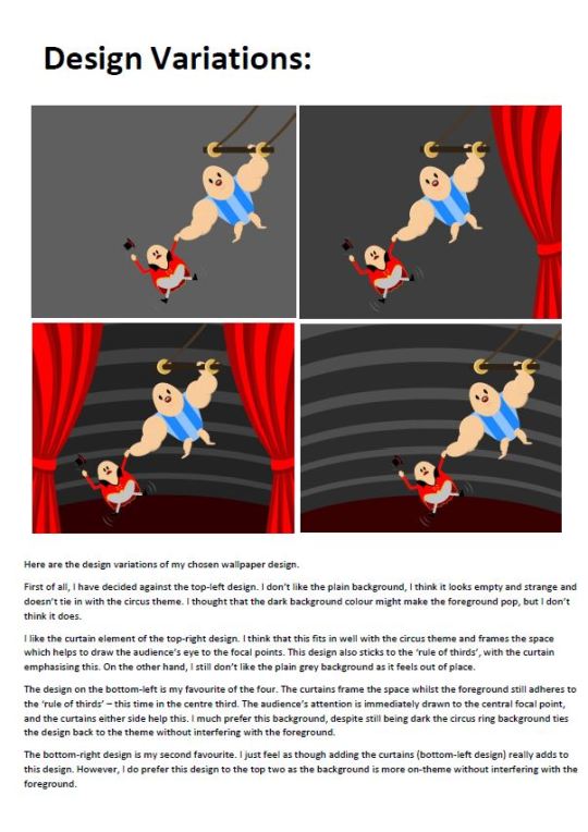
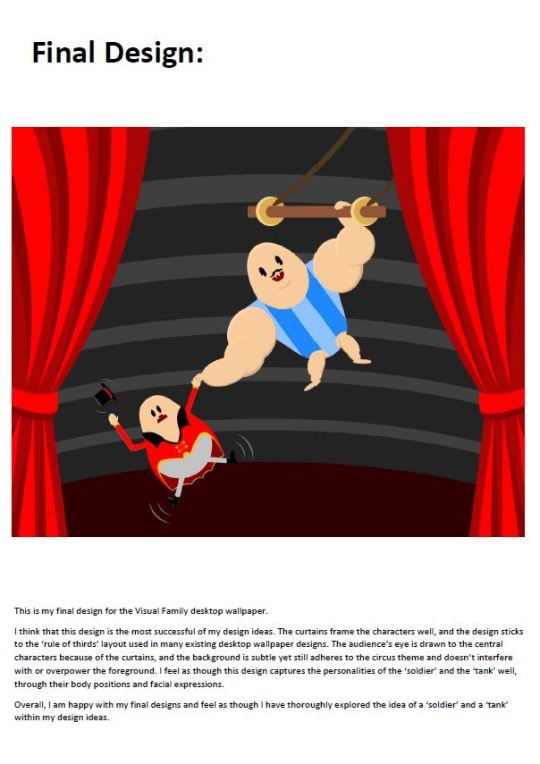
Character design process for a Visual Family of Characters.
My themes were ‘tank’ and ‘soldier’ and the idea of a Circus setting. The task was to produce a series of initial sketches, design ideas, refined designs and final designs, before presenting the final outcomes at desktop wallpapers.
0 notes
Text
Character Design - Cannon Fodder Characters
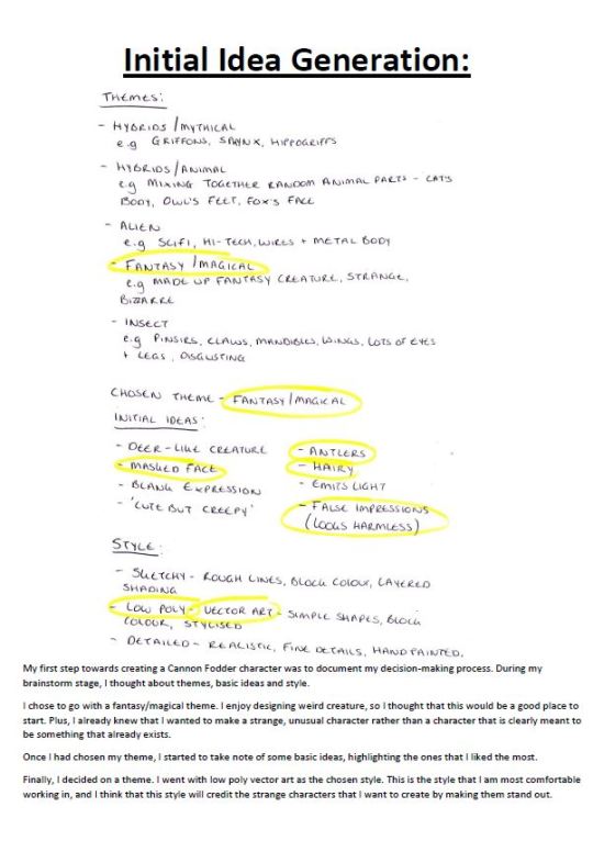
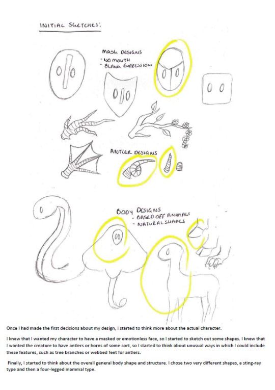
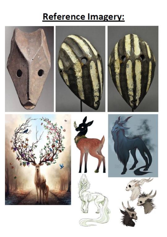
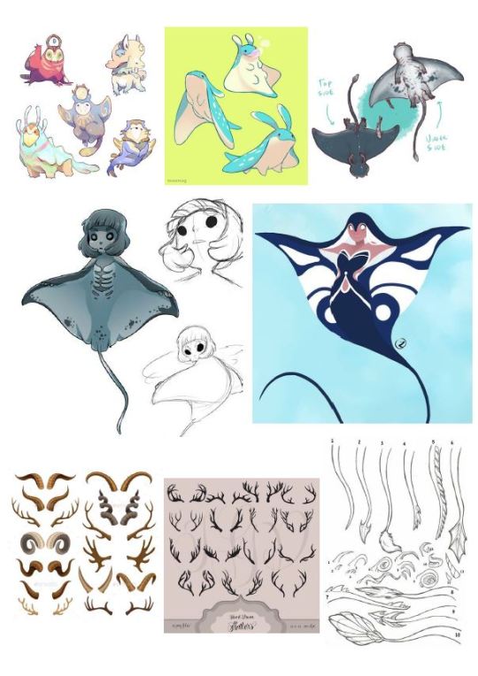

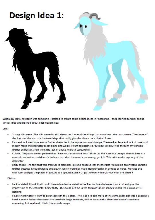
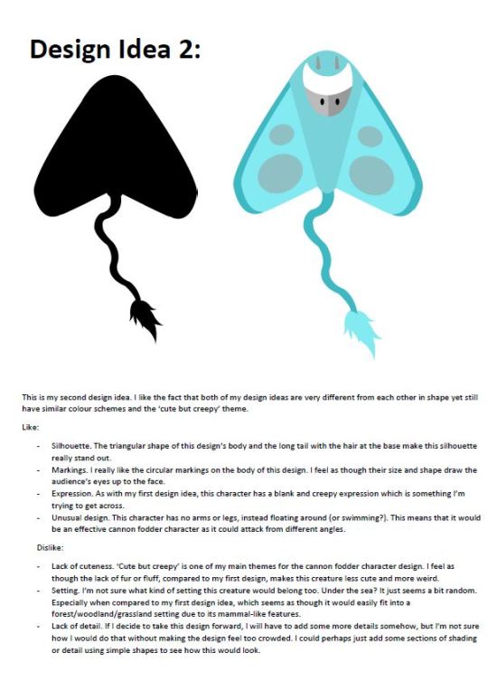
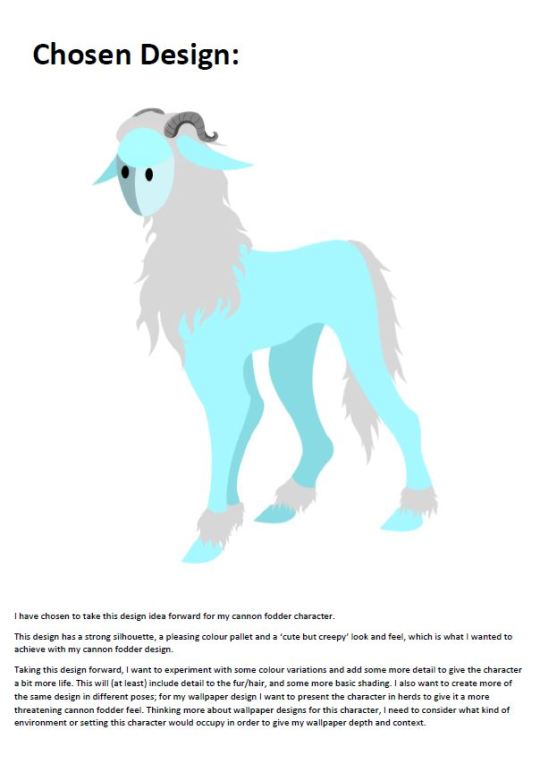
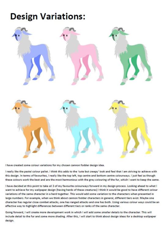
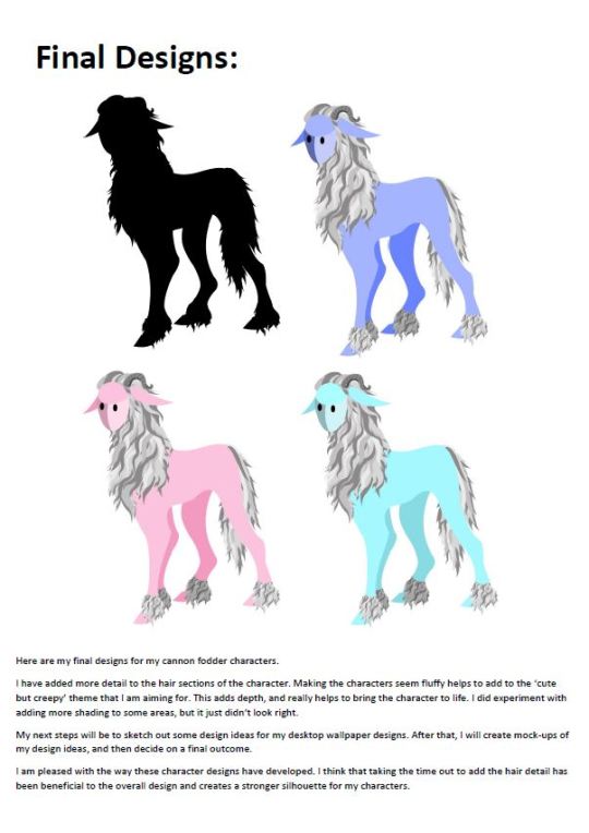
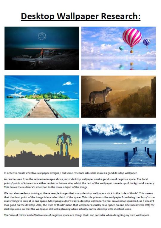
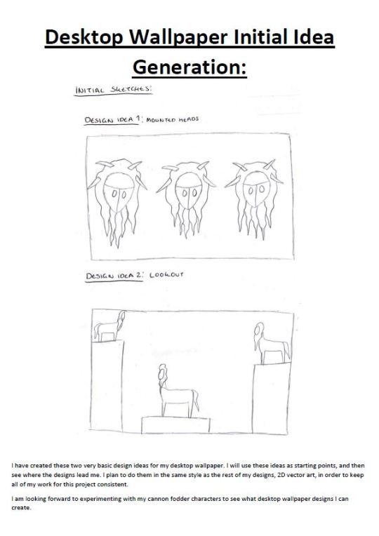
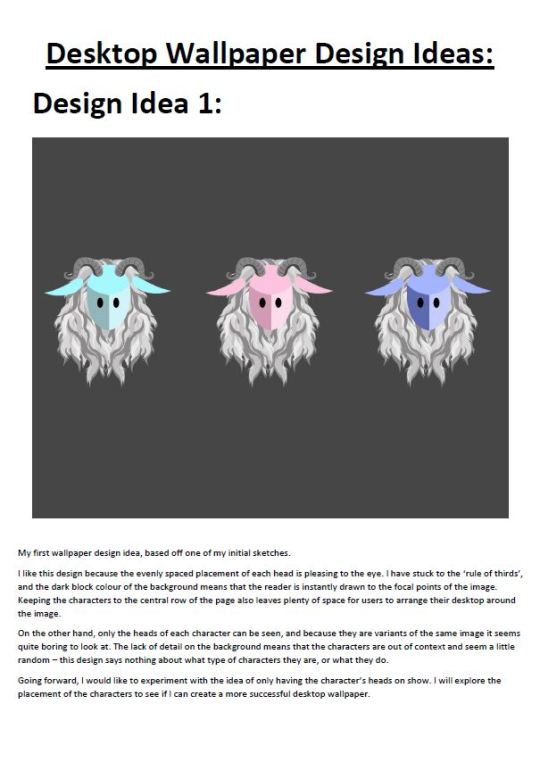
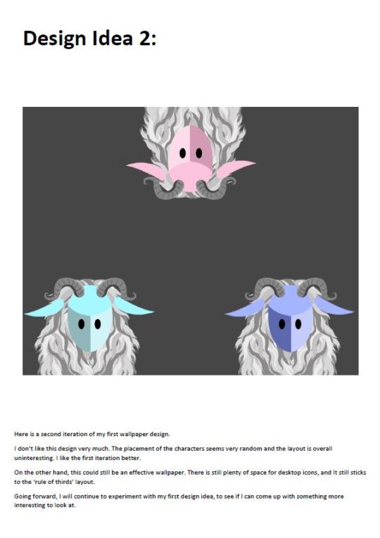
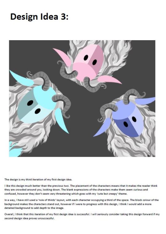
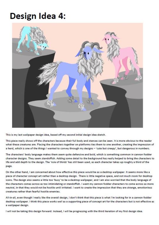
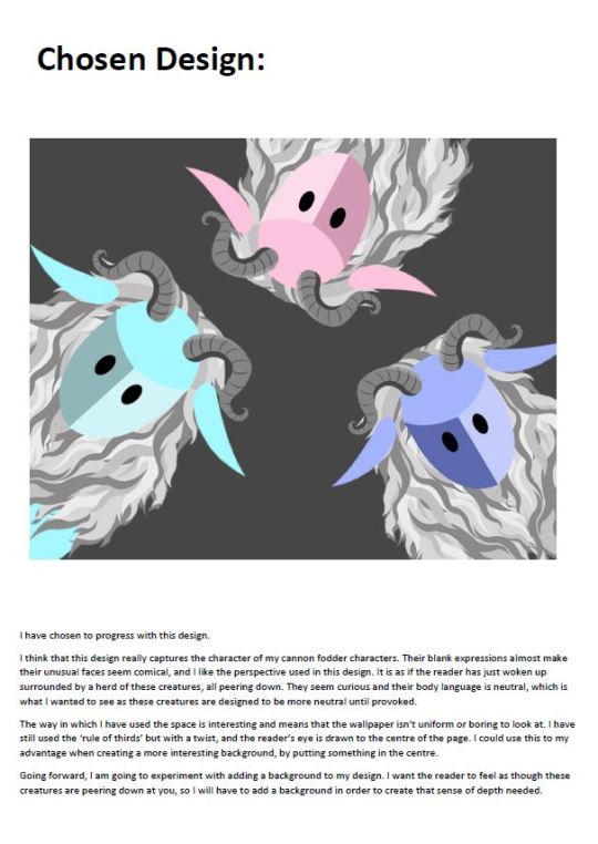
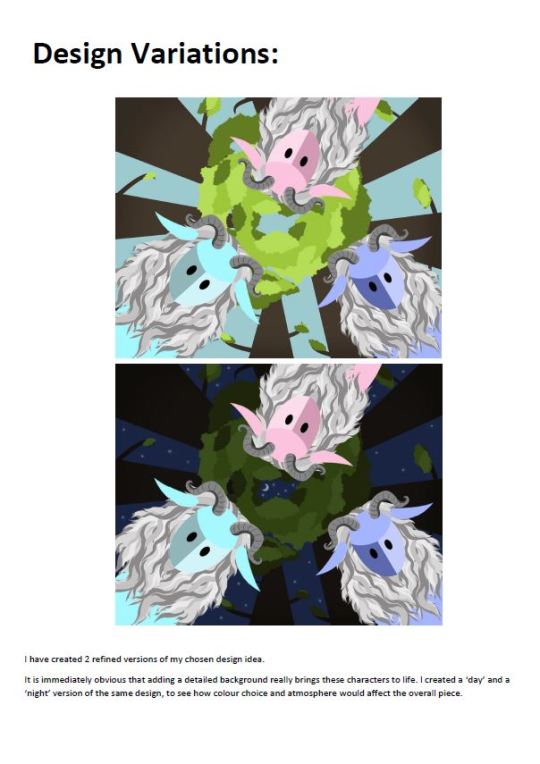
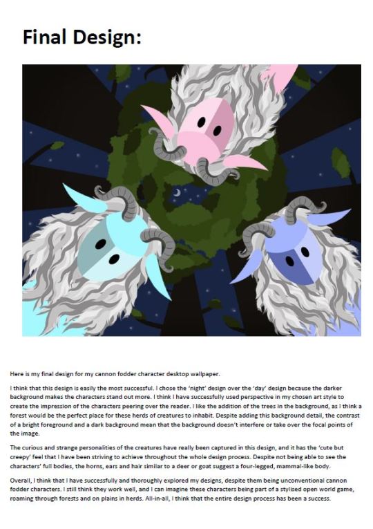
Character design process for cannon fodder characters.
My themes were ‘cute but creepy’ and the idea of the creatures being strange, emotionless and mute. The task was to produce a series of initial sketches, design ideas, refined designs and final designs, before presenting the final outcomes at desktop wallpapers.
0 notes
Text
Character Design - 3rd Person Character
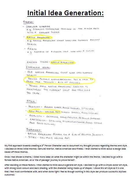
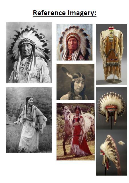
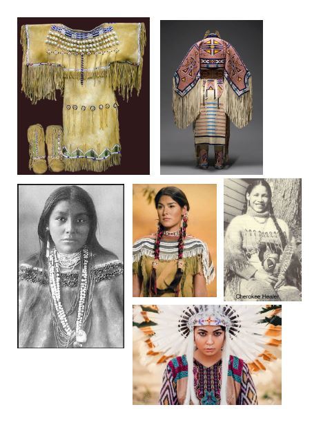
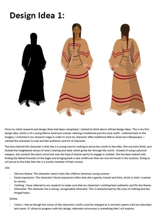
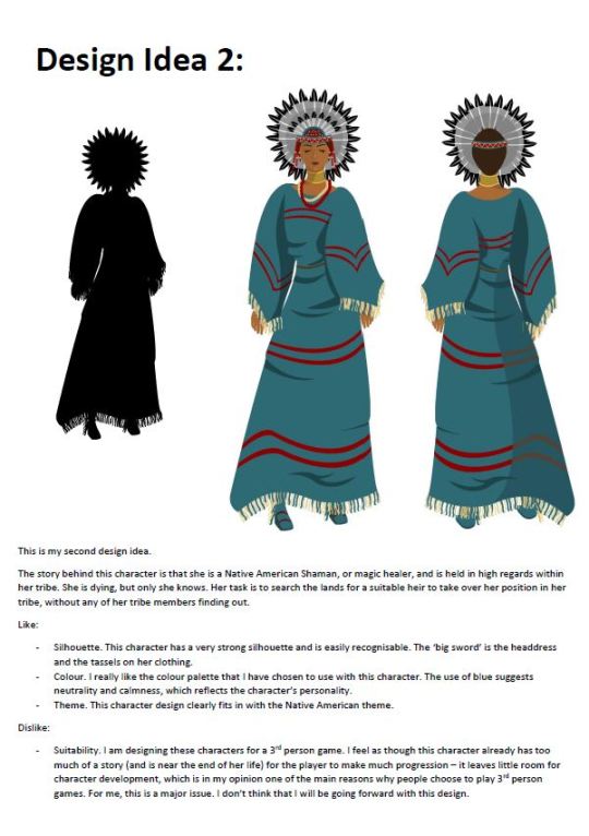
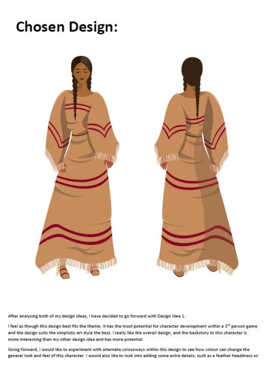
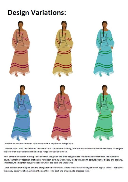
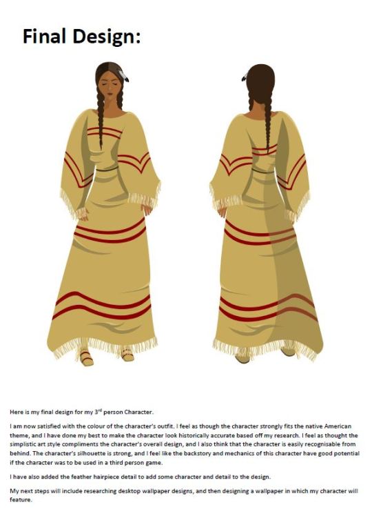
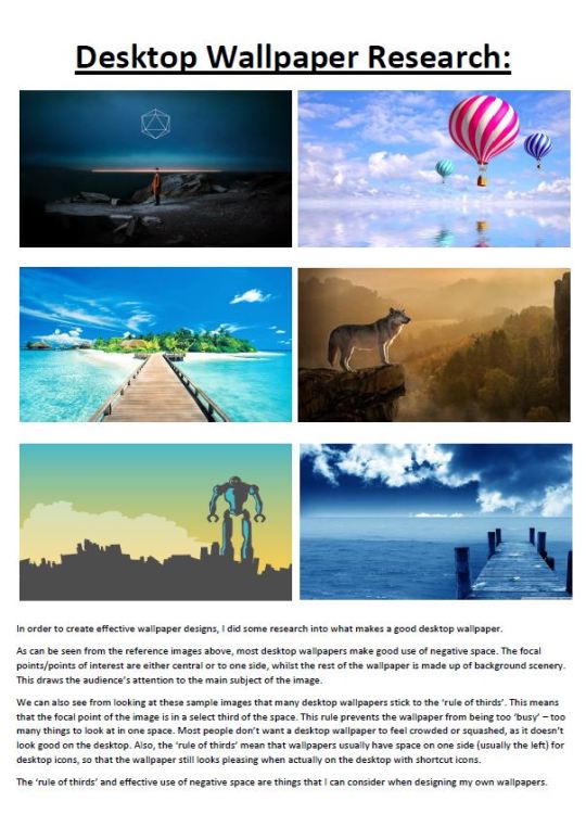
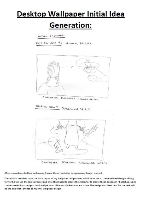
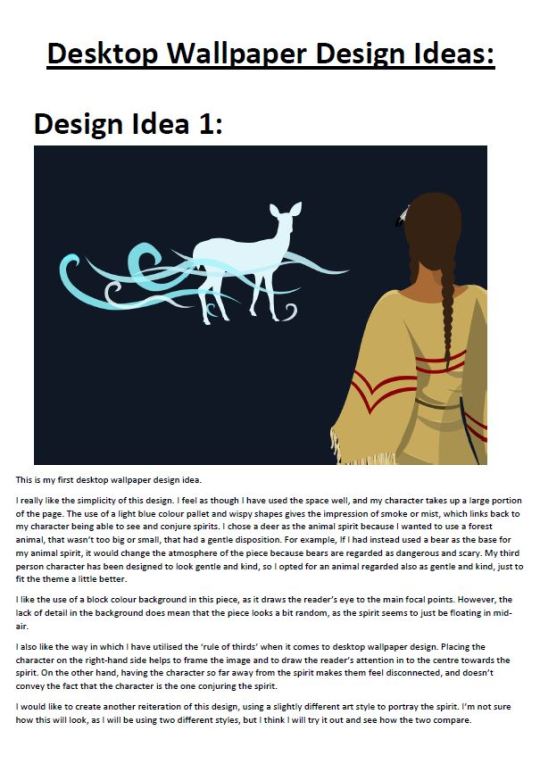
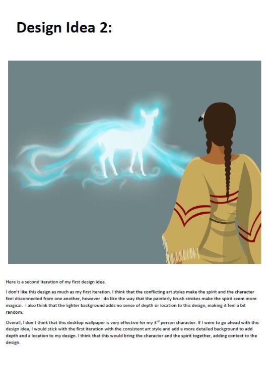
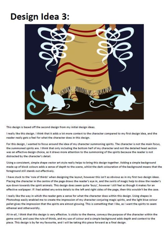
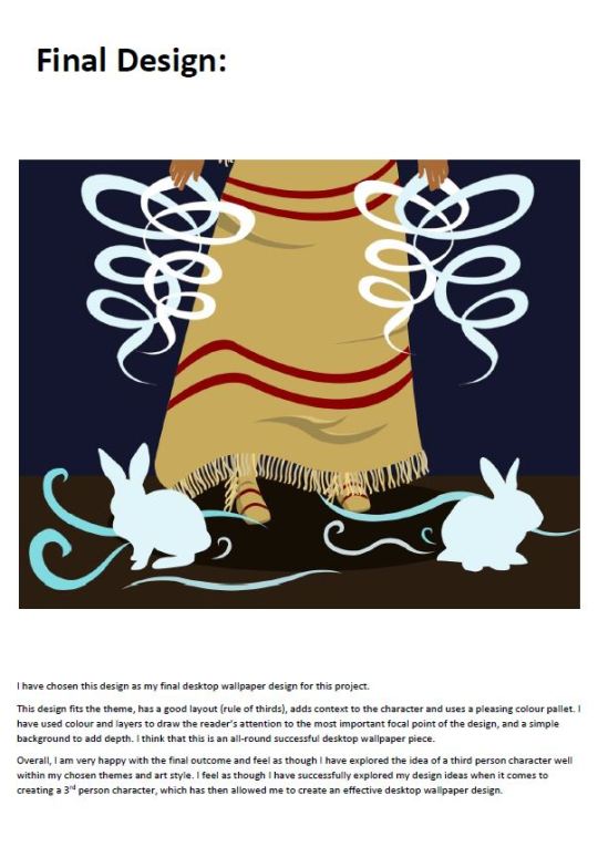
Character design process for a 3rd person character.
My themes were Native American Tribes and the idea of summoning spirits. The task was to produce a series of initial sketches, design ideas, refined designs and final designs, before presenting the final outcomes at desktop wallpapers.
0 notes
Text
PBR Texturing using Substance Painter
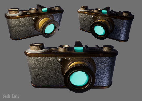
Vintage camera textured using Substance Painter.
0 notes
Text
Modular VFX & Materials
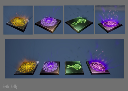
VFX magic effects and rune stones created using UE4 and Photoshop.
0 notes
Text
High Poly Modelling & Baking
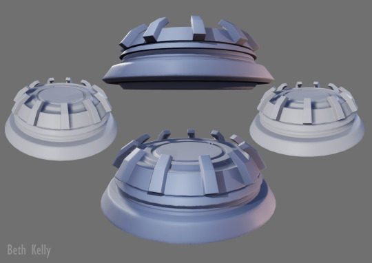
Hologram Projector created in and baked using Maya.
0 notes
Text
Game Ready Asset

VFX magic orbs and rune stone created using UE4, Maya and Photoshop.
0 notes
Text
High Quality Asset

3D stylised model of a staff that I created in Maya and hand textured using Photoshop.
0 notes
Text
4 Hour Design Test - Final Presentation of Ideas
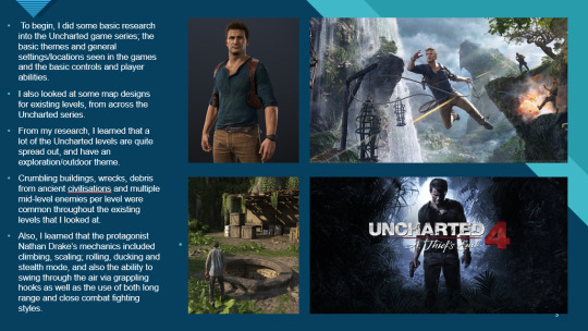


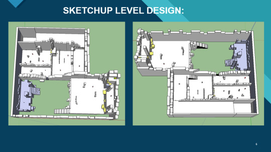

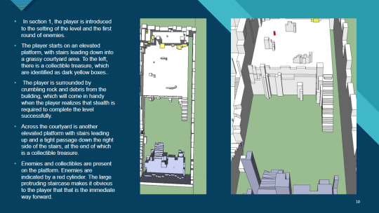
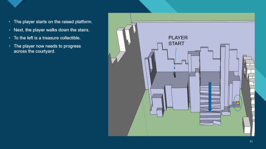


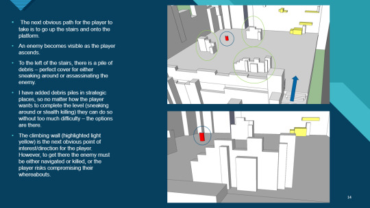
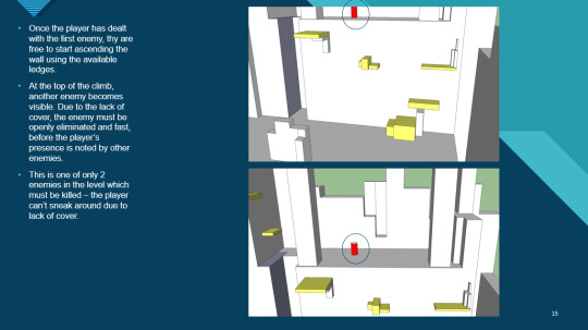
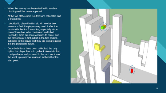
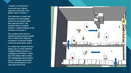
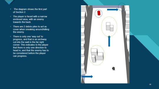
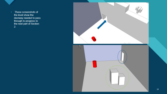

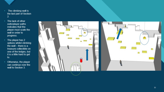
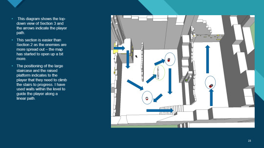
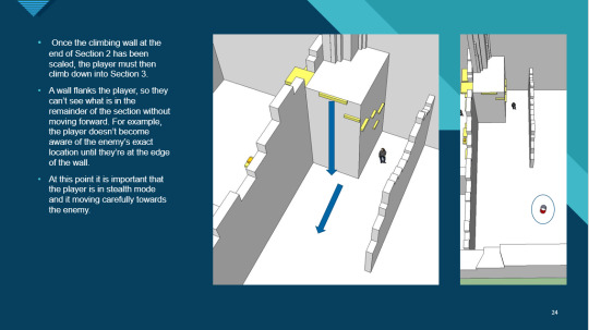
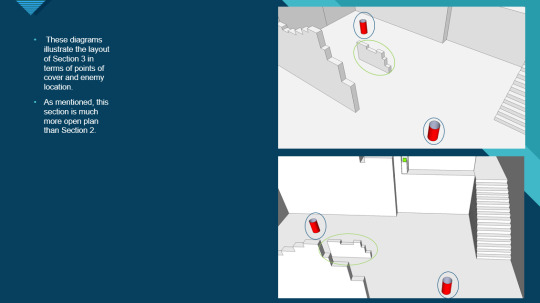
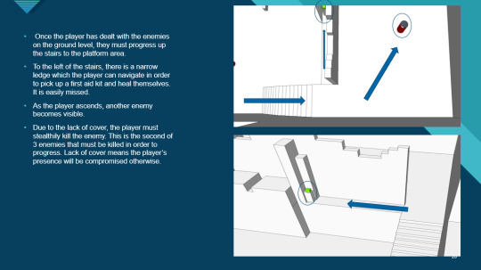
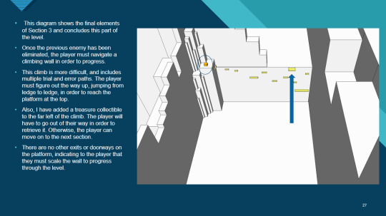

This is my final presentation of all the work I have done during my 4 hour design test task.
This stage of the task took 1 hour and 40 minutes, so I did mange to finish this task within the 4 hour limit (5 minutes to spare!).
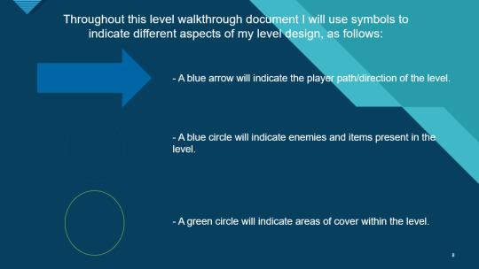
Overall I think that this document does present my idea well, my use of keys is clear and easy to follow so that the reader understands what they are looking at, and the text sections support and explain the corresponding images well.
In terms of level design, I think that my level could fit well into the Uncharted franchise. I have included parkour/climbing sections, which are a massive part of how the player explores the world in the series. I have added treasure collectables to the level which are also present in the Uncharted games. The crumbling walls give the impression that the player is in an ancient, decaying location; themes of lost civilisations are strong within the series.
The overall design and player path is very linear, with the player only having a small number of options when it comes to their path. This is something that the level designers at Naughty Dog focus on heavily in the Uncharted series, and I have tried to recreate this in my level by giving the player limited path options (mostly either forward, back or up). Adding the high walls to the playable space means that the player is confined to one area at any given time, and I have added only one entrance and exit to most ‘rooms’ which creates a clear path for the player to follow.
Following in Uncharted’s footsteps I have added copious amounts of cover space throughout the level. This gives the player the option for stealth when dealing with enemies, but also leaves open the option to go in all-guns-blazing. Having these options means that the player still has plenty of room for making decisions despite their linear path already being pretty much dictated for them.
I am really proud of all of the work that I have produced for this task. I think it works well as an Uncharted level concept, I think that I have presented my ideas in a way that makes my level easy to understand, and I think that my level design for this project has been one of the strongest that I have produced in terms of design choices, placement and use of space n a linear path.
If I were to go back and change any aspect of this 4 hour task, then I would change the layout of my final presentation of ideas. In particular, I would present my research separately to my design document, and I would present both as a Word Document PDF just to give it a more professional feel. However, as a whole, I feel as though I have been successful in my answer to this task and I am very happy with the outcomes.
0 notes
Text
4 Hour Design Test - Creating the Level
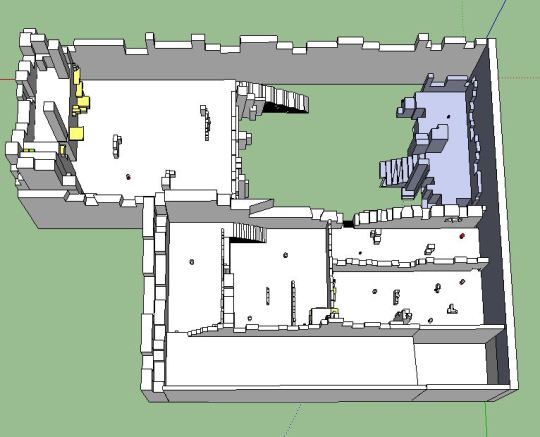
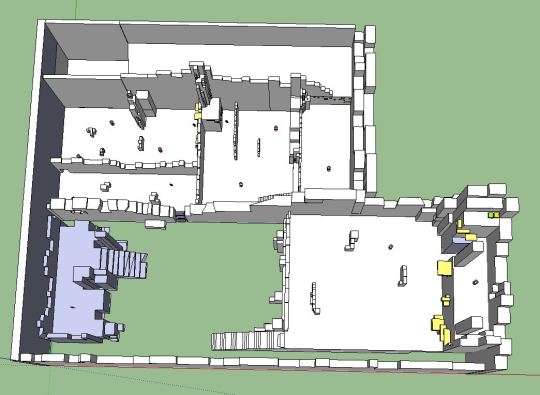
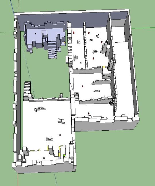
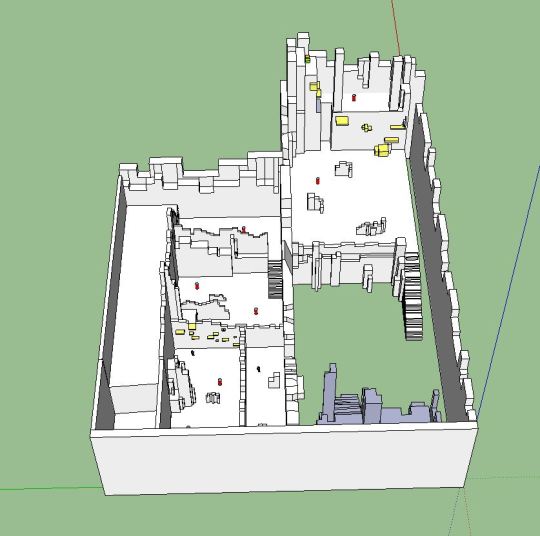
Here are some top-down shots of my design test level.
I have created this level in Google SketchUp, based off of my level design (see previous post). I have included enemy AI, climbing/parkour sections, health packs and ammo within the level, colour coded to communicate this to the reader.
This part of the 4 hour design test took around 1 hour 30 minutes to complete. I think I have spent a good amount of time building my level; I am now 2 hours 15 minutes into the design test with just the supporting design document to go.
My next steps will be creating the design document to support this level design. I plan to spend the rest of my allocated time (1 hour 45 minutes) creating this document, going into detail about each section of the level to present my ideas professionally.
0 notes
Text
4 Hour Design Test - Level Design

I have been given a set time of 4 hours to complete a Design Test - one that has actually been used in industry by Naughty Dog.
The task involves designing, researching and building a section of a level based off of the Uncharted series. The level has to have an end goal, room for cinematic moments, and has to feel as though it belongs in the Uncharted series.
To start, I did some basic research into the Uncharted series, as I have never actually played through any of the games. After that, I started to plan out a rough level design, before refining it and adding a key (above).
This research and planning stage took around 45 minutes to complete.. Despite this being quite a large chunk of my 4 hours allocated time, I think that this stage was one of the most important, especially considering I knew very little about the Uncharted series and I now have a level that fits the game’s themes and mechanics.
My next steps will include building my level in Google SketchUp, before creating a design document to support this.
0 notes
Text
Game Design Document - Final Presentation of Ideas

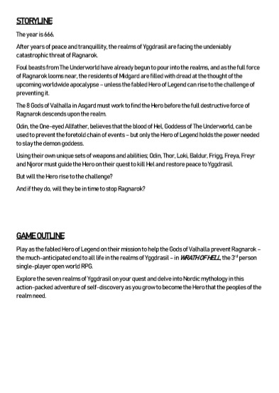
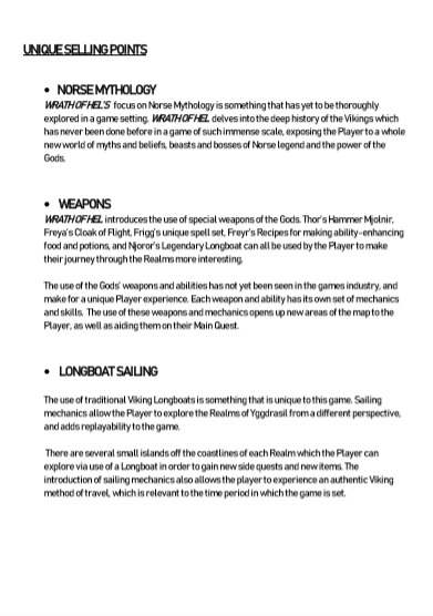
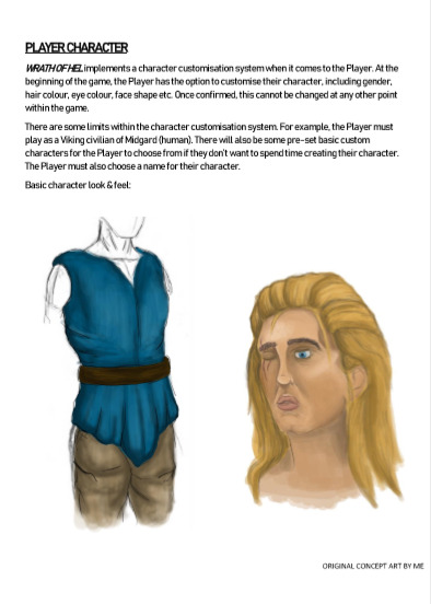
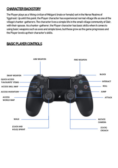

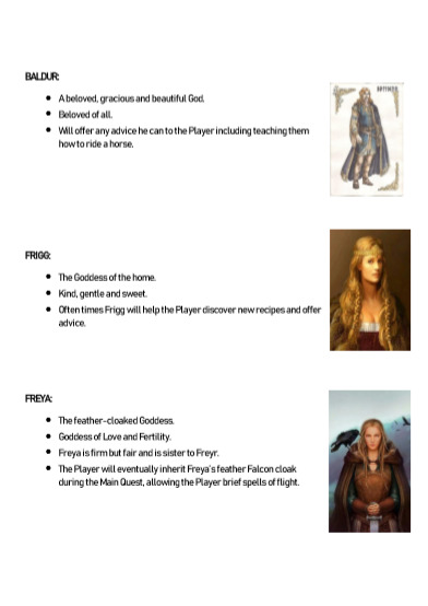


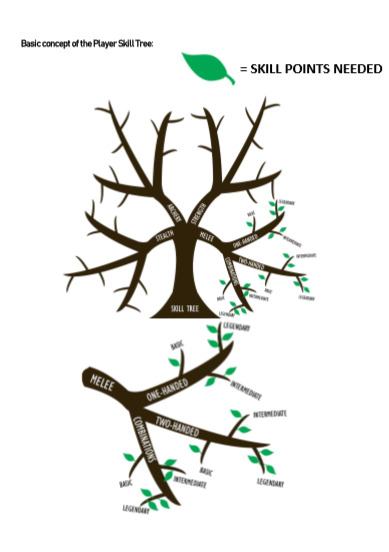
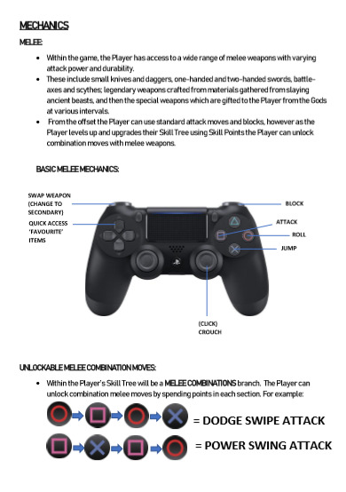


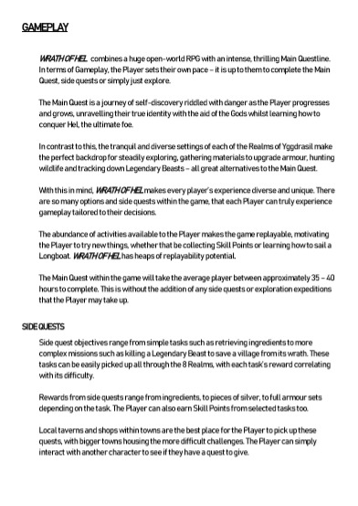

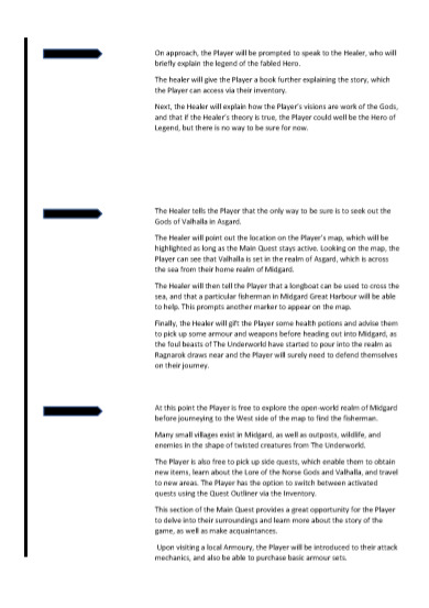
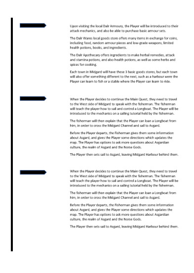
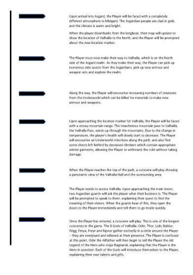
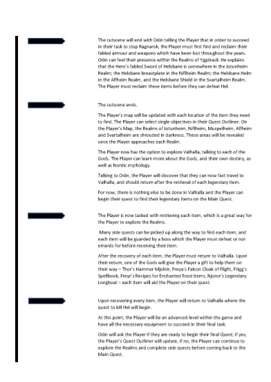
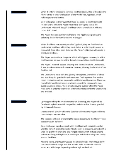

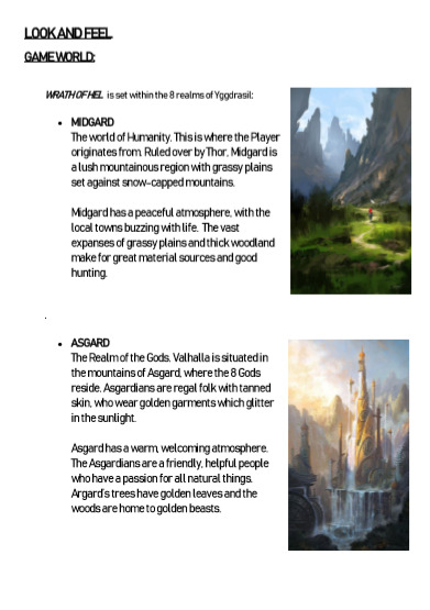

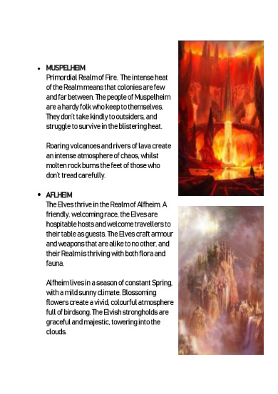
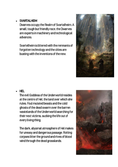
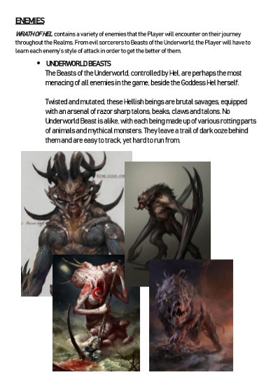
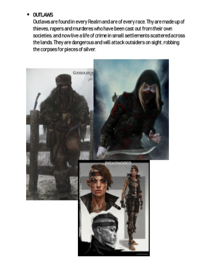
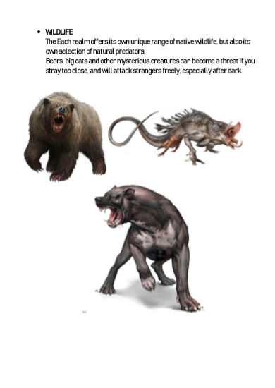
Here is my Game Design Document, which is a final presentation of my work for this task.
(As mentioned within the document, the artwork and images do not belong to me unless stated otherwise. All reference imagery is from Pinterest and internet searches.)
Overall, I think that this GDD is successful. It gets the key points of the game across, and uses plenty of visuals to help the reader visualise the look and feel of the game world.
This task has really helped me to understand the workflow and design processes behind games in the industry.
I feel as though completing this task has helped me to understand why it is important to think of the little things as well as the obvious, and why it is important that documents like this are created so that everyone is on the exact same page.
I have really enjoyed thinking about all of the aspects and little things behind the scenes that go into creating a solid game idea, and how difficult it can sometimes be to ensure your content stays original when there are so many existing games with similar themes and ideas.
Going forward, I would like to perhaps create some GDDs in my own time and explore some of my own ideas a little more thoroughly to see if any of them lead anywhere. I think this will be especially useful when I go into my third year of university and have to plan out and explore my own ideas in a professional way.
0 notes
Text
Game Design Document - Digital Illustrations
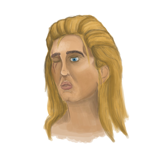


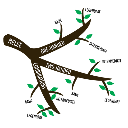

Some simple pieces of concept art I have created in Photoshop in order to help me illustrate some key points of my Game Design Document.
Initially I was going to leave any illustrations to the end and do them if I had time, but after expanding on my initial ideas I feel as though some visual concepts will help to convey my ideas across.
0 notes
Text
Game Design Document - Idea Generation & Research
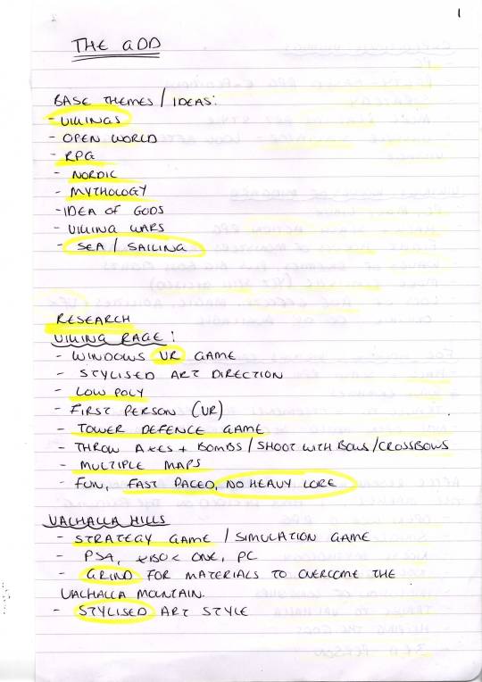
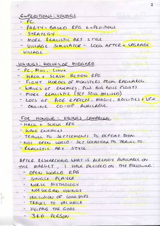
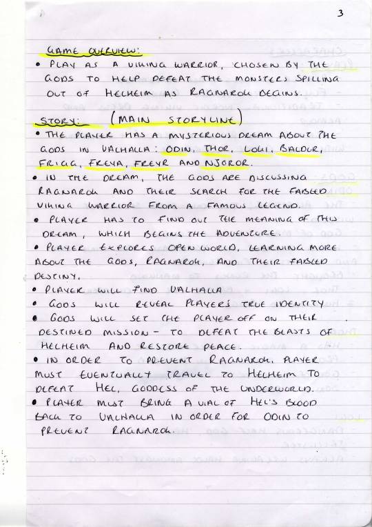
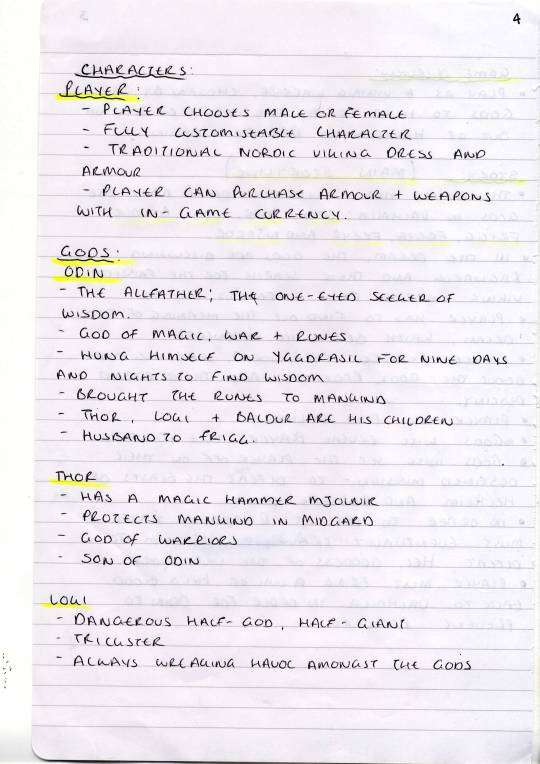
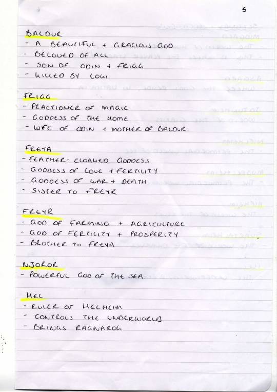
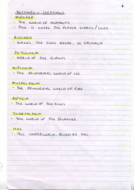
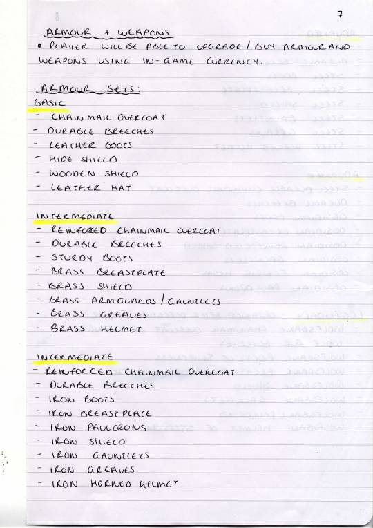
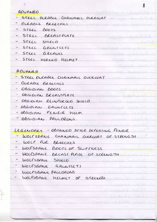
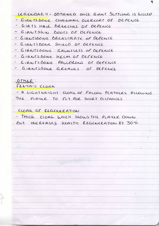
Here I have documented by entire idea generation and research process for a game on which I have to produce a professional Game Design Document.
The task includes creating a solid concept for an original game, then doing thorough research before presenting it as a professional Game Design Document, similar to the process used in the industry (yet on a much smaller scale).
The first thing that I did to kick-start this process was to think of general themes and ideas for the game that I wanted to create. At no point will we be required to actually produce any part of this game idea, the task is more about how we approach idea documentation in a professional manner.
After choosing themes and ideas to go off (open world, Norse Mythology, RPG) I started to research into existing games that revolve around similar themes. I noted down some key points from each game that I researched, before reviewing the outcomes.
At this point I had a solid idea of what kind of game I wanted to pitch in my Game Design Document. I started to note down a general overview, and put together a rough idea for a main storyline (key to gameplay as it’s an open world RPG that need direction).
Then, I started to research Norse Mythology and decide on some key characters that would inhabit my game world. I noted key points about each character, which may come in handy in the future when thinking of how to keep each character unique. I then started to research key locations within Norse Mythology, as I knew at that point that I wanted my game world to be made up of drastically different landscapes that were all bound to each other in some way. This would keep gameplay interesting and also add some variety and unique elements to a large open world map.
Once my idea had a solid structure and I had a good starting point, I started to think about a few of the finer details such as weapon and armour sets.
It may seem odd to be even considering these details at such an early stage of a concept, but this stage really helped me to get to grips with what the look and feel of the game would be, what the characters would look like, what their motivation would be in order to go out and get these items etc.
I also considered Beasts from Norse Mythology, such as Fenrir and Giants, when creating these lists; which then lead me to think of some cool side quests or tasks in which the player would have to slay legendary beasts for parts.
I really like the direction in whicht his idea is going. I am looking forward to starting my Game Design Document, and I am also planning to do some basic concept art pieces if I have time, in order to help demonstrate the look and feel of my game idea.
My next steps will be to start finalising the details of my game idea, and then typing up the game design documents. Any concept art or illustrations will be done dependant on time.
0 notes
Text
VR Project - Logo Design
Documentation of my design process when creating a logo for a group VR game I have been working on.
I really like the final product, and I think that it works well with the themes and ideas present in our VR level.
0 notes
Text
VR Project - Textures & Materials
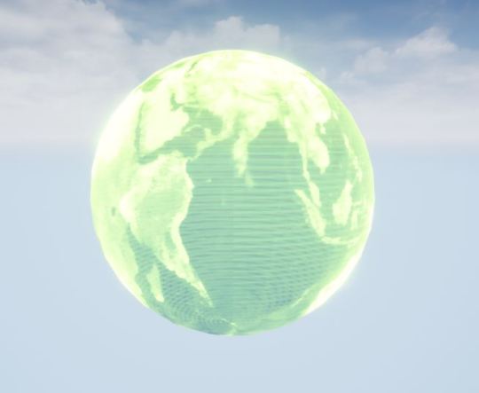
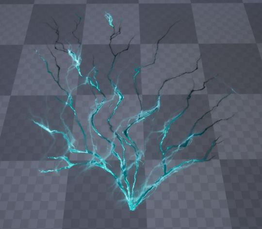
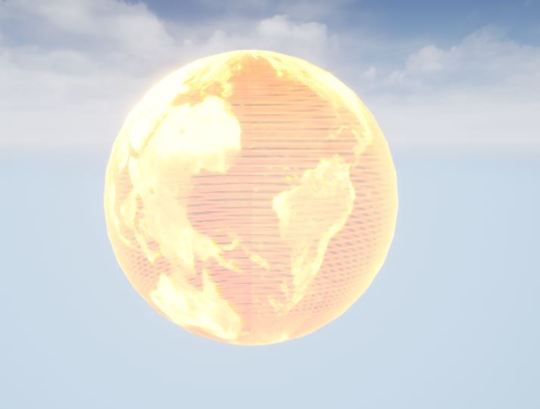
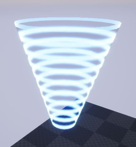
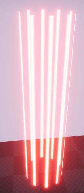
Some more simple materials and textures that I have created in UE4 for a group VR project.
The hologram planet material is what will be used to represent the spaceship’s nexus within our VR level. The laser beams and ray effect will be part of traps, and the textures will pan to create the illusion of movement. The lightning effect will be used to give the impression of crackling electricity surrounding traps on the spaceship.
These effects are all fairly simple yet achieve the desired effect. The fact that they are just textures and materials rather than particle systems of dynamic effects means that they won’t be too costly within our VR level.
I am really pleased with the outcome of these materials and textures.
0 notes
Text
VR Project - Textures & Materials
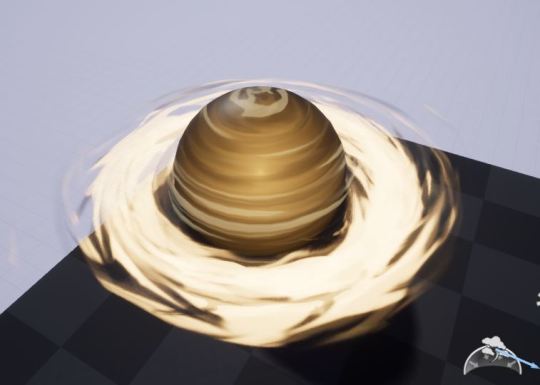
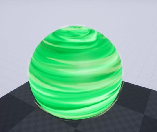
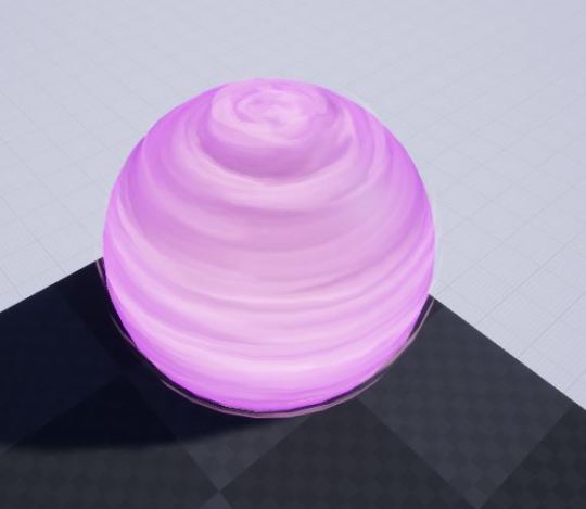
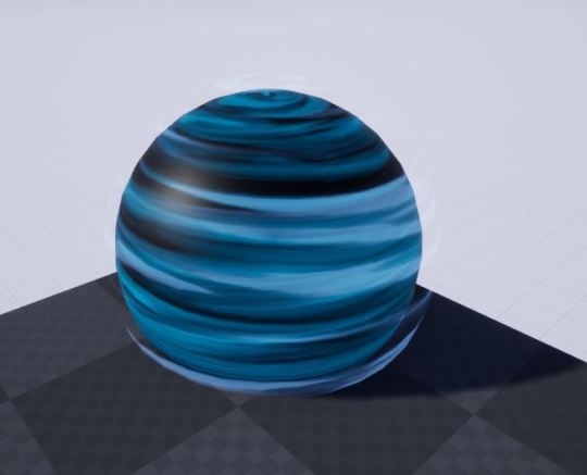
Some simple planet materials and textures I have made as part of a group VR project.
The idea is that the player is trapped on a spaceship, and has to defend the spaceship’s nexus from enemy droids. The gameplay is waved-based, with the droids coming stronger and faster each round.
My next steps will include making more materials, including a lightning effect and a hologram planet.
0 notes