Interaction Design student | Illustration l Gamer | movie enthusiast | Golf Nut
Don't wanna be here? Send us removal request.
Text
Mobile fonts
https://medium.muz.li/top-5-ui-fonts-for-website-mobile-apps-d78829e58f7e
I read this article form medium, as I always find it difficult to find a font that works with the aesthetics of the project. I’m always conscious of whether it is legible and/or still interesting enough to read. I always fall into the trap of using unique fonts that I haven't used before. From what I have read previously, I don’t need to do this because many of the fonts I have chosen in the past have very little difference and people aren’t going to know that you have used this lots of times before. Find a couple of fonts you like and reuse them, this serves a s great reminder that quality trumps quantity of choice.
Designing your content is key for communicating your ideas to people. This means offering content in that is usable and keeps reader engaged with what has been written. Presenting work in a legible format is so important
This a great quote from Ellen Lupton and makes so much sense:
“Although many books define the purpose of typography as enhancing the readability of the written word, one of design’s most humane functions is, in actuality, to help readers avoid reading.” ~ Ellen Lupton
The article lists the top 5 fonts to use when creating UI. These typefaces w work well but still remain interesting enough to keep your readers attention on the information being presented.
The one I have used for most projects is Open Sans.I use it because of its simplicity as well as being readily available on most platforms. .Best used for: Websites and Mobile Apps for prolonged usage and legibility. It easy on the eyes and can be read regularly. It is most effect as body text and pairs well with the other fonts such as Georgia or Source Sans Pro.
I found this whole article very useful and acts like a cheat sheet if you are struggling to decide what to use.
0 notes
Text
HandiCaddie Home Screen
It has been a long time since I have updated or shown any progress of where HandiCaddie is. There has been a lot of changes made to the golfers journey, but I’ll start off with the adjustments made to the home page of this part of the app.
When i drew up the original idea for the home screen, my initial thought was to have suggested courses in that are in the area close by. This would prompt the user to select a course quickly and find a caddy. However, reflecting on this concept I felt that this didn’t make sense for the functionality of the app and therefore didn't have any purpose for the design. What would be more beneficial is a call to action for user to access the 2 main features of the app, one being a single person selecting a caddie at a chosen course, the other is a person/group of people who have booked a trip through tour operators to add caddies to the courses booked. The purpose of our home page is to give the user a quick link to the information that they are looking for.
Below are some mock up of ideas I came up with for the UI of the app. Doing an A/B test will help me decide which idea fits the overall aesthetic of the app, encourages people to tap on the screen and most importantly presenting information clearly.
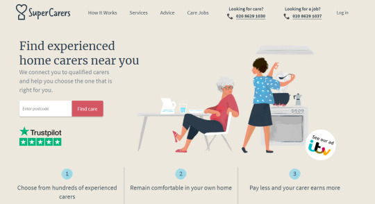
We looked at a find a carer website because it has a similar function to what HandiCaddie is like. The home page acts like a prompt for the app therefore we took inspiration from it and manipulated it into the design.

I took this idea forward and used it so that the user could access the content quicker, without wasting time. The mock ups below will help show my thought process and how I adapted and made changes to each design.
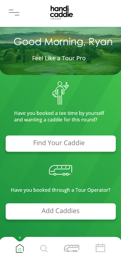
Idea 1
The information is clearly displayed
Easy to understand
Prompts look like buttons
BUT
Not very attractive
Doesn’t give the user enough information
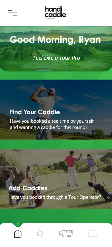
Idea 2
Clear large image
Tells the user more information about what each does
Call to action is clearer
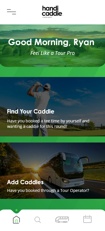
I just changes the image to something more to do with a tour operator, so that it was clearer to the user.
0 notes
Text
Sherlock Holmes Sketches
These are drawing I did to help me come up with ideas on visuals, art direction and how I could create a narrative story with the content I have been given


0 notes
Text

These are wireframes of the movie review pages for letterboxd and IMDb. I broke it down to see the overall layout of the page so that I could use it to help me come with an idea for my film pages. The content I have is very similar to this so I’m looking for so ideas on the best way to present it.
0 notes
Text
Decorative Elements
From the sketches I drew I digitised the ones I thought could work well with my project. Some of the ideas were too complicated or I didn’t think would be useful as a line break.
Black and White version
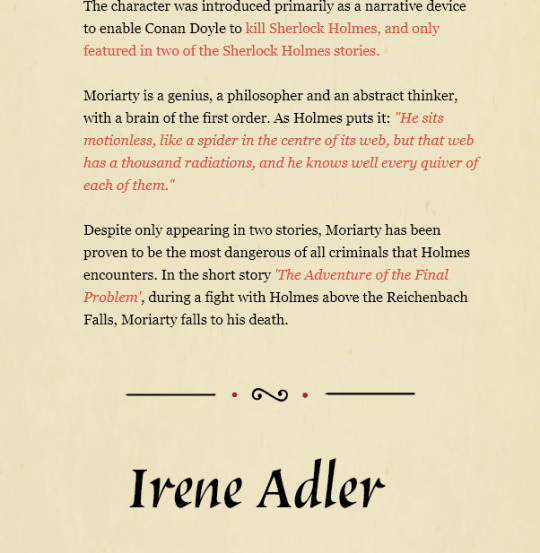
A/B Testing
A/B testing is a really useful tool to compare 2 ideas and decide which one will work best.
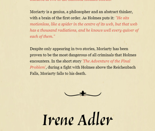
Below is the one I decided on because it works better visually for dividing up the content.I felt that the first idea was too squashed, diverted the readers glaze and didn’t fit the purpose that it was going to be used for.
0 notes
Text
Decorative Elements
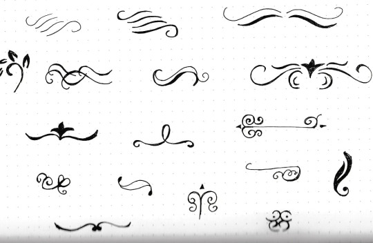
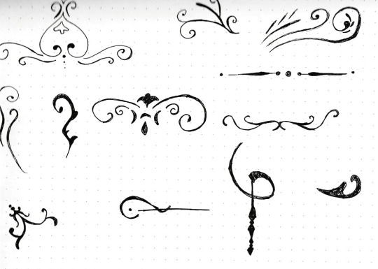
In many old traditional books there are decorative shapes/ elements that add a visual aesthetic to the book. They can act as a line break to divide up sections or just adds to the overall appearance of the book
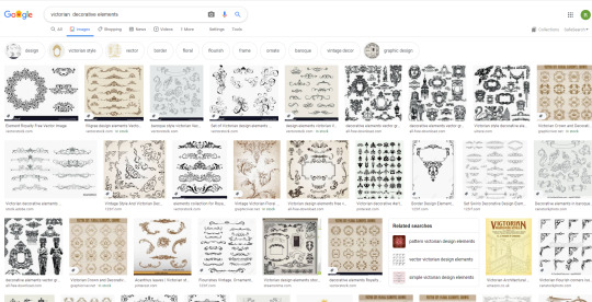
I did a quick google search to look for some inspiration that I could use to come up with new design ideas. Some were more successful than other, but it helped me to narrow down what would be appropriate for my product.
Below are some of the ideas that I came up with that I quickly drew in my sketch book. There are some really cool ideas that would enhance the art direction that for this project, but I need to see what they look like on my project. What I found tricky was drawing the various thick and thin parts strokes whilst trying to keep the sketch symmetrical. This will be difficult to do on illustrator as well, therefore I will scan these images into illustrator so that it makes it easier for me to create a more accurate design.
0 notes
Text
Movie reviews
There are loads of different movie review websites such as IMDb, Rotten Tomatoes and Meta Critic to use. I’m taking a look at these website because part of my project looks at films/ TV shows that have been based around Sherlock Holmes.
For this section we have been given content around the movies and I have to communicate it in the best way possible. Therefore looking at these movie websites will help me understand how to layout the information, inspiration in regards to UI, typefaces used( weight, sizing, font choices) and how it is used to break up content.
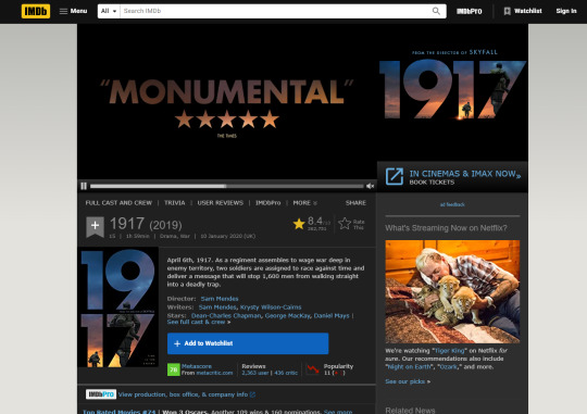
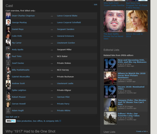
IMDb display all its content on a 1 page scroll down format.This is a really easy to follow format because it is all displayed on the one screen. Level of information is very useful if you want to go in more depth about a film, but they also have an overview of the movie for people to get a quick piece of information accompanied with movie trailer that plays once you open the page. This helps you to see what the film is about in a written and visual format, so that it encourages you to watch it. The UI isn’t the most appealing to look at but the information makes up for it.
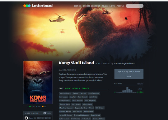
Letterbox d Is a website that I only heard about this year, however it is a lot more aesthetically pleasing that many other site. The designer has utilised their skills in UI design in order to break up the content into an easy to follow format, and presenting it in a clear and coherent way. The biggest thing I took away from this site was ideas on data visualisation and how it can be used effectively on large amounts of information. These are all things that I want to carry into my website as my project is supposed to be immersive experience rather than a traditional website.
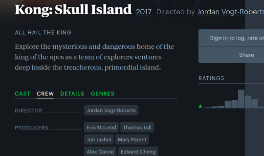
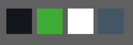
letterboxd theme
Things to consider for my project.
Using more than one font (Serif and Sans Serif)
Use different weights and font sizes
Keep art direction the same
use the same colour palette
Think about the best way to show images , be creative with bhow they are presented
0 notes
Text
Low res Mock up
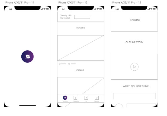
I have translated my paper sketches onto screens to see how they look and function. What I am going to try to do, is make all the screens in a low re format to see what it looks like and make sure it functions correctly.I think most of the time I can rush this step because I want to make the app look visually pleasing, instead of planning the project and concentrating on the UX. There isn’t many screens for how the user gets to view the content, but I will function on making it work like an actual app. Therefore I will use what I have learnt from my HandiCaddie project and look at adding UI kits such as keyboards to make it look and feel like a real concept.
0 notes
Video
tumblr
Just experimenting with animations and ideas that I could use for my brand logo when app loads up or when the icon appears on screen of a video at the beginning. I have sketched out couple ideas that I might try when I develop the app further.
0 notes
Video
tumblr
I was inspired by an animation I found on Instagram, which a took a generic search icon and adapted it to give some feed back to the user in the form of a micro interaction. Normally these icons are used to just prompt the user and give them a small piece of information on what the action is when clicked on.
Adding something like is very small but will have a lasting effect on the user. It adds to the overall experience and makes simple task a little bit more interesting.
Above is my attempt at creating something similar to the animation I found online. I did sort of master apprentice, by breaking down the design to see how I could prototype. I thought the, “looking eyes” element was a really clever idea because it emphasises what the purpose of the icon is.
0 notes
Text
Creating video Thumbnails
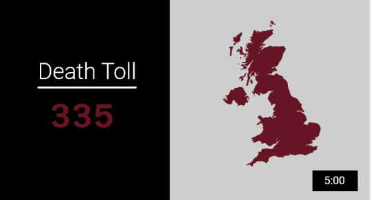
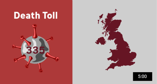
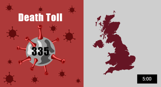
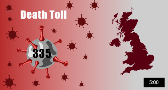
This was my first idea for a video thumbnail. The purpose of a thumbnail is to encourage the user to click on the video and find out more about it. Similar to the work of Saul Bass my designs should add to the story of the video or give the user an idea what the video is about.
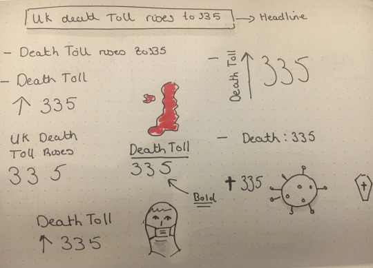
Above was a working idea I had from the sketches I had done in my sketch book. It was an early attempt at creating a thumbnail , but it was mainly to help me visualise what the app would look like. Now that I am building a higher res mock up of the app, I am going back over to this design and improve it. I took this idea an expanded on it.
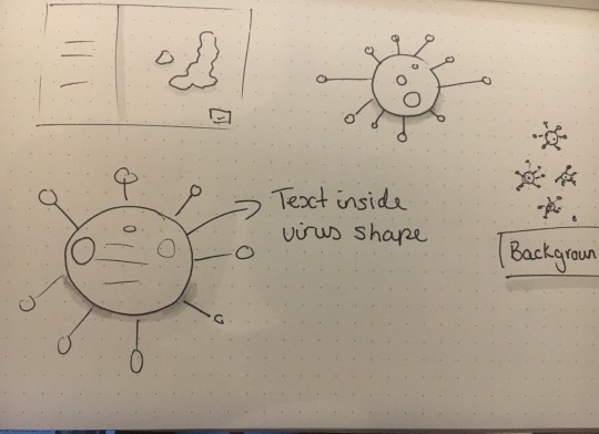
Below I have sketched out my some ideas that I could use in the design to make it better
0 notes
Text
Thumbnail Ideas
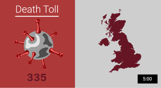
I experimented with different ideas and made minor adjustments to see what looked the best.
0 notes
Text
Snippet Wire frames
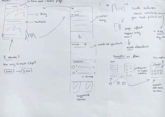
These are some concept wire frame of what I want the app to look like. I took a lot of inspiration from, YouTube, Apple News and the apple podcast app. This helped me with the function of the app, layout and taking elements form these apps that I could incorporate into the design.

Below I have looked at how it will follow from the home screen to the main content of the app. As you can see I’m focusing on using more interactions in this app that will filter into the apps usability. For example at the top of the screen, is where the name of the media company will be. I want to create drag function that changes the screen to another page of headlines from a different company.
Independent ------> Guardian
The interaction will feel like the page is turning like in a book. It will only occur when you are changing from one company to another. I will look to see if this transition becomes annoying for the user or if it isn’t a problem at all. This is one Idea I have but I will definitely look at seeing if I could include more like this in some way.
0 notes
Video
tumblr
This is just a little animation that I was trying out. It will act as a micro interaction to prompt the user to click on it to take you to the next page. I’m trying to keep the art style the same throughout the project, which I’m referring to as a sketchbook like quality to it. This little interaction will help to break up the content and make the website more of an experience for the user.I wanted this to play automatically on the prototype, but I can’t figure out how to make work properly on the actual project.Therefore I will just show what I was thinking of doing.
0 notes
Text
Mental health illustrations
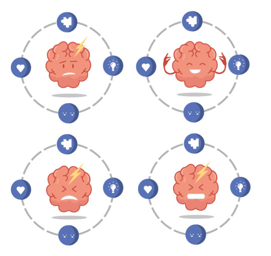
I’m still not sure which one looks best or works well with the story headlines. Probably need put it in the app to see which one looks best.
0 notes
Text
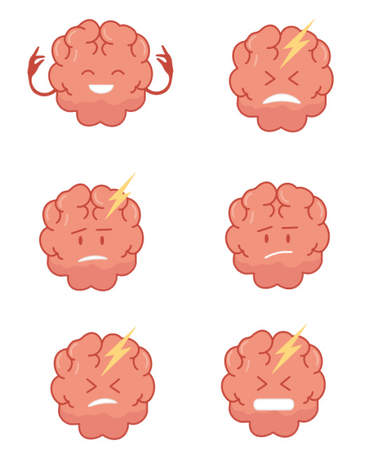
Mental health Illustration
From the sketches I drew in my sketch book I made these illustrations. I took some the ideas from my sketches combined with other ideas I had to create an Illustration to do with mental health. This will be at the center of the image and I will have like emotions or thoughts surrounding it. I think this will really emphasise what mental health problems in a clear but interesting image. The next step is to finish of the illustration and do and A/B test to see what works best.
0 notes
Text
Looking at one of the headlines online talks about mental health during this epidemic the video itself from the independent is very interesting and useful to look at however the thumbnail doesn’t make you want to click on it. What makes a video, “clickable” is usually to do with 2 things:
An interesting title of the video that draws people in. It can almost be called clickbait, but this only occurs when a video hardly mentions anything about what the title of the video suggests. It is an effective way to boast views of a video.
Making an engaging thumbnail gives an insight to what the video is about, so the user can start to create a picture of what could be talked about in the video.
I took the headline of the video and tried to come up with a slightly more interesting thumbnail that could be used advertise the video. I focused on looking at mental health, so I started looking for illustrations or icons that could be used to advertise the video. Using some of the imagery I had found I sketch out some ideas that I thought could be useful.

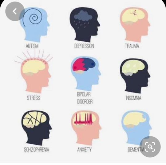
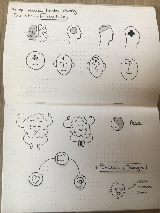
I will try and digitise them on illustrator and see what works best.
0 notes