Text
Which OC has a bad reputation?
Bonus: What did they do to get it?
833 notes
·
View notes
Text
which OC would use the instragram filters?
216 notes
·
View notes
Text
Which OC would give a child a tattoo… without parental consent?
Bonus: Which OC got a tattoo as a child?
333 notes
·
View notes
Text
Which OC collects bracelet charms?
320 notes
·
View notes
Text
Which OC would be desperate enough to use a love potion?
373 notes
·
View notes
Text
Which OC bites ice cream instead of licking it?
683 notes
·
View notes
Text
Which OC would fight a child as an adult without hesitation?
707 notes
·
View notes
Photo
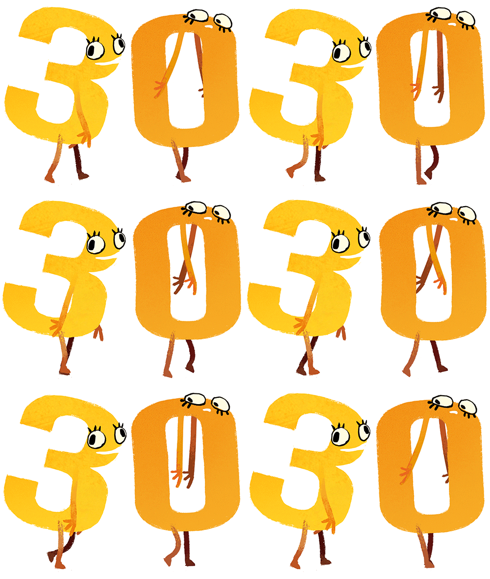
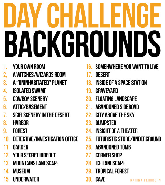
Since I noticed that I RARELY draw backgrounds I decided to do a 30 day background challenge!!!!!
I hope Darla and Stacy (the girls walking) will keep me motivated to do this! Please lazyness don’t overcome me!
If you would like to join me on my challenge please do so I would love to see your pieces!!!
59K notes
·
View notes
Photo
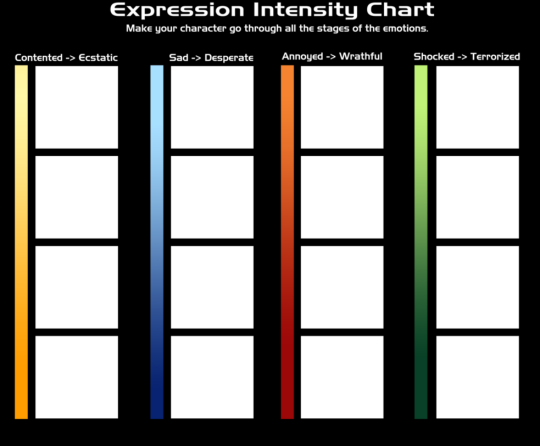
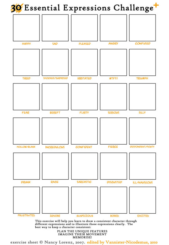
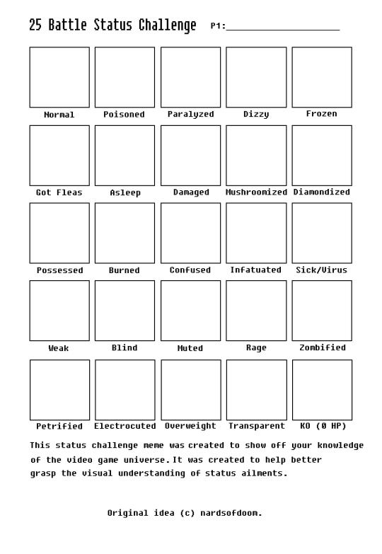

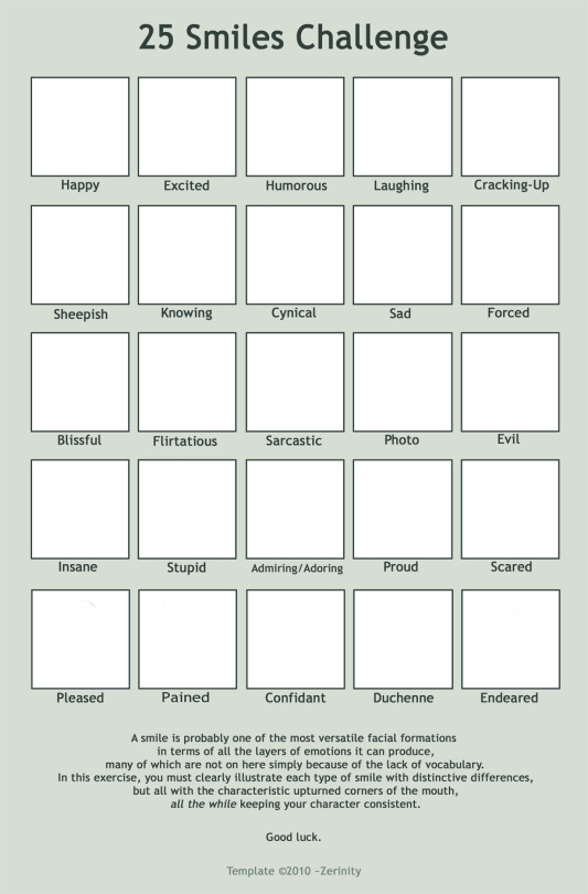
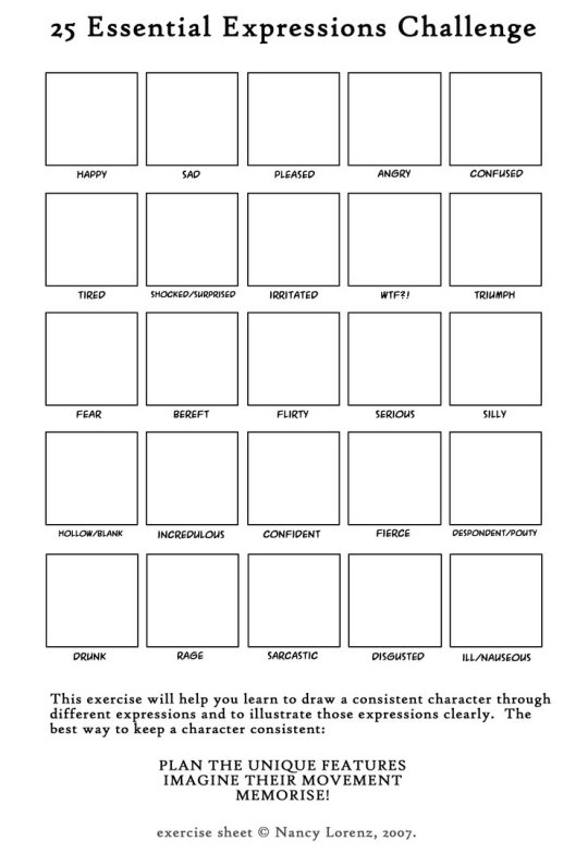


Drawing Challenges Row 1 Row 2: Left, Right Row 3 Row 4: Left, Middle, Right Row 5
62K notes
·
View notes
Photo

Fabulous Guide for Portrait Lighting (zoom for description):
22K notes
·
View notes
Text
Cosplay Wings (tutorial)
After much time finally got this done! I made this tutorial for those who want to cosplay w/ feathered wings but don’t have the money to buy professionally made ones. I’ve seen a few pairs online go for more than 100 dollars, so I’m here to show you how to make your own wings!

Ok so we’ll need some supplies before we start.

I bought all of the material (not including hot glue, scissors, and wire cutters) at my local craft store for under 30 dollars.
Be sure to get foam sheets, feathers, and ribbon in the same color. The size of you foam sheet should be big enough to fit one wing.
Also, don’t underestimate the amount of feathers you need!!! I’ve made this mistake and it’s not fun!

Also make sure you have a pattern of what you want your wing shape to be. I’ve sketched out some references, but you can find my printable templates here: http://tumblr-is-better.blogspot.com/2015/05/printable-wing-template.html

After figuring out what I would like, I drew the bigger pattern onto my foam. Trace and cut.

Pretty flimsy, right? Here’s how to add more stability:

I placed the wire on the edge of the foam sheet for one wing. Then I added hot glue over the top of the wire and cover it with the ribbon. This helps by covering up the wire so it doesn’t poke while being worn, and so that the wire stays put. It also makes for a nice place to glue feathers over.
It doesn’t have to be neat, since there will be feathers over it.

Save your scraps of foam.
From the scraps, I cut out two identical ovals. The length of each should be the same as the base of each wing.

I attached them to the wing, and added wire and ribbon around the edge. This base for the wings works better than making the wings as one piece. The base should sit right on your shoulder blades, making the wings look a lot more realistic.
Make sure they are attached at a slant, ribbon facing the inside. The side with the ribbon will be the inside or the “front” of the wing.

If the area where the wing attaches to the oval is flimsy and doesn’t stay in place (which is totally normal) bend a piece of wire into an “L” shape and glue it onto the part of the wing that slants downwards. Don’t forget to cover it in ribbon as well! (Sorry for bad lighting)

Now the time consuming part.. Feathers! I used an assortment of different sized feathers. Always start from the bottom layers and work your way up to the top.
Don’t cover the base with feathers. That will be done later.


Bend the wire in the wings to shape them how ever you like!
As for attaching the wings together, you will need elastic. I used clear elastic so the bands in between the wings were not visible. It turned out pretty well, but you might want to find fabric elastic that fits the color of your costume (if you’re wearing one) because clear elastic tends to break easily and it never lays flat.
I measured the distance between my shoulder blades. The wings do not have to rest on your shoulder blades, if they need be elsewhere, it will still work.

I cut two holes through the base using scissors and an exacto knife in the places that best fit my liking. Be sure that both holes on the first wing match up with the other wing. The holes should be directly through the ribbon, and behind the wire.
I did the same for the arm bands, but I made the holes farther apart.

When stringing the elastic through, don’t underestimate how much it can stretch. It’s better to have it shorter in the place between wings, so don’t be afraid.

Once through, I secured the elastic like so. If you’re using clear elastic put a layer of glue over the top of it. Clear elastic doesn’t stick to hot glue by itself. :/

Before attaching the arm bands, I measure the distance from my shoulder blade, around my arm, and back to the shoulder blade.
After the elastic is in and attached, I continued to cover the base with feathers.

Largest wings that I’ve made with this technique had a six foot wingspan. You can make these as big as you’d like.
I also didn’t give exact measurements since everyone’s will be different!
And done!

17K notes
·
View notes
Photo


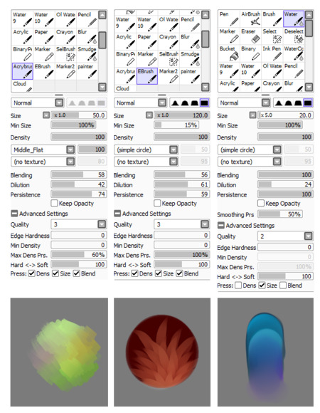
some of my friends asked me to show my brush settings when I draw clouds, and here you go hope it helps ; v ;
10K notes
·
View notes
Photo
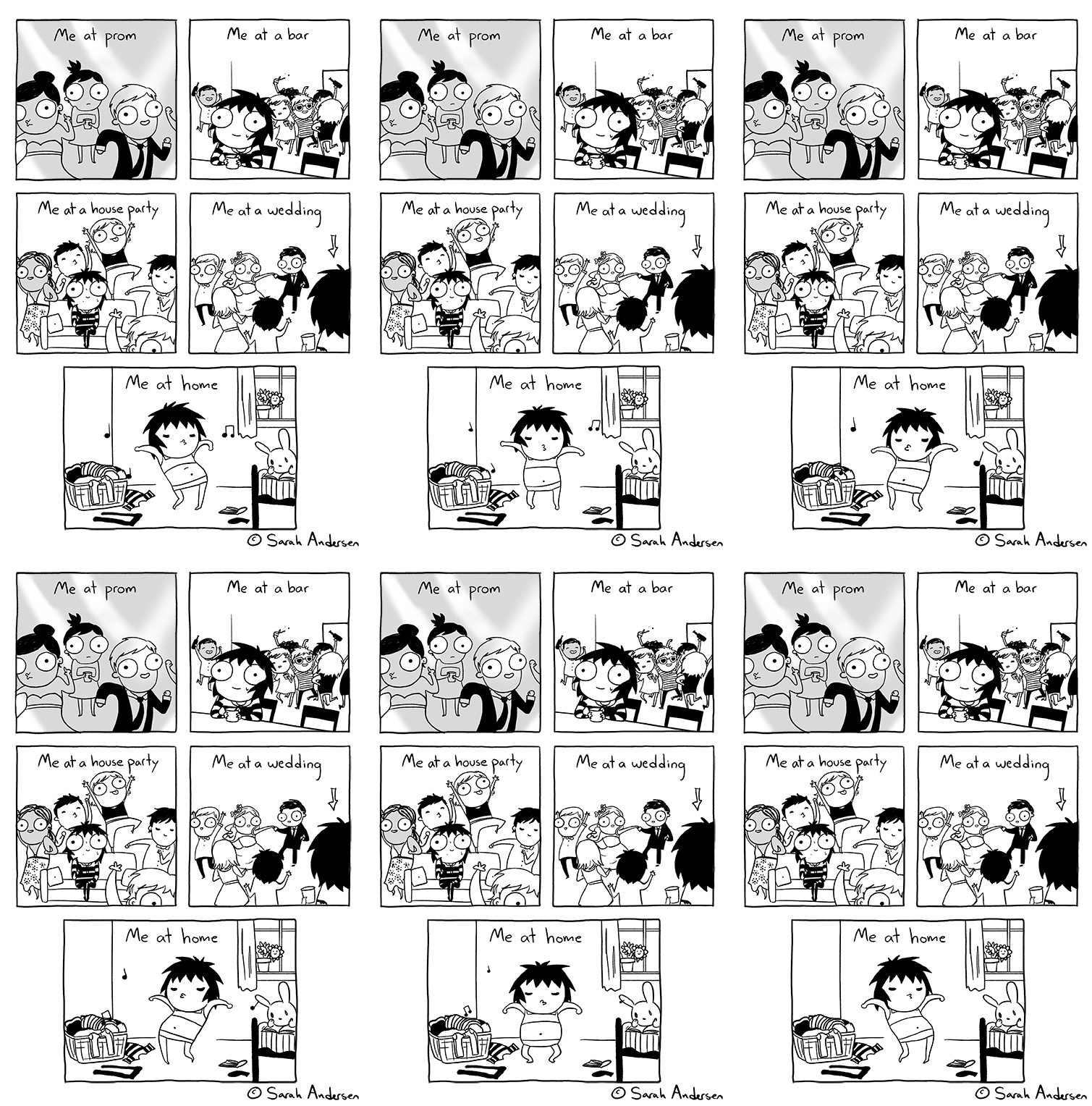
Hello and good morning everyone!
What’s this animated comic about, you ask? Well, I’ve spent some time creating a new class for Skillshare! In it, I teach you how to create an animated comic by making a GIF. I walk through all the necessary steps including sketching, test runs, finalizing, and uploading. I also review how webcomic artists typically use GIFs and how you can apply them to your own work. It’s a quick and concise class that I hope will be a lot of fun! Check it out here! And if not, I hope you enjoy my little character’s dance moves regardless. :)
28K notes
·
View notes
Text
Some of you asked for a color tutorial, and I’ve been kicking around ideas all day about the best way to do one. I’ve tried to do them before, and sometimes they’re helpful, but mostly I feel like they’re not. And I think that’s because I try to explain color theory, which is too big of a bite to take. Color theory is somethng you should read about because it will help you with your art. I just can’t tackle it here.
Instead, I’m going to do what I did in the blocking tutorial and just take you through my own steps in building a palette for a realistic portrait using a model/reference.
So I grabbed a random screencap…

Right away things get tricky because film, no matter how good the film is, is not real life. And the colors are so contextual (and sometimes very filtered), that they look ugly or nonsensical when translated to an art medium.
For example, if I were to guess, I’d say he had a pale complexion and was wearing a light green tunic.
But if I actually go in and color-pick the image, this is what the colors end up being:

Those are not the colors I expected.
So how do I deal with that discrepancy? I take what I know/want (pale man, light green tunic) and what I actually see (dark red, dark grays), and I figure out how to get from one to the other.
And here’s the funny thing about color: It doesn’t actually matter that much.
What matters more is the value of the color—it’s lightness and darkness. As long as you get the lightness and darkness right, you can pretty much make any color believable. And I know this is true because here’s a painting by Van Gogh, who puts greens, blues, pinks, bright oranges, and dark reds in his face, and it works. And not only does it work, but it makes a huge emotional impact:

So I suppose my overall advice would be to not be afraid of using the wrong color because you can make any color work. What’s more important is how it compares to the other colors aroudn it.
When I make a palette, I look at the value first. I look at what the light is doing—What’s dark? What’s light? What’s in the middle? Where are the shadows and highlights? I don’t choose brilliant or surprising colors like an Impressionist might, though. Instead, I go for colors that fit the mood I want to convey, which is mostly quietnessa and softness. If I wanted to convey more visceral emotions, I might pick more visceral colors. But that’s not my style.
So now let’s go back to Denis, and here’s the color palette I would choose for his portrait:

And here’s how it would look if my colors were applied in the same places:

(I did not color-pick the gold turban in my first example, but I decided to add it here in my own palette so you can see how it changes along with the other colors).
Basically, all I’ve done is a value adjustment. I’ve brightened the colors, adjusting as I see fit, but I’ve kept the differences in value between them the same. In other words, the range between the light green and the dark green in my palette is pretty close to the range between the purple and the dark orange of the tunic in the original cap.
It’s not the colors, see? It’s the difference in value. And there’s not much of a difference. My style is soft, and I prefer muted, subtle colors. So I keep my range pretty narrow. If I put everything in grayscale, you can see what I mean:

See how close the grays are to each other? Nothing it too white, and nothing is too black. There’s not a lot of contrast.
And this is why Van Gogh’s choice of colors is so convincing. Look what happens when I convert his portrait to grayscale:

Everything looks natural. You can’t even tell he used weird colors because Van Gogh understood that you can do whatever you want with color as long as you keep the value between the colors consistent.
It takes a lot of practice to “see” things like value range and differences in light and dark. But learning how to see a good range in value—and then to produce a good range using any colors you want, even if the colors go against what you know or observe—is probably the most important thing about working in color that I can think of. I think there’s a lot you can learn about color theory in general, and all of it can be useful (and the internet is full of resources to help you), but you have to be able to work in those black and white values first. <3
4K notes
·
View notes
Text
Art Un-Tips
Here are some ways to see improvements in your drawing quality and productivity through inaction, not action. They’ve worked for me and may help you too.
use less colours. It forces you to carefully consider your colour choices, not draw things just because you see them as a certain colour
use less layers. Don’t waste time flipping between layers, just separate the essentials (line, colour, shadow…)
don’t be pedantic about lineart. Most people don’t notice small blips in lineart, and unless you’re doing vector or professional art, the time trade-off isn’t worth it
lower your stabilizer. Low levels are enough to assist with curves. Higher levels make sharp turns hard. Adjust to your comfort, but see how low you can go
quit sooner. Spending excessive time on one drawing can be a bad habit. If you’re learning, you want to draw many different things, so quitting and moving on helps
15K notes
·
View notes


