Photography | Aerialgraphy | Drawing | Videography | Art
Don't wanna be here? Send us removal request.
Photo
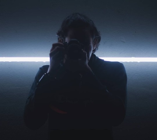
Black. #lowlight #canon600d #55mmf18 #iconcity #assignments #sillouette #highlights #vsco #amateur #brocuba #photography #rooftop #backlight #glow #neon #composition #canon (at Icon City) https://www.instagram.com/p/Bo2KvHrnouy/?utm_source=ig_tumblr_share&igshid=rjk877h2ox4a
#lowlight#canon600d#55mmf18#iconcity#assignments#sillouette#highlights#vsco#amateur#brocuba#photography#rooftop#backlight#glow#neon#composition#canon
1 note
·
View note
Photo
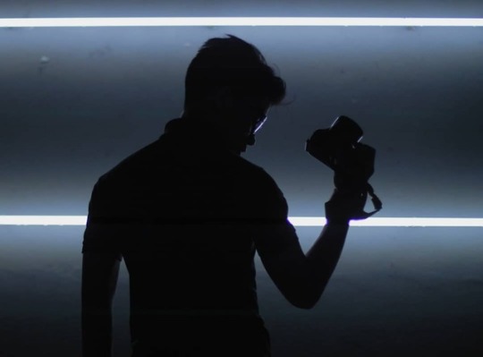
You don't choose assignments, assignments choose you. Lowlight photography session with @mn.adz and @alven.l__ Photos by @mn.adz #nikon #canon #lowlight #iconcity #vsco #rooftop #bokehlicious #backlight #sillouette #urbanphotography #composition #photography #portraitphotography #assignments #brocuba #mm #oneacademy (at Icon City) https://www.instagram.com/p/Bo2I2pbHakL/?utm_source=ig_tumblr_share&igshid=14su1eqhd38r0
#nikon#canon#lowlight#iconcity#vsco#rooftop#bokehlicious#backlight#sillouette#urbanphotography#composition#photography#portraitphotography#assignments#brocuba#mm#oneacademy
1 note
·
View note
Photo

If you cant stand the fatigue of study, you feel the poignant of stupidity. Imam Syafi'ie ~gambar hiasan~ Photo by @li.xxuan #canonD6 #work #mm #design #photography #amateur #bokehlicious#iconcity (at Icon City) https://www.instagram.com/p/BnigjdMHja1/?utm_source=ig_tumblr_share&igshid=1g7xz0ehlnzwz
1 note
·
View note
Text
Color Magic 101: The Anatomy of Color
Welcome to lesson one in this series I’m creating for beginner Art Witches!
We have all seen and heard about color correspondences. Red = Anger/Passion Yellow = Happiness etc. but the truth is that there’s much more to color than just it’s name. The psychological effects of color, and therefore the magic we can do with it, are much more heavily influenced by those other components. So let’s take a look at the three components to color: Hue, Value, and Saturation.
Hue

Put simply Hues are the categories of color. They are the general name we refer to a color by. Sky blue and Midnight blue are very different colors but they both fall under the Hue Blue.
In the vast majority of magical practices this is as far as the study of color goes. There are many lists of correspondences associated with each Hue which include planets, days of the week, deities, etc.
Begin a color journal- Start by listing Hues and what your personal associations are to each one. Does the color purple scare you? Does yellow calm you down? This information will be the basis of your color spellwork.
Value

Value refers to how light or dark a color is. It’s typically broken down in a 1-10 scale; the lighter range (called High Key colors) are referred to as Tints whereas the darker (Low Key) colors are called Shades. When creating art and visual spells there should be a full range of values throughout the piece. (unless specifically done otherwise for a purpose). When you want to draw attention to a particular area you can do that by creating high contrast there (very light values next to very dark values).
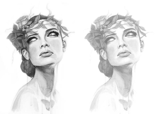
“Wood Nymph” -Lumi
As you can see the image on the left, which has a full range of values (1-10), is far more eye-catching than the image on the right which has only the top 4 or so high key values. By putting the darkest black next to the lightest white in the eye area it creates an attention grabbing contrast and directs the viewer’s eye. ….Last but not least…
Saturation/Chroma
This term is probably the most misused/misunderstood property of color. It refers to the intensity of the color. This is the range between pure color (most intense/vivid) and grey (no color, only value). This does NOT affect the value only the color.
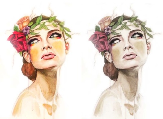
The left image is very saturated, the colors are vivid and recognizable. The version on the right is very desaturated, almost completely colorless, but the values haven’t changed only the intensity of the color.
We have powerful emotional responses to these variations which, once we understand how to use them, can help us craft powerful spells.
Homework-
Color Journal- Grab some paper and a pen (doesn’t have to be fancy) and start critically analyzing your associations to color. What do you associate each hue with in general? Are there specific variations of that color that stand out to you? Which ones are more negative/positive? which ones do you feel most connected to? We’ll be getting into the science of favorite colors in the next lesson but for now get a baseline for your personal connection to color.
Create a Value Range- Just like the graphic here, get used to mixing your medium of choice into 10 separate values. You’ll gain more control with your medium and a better eye for full value ranges. You can use paint, ink, pastels, pencil, crayon, whatever you like to work with but keep it strictly to values, no color just yet. Record your experiences in your journal.
Saturation Survey- Find or make a series of images that are saturated and desaturated. What did you feel while making/finding them? What emotional impact does the color intensity have on you? Does a desaturated image look ghostly and creepy or soft and comforting? Do the vivid colors of a saturated image make you feel excited and amped or anxious and overwhelmed? Record your findings in your journal.
I hope you have a good understanding of the anatomy of color now. Try to incorporate some of the terminology we used when referring to color in your daily life to get used to categorizing them for later use. Maybe you want to use that high key desaturated yellow from the sunrise you saw in a spell for new beginnings and fresh starts! The next lesson will be exploring the science behind your favorite color so stay tuned.
Let me know if there’s a topic you want to learn more about, how your color study is going, or if you are a fellow art witch (or are considering this path) and found this useful.
Stay Creative Witches!
-Lumi
1K notes
·
View notes
Photo


since I’m on a sem break again, it’s time to open up commissions I always like to update the design of my commission sheet lol
Contact
message via Tumblr is the best notes through my Deviantart
Will do
Zootopia characters, TMNT, Cars (Pixar & real cars), Furries, OCs and Transformers (err however it’s not really detailed, you can look through how I draw them, it’s more or less like TFA style, I’m totally for alt-modes though!), and basically anything you see on my blog, don’t see em, feel free to ask :)
Won’t Do
NSFW
Political Content
Hate Art
Anything else, I’ll let you know
Let’s do 5 slots at a time, ask to see if a slot is available. Thanks for your time & support!
150 notes
·
View notes
Photo
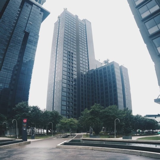
Jangan sampai lupa akhirat. #iconcity#photography#samsungnote5#composition#urbanphotography#parttimejob#sembreak#panorama#amateur (at Icon City)
#iconcity#photography#samsungnote5#composition#urbanphotography#parttimejob#sembreak#panorama#amateur
0 notes
Text
Playing The Division
Me: *Is running low on ammo*
Game: “Warning! Additional hostiles detected”
Me:

1K notes
·
View notes
Photo
Hahahahah dis is so true

Everyone in The Division’s Dark Zone
1K notes
·
View notes
Photo

Bila lagi nak asah skill kan. 😏 Eid Fitr 1439H #SHRMZB
1 note
·
View note
Video
tumblr
Well, some animation principles practice.
1 note
·
View note
Photo

--End Of Year 1-- Bukan jenis suka menulis panjang-panjang ni but this time, mungkin boleh jadi peringatan untuk diri sendiri in the future. Alhamdulillah sikit sebanyak aku nak luah apa yang aku rasa sepanjang belajar di sini. --The One Academy Of Communication Design (TOA)-- Well, that is my college full name, time aku datang aku 100% tak tahu yang kolej ni kolej art so, memang first and second sem memang kena belajar lukis orang, lukis benda tak hidup, painting wow memang sakit. Aku dari darjah 6 memang anti gila dengan seni ni because I messed up alot sebab tangan cepat berpeluh and ruin the artwork (sekarang pun masih ruin tpi sabar je lah) Well, dari melukis dan painting tu sebanarnya aku belajar, tajamkan mata, observation skills, sebab memang basic dalam design memang kena ada observation skill yang mantop. Design ni satu benda yang sangat-sangat pantas berubah, so I feel that usaha TOA untuk sentiasa up-to-date dengan trending design memang buat aku suka belajar sini but still kalau ada sahabat-sahabat nak masuk, aku terang - terang ckap jangan (huhu), sebab? I can’t say it here. PM tepi! --Cabaran?— Kolej ni jugak dikenali dgn TOA (Tons of Assignments), memang topik ni menjadi topik hangat, memang assignment gila-gila punya, kat Facebook kami ada TOA Confession Page, untuk pelajar meluahkan segala yang terbuku di hati, some are about love (lol) tpi tak kurang jugak banyaknya orang confess pasal betapa takda life bila assignment terlalu dahsyat. Sampai ada yang berasa untung break up dengan awek sebab akhirnya dia boleh ada masa dengan assignments haha...entah betul atau tak wallahualam. Full sharing on Facebook.
6 notes
·
View notes


