If I like or make it, it goes here. I definitely like more than I make, though. My tags are all over the place at the moment, but I'm really into Miraculous Ladybug and Chat Noir (ML in tags), Pokemon, LoZ, and a couple other things.
Don't wanna be here? Send us removal request.
Text
This was first known in 2019.
This is so utterly hairraisingly ridiculous that you wish she made that story up, but it is unfortunately true.
15K notes
·
View notes
Text


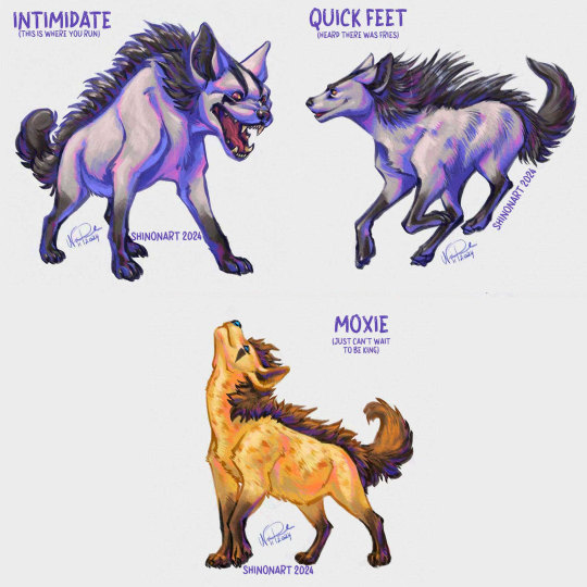


What if abilities changed the appearance of a Pokemon?
A master post of all the ability forms drawings I've done! It's been such a fun series to work on and it makes me so happy that it's brought you all so much joy!
I regret not starting the little additional descriptions earlier and I thought of fixing that but I desperately need a nap so nope.
I did fix the one that ruffled the most feathers though - quite literally! The Skarmory saga is finally complete!
Other Ability Forms posts!
Find me and my art elsewhere!
17K notes
·
View notes
Text
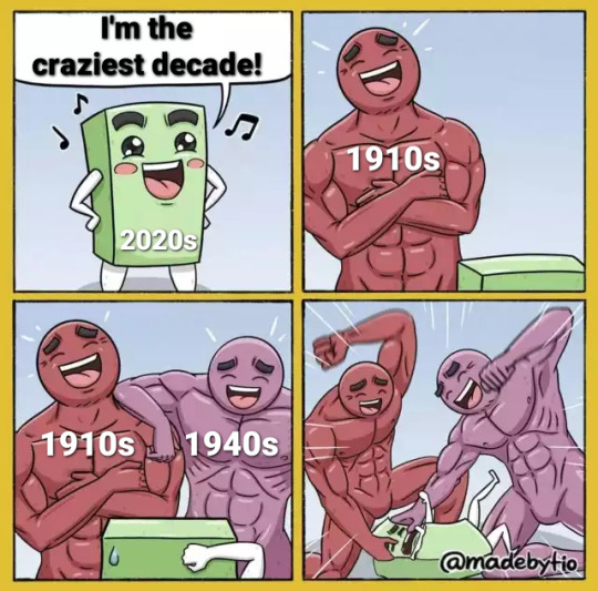
"Oh you had a plague? Come back to us when you had a World War, brand new unconventional weapons, and a new international order."
285K notes
·
View notes
Text


Dragon like cloud over Mount Fuji at sunrise. By touyoui, Nov 2024.
53K notes
·
View notes
Text
I am becoming aware of the effect a lack of trust in the media has had on people, paired with a dearth of research skills.
#not mine#reblog#sift method#combatting misinformation#I learned this is college and sometimes forget that other people I know irl haven't
23K notes
·
View notes
Text
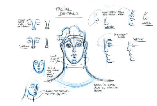
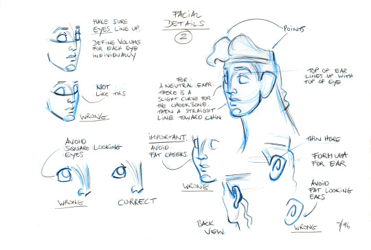
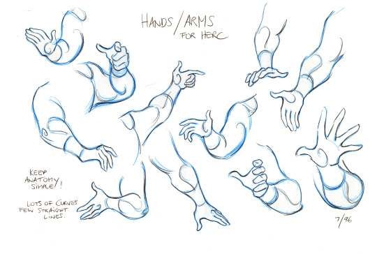
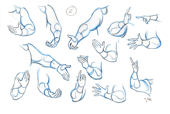
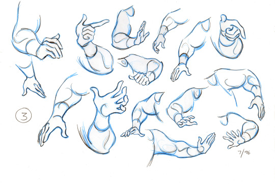
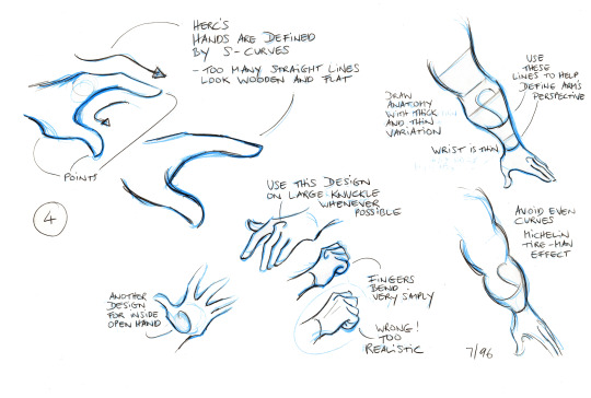
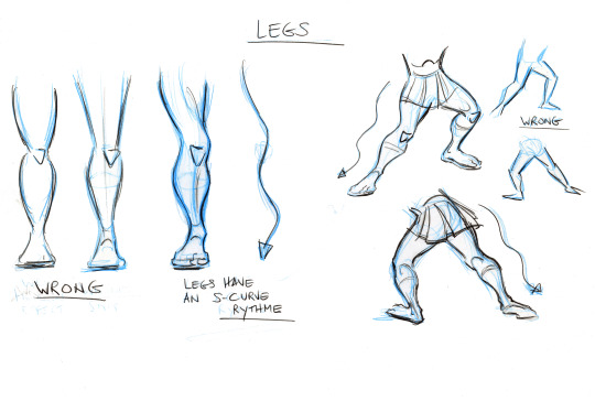
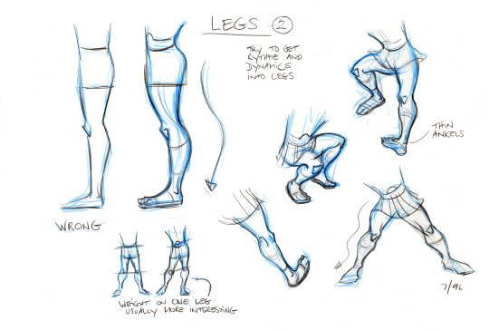
Hercules model sheets by Andreas Deja
#I've always been bad at straight lines#but curvy ones are easy for me#so Hercules' style sheet seems accessible somehow#not mine#Disney's Hercules#style sheet#character study
3K notes
·
View notes
Text
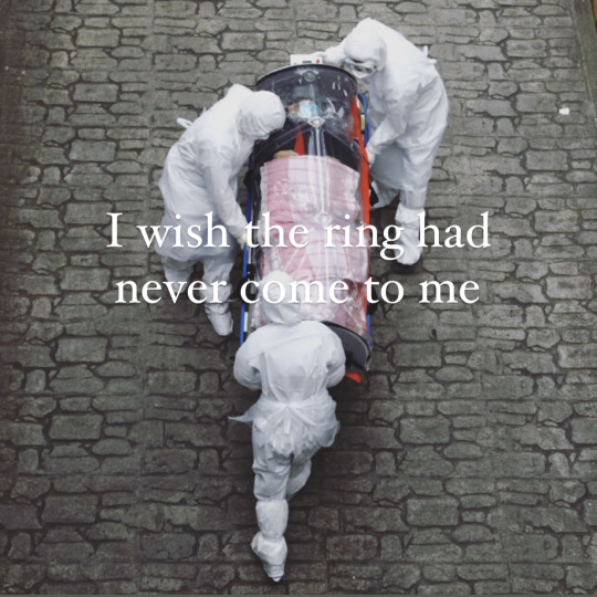
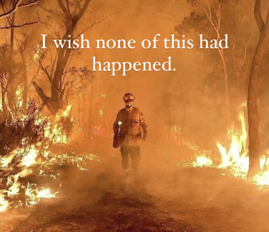
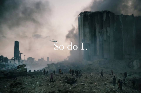
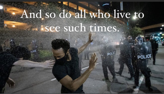
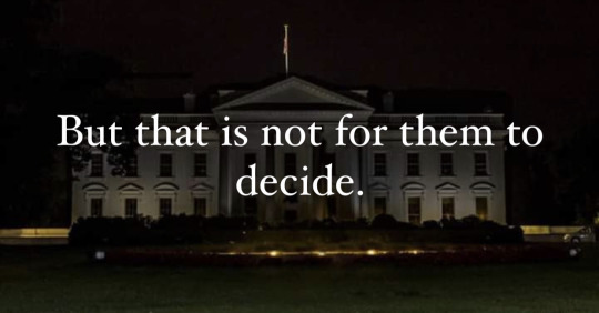
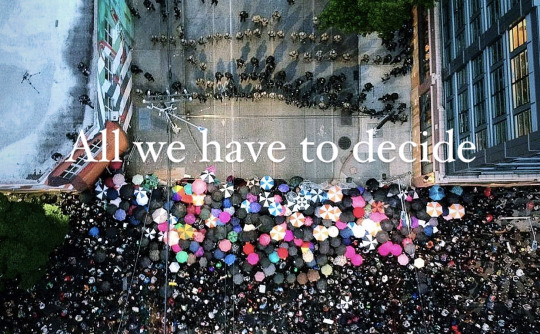
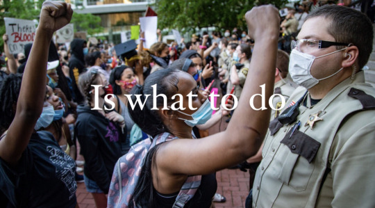

“There are other forces at work in this world besides the will of evil.”
#vote#not mine#this pictures are also striking photography#so i want them on my blog regardless#but the (apparently unintentional) subtext to vote is extra nice
127K notes
·
View notes
Video
animation of charmander makin some pancakes
223K notes
·
View notes
Text
This is a good reminder to future me that if someone is promoting something, they're probably selling it. Anyone selling something is doing so for a reason. It's becoming more important to investigate that reason, not less.
#not mine#reblog#getting scary out there#some of it is warranted#some of it is just a sales tactic#Matt 10:16 (NIV); I am sending you out like sheep among wolves. Therefore be as shrewd as snakes and as innocent as doves.#I might start adding applicable verses to stuff because i can#this was a remade post#because i accidentally reblogged the wrong thing on someone else's blog#but i can't find theirs! which is a shame#their reblog had a picture breakdown of how they checked a 2007 model and it had the same results as a 2016 one#even though their car doesnt have wifi and also the site omitted OnStar#like it was meant to induce fear to get more people's information#and then bind them to a legal agreement for their data#anyway here's the second take#you'd think after this many years on this website I'd finally get a handle on reblogging but nope!#surprise! I'm still bad at this lol
65K notes
·
View notes
Text
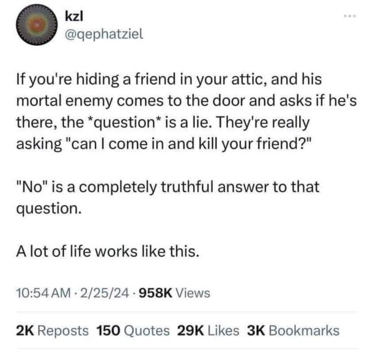
Christians have a similar dilemma.
God's 9th Commandement is "Don't give false witness against your neighbour", which has also been interpreted as "Don't lie". (Exodus 20:16)
Earlier there's an example of midwives lying to the king of Egypt to protect innocent lives. (Exodus 1:18-21) Though, you could argue that was before the Commandments were made, so I'll give another example.
Rahab, a prostitute living in Jericho, lies on the behalf of two Hebrews to the authorities. (Joshua 2:4-6) Then she gets included in Jesus' genealogy. (Matthew 1:5)
This indirectly suggests that lying is sometimes necessary for the sake of protecting lives. In which case, it's the morally right option.
#morality#Kantian logic for lying#Christians can lie to protect lives#examples from the Bible#I said this was a Christian dilemma just because I had to reference the book of Matthew#Technically it's a Jewish and Muslim dilemma too#but I'm not sure where to start when arguring for those two so I'll leave it to someone else#am theologizing
119K notes
·
View notes
Text
The composition looks so nice, and the brushstrokes are really clean. They look so real. I wouldn't have even suspected AI. Kind of alarming if it is AI art.
The only thing that made me think it might be is the noise on the edge of the branches. Y'know, that pixel fuzz?
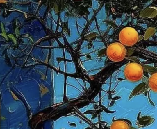
Which is less pronounced in other high contrast areas. Like where the edge of one house meets the other.
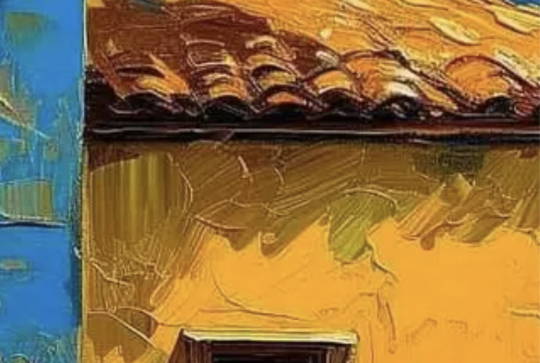
These were both max zoom and cropped phone screenshots, so the resolution is the same. The amount of fuzz should be similar if it's just a lossy file...
I hope someone smarter than I am could look into whether this artist is using AI art to generate works.
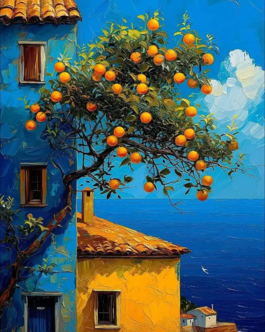
By Juan Brufal
#might be ai#gosh i hope it's not#but i cant verify cause i refuse to get insta#meta is just the worst#am reblogging#just cause i want to check the tags later to see if anyone finds evidence that it's ai#and not just my own thoughts
12K notes
·
View notes
Note
Hey, I love the comic! I love how the storywriting stays true to the original series but also adds its own fun spin on it! You've actually inspired me to write my own Blue diamond AU, lol.
Anyways I have a question for making comics just in general. How can you make dynamic compositions in such a small space. I honestly love how intricate all of your panels fade into one another!
So, if you're okay with it, I was wondering if you could give me some tips on how that would work?
Anyway, I love the comic and stay awesome!
:D
Your own comic - that's awesome to hear! It's always exciting to start something like that. I wish you the best of luck in your goals!
As for the paneling - honestly, the first step is to stop thinking of it as a 'small space'! The truth is, even on a small mobile screen, we can fit a lot of detail. And as long as we know how to use the space wisely, it's not ever going to feel small.
Ironically, cramming MORE into a panel makes it feel smaller.
Drawing less on a panel makes it feel larger. Weird, isn't it?
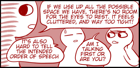
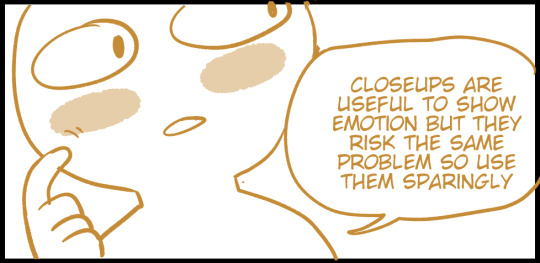
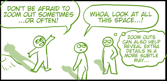
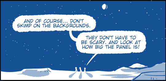
My more general advice is... STUDY MOVIES!
Don't just WATCH movies. But study them. Movies are like comics for dummies because there's only one size and shape of a panel and all the characters do the hard work of acting for you. (It's a joke, don't kill me.)
Anyway, the paneling in movies is versatile and interesting BECAUSE they're putting that single wide panel to the best use. If you already drew some comics, compare them to a movie screenshot and see what's different! Then, ask yourself why a certain angle, or a certain cropping of an image works better.
You'll find that there's some awesome ways to cram fun details into even the smallest corner of a panel. :)
There's also some awesome art resources by more talented comic artists than me out there. I'm sure others will link them in the comments, but for now, here's one I found:
388 notes
·
View notes
Note
What’s your favorite part about working on the comic? Specifically the comic; like drawing it, coloring, writing scripts, etc

Oh, that's an interesting question! Let's rate them!
Sketching/Drawing: (9/10) Creating at its finest. For me, this is the distilled elixir of creation. The heart of being a comic artist. I love organizing panels on a page, it's like playing tetris. I love drawing! Points off for requiring so much time. Why can't I just bang my head against a tablet and dump out all the pictures onto the screen at once?
Scripting: (6/10) Pretty standard work. I enjoy it well enough, but it gets points taken off for requiring so much re-writing and emotional turmoil. Sometimes, I will rework a line 3-4 times and think it works great, but inevitably something will come along to make me think it would have been better to have the character say that OTHER thing instead.
Lineart: (11/10) Excellent. Stupendous. This is drawing, if drawing required no braincells. It's meditation! I'm listening to a 2 hour long video essay about evolution or manta rays or ancient trees. I'm happy, I'm in my lane, I'm flourishing. (This would have been 12/10 except for those times when you're drawing the same line 17 times and are stuck in a ctrl+z loop.)
Coloring: (-2/10) Don't like it. Cannot recommend it. People tell me they like this part? I'm skeptical. It's tedious. It's boring. It's like one of those baby games where you put cubes into a square hole, etc, but sometimes the cubes the misshapen and don't go in smoothly. At best it's just 10 minutes of clicking with a bucket tool. At worst, it's coloring within the lines, which I have been OVER since I was 4.
Rendering values, special effects: (5/10) This is fine. It's simply fine. I can enjoy it. It's interesting, but a bit repetitive, but it takes less effort than coloring, with more variety, so I respect it.
Posting: (4/10) This is a trap. There IS a typo, and you WILL see it as soon as you click Post. Or as soon as the post hits 100 notes. Whichever one is more painful. But on the other hand... commints! But on the other-other hand... people misunderstanding your characters' intentions and being a whole clown in the comments about it! It's a mixed bag.
#curious if this will be 50/50#or if it will skew toward lineart#cause Chekhov's lineart is crisp#but their use of colour is inspired too#even tho they use it sparingly#poll
327 notes
·
View notes
Text
hot artists don't gatekeep
I've been resource gathering for YEARS so now I am going to share my dragons hoard
Floorplanner. Design and furnish a house for you to use for having a consistent background in your comic or anything! Free, you need an account, easy to use, and you can save multiple houses.
Comparing Heights. Input the heights of characters to see what the different is between them. Great for keeping consistency. Free.
Magma. Draw online with friends in real time. Great for practice or hanging out. Free, paid plan available, account preferred.
Smithsonian Open Access. Loads of free images. Free.
SketchDaily. Lots of pose references, massive library, is set on a timer so you can practice quick figure drawing. Free.
SculptGL. A sculpting tool which I am yet to master, but you should be able to make whatever 3d object you like with it. free.
Pexels. Free stock images. And the search engine is actually pretty good at pulling up what you want.
Figurosity. Great pose references, diverse body types, lots of "how to draw" videos directly on the site, the models are 3d and you can rotate the angle, but you can't make custom poses or edit body proportions. Free, account option, paid plans available.
Line of Action. More drawing references, this one also has a focus on expressions, hands/feet, animals, landscapes. Free.
Animal Photo. You pose a 3d skull model and select an animal species, and they give you a bunch of photo references for that animal at that angle. Super handy. Free.
Height Weight Chart. You ever see an OC listed as having a certain weight but then they look Wildly different than the number suggests? Well here's a site to avoid that! It shows real people at different weights and heights to give you a better idea of what these abstract numbers all look like. Free to use.
334K notes
·
View notes

