
Statistics
We looked inside some of the posts by ashcolortheoryjournal and here's what we found interesting.
Average Info
Notes Per Post
0
Likes Per Post
0
Reblog Per Post
0
Reply Per Post
0
Time Between Posts
4 days ago
Number of Posts By Type
Text
17
Last Seen Tumblr Blogs


Fun Fact
Mobile Tumblr US users spend an average of 4.04 minutes per session on the app.
Text
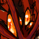
Assignment Three: Color Analysis/Collage Article Header
Starting this assignment, I had difficulty trying to find an article that had a wide range of colors that would be interesting to work with. Eventually, I was able to find “How to Quit Cars” by Adam Gopnick with a cover image taken by René Burri and Magnum. From there, I began a color analysis of the image and created a swatch set in Photoshop. Once all of my colors were chosen and set aside, I got to work on creating a grid to then fill with triangle shapes with the colors I had collected earlier. This process went by much faster than I thought it would and I found it to be quite entertaining seeing each box get filled. Once each shape was made, it was exciting to see that the entire image had been mostly recreated as not every single color in the image was used for this project. At this point, I went back to the article to read it over and get a better understanding of what it was about. With the topic being about cars and how they affect our society and our planet, I wanted to find a way to represent this. I began by only taking off the triangles on the areas with cars in them. All areas with nature were left covered. Then, I placed a large “X” over the piece to show how cars have negatively impacted Earth to the point where nature is being destroyed all around us from what we have created. After all, the article is on how to quit cars. My goal was to show that in this image and I believe that this went very well.


0 notes
Text
Influence Three
Kelli Anderson is an artist that immediately came to mind when we started up assignment three. With the triangle pattern that we had to create, I realized this was a lot like her work with folding paper and how she used color to depict a message. I want to create this same effect through my recreation of a photo of traffic. I've always loved her use of color and this project is a great way to explore that.


0 notes
Text
Influence Two
Sunflowers have always been a huge inspiration for me and it wasn't until my family and I drove past a community garden in Atlanta that I realized I wanted to use them for my book covers. My enjoyment of sunflowers first began through Van Gogh's piece and from there I spent a weekend reading through all of my dad's books on him and the letters he sent to his brother. This flower has a very personal meaning to me now and seeing a community garden in the midst of the biggest city in Georgia reminded me of this.


0 notes
Text
Influence One
Growing up, my dad would always show me his collection of books and the art that he owned. He would tell stories about his beliefs in Buddhism and how it has affected him. When we started exploring for pieces to use for Assignment One, I struggled for a while with what I wanted to focus on. Then I remembered the art my dad used to show me from Asia, India, and Buddhism. I wanted to explore an aspect of my childhood.


0 notes
Text
Albers Reading
When I started the reading, I was surprised to see that this one was a direct interview with Josef Albers about art, artists, and his own works. I loved getting to read Albers’s answers as they provided me with explanations for why Albers created what he did. I’m fascinated by his use of color and how each piece he created was different from the last even if some of the designs were the same. It shows just how vast color is and how much we can make from it. As for Albers’s views on realism at the beginning, it was interesting to see how he doesn’t think of expression as a driving force in art like many other artists do. For Albers, he tends to focus on abstraction and how to him it is “probably more real than nature”. Albers chooses to show this in his works as he says in the interview and wants to demonstrate how colors interact with one another. He wants to show us the relationships of color itself. Albers relates colors to our own society and how we interact with others. The way Albers sees color is completely different from the way most people do and even corrects the interviewer as he explains the behavior of colors. With each piece he creates, he tries to show the way he perceives reality and educates those around him as well as pleasing himself as he states. To Albers, art is something that cannot be taught which I found interesting, but teaching is able to ready someone to reveal and evoke insight. I also enjoyed how Albers described the choices he makes in his pieces and how all of his pictures have to have a beginning and an end to them. Something that really stood out to me however was the final question about illusion and how to Albers, it is just the myth behind so-called reality. Albers’s work shows how he sees reality and the relationships of color which is something I have not seen others do. At least not in this way as Albers does.
0 notes
Text
Assignment Two: Book Covers
For this assignment, I chose to focus on my favorite plant which is a sunflower as it has a very deep and personal meaning to me. I wanted to focus on the sunflower itself in my work rather than leaves and stems or the world around it. I started off by researching sunflowers and different ways that they can grow. From there, I came up with my sketch and decided to include some shapes in the background to represent leaves in a way to provide a little more than a sunflower and a bright sky behind it. Once I had completed my sketch, I went on to the Color Aid paper process to recreate my sketch. I used tracing paper to create my own stencils for cutting out the Color Aid. When everything was applied to the layout I made for the Bezold pattern, I moved on to the triad pattern with acrylic paints. I decided to go with a light blue, light yellow, and pink color triad and found the painting process quite easy as the Bezold pattern was much more complex. With my triad piece completed, I had to think for a while on how I wanted to approach the monochromatic pattern. In the end, I chose to branch off and try out colored pencils rather than creating another painted piece. I enjoyed getting the chance to work with something new and found the process simple and relaxing much like the triad pattern. Overall, I was able to express my love for sunflowers through these three pieces quite well and am proud of how everything turned out.


0 notes

Text
David Zwirner Podcast: Mattisse Reading
It was very interesting hearing about Ann’s views and ideas about Matisse’s works. Whether it was through how she thought he was inspired to how he planned out each of his paintings and the colors he used. I have never looked so closely into a painting like she has. Before this podcast, I hadn’t heard of the “Red Studio” painting so I looked it up and examined it alongside listing to Ann and the artists that she interviewed about this piece. Some people chose to believe there was not much thought behind it other than he decided to use a particular color and go from there. Meanwhile others thought of this work as more “unnatural” as Ann said earlier on and they’re trying to find an answer behind Matisse’s painting. It is a color that stands out in a certain way that sits with you leaving questions which Ann answers in this podcast. Relating this back to my own life, as I said before, getting into a piece of artwork on this kind of level is something I’ve never done before. I have never had this deep of a connection to something in this way other than music. I love to dig in deep to certain pieces I hear and analyze what I think the meaning behind it is. These artists had so much appreciation for Matisse’s work and went into so much depth about the influence of art in their lives. As one artist said in the podcast, this work celebrates and should be known as a masterpiece. The journey was not a straight line and there were many times along the way that it wasn’t a masterpiece. Such is the same for lots of pieces. They aren’t always perfect in the beginning, but they grow and change over time. Our views and our memory can affect the things we see in such a level that we can often be shocked when we see a work another time. The Red Studio exhibition attempts to show this from Matisse’s work and from what I heard in this podcast, I believe they were able to achieve this.
0 notes
Text
Assignment One: Paint Pixels Pixie Sticks
For this first assignment, I chose the piece “Hulagu Khan giving a feast and dispensing favor upon the amirs and princes” which is featured in a Chingiz-nama (Book of Chingiz Khan) of the Jami al-tavarikh (Compendium of Chronicles). This piece features a wide range of colors that I wanted to focus on through my work. I selected several of these colors to create my color wheel. The shape of the color wheel was chosen through a pattern featured in the trim beneath the tree in this painting. I wanted to find a way to incorporate a part of this piece to the color wheel and I decided that this was a beneficial way of doing so that was relevant to what I was working with. When working on my cropped selection, I wanted to focus on an area of the piece that had a wide range of colors to offer. From this selection, I pixelated the image before creating my own version of it using Color Aid squares. Finding enough squares that matched the colors properly was a bit difficult at first, but in the end I was able to tie it all together with accuracy. I cut out each of the colored squares and organized them into their appropriate spots on a grid before applying them to the paper. Once the Color Aid portion was completed, I decided that a way to produce a 3D version of this piece was through yarn. There are so many colors featured in this piece, so yarn was a way to show this in a more simplistic way. Each of the colors of yarn represent different sections of the piece from the people, the horses, the nature, and the buildings.


0 notes

Text
The Elements of Color Johannes Itten Reading
Since I am quite new to color, my knowledge about it is very limited. When starting off with this reading, I was very quickly confused by the term “color physics”. I had no idea there was physics behind it all until I looked closer. When talking about color physics, the main idea is how we perceive color through light. People aren’t able to see past the color spectrum, but the range within that spectrum varies from person to person. Something I did recognize was the basics of color mixing. I didn’t have a specific term for it until now when I learned that was complementary colors. An example of this being red and blue make purple or violet. It was useful going over the color wheel again and the color sphere since we’ve been working on that in class with our first assignment. I’m still learning hues, contrast, and saturation. All of these are things I’ve never heard about before until recently, so having this extensive review has really helped. Another term is “contrast of extension” which I haven’t heard of which is essentially the contrast between two colors. The passage also touched on color mixing and how it works. I’ve started to get the hang of it and learning what colors I need to create another color.
0 notes


Text
Color Design Principles Problems Reading
As a Sound Design major, I do not have much experience when it comes to art or color theory. My knowledge of colors is very limited, so this reading provided me with a lot of useful information on color. The reading touched on the basics of color at first, introducing how we see it and then how it can be used in art. Learning what hues, values, pigments, shades, saturation, solids, etc. were all very useful especially with the second exercise for class. I was unsure of what the different terms meant, but the confusion has now been cleared up. I was also not aware of how many color schemes there are such as monochromatic and analogous. It was helpful to see different examples of each scheme through pieces of art from over the years all varying in styles. Learning the basics of contrast were able to aid me as well with the exercises I am currently working on including color mixtures.
0 notes

