Just a little somewhere for me to collect all my art projects in one place
Don't wanna be here? Send us removal request.
Text
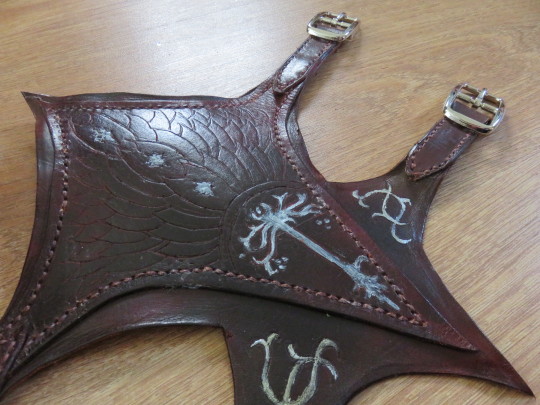

Boromir's bracers from The Fellowship of the Ring
Behind the scenes:
This was my first venture into real leatherworking so there are a lot of basics included in the materials list, but now that I have them, I won't run out for a while :)
My materials:
2mm thick scrap leather
a full basic leatherworking tool kit including metal thimble, skiving knife, edge-trimmers, diamond punches and burnishing tools
leather needles
waxed thread
swivel knife for cutting the pattern in
rubber mallet
cutting boards
leather dye and scrap cloth for applying it
sewing pony
contact adhesive
four buckles
nickel studs
I'd made the bracers before, 10 years ago, for a costume party but had made them out of craft foam because lack of time/space/money for leather-working.
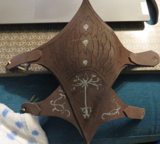
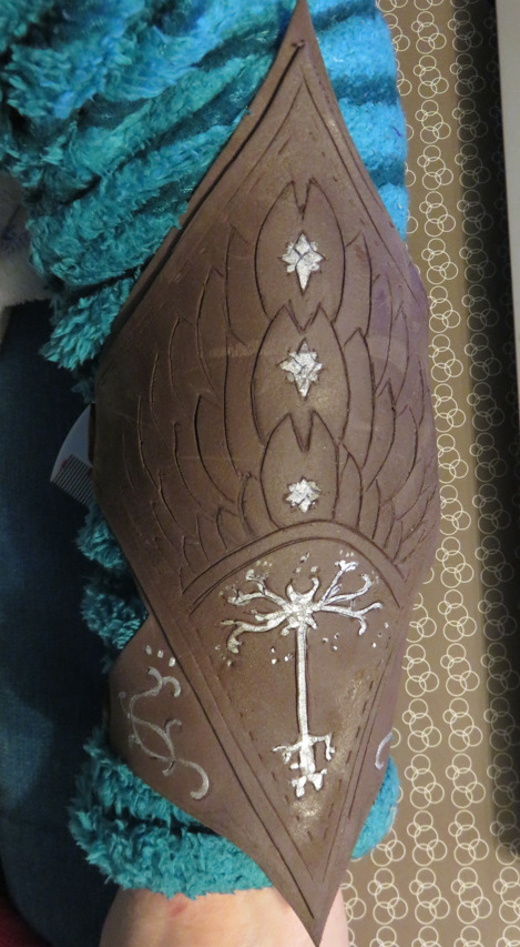
Since I had some time to kill over the holidays, I decided it was time to give things a go. First stage was redrawing my original pattern then cutting the leather to shape/size:

Next up was marking out the patterns onto the main body of the leather. Lessons have been learned. I foolishly decided to freehand it. It still looks nice, but now I know how I could have done it better.


Once both sets of patterns were down, I tooled the leather with the swivel knife. Learned very quickly that I should have got a slightly thicker leather to make the pattern stand out more, but for a first attempt, very happy.
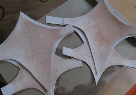
Punched the main stitching holes and then did the staining to get the red-brown colouring. Took a couple of layers and several attempts to get to the right and consistent shade.

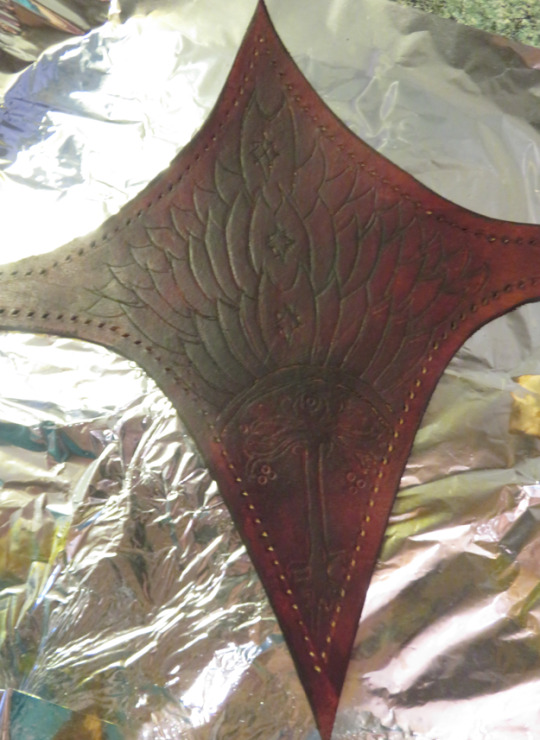
Once the dye dried overnight, burnished the edges of the smaller piece to make them smooth and shiny, then attached the two sections together with contact adhesive and started the stitching (ow my fingies)

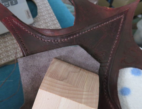
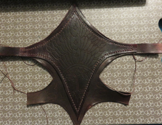
The trickiest part of the whole thing was adding the buckles and trying to work out the best length for both of them, taking into account that the bracers are meant to be worn on top of several layers, including a quilted arm-guard.
Thankfully, I found a lovely batch of buckles that also had the pin on a separate rod from the rod that the buckle loop went around, which simplified putting it all together. I've done buckles before, but never with material this thick.
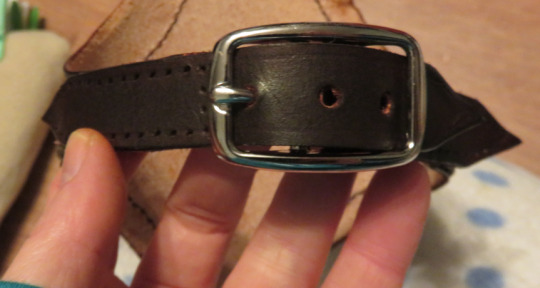

Once the straps were on, fastened with stud and stitching, it was just a matter of giving the entire thing a polish with beeswax to give it a smooth sheen all over and then adding the silver details. I did attempt foil, but it ended badly, so I switched to silver paint instead.
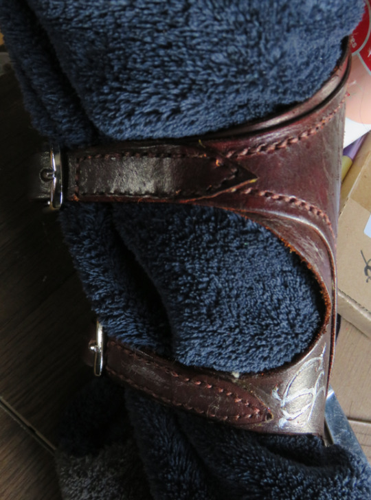

My Boromir-by-installments is coming together, little by little :)

60 notes
·
View notes
Text

Good Omens Aziraphale & Crowley Muppets
Since I'd levelled up a bit on my skills when I got to these two, I thought I'd do an updated muppet build :)
Behind the scenes:
My materials:
1/2 inch thick reticulated foam (head)
3/4 thick reticulated foam (body)
contact adhesive
basic gardening wire to make the hands poseable and wire-cutter
beige fleece fabric for skin tones
short-pile off-white fur fabric and extra long-pile orange fur fabric
clear resin with white pigment & acrylic paints.
miscellaneous felts for mouth/features
a whole load of random fabric off-cuts to make the clothes
threads etc for sewing
felting needles
arm-poles (can be bought or made)
After building a couple of other puppets, I decided to try and do these two at the same time, because I'm a nugget. I also redesigned and shaped the heads and bodies for both of them, since Crowley is long and lanky and Aziraphale is softer and rounder.

It took a bit of fiddling with the fabric sizes as well but once the fabric was one, they both looked much better.

As you can see, the mouths look a lot neater than my first once. Turns out when the instructions mention a seam allowance is essential, you probably should do one 😅
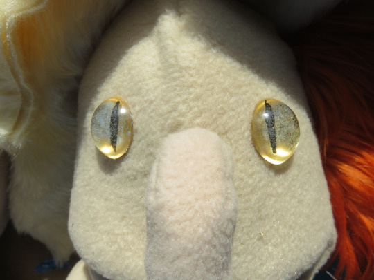
While I did Aziraphale's eyes the same way as usual (white resin with felt eyelids/lashes), Crowley's needed to be more snakey, so I used a clear resin in the mould, then painted them from the back.

Next up was adding the hair. Short-pile is so much easier, because essentially, you are making a wig to fit the shape of the muppet's head. When you have a longer pile, it can get caught up in the seams and need some teasing out afterwards. Once they're in place, you stitch them on and style them as needed (I think it's ladder stitch - if it's done right, the seam should be borderline invisible)

For these lads I also wanted to style them in their iconic costumes from S1. Thankfully, I've also been learning to make clothes, so I was able to work out how to make Aziraphale's collared shirt and Crowley's jacket, although I will fully confess my sizing was a bit off because muppets are not the same shape as actual humans XD And conveniently, I already has Aziraphale's bowtie, thanks to a cosplay.


For something a little different, I actually used loose felt and felting needles to make Aziraphale's eyebrows, so I could give them a bit more shape and fluffiness.

And in conclusion, I'm delighted with them :D
41 notes
·
View notes
Photo

Muppet of Stede Bonnet from Our Flag Means Death
Behind the scenes
My materials:
1/2 inch thick reticulated foam
thin foam sheets
contact adhesive (Gorilla Glue)
??-gauge wire (not an easily bendible gauge, but I can’t remember what size/density it is)
beige fleece fabric
blondish/gold long fur fabric
white resin
miscellaneous felts for mouth/features
miscellaneous cream/blue fabric for clothing
gold trim
white lace
threads etc for sewing
arm-poles (can be bought or made)
I made a template for my Stede design based on Puppetnerd’s videos and the samples on their websites. Stage one is tracing the template onto the reticulated foam and then gluing both halves of the head together.

You’re probably not meant to use pegs, but I was impatient and it looks very punk. The fabric for the head covering needs a different pattern since the fabric has to stretch around the head. The test-nose was made of leftover fabric pulled snug around a piece of foam that I’d cut to shape.
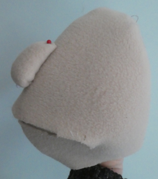
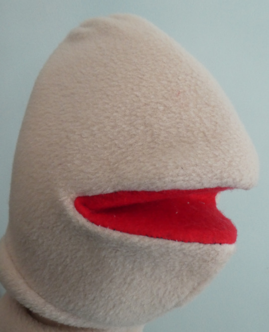
I made a booboo with the head pattern for the fabric and it’s why Stede’s mouth shows so much of the inside at the edges. I forgot to include the seam allowance.
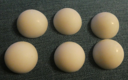
I cast the eyes out of white resin, then sanded them down to give them a matt finish and also sanded the back so they could be glue in place
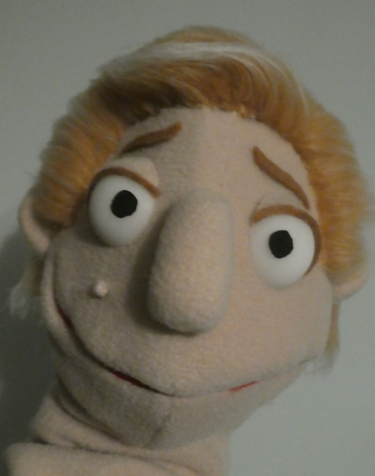
Then came adding on all the features, including Rhys’s mole, the ears and hair and such
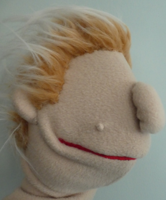
Do not speak to me of that sdfgjksghdf wig made from fur fabric. I looked like a thousand cats had shed all over me. However, once it was groomed in place with some water and PVA, it looks better :)

Add some eyes and features and we have a muppety man :)
I learned the hard way that it’s easier to attach the body before adding the head, and yet still made the same mistake with my second muppet. Still, body - much like head - is a simple case of follow the template, cut the foam, stick the two halves together, then put the ‘skin’ over it. No pictures of that, but behold muppety arms :D
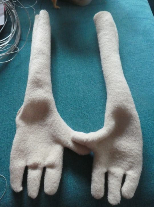
I made little wire bones for the hands to make them poseable, then padded them out with foam and filler and attached them to the body.
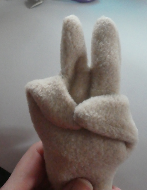
Once the arms were on, the clothing began :D I eyeballed it and made patterns around the shape/size of the muppet. Won’t go into details of the experimentation that happened, but in the end, I was victorious :) One shirt, one waistcoat and one overcoat, all removable.
And then I made him a friend.

43 notes
·
View notes
Photo
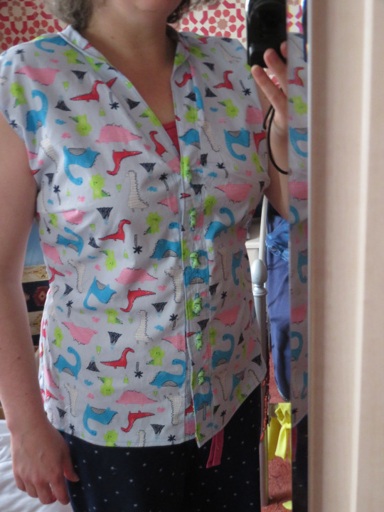
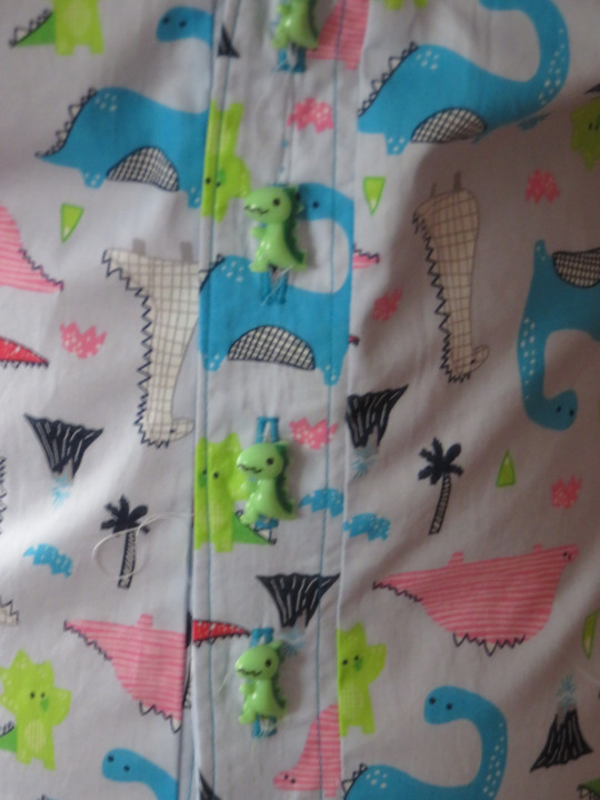
Dinosaur-themed shirt :) :) :) :)
Behind the scenes:
My materials:
pattern for shirt (this is my second using the same pattern)
fabric of choice
buttons of choice
some light/mid-level interfacing
thread
iron/ironing board
sewing machine
miscellaneous fabric/thread scissors and cutty tools
I feel it’s a bit moot doing a stage-by-stage of making clothes, especially since I forget to take pictures of said stage by stage. It can be summarised as cut out cloth and then sew cloth together while trying to remember to follow instructions on the pattern :D (Spoiler: I am not very good at following the instructions and there were many episodes of unpicking seams and resewing them all again)
Here’s the initial point where all the bits were together and I decided not to bother adding the sleeve caps.
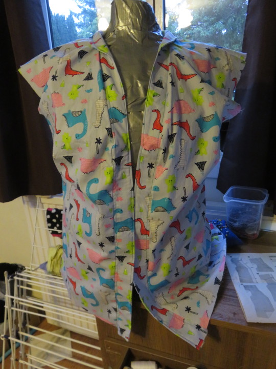
The big difference with this shirt and my first attempt is that this was what it looked like originally but I didn’t like the fit, so I experimented a bit, widening the darts that make the back of the shirt more tailored and adjusting the side seams so it wasn’t so baggy. I’m entirely delighted with it :)
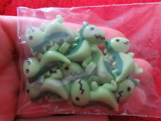
Also, the buttons are the best, even if the T-Rexes use their tiny claws to grab the thread while being sewn on.
43 notes
·
View notes
Video
Hurrah! I’m so glad you liked it 🥰
tumblr
The Queen’s Thief themed nook-book made as a gift for @meganwhalenturner
Behind the scenes:
Keep reading
146 notes
·
View notes
Video
tumblr
The Queen’s Thief themed nook-book made as a gift for @meganwhalenturner
Behind the scenes:
My materials:
ae woodene booke
much paper in many layers and shades
craft knife
scissors
foamy-tape-stuff (technical term)
acrylic paints
brushes and roller
pens & coloured pencils
PVA glue
faux gold leafing
resin
metal ruler and cutting mat
milliput
fimo
wire
craft foam boards
card
black tissue
wooden dowels
chalk
This one, I’ve been planning for a while. Originally I was going to do a standard book nook, but then remembered these gorgeous wooden books I’ve had just lying around waiting for a purpose and BEHOLD!
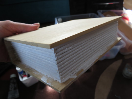
Because I can never keep things simple for myself, I wanted to try different craft styles for each section so I’ll go through them one by one.
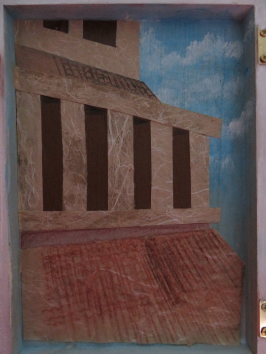
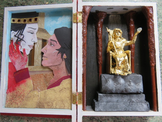
Phase 1 was challenging because it’s the shallow left side. I decided to do one of the iconic scenes that stayed with me long after I read the books for the first time in cut paper, because it would let me play with layers and the illusion of depth while also... y’know. Paper. It’s thin.
First off I made a background to add some perspective and depth to the box, so it looked much deeper than it is.I painted on a sky effect and then dug out this gorgeous paper that has a kind of marble texture to it and made the buildings.
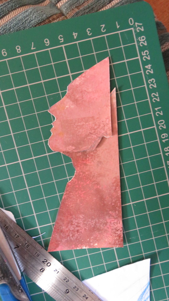
Next I did a base sketch of the faces to get the sizes right and snipped out Gen since he has more layers because his arm is foreground.

I didn’t remember to take a picture of the paper I textured for his skin tone, but basically various shades of pinks/reds/browns/whites applied to watercolour paper in erratic layers to get some texture and depth. It’s sort of visible on the hand (which was the first piece I cut out and it strikes me as ironic that it’s the piece I kept losing because I was working on my living room floor 😅)
For Attolia, I picked different papers/cards to use, specifically a rather nice handmade off-white paper with dark red rose petals imbedded in it to serve as her alabaster skin with the smudge of blood.
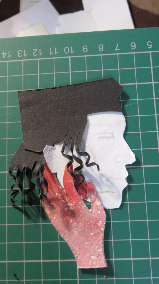
Nothing says love like floating heads, amirite? I added some layers to Attolia’s hair and coiled the strands of the ringlets around a cocktail stick to get the curls. The crown and earring are both faux-gold-leaf card with slivers of resin as rubies. So much gold-leaf everywhere. SO MUCH. Details were added with a fine-tipped pen and some shading with coloured pencils.
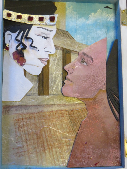
The layers. So many layers. I think Gen has about 15 separate pieces to him. For his sleeves, I added some texture by using a rubber patterned stamp and copper ink, then splatted paint all over it :D
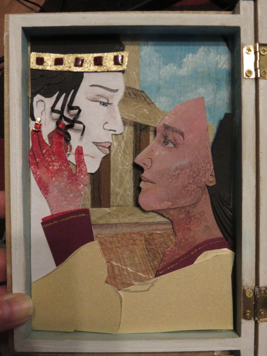
And to add even more depth to a 1cm deep space, I used thick double-sided foam tape (I have no idea of technical terms. Foamy squishy stick string) to elevate them off the background. A wee glimpse of it is visible just under Gen’s collarbone
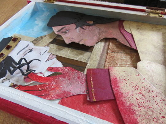
Phase 1 complete!
Phase 2 was another beast entirely. Originally, I was planning on doing the scene from The Thief when Gen steals Hamiathes’s gift, but realised that would mean an image of Hephestia that looked very much like the image of Attolia I had already done. Plus I was planning to use The Return of the Thief’s cover which is also red, so I wanted to do something less red.
Pheris was kind enough to give me some beautiful descriptions of the half-built temple of Hephestia in TRotT and I love me some forced perspective :D And naturally, I had a slightly deeper box to work with this time (omg a whole 2-3cm! Luxury!) so of course, it had to be 3D.
"I studied the Great Goddess, shining in the darkness. The treasury was new, but her statue was much older; the wood from which she was carved showed through the gold leaf. The pillars supporting the dome were tree trunks, smoothed of their bark and inverted, so they were wider at the top than at the ground"
First up, the Goddess herself. Fimo on a wire armature with a throne made of balsa wood . Since the statue is described as old with wood showing through the gold, I figured she could look a little crudely-carved and rough. Also, she is smol and I have sossige fingers.

I cut dowels to size to serve as the inverted-tree-trunk pillars and add an illusion of depth. My art teacher would be so proud.
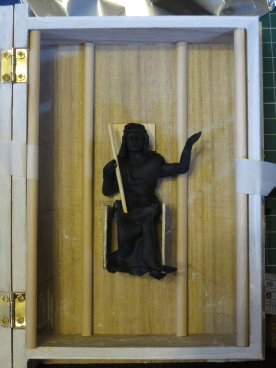
The altar was the easiest piece of the whole thing: chopped up foam board, some card for stability, cut and shaped and decorated with milliput to add the Hephestial Mountains, coated in black tissue to give a nice strong black base to paint. I used drybrush to get a nice stone effect (see a bit further down)
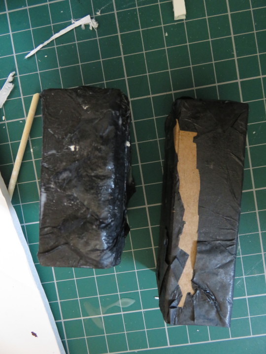
And conveniently, the entire background of the scene is black, so I added the dome for More Optical Illusions! Because hey, if it worked once, do it again :D And also started layering up milliput for the tree-pillar bits.
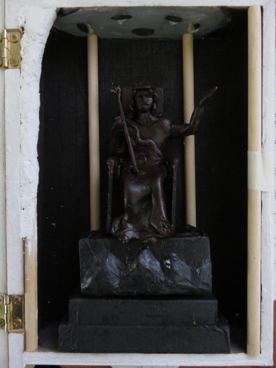
And the last and messiest step before fixing the pillars and everything in place. Gold. Leaf.
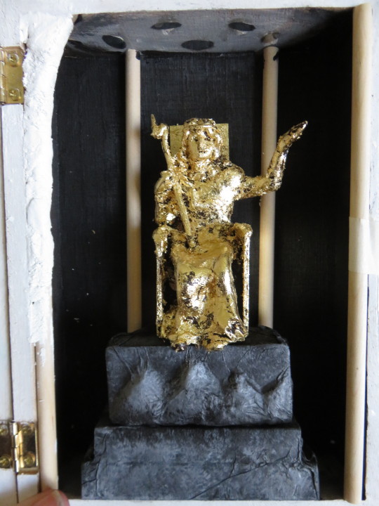
The last bits to get done were the pillars, which I fixed in with milliput and glue.
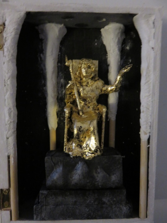
Once they were set and painted, I glued everything in place and gave Hephestia her orb and behold, phase 2 complete!
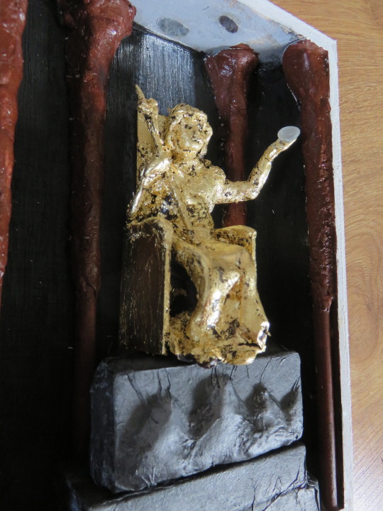
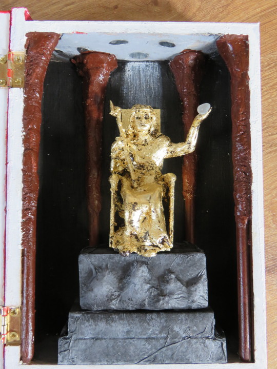
And both sides together.
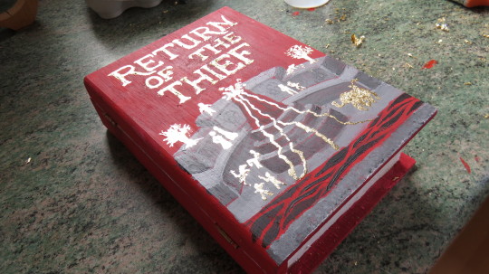
Finally, phase 3 - the cover. To keep things (relatively) simple, I went with the blood-red cover for Return of the Thief. Gave it a nice red basecoat, sketched on the design in chalk because lol, who uses tools to draw lines? Not me!
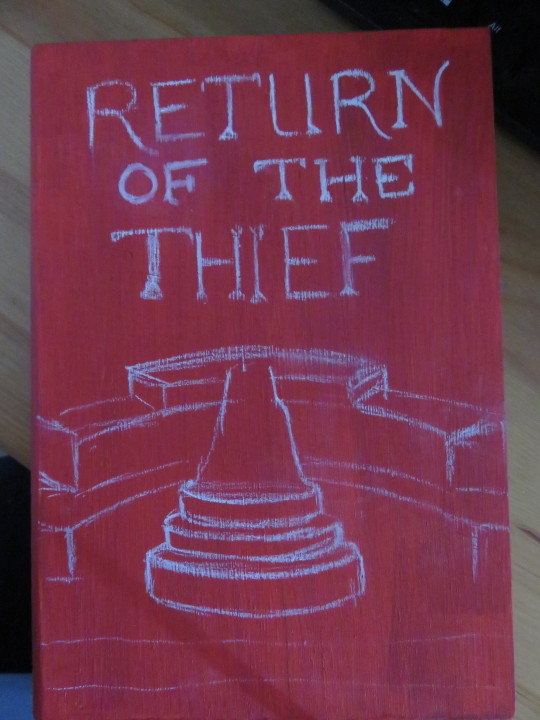
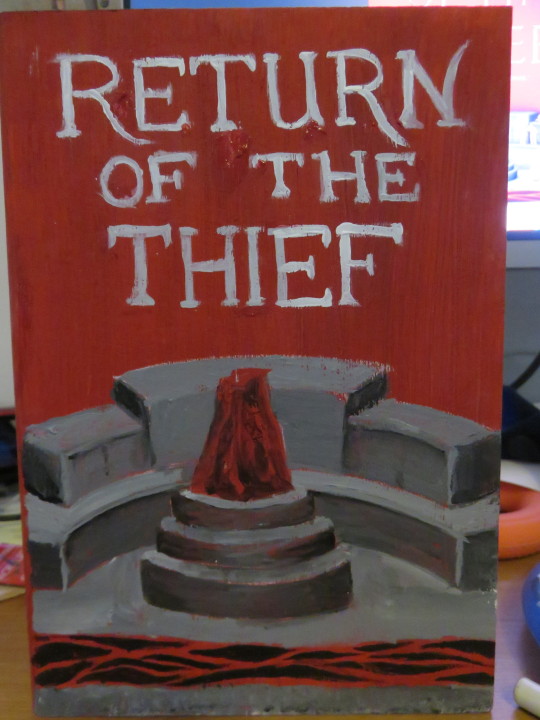
No in-progress pictures because I did it all in one run while listening to a webinar.
And as a special treat, more gold leafing!! I love the shininess of the figures on the cover of the book and thought “hey, that’s a sensible option that won’t leave you finding gold bits in your kitchen for days!” :D
Note to self: do not do this on wood again, it is very very likely the leaf will cling to the wood and require some repainting. This is a lesson. Do not forget (this memory will self destruct within 10 seconds of leaving this post)
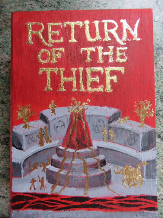
For comparison before I did some touch-ups because of the stupid leaf going rogue
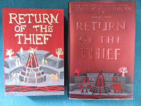
And behold, it is done :D
146 notes
·
View notes
Photo
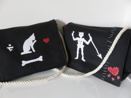
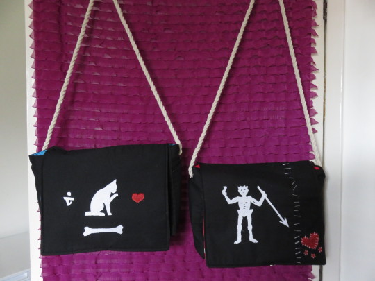
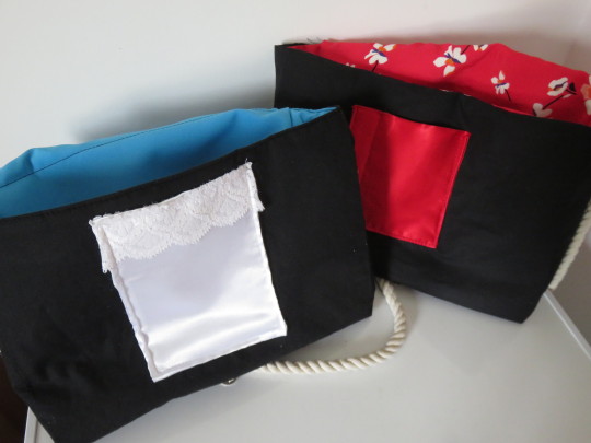
Our Flag Means Death themed messenger bags - Complete
Behind the scenes:
My materials:
black fabric (do not ask me what kind. The kind that I touched and went oooo)
floral pink/ blue fabric (see above) for the lining
red/white satinish fabric for the pockets
white cotton for the flag bits
interfacing - iron-on stuff
miscellaneous needles, including leather-needles
big fabric scissors
little sewing scissors
black, white, red and blue cotton on reels for sewing machine
white embroidery thread
a buttload of pins and clips
sewing machine
iron & ironing board
chalk
rope-looking stuff, probably for curtain tie-backs (likewise makes me go ooooo)
eyelets
sellotape
HAMMER :D
Before I begin, I will raise my hands here and admit I have never made a lined bag in my life. The extent of my experience of making 3D fabric stuff is limited to a small patchwork quilt, a TV remote-control holder based on a youtube video, facemasks and a small drawstring pouch. So accordingly, I have no idea if this is how designing/making things is normally done.
I got the idea for this bag the night before I went away on a trip and naturally, spent the whole time away sketching and resketching the best way to make it. This is but one of the experiments since I ended up free-handing the eventual design.
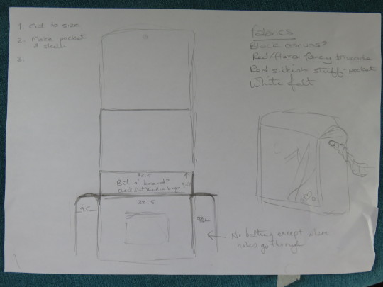
Once I worked out the shape/size, I made an experimental skellington template and - with minor adjustments - he’s remained my template for each bag I’ve made.

The entire bag itself is made of two pieces of fabric cut in the same shape: one for the exterior and one for the lining, with a small addition rectangle for the front pocket.

The picture is a bit blurry, but for the Blackbeard bag to match the flag in the show, I leave either an extra bid of width or use a rectangular strip of leftover fabric for the additional section with the heart.
I’ve learned from the first attempt that the best sequence of stitching is to get the pocket and flag design on first and everything else can follow after (I did not do this the first time. It was a mistake). Everything else takes less than 40 minutes if I can concentrate.
The flag pieces I cut out by hand and usually attach with a bit of fabric webbing before stitching them in place.

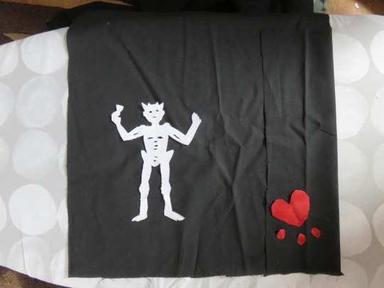
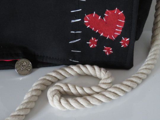
To get the dramatic white stitches to really stand out on the flag, I use full 6-strand embroidery thread with a leather needle to get it all the way through the interfaced fabric. It makes things so much easier.
The pocket is simply a rectangle folded in half (inside out), ironed and stitched down the sides. It’s then turned right-sound out for hopefully-crisp edged. On the front panel of the bag, I close the bottom of the pocket up by stitching it on upside down, then folding it up so the bottom line is nice in sharp.
To make things more annoying for myself, I added lace to the Stede pocket. A foolish decision. I regret everything. But it looks cool, so that makes it all right?

I’ve experimented with a few different interfaces and finally settled on a nice firm iron-on one, which I affix to the inside of both the bag and the lining fabric for stability. And because I’ve found it gives a nice, sharp edge, I now tend to stitch a seam along the folds, both as a nice clear marker and also in case the interface comes unstuck inside.
Once this is all done, then comes the stitching-the-thing-together. Again, I am winging it, working my way around the seams on the inside.
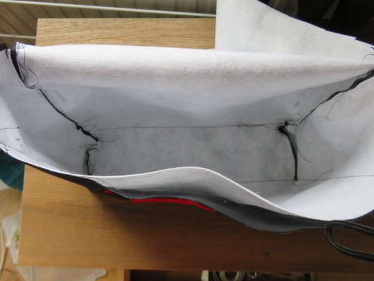

The lining gets the same treatment: a bit of interfacing, and then stitched into the same shape with a 3-inch gap left in one seam to allow me to do the magic sew-it-inside-out-then-reverse it trick.
Added bonus if you want to make yourself quite stressed when you forget: add a loop of cord or thonging to serve as a button loop for a pirate-themed button. Because forgetting that halfway around and yelling is always fun.
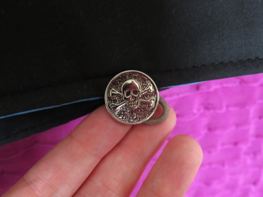
Do not ask me how many times I have had to unpicked the frigging lining because I put the inside-out bit the wrong way around or forgot a step. There has been much lamentation.
Once the lining is in (and correct -_-), flip everything the right way around. Press it all and secure the flap and all internal edges with a nice neat seam.
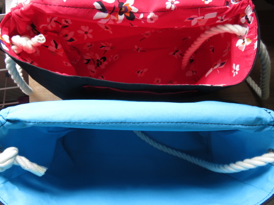
Oh and since you can clearly see them in this photo, this is the stage you add the eyelets, after everything is stitched and won’t fall apart.
Once again, there has been much lamentation when I cut the holes just a bit too big but I have it down to an art now :D You cut the holes, insert the eyelets and THUMP THEM WITH A HAMMER. It’s very therapeutic :)
8 notes
·
View notes
Photo
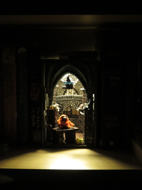


Unseen University Book Nook - Complete
Behind the scenes:
My materials:
compressed foam boards
standard 5mm foam boards
thin polystyrene sheet
cardboard (misc)
recycled bottles
wooden rods
3mm balsawood sheet
craft foam
milliput resin
PVA glue
acrylic paint
fimo (misc colours)
resin
scissors
craft knife/carving tools
toothpicks
matchsticks
paper
thread
pipecleaner
jewellery findings/chains
string of basic LED lights
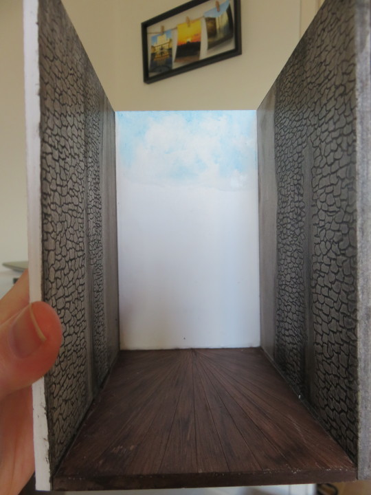
For once, I did forward planning and did a very rough sketch of the different layers that I needed to create, since the UU is infamously busy and Escher-like.
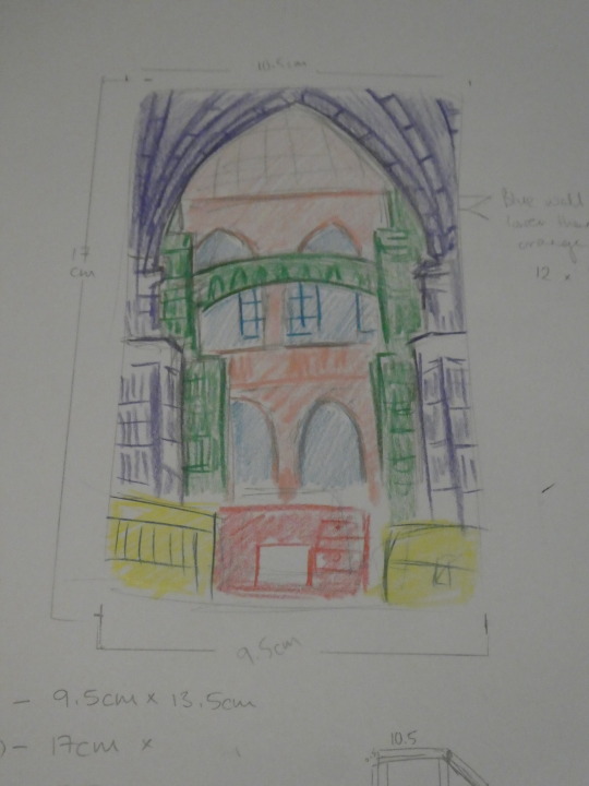
To fit in as many layers as possible, the back-most layers are ridiculously thin, to the degree I I was terrified of breaking the foam as I carved in the layers. I absolutely cheated in the window-frames, making resin moulds of these wooden MDF frames I bought online to keep the back panel thin and light.

The next layer was a bit thicker to add some depth, but I also used a fine-tipped blade to draw the patterns into the ‘stonework’. Both layers were given a wash and some shading with acrylic.

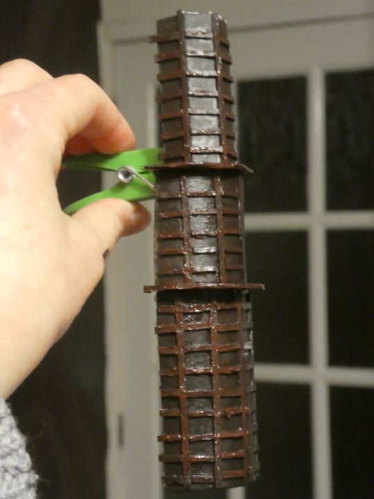
Next stop, the back-most shelves - these ones were a bit of an experiment, using cardboard tubes and thin board with the shelves themselves thin strips of mounting board cut as thin as I could manage. Layered on some acrylic (and dabbed on tiny book-patterns later).
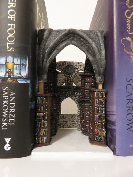
Now, to show it in context:

For the final main layer to divide front and back, I planned for shelves that rose into an arching gothic buttress, so I sculpted the archway out of milliput on a frame of card and 5mm wooden rods.

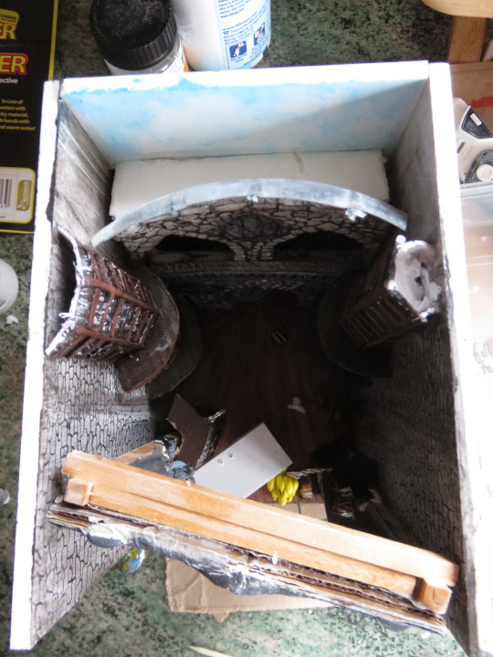
With all the layers loosely built, you can see the general shape of the thing coming together.

Now some detail for the front shelves, because gots to have some detail. Shelves are made of balsa and board, the books themselves are craft foam.
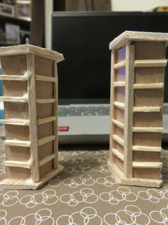
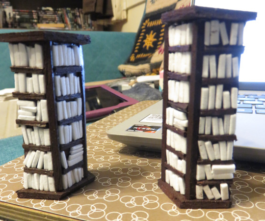
At this point, I finally decorated, fixed together and glued all layers into the box.

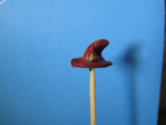
And then there were all the decorative little details to add.


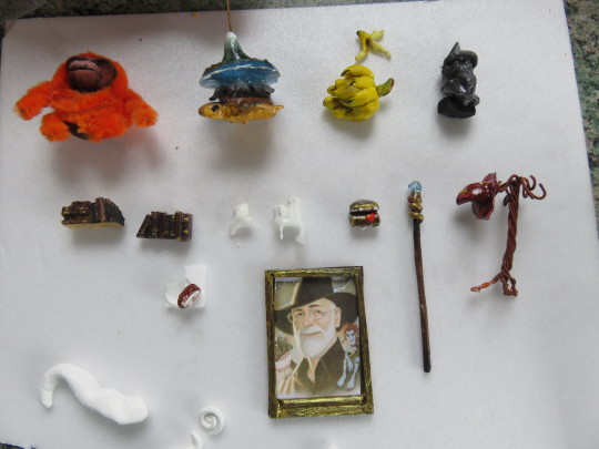

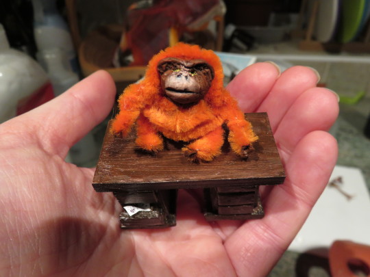
One of my favourite details remains the book on a chain flying off the shelves. I resined up the chain, attached it to both little book and shelf, and then crossed all digits it wouldn’t snap in shipping.
It’s entirely possibly I got carried away, but it worked so well I have no regrets :D
65 notes
·
View notes
Photo
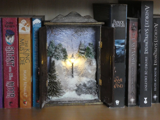
A Chronicles of Narnia winter wardrobe diorama - Complete
Behind the scenes:
My materials:
pre-made wooden box - part of set from Flying Tiger
one sheet of MDF - 3mm
one sheet of mounting card - A4
one sheet of foam mounting board - A4
two pairs of small brass hinges
a block of craft foam
several scenic trees
fine copper wire
snow flocking
print of a woodland scene
2 jewellery findings painted with metallic copper paint for the door handles
acrylic paints - burnt umber, black, white, gold
plastickote - nut brown
a craft knife
a metal ruler and cutting board
an LED lamppost and button battery pack with two CR2032 batteries
adhesives: PVA, loctite and resin adhesive
battery-powered hand-drill
I bought a set of boxes in a shop with the intention of turning them into mini dioramas and this was my first attempt using them :)
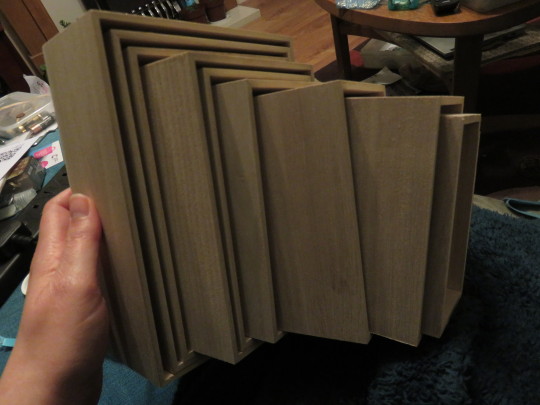
First step was sculpting the craft foam to fit into the box after working out how deep it needed to be for the lamp-post base.

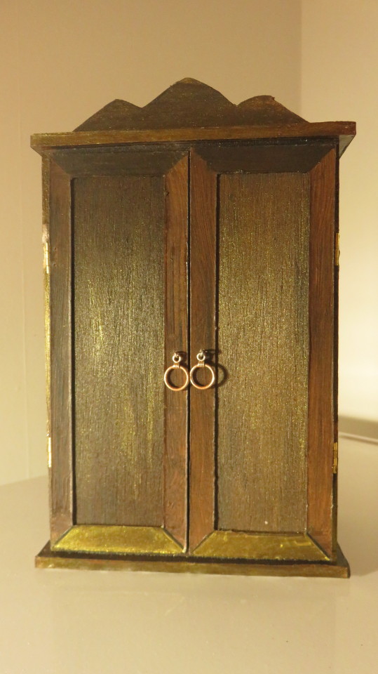
I cut the foam board into rectangles to make a slightly wider base and top of the wardrobe, inspired by the illustrations in the original book, rather than the more dramatic look of the wardrobe in the film. I also added a decorative ridge at the top made out of leftover MDF.
I will freely admit that I suck at measuring and/or cutting things in a straight line, so to no one’s surprise, the MDF doors took several attempts to get the sizing right.

To complicate things for myself, I wanted to incorporate brass hinges. I will not go into the details of how bad a decision this was for someone who can’t measure or - apparently - count.

Once the doors were sized correctly, to give them a bit more depth and an Edwardian/historic look, I used thick mounting card to make a border.
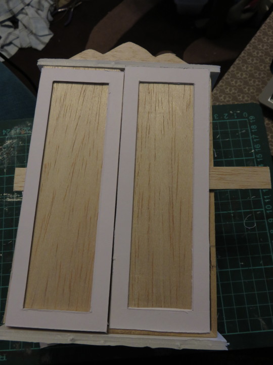
Next stage was painting and I sprayed an allover base coat of nutbrown plastikote, which turned out to be far, far too pale and bland for my tastes, but served as a good base coat to build up on with layers of acrylic.

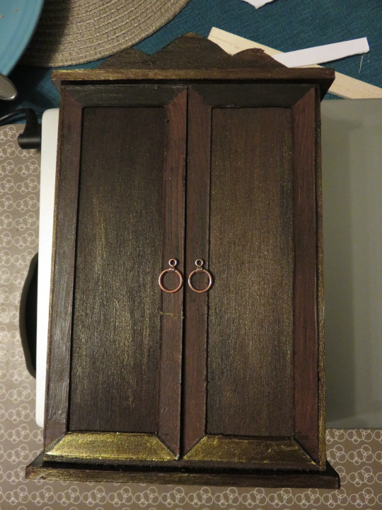
Before I could attach the doors, I needed to finish the interior. First was gluing a winter backdrop around the interior to add depth beyond the diorama.

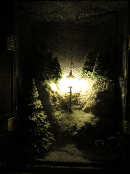
And then, we got to the diorama. I painted some shading onto the craft foam to add the illusion of depth, then glued and stuck and generally fastened all the pieces of the scenery into place before adding the first layers of snow - some using tissue and PVA/water, the rest an abundant scatter of flocking. A hole was drilled through the back of the wardrobe for the wiring.
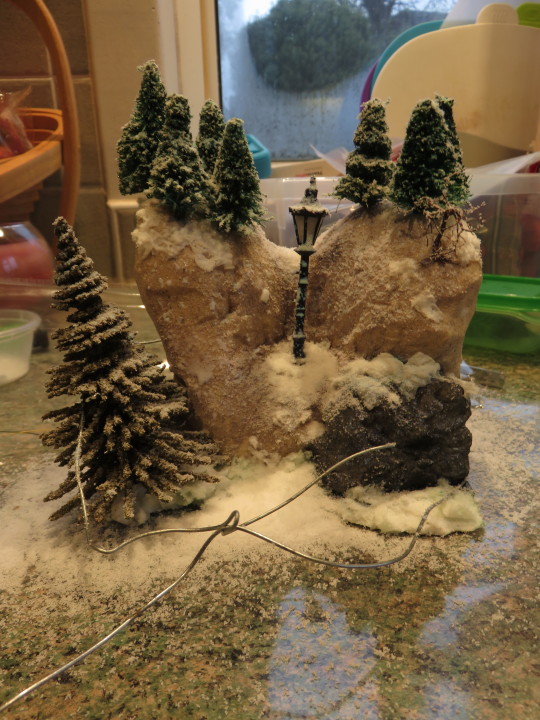
Some hefty amounts of flock later, the wardrobe fitting happened :) The tree branches poking down from the top were made out of bundles of fine twisted copper wire, which were painted and flocked too (see below the wardrobe picture)


Some more flocking was added to the floor and interior of the wardrobe and the battery pack was connected to the lamp and behold! A Narnian scene.
26 notes
·
View notes
Photo

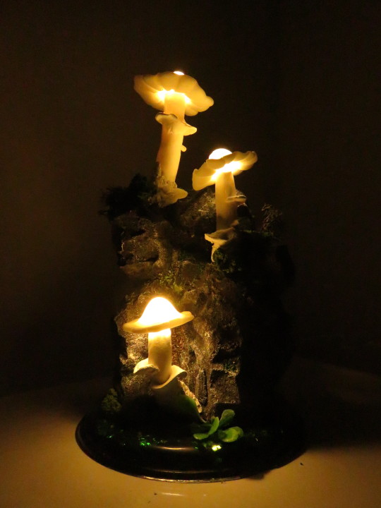
Mushroom Lamp/Nightlight - Complete
Behind the scenes:
My materials:
modelling foam (I think that’s what it’s called)
craft knife
a partial string of repurposed LED lights with AA battery pack
acrylic paint - black, white, burnt umber
white & glow-in-the-dark fimo
milliput
several types of flocking/fake plants
PVA glue
superglue
resin with pigments for the base
green glitter
power drill
scissors
rolling pin
I started out with the block of foam which I hacked to pieces to make it look like something vaguely rock-shaped. Once this was done, I drilled holes in to fit the three LED lights.
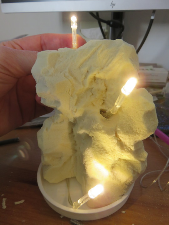
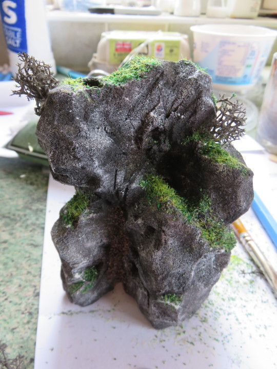
Once this was done, I painted it with several layers of acrylic paint - a base coat of black, then various layers of dry brushing to give it some texture. Once it was dry, I mixed and matched flocking to make it a nice mossy rock.
Next stop! Mushrooms! The straighter parts of the stalks and caps were made with fimo. I fitted the stalks over the light fixtures, and attached and secured them with sculpted milliput. (plz ignore the temporary base)

Alas, I don’t have pictures of the making of the base, but pretty much slapped some resin (with black and green pigment) and some glitter into the bottom of a large yoghurt pot and left it to set. Leftover resin was used to attach the caps of the mushrooms in place.
Once the base dried, I added the last mushroom and using the milliput for the bottom of the stem, fixed it to the base. With a bit more flocking and some fake shrubbery, behold, t’was done.
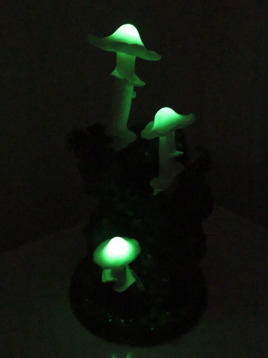
Oh and a bonus special feature: I made the caps of glow-in-the-dark fimo :D Once the lights are switched off they keep right on glowing.
3 notes
·
View notes
Photo


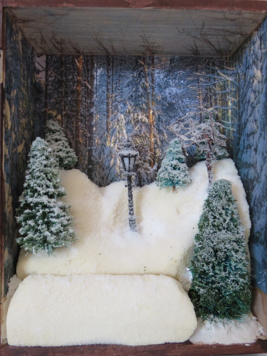
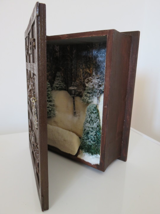
Miniature Narnia diorama in a sort-of-wardrobe - Complete
Behind the scenes:
My materials:
wooden book
LED lamppost & battery pack
printouts of snowy woodland for background
sculpting foam
pack of cheap mini Christmas trees spruced (heh) up with pva and more flocking
copper wire
Scenic snowflakes
milliput superfine
superglue
acrylic paint
craft foam
smol picture hook & old fastener for door handle
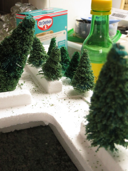
First off, had to sort my trees. I wanted to make these natty cheap ones (99p a packet) look more natural so I dressed them up in two shades of green flocking.

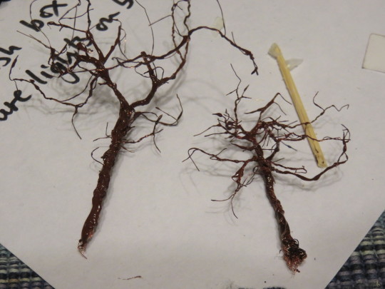
These ones are twisted copper wire dipped in diluted acrylic paint for that dead-tree-in-winter aesthetic.
After printing out a nice backdrop and sticking it to the inside of the wooden book, I carved up a snowdrift from craft foam and made a little platform for the battery and switch to go under.
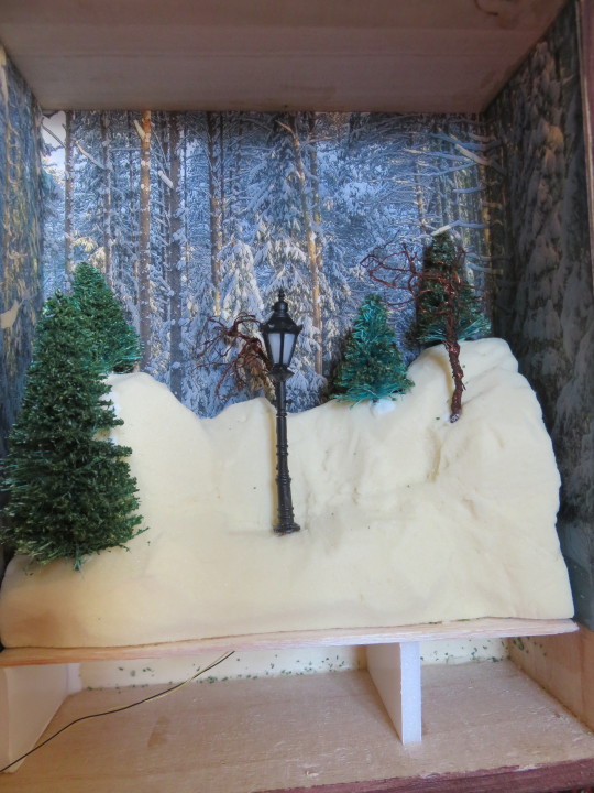
SNOWFLOCK :D I made such a mess.

Lastly, the exterior: Narnian motifs made of milliput and strips of craft foam for the faux wood effect. Painted the whole lot in acrylic and used a piece of an old fastener for the door handle.

25 notes
·
View notes
Photo
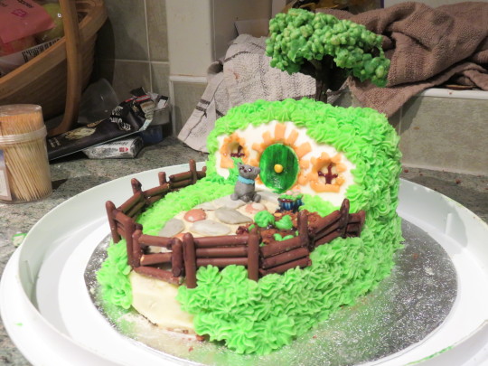
Bagend Birthday Cake - Completed
Behind the scenes:
My materials
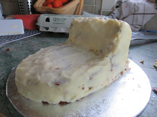
2 x small chocolate sponges
buttercream icing - for crumbcoat & grass
1 x small block of fondant for house front & paving
1 x tube of weird not-icing-brown-goo
crushed chocolate biscuit for soil
Mikado chocolate sticks for fence
milk chocolate for the tree trunk and branches
rice crispies, green food colouring & white chocolate for the leaves


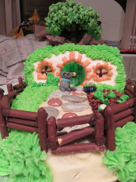
The cat was a special request by the birthday girl

2 notes
·
View notes
Photo
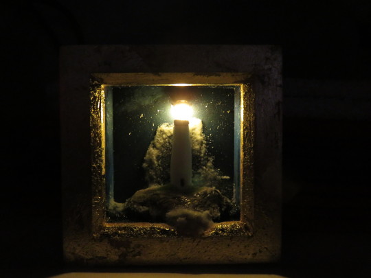
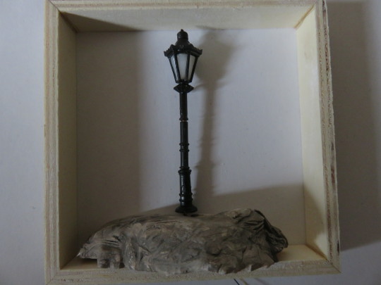
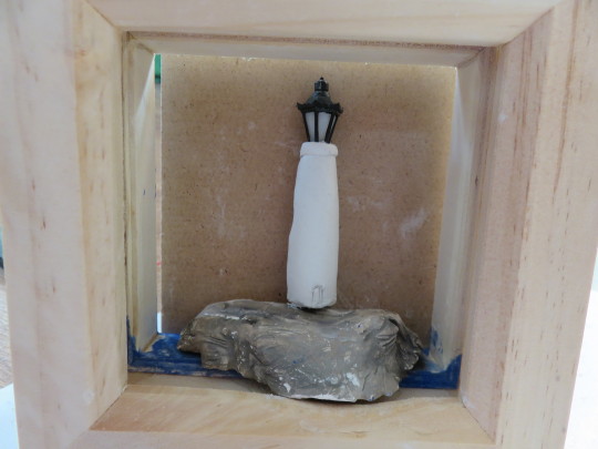
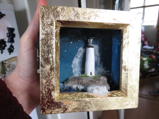
Miniature Lighthouse Diorama - Complete
Behind the scenes:
My materials:
1 x IKEA mini box frame
1 x LED streetlamp + mini-battery pack
a little air drying clay
leftover plaster chunk from previous project and bashed into shape with a hammer
acrylic paint
resin
snow-effect flocking for seafoam
faux gold leaf


1 note
·
View note
Photo
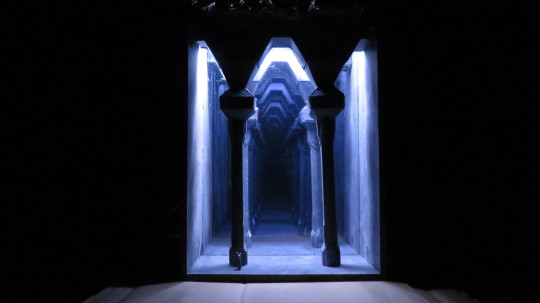


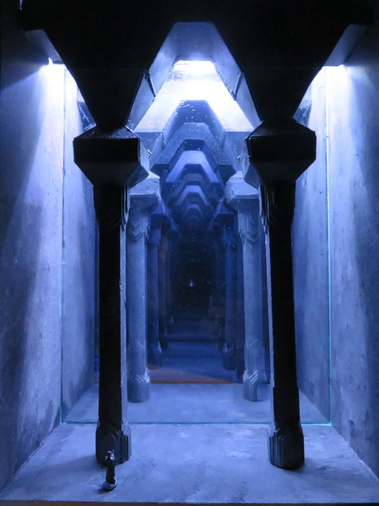
Mines of Moria Infinity Box - Complete
Behind the scenes:
Please be aware that this was my first attempt at an Infinity box and I made many, many, many errors along the way.
My materials were:
1cm square balsa wood rods cut to size
several compressed polystyrene boards
1 x A5 mirror
1 x glass from a picture frame (I tried two way mirror and preferred this)
reflective film
white card of varying thickness
PVA glue
cutting board and craft knife
superglue
acrylic paint
1 x pack of cheap LED copper-wired lights
wee tiny dinky smol figurine - 1cm tall
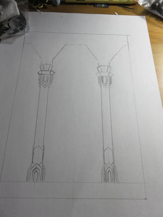
Initial sketches and planning stages:

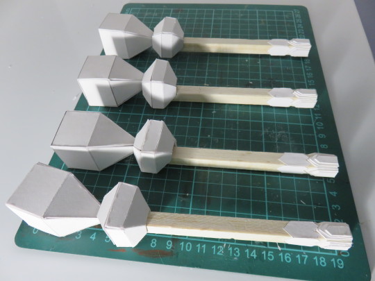
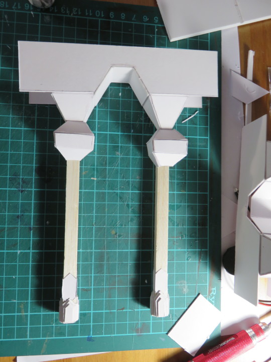
Pillar prep - cut card and PVA on the balsa pillars, then cut card for pillar tops.

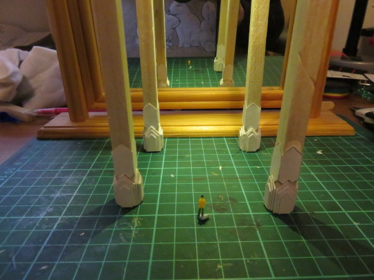
The Box. Can’t lie, I am terrible at maths, so this took lots of extra measuring work, especially since my original 2-way mirror was an unexpected size and complicated things. Going with a slightly smaller pane of glass was cheaper/easier.

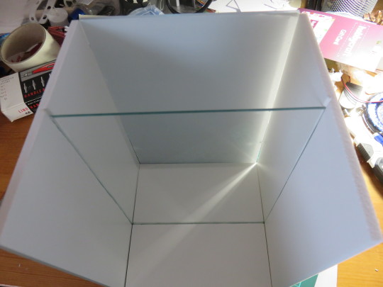
IT FIT :D My maths did not suck as much as I anticipated. (Note this is before I added the mirrored film to the glass)

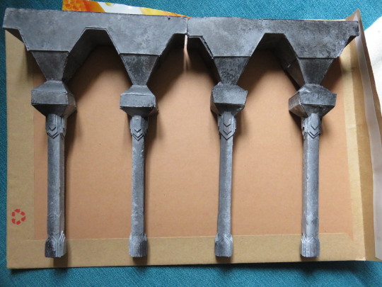
PAINTY PAINT
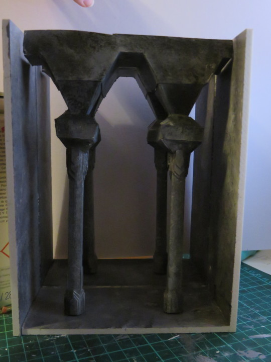
Lighting - I did originally intend to try and do some uplighting tricks with mini-LEDs, but because of the size of the mini-Gandalf and the way the mirrors worked, it got too complicated. This was the first full lighting trial. Added a sheet of plastic film above the pillars to a) even out the light spread and b) stop the lights falling into the model. It will also make things simpler if the lights ever need replaced.
Added some rock-face texture along the top with toilet paper and PVA, purely for the aesthetic :)
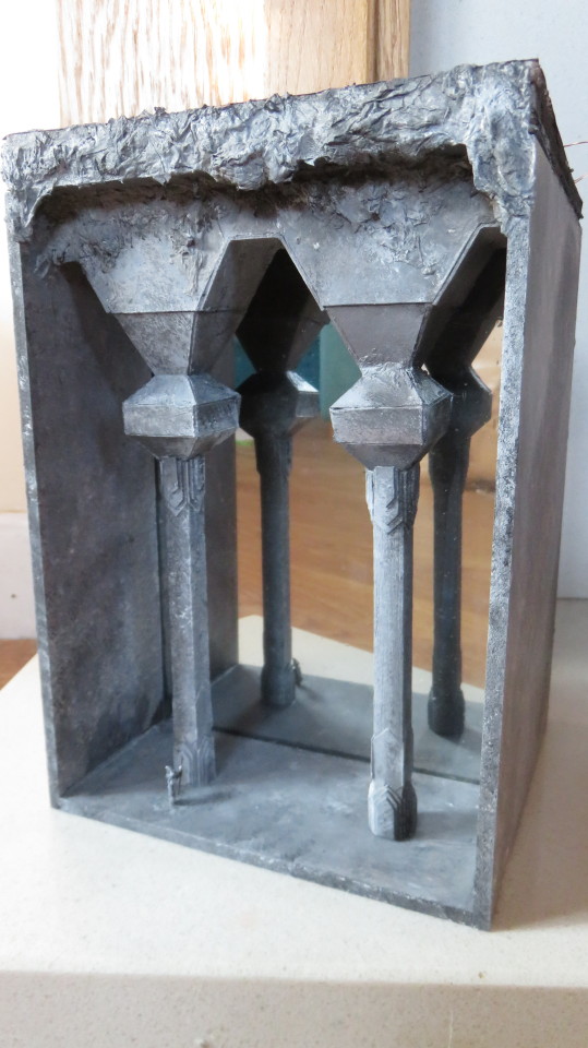
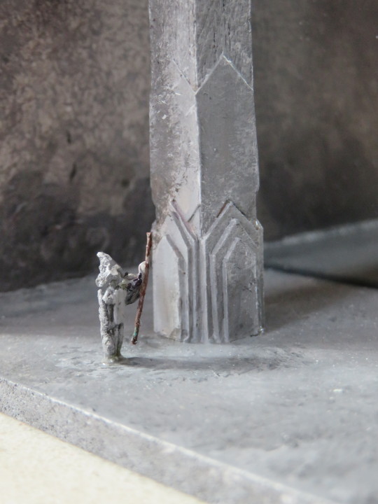

BEHOLD!
12 notes
·
View notes