
Statistics
We looked inside some of the posts by art124spring2019 and here's what we found interesting.
Average Info
Notes Per Post
0
Likes Per Post
0
Reblog Per Post
0
Reply Per Post
0
Time Between Posts
3 days
Number of Posts By Type
Text
12
Photo
5
Last Seen Tumblr Blogs


Fun Fact
28.6 is the average number of monthly visits per US mobile user.
Text
Week 15 - Final Thoughts
Emerging Opportunities in Design
Wearables
Wearables came on strong in 2017 as people tried smart watches and Fitbits and Google Glass. There seems to be an adjustment period underway right now as the costs and benefits of wearables are tested and adjusted across multiple industries from health care to entertainment and infotainment. Designer Billie Whitehouse predicts an expansion of wearables into true articles of clothing from GPS-embedded jackets to sports jerseys that transmit the sensations experienced by professional athletes to their fans. Among her most intriguing designs is Nadix, a line of yoga apparel that guides wearers into poses by applying vibration to different parts of the body. In addition to yoga there are opportunities here in fields like healthcare rehabilitation and even workplace safety, where your apparel might remind you to lift with your legs and not your back (Anderson, 2018). For wearables to become mainstream, designers have several of problems to solve. Initially most wearables were extensions of the wearer’s smart phone, but future iterations will need to shed the intermediary and officially join the Internet of Things. Practical concerns like batteries and circuits that can withstand washing and visual unobtrusiveness are ripe for design solutions as are the apps that will inevitably be necessary to interface with the technology. The lessons designers can learn from one early wearable, Google Glass, are more related to privacy than functionality although Glass too was dependent on the proximity of a smartphone. Future designers must find ways to address the discomfort many people experienced around people who wore Glass due to the possibility that the wearer might be video recording. My personal suspicion is that people have grown far more accustomed to constant recording over the last few years. The American Library Association (2014) predicts that the emergence of Internet of Things will gradually erode public resistance to the sharing of data and reframe assumptions about privacy as will pressure to participate in another emerging technology—Augmented reality.
Virtual Reality
Though several major vendors now produce Virtual Reality or (VR) equipment, there is still a strong public perception that this is a gaming technology exclusively. There is a design void to be filled here in terms of less obtrusive equipment to “experience design” in the form of conceiving and coding experiences in the realms of storytelling (motion picture and publishing), education, digital collection development in libraries and museums and even workplace training scenarios (Newsman, 2018). As the American Library Association (2017) notes “Virtual reality could become an important tool for users to connect with and experience cultural events, institutions, and collections in virtual reality or 360-degree video”. Libraries are consequently encouraged to make VR technologies publicly available as part of their traditional role as points of public exposure to new technologies though there is a concern about equitable access to content, and issues that might addressed by digital rights management rather than design.
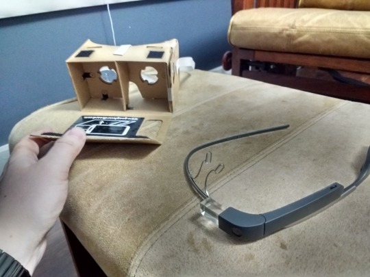
(Google Glass and Cardboard--new possibilities for AR and VR) Photo Credit: Adric Holmes
Voice control
As it becomes ubiquitous via digital assistants like Alexa and Siri, and adopters become comfortable speaking aloud to objects, voice control may be passing from emerging technology to accepted technology in record time, maybe because sci-fi books and movies have played a role in building expectations and predictions for what speech recognition could look like in our world. Early and even contemporary efforts at voice control have been inelegant, sometimes comically, suggested an ocean of design opportunities from better operational code to microphones and noise-cancelling features. Essentially any device that requires human interaction to operate is open to design adaptations that accommodate voice control. Voice control holds the promise of safer and more accessible machines with some special benefits for people with disabilities. Designers with a preference for social responsibility might see adaptive design as a way to improve lives if not planets. In late 2017, Amazon announced new voice-activated tools for the workplace, hoping that verbal commands such as, “Alexa, print my spreadsheet,” will expand to common office tasks. Microsoft’s Cortana has similarly begun to manage some of the more onerous office tasks such as: scheduling meetings, recording meeting minutes, and making travel arrangements (van der Velde, 2018).
Biodesign
Personally, I am most excited by emerging opportunities in biodesign which fuses design with biotechnology, integrating design with biological systems to achieve better ecological outcomes. This once and still includes bioengineered crops and hydroponics, animal breeding programs and living roofs. But now there is so much more. For better or for worse, CRISPR has made genetic design possible far beyond what can be achieved through selective breeding, and just last week scientists in Israel produced a rudimentary heart from human tissue through a 3-D printing process (Tangermann, 2019). Eskilson (2012, p. 259) describes how the Museum of Modern Art (MoMA) has been instrumental in promoting modern design in the United States since it was founded in New York City in 1929. To promote and expand public understanding of biodesign, MoMa has recently published Biodesign: Nature+Science+Creativity by William Meyers which summarizes the biodesign concept “Biodesign is the next step beyond biology-inspired approaches to design and fabrication. Unlike biomimicry or the popular but vague "green design," biodesign refers to the incorporation of living organisms as essential components in design, enhancing the function of the finished work.”The Rhode Island School of Design and The New Institute at Rotterdam Netherlands have staged biodesign exhibits (biodesign, 2018).

(DNA gel electrophoresis -- one application of biodesign) Photo Credit: Aidan Holmes
Resources:
Anderson, K. (2018). Wearable X: Designing a future of technology that fits - SiliconANGLE. [online] SiliconANGLE. Available at: https://siliconangle.com/2018/09/21/wearable-x-designing-future-technology-fits-cubenyc [Accessed 28 Apr. 2019].
biodesign. (2018). Bioesign : Nature + Science + Creativity. [online] Available at: https://www.biology-design.com/ [Accessed 28 Apr. 2019].
Eskilson, S. J. (2012). Graphic design : a new history. New Haven: Yale University Press.
Newsman, B. (2018). Google Glass – The Return Of Google Glass, Now With AI – Hashtag Highways. [online] Hashtaghighways.com. Available at: https://hashtaghighways.com/2018/08/01/google-glass-is-backnow-with-artificial-intelligence/ [Accessed 28 Apr. 2019].
“Privacy Shifting”, American Library Association, September 15, 2014.
http://www.ala.org/tools/future/trends/privacy (Accessed April 23, 2019)
Document ID: ee2ed2b5-7aa7-a314-4979-961920fa9191
Tangermann, V. (2019). Researchers Just 3D Printed The First-Ever Complete Heart Using Human Tissue. [online] ScienceAlert. Available at: https://www.sciencealert.com/researchers-have-just-3d-printed-a-mini-heart-using-human-tissue [Accessed 28 Apr. 2019].
van der Velde, N. (2018). A Complete Speech Recognition Technology Overview. [online] Globalme. Available at: https://www.globalme.net/blog/the-present-future-of-speech-recognition [Accessed 28 Apr. 2019].
"Virtual Reality", American Library Association, June 16, 2017.
http://www.ala.org/tools/future/trends/virtualreality (Accessed April 23, 2019)
Document ID: fa6f3017-b2dd-fa34-fd8d-3f424c786c31
0 notes
Text
Week 14 - Supplemental
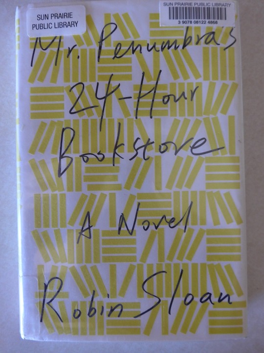
Book Recommendation: Mr. Penumbra’s 24-Hour Book Store, by Robin Sloan
Unemployed web designer, Clay Jannon, takes a night job at Mr. Penumbra’s 24-Hour Bookstore, an exceptionally vertical establishment in San Francisco. He quickly discovers that the store’s patrons are much more interested in what can be borrowed from its cryptic circulating collection, which Clay dubs the “Wayback List” than what is for sale. After many long nights alone at work with his laptop, Clay starts charting the selections of the store’s odd clientele, and inadvertently discovers that his employer is mentoring the local chapter of a secret society dedicated to discovering the secret of eternal life which they believe is encoded in the fictional autobiography of the fifteenth-century Venetian printer Aldus Manutius, which the society has worked for centuries to decrypt. (The real-life Aldus Manutius is introduced in Eskilson, 2012, p. 17.) Clay is a good detective but is even better at applying the talents and attributes of his diverse collection of friends to finally solve the mystery, and the story becomes a Dungeons and Dragon’s style quest with an ensemble cast--wizard and warrior, mage and thief.
The tale ultimately turns on the long-ago actions of the fictional Griffo Gerittszoon, apprentice and true friend of Manutius and producer of a fictional and eponymous typeface that perhaps rivals the dreaded Arial in its ubiquity (Eskilson, 2012 p. 415). The expository discursions around the particulars of metal type founding and production are both fun facts and pivotal plat points as the story is told. True to literary tradition, Mr Penumbra’s 24-Hour Bookstore calls on the reader to consider some weighty subjects: tradition versus innovation, the virtues of mortality, the nature of friendship. Like Eskilson’s Graphic Design: A New History, Second Edition, Mr Penumbra’s was published in 2012 and some elements that were trending at the time of publication have lost their freshness, for example a cohort of literary mercenaries who risk copyright prosecution in their effort to digitize all known printed matter, but overall it’s a pleasant journey for anyone who enjoys, books, mysteries or typography. The single biggest disappointment comes on the final page where there is no colophon for “About the Type”. The omission is almost unforgivable.
Interested readers can find more at:
https://readingmapofpenumbras24hourbookstore.wordpress.com/
https://us.macmillan.com/books/9781250037756
Resources:
Sloan, R. (2016). Mr. Penumbra's 24-hour bookstore.
Eskilson, S. J. (2012). Graphic design : a new history. New Haven: Yale University Press.
0 notes
Text
Week 14 - Student’s Choice
Ghost Signs and Augmented Reality
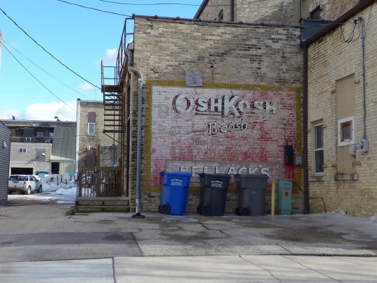
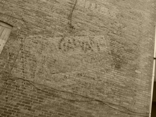
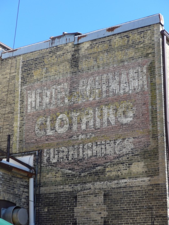
In an earlier journal post, I included a photo of an old advertising sign painted on a building in Watertown, WI. I have since learned that these paintings are widely known as Ghost Signs and I’m not the only one who pays attention to them. The Watertown Chamber of Commerce created a walking tour that features both its Ghost Signs and its contemporary murals. The Brochure’s author W.F. Janke III explains that it was very common practice to advertise on the sides of buildings in the late 18oos and early 1900s up until about the 1940s when the existence of highways made advertising on roadside billboards an attractive new option. Where the painted signs were largely permanent, billboards could be changed and updated frequently, and they gradually became the dominant technology (Janke III, n.d.).
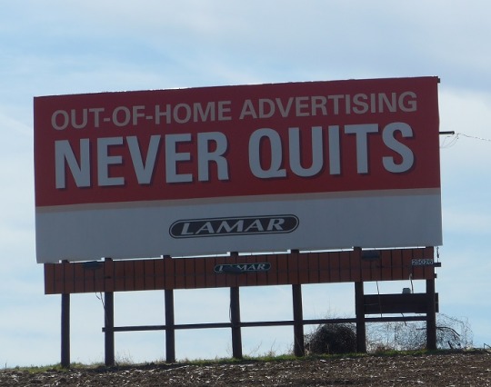
The goal of advertising has always been to capture and monetize consumer attention in the forms of product awareness, purchasing and brand loyalty. Whatever is novel, whatever is anachronistic, whatever is shocking will meet the purpose. As adoption of the automobile grew in the early 20th century, so did the opportunity to attract the attention of a passing motorist who might require food, fuel or lodging. Motels and restaurants clamored for the exposure and billboards have occluded the landscape ever since (Mixedmediaoutdoor.com, 2017). But advertising is design and design is a discipline of cycles. A movement of expressionism like Art Nouveau is inevitable followed by a movement of structurer and restraint ala the Bauhaus tradition. So, in the modern billboard, we should see both the specter of the past and the harbinger of the future. Nineteenth century building advertisements featured text and graphics, tag lines and slogans. These transitioned without much change to the emerging billboard technology. Now the billboard has come into the digital age sometimes featuring computer-generated images or even custom images triggered by sensors that “observe” passersby and tailor their displays (Landmark Dividend, n,d,).
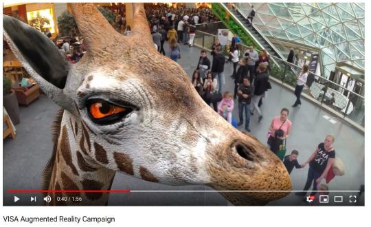
But what of the humble ghost signs? If they did not still occupy prime consumer eyeball space, I wouldn’t have seen them in the first place. I pass them shopping and commuting daily and weekly. An observant advertiser might buy or lease the space and erect a traditional billboard, but I predict the better solution lies in Augmented Reality technology. With Augmented Reality, a user need only look through a smart device at a given target to see an alternative universe. It could be a static message; it could be a video. The possibilities are beyond remarkable as the Polish “Augmented Reality Campaign” staged in 2015 for VISA has shown (Lemon&Orange, 2015).
An obvious limitation right now is the need to view through a phone or smart device, which is not especially compatible with movement o motoring, in particular, but I believe the future will see a revival of Google Glass or one of the many products inspired by its doomed futuristic vision. In time I see the growing wearables market encompassing these new optical devices (Kleinman, 2018). This should lead to an explosion in Augmented Reality experiences from historical site tours to heads-up advertising.
Coming soon to buildings (and silos) near you!

Resources:
Eskilson, S. J. (2012). Graphic design : a new history. New Haven: Yale University Press.
Janke III, W. (n.d.). Walking & Driving Tours | Discover Historic Watertown, WI. [online] Watertownchamber.com. Available at: https://www.watertownchamber.com/uploads/TourMuralsBrochure_MuralsBrochure.pdf [Accessed 23 Apr. 2019].
Kleinman, J. (2018). Augmented Reality Glasses: What you can buy now (or soon). [online] Augmented Reality Glasses: What you can buy now (or soon). Available at: https://www.tomsguide.com/us/best-ar-glasses,review-2804.html [Accessed 23 Apr. 2019].
Landmark Dividend. (n.d.). How Digital Billboards are Changing the Face of Outdoor Advertising. [online] Available at: https://www.landmarkdividend.com/how-digital-billboards-are-changing-the-face-of-outdoor-advertising/ [Accessed 23 Apr. 2019].
Lemon&Orange (2015). Visa Augmented Reality Campaign. [video] Available at: https://www.youtube.com/watch?v=HqMVZm0klW0 [Accessed 23 Apr. 2019].
Mixedmediaoutdoor.com. (2017). The History of Billboard Advertising | Mixed Media Billboards. [online] Available at: https://www.mixedmediaoutdoor.com/the-history-of-billboard-advertising [Accessed 23 Apr. 2019].
More information on Augmented Reality Advertising at:
https://rubygarage.org/blog/augmented-reality-in-advertising
0 notes
Text
Week 13 - New Media
The Digital Aesthetic
Eskilson (2012, p. 391) introduces the Digital Aesthetic as a “technology informed style” that imagines a world of smooth forms and unbroken surfaces. He traces its beginnings to the work of Wolfgang Weingart and April Greiman in the 1980s, though, based on the examples of their work on pages 346-349, one concludes that the inspirations were more idealistic than representational. Weingart’s work bears strong imprints of the Swiss style though Eskilson credits him with an openness to pushing its limits (p. 346). April Greiman’s work appears to me more related to Constructivism and even Dadaism, but we are told that she experimented with a synthesis of digital and hand-drawn elements as far back as the mid-1970s with an intent to elevate and celebrate the technical, computer-generated elements in the same way that the Machine Aesthetic of the 1920s sought to show appreciation of industrialized production. While I don’t see a lot of the smooth, polished machine shapes that characterized what Eskilson (2012, p. 161) describes as “machine idealism” in Greiman’s work, I can credit her with re-popularizing the concept. There is a clear progression from the Purist ideal of beautiful, mass-produced goods and Platonic mechanical forms after World War I and the Digital Aesthetic inspired by science fiction video games and technology that imagines a eutopia made possible by a parallel existence in an idealized virtual environment known as cyberspace. (I have to differ here with Eskilson’s (2012, p. 391) characterization of William Gibson as a technological utopianist. Gibson does conceptualize “cyberspace” for the first time as a “place” where different norms and expectations might govern human interactions, but it is not what most people would describe as utopian. I recall a bleak inner-city vibe that is more a testament to human adaptability than to futuristic perfection.)
So, if the Digital Aesthetic can still be seen as a manifestation of contemporary design, I should be able to find plentiful examples of reductive-yet-stylish, colorful-yet-texture-less images reminiscent of early video games “in which varying surfaces have the same indistinguishable, flat, featureless quality (Eskilson, 2012, p.392) and possibly celebrating the potential of technology. But.an informal survey of contemporary graphics on recent book and magazine covers casts some shade on the primacy of digital optimism. Among the new fiction books on display at my local library I could find none with cover art that employed the particular combination of elements one would associate with the Digital Aesthetic. (I excluded the new Science Fiction from my survey, since the Digital Aesthetic has long been obligatory in this genre.) I did have more success finding examples on posters and the covers of magazines, including a striking poster for the Nelson Institute Earth Day Conference that transforms an imagined aerial view of a solar farm into an modern impressionist rendering of an integrated circuit and the cover of Muse (April, 2019) which imitates a close-up of a $100 bill zoomed in so far that the image has fragmented into elemental squares like the pixel art of Eboy (Eskilson, 2012 p. 394). Perhaps the Digital Aesthetic, like New Media can best be understood as a constantly evolving ideal. Inevitably, a design movement that became dominant in the 1990s will give way to something newer and more urgent, only to be later revived as historicist or nostalgic, and what replaces it will draw on what is now just visible on the horizon, augmented reality, perhaps or some conceptualization of the Internet of Things. By the time it can be seen, something else will be poised to take its place.
Eskilson, S. J. (2012). Graphic design: a new history. New Haven: Yale University Press.
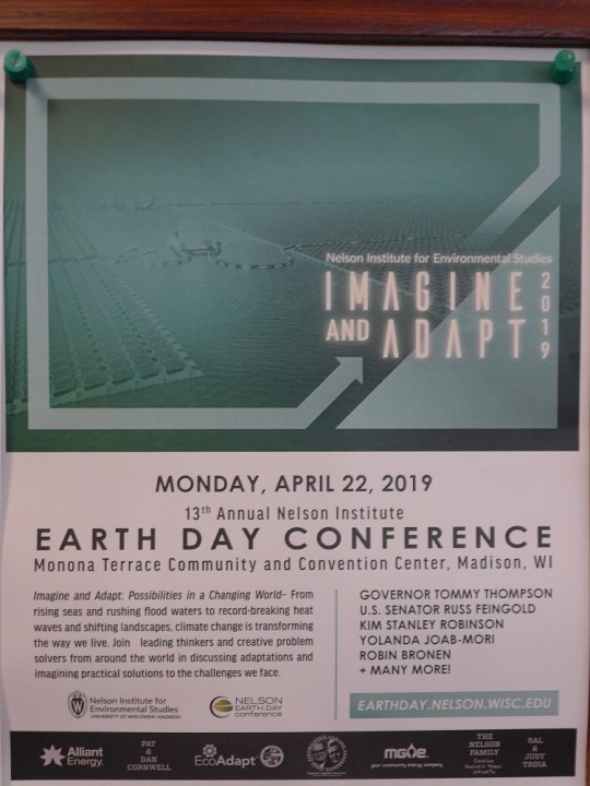
13th Annual Nelson Institute Earth Day Conference, Monona Terrace Community and Convention Center, Madison, WI
This speaks to me as contemporary Digital Aesthetic
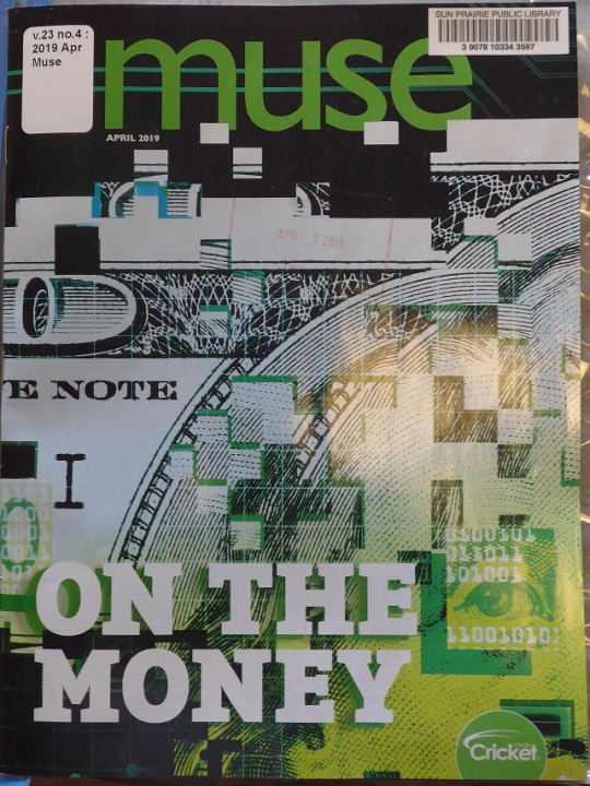
(2019, April). Muse, Volume 23, No. 4.
A modern take on Pixel Art.
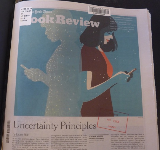
(2019, April 7). New York Times Book Review, Vol. 124, No.14.
Flat, texture-less planes of color, celebration of technology.

(2019, April 15). IBD Weekly, Vol. 36, No.1.
Bold colors, texture-less surfaces, a focus on technology, if not a celebration.
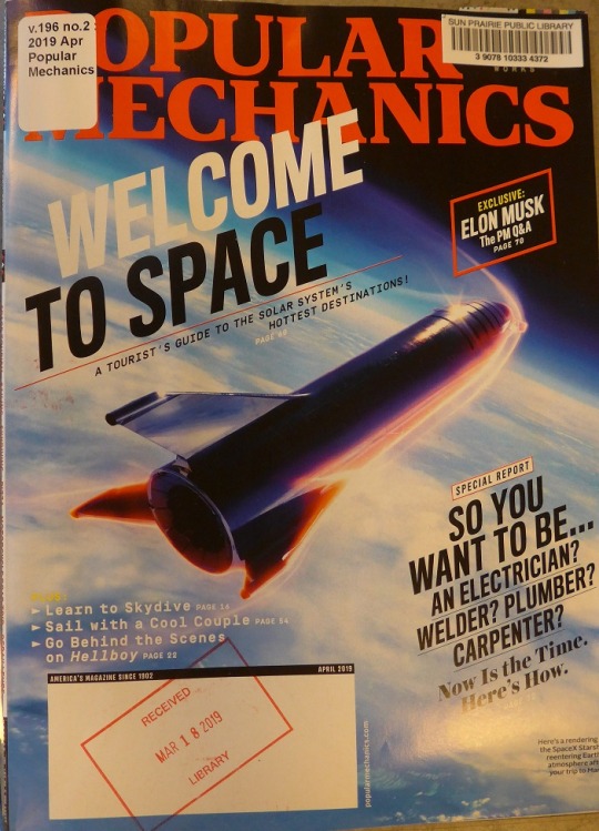
(2019, April). Popular Mechanics, Vol. 196, No. 2.
I like the way this cover blends elements of the Digital Aesthetic like kineticism and a celebration of technology with a style more reminiscent of 1950′s pulp science fiction. It is a microcosm of design style cycle. What is new will be old, and then it will be new.
0 notes
Text
Week 12 Supplemental - Colophonic Spree
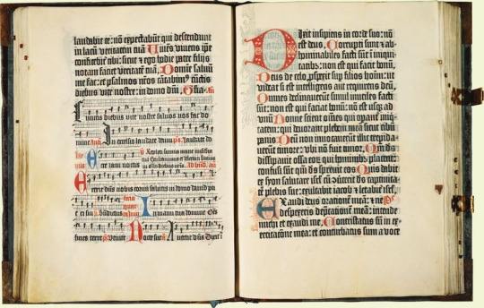
Image credit: https://www.rct.uk/collection/1071478/the-mainz-psalter
Pictured above is the Mainz Psalter, the first text to combine movable type with woodcut images and the first to include a colophon describing the typeface.
If there were a name for the people who stay in their theater seats until the end of the closing credits, then there might also be nomenclature for people who read to the very last page of a book, including the index, the endnotes and sometimes a colophon “About the Type”. When there were names for those people, I will know what to call myself. I have always looked for the colophon, and sometimes try to guess the typeface before I read “About the Type”. Until this week, I was under the mistaken impression that most, if not all, fiction books had a colophon on their final page describing the typeface. Since I am fortunate to work at a library, I was searching through our collection for a variety of colophons and discovered that they are not as common as I imagined. Encyclopedia Britanica.com describes The Mainz Psalter published in 1457 as the first printed work to feature a colophon. The Psalter was also important as the first work to combine movable printed type with woodcuts Eskilson (2007 p. 15).
The colophon text reads
The present copy of the Psalms, adorned with beauty of capital letters and sufficiently picked out with rubrics, has thus been fashioned by an ingenious method of printing and stamping without any driving of the pen, and to the worship of God has been diligently completed by Johannes Fust, citizen of Mainz, and Peter Schoeffer of Gernsheym, in the year of the Lord 1457 on the Vigil of the Assumption (The Editors of Encyclopedia Britannica, n.d.)
To those who question the sense of reading colophons, I can offer no better explanation than this one offered on the idea exchange.com: “It takes care to choose something that enhances the reading experience and doesn’t distract the reader. The wrong font could be disastrous. Could you imagine reading a Pulitzer Prize winner set in Comic Sans?” ("About the Type" | Reading + Entertainment | Idea Exchange. (2016). And Julie Harrison makes similarly convincing arguments for staying put in the cinema until the final credits scroll off. The first is to acknowledge the time and effort exerted by the hundreds of people who names won’t appear on publicity posters and the second is that “staying put allows the audience time to digest the film and let it settle, the same way a devoted reader might sit for a few minutes contemplating a book they’ve just finished.” (Harrison, J. 2017).
"About the Type" | Reading + Entertainment | Idea Exchange. (2016). Retrieved from https://ideaexchange.org/reading/idea/about-about-type
Eskilson, S. (2007). Graphic design: A new history. New Haven: Yale University Press.
Harrisson, J. (2017). Should cinema audiences stay put for the credits?. Retrieved from https://www.denofgeek.com/uk/movies/movie-credits/53941/should-cinema-audiences-stay-put-for-the-credits
Mainz : Johann Fust & Peter Schoeffer - The Mainz Psalter. (2002). Retrieved from https://www.rct.uk/collection/1071478/the-mainz-psalter
The Editors of Encyclopaedia Britannica. Colophon | visual arts. Retrieved from https://www.britannica.com/art/colophon-visual-arts
From Bridge of Sighs by Richard Russo ISBN: 9780375414954
From Daily Rituals by Mason Currey ISBN: 9780307273604
From Anatomy of a Soldier by Harry Parker ISBN: 9781101946633
From The Children Act by Ian McEwan ISBN: 9780385539708
0 notes
Text
Week 12 - New Media
The first iteration of the World Wide Web (Web 1.0) was a collection of static websites connected by hyperlinks and accessed via terms and questions entered in search engines. Using this web was like window shopping at a strip mall after hours. You could take up the information made available through the windows and make comparisons, but little was required from you aside from your presence. Your attention, while not unappreciated was not a commodity in the same way that your purchasing power was. Web 2.0 is a different beast. Characterized by motion, interactivity and User Generated Content, World Wide Web V.2 is an attention seeking creature. Interactive design is a growth industry rooted in the possibilities and requirements of Web 2.0. Interactive designers must draw from and contribute to conventions of video game design, advertising and ecommerce, among many others.
Game theory has been used in diverse settings from the schoolroom to the corporate office. Incentives like badges (rewards), levels of advancement and engaging storylines have become ubiquitous to the degree that the influence of game design is sometimes overlooked. Rutherford (2015) argues that interactive designers need to incorporate not just rewards but also cues, routines and investments. Cues are visual information that prompt users to perform and action; routines are repetitive action cycles that users can infer from the cues, and investments are way that a player might strengthen a character and become more invested in the game plot. The interactive designer might translate investment into “preferred” status of return-customer discounts. Eskilson (2007, p. 385) describes how pop culture references drawn from comics, anime and video games that were once thought too specialized for mass appeal have recently been absorbed into static and interactive design. In the battle for users attention, video game design and theory bring weapons like engrossment and even addiction as Tim Wu explains, video games present a seductive world in which players can be totally absorbed, where they can’t think of anything else (p. 193).
Another strong, yet under-recognized influence on interactive design is e-commerce. In 1991 there were four companies trying to lure Americans onto the Internet. One of them, Prodigy, created a graphical user interface and leverage its founding company, Sears into a computer-based shopping network. Limitations of online graphical display limited the success of this early effort, but the seed was planted, and in 1995 Amazon was launched (Wu, 2017). The conventions and virtual artifacts of e-commerce have greatly influenced interactive design. The list and shopping cart models have transcended e-commerce and come to be the model offered by online library catalogs and university course selectors. Many online tax preparation sites also emulate the shopping experience as they guide users through the assembly of required forms. In case the online shopping failed to catch on, Prodigy had another idea for monetizing public attention—online advertising.
No one who uses the internet can fail to notice the pervasive adverting on every type of website from search engines like Yahoo to news outlets like the Washington Post. Back in 1991 Prodigy “saw itself reselling the attention directed to computer screens” (Wu, 2017). Company executives envisioned a new advertising medium that would assemble markets for audiences the way TV programs used to and imagined they could sell advertising on every screen. By the end of the 1990s a new search engine company called Google would succeed in ways the founders of Prodigy never considered. Search was at that time eclipsing the Yahoo-style curated subject hierarchy and, thanks to that popularity, Google had massive attention available to convert to cash, and the audience were a select group that actually wanted something, “intentional traffic” in advertising jargon. Google’s real genius was even greater, buy stressing relevance, it has convinced a generation of information seekers that it does them a favor by serving up ads for stuff they might actually care about (Wu, 2017 p. 259). The ubiquity of advertising today essentially steers the ship of interactive design. Advertising has shaped what we expect to see on a page and how we scan for information. The modern web designer must look through a lens that enlarges opportunities to monetize attentions while at the same time exploiting opportunities to encourage consumers to actively promote commercial messages simply because they find the content funny or otherwise engaging as in the case of a banner generator created to promote the 2005 film Snakes on a Plane. This effort encouraged film fans to create their own advertisement for the movie and integrate it into their own website (Eskilson, 2007 p. 400).
Resources:
Eskilson, S. (2007). Graphic design: A new history. New Haven: Yale University Press.
Rutherford, Z. (2015). How video games improve your interaction design. Retrieved from https://thenextweb.com/dd/2015/10/07/how-video-games-improve-your-interaction-design/
Wu, T. (2017). Attention Merchants. Atlantic Books.
Also referenced:
Graham, L. (1999). The principles of interactive design. Albany, NY: Delmar Publishers.
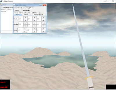
This image is from a game called Onward Dream that Adric Holmes is developing. Game design influences the interactive design of most modern online applications.
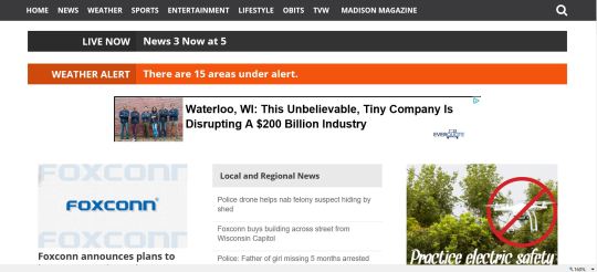
This local news website has two advertisement blocks within a user’s first screen view. The pressure to monetize a site user’s attention has influenced content providers at every level.
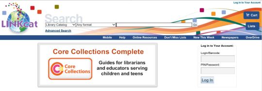
E-commerce staples like lists and shopping carts have shaped the way we search for information, register for classes and events and even file our taxes.
0 notes
Text
Week 11 – Graphic Design
The Citizen Designer is defined in Eskilson (2007, p. 425) as “a [design] professional who attempts to address societal issues either through or in addition to his or her commercial work.”
At the end of chapter 10, Eskilson (2007 p. 431) concludes that the quest for meaning in graphic design is partly a product of it’s “rich artistic side” arguing that accountants and engineers, for example, are less inclined to look for meaning in their work than the creatives who choose to work in design. I think this view sells accountants and engineers a little short, since there are surely social and moral considerations to those professions. He supports his observation by reviewing the historical beginnings of the profession wherein activists like William Morris believed the decorative arts were imbued with the ability to not only beautify the urban world but to transform modern society in a way that benefited people’s lives in all respects (p. 50). My first reaction to the concept of the Citizen Designer is that it is very much a First World Phenomenon. Pressing concerns like income adequacy and stability as well as personal agency in one’s work environment would need to be satisfied before any designer, emerging or established, could prioritize their convictions about sustainability or ethical frameworks over the need to find a job or keep a job. It is not reasonable to expect any designer to pass up needed employment just because there could be moral ambiguity in the employer’s or client’s mission or practices. After all, someone is going to come along and accept that job.
Citizen Designers would seem to be making a case for rights of conscience in the field of graphic design. Robert Orr (2013) notes “in the 1960s and ’70s, a societal consensus supporting individual autonomy emerged in Western culture—individual rights, women’s rights, minority rights, consumers’ rights, and patients’ rights”. As a library professional I have some mixed feeling about rights of conscience, since patron privacy demands that library staff honor any and all requests for information regardless of our personal feeling on the subject matter. For me personally, it is a point of pride to provide equally prompt and accurate information and to discharge any and all materials to all library patrons regardless of my own convictions. No one should feel judged for their desire to know something. I can better serve my conscience by teaching and demonstrating information literacy—how to evaluate a source for bias or trustworthiness or how to recognize manipulation techniques.
That is not to say that I agree with what Paul Rand (Eskilson, 2012 p. 369) expressed in 1990 as it became clear that detached post-modernism was giving way to social awareness in the discipline of graphic design. Rand felt it was wrong to make the classroom a forum for social issues when the curriculum called for design basics, but by 1990 students expected and sometimes demanded that instructors expose and interrogate the social and cultural extensions of virtually every subject. That was and remains exactly what they are paying for. Aesthetics may not be sociology, but norms change, and standards evolve to reshape the context in which designers communicate. Awareness is essential, but activism should not be compulsory.
Despite the momentum that currently drives the Citizen Designer movement, we should remember that all past design frameworks have had both intended and unintended outcomes. Morris was, after all, a historicist who used revived styles of the past which allowed him to sidestep contemporary design problems and a divide existed between his published beliefs and his actual design work. He produced mainly, hand-crafted items that only the very affluent could afford, entirely bypassing his intended beneficiaries (Eskilson, 2007 p. 51). The well-intentioned art a la rue, the French poster art of the Art Nouveau period that was supposed to uplift the aesthetic and moral taste of ordinary people is now regarded as both patronizing and unrealistic in its aspirations (p. 68). While designers and ultimately everyone must be free to honor the dictates of their conscience before those of civil authority, we should also ask ourselves how far the pendulum should be allowed to swing in that direction and whether the leaders of modern design disciplines are imposing unnecessary pressure on practitioners to follow the current socio-cultural currents. Inevitably, the pendulum will reverse and move back toward detachment and sociopolitical neutrality and no one should sacrifice opportunities or livelihoods before an equilibrium is reached.
Eskilson, S. (2007). Graphic design: A new history. New Haven: Yale University Press.
Orr, R. (2013). Autonomy, Conscience, and Professional Obligation. Retrieved from https://journalofethics.ama-assn.org/article/autonomy-conscience-and-professional-obligation/2013-03
The pendulum swings; the cycle continues.
0 notes
Photo
Week 10 - Graphic Design Photo Credits: Jan Holmes
This week I have an example of graphic design created by someone with limited graphic design skills. The wide availability of desktop publishing tools has made it easy for anyone to create flyers and posters, but that does not guarantee a readable outcome that conveys information efficiently. I can appreciate the way these compositions can expand entrenched conceptions of “good” design, yet I find myself wishing for some oversight and guidance.
I also discovered a colophon with a lovely remembrance of Jan Tschichold, who was able to revise his absolutist ideas about typography when he came to see how rigidity of thought can divide and diminish even while it directs.
0 notes
Text
Week 10 - Graphic Design
Week 10 – Graphic Design
Amateur Hour and the Perils of Absolutism
The reading for week 10 has required a lot of mental processing, but a few themes emerged for me. One is the cycle wherein an emerging technology is initially restrictive due to its expense or a scarcity of necessary components or skills but then becomes gradually more accessible until there are few barriers or gatekeepers. Everyone and anyone is free to try their hand regardless of knowledge or skill. Eskilson (2007) describes this phenomenon as early as page 26 when he writes of the proliferation of printing during the Victorian era as “unskilled jobbing printers polluting the urban landscape with tasteless playbills, posters and other printed ephemera.” Yet, at the same time, the energy and experimentation that can come from contributors unrestrained by traditions and rules should also be recognized and appreciated. The cycle repeats as told in the story of Rudy VanderLans (p 359). VanderLans was trained as a graphic designer in the International Style in the Netherlands and came to work at the San Francisco Chronical in 1981. There he was appalled to discover that the editors lacked either knowledge of or regard for basic design principals, the considerations about “legibility and good and bad type were swept aside.” VanderLans could have dug in and insisted on reform, but instead he came to recognize and appreciate what Eskilson calls the “vernacular culture” of his new surroundings. He began to advocate for an expanded conception of graphic design that allowed for the intuitive expressions of the designer and rejecting the “artist as engineer” foundations of International Style.
VanderLans’ evolution of ideology reminded me of Jan Tschichold introduced on page 233 as a calligrapher and typographer who became engaged with the New Typography movement after attending an exhibition at the Bauhaus in 1923. Tschichold was instrumental in outlining the theory and practice of progressive typography, literally writing the book on the subject in 1928 when he published Die neue Typographie a handbook for designers that codified his own principles including asymmetry, engineering over artistry and the superiority of sans serif text. At the time of this publication, Tschichold was an absolutist, countenancing no compromise or experimentation, asserting that axial symmetry was not just undesirable, but “dishonest” and photos could only be complemented by sans serif type. There was also an underlying commitment to socialist ideals woven into the new typography movement, though it is unclear how fervently Tschichold supported them. (Eskilson, 2007, p. 237).
Like VanderLans, Tschichold eventually relaxed his fervid ideological views. The text is not specific about his reasons but tells us it occurred around 1933 following his arrest and subsequent escape from Germany, then firmly in the control of the Nazi party. One is left to imagine how that experience might have reshaped his worldview, but as early as 1935 he wrote that asymmetry might not be the only acceptable design structure, and by 1946 he was repudiating his own New Typography principals. What struck me was his suggestion that the absolutist terms of the New Typography were not unlike the dictates of the Nazis (Eskilson, 2007 p. 288). This, to me, is unquestionably true and a cycle we seem doomed to repeat culturally, politically and artistically. Arthur M. Schlessinger Jr. and Arthur M. Schlessinger Sr. have advanced a “Cyclical Theory” model of political movements that identifies phases through which society vacillates between liberal and conservative values (Brown, 1992) which equally elucidates the rise and fall the various design movements with social reformist goals from Art Nouveau to New Typography. The new movement rises in response to what has come before, and adherents are often uncompromising in their both their devotion and their definitions of what is acceptable within the new framework. Those not immediately marginalized are likely to become dissatisfied as time passes. We are left to conclude that resistance to the introduction of new design ideas and the relaxing of the standards we once defined and defended is quite simply futile. We would be better served to follow the example of Rudy VanderLans who so quickly understood the value of the vernacular.
Resources:
Brown, Jerald (June 1992), The Wave Theory Of American Social Movements
Eskilson, S. (2007). Graphic design: A new history. New Haven: Yale University Press.
0 notes
Photo

Week 9 - Industrial Design Photo Credits: Jan Holmes
In Week 9 we considered the legacy of Milwaukee designer Brooks Stevens. He received some notoriety in 1954 when he told a group of advertisers that designers should motivate consumers to exhibit planned obsolescence, or a desire to replace their perfectly good possessions with new and better objects. Like many designers, Stevens believed that looking forward meant never looking backward. He never considered the influence of nostalgia on consumption.
0 notes
Text
Week 9 - Industrial Design
By many accounts, Brooks Stevens was a design thinker from an early age and a natural salesman. He was also skilled at leveraging his advantages, the earliest of which was his parentage. Brooks’ father William, himself a design thinker, had patented the preselective gearshift for automobiles in 1916 and served as executive vice president and director of design and development for the Cutler-Hammer Company, a large manufacturer of electrical motor controls, in Milwaukee. When young Brooks was stricken with polio, his father incentivized his recovery with promises of a Model T Ford. In 1929, as the United States endured the financial collapse that heralded the Great Depression, Brooks Stevens entered prestigious Cornell University. When he left Cornell in 1933 without a diploma, he found design work at his father’s company and redesigned the company logo. While other fortunate young men might have been content to simply consume their privilege, Brooks Stevens was able to translate these early successes into enough credibility to establish his own design firm in 1935.
When Stevens decided to pursue industrial design as a career, his role models, Raymond Loewy and Walter Dorwin Teague worked form offices in New York City. Stevens chose to stay in Milwaukee “where the business was”[1]. The observation was astute in several ways--Milwaukee was an industrial city with many businesses and industries looking for competitive advantages in marketing and product design. At the same time there were larger efforts underway to establish the maturity and legitimacy of midwestern cities starting as early as 1893 Worlds Columbian Exposition in Chicago. Stevens earliest design successes fueled a self-fulfilling prophecy since he was able to exploit what opportunities existed along with the scarcity of his skillset. Because he was effective at persuading businesses that industrial design was the advantage they needed to remain viable through the Depression, he was able to conduct business until the economy improved after WWII. Globalism eventually came to characterize modern design firms, but Stevens’ early intuition to stay in Milwaukee likely bolstered his success landing midwestern clients like Evinrude, Lawn Boy, Studebaker, and Harley Davidson.
If Stevens became successful because he worked from Milwaukee, Milwaukee became important to the field of Industrial Design because Brooks Stevens was successful. He crafted a narrative that good design would pay for itself in market appeal and his classes and lectures became the basis for modern Industrial design theory. He was then able to network with New York designers like Loewy and others to form the Industrial Designers Society of America (IDSA), further solidifying Milwaukee’s importance to Industrial Design and reinforcing the credibility of his own business.
Brooks Stevens became controversial in 1954 when he used the term “planned obsolescence” in a speech to an advertising club, saying that it is the Industrial Designer’s mission to instill consumer desire “to own something a little newer, a little better, a little sooner than is necessary[2]”. While more benign than the modern connotation of products designed to fail prematurely, his endorsement of the term has cast some shade on his legacy. For all his visionary talent, it is also clear that Brooks Stevens did not appreciate or predict the power of nostalgia or retro design. At the end of his career, he claimed that everything he ever designed was outmoded and would have to be redesigned for modern tastes, but his streamlined Art Deco and futuristic designs pulsate with nostalgic significance. Had he been able to cast his imagination just a little farther forward he would have recognized how the best design, some of his own design is missed when its popularity wanes, and what was old will be new again some day. One need only examine his archive, from the early electrical switches to the revered Studebaker Gran Turismo Hawk, to see that he was planting seeds for the future in his “modern” design.
[1] Milwaukee Art Museum, "Brooks Stevens Biography," Milwaukee Art Museum, 3, accessed March 22, 2019, https://mam.org/collection/archives/brooks/bio.php.
2 Milwaukee Art Museum, "Brooks Stevens Biography," Milwaukee Art Museum, 1, accessed March 22, 2019, https://mam.org/collection/archives/brooks/bio.php.
Bibliography
Museum, Milwaukee Art. "Brooks Stevens Biography." Milwaukee Art Museum. Accessed March 22, 2019. https://mam.org/collection/archives/brooks/bio.php.
Other Resources:
https://brooksstevens.com/our-history
https://www.idsa.org/content/brooks-stevens-fidsa
https://bsiproductdevelopment.com/
https://en.wikipedia.org/wiki/Brooks_Stevens
http://archive.mam.org/brooks-stevens/search.php?type=highlights
https://www.designdirectory.com/brooksstevens
https://www.excaliburclassics.com/bio.html
https://www.britannica.com/biography/Brooks-Stevens
https://www.autoclassics.com/posts/reviews/brooks-stevens-car-excalibur-hero
https://www.gsc-3d.com/articles/2017/06/design-inspiration-brook-stevens
https://www.wisconsinhistory.org/Records/Article/CS553
0 notes
Photo


Week 8 - Industrial Design
A sign lettered in Fraktur was the discovery that inspired my design observations in week 8. It caused me to think about the ways that design reflects the assimilation of immigrant groups.
0 notes
Text
Week 8 - Industrial Design
German Immigrants and Degrees of Assimilation
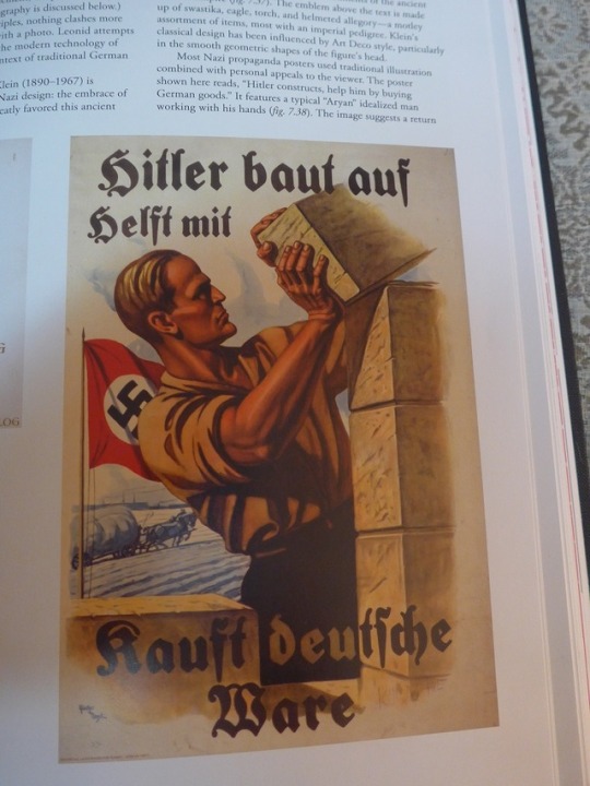
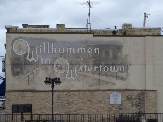
I was browsing a Watertown, WI antique shop with my daughter. The first floor was crowded with displays and shoppers, so we fled upstairs. The second story was devoted to used books and records, but was also uncrowded and quiet, so we looked around. I was startled to notice words in German painted on one of the brick walls. Not graffiti, but a sign. The name Clara Weiss was clearly rendered in slightly feminized block letters with gently trailing serifs on the left side of each capital a. Beneath the name was a German word I couldn’t quite make out, even though I speak some German. The problem was that the script was true Fraktur, or broken script. I recognized it from the descriptions and examples of Blackletter in our text book (Eskilson, 2012, p. 126, but that didn’t help me decipher it. What struck me was that this was an authentic German sign, intended to be read by German speakers. In Wisconsin we often see what I think of “gentle” German script. It looks calligraphic and invokes a Europe of bygone days, yet it lacks the aggressive downstrokes, spikiness and ligatures that characterize Fraktur. On the opposite side of Main Street from Clara Weiss there is a mural celebrating the German heritage of the city that uses this alternative lettering to declare “Wilkommen in Watertown”. It struck me that the sign in the antique shop wall was sending a specific message to both the German patrons of the shop and to the non-German population. We are Germans here, and this shop is operated the German way. If you are not German, maybe it is not the right shop for you; we are not making accommodations. I took a photo of the sign and decoded it when I got home. The mystery word was Putzgeschaft or milliner. I searched online for more information and discovered that the Clara Weiss Millinery was operating in Watertown from about 1890, and the building was constructed for that concern[1].
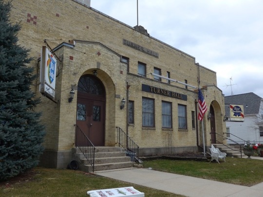
The German population in Watertown could afford to be exclusive, because they were so numerous[2]. They were resistant to the isolation and marginalizing that can happen to smaller populations of immigrants. The latter may be what fosters the type of assimilation practiced by immigrants like my grandfather William Behm. William was born in Germany in 1896 and came to the US as a teenager with his twin brother and a sister. He did not join a large, established German population, but lived a quiet rural life occupied by farming and trapping. By the time he was an adult, he had fully adopted English and was never heard to use German in daily activities. My Grandmother Mildred was also fully German, and the two could easily have conversed in German, but they didn’t. None of their ten Children learned the language and, aside from some family photos, there were no items from Germany in their home. They practiced a “full immersion” assimilation that completely exchanged their German identities for American, though there is some evidence that they may have quietly attended church services occasionally conducted in German. It is instructive in divisive times to reflect on these diverse patterns of assimilation. Where immigrants make up large majorities of a population, they are likely to congregate and nurture the speech and traditions of their homeland, and to work actively to preserve and share their culture. We established Americans need to stop seeing this as a threat and appreciate different ways. Germans in Watertown brought their traditions of early childhood education in the form of Kindergarten, and their love of singing and cultural performances, which, in time became Watertown Turnverein and later Turner Opera House which still stands[3].
As I looked for design observations in Week 8, I was strongly influenced by the German propaganda poster shown on Eskilson (2012) p. 269. The text, rendered in Fraktur, compels citizens to “kauft Deutsche Ware” or buy German goods, so I captured images of items and places from or related to Germany. I was surprised that I could not find anything marked “made in Germany”, even items that I purchased in that country. I couldn’t help but think of my grandfather shedding his German-ness as he became American. Besides the Eskilson text, my observations included:
--The wall sign for Clara Weiss, Putzgeschaft
--A sign advertising the site of the first Kindergarten in America
--Turner Hall in Watertown, WI, which began as the Watertown Turnverein, a German social and cultural organization
--“Wilkommen in Watertown”, a mural celebrating the city’s German heritage featuring the “gentle German” script that has come to stand in for authentic Fraktur.
--St. John’s Evangelical Lutheran Church
Hints that my grandparents may have occasionally reconnected with their German past at their Lutheran Church:
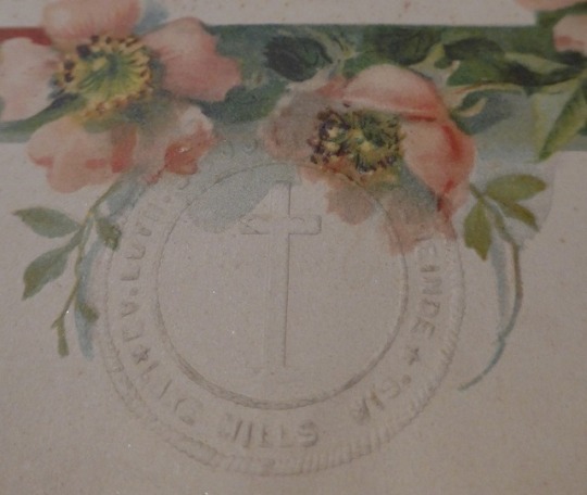
--The stamp that embosses my father’s baptismal certificate from St. John’s Evangelical Lutheran Church—it reads “Ev. Luth. St. Johannes Gemeinde (German for St. John’s Parish) Lake Mills Wis” suggesting it might have offered services in German.
--One of several monuments in St. John’s cemetery that bears a German inscription, another suggestion that assimilated German Americans might have briefly engaged with their native culture and language in that setting.
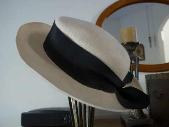
--A bespoke hat and a cuckoo clock from the Bavaria region of Germany. No labels or inscriptions mark them as German, though I know that is their origin. Like my grandparents they have become American. The hat came from a millinery shop much like the Clara Weiss shop must have been. It was called Der Hutmacher, another German term for milliner.
[1] Wisconsin Historical Society, Wisconsin Architecture and History Inventory, "Merchants National Bank; Clara Weiss Building", "Watertown", "Jefferson", "Wisconsin", "76220".
[2] Watertown Historical Society (2018). Settlement. [online] Watertownhistory.org. Available at: http://www.watertownhistory.org/Articles/Settlement.htm [Accessed 16 Mar. 2019].
[3] WHS Library-Archives Staff (2009). A Brief History of Watertown | Wisconsin Historical Society. [online] Wisconsin Historical Society. Available at: https://www.wisconsinhistory.org/Records/Article/CS2389 [Accessed 16 Mar. 2019].
0 notes
Photo
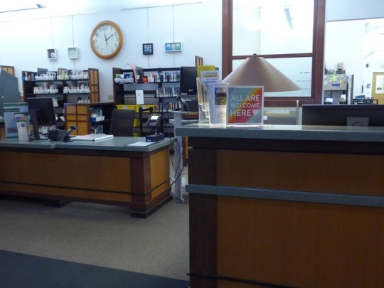


Week 7 Supplamental - Inclusive Design in Libraries Photo Credits: Jan Holmes
Libraries equate their value with their usability, so they are often at the forefront of inclusive design.
0 notes
Text
Week 7 Supplamental - Inclusive Design in Libraries
The value of a library and its collection is directly proportional to its usability. That is why libraries have always been at the forefront of universal usability and inclusive design. Library staff have an obligation to identify and remedy barriers to access ranging from physical access to the building to website usability. Many inclusive technologies are now ubiquitous due to the Americans with Disabilites Act, (https://www.ada.gov/) and libraries are not alone in maintaining wheel-chair accessible isles and walkways, chair-height service counters or automatic door openers. The American Library Association (ALA) has developed several “toolkits” or collections of advice and guidelines for libraries that address many facets of accessibility from serving patrons with service animals to accommodating volunteers with disabilities. One interesting common thread in the many toolkits is the importance of good lighting, which makes it an important yet under-considered element of Universal design along with good signage placed at an appropriate height.
http://www.ala.org/news/member-news/2018/02/understanding-accessibility-challenges-patrons
More recent efforts toward inclusivity include an awareness of gender-related barriers. Public attention in this arena is often focused around restrooms, but ALA also extends advice for programming and collection development that signal openness to the LGBTQ community.
http://www.ala.org/rt/sites/ala.org.rt/files/content/professionaltools/160309-glbtrt-open-to-all-toolkit-online.pdf
0 notes
Photo


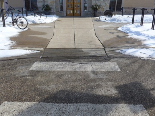
Week 7 - Architecture Photo Credits: Jan Holmes
0 notes
Text
Week 7 - Architecture
Two Principals of Universal Design
1. Equitable Use
1a. Provide the same means of use for all users: identical whenever possible; equivalent when not.
1b. Avoid segregating or stigmatizing any users.
1c. Make provisions for privacy, security, and safety equally available to all users.
1d. Make the design appealing to all users.
The best example of equitable use in my environment are the employee restrooms at my workplace. We have two identical unisex restrooms outfitted with a sink, toilet, and towel dispenser/wastebasket combination. All are wall-mounted above floor level, to eliminate trip hazards and allow roll-up by wheelchairs. Lighting is motion activated eliminating the need to manipulate a switch. Each restroom is large enough to accommodate a person using a wheelchair, and grab-bars are appropriately placed on the walls. Doors and sinks are operated with levers. The restrooms are equally inviting and useful to all ages and genders. Locking doors protect uses’ privacy. While progressive, the layout is not perfect. The mirrors above each sink are too high for a person of short stature or a wheel chair user. I wouldn’t lower the ones we have, but rather add a second one at a lower level. The doors are on the heavy side and might require more force to open than a person using a wheelchair could easily apply. Modern public restrooms often eliminate entry doors entirely and replace them with spaced, angled walls that prevent passersby from looking in.
3. Simple and Intuitive Use
3a. Eliminate unnecessary complexity.
3b. Be consistent with user expectations and intuition.
3c. Accommodate a wide range of literacy and language skills
3d. Arrange information consistent with importance
3e. Provide effective prompting and feedback during and after task completion.
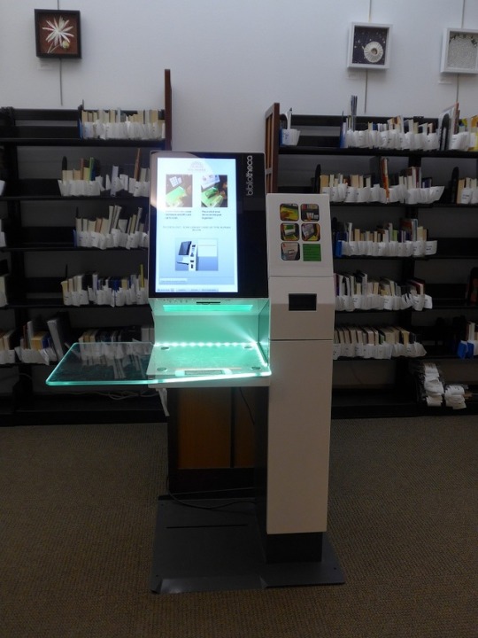
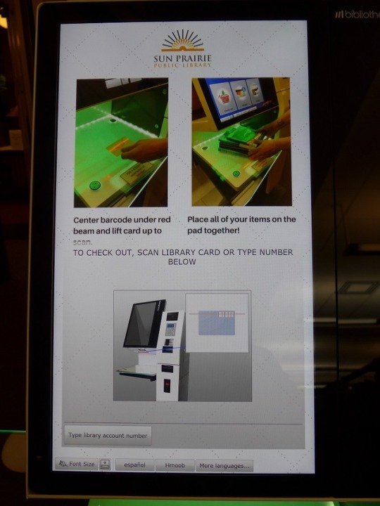
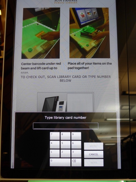
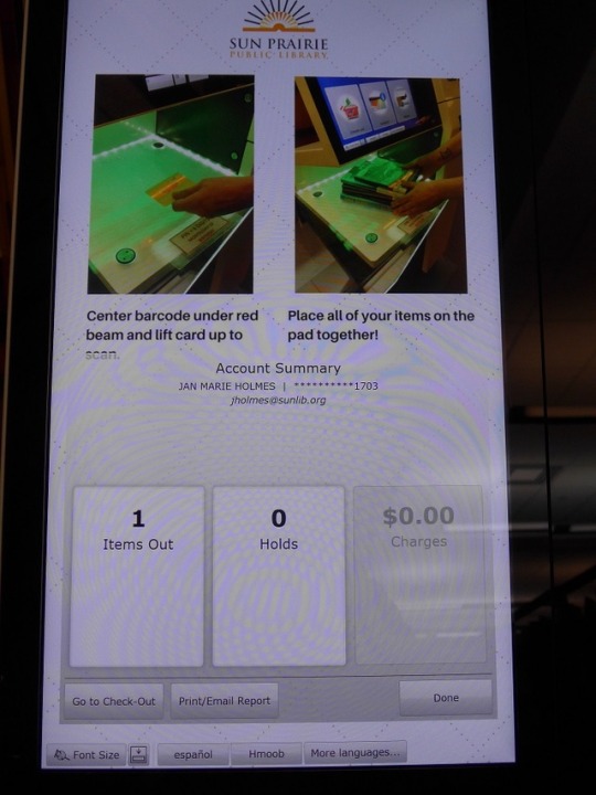
Self Checkout is a common feature at retail stores and increasingly at public libraries. Sun Prairie Public Library has four Self Checkout kiosks for our patron’s convenience. Designed by the library automation company Bibliotheca + 3M, the kiosks incorporate multiple principles of Universal Design including roll-up accessibility for wheelchair users, but they excel in the area of intuitive use. The kiosk display screen is generously sized to allow for large readable text and graphics. All actionable display features like response buttons or an on-screen keyboard appear at the bottom of the screen where they can be reached by children of wheelchair users. Instructional text is minimal while short video sequences convey most instructions. There is good session persistence once a user has accessed his/her account; they can switch between checking out materials and reviewing their account information without having to log in multiple times. The “Done” button, which ends a user session could be improved by triggering and “are you sure” response, but at least designers have made an effort to separate it from the other buttons on the screen to minimize accidental selection. The most impressive feature is the level of prompting and feedback a user receives. Both still images and a video display show a user how to initiate a session with their library card. Every user action is followed by a visual and an audio reaction. My one criticism is the lack of verbal audio instruction. The system has excellent visual cues and some audio feedback tones, but lacks it a complete instruction mechanism for the visually impaired.
0 notes