ally-moors
20 posts
Don't wanna be here? Send us removal request.
Photo

INIGO COMMUNICATIONS - CREATIVE DIRECTOR
I found my passion in college by way of Inigo Communications: Chicago’s first and only student-run AD/PR/Communications Agency, a Loyola University Chicago exclusive program. I began my time at Inigo in 2019 as a Creative Coordinator, moving onto the role of the agency’s Creative Director the following semester. Inigo is not just an experiential learning course, it’s a full-service agency with real, contracted clients. Our work reaches all aspects of the industry, from direct marketing to branding to strategic analysis to social media campaigns, and much more. Our motto: Be Brave, Be Bold, Be Blunt. And most importantly: go forth and set the world on fire.
To see more, visit inigocomm.com
0 notes
Photo


COLD CASE
According to the FBI, 302,218 women were reported missing in the year 2018. In Cold Case , I explore the story of missing woman #4,912, who seems to disappear and reappear at will. Through a series of photos, I ask questions such as “Where has she gone? Who has she become? Who was she to begin with? Why does she want to be missing?” With enough ambiguity to make a detective’s head spin, it is my intention that the viewer constructs their own hypothesis. This project was inspired by Cindy Sherman’s famous Untitled Film Stills, in which an air of mystery is always surrounding Cindy’s many female characters. It also looks to stories such as the film Gone Girl for inspiration, seeking to tell a story people feel as though they’ve heard all the time—someone is missing—with a twist of focus on the person you’d least expect to be around for the narrative—the missing person... who wants to be missing.
0 notes
Photo

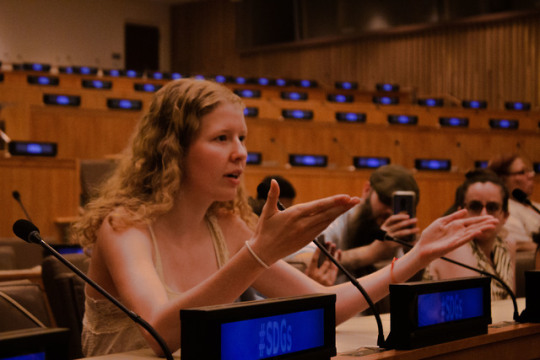
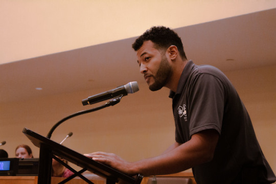

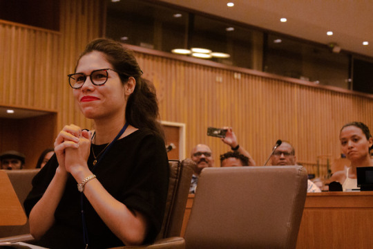

YOUTH LEADERSHIP COUNCIL GRADUATION CEREMONY (NYC Parks- GreenThumb)
Another privilege I was granted during my time as a GreenThumb Intern was to be able to attend their Youth Leadership Council’s (YLC) Graduation Ceremony, held this year at the United Nations Headquarters in Manhattan. The YLC is made up of kids ages 14-21 who choose to be involved in a community garden’s staff over the summer, learning about things like sustainability, food insecurity, composting, gardening, and the myriad of other skills that come with learning to tend to a garden for the benefit of the community and the benefit of the environment. At the ceremony, several YLC particpants were able to speak to the room as a panel and share what YLC meant to them, and what they had learned and become passionate about in the process. Many other YLC participants sat in the audience, cheering on their friends as they presented, and eventually, many of the graduates spoke as part of a group-wide conversation on the future of urban gardening and eco-friendly living. I was honored to be able to attend and to see the YLC participants be celebrated as they deserved to be, and to see them be encouraged to speak up for what they believe in and be a part of a greater conversation. The event was so inspiring I decidedly photographed it in a sort of vintage manner, reminiscent of how these young people will someday be looked at as trailblazers of their time, giving off a wholesome, old-soul feeling of “be kind and make a difference”. I also focused heavily on getting up close shots of those who spoke, hoping to really give a spotlight to anybody and everybody who had the courage and the passion to speak up. I hope for this to be the first in a long line of my event photography opportunities.
0 notes
Photo

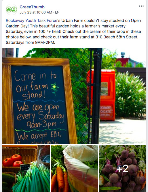
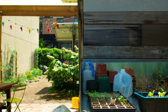

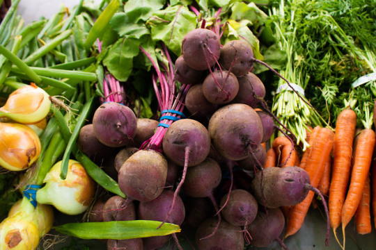
OPEN GARDEN DAY (NYC Parks: GreenThumb)
A major focal point of my time as a Media and Events Intern at GreenThumb, the community gardens division of the New York City Parks and Recreation Department, was the preparation for and documentation of Open Garen Day. Open Garden Day was a coordinated day in which Community Gardens and their dedicated volunteer gardeners opened their garden gates for the public, allowing for citizens to participate in facilitated workshops and events ranging from herbal harvesting and tea making, to arts and crafts, to simple garden tours complete with fresh-picked produce for attendees to take home. I contributed by traveling to mutiple commnunity gardens and photographing them, stumbling across Rafael Omiz Solar in the process and being inspired by our conversation to write up a small piece on what makes these gardens so beautifully special. The photos and write-up were featured on GreenThumb’s facebook page, promoting Open Garden Day. Additionally, on the day of Open Garden Day, I took a ferry ride to Rockaway Youth Task Force’s Urban Farm to photograph their farmers market they had opened for the event. I came across an empty stand- they had sold right out of all their fresh produce before I could even make it in the early afternoon. I photographed their garden and wrote up a facebook post celebrating their achievements, which was also featured on GreenThumb’s facebook page. Additionally, they used a photo of mine from the Urban Farm and began using it as their cover photo. Please click the link’s attached to the photos of the Facebook posts to travel to GreenThumb’s Facebook page to see more!
PHOTOS IN ORDER OF APPEARANCE:
Java Street Community Garden
Rafael Omiz Solar and his Cherry Tomatoes, Keap Fourth Community Garden
Rockaway Youth Task Force Urban Farm
0 notes
Photo


PORTRAIT OF THE ARTIST
A series of self portraits. I enjoy periodically setting up shoots of myself as a way to both exercise my styling, directing, photographic, and editing skills, as well as create small photojournals of points in my life. It is functional as a digital scrapbook and a simple way to gauge my own abilities. This set features my practice with skin/body retouching (smoothing out dark circles inconspicuously, etc.), color correcting, and creative direction.
0 notes
Photo


ANCHOR MISSION: BUY-DO-DINE-SERVE-BE LOCAL
At Loyola’s Center for Experiential Learning, I spent two weeks of the summer contracted to work on the school’s latest and greatest grassroots project: The Anchor Mission. The Anchor Mission is a taskforce of Loyola faculty dedicated to using Loyola’s prominence in the community to serve��the community, in many ways. From making a pointed effort to cater Loyola events with the help of local small businesses, to decorating offices with the knicks and knacks of local artisans. My role in the project was to spearhead the marketing campaign for Anchor Mission, to raise awareness of the joys of “Living Local” to Loyola students. I decided on a graphically bold series of images that portrayed the fruits of local, independently owned enterprises. I found myself enthralled with this project. There’s no better feeling than interacting with these entrepreneurs as I approached them for photos and leaving feeling as though you’ve made a real connection with the small moving parts that fuel a whole community. I joked with Mr. Kim and the other employees of Kim’s Hardware. I learned from the niece of Aunty Joy where Aunt Joy’s Jamaican Kitchen got its namesake. My goal for the project was to not only highlight how wonderful of a contribution these places make to the community, but to put at the forefront the humanity behind these businesses, and to encourage students to create these same human connections with the world around them. Over the course of the project, I utilized my own sociability skills, cold-calling shops and restaurants. I also brushed up on my photography ability as I staged and captured the photos, and my editing/graphic design skills in Adobe Camera Raw, Photoshop, and Illustrator.
0 notes
Photo

Center for Experiential Learning REBRAND
My first task as the Graphic Designer at the CEL was to help the office undergo a rebrand. They were in need of a facelift that would make the office more recognizable and enticing to students who could benefit from their resources. I chose to go with the layered text for depth and style that included a simple, Loyola-esque color palette (which has been since embedded into all of our social media content as well) and a series of lines and dots resembling the Chicago Transit Authority map of operation. The intention was to embody the office’s mission of connecting students with the city in meaningful and practical ways, such as internship, volunteer opportunities, service learning, etc.
0 notes
Photo


WHITE FERRARI INSPIRED PATTERNS
I was recently tasked with designing a series of patterns inspired by a piece of text I felt influential and beautiful. The parameters of the assignment called for one pattern to be 3D element based, one to be hand drawn, and one to be typography based. Unsurprisingly, I landed on the masterpiece that is White Ferrari by Frank Ocean from his sophomore album Blonde. The song is rife with emotion so intense it feels like the song is bursting at the seams, evoking stunning imagery and feelings often untapped except by the right work of art. The composition is a passionate yet concise exploration of the intersection of feelings such as love, pain, loss, and acceptance, shrouded in an ethereal atmosphere that feels as scary and beautiful as a lonely drive down an empty road at the brilliant, colorful sunset hour.
Each pattern is named and modeled after a set of lyrics from the song itself.
1. Mind on the Road, Your Dilated Eyes
2. Watch the Clouds Float, White Ferrari (Stick By Me, Close By)
3. I Care For You Still and I Will, Forever (That Was My Part of the Deal)
0 notes
Photo

GEOMETRY TEXTBOOK COVER DESIGN
In the fall of 2018, I was asked to conceptualize a geometry textbook cover. As a fervent opponent to all things mathematical, I challenged myself to design a book cover that would’ve made someone like me excited about opening it. That required accomplishing two things: including as little math on the cover as possible while still articulating that it is, in fact, a math book, and creating a composition worthy of an Instagram picture. Such an approach would appeal both to textbook companies and students alike by visually stimulating students in a way that can get them attached to these books educationally and encourage them to share the imagery with others. The design is rooted in minimalism with a gentle sense of movement to keep the eye kinetic, while also following a loose grid pattern for an organized, structured feel.
1 note
·
View note
Photo


SAFE DRIVING PSA
In the fall of 2018, I created this two-part PSA for a digital design class project that called for an anti-distracted driving theme. I found myself particularly attached to the subject matter of this assignment. On July 30th, 2017, on I-75 in Troy, I lost my big brother to a car accident in which he was a passenger. He was 22 years old. The crash occurred as a result of a number of unfortunate choices by both vehicles involved in the accident. Although my family and I have made peace with what we cannot control, a situation like this inevitably leaves you wondering what could’ve been different; more importantly, it makes you ask what you can do to prevent anyone from having to go through the same.
All too often, young drivers feel invincible. I myself will admit guilt—I’ve picked up my phone while driving to play music, or answer a text, telling myself that taking my eyes off the road for mere seconds is trivial. Since my brother’s death, my driving has changed for the better. However, nobody should ever have to wait until a tragedy happens to realize the importance of safe driving habits.
It is my hope that through a series of modern, visually exciting graphics targeted at young drivers, MDOT can launch a social media-based campaign encouraging safe driving habits. Like the example below, I believe that one of the most effective ways to get a message such as this one across is with harsh realism. The aesthetics of the PSAs would override a young driver’s natural tendencies to dismiss the age-old “don’t text and drive” message. Making a visually interesting composition makes young eyes want to engage with it. First, they notice it. Second, they read and internalize its the message. Thirdly, they share it with colleagues through social media. This approach has the potential to make a real difference in the way kids think about safe driving, a topic dearly important to me.
1 note
·
View note
Photo


UNDERGRADUATE RESEARCH AND ENGAGEMENT SYMPOSIUM + RELATED GRAPHICS
My first major project as the graphic designer for the Center For Experiential Learning at Loyola University Chicago (LUC) was to brand the 2019 Undergraduate Research and Engagement Symposium (URES). I approached the task with excitement, knowing I’d been given the opportunity to create a look for the event that would transcend typical academic visuals that college students have trained themselves to associate with boredom or monotony. The goal was simple: override that association by designing a more modern, stimulating look that catches young eyes among lined walls of other school flyers and communicates to students that URES might be a scholarly event, but is by no means dull.
The composition, donning LUC colors (maroon and yellow), is a unified collage sampling the wide variety of disciplines found at URES. It features Da Vinci’s Vitruvian Man (mathematics, anatomy, art) spliced with the hands of Michaelangelo’s Creation of Adam (art, theology), a bust of Greek icon Alciabides (history, literature), a wall of vibrant green leaves (environmental science, ecology), a set of mechanical cogs (engineering), and Loyola’s own cultural staple—the Cudahy Door. Cushioned by an opaque background of the event’s date repeated for emphasis, the collage serves a functional purpose of stimulating the viewer, and a secondary function of creating recognizable figures that students can begin to associate with URES. Alcibiades’ bust can be found on the research abstract workshop poster. The hands of God exemplify community on the awards posters. The cogs reappear frequently.
1 note
·
View note


