Please find all workshops from the process and production module.
Don't wanna be here? Send us removal request.
Video
Sara’s last workshop, a showreel of all workshops
0 notes
Photo


This is Jay’s fourth workshop where we created bottles and cans on cinema 4D.
0 notes
Text
3P - 3D reupload
This was my first attempt at the 3D workshop with Sara. I rushed too much and was not happy with the outcome but it has a cartoon feel to it.
vimeo
I redesigned the illustration to have a more 3D look.
vimeo
0 notes
Video
tumblr
Lesson 5 with Jay - Final Output
0 notes
Video
vimeo
Infographics Workshop
Using a bright green colour to illustrate the Richard Sparling’s quote I create this segment of a showreel about football during the first world war. The quote is in regards to the Sheffield City Battalion in 1920.
0 notes
Video
tumblr
This was my first attempt at rotoscoping using a shortlow quality video I found on my phone. I redid this with a higher quality video and a simpler silhouette.
vimeo
The masking on this attempt got messy since the bottle and her lips touched and did not workout as nice as I thought it would so I redid the masking with extra masks to look more smooth.
vimeo
0 notes
Photo


The Hand
Using a mixture of digital and analogue mediums, I created this animation on After Effects. This animation consists of three variations of my illustration of eyes.
vimeo
0 notes
Photo


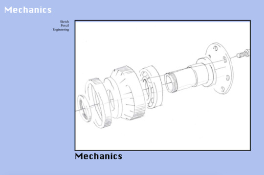
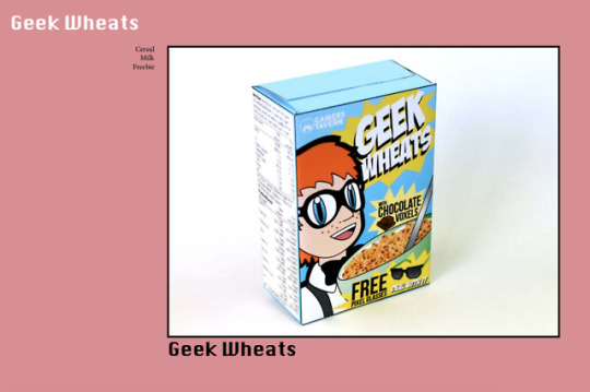
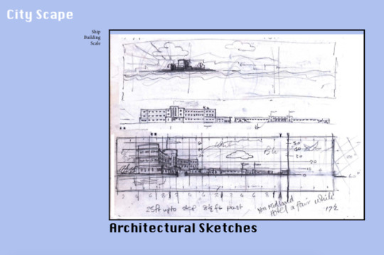
In Jay’s third workshop, I learnt how to use the guides on InDesign to create an organised presentation. Using the workshop starter pack, I edited some scans to appear clearer on screen. Using the guides on InDesign I arranged them in a way that is easy to read while the main focus on the page in the image so that while presenting the slides I am not tempted to just read off the screen.
0 notes
Video
tumblr
This this the cloth texture I made using a cube. The material was deformed to point where some of the faces became translucent and the colours began to blend.
0 notes
Video
tumblr

This is part two of Jay’s second workshop, I created this black and white wavy texture. This looked very monotone and boring so I experimented with colour and added more texture and colour to the animation. I changed the angle of which the camera was looking at the texture to create a diagonal dimension to the waves in the animation.
vimeo
0 notes
Video
tumblr
I created this animation on Cinema 4D using the shape tools and camera. This inspired various patterns and optical illusions.


0 notes
Photo


Self Annihilation
For this workshop I used a low quality image of my university ID photo to deconstruct and break down. In the second part I used the deconstructed version of my photo as reference for a drawing of it. In the third segment, I scanned my face across the scanner and cut up the printed pieces to make an abstract outcome.
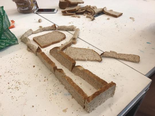
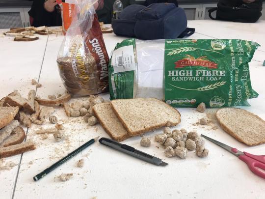
Breaducation
Created a typeface using two loaves of bread. Limited to the medium of bread, Bilkis and I cut shapes out the slices of bread to make letters. We created the letter R by rolling up the soft parts of the slice and making the crust hold up some of its shape. This was an interesting workshop as it opens up the possibilities to use anything as inspiration.
0 notes
Photo

In Nick’s second workshop, I brought in a personal object that has some historical / nostalgic attachment to me. I chose my gold chain that my mum gave to me when I was sixteen; it was previously hers as it was the first gold piece she had ever bought for herself. I have worn it for the majority of the past three years of my life so I was able to create something memorable out of this workshop. I enjoyed using the distorted scan of the necklace as I was able to play around with the different lengths of the chains that had rainbow undertones.
0 notes
Photo

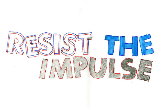
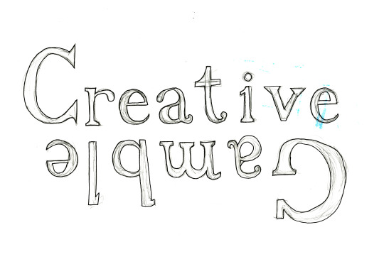
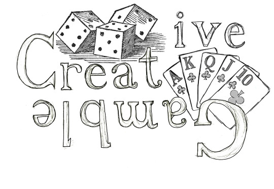
In Nick’s first workshop we worked with three different typefaces to inspire our own typeface. The fonts were interpreted in different ways using colour, size and various pens. The first poster was inspired by the font Cooper Standard, using a creative take on the word ‘Eliminate’ as the last letter is not included on the first line. The second poster was created from the font Futura; I played with the colours red and blue to create a 3D effect and used a 6B pencil to create a gradient effect on the the last word. Finally, in the last poster I used the font Baskerville to write the phrase ‘Creative Gamble’. In my opinion the way I wrote this phrase did not correlate with what the quote means so I developed this further on Photoshop to create some depth in the final piece.
1 note
·
View note
Video
tumblr
This animation was created by using shapes that was made on Illustrator. I used several effects on each individual shape to make a sequence of animations. After making a composition foe each shape, I made a a compilation of all of them to create this final piece.

0 notes
Video
tumblr
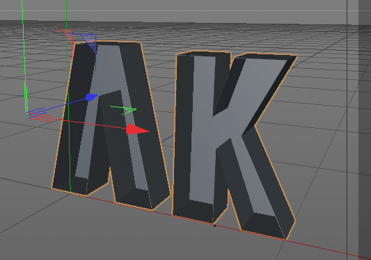
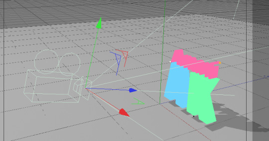
After creating a logo on illustrator, I imported the shape layers into Cinema 4D to create a short 3D animation of the logo spinning. Using various tools such as the camera tool, I created an effect that made the logo appear to be spinning.
0 notes
Text
The influence of Social Media
Kylie Jenner is one the most influential persons on the internet as she has a great following on all of her social media platforms and being a part of the Kardashian family also plays a part in her fame outlet. The Kardashians are known for being the most popular American TV show personalities as they use their money and fame to get up to all kinds of antics. Kylie Jenner is known for transforming from just another Kardashian sister to becoming one of the most desirable women on the planet. Her transformation began with getting lip fillers / injections and for this practical seminar, I wanted to illustrate that process. Beauty has no definition and is constantly evolving but upon saying that, the fascination the world has with Kylie’s lips is as if she invented plump lips is ridiculous. The ‘KylieJennerChallenge’ had everyone sucking on shot glasses to achieve ‘Kylie’s look’ when really, its plain racial fetishism. Historically black features were considered undesirable but when white women turn it into a trend suddenly they become icons in the beauty industry. I did not want this to look like an attack on Kylie Jenner, which is why I did not illustrate her face, as I am trying to express a comprehensive tendency of how the whites take credit for trends that have been evident black culture for decades.
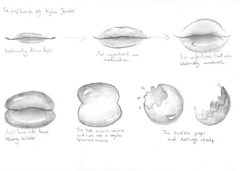
I wanted to illustrate this in a lighthearted manner, despite the loaded meaning behind this short animation, without too much detail. In the sketches I created, I began the story board with a pair of average thin lips that blew up to be plump and full. However to display the message I want to convey, the lips eventually blow up to form a bubble that eventually pops as a metaphor that can be interpreted in different ways.
vimeo
0 notes