Text
The emotions of color
reThis won’t be my last time saying this: put emotion into your design! When someone looks at your logo, flyer, or cover art, they should FEEL something. The only way to accomplish that is by using elements within the art that bring out the emotion you’re going for. Just like typography, colors have feelings attached to them. It’s pretty subconscious if you ask me. When you see art with red, you may think the message is important, or urgent, maybe even negative. When you see designs with blue, you may get a calming or relaxed vibe from it. Green artwork almost always makes me think of health, nature, and organic items. Whatever impression your client wants to give off should be addressed BEFORE you begin designing. This way, you can get a sense of what direction to take your color palette. I’ve put together a list of emotion-color relationships to reference when designing.
Blue Use blue when you want to bring out calm or relaxing emotions. The lighter the blue, the calmer the impression. As your blue gets darker, the emotion can change into one of power or trust (i.e police departments and banks).

image source: https://images.app.goo.gl/CmeSADuCtSP8aRXQ8
Green As I mentioned before, green is a color of nature or tranquility. It can also be used to symbolize luck, hope or wealth. Green is a good choice when designing for an organic brand, or even a nonprofit. Alternatively, green sometimes brings the emotion of envy, jealousy, or sickness. Keep this in mind when designing.
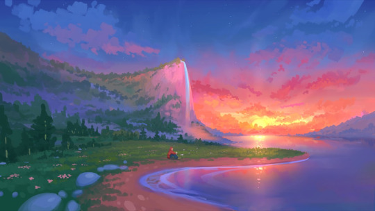
image source: https://images.app.goo.gl/Cx5Ex1ZhHiJ1zkEm7
Purple Historically, only the rich had enough money to purchase clothing that was purple. Rich, dark purples give the feeling of royalty. Lighter hues of purple symbolize tranquility and peace. Do you think it is a coincidence that lavender, one of the most relaxing herbs, is light purple?
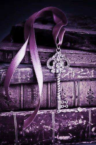
image source:https://pin.it/5LoE1CW
Red Red is a color used to grab attention and evoke passion. Whether it be aggressive passion or not is up to the designer. Love, hate, excitement and anger are all strong emotions that red symbolizes. Be careful how you use this color, because it can mean so many different things. This is a color that is best used when partnered with images, typography, and verbiage that clearly show the emotion you’re going for.

image source: https://images.app.goo.gl/wnB6n86gQiUPTMJs6
Orange Orange is a great color to use when trying to grab attention. When used too much it can be overbearing, but as an accent color it easily brings focus to a particular element on the page.
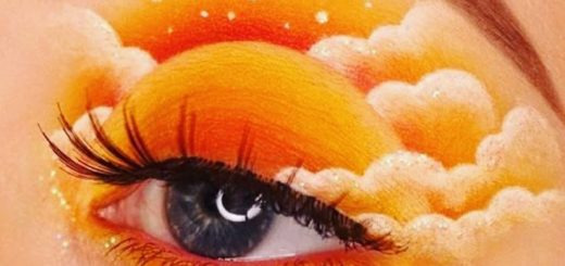
image source: https://images.app.goo.gl/7uAUFrNVpaznW1fc8
Yellow Yellow is considered the brightest of all colors, and is often used in cheerful, energetic and warm contexts. Just like orange, using too much yellow can be irritating to the eye, so be mindful. When used correctly, yellow can make a design seem happy. Also, yellow is connected with “appetite stimulation” so it is an ideal choice for food brands.
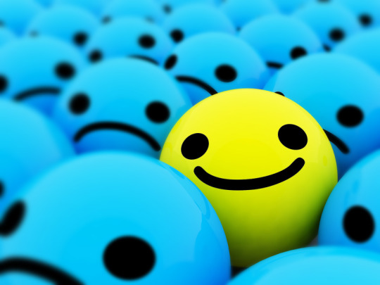
image source: https://images.app.goo.gl/tC246Dy7QsBY6XmC7
White Using white in design gives off a feeling of cleanliness. Minimalist designers love using white, along with other neutral colors, in their art because of its clarity. Depending on the context, it can mean emptiness or openness.
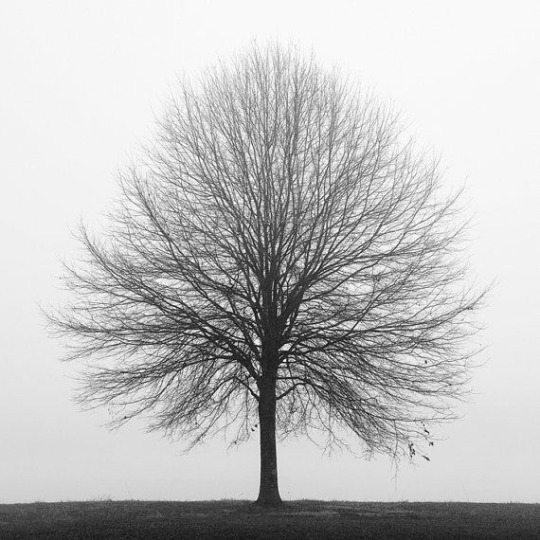
image source: https://images.app.goo.gl/zTsQz2a9rFMStWsV6
Black Black is a very strong color. It can be used to show emptiness, hurt, unity, power, authority and many other emotions. When using black as a primary color, think of the emotion you want to evoke, and bring in another color that will do the job.
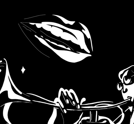
image source: https://images.app.goo.gl/rpxpz8iFijv6smzWA
4 notes
·
View notes
Text
Create daily to better your design skills
PRACTICE MAKES PERFECT.
I know, we hear it all the time, but it’s true! Whether you’re new to designing, or consider yourself a veteran, there’s always time to be a student in the field. Look for a design that you really like, but may seem out of your comfort zone, and try to recreate it. You can tweak it everyday until it looks exactly how you want it to, and then find another design to recreate. Another route to take is think of a design skill you can’t get quite right, and implement it into a design everyday. Over time you’ll see an improvement, and you might even be able to complete the skill quicker.
If you’re thinking about doing graphic design, but aren’t ready to invest in it just yet, try out canva.com. You can create simple designs for free and get a feel for your design style.
Another less expensive program is PicMonkey.com. It has some of the same features as PhotoShop at a much cheaper price starting at $72 annually, and they offer a free trial.
I hope this helps someone get started in their graphic design hobby or career! We all have to start somewhere, and as long as you put in the time to hone your skills, you’ll reach the level you’re aspiring for!
0 notes
Text
Become a master graphic designer: 3 quick tips on shadows and lighting
Shadows and lighting is an important skill in graphic design. An otherwise flat or basic design can be brought to life with a simple hardlight effect, or cast shadow. If you aren’t quite sure of how to use shading and lighting in your design, keep reading, I think I can help!
Before I get into it, I have to warn you that just like most things in life, too much of anything can be a bad thing. With that being said, remember shading and light effects can easily be overdone. On the bright side, successfully implementing shading and lighting can create a three dimensional illusion, giving your design a more life-like appearance. Below are three quick tips on shadows and lighting for the beginner or professional graphic designer.
1. Add depth through color
The illusion of lightness or darkness can be created through color layering. To the human eye, lighter colored objects are farther away than darker colored objects. Try putting varying shades of the same color in your design to add depth. The image below is a great example of this. The lighter shaded trees look like they’re in the distance, while the darker trees seem closer.
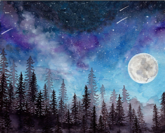
image source: Original artwork from PearlSkullAlchemy on Etsy
2. Create a point of focus with highlighting.
To emphasize areas of your design, try making your focal point brighter than the other areas. This also gives your design a more realistic look. An important thing to remember when adding shadows or lighting into your design is the imaginary light source. Where is the light coming from that is creating the shadow or brighter area? Keeping this in mind helps to determine what angle your lighting and shading needs to be. In the image below, highlight and shading is used to bring attention to the name of the company. It stands out because that area is lighter than the lower part of the image. You can also see the imaginary light source is coming from somewhere in the upper left region of the photo.
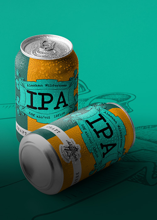
image source: Branding is what we do
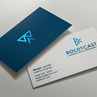
3. Create a cast shadow or drop shadow First, I’ll explain the difference between the two. A cast shadow is the shadow an object creates. It’s position is determined by a light source that can come from anywhere. A drop shadow is a shadow directly or approximately right underneath an object. This is because the light source is seemingly above the object. Now that you know the difference, you can experiment! The images below show examples of cast and drop shadows, respectively. Pro Tip: Drop shadows are great for designers wanting to display flat print designs on a digital platform (business cards, fliers, branding boards, etc.)

Now that you’ve taken my crash course in shading, you’re ready to try these effects in your own designs! Remember, don’t overdo ANY effects you choose to include, and consider your imaginary light source.
0 notes
Text
When to use “Serif” typography in design
Graphic designers know the importance of typography, and the effect a good font can have on a design. On one hand, when you find the perfect font for your project, it stands out amongst the other options immediately. On the other hand, choosing the wrong font can ruin a design, and throw off the entire aesthetic. Design is all about invoking an emotion from the audience, and just like colors and images, fonts have impressions tied to them as well.
If you’re going for a historical, professional, or classy feel, try a Serif typeface. A “serif” is a small character at the end of a line. The human brain easily processes the letters because of the serif, which makes reading more effortless. Picture Time Magazine, Dior or Volvo logos; All those fonts are a type of Serif. There are many options in the Serif group, so let’s dive in a little deeper to help determine which route you should take in your design.
There are four different sub-categories of Serif typography:
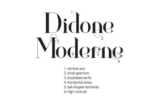
1. Didone (Modern)
In this typeface there is a high contrast between thick and thin lines. The serif is usually thinner than the heavy vertical lines. This is a good font to use for a classy or feminine brand.
2. Old Style
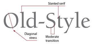
The most notable characteristic of this typeface is the diagonal serif on lowercase letters. This makes the font easier to read and is ideal for large bodies of text. Old Style is used in many newspapers, magazines and books. You may want to use this for a brand looking for a historical feel.
3. Transitional (Baroque)
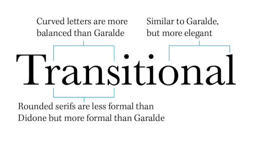
This group has the name “Transitional” because its design is between Didone and Old Style. If you want something that is a little more masculine than Didone, but not as harsh as Old Style, look into Transitional Serif fonts. This is great for a modern brand who wants an “old-timey” aesthetic.
4. Slab Serif
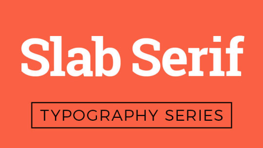
Slab Serif fonts are recognized by their chunky lines and serifs. Usually all the lines in this font have the same thickness throughout. You can find these fonts on posters, book titles, and as headers on websites. On letters that have a curve, there is a perfect roundness, as opposed to the other fonts that may have a slant in the curve. You can use this typeface for a brand that has a bold, fun feel.
Serif typography is great for text-based logos, print design, and large bodies of text. When designing, it’s great for classy, professional and timeless brands. It’s also a great font to pair with a cursive or handwriting typeface to give contrast. After looking over the uses and different groups of Serif fonts, you should better understand when to use this typography in your design.
#graphic design#creator#creative#pinterest#marketing#branding#graphic design tips#typography#typeface
4 notes
·
View notes
Text
Why a Mood Board is ideal in the creative process
Don’t you love when you have an instant vision in your mind after talking about a design opportunity? It’s a relief to go into the creating process with an idea of how you’d like to design. But when the opposite happens, and you have a “brain fart,” try a mood board. Using a mood board is a quick and effective way to gain inspiration when creating logos, fliers, social media content and other marketing graphics. There’s two ways to go about it:
Make it yourself.
Making a mood board yourself (digital or physical) can give you an opportunity to work your creative juices. Try looking in magazines, books or online to find fonts, images, colors, words and textures that remind you of the concept you have in mind. Put it all together in a collage and you’ve got something to refer to.
Find one online.
You can search for mood boards. Pinterest is one huge collection of mood boards! Let’s say you’re branding for a yoga studio and don’t know where to start. Try searching yoga mood board or relaxation mood board. After looking through a few you’ll have a better idea of fonts, colors, and other details to implement into your design.
All in all, mood boards are a huge help for graphic designers! If you haven’t added mood boards to your brainstorming process, you should definitely try it out.
2 notes
·
View notes