i'm a whole ass adult now. born in the 90s. ~~~☆~~~ this blog is NSFW
Don't wanna be here? Send us removal request.
Text


tutorial for drawing characters with cleft lip! sorry that it's mostly unilateral-centric but it makes up the vast majority of resources and photos. still tried to get tips for drawing bilateral clefts in though.
please keep in mind that this is an introductory drawing tutorial and has some generalizations in it, so not every “X is Z” statement will be true for Actual People : )
if you draw any characters using this feel free to tag me!!
36K notes
·
View notes
Text


0 notes
Text
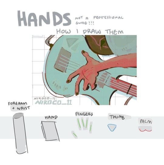


my recipe for drawing hands!
(small note that this is a shortcut that is more abt style and ease than anatomical accuracy. it helps to take time to really properly study hands, makes it easier to bend the rules a bit like this and have it still look good!!)
(learn rules b4 u break them or whatevah)
58K notes
·
View notes
Text
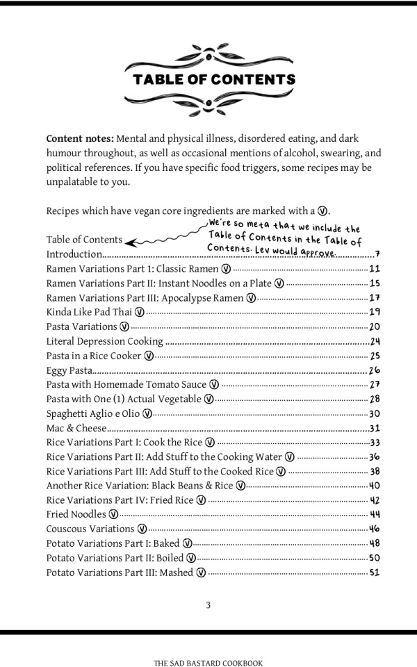
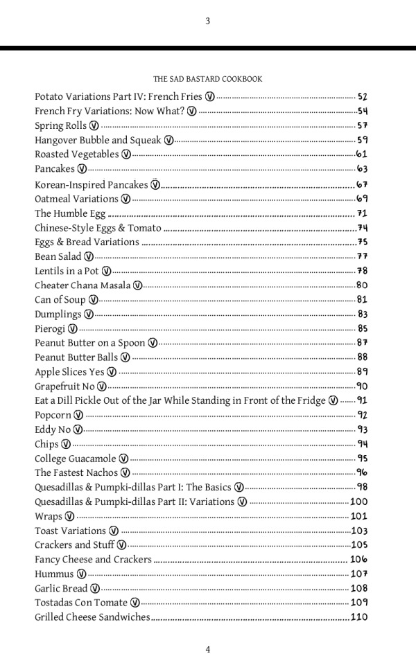
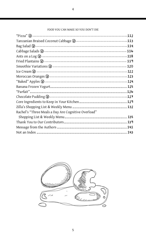
People with low spoons, someone just recommended this cookbook to me, so I thought I'd pass it on.
I always look at cookbooks for people who have no energy/time to do elaborate meal preparations, and roll my eyes. Like, you want me to stay on my feet for long enough to prepare 15 different ingredients from scratch, and use 5 different pots and pans, when I have chronic fatigue and no dishwasher?
These people seem to get it, though. It's very simple in places. It's basically the cookbook for people who think, 'I'm really bored of those same five low-spoons meals I eat, but I can't think of anything else to cook that won't exhaust me'.
And it's free!

111K notes
·
View notes
Text
How to draw: Not white characters
How to draw a Black person
How to colour Black people skin tones
How to draw dreadlocks
How to draw African hair
How to draw curly hair
How to draw braids
How to draw braids part 2
How to draw cornrows
How to draw Bantu knots
How to draw two strand twists
How to draw an Asian person
How to colour darker skin tones with alcohol markers
How to draw hijabs/traditional Muslim hair coverings
How to draw a hijabi girl
All links and art provided by @ itsajart on TikTok
Before you go “mY aRt sTyLe iS dIfFrEnT tHoUgH” you can moderate it and play around with your style to get it to fit.
69K notes
·
View notes
Photo
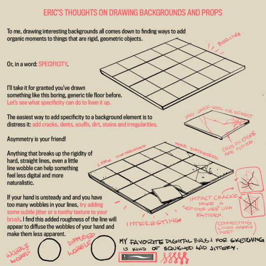

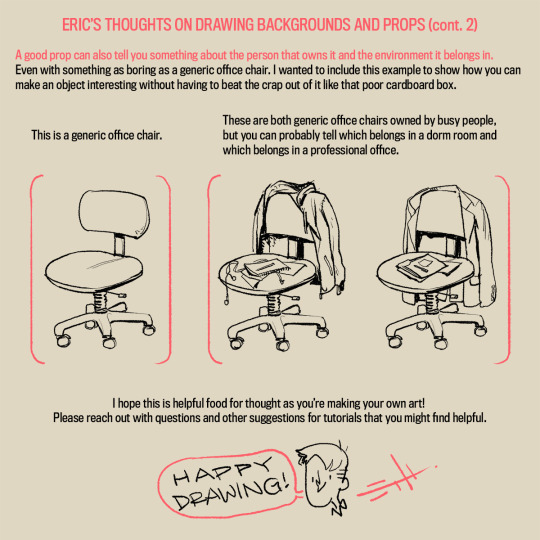
A long time ago an anon asked my thoughts about drawing backgrounds, so I finally got around to putting this together. It’s more prop-centric, but it still represents my philosophy to backgrounds.
I’ll try to do something more about drawing actual background spaces in the future! Please let me know what you think, if anything is unclear, or if you have suggestions for other tutorials you might find helpful!
85K notes
·
View notes
Text
i think the world doesn’t know what it really means to live in a theocratic dictatorship. Let me tell you about our experiences living in the islamic regime of iran.
1. Your parents were born to muslim parents so they’re automatically muslim. You’re automatically a muslim too. You didn’t choose your religion and you can’t opt out of it or you will be executed.
2. The compulsory hijab law makes you a criminal if you choose not to wear hijab even tho you didn’t choose to be a muslim and you don’t consider yourself a muslim but the regime has forced you into that role whether you like it or not. And when you ‘break that law’, they can do with you as they please.
3. little girls as young as 7 yrs old are forced to wear hijab at school even tho the islam itself says the age is 9. and all the schools are gender segregated so imagine how they force you to get used to hijab even when you’re just surrounded by other girls. And all day long at school they tell you horrible stories about what will happen to you in hell if someone sees even a strand of your hair.
4. the regime modifies all the textbooks, story books, cartoons and movies to represent the ideal woman with full on hijab. The iranian media is ordered to photoshop every photo of a woman that may be showing a little skin. And if they’re iranian, no hair is supposed to be seen or that will be photoshopped away. Women are mostly excluded from billboards and tv commercials.
5. imagine going to work or meeting up with a friend when suddenly the morality police kidnap you in broad daylight and force you into a van to take you to a station where they will treat you like a criminal and if you don’t agree to get humiliated and do as they say, they will put you in prison. And in case of Mahsa Amini and so many more before her, they will beat you to death. My sister was barely 18 when she got kidnapped and they didn’t let her call home and she’d been so fucking scared and we had no idea where she was. Imagine all the psychological trauma.
6. If you’re in a car and not wearing hijab they will fine you and seize your car. So when u get into a taxi the driver will ask you to keep your hijab on otherwise they’ll get fined. And if you refuse they’ll ask you to get off the car.
7. And its not just about hijab. In Ramadan, they get even more vicious. If they catch you eating or even drinking water on the street they will give you lashes as punishment and even imprison you for breaking the law. If you work in a state-owned company it’s even worse. They will close the cafeteria and take away the water dispensers. All restaurants are banned from delivering food before iftar. It’s a fucking mess. Everyone has to pretend they’re fasting or they’ll be severely punished.
8. And how could I forget about this! iranian women are banned from singing! the islamic regime prohibits women’s singing voices to be heard by men so imagine the horror of having 50% of the population banned from ever becoming a singer. If they identify a female singer in iran, they will take her to jail and force her to repent her sins in the most humiliating way so that she will never dare sing again.
9. And every time the regime gets wind of a private gathering of men and women trying to have fun and live their fucking private lives, the police crash the party and take everyone to jail bc the Islamic regime bans iranian men and women from having fun.
So if you see Islam has become for many iranians a symbol of oppression and torture and discrimination, that’s why. The regime uses islam as a weapon to silence and punish anyone who opposes them. You can love islam all you want from the safety of your home in a free country and talk about how kind and benevolent the religion is, but in iran, it’s a whole different story.
Our economy is fucked. All govt officials are corrupt as fuck. Most websites are banned in iran. Even tumblr is banned. The world has cut the iranian ppl from many services. We don’t have intl credit cards like visa card. Amazon doesn’t do delivery to iran. We cant get netflix, spotify or even a gamepass subscription. we don’t get any Apple services here. iran isn’t listed as a country you could choose when signing up for a lot of services. and when we decide to leave iran and escape this hellhole, every country out there will make it sooo much harder for us to get a visa just bc we had the misfortune to be born in iran at the wrong time.
This is the story of iran for the past 44 years. Held hostage by a corrupt regime that uses religion to suppress and torture the people and being abandoned by the rest of the world bc our lives don’t matter.
Please be our voice. Once they shut down the internet completely and silence our voice, they will start slaughtering us to stifle the protests just like they did in 2019. Please help us. We want this fucking regime gone.
50K notes
·
View notes
Text
0 notes
Text
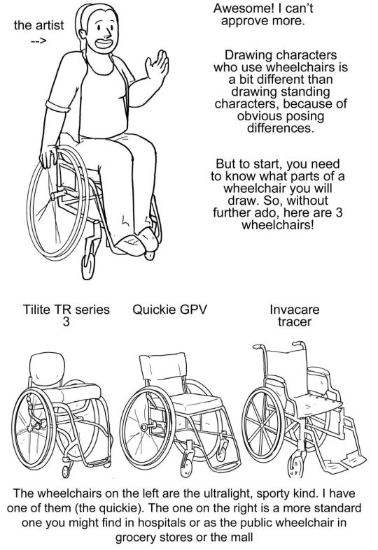
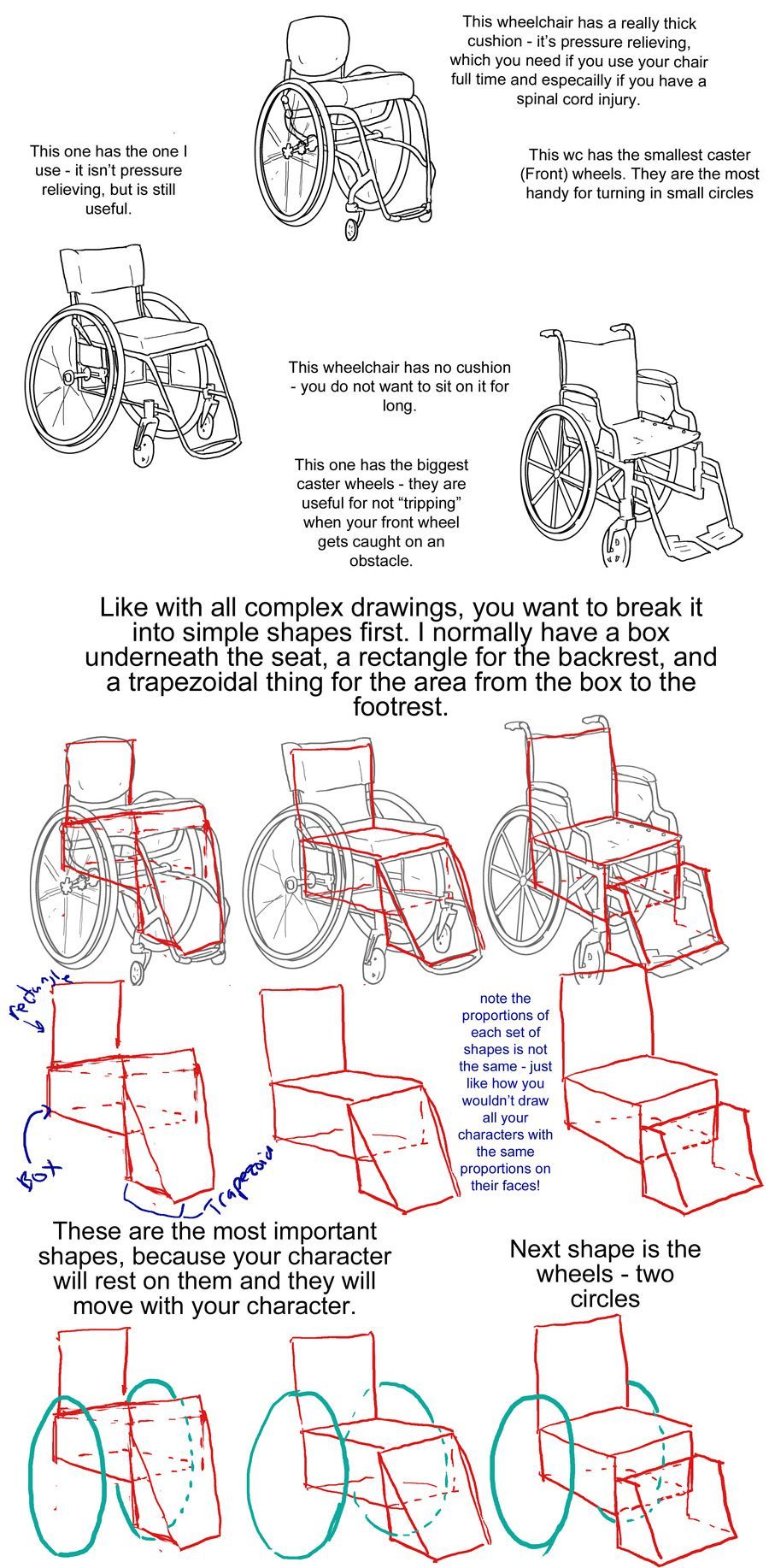
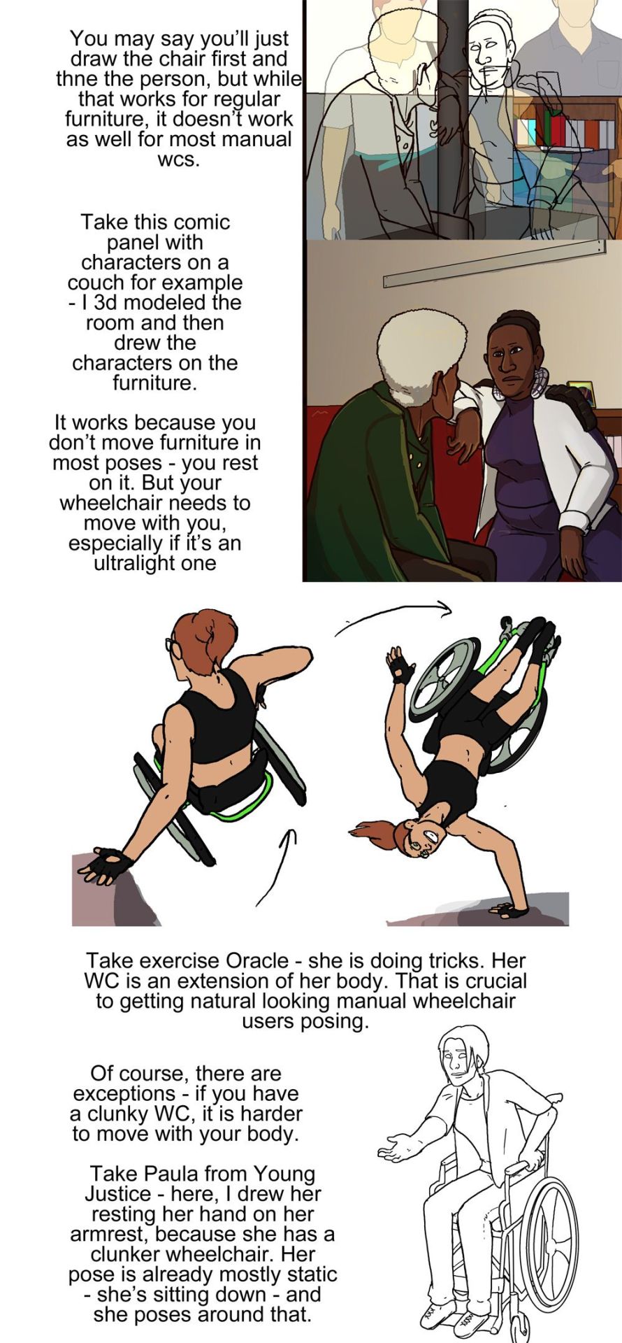
Manual Wheelchair Tutorial by Fade31415
So... I technically drew this 3 years ago but forgot to post it. I think I was going to clean up the end and make a nice recap, but I ran out of steam and then just left it as a wip for years. I got reminded of it because I was talking to a friend about how to draw wheelchairs today.
This covers most of what I view as the most common errors when it comes to drawing characters who use manual wheelchairs. I hope it helps you a lot.
Image description is in alt text, but there is a back up image description under the cut in case that does not work for some reason
[image description: a 4 picture long wheelchair tutorial. the background is white and the text, when it appears, is black and in calibri. each step will be labeled with "Step #" and a description of the drawing next to it, and "text" and then the text that is written to explain it to follow.
Step one text: So, you want to draw a character who uses a manual wheelchair? Awesome! I can't approve more. Drawing characters who use wheelchairs is a bit different than drawing standing characters, because of obvious posing differences. But to start, you need to know what parts of a wheelchair you will draw. So, without further ado, here are 3 wheelchairs!
Step one image: a simplified drawing of a chubby woman sitting in a quickie GPV manual wheelchair and resting her hand on the handrim of one of the wheels. this is labeled "the artist"
step two: next there is a lineart drawing of three wheelchairs. one is a tilite TR series 3. this is an ultralight wheelchair with a bucket seat (the back is lower than the front), a big cushion and a short backrest that kind of contours to the back of the person who would sit in it. the caster wheels (front wheels) are very small and the footrest is just two little metal bars. next image is a quickie GPV. this is also an ultralight wheelchair with a low back, but its caster wheels are slightly larger, the back has regular upholstery (it does not look like it was made to conform to the back of the person who sits there) and the frame is boxier -- there is no bar underneath the seat where the wheels would attach, rather each wheel is attached to the side of the chair. the next wheelchair is an invacare tracer. it is how most people imagine wheelchairs when they hear 'wheelchair'. it has no cushion and it has a high backrest with handles. it has high armrests that would be comfortable to rest your elbows on if you were just sitting. the wheels are not bicycle wheels like the previous two but are rather plastic. it has big footrests and big caster wheels.
text: the wheelchairs on the left are the ultralight, sporty kind. I have one of them (the quickie). the one on the right is a more standard one you might find in hospitals or as the public wheelchair in grocery stores or the mall.
step three: first is text to accompany the tilite. "This wheelchair has a really thick cushion - it's pressure relieving, which you need if you use your chair ufll tiem and especially if you have a spinal cord injury. This wc has the smallest caster (front) wheels. They are hte most handy for turning in small circles." next there is text to accompany the quickie gpv: "This one has the one I use -- it isn't pressure relieving, but is still useful." next is text to accompany the invacare: "this wheelchair has no cushion - you do not want to sit on it for long. This one has the biggest caster wheels - they are useful for not 'tripping' when your front wheel gets caught on an obstacle.”
step four text: like with all complex drawings, you want to break it into simple shapes first. I normally have a box underneath the seat, a rectangle for the backrest, and a trapezoidal thing for hte area from the box to the footrest. these are the most important shapes, because your character will rest on them and they will move with your character.
step four image: the lineart of each wheelchair has been put on reduced opacity, so we can see the square representing the backrest of each seat (the square is the smallest for the tilite and biggest for the invacare), the box for each seat and area underneath it, and the trapezoid for the footrests. the next step labels the images of these simplified shapes as the lineart is removed. "Note the proportions of each set of shapes is not the same - just like how you wouldn't draw all your characters with the same proportions on their faces!"
step 5: we see the same shapes to form the wheelchair, but now with blue circles drawn where the back wheels would be.
text: next shape is the wheels - two circles
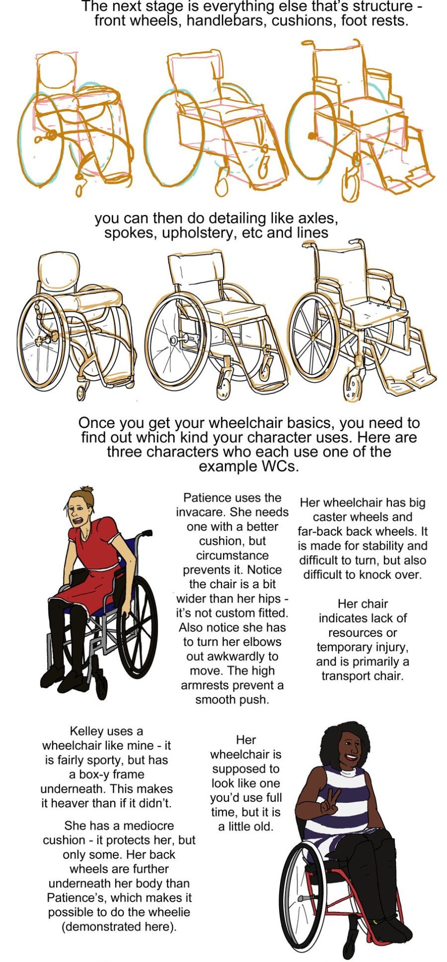
step six: next we see the wheels and shapes have been reduced in opacity and the basic structure of everything about each wheelchair: footrests, caster wheels, upholstery details, axles has been drawn on in orange.
text: the next stage is everything else that's structure - front wheels, handlebars, cushions, footrests.
Step seven: we see the lineart on top of the lowered opacity sketch.
text: you can then do detailing like axles, spokes, upholstery, etc and lines
step eight: next we see three drawings of different characters. there is patience, a skinny white woman sitting in a blue invacare wheelchair. kelley, a slightly chubby black woman wearing a stripey dress sitting in a red quickie gpv wheelchair and doing a wheelie while smiling. then luke, a white man with short blond hair wearing khaki pants. he is sitting in a tilite chair.
text: once you get your wheelchair basics, you need to find out which kind your character uses. here are three characters who each use one of the example WCs. patience uses the invacare. she needs one with a better cushion, but circumstance prevents it. Notice the chair is a bit wider than her hips - it's not custom fitted. Also notice she has to turn her elbows out awkwardly to move. the high armrests prevent a smooth push. her wheelchair has big caster wheels and far-back back wheels. it is made for stability and difficult to turn,but also difficult to knock over. Her chair indicates a lack of resources or temporary injury, and is primarily a transport chair
kelley uses a wheelchair like mine - it is fairly sporty, but has a box-y frame underneath. this makes it heaver than if it didn't.she has a mediocre cushion - it protects her, but only some. her back wheels are further underneath her body than Patience's, which makes it possible to do the wheelie (demonstrated here). her wheelchair is supposed to look line one you'd use full time, but it is a little old.
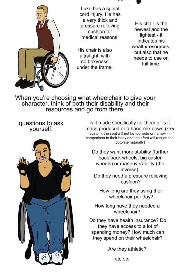
luke has a spinal cord injury. he has a very thick pressure relieving cushion for medical reasons. his chair is also ultralight, with no boxyness under the frame. his chair is the newest and lightest - it indicates his wealth/resources, but also that he needs to use on full time.
step nine: just a drawing of me sitting in my wheelchair holding my hands up to show fingerless wheelchair gloves. we're looking at me from above.
text: when you're choosing what wheelchair to give your character, think of both their disability and their resources and go from there. questions to ask yourself: is it made specifically for them or is it mass-produced or a hand-me-down (if it's custom, the seat will not be too wide or narrow in comparison to their body and their feet will rest on the footplate naturally). do they want more stability (further back back wheels, big caster wheels) or maneuverability (the inverse). do they need a pressure relieving cushion? how long are they using their wheelchair per day? how long have they needed a wheelchair? Do they have health insurance? do they have access to a lot of spending money? How much can they spend on their wheelchair? are they athletic etc etc
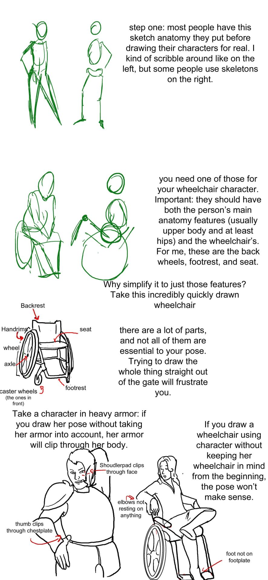
posing steps:
step one: a sketch of two people standing up. one just shows the outline of a person's body, with legs that are ind of triangle shaped, the other shows a sketched pelvis and rib cage to go along with the bones of the legs and arm. text: step one: Most people have this sketch anatomy they put before drawing their characters for real. I kind of scribble around like on the left, but some people use skeletons on the right.
step two: there are now too sketched pictures of people in wheelchairs. one shows lightly traced human form (arms articulated, curve for a stomach, legs that are kind of triangle shaped and pointing down) sitting in a wheelchair that is just the sketch of footrests and wheels. the other sketch shows the sketch of a body with a circle for hips and an oval for a rib cage and the person doing a wheelie (lifting the front end of the wheelchair off the ground and leaning back). their wheelchair is also sketched out and defined by a circle for their wheels and 2 lines, 1 of the seat and 1 for the backrest. text: you need one of those for your wheelchair character. important: they should have both the person's main anatomy features (Usually upper body and at least hips) and the wheelchair's. for me, these are the back wheels, footrest, and seat. why simplify to just those features? Take a look at this incredibly quickly drawn wheelchair.
step three: there is a lineart drawing of a manual wheelchair with slightly cambered (angled towards the seat) wheels, a backrest, and a footrest. the frame is light and there are no handlebars. there are labels pointing to different parts of the wheelchair: Backrest, handrims, wheel, axle, seat, footrest, and caster wheels (the ones in front). text: there are a lot of parts, and not all of them are essential to your pose. trying to draw the whole thing straight out of the gate will frustrate you.'
step four text: take a character in heavy armor: if you draw her pose without taking her armor into account, her armor will clip through her body. if you draw a wheelchair using character without keeping her wheelchair in mind from the beginning, the pose won't make sense.
step four image: next we see two lineart drawings of different characters. one is a bulky woman wearing plate armor. her hand is on her hip and she is trying to scratch her back with the other hand. there is the label "shoudlerpad clips through face" and "thumb clips through chestplate." the next drawing shows a woman in a wheelchair with one foot rested on her knee and her arms rested back, such that they would be rested on the back of a regular chair, but the back of her wheelchair is not wide enough for them to actually be resting on anything. the text here reads "elbows not resting on anything" and "foot not on footplate"
step five: there are two images, one is lineart on top of a 3d modelled apartment with sketchup, the other is a colored in version of that lineart with the background also colored in and no longer a 3d modelled screencap two characters, one old woman wearing a green jacket and one younger woman wearing a white shirt and blue undershirt, are sitting on a couch. the old woman is leaning forward and the young woman is resting her arm on the couch. behind the young woman is a bookshelf.
step five text: you may say you'll just draw the chair first and then the person, but while that works for regular furniture, it doesn't work as well for most manual wcs. take this comic panel with characters on a couch for example - I 3d modeled the room and then drew the characters on the furniture. it works because you don't move furniture in most poses - you rest on it. but your wheelchair needs to move with you, especially if it's an ultralight one.
step six image: there is a flat color drawing of barbara gordon in her wheelchair. she is wearing a black sportsbra and black shorts. in the first image we see she is doing tricks in her chair, zooming through the air (as if she has just launched herself off the ground in a skater park or somethign) while her left hand is resting on a structure and her right hand is heading towards the right handrim. the next image shows her right hand planted on the ground and her chair and body above her, such that she is briefly doing a one-handed handstand, but the motion line indicates that she is moving and this will not last. her left arm is near the handrim of her left wheel.
text: take exercise Oracle - she is doing tricks. Her WC is an extension of her body. That is crucial to getting natural looking manual wheelchair users after posing.
step seven: we see a lineart drawing of paula from young justice. she is sitting in a standard manual wheelchair with high armrests (goes up to the bottom of her ribs probably) and a high backrest (goes up to just below her shoulderblades). she is setting her hand on the armrest, leaning forward, and holding her other hand out.
text: of course, there are exceptions - if you have a clunky WC, it is harder to move with your body. Take Paula from young Justice - here, i drew her resting her hand on her armrest, because she has a clunker wheelchair. her pose is already mostly static - she's sitting down - and she poses around that.
51K notes
·
View notes
Photo
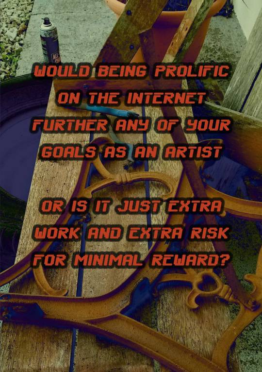


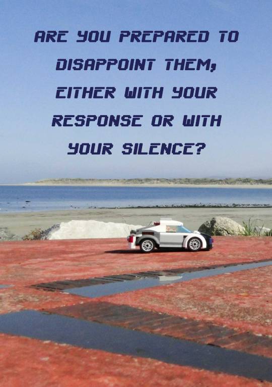


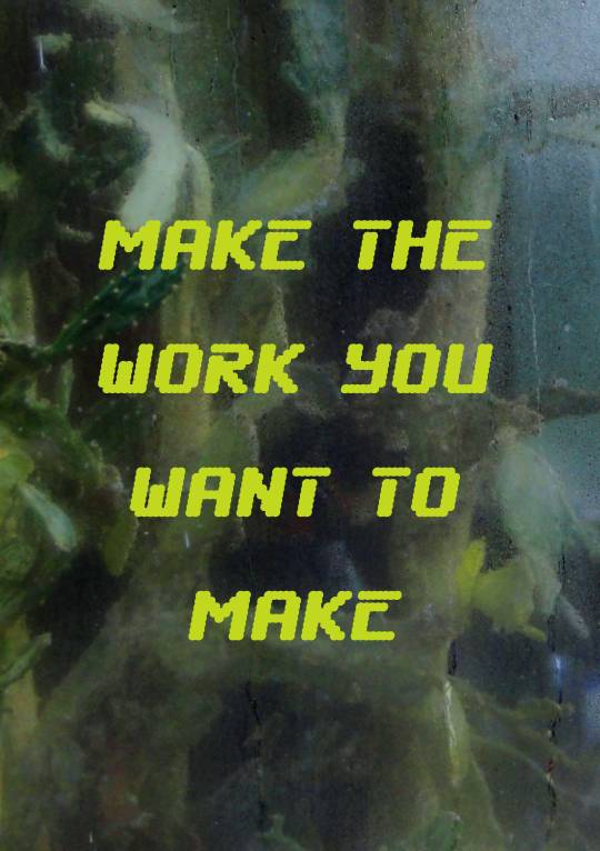


What Do You Think You’re Doing? by Kaiser Caimo
Part 4 of 4.
(Part 1 here)
An aggressively ugly digital zine about making art. Available in full as a pdf for free/pay what you want here: https://gum.co/lUpii
19K notes
·
View notes
Photo

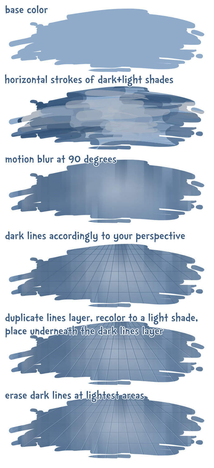
5 min tutorial for trcelyne, hope it helps!
441K notes
·
View notes
Photo
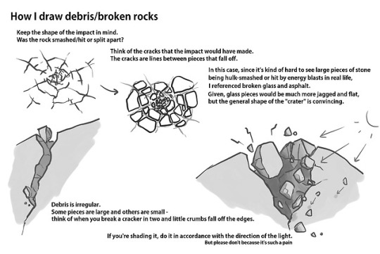
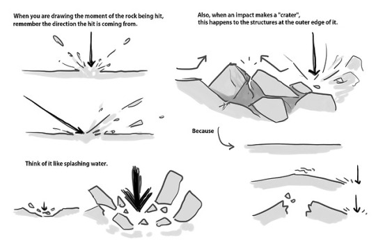
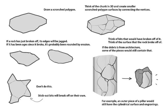
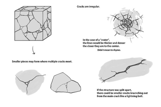
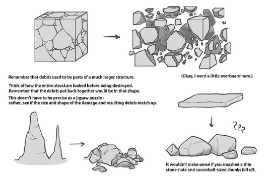
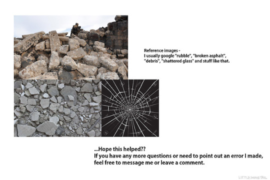
Some people asked me to do a tutorial on drawing rocks, and since I found myself drawing rocks a lot these days, I thought I would share some things that I do.
Note: I am not a professional artist nor have I received much professional instruction. I am self-learned and thus prone to error. If you see anything wrong with the above contents, feel free to point it out, and generally, take this whole thing with a grain of salt. You don’t have to draw rocks this way.
And since this is my first time making a tutorial, feedback on readability/helpfulness would also be welcome, so that I can have a better idea of what to do in case I make another one.
18K notes
·
View notes
Text

Someone made an engagement map for TERF tweets
95K notes
·
View notes
Photo
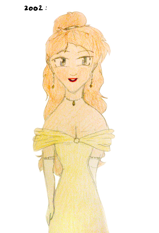

I’ve been wanting to do a thing like this for a while. Behold my amazing animu mongah skills there wow swoons
245K notes
·
View notes


