Don't wanna be here? Send us removal request.
Text
My Evaluation
The benefits of working from home for me was I can have a break from working whenever I really needed it, for example I was able to exercise as much as I wanted to, so that I wasn’t just sitting all the time and can be active. Also I was able to work during the hours that I was more efficient at which is the evening. However the problems that I faced was some days I would feel unmotivated to work and my workflow would be much slower. Fortunately I did complete the work that I had planned, and to follow through with this I made to do lists to help stay on track. I communicated with my team using slack as thats what worked well with everyone without any technical difficulties compared to teams, this has been successful as in the end everyone contributed.
My most successful piece of work would definitely be my album cover as I felt like I payed the most attention to detail with it and I really enjoyed designing it. I do feel like my work shows my achievement to the original brief as I provided all of the outcomes that were necessary. The presentation was successful as everyone contributed to talk about their outcomes. My role was being one of the creative directors, the showreel editor and the copy writer for the manifesto. I enjoyed writing the manifesto as I generally enjoy creative writing. Being the creative director was a bit stressful as I had to ask people to contribute at times as some people weren’t sending their work or helping with the manifesto. Lastly the showreel was somewhat not too stressful as Isabelle and Billy was helping with the editing. I went back and checked the L0’s and I think I have covered them all in ordered to pass hopefully.
I did allow sufficient time to complete my work as I didn’t want to be behind on any of the outcomes. I surprisingly coped well with the short deadlines, one way I did this was making to do lists and completing it. The aspects of my work that I would change is the instagram slides. I feel like I could’ve added more detail to it and make it much neater with the design. I felt like I was constantly nagging my peers to contribute as we needed the work to move on to the next step, and this resulted in making me feel a bit stressed. When developing the outcomes for my work my tutors and peers helped influence my decisions as it helped me enhanced my work.
The primary research I did was listening to different talks that was available to us such as Lucy Harmony Grimes and Avi Brahma. This has influenced my work as I was able to look at my workflow from a different perspective.Next the secondary research I did was looking at different album covers that I can redesign using the art direction. I reacted to the art direction by first annotating it and identifying the features that I have to replicate so that my album that I redesigned would look similar to it.
1 note
·
View note
Text
For the outline type universe type foundry class collaboration we communicated the most via slack as it was much easier for everyone and we used Teams for a while.
1 note
·
View note
Text
The cost of my typeface will be £2.99 as my theme revolves around water I want it to be the price of bottled water so that its cheap for the public, also relating to the flint water crisis topic the money I would make from my typeface would go towards it as I want to help with donations, I dont want to make any profit from it.
1 note
·
View note
Text
https://www.axa.co.uk/business-insurance/business-guardian-angel/five-essential-legal-principles-for-graphic-designers/
Legislation
Graphic design contract checklist
Delivery details: when and how you will deliver work
Expenses: travel to meetings, hotel accommodation etc.
Retention of title: confirm you own the goods until they’re paid for
Retention of copyright
Confidentiality: what information, if any, can you disclose and when
Void contracts: what circumstances would breach the contract and become void
Additional costs: g. who pays for postage of materials, packaging etc.
Expenses and cancellation fees : As well as the more standard terms and conditions, you might also want to consider detailing the expenses and additional costs you expect your client to cover during the time you’re working with them. These additional costs could include things like travel expenses for meetings or overnight accommodation costs. By outlining the exact terms of any extra fees or expenses, both you and your client will understand exactly how much everything is going to cost before any work is done, meaning you can focus on the job itself and building a good relationship with your client.
You’ll also want to agree a cancellation fee (if you have one at all) as well as information about the terms of late payments.
Set out your graphic design terms and conditions: In your graphic design contract, you’ll want to confirm your terms and conditions in writing ahead of starting work for any client. Setting out clear boundaries means your clients will understand exactly what you’ll be doing and when you’ll be doing it. Setting out these terms clearly will help to avoid help avoid any disputes over delivery times or payment terms.
Fair use’ :Under US and UK law, the ‘fair use’ principle exists to prevent copyright law from hindering free speech, freedom of the press, and to avoid excessive legal action for accidental or minor breaches of copyright. It allows content creators (including designers) to include quotes and excerpts from published works if they credit the author and source, and justify the extent of its use. Fair use is usually applied to news reporting, incidental references and private or educational use. Outside of these cases, it’s wise to seek the owner’s permission.
Creative Commons
Creative Commons (CC) licences automatically give people the right to use, modify or share content. There are various degrees of permissions:
CC0 is public domain, meaning the content is anyone’s to use, modify and share – no strings attached.
CC BY (CC Attribution) is anyone’s to share, use and modify, if you credit the original creator.
CC BY-SA (CC Attribution-ShareAlike) is as above, but requires you to share any modifications under the same licence.
CC BY-ND (CC Attribution-NoDerivatives) allows credited use and sharing, but not modification.
CC BY-NC (CC Attribution-NonCommercial) allows credited use, sharing and modification – but not for profit.
CC BY-NC-SA (CC Attribution-NonCommercial-ShareAlike) is as above, but you must share any modifications under the same licence.
CC BY-NC-ND (CC Attribution-NonCommercial-NoDerivatives) allows credited sharing and usage, but not modification or sale.
Font licensing
These are a whole different ball game, so let’s start with the basics: while you're licensed to use preloaded fonts in programs like Photoshop, this isn't the same as owning them. Most licenses allow designers to use the fonts to create designs and documents on their computer, but not necessarily to ‘embed’ them or, in other words, share the font with unlicensed users.
Here are the four permission levels you’re likely to encounter, and what they mean in practice:
‘No embedding’ – you can’t embed these fonts in a digital document.
‘Preview and print’ – you can embed the fonts in a digital document (for example a PDF), but only to be viewed on a screen or printout.
‘Editable’ – you can embed fonts in a digital document, and it's fine for the recipient to view, print or edit the text.
‘Installable’ – the recipient can install the font to create completely new documents.
In web design, there are a few common approaches to sharing and rendering fonts:
‘Web-safe’ fonts are a small selection of fonts commonly found across both Apple and Windows computers, typically used by designers to ensure that text renders as well as possible in various web browsers. The operating system licence governs these fonts.
‘Rasterised’ fonts are turned into images and therefore not embedded.
‘CSS @font-face’ instructs the browser to temporarily download the font onto a user’s computer, and these fonts have their own licence terms.
Adobe Typekit gives subscribers access to a catalogue of fonts and has its own terms of use.
Logo ownership: the client or the designer?
Unlike other areas of graphic and web design, it’s common for the client to have ownership of the logo you design for them.
A logo design is such an essential part of the day-to-say functioning of a business that it’s easier for clients to have all the legal rights of ownership
Also, business owners want to protect their brand identity and logos are a big part of that. If the designer owns the rights, a business can’t register the logo design under the Intellectual Property Rights which can cause a number of legal issues further down the line for business owners.
Intellectual Property (IP)
Anything original that someone creates using their own mind is their intellectual property. Intellectual property rights allow you to make money from the intellectual property you own. Intellectual property can have more than one owner and it can be bought and sold to individuals or businesses.
You own intellectual property if you: created it bought it from the creator or previous owner have a brand that could be a trademark (e.g. a well-known product name)
Types of Intellectual Property (IP)
Automatic protection
Copyright
Protects your work and stops others from using it without your knowledge or permission. You automatically get copyright protection when you create something original such as an illustration or a photograph. You can mark your work with a ©, your name and the year you created it. However, doing this won’t affect the level of protection you have.
Design right
Automatically protects designs to prevent someone from copying you 10 years after it was sold or 15 years after it was created (whichever is earliest). Design rights only apply to the shape or configuration of 3D objects; you must register to protect 2D designs like graphics or textiles.
Protection you need to apply for
Trademark : Registering your trade mark can help to protect your brand. For example, you can trade mark the name of a product or service. You can use the ® to show that you’ve got the trade mark and you’ll be able to take legal action against anyone who tries to use your brand without your permission.
Registered designs : You can register the look of something you’ve designed to stop people copying or stealing it. The ‘look’ of a design is its appearance, physical shape, configuration and decoration. Shapes of objects might already be automatically protected by design right, but registering it will give you further protection.
Patents :To be granted a patent, your invention must be completely new (not a modification of something that already exists) and it must be something that can be made or used. Patents are notoriously expensive and difficult to get, so you’ll need to think carefully about whether you really need one or not.
Image copyright
In the eyes of the law and the Intellectual Property Office (PDF), "photographs, illustrations and other images will generally be protected by copyright as artistic works."
1 note
·
View note
Text
https://en.m.wikipedia.org/wiki/Type_foundry
A type foundry is a company that designs or distributes typefaces.
Before digital typography, type foundries manufactured and sold metal and wood typefaces for hand typesetting, and matrices for line-casting machines like the Linotype and Monotype, for letterpress printers.
Benifits: linoprinting
• Efficiency in printing.
• Higher rate of manufacturing for books, newspapers, and pamphlets.
• Lower cost of manufacturing for books, newspapers, and pamphlets.
• Lower prices for books, newspapers and pamphlets (for the public)
• Wider availability of educational and informational materials.
• Linotype has two cons compared to modern day printer: it is inefficient, and bad for the health.
Today's digital type foundries accumulate and distribute typefaces (typically as digitized fonts) created by type designers, who may either be freelancers operating their own independent foundry, or employed by a foundry. Type foundries may also provide custom type design services.
Digital foundries are beneficial in my opinion as it's a lot quicker to produce and distribute typefaces.
0 notes
Text
Weekly overview:
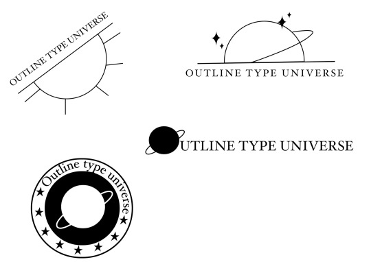
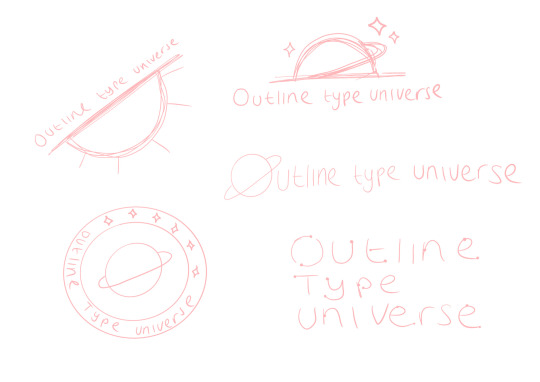
🌱 This week I completed my video poetry. Also in our groups we came up with a name for our studio. Which I then began to do some sketches and digitalise them.
1 note
·
View note
Text
1 note
·
View note
Text
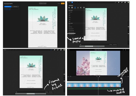
Screenshots of my animation process.
As I don’t have after effects I had to use an alternative, inside the Procreate app I used the frame by frame animation to animate the words and lines appearing. Then I imported the file into iMovie to add the flower image into the background, which I then imported the audio.
1 note
·
View note
Text
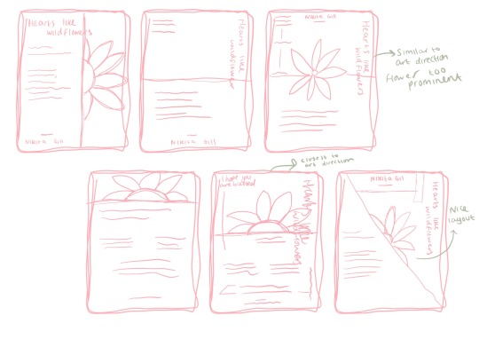
Sketches of my poster layout for my animation based on the art direction I was given
1 note
·
View note
Text
The poet that I was assigned to was Nikita Gill.
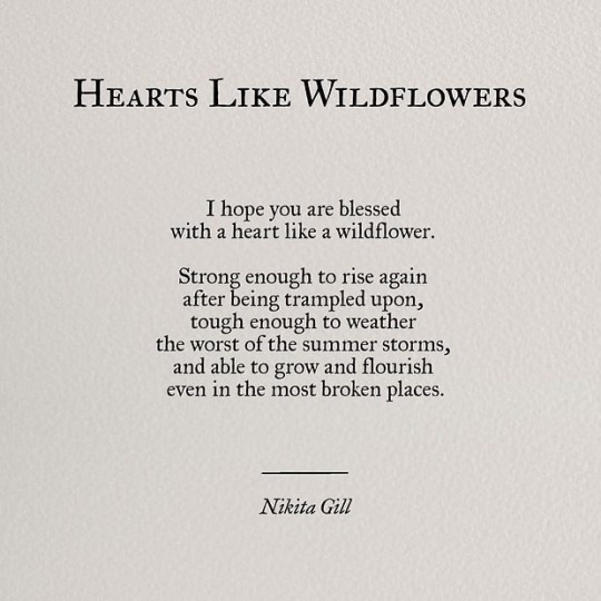
I’ve chosen this poem to work with typographically as the length of the poem isn’t too long or short and can fit into my art direction well.
1 note
·
View note
Text
Goals for this week:
✨ This week I will be going through the checklist making sure I’ve got my work and tumblr up to date.
✨ I will also be research the poet that I’ve been assigned to.
✨I will research what video poetry is.
1 note
·
View note
Text
Overview of my week:
🌱 During the week I worked on the initial ideas of my album cover, which I eventually developed digitally with variations. Lastly I place the album design into mock-ups.
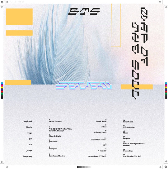
Also as part of a task we had to test out the 3mm bleed and marks on our album cover.
0 notes
Text
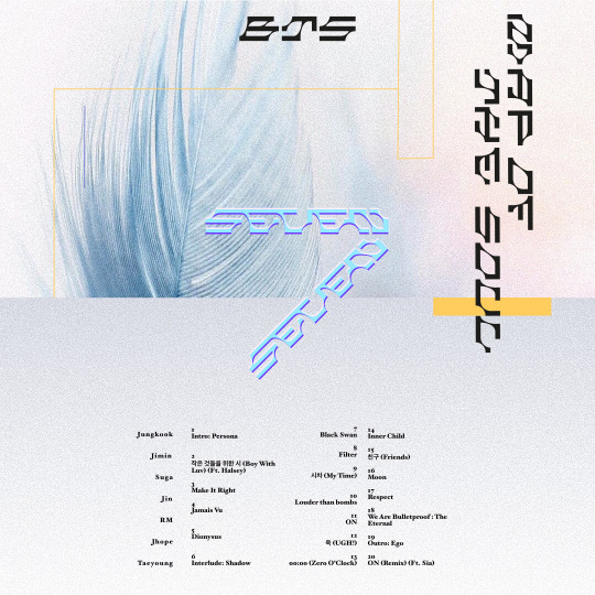
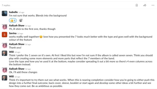
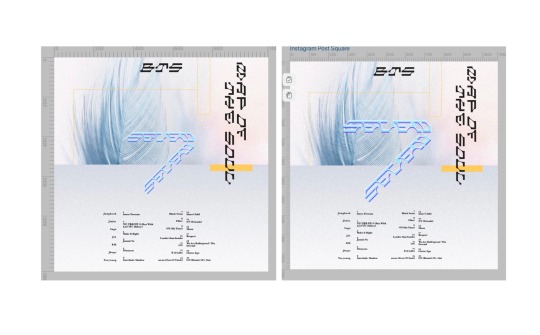
This is my 3rd variation, with screenshots and feedback
2 notes
·
View notes


