Text
Last 2 CRW’s
Additional CRW’s:
Keara
I loved this presentation, and might’ve had a bias, because she taught more people about Wicca holidays. Her presentation was about the art of pumpkin carving associated with Halloween. It originated as a Pagan/Wiccan holiday tradition for Samhain. They were created to guide friendly spirits and scare off negative spirits during the celebration. She took the time to ready little pumpkins with tea light candles (electronic), and while we didn’t get to carve pumpkins, due to time constraints, she allowed us to still decorate our pumpkins, and squash, so that we could take part in the tradition. It was a really fun conclusion to the end on in-person classes.
Katrina
Katrina did her performance on the culture of voice behind hair, and how it can transform identity, and convey a message. She brought up, for example, the hairstyles of France, with large bonnets of wigs, often too heavy and causing back problems. For her hands on portion, she brought little clip on colorful strands of hair for everyone in class. She taught people to braid while at the same time teaching about the significance of that style of hair. It was very unique, and at least for me, I never knew the significance that hair could have on one’s identity and voice. It makes sense though, especially with marginalized groups of people who had their hair obsessed over by oppressors, and eventually turned their hair into a symbol of pride.
0 notes
Text
Cuban Art
So, I couldn’t find just one image to examine, but as with any art that tells the story of a national identity and how is combines local and global influences, one image is simply not enough. For example, I chose to examine some art pieces from three distinct Cuban artists. After Cubans gained their independence in 1902, they went through a sort of Renaissance, similar to that of Italy. With three distinct periods of Modernism, Experimental, and Avant Garde work, Cuba created a name in art as it developed its own style. Bold lines, and bold colors are hallmarks of their art. Images also often include descriptions of typical people in Cuba, a nod to the local, the average community member. As for global influences, artist Amelia Pelaez studied in Paris and brought those stylistic influences and teachings back with her to Cuba, using them to boost the unique Cuban art that had been established decades before. While challenging to keep identity and unique complexity while incorporating other influences, some of the best works of art, inventions, and cultural aspects were expanded upon from previous information and actions. Cuba managed this likeliness, creating its identity, while still appreciating the work of everyone else, from the small routine local worker, to the fancy artists from France.
https://artmundus.wordpress.com/2010/05/15/cuban-art/
0 notes
Text
Football Racism
Football, an American sport that captures the attention of millions every year. With hundreds of teams and variants of logos, one would think that creativity could really soar. The struggle now is the overwhelming use of the stereotyped image of a Native American, in its old and racist name of ‘Indian’. Just look at Idaho, with over ten ‘Indian’ themed mascots, like the Teton Redskins or the Boise Braves. The use of this imagery isn’t just hurtful and disrespectful towards the Native American population, but it further perpetuates racism that was founded on slavery, bloodshed, and ‘re-education’. This harms all the beautiful culture of the many different tribes and communities, as well as lumping everyone in a category. Everyone here in New Mexico knows that the Navajo are completely different from any other tribe, and has its own unique culture and history. The use of these mascots, and their popularity, only continues to teach generations that this harmful racism is okay. That is why thousands of Native Americans have created a call to action, to change the mascots that create division. As stated on the National Congress of American Indians website, “As documented in a comprehensive review of decades of social science research, derogatory "Indian" sports mascots have serious psychological, social and cultural consequences for Native Americans, especially Native youth.” These mascots are derogatory and harmful, and need to end if progress can be made.
http://www.ncai.org/proudtobe
0 notes
Text
Color Theory in Fall

The image I chose is a painting by Leonid Afremov named Autumn Colors. It is an image that I think shows a good balance and has two different types of color harmony within it. The first, and most visually recognizable, is analogous harmony, showing a balance between similar colors. In the image, shades of warm colors (red, orange, yellow), as well as reddish browns mix to create a stunning visual of autumn leaves on trees. It can also be seen on some of the path. The other type of harmony, is triadic harmony, showing colors on either side of one color’s complementary pair. Alongside the warm oranges and reds, there is a large amount of cyans and greens, and some purple/purple-blacks. These two harmonies provide both a stunning contrast, and balance that makes the image’s theme of autumn one of warmth and cool at the same time. The image heavily focuses on its use of warm colors, making the leaves of the trees the main focus, eve to the point where the two people in the background are almost unnoticeable. It captures your eyes. This makes the image as a whole a little unbalanced, but think of the Mona Lisa, and what your eyes always focus to.
0 notes
Text
#LikeAGirl
I chose this campaign, as I have talked about it in other classes, and have a strong opinion about it. I don’t like this campaign, and feel as if it does more harm than good. It makes a slogan that is usually used as an insult to women, like a girl, and tries to make it an empowerment slogan. In my opinion though, it makes it come off as lifting up women in a way that doesn’t make them equal. We don’t tell a boy that he’s doing something like a man, or try to use it in the same context for transgendered people. To make it equal, I think it should be more about, well, doing something that is human, that way it applies to everyone that watches the commercial. Or, just try and get rid of it in the first place, making it not an insult anymore, but just getting rid of it. The term is very gendered and stereotyping. As I learned in my social psychology class, stereotypes don’t always have to be negative, but they can still harm people. The #LikeAGirl campaign does more harm than good, keeping its heavily gendered background, even in its revision, and excludes any boy, or anyone who identifies as a boy, or even anyone who doesn’t align with the binary gendered spectrum.
https://www.youtube.com/watch?v=XjJQBjWYDTs
0 notes
Text
Websites in Popularity
With one of Japan’s highest ranking websites, Syosetu, it is a novel publishing site. It’s design is very simple and condensed, with small text, bordered sections, and any images being small as well. Compare this to Google, the world’s top website, a more Americanized website. The font for Google is unique, and constantly changing to reflect important people and dates. The text is larger and more pronounced, with most content in a central or right hanging focus. Syosetu is indicative of Japan’s design preference, outlining more of a straight to the point with as much info packed in as possible take on design. Even with the site translated into English, it has a very Japanese feel to it, and continues to keep that theme regardless of the audience. Contrary wise, Google is good at adapting to its audience, including people, culture, and holidays from around the globe. I did notice that Syosetu also heavily focuses on shades of blue, orange, and yellow in its design, relatively calm colors in America. There is also a large amount of white space, that it shares with Google’s design. This white space makes the content more visible and less busy, making it more easily accessible to a large audience.
http://www.similarweb.com/website/syosetu.com#social
https://www.similarweb.com/website/google.com#overview
0 notes
Text
Hands of the Faithful
The image I chose was a piece of art created by Helen Devenish. It shows a pair of hands, surrounded by a blinding light, and with broken shackles around the wrists. While its intention is to be religious, even without that knowledge, it gives off a sort of spiritual vibe. The beams of life, hands raised to the sky, powerful and simple in its own way. There are certainly layers. One can argue that the shackle represent being a slave to humanity, one that is freed by the saving grace of the (most likely Christian) Lord. While definitely not applicable to everyone, with Christianity being the world’s most known and subscribed to religion, it makes sense that such an image would not be vague, but be more guiding to that religion’s image of God. Formally, religion is formal. Culturally and historically, religion is that too. In fact, religion has been there for every moment in history, no matter where one is or what religion it is, it can be found. And with this image, the power of religion is literally breaking the shackles, maybe the shackles of humanity, or maybe it has another unknown meaning. Maybe the shackles of sin. Regardless, it is a powerful image that is grounded it its ability to be interpreted in many different ways.

0 notes
Text
Still Death
The image I chose was that of a bird, most likely a crane or swan, almost frozen in stone on the bed of a lake. The lake in question is Lake Natron in Tanzania. It’s infamous for its unique water, “The alkaline water in Lake Natron has a pH as high as 10.5 and is so caustic it can burn the skin and eyes of animals that aren't adapted to it.” This means that any animal not native to the lake, can quickly die in a process similar to chemical erosion. The photographer found dead bodies of birds and other creatures along the shores and chose to place them once again in the water, to create a visually stunning photo of life in its death. The image was so stark to me. No color, no text, just the use of shadowing, and a simple subject and background. The bird, clearly shows the alkalized feathers and bones peeking through the outside ‘crust’ of sorts. The beak curves down, the body a stoic reminder of death, even in its pose full of life. The lake isn’t a death spell, and houses a thriving ecosystem for lots of plants and creatures. That makes this image all the more grim and phantasmal at the same time. As if frozen in time, a statue of life, even when dead.

0 notes
Text
Data Visualization Disaster
Data Visualization is a key part of any piece of data being presented to a community. In this case, it was the lack of understandable and clear visualizations that could’ve possibly been the cause of the challenger disaster. In 1986, the challenger, briefly after its launch, exploded, killing everyone aboard. As much of a tragedy that was, new evidence leads some analysts to believe that it was in-efficient data visualizations that lacked the clarity to reason with the high up’s in control of the launch. Some speculate that if those has been more efficient, handled the material better, and were more clear, that the engineers would’ve been able to convince the shuttle not to launch. Now, technology and rhetoric has vastly changed and improved since 1986, yet the question still arises. As you can see in the visualizations themselves, there is no color, and all the information is pushed closely together. Even without any advanced engineering information, the images look confusing and unbalanced. Everything is placed so tightly packed that interpreting it is complicated and not thought out. And for some executive with little knowledge but what he is given explanation, this, in my opinion, makes a good case for explaining why the launch happened.
https://www.govloop.com/community/blog/challenger-disaster-importance-data-visualization/
0 notes
Text
Biology Data Visualizations
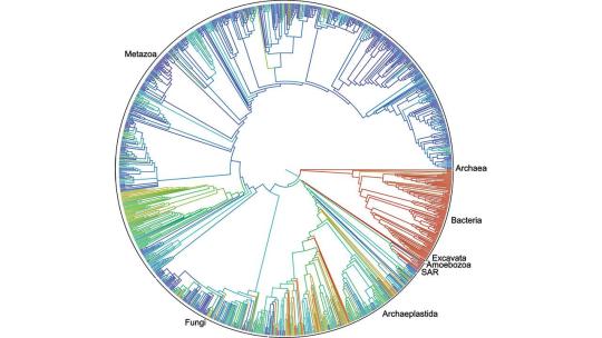
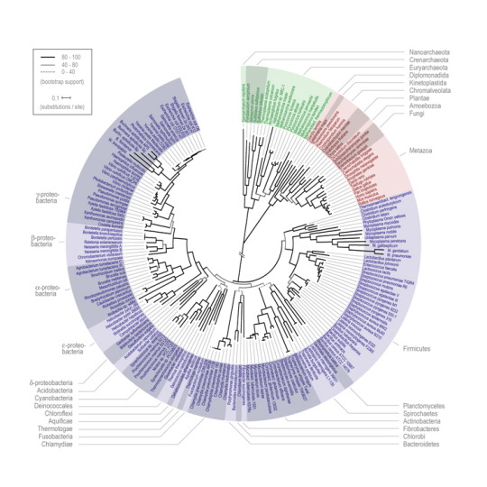
For my data visualization segment, I chose to work on a graph loosely referred to as a tree of life graph. It is used in Biology to show lineage and genetic connections between species of the same or similar familial groups. It is round most commonly, but it can also be found in a blocky version extending out in one of the cardinal directions. It starts from a central point, and branches out. Each branch represents a point where a species broke off slightly and became unique, causing the tree like branching appearance. Visually, it is complex but stunning. Almost like a work of art, when trained, one can clearly read all of the subtle intricacies including all if the scientific names and genetic families provided. I don’t know how long these style graphs have been around, but I studied them when I was working with the Bosque Ecological Monitoring Program and the National Center for Genomic Resources studying the genetic lineage of porcupines living in the Bosque. It is useful for tracing genes back to see if the population has been in a place for decades, or if it has been moving around nomadically. Now, this data visualization is almost only used in STEM fields as it is too complex for most people to understand. You have to have a certain level of training, but while it is very regimented in who can view it, those who can, can appreciate the detail that went into it.
0 notes
Text
Typography in Journal Design
I chose the signature look of the Albuquerque Journal masthead. I want to use both my own personal perspective as well as a technical perspective of the logo and how it works. First, my own view. I personally don’t like it, because it seems too simple. It is black and white, with a typical sans serif font, and an eagle underneath. I was also confused, isn’t the eagle a sign of America? So why is it used here in a specifically Albuquerque journal? In general, it just felt boring. We’ve been learning all about different aspects of design, so why is it that this feels like there was no technical design used in it at all? All of these questions immediately sprung into my mind when looking like this. It just doesn’t feel unique, especially compared to other name journals like the New York Times and the Huffington Post. From a technical point, it’s got great contrast, black text on a white background. It also uses size to its advantage, and is blocky and condensed. The only use of color is a thin red band on the top of the logo, that has absolutely no sense of being there except to try and save this logo from being too boring, which it did not manage to do. Overall though, I was incredibly disappointed with this design.

0 notes
Text
Brochure Design
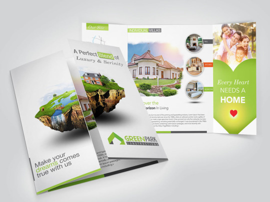
I chose the above brochure because it caught my eye when randomly searching for brochures to use for this segment. What first caught my eye was the house on the front. It was big, centered, and colorful. Like a house, it was inviting, and there was even the metaphor of entering the house with the separation of the two sides that open to the inside. The information was kept brief, but what I gathered was that it was a brochure for some housing complex/community, or a retirement home. Either way, it certainly enticed me. I also felt that it was neat, and not muddled down with large blocks of text. They even have a quote, “Every heart needs a home”, which is in a heart shaped background. The colors used are light colors, with greens that associate with nature, adding a natural influence to their houses. The text is simple, but differentiates the headings with the body by the use of italics, and some words even have a block of color behind them to make them stand out a bit more among the white background. My one complaint would be that there seems to be a lot of white space, and I felt maybe a soft design or something would’ve helped it not be so stark compared to what we do see on the brochure.
0 notes
Text
Undertale Typography
In the game Undertale, the use of typography is used to define some of the characters. Characters like Sans and Papyrus share their names with the font of their text dialogue, and is used to show more about the character. Sans, the short and often mischievous skeleton is denoted by the sans style font. It shows his lack of care or refinery, and there is often a lack of proper grammar or punctuation. Papyrus on the other hand, is a dramatic and daring skeleton brother to Sans, and his font shows this. Papyrus as a font is thin with little detail, but in all caps can show a sense of force. For Papyrus the character, using this font allows him to aptly express his dramatic flair and sometimes over worrisome nature towards the actions of his brother and the other characters. The creator also created his own fonts, the most common one unofficially referred to as the Determination font (Determination being a key feature of the game). He uses that font for some characters as well as general narration. The use of certain fonts as well as his own shows a level of thoughtful design in the creation of his game, taking into consideration just the shape of the letters or punctuation or capitalization has made the game a more unique experience for players.


0 notes
Text
CRW 2
The second set of presentations included mine. To reflect on mine, I believe I did alright. I prepared for the assignment to the best of my abilities, including reflecting on the personal religions people may have. What I didn’t consider was the cultural impacts of my project. My classmate Tye explained why she had to stop participating due to her personal culture and upbringing. The other presentation was by Walid, and was about the technicality and design of reddit. While his instructions in terms of participation of the activity weren’t very clear, it was interesting hearing about the specifics of design like topics discussed, how to format and structure, as well as other things we talked about in our class. What I liked most about his presentation was that I had no idea what reddit was used for, but he explained it in great deal and how to use it.
0 notes
Text
CRW 3
The 5th and 6th presentations were my favorite. The first, a plate design presentation was tactile and fun, though we didn’t find out who the winner was. It allowed us to practice looking at placement, themes, sizing of food and plate, decorations and design of the plate, color patterns, and food types. Looking at all of these factors allows us to create a well thought out and aesthetic plate of food. The second presentation was by far my favorite. Daniel, a Native American man in the Navajo tribe, talked to us about the history and design of native Navajo rugs. He told us about Spider Woman, and about the deep meaning woven into each carefully designed rug. He explained the importance of the four main colors, black, white, red, and brown. He explained that each rug needs to be perfectly symmetrical. I even made my own rug. I implicated a simple design, combined with red crosses (to represent health), and pine trees (to represent nature).
0 notes
Text
Shadow Theory

Icons in comics can be more prominent if they are more unique, having that individuality stand out amongst the pages. While not exactly relating to comics, I’m choosing to discuss what I am calling shadow theory. Shadow theory basically states that a character is original enough in its design if the detail is left out and there is only a black silhouette of the character, yet it can still be recognized. For example, everyone knows what Mickey Mouse looks like, and can identify his shape among the various other shadows in the image I chose. In fact, try guessing the images to see which ones immediately stick out to you. Certain features of a character, like how they are shaped, their size, and interesting or special features (like tails, extra limbs, big clothing, etc.) can make your character more memorable and thus making it an icon. This can be applied to comics too, as almost anyone who knows of the Batman comics can pick out his unique silhouette among a group of others. In terms of iconic abstraction, the more abstract your character, the more memorable they are. And in comics, memorability is key to success, and without it, your comic can be left in the dust of the bookshelf.
0 notes
Text
Design Principles
For principles of design, I chose to do two different formats of the engineering design process. The first is a spiral graph that explains the cycle of the process. It includes 5 of the 7 principles; pattern, emphasis, balance, harmony, and movement. Pattern, balance, and movement directly appear in the circular design itself, and tied with harmony, make the image symmetrical and easy to jump from one main point to the next. Emphasis can be seen with the title of the process in the center, as well as the blue circles emphasizing the points. The second is a more technical document of data values. It uses contrast and balance mostly. The contrast is in the black and white nature of the document, outlining each and every section to clarify the different parts. It is also balanced in that it provides some symmetry, and uses a square format throughout the whole document’s design. Overall, I chose both documents to show the importance of both. The first is more clear and visually appealing, but less detailed, while the second is more informative, but follows less of the design principles. Some, like the first image, are better for presentations that offer quick and easy information that can be mostly understood by the audience.


0 notes