Don't wanna be here? Send us removal request.
Text
WEEK 12 -> FINAL OUTCOME
As I have been sick during all of the last week I failed to keep a daily post.
However, I did complete a 15-second video of my kinetic-type animation. Each 'scene' you could say, was created over the course of Week 11. I'll be explaining here my processes and reasonings behind why I did what I did.
In the beginning, I animated these moving lines that rapidly move into a solid colour. This to me represents the rigid lines of Art Deco intros or title sequences which I had seen from previous research detailed in the posts below. I also wanted to give the effect that it's winding, like a river which leads perfectly into the next scene in this animation.
The creme colour fades into a picture of te tūtaekurī awa this picture is rightfully owned by Stuff NZ, and taken by Iain McGregor. This image is meant to give some texture to a rather basic background. I added monochrome to the image to make it fit with the colours seen in my Type Specimen.
Tūtaekurī is a river that flows in the Hawke's Bay region of Aotearoa, just south of Napier where it confluences with the Ngaruroro and Clive rivers before heading out to sea. This river is featured in my Pepeha.
This is where you see the first text which appears, simply saying 'TŪTAEKURĪ' this quickly is pulled out of the shot. I originally wanted to make it look like rolling credits that are also seen commonly in early films from the Art Deco period. But upon reviewing and feedback from my friends and family I decided to speed it up.
This leads into the last segment of the animation. Which shows the text being rolled over the video. This was also meant to give the feel of rolling text but additionally feel like rushing water. I purposefully made the middle text bar slower than the outer ones making it easier for the eyes to read and adjust to the pacing of the clip.
I additionally played with the style of my Dunbar text, creating contrast by filling some and others not.
REFLECTION:
Ultimately learning After Effects was an interesting experience and took a bit to get used to. I know for next time that I can be more efficient at using the application. Something that stumped me originally was how to piece the many parts I had created, and how to time them so they didn't overlap in one big pile on my screen. A simple Google helped me overcome many obstacles that were in my way of using After Effects.
0 notes
Text
WEEK 10 -> Experimenting in Adobe After Effects
REFLECTION ON EXPERIENCE:
This application I find very intimidating, especially without the guidance of the lecture tutorials. However, when I started doing it, it became less intimidating. I did have to ask Google some questions like how to "ease" the keyframes, or where "trim paths" was but other than that it was a very exciting first go.
0 notes
Text

WEEK 10 -> Research into animation.
Still undecided about my plan for the animation. So I looked at my type specimen for ideas. I really liked this squiggly design feature I created for my cover and is an element that is seen throughout my type specimen. Including something similar could be a great way to help create consistency between my type specimen and my type-face animation.
You can see on the side, I scribbled out some ideas for what I could do.
0 notes
Text
WEEK 10 -> Further research into art deco animation.
David mentioned to me one of the earliest films ever created - Metropolis. This film was also made at the time Art Deco was most popular. Here is the clip of the introduction to the film. Something I found interesting was that in this film, the credits rolled at the beginning and not the end like how we traditionally see them nowadays.
We can see once again there's a lot of line work used in this introduction. Art Deco seems to have a consistent theme of using rigid, symmetric lines.
0 notes
Text
WEEK 9 -> Learning after effects terminology.
Timeline -> The timeline is the important part to After Effects as it's where you'll see your compositions and layers.
Properties -> Each layer in After Effects has properties, which hold values such as, position, text, colour etc.
Keyframe -> Frame at any specific time. The application can calculate exactly the in-between values of two or more keyframes of separate frames.
Timecode -> In either seconds, minutes or hours, it is the exact time a specific frame is given. Typical frame-rates are 24/25 or 30 frames per second (fps).
Render -> This word is often used in verbs. It is the action of writing a sequence or image into a format like QuickTime.
Codec & Format -> The word 'codec' is the portmanteau of compression and decompression.
0 notes
Text
WEEK 9 -> Research for inspiration.
I really didn't know where I wanted to take my typeface animation. So I looked at some art deco templates for some needed inspiration.
It was very common to see lots of line work used in animations not only from here but from other animations I saw.
I'll be using linework to help promote the art deco feel with the font.
0 notes
Text
WEEK 9 -> Learning Premier Pro & Using After Effects.
This week I recorded myself following along with David's tutorial. Since I have previous experience with Premier Pro, I found this more comfortable to use.
0 notes
Text
WEEK 8 -> After Effects.
Sadly I did not record or save my files from the session we did with after effects. But essentially we were creating moving text and a moving eye that moved up and down the screen.
After learning After Effects it is definitely an overwhelming programme. But I most definitely am determined to try use this programme for my animation.
0 notes
Text

WEEK 7 -> Storyboarding
In this week's class, we started out with making storyboards of ideas of what we could do for our type animation.
Also, we are additionally thinking about what programme or media we were thinking of doing. I'm juggling between after effects or some sort of hand-made content.
0 notes
Text


Week 3 — Layouts
Using the layout from my notes to help guide how to do my layouts. I ended up doing the first one for my type specimen as it made the most sense to me.
0 notes
Text


Napier Art Deco Origins — Research
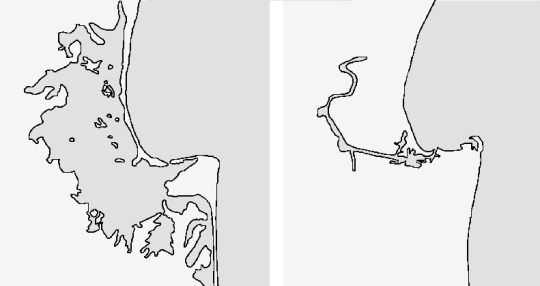
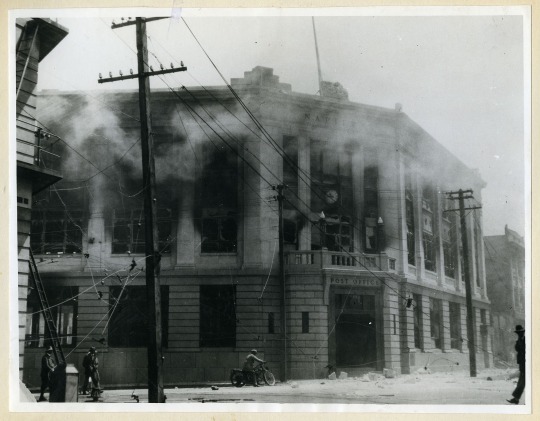
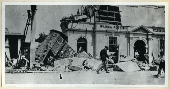
Using the government's website on New Zealand history. I went about researching the origins of Napier's Art Deco origins and explored the dark past. Above are some photos of the ruined city of Wairoa and Napier. There's also a map displaying a before and after the removal of the Ahuriri Lagoon that now hosts the Hawke's Bay Airport.
This research is for context in my rationale.
0 notes
Text

SDL — Jotting down layout for pages.
Having a base layout of how my pages should be is really helpful. Because of the number of pages and content that needs to be laid out. Writing this down in my notes app helps me to think about the layout iterations.
UPDATE -> "Origins of font" has become the rationale
0 notes
Text

Week 4 — A4 Typographic Poster
This poster was designed before I had even chosen my colours. I simply applied Week 4's in-class activity of using duo tones.
0 notes
Text

2023-512-nickgiles
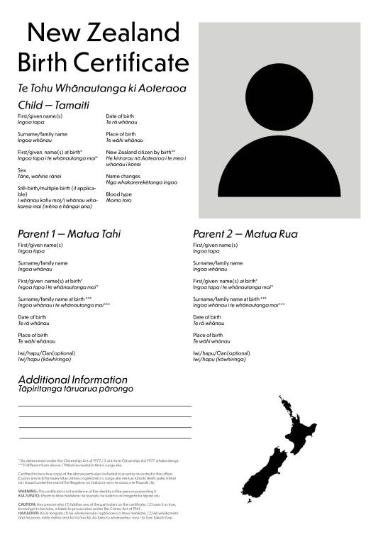
Week 3 — Birth Certificate Redesign [2]
0 notes


