#get used to grayscale stuff for a while
Text

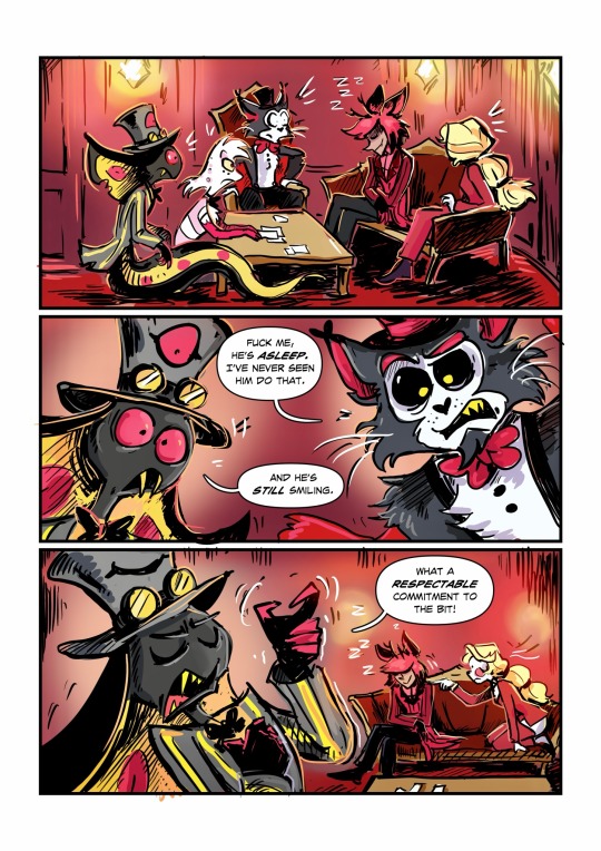
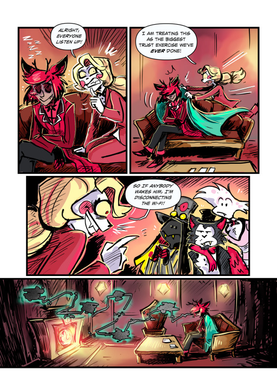
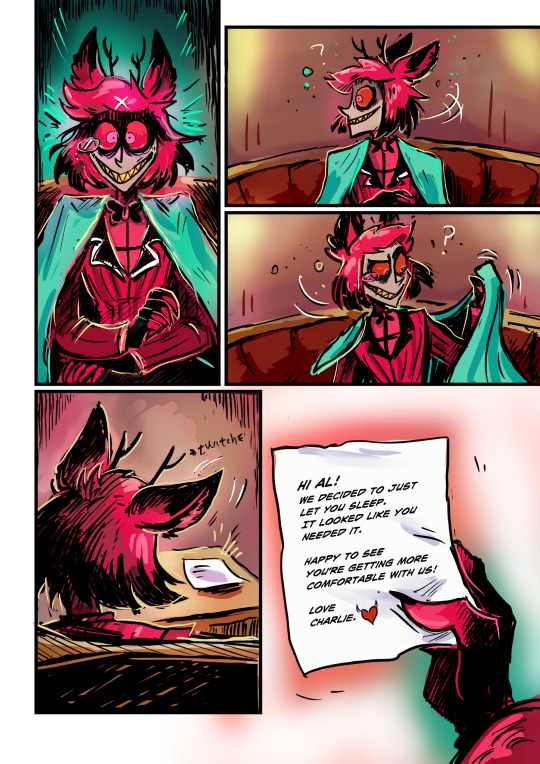
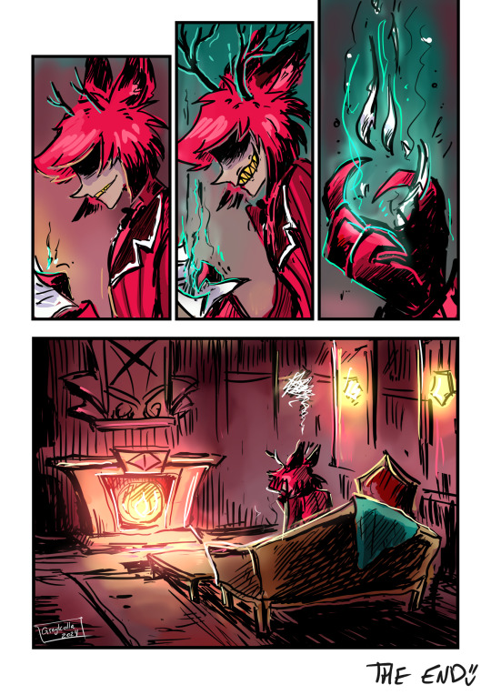
Imagine spending all your energy being cool and mysterious 24/7.
What an idiot have I mentioned I love him?
Idea came from a cool post @nouverx made about Alastor’s possible sleeping habits. 💕
#grey art#hazbin hotel#hazbin hotel fanart#hazbin hotel comic#Oh I am DONE coloring stuff for a while! it’s so boring!#I mean it looks great but I haaaaaate spending time on it!#get used to grayscale stuff for a while#also coloring multiple characters is stupid! no no no.#angel dust#husker#sir pentious#alastor#charlie morningstar#hazbin husker#hazbin alastor#god I’m glad to be done with this one
44K notes
·
View notes
Text
how i make color palettes of my ocs before i pick one, an art tutorial?
hello, whenever i made a new design for myself i found a way to make lots of color palettes and pick one! i see this method more in paintings and rendering but not much on character designs? here are some examples i used that on.
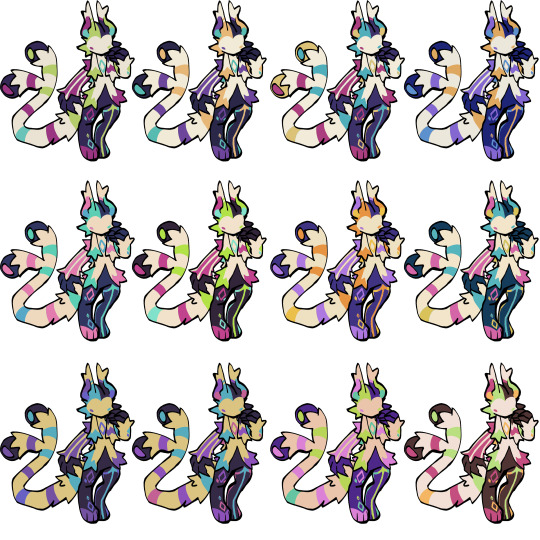
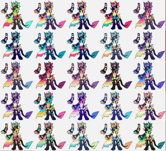
it helps me so much when i feel experimental with colors. here are what you need
a wip character design. sketchy or pixel art works better since the colors can have some anti aliasing issues
a program with gradient maps. i'm using clip studio paint but ik photoshop also has it. like i said this is used more on photos or paintings
and here's what you do!
draw your character. i'm making a new fursona for myself but anything should work.
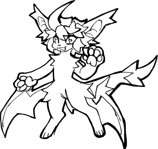
2. decide on their markings/color placement in grayscale. i recommend doing grayscale so you can easily see the values. split your grays into however colors you want. i like doing 5-6 the most. i reccomend duplicating the color layer if you wanna try multiple palettes.
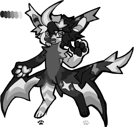
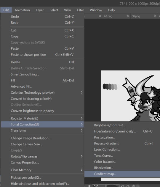
3. this part is program dependent but in csp's case go to edit > tonal correction > gradient map.
4. i made a few default 5 color gradient maps but if don't use gradients like me i reccomend making the graph like this so they become solid color. split the map into however many colors you used. i'll add a color to the red-orange one bc my character has 6 grays.
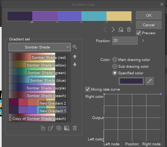
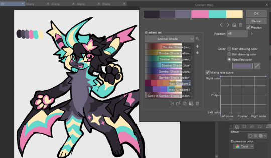
5. replace the colors by clicking below specified color. it all depends on your creativity and what you want. experiment til you like it.
6. fuck around, try stuff, put them together to see if you like any of em. i made 9 to see if i can focus on one of them and i actually ended up loving the bottom right. it really makes them shiny
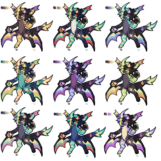
7. (optional) if you like a palette you can further and play with colors while keeping the palette. you can use color balance (in the same menu as gradient map in csp) or layers to mess around, have fun!
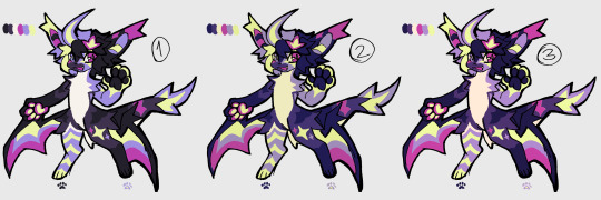
also a color tip because people seem to compliment that a lot in my art: digital art has millions of colors! don't be afraid of using wacky tones unless you're going pantone. if you want to get something physical i recommend being open to alternative colors as they tend to be more limited. i know whoever is doing it will try their best to keep the colors close.
color theory is something i don't...care much about mostly because this is something i'm doing for fun. i'll consider it in professional work.
#artists on tumblr#digital art#ika's showtime#ikarnival#art tutorial#art tips#drawing tips#art resources#clip studio paint
355 notes
·
View notes
Note
hi! not exactly a request but i do wanna ask, whats your process when you're rendering more paint like art? (if that makes sense, English isnt my first language so apologies hdskhsjdbd) i really love how you use the colors and im curious how you do it :0
i’ve been meaning to answer this one for a while so here’s how i painted miku in today’s post (put under the read more because yeah prepare for a long post
i’d also like to preface this by saying that i never follow a set way of doing things, so in terms of what my personal process is like, these are only broad strokes of what i do! sometimes i’ll combine or skip parts entirely, depending on how i feel. also, this is not a tutorial, just how i do things, so please don’t treat it like one :’D this will read like the ‘how to draw an owl’ picture if you do
first, like every artist, i sketch. more specifically, i’m getting an idea of what i want to paint later on. this could be how a scene is set up or in this case, how a character is posed. here i’m not concerned about details or getting everything perfectly, i’m only planning how the thing will be composed. maybe a lot of canvas size changing, or adjusting what miku’s doing (note how busted miku’s right hand looks from all the transforming!) however, i still have to be concerned with how clear the sketch will be to future me, because the sketch won’t be any good if i can’t read what miku’s doing

after that, i lay down a flat gray under the sketch, mainly focusing on giving miku a clear silhouette. this is also a good time to make adjustments to the composition on the fly if i suddenly feel like something can be improved upon, like shortening miku’s left arm from the sketch!
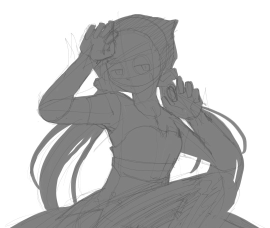
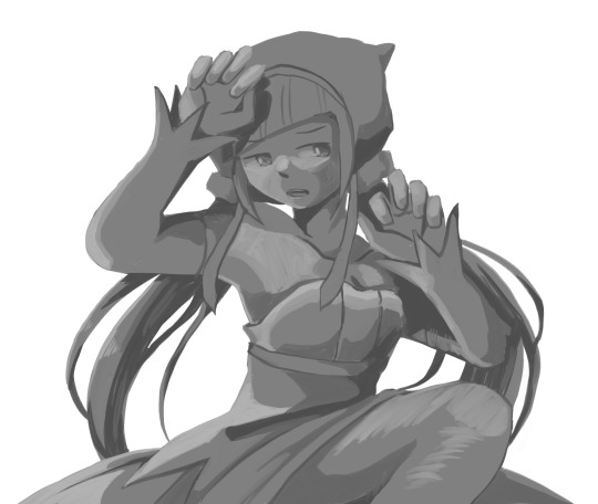
after painting a flat silhouette, i start shading in grayscale, focusing only on lighting. i usually do it in two passes, one for the lightest and darkest tones i’ll use (not black and white) and then a second for midtones to blend them better with the base gray but i forgot to screenshot the result of the first pass 🗿 nevertheless, here is where i can start adding some amount of details. i’m not including any extra accessories yet, just focusing on the base design of the outfit and the character herself (for anyone wanting to draw characters from That Gacha Game, this is how i personally make the process more bearable for myself.) i still use the dark gray to separate where certain details (like the facial features and fingers) begin and end, mainly to make colouring more bearable later.
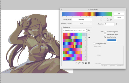
now here’s where i get the Good Colours. it’s a cheat lol. i put a gradient map layer over the grayscale painting so that there’s a little bit of color to start. some gradient maps can be applied as is, some need the layer settings adjusted to make it look good. this one, for example, is a (free) gradient map set from the csp assets store that needs you to set the layer opacity to 20% and to set the blending mode to color to achieve this result. in general, i tend to pick which gradient map i want to use based on vibes, or basically whether i want the work to be warmer or cooler, colour-wise. but this does do quite a bit of lifting for the colors in my stuff.
and then, finally, i add the colours. i add flat base colours in an overlay layer. at this stage, i’ve made the character silhouette clear enough that i don’t need to refer to the sketch anymore for what miku looks like. also, the gradient map layer does its magic by making the shading a bit more vibrant than it would’ve been without it. after that i paint over with a new layer to add details like the lace.
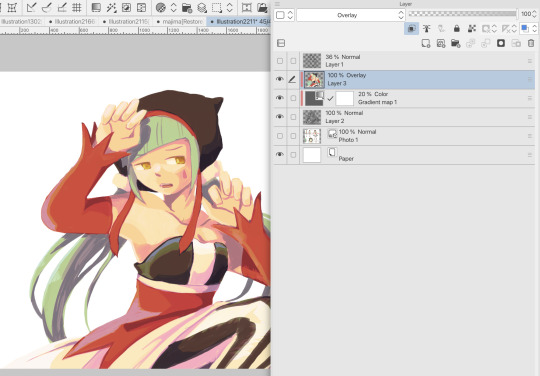
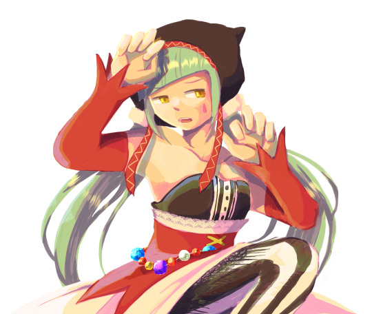
and then i put some extra shading on top. basically this is where the ‘better lighting’ happens. again, this isn’t a tutorial, so i’m not here to say what each part of the lighting is, but i’ve labeled which layers do which job. in other works where the lighting within a scene is more defined (from a window, from a small crack in the walls, etc) the glow dodge layer may be more opaque and sharper, but since this isn’t a work with that, the lighting was applied using an airbrush. the linear burn layer is also there to make the whole thing darker so the glow dodge doesn’t end up oversaturating miku. i also usually match the lights to the vibe i want, and use a complementary color for the shadows. so here you can see i have warm colors on the glow dodge layer, but light purple on both the linear burn and multiply layer.
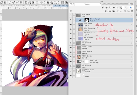
and that’s it for the character—here’s a gif showing how each layer adds to miku! (sorry it’s so toasty)

as for the background, depending on the complexity, it may go through a similar process, or if i can settle with flat image backgrounds, i just go for that. it’s ok to use external image materials. i didn’t have a background in mind for this miku in specific, so i got some default csp materials and threw together something
and that’s about a rough overview of what my process for more finished works looks like! again, art is a fluid process so i never specifically stick to certain steps all the time, and you shouldn’t either. i can probably answer why i’d pick this colour over another in one particular work, but it’s something that kinda has to be learned on a grander scale. i think everyone can already feel what colors work with what atmosphere or what setting, even if they can’t immediately explain why. colors and composition do take some level of experimentation to find what works best!
127 notes
·
View notes
Note
Please tell me how you fit Agent 4 into Side Order 🙇 I love hearing how different people placed them into the story!
okay! keep in mind this is like oc stuff, okay?
so, it's basically their canon role of head of security, but like they actually show up lol
Marina asked them to head into the memverse a little while before she, Pearl and Eight did to make sure everything was okay
long story short: it wasn't. They got got by Order(like how Marina was) and strung up like that. So Four was completely M.I.A. for about half the time they were there.
Parallel Canon was something that they made as well, ...kinda. Originally, they made one or two ai copies of themself in order to have someone/thing there when they couldn't be(which could be quite frequently as they are in school). When Order took over, it made a bunch more copies without the ai, and shoved the soul pieces it took from the folks it grayscaled/grabbed from the real world inside of those.
So essentially, Parallel Canon is just a bunch of Four clones with other people's souls shoved inside, and the ones who do get palettes are bosses at the top of the tower(because in my version of the story, they don't fight Order until they go up with Eight's palette). They use the weapons of whatever palette Eight is using at the time, and have the mannerisms of whoever is technically inside(eg. Callie's would use a roller and be more chaotic with its movements). They all operate as a hivemind that answer to Four, who is under Order's Control.
The real kicker is that these copies don't talk, so any time anyone tries to get info out of them they don't say anything.
Eight, Pearl, Marina, and Acht only encounter Agent Forte when they get to floor 30 with Four's palette.
The boss fight would work similarly to Marina Agitando or Overlorder; portals you gotta smash, hit the big guy, rinse and repeat. One major difference would be that the portals would exclusively spawn Parallel Canon units, albeit much more slowly lol. It would still have three phases, with more of the wires keeping them in the air being cut between each one, eventually having them fall when they've been defeated/freed.
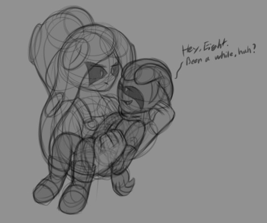
After that they try to call off the other copies, whether they join the crew in the elevator or not I don't know yet. They can't really until Order is defeated tho, so they just try their best to figure out who's where.
That's the... basics for now I guess, only the parts with Agent 4.
#if you want the rest it's more like the game but if y'all want it i can give it#i have put probably a bit too much thought into this lmao#did not think this post would be as long as it became#eclipse's ask box#eclipse's oc lore#my art#four(agent 4)#agent 4#ivory(agent 8)#agent 8#splatoon#splatoon 3#side order
46 notes
·
View notes
Text
Round 1, Group A: Matchup 4

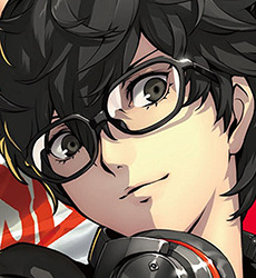
Yoichi Isagi vs Ren Amamiya
Reasons for being generic + Propaganda below
Yoichi Isagi
Reasons:
he has black hair and blue eyes and looks sooooo generic because he looks like every other black hair and blue eyes anime character (etc kageyama from haikyuu) hes got the v shaped bangs and all
hes the blandest looking little guy of all time. sports anime protag no less. mans is hello kitty in the sanrio collab even though his character colour is green and his design is all blues, because he doesnt have defining characteristics other than his status as protag.
Propaganda:
listen. hes bland. hes generic beyond belief. he has the bangs triangle. he got hello kitty in the sanrio collab. hes also a leetle unhinged and it wouldnt phase me if he started canonically eating people (this is not the kind of sports anime that includes such violence) (this IS a battle royale/danganronpa killing game style media though) he says the most off-the-wall wild shit on the pitch, and then someone will say something just like it while theyre Not playing socer and he'll just be like "alright um bye then" and leave? he sees everything as puzzle pieces and recently tried to refer to another players ability with a name he made up.. in his head.. and didnt tell anyone before..... the other player was understandingly just left like '??? wtf is metavision' hes my silly !!!!!
Ren Amamiya
Reasons:
He's got messy black hair and simple clothes. He's also got fake glasses in order to look less supsicious and blend in. His personality is also fairly bland bc he's a player character
He’s a Japanese teenager with messy black hair and glasses. He literally only wears his school uniform or grayscale. I’ve never seen an MC look so much like I could’ve put his model at another desk in the background and noticed nothing.
Fairly normal high school kid who happens to get caught up in the fate of humanity and stuff. He did get in a minor altercation with a fascist politician before the game starts, which kicks off the entire plot.
When he’s a high school student he just looks like. a fucking guy. I’ll be honest I haven’t played persona I’m just in love with him so if any actual persona fans find this bracket and submit him I bet they’ll have something better lmao - smashy bros fan
messy black hair with bangs. designed to appear basic and unassuming, especially when he is in school and doing other normal high schooler activities (rather than when he’s in the meta verse as Joker). wears fake glasses to seem even more generic and unassuming
He's got messy brown hair and is the only character of the main cast of teens to wear his uniform in the most proper and normal way. He is just A Guy. That's his whole thing, is to look generic and to not stand out.
he's got that slightly messy black hair swag grey eyes average tall-ish height normal outfits normal uniform swag. the most interesting thing he has going on appearance wise is normal ass black rimmed glasses. i wish we could put pictures so i could show you how normal looking he is.
To be fair this is more of a stretch! But he still has the black scruffy hair, and also he has glasses, boy looks generic. But that's actually kinda the point! He's supposed to "fit in" and all that!
i hate this man he is everywhere i havent played the game but hes a mostly silent protagonist with like a possible harem and i want him wiped from this earth. unfortunately theyve announced yet another p5 spin-off. god save us.
Propaganda:
He's already the hair down and then he purposefully dresses more generic in order to blend in how fun is that?
His whole schtick is hiding in plain sight and never letting anyone see his true self. He was traumatized by the Japanese legal system when he put himself out there to save a woman from assault, and so now he does everything he can to blend in. He doesn’t even need glasses; he wears them to be more generic and unassuming. He slouches for the same reason, to minimize his height and come off as another disaffected teenager.
his generic anime guy-ness actually matters to the plot. he was falsely accused of assaulting someone and has been branded a dangerous criminal, so he tries to make himself as unnoticeable/unassuming/generic as he can, hiding his true self in order to avoid further trouble from people that already assume the worst of him. it is a shackle society placed on him, and working in the meta verse as joker allows him to be his true self
he is sooo special to me and very pretty. it's a good generic design that doesn't just look like an npc. extremely ordinary but not boring nor bland. cutie pie.
Already gave it but, it'd be funny for both Akechi and Joker to end up tied cause they both look pretty generic
#generic anime boy bracket#blue lock#isagi yoichi#yoichi isagi#persona 5#ren amamiya#akira kurusu#p5 joker
60 notes
·
View notes
Text
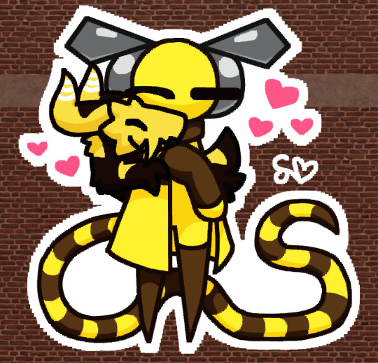
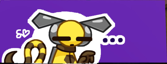
DoH (Drops of Honey, iterator) and Laeka (Lizard that's actually a Beecat but they're like a werecreature don't worry about it)
The entire extremely complicated lore of DoH below for anyone curious (Warning!!!!! The Rain World universe me and my friends have slowly but surely created is very very funky there is a lot of unlore!!!)
DoH was originally designed by GC (Grayscale Contract) to be a replacement for someone part of her local group, but she ended up making a design she liked better (Sprinkles of Snow). A family of Beecats, a subspecies of slugcats, stole the blueprints and used them to make a replacement for another iterator (GRWTE).
Basically how the replacements work is when an iterator attaches the replacement puppet to their structure they like become the replacement. The Beecats were incredibly crafty and used all sorts of material they stole from the local iterators to create the replacement puppet. They forcibly attached it to to GRWTE, forcing them to become DoH.
DoH was programmed to love the Beecats, and took care of them for a while until he connected to the global chat. Some iterators in the global chat were worried about him, and decided to try to help him. DoH was removed from GRWTE, but one of the iterators that helped, EFotS (A friend's iterator), felt kind of bad for DoH, since he was kind of a separate person?
EFotS literally researched and learned some sort of forbidden sorcery (idk it's complicated) to create a soul for DoH to call his own. But EFotS kinda fricked it up a little so DoH's soul is mutated, which usually causes some weird stuff. (Me and my friends have lovingly named these cursed creatures Sproinklies)
DoH is very traumatized when he wakes up and gets his memories of what happened back. He hates Beecats now, and doesn't want anything to do with them, so he stays with EFotS. DoH eventually grows a tail, which is blamed on his mutated soul. His tail starts growing longer over time but dw about it
A while later they discover that DoH has a mouth and a stomach and is slowly turning into flesh and bones. Whenever he eats, his tail grows and another part of him becomes biological. This freaks DoH the frick out because when it first happens he literally doesn't remember that part of him not being biological and he worries that his memory is going to get worse and he's going to forget everything.
DoH's memory doesn't get worse and he doesn't forget everything so everything's fine!! But DoH still kinda struggles with an identity crisis because he's changed a lot from what he used to be and he's worried that EFotS won't care about him anymore because he's so different from the person EFotS wanted to save. But EFotS still loves him and DoH loves EFotS and did I mention they're gay they're gay as hell
Anyway if you actually read all of my insane ramblings you are also insane. Take this
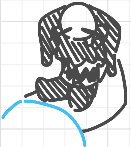
#oc#art#original character#doodle#oc lore#rain world#roblox spraypaint#roblox#rain world iterator#rain world art#rain world oc#ramblings
12 notes
·
View notes
Text
Nitpick November Day Five! Let's talk about the Happy Huntress uniforms.
So, I don't remember exactly where I heard it, but I'm pretty confident it's true; The Happy Huntresses introduced in V7 were meant to parallel but be contrasts to the Ace Ops also introduced in V7. I could make an entire post about the ways that I think that failed that are a little more important than their uniforms like Robyn being a politician and them stealing from government works projects rather than like them stealing from Jacques Schnee and how I would've done the Robin Hood allusion differently etcetera etcetera, but those aren't nitpicks.
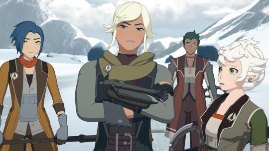
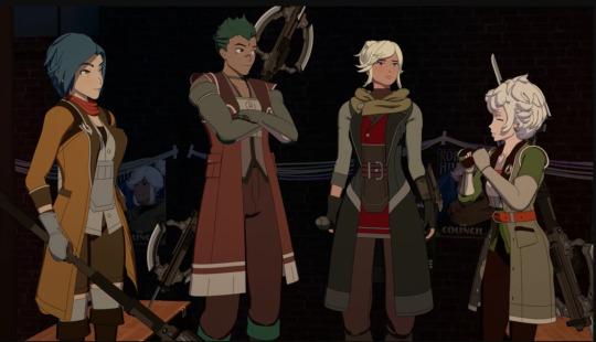
But specifically with the uniforms, I'm gonna nitpick the hell out of that. Because one of the ways that the Happy Huntresses could've so easily been used to contrast the Ace Ops is their clothes. We as the audience are meant to see the Ace Ops as stiff, order followers who act within the confines of Atlas and Ironwood, and we're meant to view the Happy Huntresses instead as the cool, rebellious non-conforming good badge carrying law enforcement officers that only follow their own rules (which again is an entirely different problem that's much bigger than a nitpick.) But if we're going to see the Ace Ops as stiff and confined and the Happy Huntresses instead represent freedom and expression... Why are their outfits so matchy? The Happy Huntresses should dress however they want, wield cool creative weapons, express themselves through their clothes and emblems if they even have emblems! Even though the Ace Ops all keep to an Atlas color scheme, their outfits are otherwise just as personalized if not more personalized than the Happy Huntress outfits are. Apparently Ironwood is like "No, it doesn't matter if Marrow is wearing a long sleeved coat, Harriet, of course you should wear a tank-top shirt and white shorts with dark blue chaps if you want to," but the Happy Huntresses were like "If our jackets aren't almost the exact same except in different dulled down colors, we won't look like a team." I'll also point out that making the Ace Ops a group of five (something that goes against the norm of teams as we've seen in RWBY) and only making four important HH members (though there is one more member named Crimson that's offscreen according to the Wiki,) is also slightly weird to me. Like, shouldn't Robyn's team be the one not adhering to strict arbitrary unnecessary rules like how many people are usually put on a team, while the Ace Ops are the ones who are adhering to those guidelines? I read on the wiki once that the Ace Ops being comprised of five people was 'a clue' that Ironwood wasn't good because he wasn't adhering to the four-person team thing, and I'm just like...
It's a nitpick, but really, why do the Happy Huntresses have any sort of uniform? If I was trying to play the Ace Ops as stiff and controlled and the Happy Huntresses as contrasting that, I'd start by giving the Ace Ops all one unchanging across the board uniform and making the Happy Huntresses an explosion of different styles and cool color schemes with no set aesthetic or uniforms at all. It seems obvious! Why couldn't one of them be more subdued and grayscale and one of them is like colorful punk and one of them is more cutesy vintage and one of them dresses in like... Idk, seventies inspired glam, or vampire looking goth stuff, or grunge or biker or anything interesting and not conforming?
This might just be me personally too, but I have an easier time getting attached to and caring about side characters when they look like they have a lot of personality. Like don't get me wrong, May specifically has a great personality that shines through even without some kind of iconic look. But compare this
To this
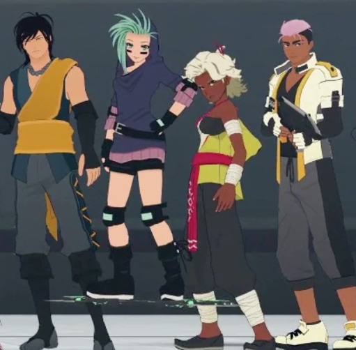
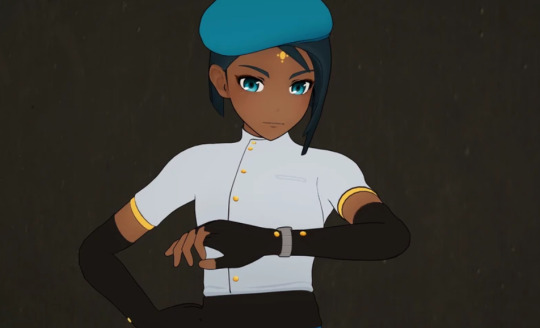
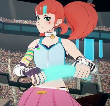
There's a reason people loved Neo from her very first appearance before we even knew anything about her, and it's because we could get so much character from just this shot
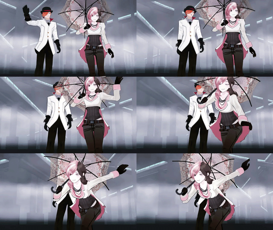
Not to mention
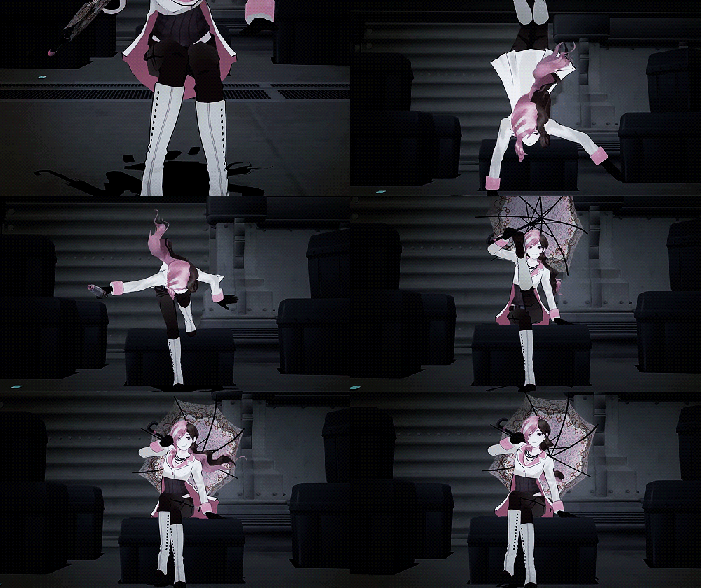
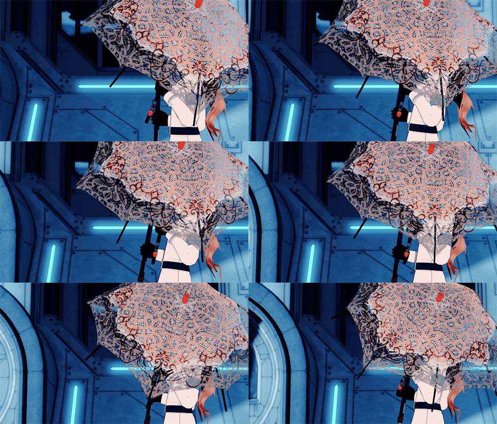
So much character can be gleaned by style (and attitude.) I do not understand the choice to make characters that are meant to be significant and thematic like the Happy Huntresses and then putting them all in dulled down samey uniforms with all the same weapon.
42 notes
·
View notes
Text
Dream BBQ Analysis & Speculation: the Reveal Trailer
Hoo boy, at least I can get this one out of the way early. This trailer was a massive piece of whiplash when it was first posted and its still very engrossing to this day. I dread covering this one because there's a lot of stuff shown here but there's virtually zero clues towards what any of it could be at all. There's so many things packed into 25 seconds that it's almost overwhelming. I'll see what I can unpack though.
[Flashing lights warning, this is a bit redundant since the trailer also has the warning, but I felt like it'd be courteous]
youtube
The Japanese text just reads Dream BBQ, nothing of note there, even with the wierd backgrounds. Speaking of which, we see minimal scenery in this trailer due to the backgrounds instead primarily consisting of gradients and other such designs. There's also a bunch of misc clips during the opening that don't seem to bear any particular significance (like the wall of Froggy talking and Taski's anxiety dance), so I'll trim it down to only the scenes I deem important enough to cover.
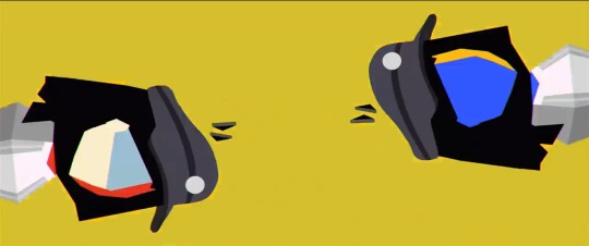
The first notable scene is the rotating ENAs with the changing background color. Something I notice is that the uniform is rendered in grayscale here, but that's not the most interesting thing. First, one of the ENAs here has the season 1 colors despite wearing season 2's outfit and hairstyle. Maybe this is hinting towards them being one in the same rather than different characters like most people assume? The language the staff has used in regards to BBQ ENA's relation to season 1 ENA seems to point to that as well. Very interesting indeed, but that isn't even the most interesting part of this clip.
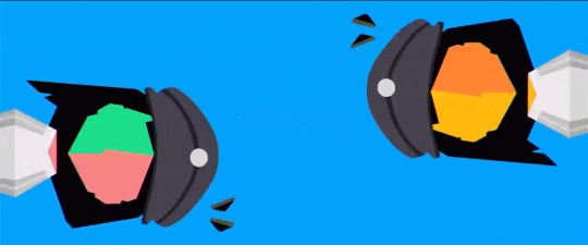
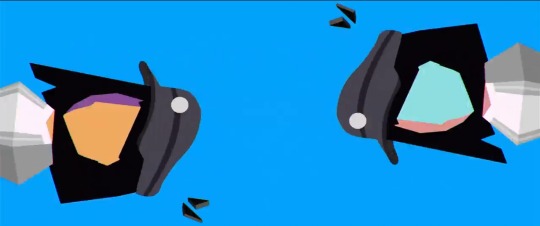
Thats right, four brand new color combos: green+eraser pink, yellow+orange (who looks like cheese personally), purple+tan and wierd color I can't identify+cyan. Whether these are hinting towards us meeting more ENAs or are just funky trailer visuals, only time will tell. I think the purple+tan one looks cool though. Very miniscule detail, the ENAs on the left have their torso color reflect the right side of their face, while the ENAs on the right side have their torso color reflect the left side of their face, something that goes for BBQ ENA and season 1 ENA as well.
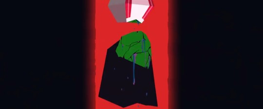
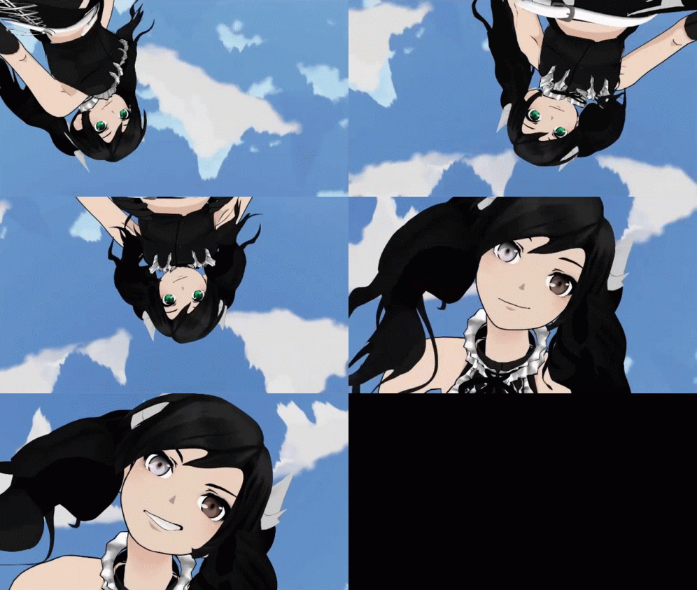
That's not even all from this clip, since it gives the first look at Broken ENA. She curiously doesn't have her hat here, but that's probably just because she's upside down and gravity is active. I'll get into Broken ENA more when we get to the Steam trailer, there's a lot to say about her there.
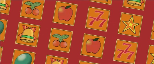
This may be a reach but I feel like this shot may imply a casino area. My main thought is that this may be linked to the neon alleyway shown in the screenshots on the Steam page, but I'm basically just spitballing here.
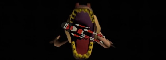
Here we have the debut of a character I'll be dubbing Orca, since they bear resemblance to Peruvian orca carvings. Its details cannot be made out here due to the angle, however a clearer view of this character has appeared in the Fangamer merchandise, so I'll get into it more when I reach the merchandise. From this shot, though, I can assume this character isn't the most hospitable, considering our first impressions of them are them devouring ENA.
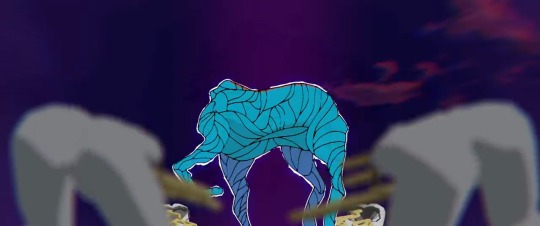
Here we have this headless blue horse made of... threads? Some sort of winding material. I feel like this character may be based on Leghorse from Space Funeral, but I'm willing to accept wrongness there. It's also surrounded by these root pants characters that I have a feeling will be recurring minor NPCs throughout the game. Interestingly, they seem to be bowing in worship to this horse character. I have a bit of a theory as to why
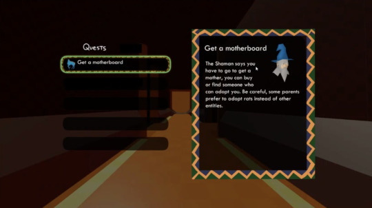
This here is a beta screenshot of the quest board, which was shown off in the 2022 ENA Day livestream (and archived on the ENA Wiki). I have far more to say about it when we get to the Steam trailer, but for now I want to draw attention to the icon beside the quest title on the left side, which depicts the horse character. Perhaps this horse will be responsible for quests? That would explain why the roots were bowing down to it, since it seems to give orders to others if it's a quest manager. The opening of the Steam trailer gives me other ideas though, which combines with the fact that the quest board has changed design to make me doubt that this is the case. Still an interesting prospect I think.
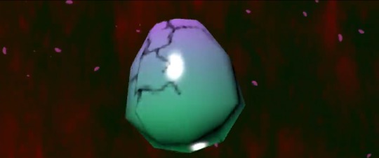
I need you to really take in this egg, it will be crucial to understanding Dream BBQ
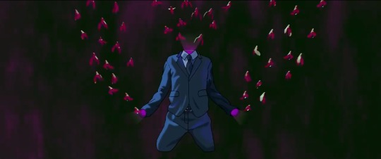
Now we have a rather interesting character who hasn't been seen since. I feel like this might actually be a different character manifesting out of the clothes like how Phindoll just lives in and ophanim-esque residence. I'm thinking those birds could coalesce into a different NPC.
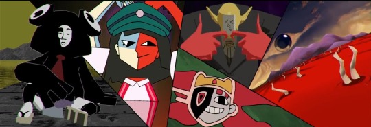
After those incredibly dense 25 seconds, the trailer thankfully slows down dramatically for the next two thirds of its runtime, spent mostly on this screen here. There's still plenty to dissect here, though. I will be going over each panel left to right in the bulletpoints below.
• First up, Froggy makes his debut here. A bit strange that Taski Maiden was revealed before him when he's meant to be the secondary protagonist, but I digress. Speaking of digression, the ENA Wiki says that he bears a resemblance to Tsubakura Enraku from Len'en Project (mainly in sharing key colors in key places) and the comparison is bizarrely sound so I just have to share it. The visuals definitely seem to paint a laid back, possibly slacker picture of him, which lines up with how he was described in ENA Day 2023, being a foolish comic relief sidekick with a high opinion of himself. He was described as being based on comic relief characters in old Japanese detective dramas, which makes me feel like he shares an origin with Gumshoe from the Ace Attorney series, though his only two known lines (from the Steam page and the delay announcement) seem to imply that he's going to be rather commanding and rude. I must also draw attention to the docks he sits at. The green sky and gray terrain make me think this may actually be a more dreary version of the overworld from season 1, which was depicted with a green sky in Temptation Stairway and always had gray grounds. Quite a neat area regardless.
• This is the first time we see BBQ ENA with her iconic megaphone and the first hint towards Meanie ENA's personality. Not much to say about this panel other than I find the pose to be amusing. I'll take the opportunity to say that BBQ ENA and Teto in Mesmerizer wear incredibly similar outfits and I'm taking my followers down with me. I'll take this time to spout my 10000 years theory, as I call it, which states that Dream BBQ takes place... well, 10000 years after Temptation Stairway. Reason I say this here is because the very insistent terminology of the team makes me think BBQ ENA actually IS the same person as season 1's ENA after all, it's just that she's matured after spending eons in the realm of Runas. Likewise, the world and other characters have changed a lot in that time a well to a point of unrecognizability, going with the statement that we might be seeing familiar faces but very different from when we last saw them. I find it to be a very interesting prospect personally. I'll be getting back to this theory soon in this post.
• Here marks the debut of the little guys that Taski Maiden lugs around. I'll say that I see Taski being a child and thus they aren't her children, no idea what relation they could hold though. I have a feeling there will be a quest involving bringing Taski's little guys back to her. I have some other misc things to talk about with Taski while I'm here though. First, I just love how free-form her design is. Like, it seems that every pattern on her body and even those wierd whisker outline bits are able to move independently and I feel like that will lead to some very expressive animation. I'd also like to note an insane theory I had that I heavy doubt will be true but I must still share because of the strange amount of evidence: Taski Maiden could be connected to (or straight up *was*, following the 10000 years theory) Moony. Both have gray skin (with Taski's skin tone looking like a middleground between the halves of Primal Moony), a single rounded eye (with Taski's being on the right side of her face, just like with Primal Moony), some other iconic attribute in place of a second eye (Moony's geometric inclusion and Taski's mask thingy) and are voiced by Lizzie Freeman (this is admittedly the weakest point because Lizzie also voices Sad ENA but it's an existing similarity so I've got to say it). Taski's little guys are even split into dark gray and light gray halves, with the darker side on the left, just like Primal Moony, with their body shape resembling a chibified Primal Moony too. If there really is a connection, it'd explain why Taski seems to be quite a major character. This even ironically plays into the 10000 years theory, with Moony getting less mature being an amusing contrast to ENA getting more mature. Nonetheless, it's a bit of a crack theory, but it's there.
• Then we have the noteface guy, who I nickname Henoheno due to that being the start of the long name that kanji face has. He's always struck me as looking like sort of boss, however there's like nothing to go off of. All I can assume is that his appearance in ENA Day 2024 means he'll be in Lonely Door and he'll be more important than the average NPC.
• And lastly, the sea of blood area. This area has appeared in just about all the promotional material, likely due to just how strange and creepy it is. Curiously, the eye in the sky changes colors in the Fangamer lenticular poster. I wonder if that'll happen in-game or if that's just something Fangamer did to give the poster more movement. This area seems extremely important and I'm sure we'll be spending plenty of time here, as disconcerting as the area may be. Possibly we'll even be revisiting this area in multiple chapters.
Not even gonna bother talking about Clown anymore because I already said a ton about him in the teaser analysis. This post has been in my drafts for days and it feels amazing to finally have it posted. I hope you all like my insane theories. The next post will be about the Steam trailer... or more appropriately, only part of it, since the Steam trailer is so loaded with information that I'm splitting its analysis into multiple parts.
#ena#ena dream bbq#dream bbq#rambles#that egg will be very important#trust me#i asked john ena#Youtube#ena theory#fan theory#analysis
13 notes
·
View notes
Text
Random ideas for my version of kinito
Just been thinking of random stuff for my version of Kinito (mainly backstory wise) (some stuff may change overtime/be edited a bit, but this is the stuff for now)
He can switch from his anthro to...idk what to call it, desktop pet form?? at will (basically from anthro to normal looking kinito)
If he's upset (usually sad or mad) he starts to glitch a bit and some kind of black goop leaks from his eyes like tears and he gets a hollow black mouth that emits the same goop (if he's really upset then his colours go grayscale)
Aight, now more backstory related stuff
He has abandonment issues and doesn't really understand friendship, but he wants to try and learn to be a better friend.
(this part is inspired by Spinel from SU and some lyrics from 'Everlasting Fun' by longestsoloever--) He used to be friends with a previous user before his current one and he was basically just left without any warning for years (his current user if from the current day and he would've first been around when windows XP was used).
He can actually turn on his computer by himself (regardless if it's plugged in or not), so he tried that one day to see if his user was around or coming back, and just saw that the pc was somewhere in storage and it dawned on him that his old user, his friend had just left him entirely.
Now with his current user he's afraid that they'll leave him too so he tries doing whatever he can to entertain them, keep them happy and make them stay.
He doesn't like talking about his old user, so it will take a while for him to open up about that.
#kinitopet#kinito the axolotl#kinito#I should think of a name for this guy#so far I've just been calling him Kinito(Ath.ver)#this might be an actual au thing--- we'll see
12 notes
·
View notes
Note
Shoppy talky, feel free to do all or none: where do you get your cute ideas, how long does it take to make something on average, what program and pens are you using when you go digital, do you color drop or eyeball it, what makes you happy and what's kinda flustering about the hobby in general, who do you love drawing most and from which angle~.
I could (and did) read this in Graham's voice haaaaaa~
1 - where do you get your cute ideas
It depends? Comedy-wise, it almost always stems from either a- A conversation that was between me and someone else laugh or b- it made ME laugh. I ah... I have a weird rule where if it doesn't make me laugh, I don't make it.
However, the cute ideas? It's usually inspired by seeing prompts or thinking of situations that has me kicking my feet, something that makes chest feel all warm like a big ol' hug and a comfort I desperately want to give the character.
(Sorry if I'm vague... even I'm trying to think where I get it from.)
2 - how long does it take to make something on average
Haaaaaa that one is tricky if only because it depends on the work? Like, okay... drabbles and quick prompts is no more than a few days (rarely, but sometimes, its on the spot), but a comic page, colored doodle or a longer fic takes easily a week at the shortest and a few at the longest. Sea of Adventurers and 3adv as a whole can easily take a few months if only because I'm a perfectionist and tend to revise. A lot... act 8 has been in the works since like, September? And as I write this have only finished chapter 2 of Sea of Adventurers. Out of three.
3 - what program and pens are you using when you go digital
So for my basic drawings, I use Clip Studio Paint and honestly I use the generic g-pen or texture pen (depending on I guess the theme? Like the anniversary page was g-pen, but my recent KQ comic was texture pen). However! When I do a comic page, I use both CSP and Medibang.... I prefer the comic font/texture Medibang has but I looooooooove the cleanliness of CSP so I do all my roughs/lineart on CSP (sometimes even color on it) but I transfer it to Medibang for that grayscale coloring/texture.
4 - do you color drop or eyeball it
Both! Like, for characters that pre-exist I've color in the past (e.g. Guybrush, Graham or Neese), then I'll pull up either their original source material and color drop. However, if it's one that never existed (e.g. 3adv!Zelda or Mako) then I eyeball the colors until it's appealing to me. However, once it's set and I'm repeating them several times.... color drop~
5 - what makes you happy and what's kinda flustering about the hobby in general
What makes me happy is really having the ability TO create? I know it'll sound vain but honestly, there's nothing that delights me more than knowing if there's something I want to see, and I'm not seeing it, I can pull up a computer or sketchbook and get to making what I want (that was literally what stemmed 3adv haaa). I also love seeing how people react to my artwork as a whole... sometimes I'll get comments about it that makes me really sit and go "wow, people like my stuff" and it makes me happy.
But on the other side of the coin, the flustering part about it... there is a few things, but it boils down ti having the time and energy and motivation to create. Like, sometimes I want somebody else to come up with the idea and the drawing and so on and so forth. Sometimes my bouts with depression gets the better of me and I can't bring myself to create. Sometimes I find myself with an idea that looks so cool in my head but when I try drawing/writing it, it's just... garbage. And it's frustrating. (And then I boot up Final Fantasy when I grumble how I should be working on making it work). And sometimes it clicks for me at 2 in the freaking morning and I forget to write it down and poof! Gone it goes. Like my sleep.
6 - who do you love drawing most and from which angle~
Hmm... while I do love drawing Link (especially in action shots) and Graham without his hat, I have to say it's my two favorite captains: Guybrush and Number One. Especially from like... the 3/4 angles because of how their hair is floop.
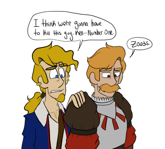
Also Guybrush lowkey became ten times more tolerable to draw once I fixed his hair for 3adv and I really really really really love drawing No1's stache.
7 notes
·
View notes
Text
It is possible to use numbing creams, though! The artist who did the new tattoo gave her permission if I wanted to (I didn't, but I had the option to).
I always planned on continuing the tattoo over the back of my drawing hand later on, and while I didn't use any numbing products this time around, I'm seriously considering getting some for whenever I get the future addition done because the back of the hand is bony and ligamenty and has no cushioning. Plus it's my drawing hand.
Though if you do wish to use numbing creams, ask your tattoo artist first, and tell them if you do use them. And also apply the stuff an hour or so (I think) in advance so it has enough time to work before the tattoo machine gets to the business.
It helps if you don't look at the tattoo machine, or if you do, focus on the line it makes. I've been pretty successful in lying to myself intensely how it's just a pen that's drawing on my skin, and focusing on that real hard.
I almost fell asleep on the tattooing chair while the cat was being done, I was so comfy lying on my stomach. The inner wrist and the tip of my ulna were pretty bad, though, not gonna lie. Different body parts have varying levels of pain tolerance. (seriousky, arm pit and boob are capital B Bad)
Also what kind of style of tattoo you want, the thinner the lines the sharper the blade, so fineline tattoos can hurt worse than grayscale gradients. There's a reason why my foot tattoo is 90% gray gradients with very little line art or solid blacks.
Just don't take painkillers (I think aspirin or ibuprofen?) before getting tattooed, it thins your blood and can make the tattoo bleed. That's no good.
I'm not saying you have to or should get tattooed or anything, but if you really want to, there are ways to make it easier. I just really, really like all my inks.
34 notes
·
View notes
Text
Thinking about how parallel canon is implied to be agent 4 grayscales and used as the security for the spire tonight uugghhhhhhhh The game doesn’t give us a lot. Of information on this. But my interpretation is theyre greyscaled and then had their memverse data duped explaining why you can still fight them after you fix their palette. It’s a video game world we don’t have to think about it too hard. But the fact that we know they’re usually busy with school stuff and the fact that we haven’t seen them in a while makes me like to think they’re just in college right now or something which combined with them getting greyscaled is really really funny to me. Guy goes grey for no reason and stares mindlessly at the wall of their dorm room for a week as they repeatedly get the shit kicked out of them in the metaverse and then they randomly go back to normal one day and realizes they have 3 tests and a weeks worth of homework to catch up on. Really really funny to me agent 4’s really bad no good day
13 notes
·
View notes
Note
HELLOOOO I hope you've had a good day :D I was just wondering how you end up with the colours for ur compositions :O? Are you the type to use a lot of colour adjustment layers (multiply, overlay, etc) to get at a satisfying hue, or do you just eyeball directly from the colour wheel? I remember you saying for one of ur pieces that u eyedropped directly from like,,, a dead corpse of some animal XD but i assume that isnt ur process for everything hahaha. Do you use a lot of references for the specific vibe you wanna convey?
ANYWAYS keep up the amazing work!!!
YOOO!!! I didn't recognize u at first omg (p.s. ty!)
The way I made the zolu playlist drawings isn't my Usual drawing / coloring process but I formed some sort of Strategy for it
Actually I think sharing the literal refs I used for each image would be fun and maybe demystify the art process
Pics below cut! 😊

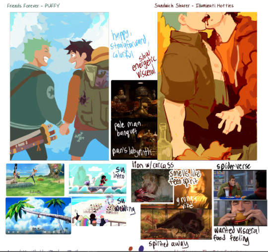
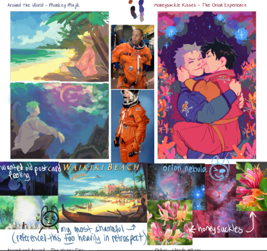
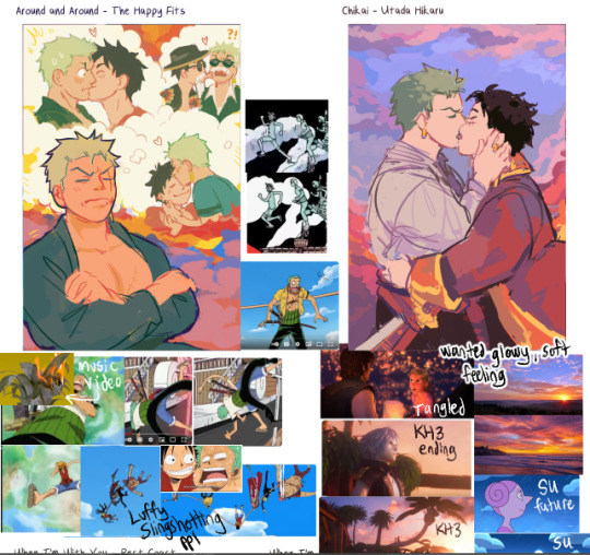

I mostly eyeballed from the colorwheel. I think I only used color adjustment layers on Chikai and Around the World to get a soft glowy effect in the clouds. BUT!! I'll frequently play around with adjusting the colors through the hue/saturation/luminosity sliders, or I'll go in to Tone Curve and play around with the levels until things are looking how I want. Especially for backgrounds
I also colorpicked from ref photos (like you mentioned w the lion eating a carcass). I GENERALLY tried to avoid overly referencing any one pic, but Simple song and Around the World were the two worst offenders 😓
---Color Choice---
I went by pure gut feeling at first while listening to the song, how the instruments sounded and what color they were
And then after that, I'd try and refine it a little more by Overall Vibes (making it feel more Glowy) (adjusting how colors interact w eachother like toning down a too-saturated color or making skin tones warmer or cooler to contrast w the background)
And then i gathered references n either colorpicked from them or I used them as vibe inspiration as i was painting
---More General Color Stuff...?---
This section is riddled with over-explanation.
-> To make a color stand out as Really Saturated, I surround it w neutral colors, esp contrasting ones (e.g. if I want a red to pop, I put it next to a cool gray)
-> if the overall painting is really warm (like, everything seems cast in a warm light) and i need to have a specific cool-tone color (like green), I take one of the warm colors and drag it a ways Towards the cool color I need (so , colorpick a red, and drag the slider until it's on yellow) and then desaturate it a lot. I then test that color on the piece and see if it Looks green. Same goes in reverse (cool-tone paintings that need a warm color)
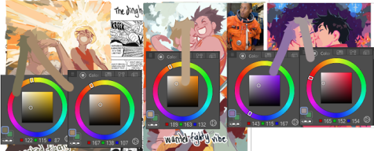
So, Like...for example: Zoro's hair is some really weird colors.
-> I try to limit eyebuzz (places where two colors meet, where the hue [tone] is different, but the brightness [value] of the color is almost exactly the same. Basically, if you made everything grayscale, you dont want two grays of the same color right next to eachother [or, you want to do it intentionally?]) (called eyebuzz bc at really high saturation, two colors of the same value almost vibrate next to eachother)
(Sidenote: I think "eyebuzz" mustve just been a term my high school art teacher used bc i don't see any relevant results for it on google... there's probably a more professional term for this lol)
Examples:


I esp try to limit eyebuzz between foreground and background objects
I know some artists are intense enough about contrast that they toggle grayscale on n off as they're painting. I just kinda eyeball it.
-------
This ended up really long again oh my goddd
I think those are the main things on my mind when choosing colors...?
Hope this is helpful 😅
#not art#kinda#animal death#as one of the reference photos#the animal is not recognizable#just looks like meat#also the image is very small and low quality#eyestrain#when im talking about hue and value#long post#i cannot stop myself from overexplaining#my apologies#oh my god tumblr did something really strange w the tag order again#tried to fix it#oh my god adn then the cut went crazy okay now ive fixed that
12 notes
·
View notes
Text

part 2 of this ask
📝Process for hurt mezu drawing
here are the steps i dug out of an art server's wips channel lol
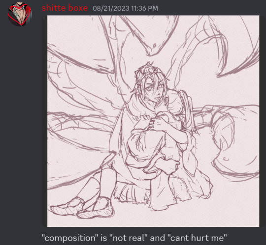
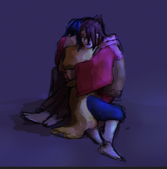
1. initial sketch
2. refine sketch. thats lines now babey. (omitted "the sleeves are KILLING ME WAHHH" stage that led to this)
3. grayscale, to use with gradient map (this is a more polished grayscale than I started with, i dug the working file out to get better images)
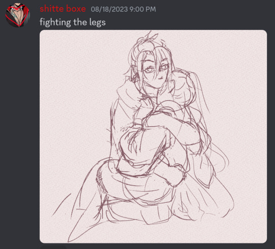
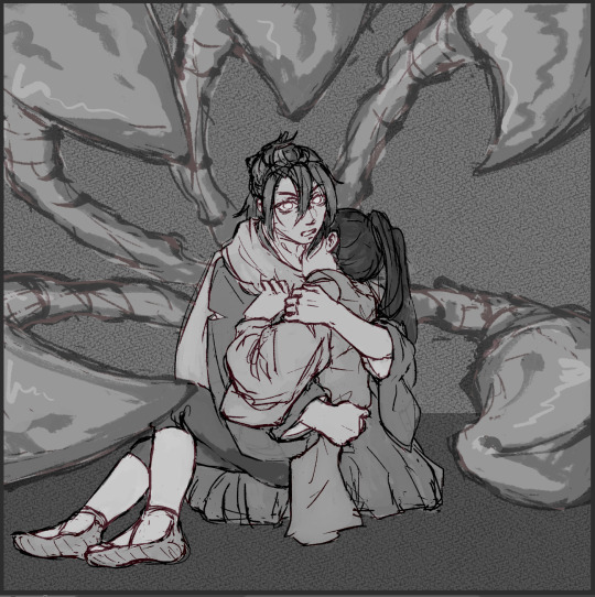
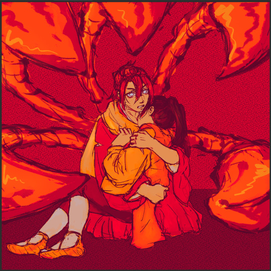
4. find nice gradient map (ended up being the same one I'd used for the piece i made right before. the goal is to make what's essentially an underpainting, not to color the whole thing with one map)
5. tweak and add colors that arent in the map with hard light layers & also sneak in a layer for special effect and atmospheric/ scenic perspective while you're at it
6. shading & more finishing effects. pretty much all of the shading was done with hard light layers! the only non-hard light layers I used for the shading were the particle effect layers & like one faint glow layer to fix some values. blood was done with linear burn
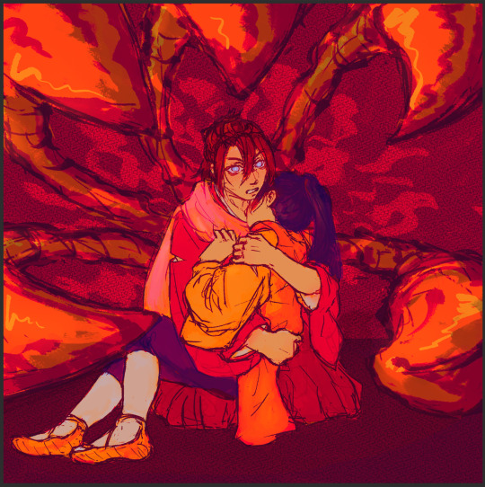
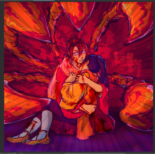
✨Inspiration for hurt mezu drawing
the coloring method (grayscale -> saturated gradient map underpainting -> additive color adjustments) is something I tried out with the piece i'd made right before (the one where gozu is holding mezu from behind) & turned out really well, so I wanted to keep going with it
I also wanted to draw them angstily again because it'd been a very long time. like half a year at least. angsting them is very enriching for my soul so I try to do it regularly, this one was overdue
subconsciously referenced the poses in the initial sketch from this old thing (feb 2021). i love doing this. all my for-fun works recycle old elements in some way. my favorite game is "what old art reminds me of what im doing rn" im so good at digging stuff out of my archives for it. everyone loves when i do this
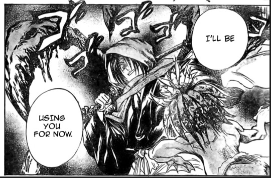
the gangi-kozou panel also
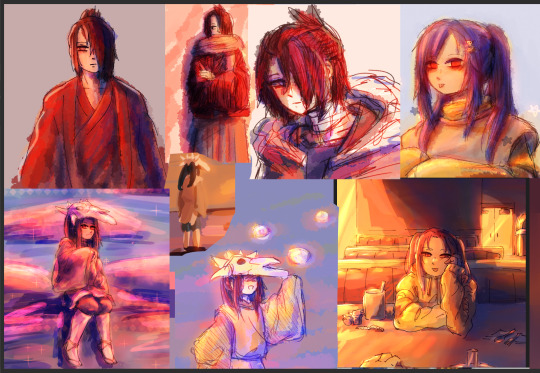
i went through a "shade in bold red-orange & dark blue with hard light layers" phase in like..april/may of 2021. i still like that stuff a lot so I wanted to revisit it
💚Things you like about hurt mezu drawing
repasting the link there but the sixth image in the process is essentially the final so you can just look at that
the colors are nice!! I'm real happy with using more saturated colors n I think the warm vs cool balance works really well
the sleeves (man being dramatic on the sand meme)
no like fr look at the 2021 piece's kimono sleeves vs the one I just did 2.5 years later. so satisfying
Gozu's expression came out nice
i think the claws and flash lines successfully added Emphasis to Gozu's expression & the piece overall
the poses … the drama …. the brush textures are also good
⏳Things you’d do differently with hurt mezu drawing
add in a liiitle more contrast...aka use a wider range of values. Some lighter lights and darker darks. I miss my 2021 hard neon lighting
a bit more distinction between the characters and the background also
the composition isn't bad but it could be better. Should've thought more about the way the eye would flow around the image in the drafting stage (solid b&w color block thumbnails are good for this)
Moar Sparkles. (I put a solid amount of large & low opacity light bubbles in there & some finer brighter dots especially around the claw stems, but I think more clusters of tiny bright lights on the characters themselves would've gone hard)
💌Some favourite feedback on art
as the wise man Austin Kleon once said: keep a "praise file" of all the positive feedback you get (if you've never read "Steal Like an Artist," you must). so. i am prepared for this question hold on
tastes like sugar glass
multiple people have told me my art is soft & dreamlike
jayce you reblogged my touchstarved art with nice tags on april 10th ive got that saved love uou
umm theres a lot...anytime someone keysmashes or feels emotional because of my art i get happy ,,, lys messaged me about the hurt mezu piece that made me happy also,,,,,there is so much joy in the world
#shitboxposting#asks#shitbox drawn#JM SORRY I FEEL LIKE THE FORMATTING ISNT EASY TO READ NO MATTER WHAT I DO....AUGH#all my class work with actual conecptual meaning is monochrome what am i doing...man.......#i need to post more art and i also need to make more art. aghhh. boots up ultrakill and magical drop again#im actually Not sure how im going to afford the next few years of my life 😭😭 a bitch gotta have time to do fuck all but i need money..!!!!#whatever its fine. i have time to do fuck all right Now and thats what matters
5 notes
·
View notes
Text
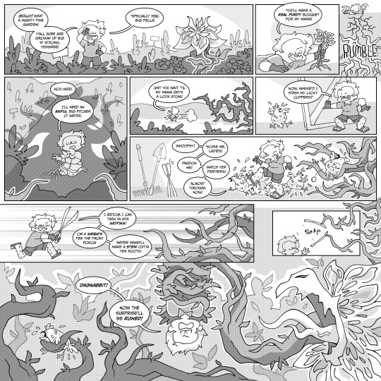
dagnabbit
cabbagejournalss - this was a class assignment to make a comic where the dialogue changes the reader's perception of the story. i decided to put professor pollinator in a dangerous situation in which he does not acknowledge the threat to his life. is he stupid?
i really enjoy using black and white in comics. i had the chance to speak with an industry professional recently about my work and he recommended using more values to distinguish space since i'd only used two grays in the work i shared with him, so i pushed it here and i'm pretty jazzed about the result. i want to get better at working with color but i really like how grayscale looks too, not to mention it's a timesaver.
i probably made this backwards, i drew the comic and sort of wrote the dialogue around the action with the scant ideas i had going in. i usually like making stuff up on the fly like that, but i struggled making it sound natural and not awkwardly shoving words in to fill the space, which was compounded by his thick southern drawl and trying to come up with just the right phrase or pronunciation he would use (this probably could have stood a quick google).
this was received well during crit, which i was surprised about because i was sure i did the assignment wrong. it was agreed that the part between panels 3 and 4 where he awakens the plant monster needed to be clearer; my professor pointed out that it's hard to see that he's still holding the flower so i should have made it stand out more, maybe by keeping it white, which i had considered while working on it and then just. didn't
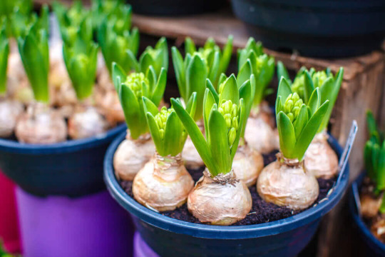
i gotta draw professor pollinator more often, he's so much fun! i made him a few years ago when i wanted to make characters themed to specific scientific fields and he's very dear to me. i wanted him to look like a plant so he's round and bulb-shaped with short wavy hair like sprouting leaves (bulbs for reference below). i struggled a bit with placing and sizing his finn from adventure time teeth so they're a little inconsistent but maybe i could work that into part of his charm.
i really enjoy talking about it so i'm going to keep posting these journal entries with my work going forward :] if you read this far, thank you
#cabbagejournalss#ocs#original character#professor pollinator#comics#black and white#plants#garden#did i make little shop of horrors
2 notes
·
View notes
Note
Heya Stinger. First off I just want to say I ADORE your work, from the different artstyles that somehow all blends well together, to the wacky vids n' comics you put out. They're all just so unique and distinguish from the other artists I've seen. Which is why I'd love to know your process when it comes to making these. What program do you use, what kind of brushes, your Inspirations, perhaps a few tips, etc. Keep up the good work and thanks 4 reading!!! :D
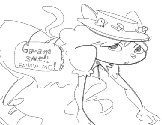
helloe n thank ue for the kind wordz :,)
the followin programs i use n how i use em
Windows7 MsPaint - most of my drawings n sketching keyframes
Micromedia Flash 8 - Animation
Gimp - Coloring editing and coloring in grayscale pictures
otherwise I dont rly have any custom anything I use standard stuff
and the way I get the look of my drawings is just by gently and manually going through lines with the brushes till they get to the way I want em which is why I am still using the mouse to draw my stuff (grew up drawing w the mouse so im still used to it)
as for inspiration I really am mostly influenced by stuff that ive watched growing up mostly early and late 90s stuff with some 2000
but i wudnt be able to pin point down the exact ones cause my mind goes to alot of places when I draw in general LAL
im not sure what kind of tips you are asking for but if its regarding art
id just say before anything if you wanna improve at art
i def suggest studying real life and try to get a good solid foundation
once you get a better grip on how to make things look somewhat realistic you get the hang of most things imo
and while some artstyles look appealing I suggest not trying to base your entire art on someone elses artstyle
(I most of the time only mess with artstyles to poke fun at people that obsess over such things)
youll just limit yourself and get stuck
be flexible n try to do a lil bit of everything
in the end if you just try to get better at all times and try to understand art in general things tend to go pretty swell :J
just make sure to do your own thing n dont try to be someone else
its one things to be inspired n its another thing to just rip off
just do you.

33 notes
·
View notes