#comic books
Text
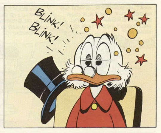
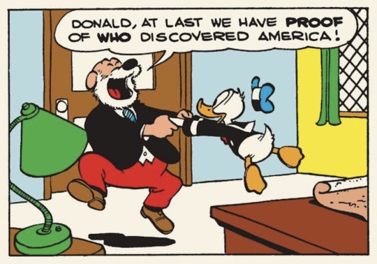
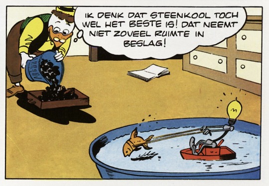
How to depict blinking in a comic? Oh hello, by the way. Yes, I'm still alive. I'm fine and how are you and all that but—how to depict blinking in a comic strip? Carl Barks used this method—
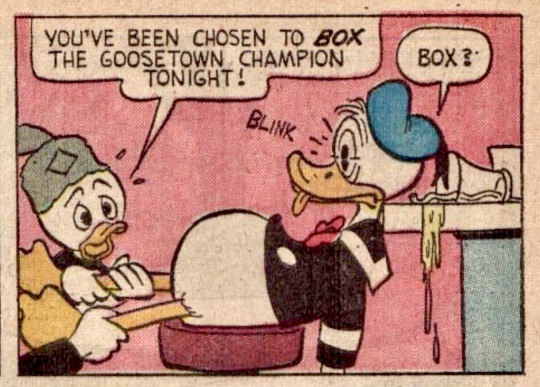
The ducks' huge eyes are split in two, with one set of slightly faded pupils in the top half (see image 1), and another of solid black pupils in the lower half, both sets cut off in such a way that the “stacked” pupils don't appear like one large elongated pupil (a thin white horizontal line separates the two states as well); and that, with the added "Blink! Blink!" gets the job done perfectly. Here’s another slightly different blink:
(Now that I'm writing this stuff about top half, bottom half I'm suddenly reminded of a Barks gag I came across: a file cabinet in the background of a panel with one drawer saying TOP SECRET and the one below it saying BOTTOM SECRET.)
Really though, Barks's brilliant stories are en endless source of great ideas, gags, splash pages, twists, visual tricks, pacing, phrasing, suspense building, the whole proverbial "shebang", whatever a shebang is: I've said it before on this blog but any budding artist or writer—heck, even a professional one—could learn a lot from Barks's best work. Fireworks of creativity.
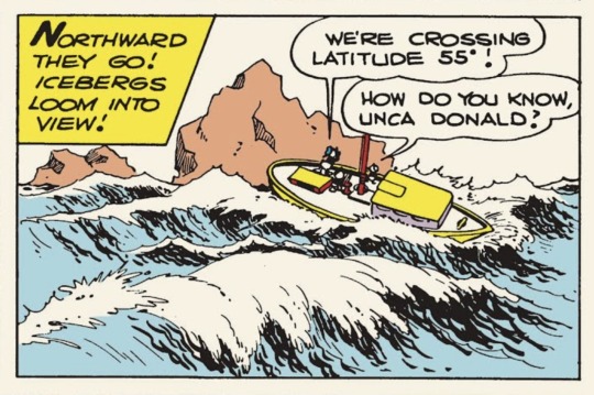
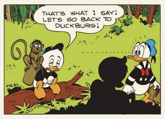
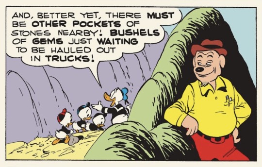
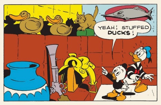
Re-reading some of Barks's stories, as I sometimes do by way of therapy, it struck me that many panels consist of three main elements: a foreground element, a middle section where the action takes place, and a background:
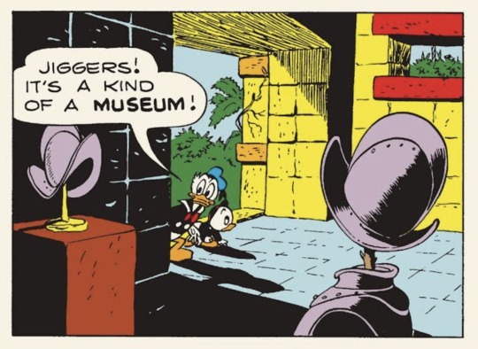
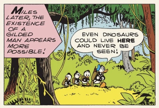
This foreground element can really be anything. It can be a bush, a tree, a rock, even a wave:
It can be a chair, a table, or any other piece of interior:
It can be a character, or just their silhouette:
And of course it's also a good way to hide snooping villains:
In the Gyro Gearloose stories the foreground element is often Little Helper having a kind of silent slapstick adventure of his own (in Dutch here as it’s from my own copy):
…Also, how is this for dark:
#carl barks#donald duck#disney#comics#comic books#comic strip#comic panels#walt disney#ducks#blinking
269 notes
·
View notes
Text
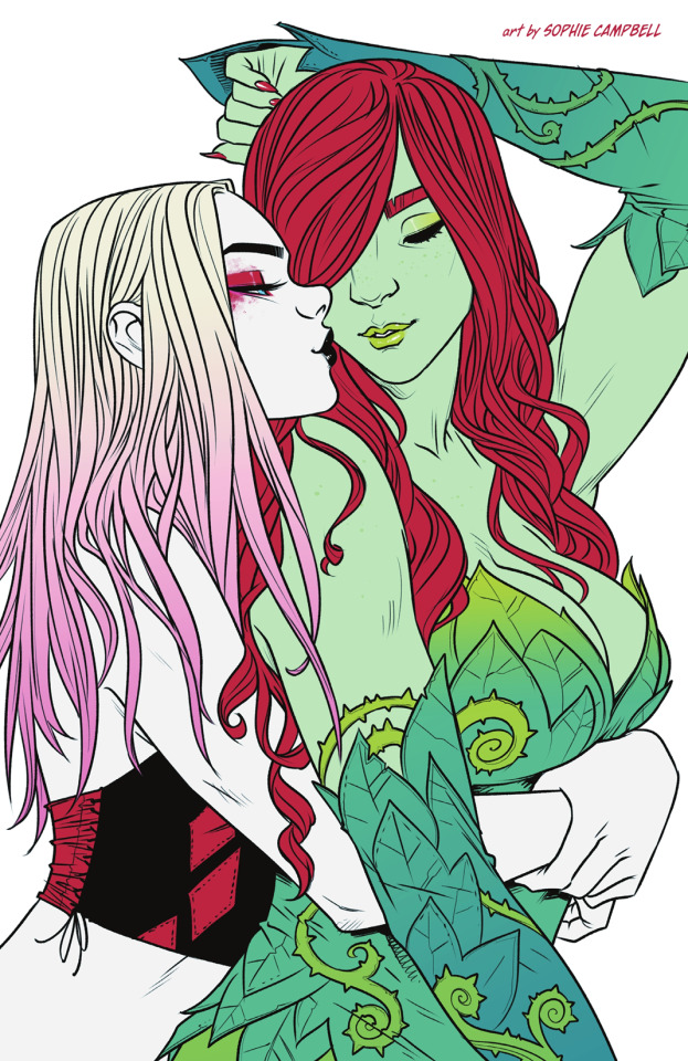
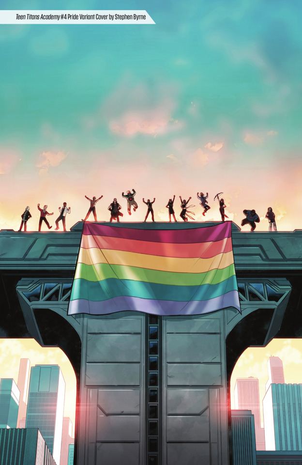
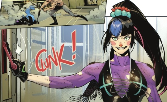
DC Pride: Love & Justice (2024)
art by Sophie Campbell
259 notes
·
View notes
Text
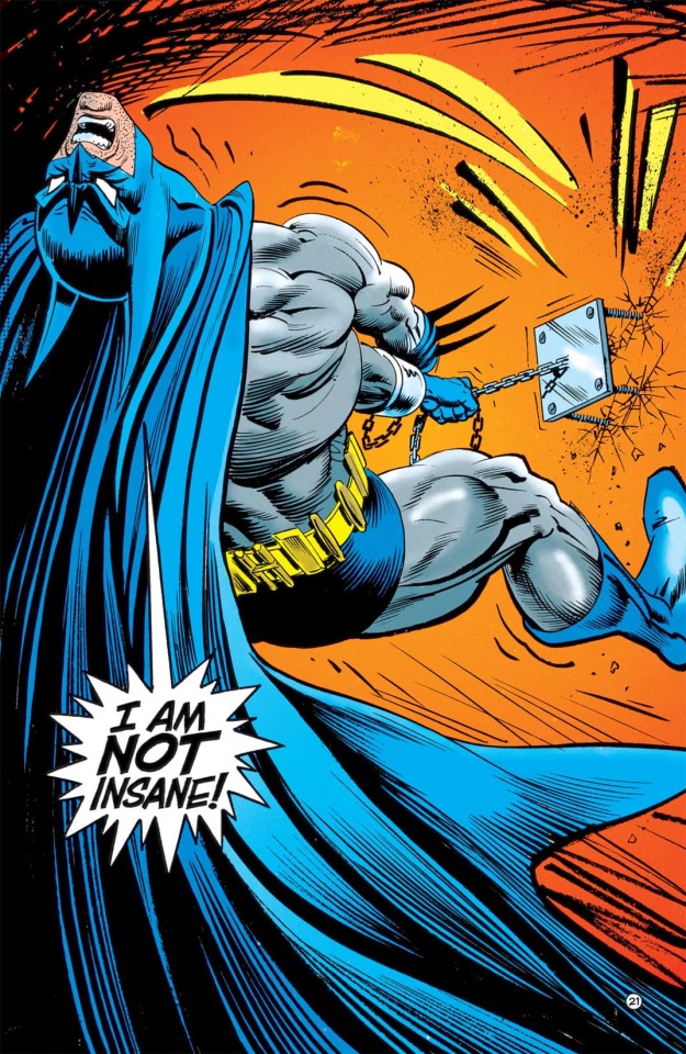
[After Knight Terrors]
Tim: It seems Jason is more mentally ill than I realized.
Steph: Yeah duh.
#dc#dc comics#comics#comic books#knight terrors robin#knight terrors: robin#kenny porter#knight terrors#batfam#batfamily#batkids#batbros#bat brothers#funny#original dialogue#character dialogue#character dynamics#found family#tim drake#robin#red robin#jason todd#red hood#the red hood#stephanie brown#batgirl#the spoiler#humor#poor little meow meow
125 notes
·
View notes
Text
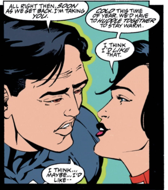
From Green lantern volume 3 (1990)
They are Kyle Rayner (Green lantern) and Donna Troy (darkstar)
--------------------------------
submitted by @ajaxxx-x
68 notes
·
View notes
Text
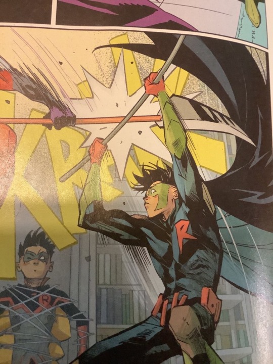
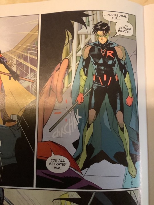
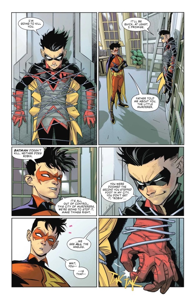
WHY DO THEY KEEP GIVING HIS SUCH UGLY ASS SUITS GET HIS ORIGINAL BACK!!!
(Edit it’s Tim I’m so sorry everyone still ugly though)
#dc comics#comic books#dc#comics#damian wayne#damian al ghul wayne#damian al ghul#robin#tim drake#red robin
82 notes
·
View notes
Text
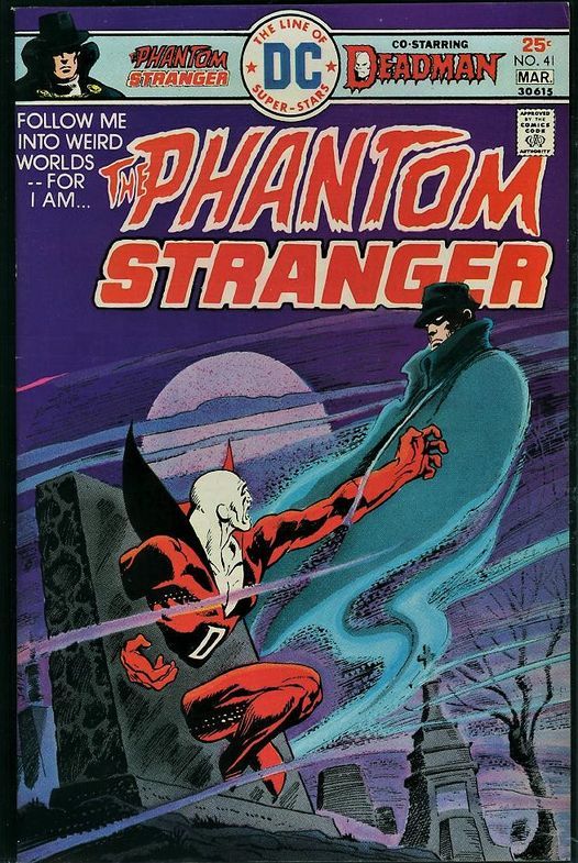
PHANTOM STRANGER #41 (DC, 1976)
Art: Jim Aparo
#dc#dc comics#dc characters#deadman#pulp#horror#comics#pulps#comic books#70 comics#70s comic books#1970s comics#1970s comic books#70s horror#1970s horror#bronze age#bronze age comics#pulp art#bronze age horror#phantom stranger#jim aparo
69 notes
·
View notes
Text
#touhou#alexa demie#bsd#cheryl blossom#eternal sunshine of the spotless mind#wonwoo#web#pride month#comic books#brokeback mountain#liebe
130 notes
·
View notes
Text
#bsd#cheryl blossom#web#comic books#brokeback mountain#liebe#victuri#gurren lagann#iron dad#elsa#french#Kirishima#earthquake#lee felix
123 notes
·
View notes
Text
Joshua Robinson
51 notes
·
View notes
Text
Norm Breyfogle
33 notes
·
View notes
Text
DC Pride: Love & Justice (2024)
art by Stephen Byrne
192 notes
·
View notes
Text
I don't really have strong feelings about what Cass and Jason's dynamic should be. But I think people who think Jason would hate Cass for believing in not killing don't understand Jason as a character.
#dc#comics#dc comics#comic books#comic characters#batman characters#batfam#batkids#batfamily#batsiblings#jason todd#red hood#the red hood#cassandra cain#batgirl#orphan#media commentary#my commentary#media analysis#character analysis#jason peter todd#batfans#comic analysis#jason todd wayne#cassandra cain wayne#opinions
97 notes
·
View notes
Text
40 notes
·
View notes
Text
WTF is going on
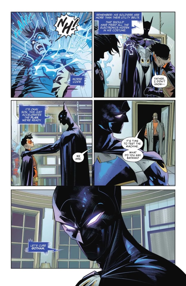
(Edited)
#dc comics#comic books#dc#comics#damian wayne#damian al ghul wayne#damian al ghul#robin#Batman#bruce wayne#failsafe#Batman 148
52 notes
·
View notes
Text
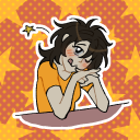
Just two crime lesbians and their sleeping bisexual boss. Crime is tiring business.
#my art#illustration#digital art#artists on tumblr#dc fanart#comic books#comics#the riddler#edward nygma#echo and query#crime time#crime is tiring#Eddie needs his sleep#lesbians and their pet bisexual#edward nigma#query and echo are best henchwomen#sleepy riddler#nina damfino#diedre vance
28 notes
·
View notes
Text
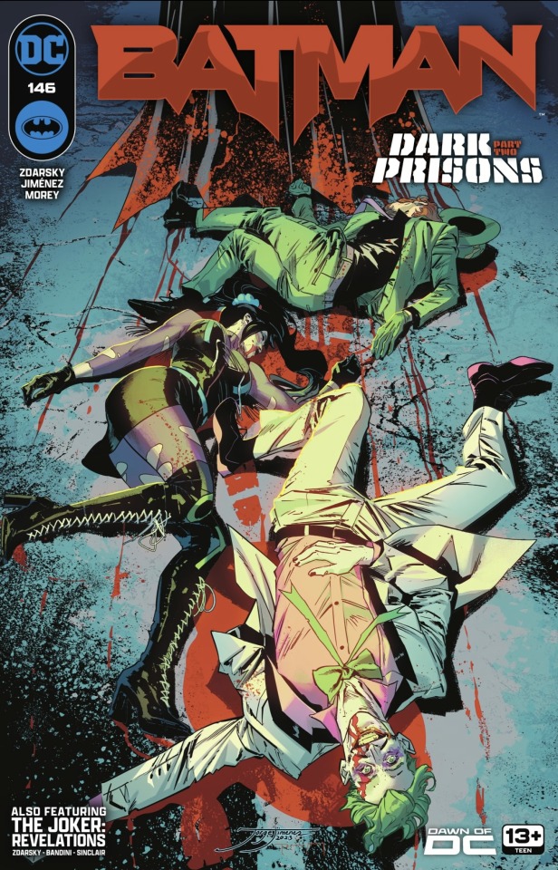
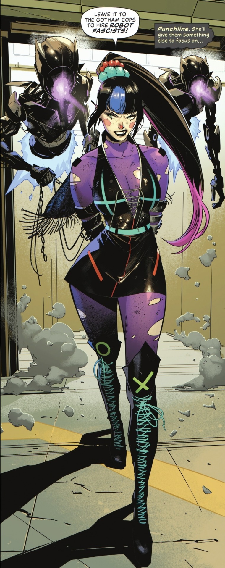
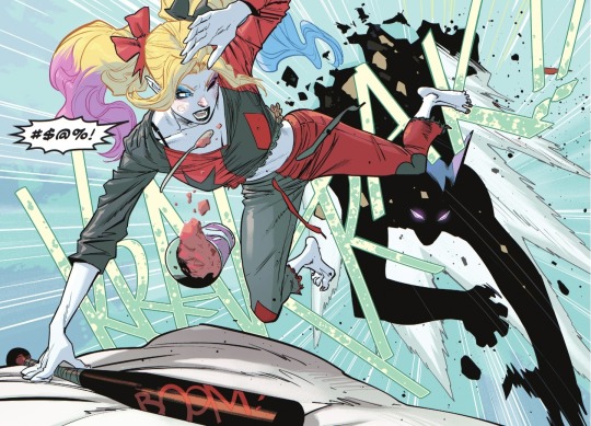
Batman (2016-) #146 art by Jorge Jimenez
#jorge jimenez#punchline#harley quinn#superman#clark kent#bruce wayne#batman#the joker#riddler#comics#comic books#comic art#dc
27 notes
·
View notes
Last Seen Blogs

josiinthesky
Unveil your lies . .
alekk2018
time dead children

beatricebailey8600-blog
Beatrice Bailey from Kansas City


gretagarden
So Sweet, We Have Gone Blind