Don't wanna be here? Send us removal request.
Video
tumblr
Adobe Aero Mural - with Arlena’s illustration components
0 notes
Photo
Prototype Development
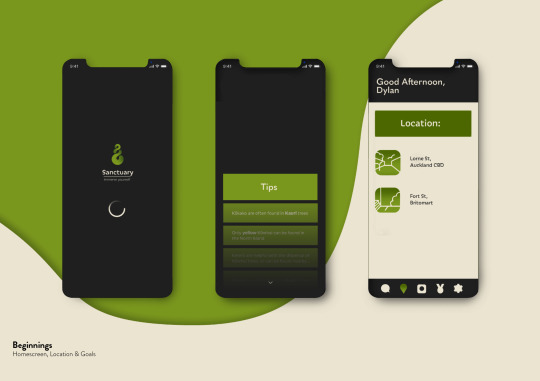
Since the prototype feedback session, I have been refining some of the details of the final app interfaces. This includes adding a home/load screen for the beginning experience of the app, tips or goals of different creatures you can find, and a species collection page (where you can refer back to creatures you have found and their personal information).
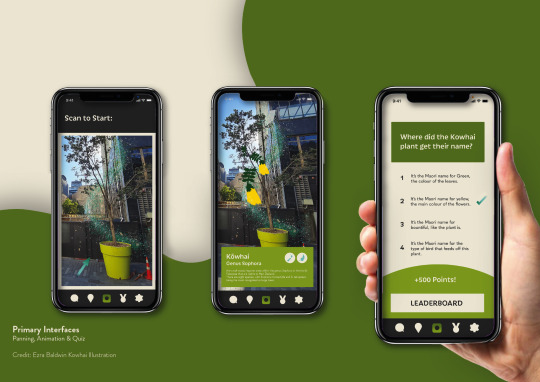
I have also smoothed out the background design, drop shadows and layouts, so the mock-ups appear more professional. I included the phone screen mock-ups in the 3rd slide because these are the primary interfaces which show the main use for the app. I have also decided to not change the object boxes to have more rounded corners, because they seemed out of place with the rest of the interface design. Rounded boxes evoke a childish theme, almost like a dated apple product system update.
Other than these changes, I think the app prototype is just about finished. The display of the key interfaces are professional enough for submission, and the areas included are easy to understand as a user manual.
What will also be included in my prototype submission, will be the branding and button choices, Kokako animation video and Kokako illustration motif, as well as an animation video submission of Arlena’s mural design - to make the garden that much more immersive.
0 notes
Text
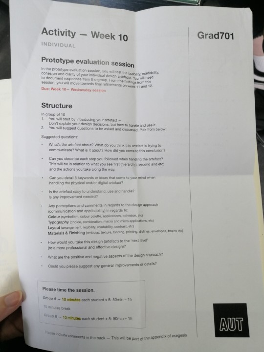
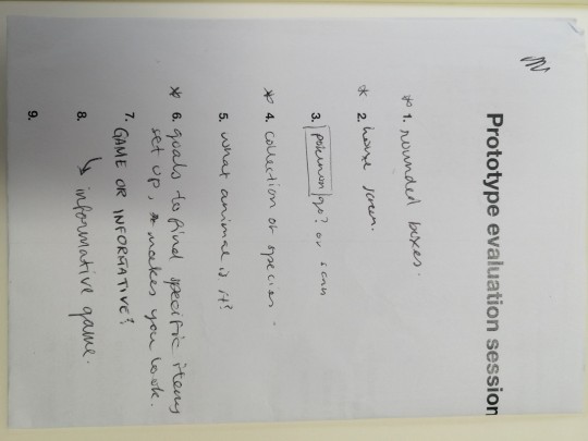
Prototype Evaluation Activity
Today in class we made a focus group of 9 random students across 2 streams. We each showed our current projects and asked questions to help sort out the final details. Things I will need to think about before submission are:
Rounding the corners of the object text boxes to give it a playful & environmental feel that is easier to view.
Creating a home screen interface for when you first enter the app, this could even be just a loading screen with the logo & header.
A species collection concept. One of the group members thought it would be nice to have a page where all of the items/creatures you have found can sit - kind of like an inventory. This would be on top of the point system for users to find more pride in using the app.
Possibly set up different goals of what people should find. That way people have hints of how to find certain things and don't go into the activity blindly.
For these things I could set up a few new pages in my prototype file. With the interfaces in a consecutive order this time and with a consistent background.
Getting someone to test the usability of the buttons and pages, seeing if every interface has a way to enter and exit it.
0 notes
Photo
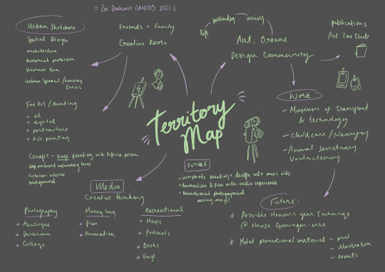
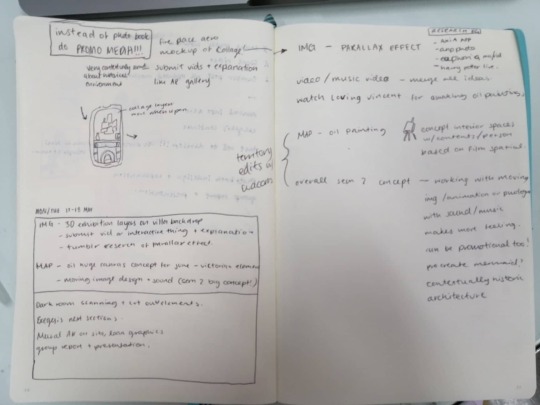
Developed territory map with future goals/concepts and other details. My plan is to somewhat combine my love for moving image and lens based design, into a useable audio visualisation - Think music videos, short film, promotional animation, etc.
0 notes
Link
Aria Platform
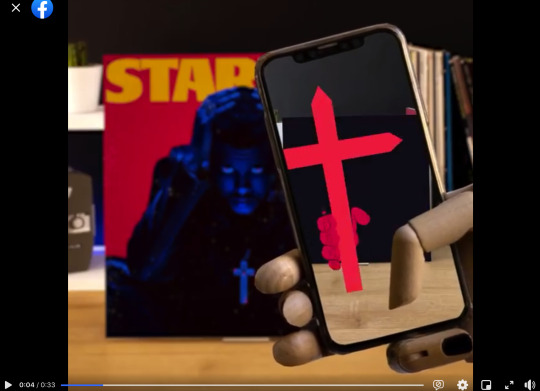
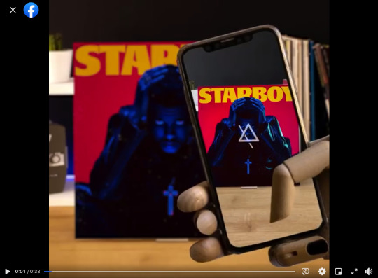
An example of a real AR app that uses way-finding tools to connect immersive animations with vinyl cover art. The application is a work in progress as it requires different talented artists and designers to create the animations for every cover & currently only popular rock bands someone might have in their collection is available.
This is an in-depth example of how our murals could come to life when using the Sanctuary space and app. I want visitors to recognise and further connect with elements of New Zealand’s biodiversity that they already know. This design has more professional fluid movements that help this work, possibly made on After Effects, Aero, Procreate, etc.
Territory Map Development & Connections
This is also an example of what I might like to do in the future. I am planning on adding concepts for next semesters design project onto my Territory Map, after having a long conversation with Marcos today in Studio (notes taken below). Drawing in my love for movies and animation with my design and painting abilities, to create an emotional moving image with further connections to sound/music is something I would love to explore - with music video being one of my dreams since I was listening to my mp3 player on road trips in the 2010′s.
1 note
·
View note
Video
tumblr
Adobe Aero Practice - Just beginning to get the hang of the app and how to position each of your component. Getting ready to use Arlena’s mural illustrations at the site of the garden (Lorne or Fort St). This example is just laying out random bits and pieces on the closest flat surface I could find *not for aesthetic development purposes*
0 notes
Video
tumblr
Final Kōkako Animation
Kōkako AR animation with updated application interface! I added all the details that I have updates recently - like colour scheme, buttons, info text box, and even little symbols for the type of organism you are viewing and its habitat!
This was really fun to make because I could just update the branding and insert it into After Effects with the same bird phases/movements loaded in. Unfortunately, I attempted to add some sparkle effects in the background that moved with the bird (like I added in the still version with the Kōwhai plant example) but it seemed rough and un-professional.
0 notes
Photo
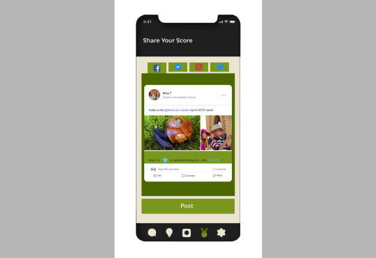
Social Media Sharing
I thought another way of making the app more comprehensive design, would be to include an interface through the scoreboard section, that allows you to share your experience and scores on social media. This is an interesting way for mutual friends to track each others process, show that they are learning about our native culture/biodiversity, and advertise the space/campaign futher.
0 notes
Photo
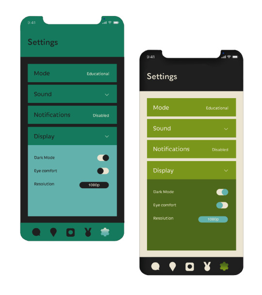
Dark Mode - For easier use with sensitive eyes, and for use during the evening. I think this seems like a more exciting way to use the app - in the evening with aesthetic lights and atmosphere, or even way-finding animations that are more electric/glowing in colour (to contrast in the darkness).
I also showed this mode alongside the the settings that actually allow you to enable it, as well as a comparison to the original scheme. I thought using the blue accents from the original scheme would be a good way to further incorporate them.
0 notes
Photo
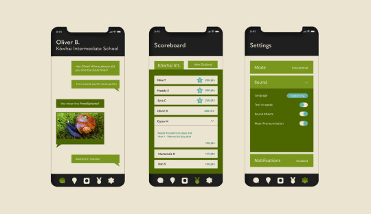
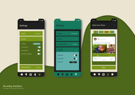
Secondary Interfaces
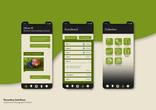
This week, I asked my team members Ezra and Dylan what I might be able to do to further develop my prototypes. They explained that maybe showing a few more uses for the app, other that my original 4, will help to make my app more cohesive.
I have developed this into my User Manual, where I can briefly show every step of the app, how to get there, and how to adapt the app to become more personal to you.
Previously, I only had the way-finding tool and a quiz to show what could be done on the app. The new interfaces above, include a school and NZ scoreboard, messaging profile to communicate about the experience in the garden, as well as settings like language, pronunciation, educational mode, etc.
0 notes
Photo
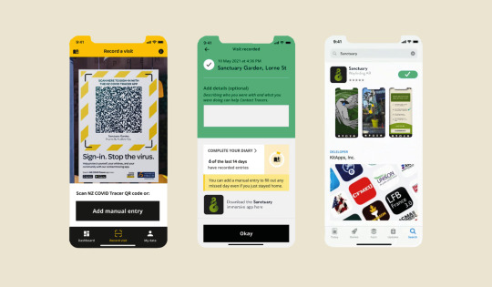
Accessibility
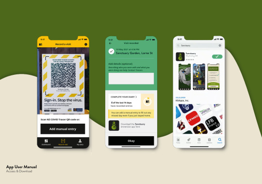
Another component I will add to my visual hand-in is the way the app might be accessed. I have just mocked-up the different phases of how a visitor of our space would efficiently access the app, by QR scanner. I liked using the key interfaces of the app in the app description, and trying to show the activities that might interest people.
0 notes
Photo
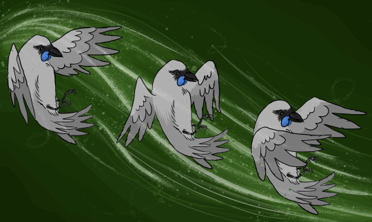
Kōkako Motif Prototype
I made a mockup of my bird illustration (with the 3 wing phases used in the way-finding animation video) for a final visual prototype. This is just a nice way to show some of the other work I have been putting in behind the app use and video work.
0 notes
Video
vimeo
Kupu
Take a photo, learn a language.
1. (verb) to speak. Māna hei kupu ki tana tamaiti, hei ārahi i a ia / She will speak to her child, to guide him.
Global connectivity enabled by smartphones is contributing to the decline of indigenous languages everywhere. On average, one language is lost every 14 days. What if we could use the same smart phones that are hurting indigenous languages to help make them stronger?
For Māori Language Week, Spark launched Kupu; an app that translates the world around you into Te Reo Māori. The app combines Google’s Cloud Vision and Translate API’s, along with Te Aka Māori dictionary data, to give the Māori translation for photos you take on your phone. It serves up the most likely translations and provides audio examples for pronunciation.
This is a genius example of how AR can inspire everyday life, and in this case Sanctuary Gardens. By hovering over imagery, you are given its english name, and then a simple translation to Māori, with easy translations. The usability of this app is so simple, users hardly have to do anything - leaving more room for putting effort into just learning the language.
For my app prototype, I would want the accessibility to be seamless and hassle-free for busy CBD workers. Once the phone has downloaded the app and located the beginning point, it should be able to pick up all data when walking around the different locations. So if the camera was held up to a random specific tree, it would give every phone user the same sample of animation (one area is linked to one creature).
This means people can ask questions as to where they can find information on specific organisms, and friends can point them in the right direction. This will encourage people, even strangers, to work together which will create more of a fun community approach to the immersive space.
Showing the full application identity, and user manual through my final prototype pdf, will help to show how refined the accessibility of the stages of the app are. For instance, the camera section will be the first interface to open for instant access, and a range of settings, quizzes, communication can be found after-the-fact.
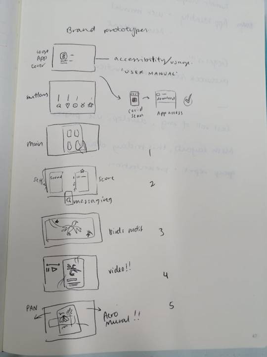
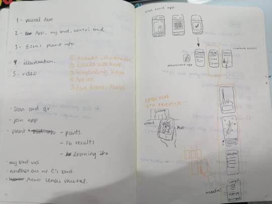
Below is a couple of sketches showing different stages of the user experience that I could show in my prototype pdf. For example; app logo, type/colour schemes, buttons & their uses, covid scanning action, primary & secondary interfaces, bird motif, AR video concept, and Adobe Aero mockup of Arlena’s mural illustration.
0 notes
Photo
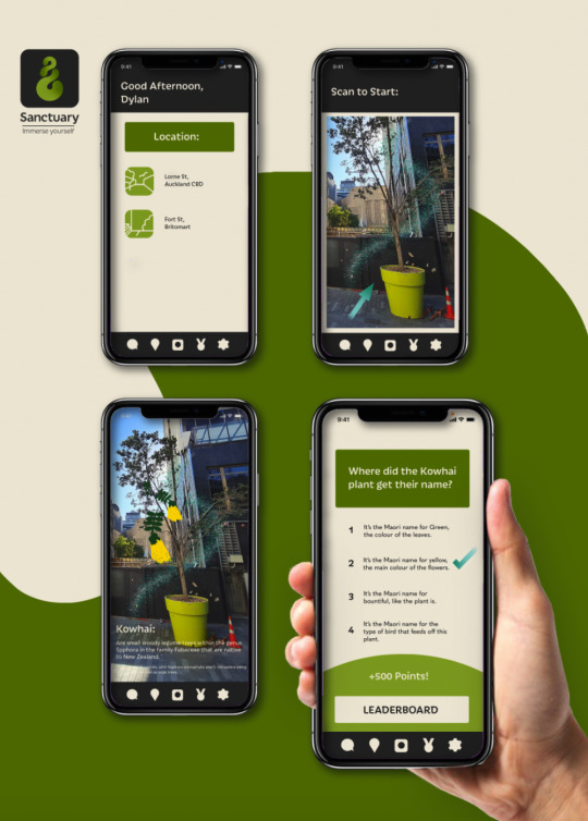
Finalised App
This is a mock-up I can use as a final prototype for the hand in. Since the last development, I have fixed the typeface to ‘Iskra,’ finalised button vectors, toned down the beige colour and incorporated the blue tones from the scheme. I also think incorporating the gradient logo in a charcoal rounded square looks really effective as a simple app logo for visitors home screens
0 notes
Photo
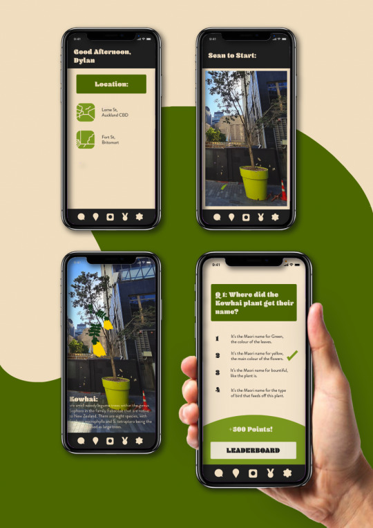
App Mock-up Development
In this, the colours and vectors are all smoothed out, encouraging a smoother and more readable design. The typeface will need some more development (to match the new logo by team member Dylan) but that should be simple to swap out. My group has also decided on a colour scheme which has some additional blue tones. Incorporating these in, much to my dislike, will be the next step.

0 notes
Photo
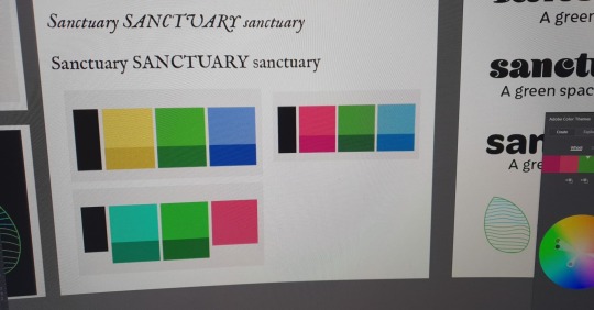
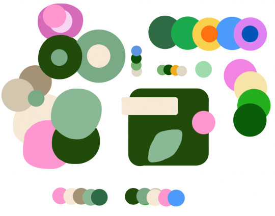
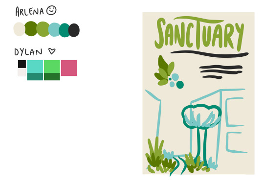
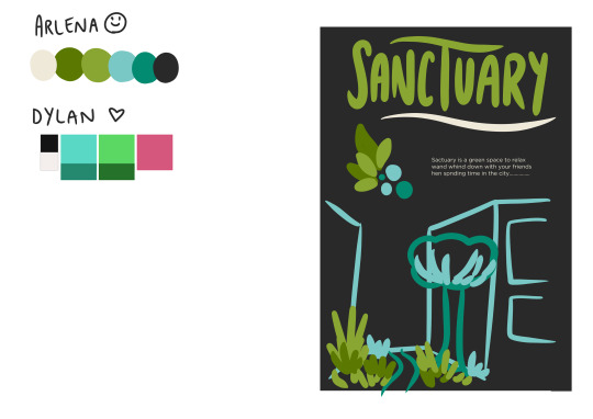
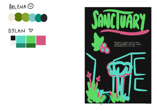
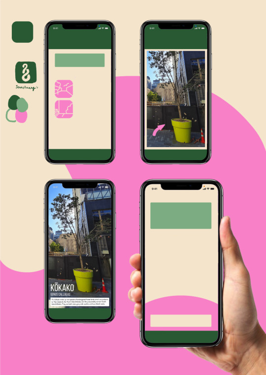
Colour Scheme Development
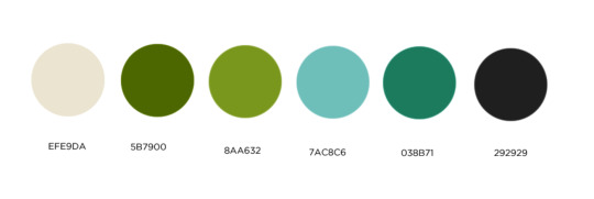
What we have decided is a four-way colour scheme - With an overall dark green, a medium/muted green, a neutral sand, and a bright pop of colour for accents like yellow/orange/blue/pink. Although in my opinion, blue adds in too much of a sky theme whilst we are going for more earthy tones, and yellow evokes Pac n Save.
The bottom right mock-up is the most refined so far, with vector shapes and added photography for a more realistic prototype. The pink and beige help to balance out the majority of greens.
0 notes
Text
App Development
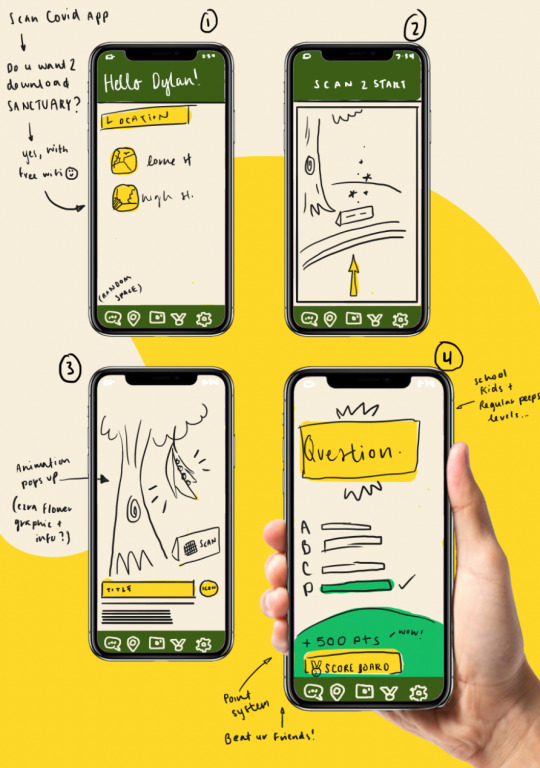
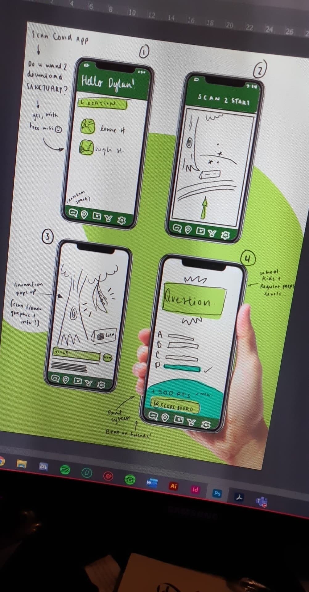
Here I am starting to develop the phases of how someone might use the app. I have added some annotations so that my group members can better understand my thinking. Obviously in the next week or so we will solidify the typography, colour scheme and logo, which will help smooth out the ideas.
The next step would be to simplify the ideas and icons into vector graphics on Illustrator. Meaning the designs will appear more professional and I can change out the colours/textures very easily.
Below, is some of my ideation for the different stages of the app (as well as what I might need to make for the final prototype submissions to the left). Essentially, a visitor might be redirected to a download page after scanning the Covid QR code upon entry. Free internet could be provided for this to run as smooth as possible, and people can easily unlock access to the full immersive experience.
0 notes