
Don't wanna be here? Send us removal request.
Statistics
We looked inside some of the posts by zephthepto and here's what we found interesting.
Average Info
Notes Per Post
3
Likes Per Post
3
Reblog Per Post
0
Reply Per Post
0
Time Between Posts
39 minutes ago
Number of Posts By Type
Text
9
Last Seen Tumblr Blogs


Fun Fact
In 2020, Tumblr had 29.4 million users in the US.
Text
Nebula reflection
This was a very fun project to sink my teeth into, I really liked the workflow of creating a solid foundation using Figjam as a digital whiteboard. A lot of aspects of this project I’d consider some of my best work as of now. Working in a small team was nice, having to manage only a few people, but it definitely had some downsides, given that everyone had to have more responsibilities.
The use of YouTrack was very rudimentary this semester, knowing what I know now though, It has a lot of tools and we really didn't make the most of them. I believe we can use it for so much more in the upcoming semester.
The game is a little bit behind what I had been envisioning as the end state for this semester, but since most of the reusable mechanics are done now we will be able to build so much atop this over the coming semester. We have a lot of playtesting feedback that we never got around to implementing, but it can easily be done at the start of next semester, to ease us back into development. From there, we will need to make a proper roadmap of our development. I think we can get this game looking industry standard, the biggest hurdle I see for that is getting enough artwork done though, so I may need to lean more into the artistic side of things next semester.
I foresee this project going very well and is just as enjoyable as I hoped going into it. I'm very much looking forward to the next semester where we can really bring it all together.
0 notes
Text
Nebula topic 6 - Shader graphs (part 2)
Bush Sway
This is just a very simple shadergraph for one quick effect. It just makes the leafy bits on the bush armor sway about a bit. It was my first proper time working with the vertex shader, but following some documentation, I was able to add a bit of noise displacement. This is already something I’ve done before in blender geometry nodes, so applying the idea wasn't too difficult.

This makes some noise textures pan around with a sinusoidal time. These correspond to the different axes, making the bush get mildly displaced as if it was swaying in the wind.
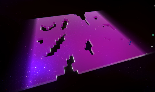
Space
This was a pretty big important shader and it had gone through a handful of iterations. What I wanted to do here is replicate an effect similar to the shaders used for the Minecraft End dimension portals but also a general space look to it.
This is broken into a few steps. First of all, we have a sub-graph which defines everything a shader might need to know to be able to make a space effect. This has a few layers of panning noise, and a few layers of stars. You can also adjust the colours and scales of the different patterns to really perfect it.

The space effect turned out pretty good at the end, its very reusable too, though it admittedly has a lot of settings. Arguably, this could be replaced for a static texture for lower graphical settings, but I haven't gotten around to setting up anything like that yet.

The first go at it was done with a plane fog effect interpolating in my own method of doing the space look. It was using a lot of complex maths and I didn’t really feel like I understood the operations.
This can be found at:
How this worked is that it made the fog appear behind a plane, being more opaque based on the depth of the closest item behind it. This worked pretty alright for making the environment disappear vertically down, but the illusion easily broke if you were trying to make the bridge fade off in the distance on either end. I soon enough decided to construct my own take on it, one that solves these issues.

Similar to the dither shader, this one also relies on being a render feature. How it works is that it has two vector positions defines within itself, together these form the corners of a bounding box. I then have settings as to how far the fog should fade in each direction. With that I can separately choose the depth the bridge goes down before disappearing, along with how far the bridge stretches on outside of the walkable environment.
This makes for a very convincing effect in game.

This shader effect is only applied to specific layers of the scene.

The skybox being used is actually just a plane far below the level, also being affected by the render pass.
I really like how this one turned out, it gave me a bit of trouble, and I can foresee a few things might appear to be strange with it later down the line based on camera angles, but it should remain stable for a pretty good while i think.

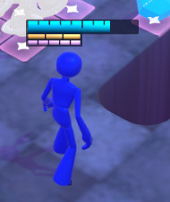
Taking the base space shader, I decided the enemies could do with looking a bit more interesting. I made a version of the space material that just keeps it solid and gives us a bit of control of the surface properties, such as smoothness, metallic and also a bit of fresnel glow.
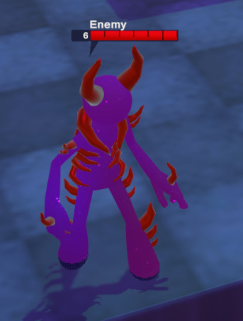

This turned out giving the enemies a much more interesting identity than just having them wearing boring standard materials. It helps bring them together overall.
This also ends up having a very cool aesthetic when used with terrain. This hasn't been used for anything yet, but it would be really cool to do something with it at some point in the future.
Health Bar

Pretty early on in the project, I had made a health bar setup as a placeholder, using some images with a fill percentage to lower their health displays. Eventually it just looked very outdated and frankly not good. We needed a way to display a health bar and its 2 shield bars in a way that can be easily readable with a more concise colour coding.

This is the inside of the health bar shader, this has variables that let you tell it how much health the character has, and what their max health is. This also has a lot of different settings for defining how tall and wide each mark should be. You can also define a major mark, which adds a larger line for each X amount of health. This also has a bunch of gradients that make the bars have just that little extra detail of depth. Admittedly the maths gets a bit complicated with this one, but it's essentially splitting it into the right amount of sections, then making each section have the correct size shape inside it with some stepping and masking.
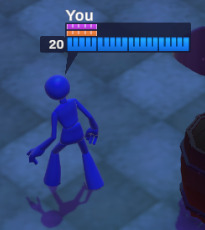
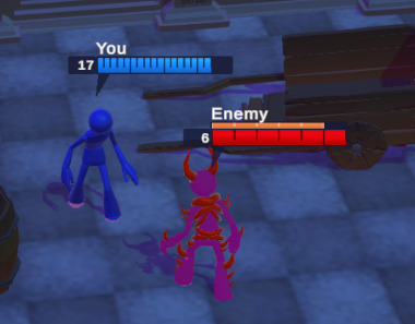
It took a few iterations with actually trying out different layouts, but eventually I got it to a place we liked. A lot of planning went into the actual new layout of the health bars and it’s in a really good place right now.
Unfortunately I’m not fully satisfied with this implementation, as cool as it may look. There is a part of it that defines how wide each mark is, and I struggled for a really long time to make the maths on that work consistently with stretching to fit different sizes. It works as is, but it is not fully entirely customisable the way I like it. If I were to revisit this, I would make sure the marks actually scale correctly with the variables.
1 note
·
View note
Text
Nebula topic 6 - Shader graphs (part 1)
Tile decal
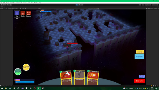
Considering the fact that our game is going to work on a grid system, we needed some neat way to display how this grid operates to the player. This was achieved by making use of decals. Decals are a way to paint textures onto the environment, almost like stickers or graffiti. These become available by switching them on as a render pass in the URP settings for each graphical quality we were using.

The general concept here is that we can define the size of the grid that this decal displays, which is consistent in world space, and then use an image mask to make that section visible. This creates a sort of flashlight effect that looks like it reveals the underlying grid when it moves around. This can then be locked to specific render layers to make sure it only appears on the terrain.


With a bunch of variables, we can choose how the highlighted area should glow. Then we can stack multiple of these atop one another to create a sort of blueprint look.

By creating an object that tracks the cursor, remaining snapped to the correct grid increments, then making the image mask a full square, we can make something which looks like it's selecting specific tiles.

By making pixelated circles, we can make it look like everything within the highlighted zone is about to be hit with an area of effect attack.

By creating two cursor following objects with different materials, we can create one cursor for selecting movement positions, and another cursor for selecting enemies to attack.

With pathfinding, we can display the reachable tiles by making them glow. At first this was handled by instantiating individual squares, which I switched to individual decals.

Once I had the tiles reformatted to be stored as a texture, I could make it so that instead of lots of individually instanced decals, we could use one big decal with the available tiles as a mask.


I was able to make these look very cool and high contrast by the end of the project. I defined separate materials for using movement and for using cards, which really helps with the readability of the current action being made. When selecting a target, I made it look a bit more like some search light, fitting in with the idea it’s for finding someone.
Overall this was a very fun first shader to work on and generally did not pose much trouble. It does everything it needs to do perfectly fine.
Dither passthrough
When playing through Mario and Rabbids Kingdom Battle, I realised that all characters can actually be seen through walls with a slight transparency. This is very important for a tactics game, because you will need to know where all of the characters involved with the fight are.

The idea behind this one is not too complex, but it comes in a few steps. We take the screen pixel positions and do some maths to find the horizontal and vertical lines. From there, based on the operation we do, we can fill a different ratio of pixels, up in multiples of 25%. This is then paired with a rendering technique I discovered from a youtube video, which allows me to make this render over top of a character if they are obscured by something.
Show a Silhouette When Hidden Using URP Renderer Features (Unity Tutorial) - Ketra Games
youtube

I made 2 separate passes of this, one for characters and another for other indicators in white.

This really helps with indicating the walkable areas the player can reach.

I didn’t want to use solid colours, but using transparency didn't actually work for this. This is because there are multiple objects rendering through each other, and being transparent lets them essentially stack on top of each other in layers. What I needed was a solution for transparency that doesn't actually use transparency. This of course is dithering, hence why we were using the grid patterns to make parts invisible. With this, a pixel either is or isn’t being highlighted, and it doesn't matter if they stack.


This solution had worked perfectly fine until it came to anti-aliasing. The nicest anti-aliasing method that makes the rest of the game look the best completely ruined the effect, making it look strange and distorted internally. It took a lot of trial and error, but eventually I found that this issue really only occurred with a 50% dither. Changing it to 75% dither completely removed the artifacting. Unfortunately this also leaves the outline a bit more opaque than I wished.
If I were to revisit this, I would look at making the outlines entirely function on a separate pass, perhaps with a custom shader on a virtual texture. If the whole image is captured, it could then be evenly turned transparent after the fact.
Holographics
This was a quick little idea I had to add a bit more depth to the cards. I didn’t really do as much with it as I had intended, but then again we never did get actual card art. This was primarily done following a tutorial too.
How to make a HOLOGRAPHIC CARD effect in Unity! | Unity Shadergraph Tutorial 2024 - Rigor Mortis Tortoise
youtube


The effect didn't really turn out as I hoped, the colours are much denser around the middle of the screen.

I did also end up putting this on some of the other UI elements to give them a little more depth.
This may need a proper revisit in the next semester, especially once we make cards actually twist about, since that would help display the holographic effects.
1 note
·
View note
Text
Nebula topic 5 - Character design/ implementation
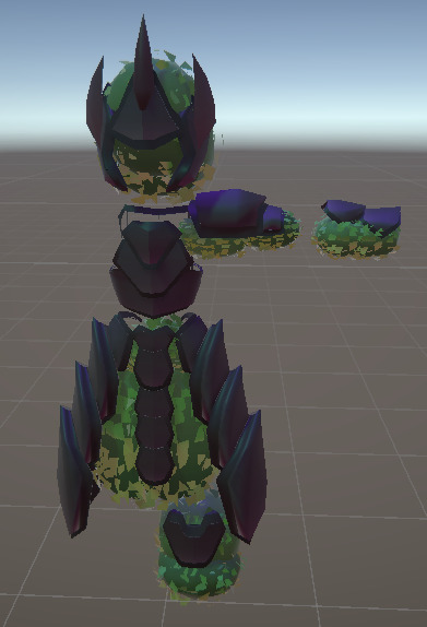
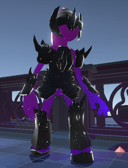
As someone who can specialise both in programming and art aspects, I had been contributing towards the project's development from an artistic direction too. The main way I was able to do this at the start was by drawing concept art of how I was envisioning the game could look.


We knew we wanted characters to wear armor, so with my skill set linking both design and implementation, I was the most suitable to plan how we may be able to implement this. As far as I was aware, the standard approach to making wearable armor sets in games is to apply them to the same rig as the characters were built upon.
Partially inspired by the characters in minecraft and retro games like Mario 64, I figured that it could be much easier for our team to make content in bulk if the characters were all made with multiple solid pieces. This saves us the effort of doing tedious weight painting for the characters and then for every single armor set too.

The team generally agreed and then it became the question of how many pieces and what proportions. I offered up 4 concepts to the team, some smaller proportioned characters that would be easier to make, and some larger proportioned characters that could be more expressive. We ended up going with the more properly proportioned characters.
From here, the idea also got further fleshed out into doing less manual rigging on each armor piece. If we can just have the characters and armor be in the same pose, we can weld them together at runtime and have easy armor equipping directly from modelling to texturing to exporting.


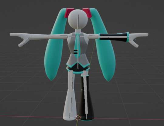
With that in mind, I was able to create some more character driven concept art sketches and mockups, unifying the general artstyle concepts in one consistent direction. This included making the general proportions of the characters, and mocking up a few armor sets and weapons, and then replicating another teammate's concept art into this consistent style. Some of these armor sets admittedly took more inspiration from media than others, but my main goal was to demonstrate how outfits would sit on the characters, and not come up with brand new armor designs. I had a pretty good idea of how I wanted the character hands to look like, and then I even dabbled with how this style may look like on non human characters.

Since I knew exactly what the characters should look like, it ended up being my responsibility to make a character modelling reference sheet. This part took a lot of inspiration from our reference material, such as adventure time, since that had the characters visible from many angles. The idea of the ball joints was my own, since I wanted the characters to be able to twist them without any major seams.
Giving my teammate the reference image, they were able to do a big chunk of work in blender, with me staying on call to guide them with how to do certain parts effectively. They didn’t manage to complete everything, but the start of the model was good enough to use in our first playtest.

After the first playtest was over, I was asked to step in and take over the rest of the character modelling process. From here, I did some retopology and made some of the shapes a bit more distinctly readable. I then added the missing parts, such as the neck and hands. Next I rigged it all up, which was very easy for the most part, since most of the pieces were entirely solid. The trickiest part was the hands. It took me work over a few days to perfect the rigging and the proportions of the hands. As I worked, I made a lot of example poses demonstrating how dynamic and expressive this character rig can be.
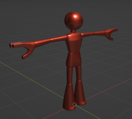


With some of these poses I was able to replicate our concept art very well. Eventually I had the character rigged up exactly how I wanted it to be rigged up.
From there, it was a matter of importing the character into the game, but the t-poses were starting to annoy me. Our plan had been to get our characters all animated with motion capture at the university mocap studio, however we were far from having a comprehensive list of animations. Because of this, I got pointed towards trying out Mixamo, an Adobe library with a lot of free to use animations.
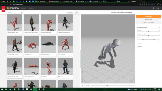
It took a lot of trial and error but eventually I understood the concept behind taking mixamo animations and remapping them to my character rigs. With this, I’ve been told using motion capture data can be used in a similar process, so I’m certainly hoping the practice will be transferable.
Soon enough I had the characters rigged up and animating in game based on the actions they were doing. Later down the line I further evolve this into working with specific card actions too with a very robust animation graph system to which I can easily add more animations.


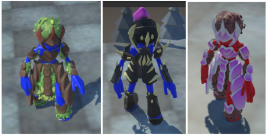
I then started working on the actual armor system. For this I made a few placeholder armor sets so that I could test things. These armor sets are very roughly done and aren't intended to be used for the final publication of the game by the end of the second semester. Unfortunately they haven't been replaced or upgraded as of preparing them for the first semester submission.

Once I had something to test with, I was able to develop a system that takes prefabs of each individual piece and attaches each of these pieces to the bones they are supposed to attach to. This took some figuring out with export settings but I eventually got it attached, working with the animations and automatically mirroring parts that need to be mirrored. I had it defined as 3 sections: Head, Torso, Legs. Each defined section had each defined attachable section on it, and a character was allowed to have one of each. Meaning that mixing and matching was possible from this point on.

It seemed to work pretty well, but there were so many pitfalls I just happened to not fall into at the start. This system broke so much at every step as I tried importing new armor models from my team. This was partially because of export settings and partially about the way the models were oriented.

Eventually I had most of it standardised enough and characters could render with specific armor sets. This was mostly just being handled by the playtesting system that allowed the player to choose which build they wanted to use at this point.
Unfortunately, the system was taking a lot of shortcuts that I was able to get away with when the use case was simpler. The armor getting welded in the right place actually really relied on the characters appearing in a t-pose, I had been expecting this to return as an issue eventually.
When it was time to let the player change their equipped armor at runtime, everything was falling apart. I spent so long trying to resolve the issues. The thing being lost is that each armor piece was unable to know its intended position in reference to the limbs, this is partially because every piece of armor had its origin set at the origin of the full model.

Eventually though, I figured out a solution where I place marker objects on each bone, which get standardised when a character spawns in. From there, I can create the armor pieces on the marker objects which have the correct relative offset to perfectly place the armor on the character. Honestly this should probably be done with some form of devtool, I want to try to use the Odin Inspector package to further develop this sometime and make a button that standardises them for me in the editor. If I do that, I might be able to make a setup for characters of different proportions to be supported too.


I was then actually able to link these armor piece models to the random equipment that the player gets at the end of battles and it was able to work beautifully.
As we were approaching the second playtest, I wanted to do something that I had in mind for a while. I wanted to get the character model 3D printed to draw attention to our game. I originally wished for it to be printed in resin, but the MediaCity workshop resin printer was unfortunately out of order so I settled on getting it printed in filament. The finish wasn’t perfect, and the overhangs clearly had some issues too, but it got the idea across!


Honestly I do wish to develop the character armor system into something a bit more modular. I'm not fully satisfied with how the lower torso piece is fully dedicated for the torso equipment. It would also be very nice to make smaller pieces of equipment, like bottles, also displayed on the player’s hip, or something along those lines. I would also like to make this system allow for total character piece replacements, for instance replacing a hand with a hook.
An idea that may be a bit more approachable to the current state of the game is also adding physics to some of the pieces, such as the hair or cloaks of the armor sets. I know it definitely is possible, and given the fact each armor piece we make is its own prefab, we should have the availability to define them with whatever we want.
Another thing that we wanted to get done for the first semester but didn’t quite manage is making the weapons display on the characters. This is particularly tricky because we can't just glue the weapons into their hands, we would need to have some form of defined hand grip animations. Not only that, but the characters would also have to stop holding the weapons to do certain animations. For instance, the character shouldn't do a potion drinking animation while holding a sword. I’m sure there would be some way to resolve this, or maybe standardise character animations to be done a specific way when a specific item is the held weapon, but that would have to be properly polished up next semester.
0 notes
Text
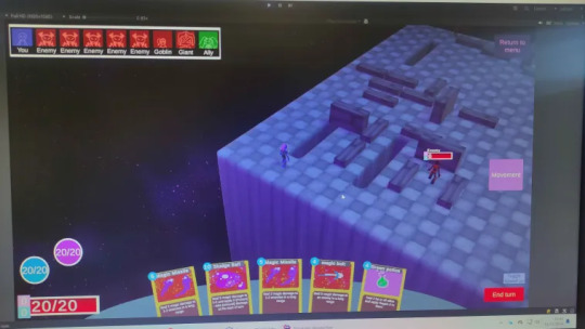
Nebula topic 4 - Grid systems
From early plans, we knew that our game was going to be a top-down strategy deckbuilder where the player can move their character around a certain distance each turn. However, we had to decide the exact implementation we wanted to move forwards with. I led the discussion on deciding what that's going to be, offering up multiple directions we could take it. The initial ideas were between a square grid, a hex grid and a more freeform movement.

From here, I suggested my findings to the team and we got into a group discussion about what everybody would prefer, gathering several points of reference. I set up a format and documented the positives and negatives of each movement system, but the team opinions remained very split.

The collection of pros and cons of each system was an instrumental step to finding a compromise. We had one member of the team who was against a grid system because it is too constricting, reducing the amount of freedom of decision, while another thought a freeform system would be too confusing, being too complex to properly convey effects with. Both of which were entirely valid criticisms.
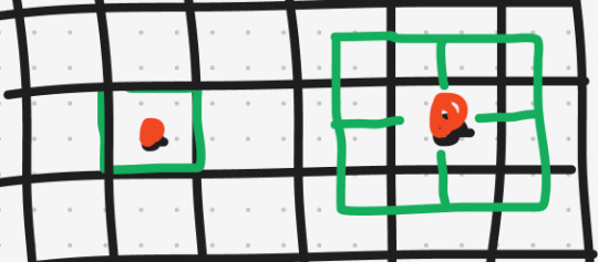
This is where I came up with a revolutionary idea, one that we were unable to find any other tactics game implementing. We call it a subdivided-grid system, the idea is that it remains as a grid system, but each tile actually is broken up into several increments. The value we found to work best is subdividing each tile by 2 lengthwise, aka turning each tile into 4 areas. The key point of this being that it continues having a quantized amount of possible standing positions, but still allowing for a more refined resolution of available options. This is particularly notable with attack ranges being able to be more circular. This also meant we could have characters of different sizes, where the player would take up 2x2 sub tiles.

I eventually managed to get the whole team on board with this. The next step was informing the other programmer how to get this implementation working, which had them a bit intimidated due to the apparent complexity. I went over it with them step by step and explained how it is basically just a regular grid system with some extra steps at the end. With this, they were able to make a standard A* implementation with a bit of path travelling. However they did eventually choose to pass on the further steps of the implementation over to me.
My challenge was changing a 2D array of tile info into something usable with the dual grid. The first step to this was converting all of the systems into a more easily manipulatable format. I chose to make this into a texture, however ideally I would have been able to do this as some form of binary map, since some of the next steps could be completed with basic binary operations.
It took about a days work, but I was able to make all of the systems interface with the grid entirely via texture maps. With this, i could actually do some operations on the data and actually bake some of it to optimise the further steps. One of the first things I did with this is plug the texture into a decal shader to display all of the movable tiles as a single object, instead of the previous implementation which had each tile being marked with a separate one.
Somewhere around this point I had also added a line renderer which uses some of the baked data to display the actual path being stored from the pathfinder.

The next step from here was taking the grid and subdividing it. The first part was simple, all it took was changing some settings on the actual size of the grid tiles, and it would already be smaller. The harder part is making sure that the characters are aware of how much space they take up on the grid, but I had a plan for this already.

The above image demonstrates the idea. I don't need to make a pathfinding algorithm that works for a 2x2 character, I need to make a 1x1 pathfinder only see positions that are valid for a 2x2 character. Now that the data is stored as a texture, we can do operations on the pixels. If we want to filter out all of the positions that a 2x2 character would not be able to fit into, we can take the map for valid 1x1 positions and shift it over by a pixel, doing an AND operation, or in terms of colours, multiply. This way, only the positions where the given pixel AND its neighbour are free will remain free, this gives us a 2x1 valid map. We can do this in the other axis too, making the 2x2 valid map we were after.
This poses another issue though, with this, only characters of odd sizes would remain properly positioned on the grid. To resolve this, I realised that the origins of all characters will have to shift to a corner to allow for even scaling.

This was a perfect solution, not only did this work with all of the sizes, but it also meant that the map shifting operations didn't actually need to take any extra steps with repositioning later down the line.


It took a lot of refactoring things to make the offsets correct, but i could then filter available tiles for a 2x2 character, find all the reachable tiles, then unfilter the remaining data to make it visually display how it would look like if a 2x2 character was going to stand there.
With this I was also able to implement attack ranges, all it took was giving the pathfinder a blank map, essentially saying that it can pathfind wherever it wants. Then that result can get filtered into only positions not overlapping with obstacles.

While I was at it, I also made sure that these different tile sizes fully worked with enemy AI, and with enough work, it all integrated very nicely. Making the system modular really helped with upgrading it easily.

Since I was already working with PNGs, I also implemented a dual grid based environment generator. Dual grid tilesets are actually very cool because they can give you a full set of 3D environment parts by making just 6 tiles. This is actually currently not linked with the functionality or generation of the grid, but it will be crucial to do so when we get around to adding more levels to the game. This is not only very useful as a tool that lets us quickly handmake levels with just a quick pixel texture, but it also means we can do more procedural elements manipulating the level textures to adjust how the environment is made. It was my second time making a system of this sort and I had since learnt some new tricks, not only that but I had plenty of tilesets I had previously made which I could use as placeholders. This time around I knew how to define tile data much more efficiently using flag enums to define the directions on the tiles instead of individual boolean flags. This also meant that rotating tiles was much easier, turning it from a lot of IF statements into some bitshifting algebra.
When making this, I encountered strange issues with enum flags that had me very confused. Things were breaking when certain options were selected but it looked like some weirdly baked serialisation issue that just disappeared eventually despite the code not changing, I have not encountered it again since.

With this grid system working on a PNG system, I already had the data plugging into the decal display, but I realised I could just as easily connect the valid selectable tiles to a grid system. From there I was able to make a quick tileset of tubes along the borders of tiles. Setting it all up, I had a working outline of the available tiles and it really just came together very nicely.
0 notes
Text
Nebula topic 3 - Card effect systems
Going into this project, I knew that without substantial variety, deck-building games can really fall flat. Making a system which allows for a very modular card effect creator is crucial for keeping this project within a manageable scope. Each card needed to have a way to interact with it, and an action it completes. Making a unique class for every single card would be absurd though, so I wanted each action to be as flexible as possible. This of course meant the systems had to be designed in a way that is very modular.
We had a plan of various ideas we may want to use, and several of them had fundamentally different interactions. For instance, some cards may be usable instantly, such as a card that heals yourself. Some cards need to select a target, like attacks. We needed a way to neatly organise all of that.
We did a bit of brainstorming and narrowed it down to 4 main ways of letting a character interact with a card. Instant(no selection), Unit selection, Card selection, and Position selection. Each of these categories then gets split into some subcategories, each of these subcategories then has marked what inputs it must have defined, and then what outputs it produces. The idea being that an action could be defined as a Selector paired with an Effect, with the data from one automatically plugging into the other. An Effect would be a defined thing that happens.


I soon realised that this system actually turns out to be extremely limiting, it would be barely customisable and it would be hard to define any multi-step actions. This led me to rethinking how exactly an action could be defined and I decided that an action should realistically contain multiple of these modules chained together in a unique script. To do this, I designed an abstract base CardAction class that is inherited from to create every single unique card action.

Within one of these actions, there would be a DoAction script mainly composed of all of the previously established capabilites. These would still allow for the action to be defined with a few variables, to allow the scripts to be recycled in different contexts.

From here, the tricky part was deciding how this would interface with the actual action of using a card. The idea here isn’t too complicated; a card is chosen to be held by the player, then the selector script fires off to do the selecting that needs to happen. From there, the player can choose if they use the card or if they change their mind. If the player uses the card, the DoAction gets run and the card gets used.

With this, I tried to further expand what it could imply whenever any particular card action selector is used.

This solution was frankly getting really unnecessarily complicated, the biggest issue I was facing was that there was no way for me to guarantee what type of data was being returned from the selector, meaning I wouldn't be able to store it in any sort of proper way. This was really hard to figure out and had me taking a lot of notes trying to solve it.
It was such a non standard issue that I was really tempted to just brute force it, pushing all of the data through regardless of the selector. Which, given some more thought, made me realise that it can actually make for a very elegant solution.
What I needed to define is a card payload, the card payload can store all of the relevant data that a selector could possibly want to have saved. Not only that, but having a general payload for the completion of an action has plenty more utility as well. It can easily be one centralised location for storing the user of the card and the specific card itself. All of that data being accessed so easily would prove itself essential to creating a lot of cards down the line.

From here, it's a matter of making any given turn controller able to interface with the system. At this point I chose to actually entirely flatten down the functionality of the selectors into their main 4 categories which can be stored on the action as an enum. The actual functionality can be handled by the turn controllers themselves. This is how the player is able to use the interface to make their choices while NPCs make their own AI choices.
Developing further on this idea, I started planning out how this may flow within the rest of the Battle Manager loop, and I came up with some systems that could work very reliably. The TurnController script would then branch into preparing the card based on which selector was passed through. And each branch can be overridden based on who is calling it.

Here we also needed to define what limits are in place for the selection being done. This gets boiled down to each type of active selector having its own checklist. The checklist information is defined within the cardData, and if we were to define a unit selector card, it would contain how many units it needs to select, along with what alignment they have (ie ally, enemy)
Cards that take a selector that needs a choice will have a checklist. Eg unit selector needs to know which alignment to select, and how many to select.
Then its a matter of running the effect. Once a card has gone through the stages of preparation, the DoAction can reference any data it expects to have in the payload and can do operations on it. Now, working with this to make a few cards I quickly found myself constantly looking for where things were being held, trying to find which element contains which function. It was a mess and it needed to be organised.
This is why I designed the CardEffects helper system that allows me to do all of the functions from one centralised location. This really simplifies calling these actions. When writing a script I can just write CardEffect and then browse through all of the options it allows me to call from there.


I later visualised this to demonstrate to the team what modules they can use to plan card effects that they might want to see implemented into the game.
This includes utilities such as:
Doing attacks
Playing animations
Changing energy and movement points
Drawing cards
Selecting all battle participants
Filtering a list of units
Of course many actions include attacks, they are a fundamental part of the gameplay loop. I created a special class for defining attack data, which stores the full definition of the results of the attack. Ie damage value, damage type and status effects.
Calling these attacks may admittedly not be entirely correct, as these function as much more than just attacks but I was starting to run out of words between Attacks, Effects and Actions, along with how damage was initially the only purpose of these. Attack type can define the consequences of the attack to be entirely different. For instance setting it to Heal makes the target regenerate the specified amount, there's also shield setters which add the selected amount of Barrier to the target, either Physical or Magical. This is of course also used for normal combat terms with Physical, Magical and Chaos damage which determine which shield should block the damage before the attack hurts the target's health, or it can bypass that entirely. There's also shield breaking which can only ever deal damage to shields, not doing any damage to health at all.


Any attack can also be paired with affecting a status condition on the target. This can be something like having an attack that also applies some damage over time with Poison, or could be something like SinisterPlan which makes the target draw an extra card whenever it takes damage.
Status effects are also a whole big system of their own, but they’re essentially the same as card effects which happen whenever a certain condition is triggered. Once they are triggered, they can apply their corresponding effect to the target. These effects can really be anything that the cards can do, such as doing attacks, gaining energy, drawing cards, the options are limitless.
0 notes
Text
Nebula topic 2 - Battle manager system
Our game was designed to be a turn based game, meaning that only one character can be doing actions at any given time, and that they can only do a single action during any point in their turn. This was a gameplay system that needed considerable planning otherwise things could easily break.
There were several pitfalls I wanted to avoid when designing this system:
Having multiple characters thinking its their turn to do an action
Having a character start one action while already doing another
Having characters do actions despite being dead
Having the battle stuck on a dead character’s turn
Unfortunately, I had fallen into these pitfalls and many more plenty of times throughout the development of this system. The system has undergone 3 major iterations so far, and I currently see the latest one as an overall very elegant solution.
The first iteration of the system was being designed from the ground up. I was focusing a lot of effort on the planning of this solution to build a very stable foundation for everything else to be built atop of. From the beginning, I was aiming for maximising the modularity of the systems, meaning that even as this evolved, the surrounding systems didn’t need to care about the exact implementation to produce the results they were supposed to produce.
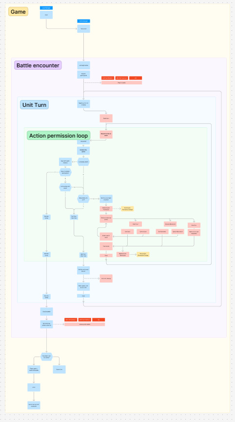
The general idea of this system is quite simple; there is to be a singleton BattleManager which is the main heart of the operation. This prepares a battle, taking all of the participants and tells them to prepare before the battle begins. Once all the preparations are done, it looks at its queue and tells the first unit to begin its turn, by which point it waits for a response back from the unit that its turn has completed. When this happens, it checks if the battle should be over, and if not, it shifts the active unit to the back of the queue and repeats the process until the battle is determined to be over.
The units in this case are represented by a UnitTurnController script which gets attached to objects that already have a UnitBase script. This UnitTurnController script handles every action a unit may choose to do on their turn, namely using cards, doing movement and ending their turn. This of course comes with plenty of utility functions too while also outsourcing the complex actions to their own managers, namely the CardEffectManager and the MovementManager. This script then gets inherited from to create the PlayerTurnController and NPCTurnController, which are used for the player character and any non player characters respectively. Each of these overrides several functions to allow the relevant systems to interface with them. For instance, the PlayerTurnController interfaces with certain UI elements to tell the player what they are able to do at any given point, and allows the player to make actions on behalf of their character. On the other hand, we have the NPC turn controller who would have an algorithm controlling what choices they make.
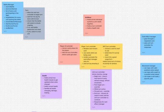
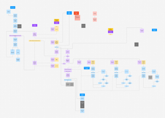
It may be hard to make out the exact details of the illustration, but this general plan has been developed further into a more specific, sectioned flow chart. This illustrates relevant scripts in the saturated title boxes, following an internally consistent colour scheme I used for development. The overarching idea here is that the battle manager has a loop which continues whenever it is told a turn has been completed. This happens when a given UnitTurnController’s internal loop is told its turn should be completed. This happens whenever ending the turn is chosen as an action. Alternate actions can keep being taken until ending the turn is chosen. Each alternate action outsources to some manager.
This system, while functional with basic functionality, really struggled when status effects were introduced. Namely, the issue was that units could die on their own turn, which becomes a major obstacle. The system was able to be kept afloat for a while with some workarounds thrown into the functions, but it was by no means a long term solution. The issues piled up further when it was time to add the functionality that lets the player win a battle. This is when I realised a severe rework was going to be in order.
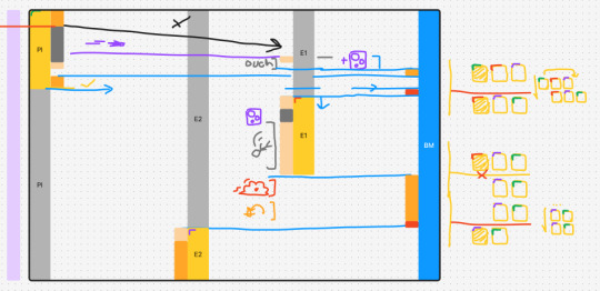
What I needed is a system designed to be fully interruptible from any point in a character’s turn. It needs to always know that the game is in a state where it is permitted to do an action before it does an action. Another issue I’ve been having with the previous system is that certain things are simply unable to wait to be finished before the next thing happens. This is also crucial because at this stage in development, item drops were about to be added to the game, and it needed to be able to allocate the time for the item to drop to a designated position before a new action can be taken. In essence, the system had to fundamentally guarantee only one thing can be happening at any given time
By this point in the project, I had been getting much more comfortable with using coroutines, which had already been put to use in creating the battle system. One thing the previous implementation lacked was commitment to using coroutines. It had coroutines stopping and waiting for a new thing to start a fresh coroutine anew. It was creating a lot of loose ends that were hard to keep on the same page.
With this all in mind, I had formulated a new plan that distinctly splits the gameplay into several interwoven loops.
The Game as a whole contains everything, this level handles what happens before a battle starts and after a battle ends. For instance, this can make new battles begin after a previous one ends.
The Battle Encounter contains things specific to the battle happening at a given time. This includes preparing everything before a battle, cleaning everything up after a battle, and telling a unit in the queue to do its turn.
The Unit Turn contains specifically what a unit is able to do before its turn ends. This includes setting itself up to start a turn, cleaning up if the turn needs to be ended, along with looping through actions while permitted.
The Action Permission Loop is what happens when a unit determines whether it can do an action. Here, the first thing that happens is the unit asks the battle manager if it is able to do an action. The battle manager determines whether or not this unit is dead, whether the battle is continuing and whether this unit actually had previously asked to end its turn. Based on all of that, it splits into either ending the battle, ending the turn or actually permitting the unit to do an action. With something very similar to the previous implementation of the actual action selection.
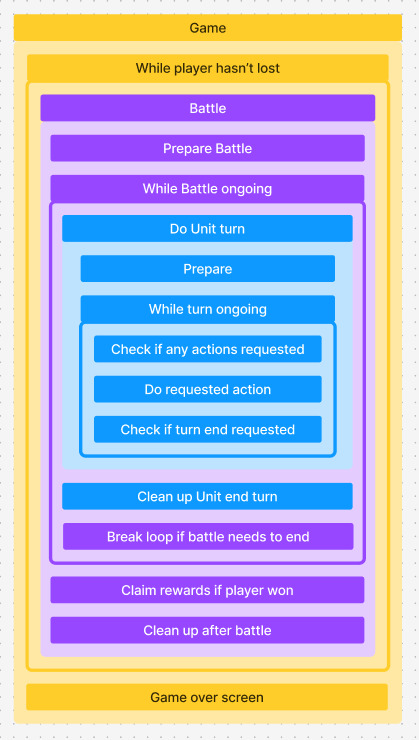
While I was working on implementing this into the engine, I had a discussion with my module tutor, making me realise that this system is in reality quite redundant. As such I had made a few modifications off the top of my head to make it more aligned to how I interpreted the suggestions. It essentially boils down to making everything entirely function within layered coroutines. Due to my very modular design work up until this point, switching the implementation proved to not be too challenging.
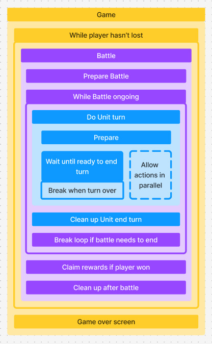
Unfortunately, this visualisation of the system came after the fact, I did not at all think to change the individual turn actions out of running in parallel, since they were already mostly functional. Because of this oversight, the implementation of the NPC turn choice algorithms ended up making it to playtesting with a lot of outdated code trying to start new parallel actions during actions, causing the coroutine to branch several times. It was very hard to debug and had grounded me back to remembering why I used to dislike working with coroutines the few times I had previously done so.
The fix was simple once I had found it, I had some old StartCoroutines from the initial reply system firing off to manually loop the sections, whilst it was already looping automatically. As I’m writing this blog, I realise that despite this being an issue with refactoring, it does not entirely fit my personal criteria of being an elegant solution in the state it is now. I think it could be interesting to see if I could manage to get it all into one continuous coroutine, I believe this would make the implementation even more reliable, and could simplify several other aspects of the game which need to check if an action is permitted in the first place.
0 notes
Text
Nebula topic 1 - Data/Database systems
One of the aspects I was in charge of for our project was setting up all of the internal databases of the content in the game. This includes the data that defines Cards and Equipment, along with how other systems interface with them such as Inventories, Decks and elements which render them to the screen.
A huge part of the development of these aspects was scaffolded by the use of FigJam as an online tool to create various notes and mind maps to visualise a train of thought. It really helped with planning out concise and organised systems. I was really able to hone in on working with the Single Responsibility Principle, ensuring that each element handles itself. This was great when it came to modularising the project, since each thing handled itself when asked, plugging things in later down the line was really as simple as just plugging them in.

The plans for the implementation were very concise from the beginning. I was planning to define all of the items in code, which automatically stored the defined cards within library scripts, accessible via unique identifiers to allow for easy fetching.
I have chosen to do this in code for a few reasons; I have extensive experience with defining cards for a unity project via individual definition entries. Furthermore, within previous experimentation, I have found scriptable objects to have several limitations within this sort of implementation. For one, scriptable objects must be individually defined and can be difficult to browse through, making it hard to work with them in bulk. Another major issue with them is the fact that scriptable objects can only serialise so much, which becomes a problem when it comes to defining their functionality. In code, the functionality of a card can simply be any defined card action that inherits from the base abstract class, whereas in scriptable objects, you can't choose which class goes into a section unless it itself is a scriptable object or you have a custom editor designed specifically to accommodate each possible action class. Both of these options pose significant difficulty. Having a scriptable object for each individual layer of functionality would quickly bloat up the amount of individual effort it takes to define one card. On the other hand, having a custom editor designed to accommodate this may produce a more professional and much easier design experience, however it would have major upfront setup time and effort for defining any new type of action. This does not even account for the ability to make actions call other actions, which would significantly impact the viability of both of these solutions.
There are other positive aspects I have discovered when defining these elements in code. Namely, if I chose to redefine the inputs of an action, I would immediately be able to tell where each element requires being re-adapted into the new format. I believe that with scriptable objects, these changes would remain invisible until someone specifically looks for elements with now missing fields, or if those fields were to throw errors at runtime.
That is not to say defining these elements in code does not have its own downsides. For instance, the definitions being within a programming script makes it considerably harder for other people on the team to make changes, particularly if they’re not familiar with format of C#. This is actually not too big of an issue though, since we can still use a document to track all of the card and equipment plans. Having multiple people changing the actual cards in the engine may also lead to other issues. However, a more notable downside is the fact that since each card is defined and internally referred to with a simple string ID. This is entirely plaintext and has no sorts of data validation, meaning that any typos or incorrect naming would lead to requesting an invalid card, which can easily go unnoticed until things break.

Cards and Equipment would each be defined in their corresponding databases. Each database has the specific tools and functions to make creation of these elements as easy as possible. Once those specific pieces get defined though, the data is instanced as CardInstances and EquipInstances, which give us the opportunity to define specific data to an individual copy of an element, for instance if a piece of equipment has a random selection of defined cards, or if a specific card has been targeted by another effect to deal extra damage. It would be these instances that the player actually uses, adding an extra layer of protection to the underlying stored data, which we do not wish to edit.

Here is an early screenshot within the CardDatabase showing the general idea of how cards may be defined. The card defining script is run for each card, creating an entry within a database based on the given card name, or otherwise specified ID.

Here is a screenshot from the EquipmentDatabase, demonstrating how equipment can be defined, referring to having a specific collection of cards which it would provide to the player if equipped.
This is a lot of setup to do in theory, so it’s important to check that it actually works. This can be tested on the player with a temporary setup. This puts the items matching those IDs into the players inventory.

When the player’s inventory then is initialised, it will recognise that it has those specific pieces of equipment and then will compile all of its cards into one place, where it can be referenced further by other scripts.

Sure enough, even with some basic serialisation, we can see which cards are defined in the players inventory, along with which inventory slot they originate from.
This data system can then be used to draw cards to UI elements. In this example, the UI card images have specific IDs assigned to them, and they have a placeholder graphic in place. But sure enough, with some basic effort, the cards display the right information.

This can be further developed by setting up a tool that references the Resource folder. This folder is special because there is an easy way of accessing the data from it by code. What we can do is throw in a bunch of images here and name them corresponding to the card IDs we wish to represent. Then we can tell the cards that, unless specified otherwise, they should take the corresponding asset from the folder as their image. This turned out to be a surprisingly easy implementation.

This general implementation stayed fundamentally the same as the project developed. It has been a very fun implementation, and it was a great introduction for planning implementation with FigJam before committing to writing it into the engine. Remaining in code proved very satisfying when it came time to start importing cards from the planning spreadsheet, it was a lot of easy copy pasting and value editing. Admittedly though, there have been multiple situations that have caused major issues because of error cards being drawn, these are created when you request to make a card with an ID that has not been defined in the library. This normally wouldn't have been an issue, but the way the error cards had been defined was problematic because their action was left as null. This used to work fine, but as the implementation around them grew, cards were internally assuming they had actions, causing many crashes during the second playtest. This of course was not ideal, one option from here was to find some sort of way to validate any requested IDs before they compile. Unfortunately, the project is too close to the first deadline to safely commit to rewiring how all of the cards are defined. While I did not want to use scriptable objects before, I have been introduced to the Odin Serializer/Inspector package. I haven't fully grasped it yet, but from what I understand, it may be a way to serialise the data that I thought I was unable to. If that does end up working, the project would become much more accessible to editing and could severely reduce the risk of incorrectly defining a card.
0 notes
Text
Project Nebula Incoming!
Over the past 12 or so week I have been working on a group project for my games design university course. I'll be posting a handful of topical blogs about the development here!
1 note
·
View note