Text
2nd December 2019 Student-led seminar 5
Text: Bolger, M.A. (2011) ‘The Ephemera of Eternity: The Irish Catholic Memorial Card as Material Culture’, in King, L, Sisson, E. (eds.) Ireland, Design and Visual Culture: Negotiating Modernity, 1922 – 1992. Cork: Cork University Press, pp. 235-247.
Table of content:
Introduction Main part: Memorial Card and Illustration Memorial Card and New Media Conclusion Notes: Books and articles Picture(s)
About the author: Dr Mary Ann Bolger is a lecturer in Design History and Visual Culture at the Dublin School of Creative Arts, Technological University Dublin. Since 2017, she has been programme chair of the BA in Contemporary Visual Culture. She also teaches on the MA programmes in the School and supervises PhD students. Mary Ann received her doctorate and her MA in the History of Design from the Royal College of Art, London. Her research interests include design in and of Ireland, graphic design, typography and language, the visual culture of the everyday, and the material culture of religion (Bolger, 2019).
Introduction
This essay made me think much about the Church and how it brought a lot of the same structure into different cultures, replacing or suppressing indigenous traditions. It made me wonder how much regional art might have got lost due to the mass production of memorial cards introduced and used everywhere? Especially in cultures that are rich with colourful images such as the South-Americas or India which were mentioned in the essay. But at the same time, Ireland has a rich tradition around the death as well, Samain to be precise. It made me realise that, indeed, many Church shops in different areas I’ve visited had almost the exact same religious items on offer.

Above: My screenshot of Newgrange UNESCO World Heritage Site (2019).
Memorial Card and Illustration
As the article states, the photographs and the tombstones were some of the few possibilities for people to escape the norm and the seemingly hard frames the mass production and the Church might have put on them.
Setting the Memorial Card into the area of illustration, I can imagine plenty of possibilities from drawn portraits to fully illustrated Memorial Cards with hand-lettered prayers. Putting the deceased into an abstract appearance could eliminate the punctum Barthes(Bolger, 2011) argued about. The punctum of time would be removed. This could also be seen as an additional ‘emphasis on individuality’ as mentioned by Bolger(Bolger, 2011). However, I can imagine that most of the bereaved might prefer a photograph with less abstraction than a stylised version of the person. Especially since portraits might be even more subject to taste. And how to draw the person anyway? Smiling, the gaze set on the viewer, or looking away? The hairstyle the person had 2 years ago or rather one the bereaved prefers? When looking at the layout, however, I can imagine that soft drawn outlines in floral ornaments might find interest.

Above: My own sketch for an illustrated Memorial Card, (2019).
Memorial Card and New Media
Going even further and pushing the topic into newer media, I could imagine the creation of an app to collect Memorial Cards digitally instead of a paper version. This would surpass ‘the vulnerability of the material’ as Bolger(Bolger 2011) pointed out. However, she also emphasised that ‘This digital incorporation of the photograph lessens the tactility of the cards.’(Bolger, 2011), which could also be the case for completely digital versions. Younger generations, I believe, are not very focused on this matter, as can be seen in the decline of holiday greeting cards as well as that of printed photography requests.
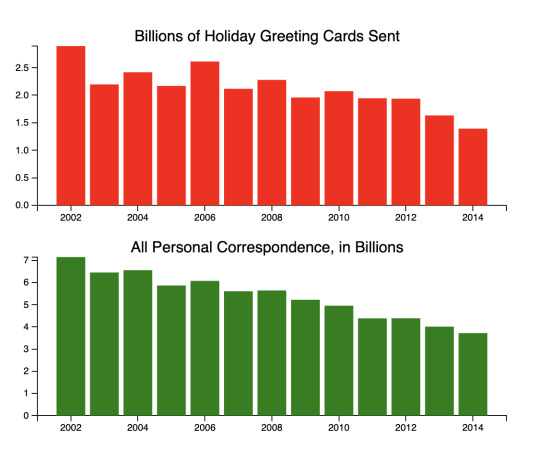
Above: My screenshot of ‘See the 1 Number That Shows the Decline in America’s Holiday Spirit’, (2015).
Such an app could be used as a living collection of thoughts connected to the deceased. It could send alerts for anniversaries and open the possibility to connect with other mourners to meet and overcome the loss together. It could even give the possibility to select and order a flower bouquet digitally at the closest florist before you make your way to the cemetery. Or, if you live too far away, to be collected by one of your connected friends/family members or be delivered by the florists with a photograph you could add to your folder in the app.
Conclusion
While times were different in 1930, the progress of new media might allow a change in the memorial card to be seen soon. As with everything that touches very intimate areas, any design needs to be appropriate and dignify the circumstances. When I read the article first, I couldn’t think of much to add to it. Looking back now, I found it to be inspiring and yet another reason why I highly value Albert Einstein’s quote: ‘The important thing is not to stop questioning. Curiosity has its own reason for existing.’.
Addendum:
Reading this essay made me curious about South-American rituals around the dead. I found https://theculturetrip.com/north-america/mexico/articles/the-day-of-the-dead-mexico-s-mysterious-holiday/ very interesting to read.
Additionally, I also read about the Solstice in Ireland and this article was very interesting as well: https://voicesfromthedawn.com/newgrange/.
Further Reading:
https://www.nytimes.com/1981/08/23/books/death-in-the-photograph.html
JOURNAL ARTICLE: The Photograph as Mystery: Theological Language and Ethical Looking in Roland Barthes’s Camera Lucida
Sarah Sentilles: https://www-jstor-org.ezproxy.mdx.ac.uk/stable/10.1086/654822?seq=1#metadata_info_tab_contents
Search options: Neville Knott, John Walsh, Peter MacCann, Robert Tully, Orla Keane, and Kerry Meakin.
Notes:
Books and articles
Bolger, M. A. (no date) Staff. Available at: https://www.dit.ie/creativearts/people/staff/staffarticles/staffname165834en.html (Accessed on: 1st December 2019)
Bolger, M.A. (2011) ‘The Ephemera of Eternity: The Irish Catholic Memorial Card as Material Culture’, in King, L, Sisson, E. (eds.) Ireland, Design and Visual Culture: Negotiating Modernity, 1922 – 1992. Cork: Cork University Press, p. 246.
ibid.
ibid., p. 245.
Picture(s)
Newgrange UNESCO World Heritage Site (2019), Newgrange. Available at: https://www.newgrange.com/images.htm (Accessed on: 1st December 2019)
My own sketch for an illustrated Memorial Card, blue pencil on paper, ca. 7x6 cm, 2019.
Wilson, C. (2015) ‘See the 1 Number That Shows the Decline in America’s Holiday Spirit’, in: Time. Available at: https://time.com/4151915/holiday-greeting-card-mail-usps/ (Accessed on: 1st December 2019)
0 notes
Text
2nd December 2019 Student-led seminar 5
Text: Black, J. (1997) ‘Frontiers’, in Black, J. (1997) Maps and Politics, London: Reaktion Books, pp.121-147.
Table of content:
Introduction: The German Reunion Main part: Long-Lasting Effects Frontiers in Art with Oliver Jeffers as an example Conclusion: The Meaning of borders for artists Notes: Books and articles Picture(s)
About the author:
Jeremy Black is Professor of History at Exeter University.He is a prolific lecturer and writer, the author of over 100 books. Many concern aspects of eighteenth century British, European and American political, diplomatic and military history but he has also published on the history of the press, cartography, warfare, culture and on the nature and uses of history itself (Black).
Introduction: The German Reunion
Borders have a special meaning for me. Having grown up in Germany, I lived through the reunification of East and West Germany. I was very young and lived in a largely unaffected region but my father regularly travelled to East Germany and with every phone call we had he would tell me about bits and pieces.
I also remember vividly a visit to Dresden, one of the cities deep inside East Germany and heavily impacted by the Russian-led government. When I was there as a kid, very shortly after the reunion, parts of the city were still in ruins from World War 2 and bullet holes were to be found, something unimaginable in the South of Germany. It was a shocking experience and a display of how much difference a border can make.
Years later I revisited and the rubble was gone, many iconic buildings rebuilt and the Frauenkirche in Dresden was standing in front of me, whole again.

Above: The restored Church of Our Lady has become a symbol of Dresden's resurrection. Photo: REX FEATURES.
Long-Lasting Effects
Looking at the German reunion, even now, thirty years later, the effects are very visible. From a still present pay-gap to worse living standards all the way to a clearly different political attitude, the border impacted every facet of life in a long-lasting manner and the removal of the border made those even more obvious. Borders are useful tools to separate different identities, as the given text outlines in many examples, but they can also have devastating effects on people and their identification with the land they live in. So, while I agree with following statement Black quoted:
‘Frontiers assert and separate identities. They reflect and create borders, and borders produce their own geography.’(Black, 1997)
I sometimes would wish it to be not this way, especially looking at the still visible differences between former East- and West-Germany.

Above: My picture of the exhibition ‘Observations on Modern Life’, (2019).
Frontiers in art with Oliver Jeffers as an example
Artists pick up on this topic as well and use cultural differences across borders in their work. One of my favourite illustrators, Oliver Jeffers, recently had an exhibition at Lazinc Gallery, London with the sole topic of borders across the world. In a satirical way, he depicted many differences between countries and their current activities, criticising the use of borders as a political tool and evangelising globalism. In his own words:
‘I am a citizen, nay, a patriot, of Earth.’(Jeffers, 2019).
Living outside of Germany most of my adult live, I agree with his statement. Confronting Blacks founding:
‘Emphasis on frontiers increased in the nineteenth 2century. This reflected the greater pace, extent and intensity of imperialism,9 and the role of nationalism within Europe. (Black, 1997).
with Jeffers quote, I can see how narrow borders can create narrowed nationalism feelings in a globalising world.
Conclusion: The Meaning of borders for artists
What relevance do borders have for artists? In my opinion, less and less or in Oliver Jeffers definition:
‘By making environmental, apolitical and sometimes humorous comments on maps and globes, I have been addressing issues I feel strongly about regarding how random maps are in the first place, how arbitrary the carving up of things and drawing of borders are.’(Jeffers, 2019).
Our entire world is moving towards fewer borders because technological advancements are removing them one by one.
Improvements in mobility mean that crossing into another country is no longer an expensive and time-intensive endeavour but done comparably cheap and within hours.
Communication tech connects the entire world with each other, largely ignoring most natural and human-made borders, and the latest innovations in machine-translation are drastically removing the borders created by language barriers.
If I’m an artist nowadays I can largely ignore the restriction of previous days –from transportation to translation, the internet takes care of that and art is shared widely and freely. Yet, when trying to monetise art, borders are still relevant, and if only for one remaining thing laws and regulations.
Further reading:
https://www.mdr.de/kultur/ausstellung-point-of-no-return-bildermuseum-leipzig100.html
Notes:
Books and articles
Black, J. (2019) Biography website. Available at: https://jeremyblackhistorian.wordpress.com/ (Accessed on: 30th November 2019).
Black referring in his essay to Rumley, D., Minghi, J.V. eds. (1991) The Geography of Border Landscapes, London: Rout ledge.
Lazinc Gallery (2019), ‘Oliver Jeffers: Observations on Modern Life’, April 4 - May 15, 2019.
MacKenzie, S. (2019) ‘Oliver Jeffers: ‘Patriotism is suspect, but I can get behind cultures’, in: BigIssue. Available at: https://www.bigissue.com/culture/oliver-jeffers-patriotism-is-suspect-but-i-can-get-behind-cultures/ (Accessed on: 30th November 2019).
Black, J. (1997) ‘Frontiers’, in Black, J. (1997) Maps and Politics, London: Reaktion Books, p.134.
Malby, P. (2019) ‘20 questions with... Oliver Jeffers’, in: GQ Magazine. Available at: https://www.gq-magazine.co.uk/article/20-questions-with-oliver-jeffers (Accessed on: 30 November 2019).
Pictures:
Telegraph, (2015), [Screenshot]. Available at: https://www.telegraph.co.uk/history/world-war-two/11397715/Dresden-The-wounds-have-healed-but-the-scars-still-show.html. (Accessed on: 30st November 2019).
Lazinc Gallery. Photo taken by me, 4th April 2019.
0 notes
Text
19th November 2019 Student-led seminar 4
Text: Rock, M., (2009), ‘The designer as author’, in Armstrong, H. (ed.) Graphic design theory : readings from the field. New York: Princeton Architectural. pp. 108-114.
Table of content:
Introduction: Main part: The name - the brand Games and authors Conclusion Notes: Books and articles
Introduction
Today the role of the author, as explained by Rock already in 1996, can be defined in a broad field of possibilities, from books and essays to commercial advertisement campaigns and movies to video games, tweets or TikTok videos.
It also depends a bit on the product. The question that should be asked is more about whether the product, the brand or the author him/herself is the brand and the product.
The name - the brand
In former times it was mostly one person creating a brand and standing behind the product, like Ford, Eddison or Leibnitz cookies, they all created and lead their brand and they were also seen as the inventors. They all had a big team behind them working on those products but the brand was directly linked with that one person with their name on it.
Nowadays, many parts of our world are branded through big marketing-strategies with PR departments, social-media strategists, and design companies such as the famous 2x4.
Apple is not the name of the creator, the same goes for Google or Amazon. Today, marketing-strategies are in the decision making, the author is only of importance to promote the product.
A movie with the name of a famous director such as Cameron, Scorcese, or Spielberg on them along with the names of famous actors just sells very well with a broad audience. I’d argue it’s because they became a product themselves. At the end of the day it sells and this is what matters most.
Games and authors
A different point I’d like to argue about is video games. Do you know any well-known author in the gaming sector? Looking at commercials it mostly states “From the makers of XYZ”. Mostly there is no name of a single person to be found, because the product (a game) is made by a collaboration of a few or many people. Perhaps that is because the gaming industry is comparably young and did not have to go through reiterations as much as other products, which had to adapt to new media again and again.
‘While some claims for authorship may be simply an indication of a renewed sense of responsibility, at times they seem ploys to gain proper rights, attempts to exercise some kind of agency where there has traditionally been none.’(1)
In the field of gaming, recognition is not a rare find. Outstanding and groundbreaking work is lauded, people and teams and companies are getting commended and earn trophies by now. Same goes for designers: the IDA (International Design Awards), the D&AD (Design & Art Direction), or the US version of it: The One Show. Both, however, celebrate more their success in their own fields of work. This might sound a bit secluded, same goes for fashion weeks or movie awards.
Rock’s findings that
'[I]f we really want to go beyond the designer-as-hero model, we may have to imagine a time when we can ask, "What difference does it make who designed it?’(2)
is the reality of the gaming industry. It might be that this industry learned from the designer issue as author, this would need further investigation. It is not equal to the question of authority or responsibility, though. If a game or an advertisement campaign goes wrong, responsibility is found rather quickly. It is upon the team during the process of creating the product to not end there, hence the responsibility lays heavily upon the team and producers.
Conclusion:
For me, the author’s quintessence was somehow a mere outcry to receive more recognition as a designer. In my opinion, having worked for the highly valued company Prada, it comes with no surprise and looks like he wants his name closer connected to the brand.
And it seems like Larochelle’s writing about the Author in Postmodernism became his living nightmare(3).
I do agree with his final statement that ‘the primary concern of both the viewer and the critic is not who made it, but rather what it does and how it does it.’ which seems already embraced by other industries such as the one I outlined above(4).
Sometimes new areas of industries do have new ideas on how to get around issues, such as authorship and agency. My idea for Rock would be to look around at how other industries tackle this kind of issue and to form a new way for themselves.
Notes:
Books and articles
Rock, M., (2009), ‘The designer as author’, in Armstrong, H. (ed.) Graphic design theory : readings from the field. New York: Princeton Architectural. p. 114.
ibid.
Larochelle, G. (1999) ‘From Kant to Foucault: What Remains of the Author in Postmodernism’, in Buranen, L., Roy, A. (ed.) Perspectives on Plagiarism and Intellectual Property in a Postmodern World, New York: State University of New York Press. pp. 121-130.
Rock, M., (2009), ‘The designer as author’, in Armstrong, H. (ed.) Graphic design theory : readings from the field. New York: Princeton Architectural. p. 114.
0 notes
Text
19th November 2019 Student-led seminar 4
Text: O’Keefe, T., (2014) ‘My body is my manifesto! SlutWalk, FEMEN and femmenist protest’, Feminist Review, 107(1), pp. 1–19. doi: 10.1057/fr.2014.4.
Table of content:
Introduction: Main part: Different forms of protest Protest and societies Conclusion: Other ways and fraternisation Notes: Books and articles
Introduction
Decades of liberalisation within societies and the development of our modern communication technologies had the effect that any public protest nowadays has to be more diverse, inventive or aggressive – a requirement to stand out of the crowd and still have an element of ‘shock', or otherwise the public might simply not pay any attention.
A great example to that point is FridaysForFuture. The shocking element in my view, was young school kids skipping classes, a fact that was heavily criticised by conservatives and climate sceptics, which in turn elevated the movement into the mainstream and gave them a wider reach. Would FridaysForFuture have reached today's size and impact if they had demonstrated after school during approved hours? Most likely not.
Different forms of protest
Groups supporting feminism are no exception and the two examples Theresa O’Keefe discusses, SlutWalk and FEMEN, proof the point. They both use aggressive up towards illegal methods to grab the attention of the public. O’Keefe describes in length why, however, both groups are not benefitting the idea of feminism nor the goal of equality, since they are not promoting equality in the first place.
She even goes further and indirectly claims that their purpose is not to promote feminism or change societies perception of women, but simply a capitalistic venture to make profit out of the popularity of the movement(1).
I largely agree with her findings, but at the same time have to ask myself the big question: how can feminism protest effectively without falling into any of the mentioned traps? It can’t be timid or shy or it will not create the necessary amount of shock to be visible in public. It can’t use the female body or some of the language associated with female suppression or else it will pay into the same patriarchies stereotypes it tries to remove. It seems to me that no matter what angle feminist groups try, there is simply too many avenues that can be used to attack them and devalue their arguments.
Then why is it so hard to protest effectively against gender inequality? It seems other topics are much easier to address, such as political issues, corrupt representatives or activities by companies just to name a few. There are numerous demonstrations all over the globe at any given time and they often have direct and immediate effect (Examples: Chile(2), Hong Kong(3), Yellow Vests(4)).(5)
Despite the above examples that the tools women have at their disposal should largely not be exploited for protest (their own bodies or female sexuality in itself), I do not believe that this is the true underlying problem for it being so hard to effect any change. Instead, I believe the reason lies in how old this topic is and how much it affects our private life.
Protest and societies
Many of the named examples are about topics that have been implemented recently or within one or very few generations, like a government or a person that came into power, which then reached a tipping point for enough people, and is now being protested against. Such topics are a bit more isolated and can perhaps be rolled back as quickly as they have been implemented.
Female inequality on the other hand is not a recent occurrence. The modern feminism in itself is already more than 150 years old and the patriarchy can be traced back thousands of years(6). It is ingrained into our societies no matter which country or culture we look at. It is present in almost every aspect of our life; from the stories we tell our youngest children to the way women are treated no matter where they are.
Conclusion: Other ways and fraternisation
I would like to compare it to the attempts of vegetarians to make a dent into our society. No matter how reasonable and valid their arguments are, they are facing similar problems to feminists. And what they are protesting against, the consumption of meat, is likely as old as and ingrained into our society as female inequality.
Recently, vegetarians got handed a superpower in the form of climate change activism. They found a powerful partner topic that reaches the masses and gives them a new cause they can use and rally their own topic behind.
Perhaps feminism needs such a catapult as well, but what could be the climate change for feminism?
Every protest needs champions and enough people to think and act alike to get a broader momentum. And as sad as it might sound, we might need to wait for further generations to make this to become more mainstream and adapted into society.
Notes:
Books and articles
MacNab, G., (2013) ‘The man who made FEMEN’, The Independent. September 3 2013. Available at: http://www.independent.co.uk/arts-entertainment/films/news/the-man-who-made-femen-new-film-outsvictor-svyatski-as-the-mastermind-behind-the-protest-group-and-its-breastbaring-stunts-8797042.html (Accessed on: 18th November 2019).
cf. Bremmer, I., (2019) ‘What happens next in the Chile protests’, Time, November 15 2019. Available at: https://time.com/5730814/next-chile-protests/ (Accessed on: 18th November 2019).
cf. Yan, S. (2019) ‘Hong Kong protesters attempt daring escape down ropes as police seal off university‘, The Telegraph. November 18 2019. Available at: https://www.telegraph.co.uk/news/2019/11/18/trapped-hong-kong-protesters-fear-crackdown-police-seal-university/ (Accessed on: 18th November 2019).
cf. Schofield, H. (2019) ‘Yellow vest protests: More than 100 arrested as violence returns to Paris’, BBC. November 16 2019. Available at: https://www.bbc.co.uk/news/world-europe-50447733 (Accessed on: 18th November 2019).
As these were only 3 named, I feel obliged to at least honour some of the other protests occurring around the world right now, a well-written overview I found, is Safi, M. (2019), Protests rage around the world – but what comes next?, The Guardian. October 25 2019. Available at: https://www.theguardian.com/world/2019/oct/25/protests-rage-around-the-world-hong-kong-lebanon-chile-catalonia-iraq (Accessed on: 18th November 2019).
Rampton, M. (2015), Four Waves of Feminism, Pacific University Oregon. October 25 2015. Available at: https://www.pacificu.edu/about/media/four-waves-feminism (Accessed on: 18th November 2019).
0 notes
Text
12th November 2019: 2019-20 ART4001 Critical Debates EXHIBITION VISIT
Table of content:
Introduction: Lost and found, displayed and hidden world Main part: Floating World Preservation and artistically approach Re-Print Create connections Thoughts in general about my V&A visit Disconnected reconnection Conclusion Notes: Books and articles Pictures
Visited Exhibitions:
Exhibition 1 - Victoria and Albert Museum: Manners and Modernity: Ukiyo-e and etiquette on the Seibu Railway Exhibition 2 - Victoria and Albert Museum: Landscape and Language in Artists' Books Exhibition 3 - Victoria and Albert Museum: Making an Impression: The Art of Relief Printmaking Exhibition 4 - Victoria and Albert Museum: Beatrix Potter’s Art: 'drawn with design' Exhibition 5 - The Barbican: Into the Night: Cabarets & Clubs in Modern Art
Introduction
Let’s start with a question everyone comes across in his/her life eventually, sometimes more often, sometimes less often - that depends on how concerned or engaged a person is: how do we, as adults, encourage good manners in our society?
Or, to be less precise and more about the bigger picture, how can we see the forgotten and the unseen things around us?
Not the news and discussions happening around us right now, those on the internet, on TV, on Podcasts, Newspapers or SocialMedia. It’s about things that got lost between the news, between the SocialMedia about self-expression and individualism. How can we learn to really look and conserve something before it gets lost forever? Before we can do that, we need to know that things are there to be conserved, that this object might soon be gone, not relevant anymore, something as mundane as library cards, postcards from holiday stays, letters written by hand, advertisement for the circus or theatre, or something that could be lost forever, such as a language, maybe due to changing society and etiquette or because no one speaks it any longer.
Most of the answer is to collect those things, record them and display them to make people aware. This, however, needs people that do look openly around and find and collect. People that are aware of something becoming lost otherwise and organisations that want to help to conserve and have the financial backing and space to put those things on display.
We live in a fast-paced world - news that was current 2 hours ago could already be outdated right now; just like following a sports game, news about ongoing investigations or Twitter posts. Part of right now is already in the past. We live in a fluid world.
Exhibitions often display past events and art and because they can teach or imbue us with new ideas, I chose to visit some and find inspiration for my own work.
Floating world
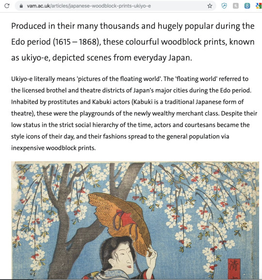
Above: My screenshot of Japanese woodblock prints (ukiyo-e), (2019).
With short-lived art representing the day's events, the displays of ‘Manners and Modernity: Ukiyo-e and etiquette on the Seibu Railway’ translate Japanese wood prints to the modern era. They teach us, while remembering the ‘good old days’ of manners and customs, and open us up to be more aware of our surroundings with a funny twist. Maybe this funny attachment to daily nuisances gives the viewer enough self-awareness through humour.
My thoughts: It seems to be a common theme in public transport around the world to use humour and subversion to instil manners. What else uses this kind of mix for similar incitements? The boundaries between art to advertisement can be blurry. At what point does advertisement become art? When does art become advertisement? (This is nothing new, see the Pop Art movement beginning in the 60s) Where else might art be used as a starting point for advertisement? Besides this example, what other places use humour to instil manners nowadays?
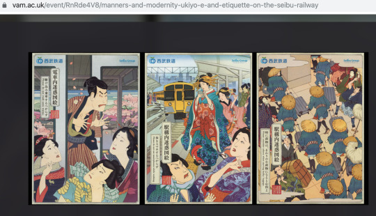
Above: My screenshot of Manners and Modernity: Ukiyo-e and etiquette on the Seibu Railway, (2019).
(Not completely related but similar funny commercial for manners in public transport(1).)
Preservation and artistically approach
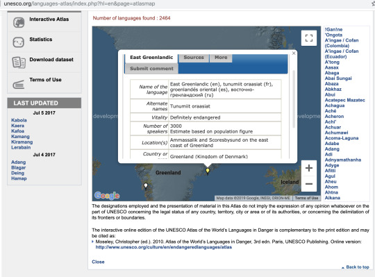
Above: My screenshot of UNESCO Atlas of the World's Languages in Danger, (2019).
Landscape in artist’s books: Although unfortunately, no audio recordings of the language were preserved in this project by Nancy Campbell, this exhibition is still important and cleverly composed(2). The melting Arctic changes its course. What is left of it will never be the same again. The combination of an endangered language with polysynthetic, ambiguous words places the urgency of climate change in a new context. The combination and contrast between color, white parts, and font creates a multi-layered aesthetic. It is combined with other artist’s books such as ‘Die wiese; The meadow: eschenau 1986-2013′) by dutch artist Herman de Vries, who documented his work of bringing a small patch of farmland back to its original state(3).
My thoughts: How can artists take part in preservation and renovation? How should artists treat such a topic? Should they behave like archaeologists or can they be in free correspondence and take an artistic approach? Is there public interest and funding? This display was quite small, hence my question whether this kind of exhibition would draw more people in if it would be on extensive display with more artist’s books? Are people even interested in artist’s books showcasing sujets like this?
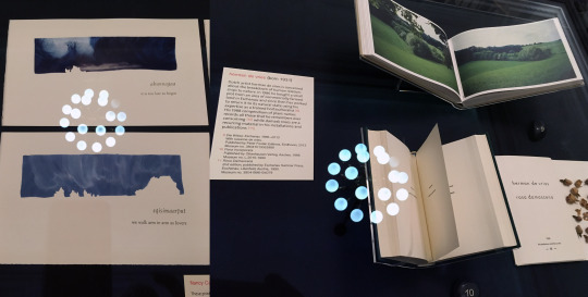
Above: My collage of Landscape and Language in Artists' Books. Left: Campbell, N. (2011) How to Say ‘I Love You’ in Greenlandic: An Arctic Alphabet. Right side: de Vries, H., de Vries, S. (2013) Die wiese; The meadow: eschenau 1986-2013, (2019).
Re-Print
Making an Impression: The Art of Relief Printmaking. Well-known methods of expression, such as printmaking, can be set on display to present an overview, a variety from current art directions, and highlight special variations over the decades. Relief printmaking has been around for a long time and the exhibition shows that this method is constantly being redrafted and readapted to current art movements with an appropriate voice and scaffolding.
My thoughts: The displayed works showcased a broad variety of fine art to newspaper illustrations, once again underlining the question of art versus commerce. Is it necessary to draw a line, as exhibitions like this and the mentioned Japanese works with different backgrounds back to back?
Entering this exhibition I was asked by the staff whether I knew about this exhibition or was just passing by. This exhibition spanned two rooms and had a broad display including Munch, Picasso, Beatrix Potter, and William Blake who have a massive show at Tate Britain right now(4). However, this exhibition was barely visited. I believe displaying artwork in context to a classification, influence, certain methods instead of a focus on one’s Oeuvre, can present new and interesting impressions to visitors.

My pictures of the exhibition ‘Making an Impression: The Art of Relief Printmaking’, (2019).
Create connections
Beatrix Potter's art: 'drawn with design': The display is rather short-winded with mostly sketches and some letters she made for her childhood friends. These are showing a very sincere and interested approach for her surroundings without revealing too much about the subjects of the letters (meaning: no additional information on display).
Introducing this aspect of her encourages visitors to rediscover something handmade or even to send a letter to someone dear.
The fact that they have mainly shown sketches gives the whole exhibition the charm of imperfection. The sketches show that she really learned to draw animal characters through observation. While sketching from the sketches myself, I overheard visitors saying, "Oh, I should do that!". An exhibition can remind people of certain cultural values and perhaps even bring them back to pick habits up again or at least to try to.
My thoughts: I wonder whether there were only so few letters left? Could exhibitions like these get people back to crafting and handwriting? By displaying sketches, are exhibitors serving the broad audience or is this rather for a niche audience? How can letters be presented so that everyone can read and enjoy them when considering the difficulty of some handwriting, language differences, and font size.
Can exhibitions support educational organisations like The National Literacy Trust tackling literacy issues in children and adults? A quote on their website struck me:
‘Overall, fewer children and young people in 2017/18 said that they enjoy writing compared with the year before, decreasing from 50.7% to 49.2%.’(5).

My collage of the exhibition Beatrix Potter's art: 'drawn with design'. Left: exhibition panels, right: detail of her letters, (2019).
Thoughts in general about my V&A visit:
Should an exhibition be measured by its amount of content? If I would be interested in themes like the ones above, how can I find such exhibitions, when advertisement is mostly for larger exhibitions.
How educational should exhibitions be?
The ones I visited were displays of material only, none of them were interactive or provided additional digital information. Does an exhibition nowadays have to be modern to lure more visitors in? Is there something like exhibitions tailored for scholars and exhibitions for a bigger audience? Should those perhaps exist?
Disconnected reconnection
This brings me to my last exhibition, Into the Night: Cabarets and Clubs in Modern Art, which showed a combination of forms of expression, art in paintings, print and objects, poetry and music as well as interior and exterior design. The cabarets, cafés and clubs all tried to actively imbue people with new ideas and provide nourishment for artists of all kinds to create an interdisciplinary exchange and networking platform. At the same time they were meeting points for a certain scene, which had certain manners, a certain language, and expression which made them appealing for a niche clientele.
The displays were of broad variety, showcasing the scene in different cultures from all over the globe. Colour schemes, architecture and art on display gave each area a distinctive vibe. While Mexico City and Ibadan (Nigeria) were very colourful, northern Europe Cities were more settled in colours and in a closed framework (especially Strasbourg). A surprise somehow was Tehran to me, I knew that it had a western-related history in 1966 - 69, but seeing actual parts of it made me sad. A similarly interesting situation for me personally was when other students pointed out paintings in the part about Berlin and I was able to explain to them the Expressionism and Dadaism scenes in Germany and about ‘degenerate art’ and its prohibition and destruction in the rise of the Nazi era.
But there was a sterile disconnection between the lively scenery they depicted and the visitors. There was some music to be heard, some videos played and some rooms somehow recreated, but everything seemed far too dull, items separated into areas for advertisement, areas for art and areas for the interior. Thus, the exhibition in its form remains closed to the viewer in that it can not show everything, because not everything could be restored.
My thoughts: I can imagine it to be a big task to display so many different parts equally. I recognised many female artists and ethical minorities on display. Did they prioritise those? Could this exhibition work in other venues even better, perhaps with the possibility to showcase more audio and audio-visual samples? Would a documentary series work even better? VR could have been added, too, did they consider it? I felt disconnected from this exhibition even though I found it very interesting and I am interested in learning more about different aspects of it such as Tehran’s past, Ibadan, Hannah Höch(6), Harlem’s history and music from its cafés and clubs.
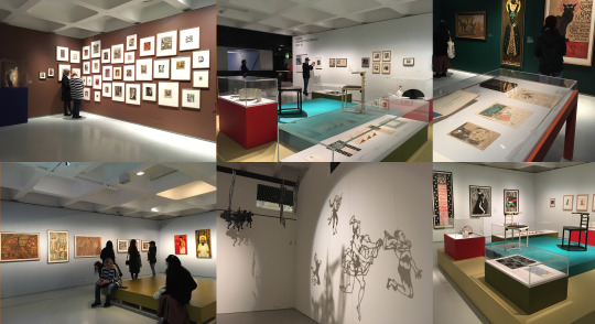
My collage of the exhibition Into the Night: Cabarets and Clubs in Modern Art, (2019).
Conclusion:
We can only see what an exhibition shows to us and that is never the full representation of the original thought or the past that is depicted in an attempt to conserve it. The limitations are many, in terms of venue size, available exhibits, or the chosen media. Much could have been shown differently by using different technological solutions but the question remains - what was intended to be shown, and did it achieve this result? Nevertheless, as long as people collect, exhibit, and attempt to show, items and ideas can be preserved for others to a degree and more so they can inspire visitors to their own ideas.
Notes:
Books and articles
Megginson, T., (2011) Don’t behave like an animal on public transit, Asocio. Available at: https://osocio.org/message/dont-behave-like-an-animal-on-public-transit/ (Accessed on: 17th November 2019).
cf. Campbell, N. (2011) How to Say ‘I Love You’ in Greenlandic: An Arctic Alphabet, Oxford: Bird Editions. (On her website further information as well as a video about the book can be found. Available at: http://nancycampbell.co.uk/work/artists-books/how-to-say-i-love-you-in-greenlandic-an-arctic-alphabet/ (Accessed on: 17th November 2019).
cf. de Vries, H., de Vries, S. (2013) Die wiese; The meadow: eschenau 1986-2013, Eindhoven: Uitgeverij Lecturis B.V..
cf. William Blake (2019-2020) [Exhibition]. Tate Britain. 11 September 2019 – 2 February 2020.
National Literacy Trust (2019) Children and young people’s writing in 2017/18. Available at: https://literacytrust.org.uk/research-services/research-reports/children-and-young-peoples-writing-201718/ (Accessed on: 17th November 2019).
I only knew her from my studies about picture books and artist’s books. cf. Höch, H. (2008) Bilderbuch, Berlin: The Green Box.
Picture(s)
Victoria & Albert Museum (2019), [Screenshot]. Available at: https://www.vam.ac.uk/articles/japanese-woodblock-prints-ukiyo-e (Accessed on: 17th November 2019).
Victoria & Albert Museum (2019), [Screenshot]. Available at: https://www.vam.ac.uk/event/RnRde4V8/manners-and-modernity-ukiyo-e-and-etiquette-on-the-seibu-railway (Accessed on: 17th November 2019).
UNESCO Atlas of the World's Languages in Danger (2019), [Screenshot]. Available at: http://www.unesco.org/languages-atlas/index.php?hl=en&page=atlasmap (Accessed on: 17th November 2019).
Landscape and Language in Artists' Books (2019-2021) [Exhibition]. Victoria & Albert Museum. Tuesday, 5 November 2019 – Sunday, 4 April 2021.
Making an Impression: The Art of Relief Printmaking (2019-2020) [Exhibition]. Victoria & Albert Museum. Monday, 9 September 2019 – Sunday, 13 September 2020.
Beatrix Potter's art: 'drawn with design'. (2019) [Exhibition]. Victoria & Albert Museum. Monday, 18 February – Sunday, 17 November 2019.
Into the Night: Cabarets and Clubs in Modern Art (2019-2020) [Exhibition]. Barbican Centre. Friday, 4 October 2019—Sunday, 19 Januar 2020.
0 notes
Text
5th November 2019 Student-led seminar 3
Text: Filipović, Katarina (2018) ‘Gender Representation in Children’s Books: Case of an Early Childhood Setting’, Journal of Research in Childhood Education. Routledge, 32(3), pp. 310–325. doi: 10.1080/02568543.2018.1464086.
Table of content:
Introduction Main part: A coherent picture, or is it? From 15 between 1967 - 2013 to today's releases Conclusion: How far have we come? Notes: Books and articles Picture(s)
About the author: International Master in Early Childhood Education and Care (IMEC). Dublin Institute of Technology, Oslo and Akershus University College of Applied Sciences, University of Malta and University of Gothenburg. Erasmus Mundus joint degree.
BSc. in Pedagogy – Psychology. University of Tuzla, Bosnia and Herzegovina.
Katarina Filipović had previously worked in a range of educational roles such as primary school Pedagogue and Psychologist, Early Childhood Educator and Associate Faculty Lecturer.
Research interests: Children’s and educators’ well-being, work related stress and burnout, impact of educational policies on practice, professionalism in ECEC, and gender in early years.
Teaching Areas: Professional Practice In The Early Years, Child Protection And Safeguarding, Supervised Practice Placement(1)
Introduction:
The end of 2019 is just around the corner and humanity can look back at many great achievements by men and women alike, such as landing on the moon, curing or even eradicating many diseases or fast communication technologies, to name just a few. With all those accomplishments, one might think we as a species live in an equal society that strives to build a better world from generation to generation. And I do believe this is the case! Some aspects, however, are still ongoing issues, such as gender equality or ethical equality.
To think equal, to act equal, live equal also means to teach equal, to live as equal role-models for our next generation. It starts with small things like labelling clothes, hair-styles, or colours to be dominantly female or male.
To teach equality means to offer learning material that depicts this virtue. In this discussion, I am looking at educators who are aware of gender equality and their use of picture books. Going through recently published picture books one might think that things have changed, for example with the bestselling book ‘Good Night Stories for Rebel Girls’ by Elena Favilli and Francesca Cavallo from 2016. This book compiles short-story biographies of 100 real-life women that could be role-models, including Amelia Marie Curie, the Brontë sisters, and Jane Austen. Favilli and Cavallo self-published the book with money raised in a Kickstarter campaign. Their original target was set for $40,000, they ended up receiving $675,614 by 13,454 backers between April 27th and May 26th, 2016 (28 days), which shows an amazing response and acceptance by society(2).
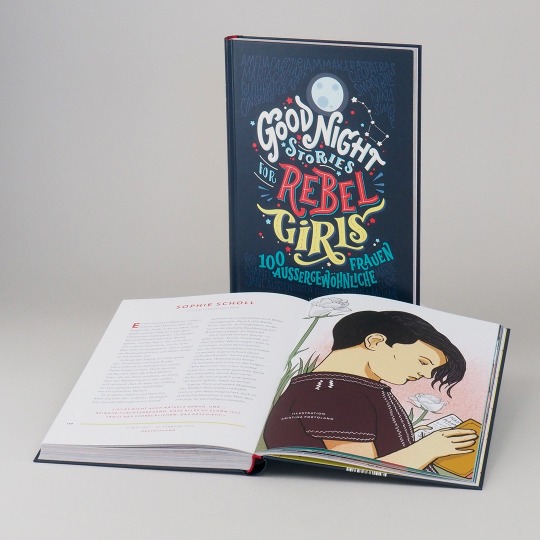
Above: My screenshot of Good Night Stories for Rebel Girls, (2019)
A coherent picture, or is it?
The given research by Filipović uses picture books chosen by skilled educators for younger children between the ages of waddler to early school, the books in that study are a mixture from 1967 to 2013(3).
In my view this study, however, only scratches the surface of the actual topic: the image of the woman in modern societies. Her research shows a glaring imbalance that fits the narrative perfectly but shies away from really forming a conclusion and making a strong statement. And that even though Filipović underlines her research with a broad variety of similar research outcomes highlighting an ongoing problem between gender representation in early childhood picture books.
Looking back into recent years, we find many different movements with this as their main topic, not just #metoo. Gender studies are more common than ever as Filipović’s references show, and pay-gap has long entered mainstream discussion(4).
Women still tend to enter nurturing professions more than risk-taking, managerial or scientific ones, even though they have equal or sometimes better qualifications. Germany just released a governmental study that showed young girls out-matching boys in mathematics at school, yet they perceive themselves as clearly inferior to their male classmates(5).
Looking at depictions of women vs. men in media and advertisement would open a whole other can of worms(6).
And it all fits together so coherently: we are coming from a patriarchal past(7). Just a few generations ago, men ruled everything and women were confined to the kitchen or tending to the children. While we are looking with suspicious eyes at other societies such as the conservative Muslims in Saudi-Arabia, where this is still very strongly the case, we believe to have developed far beyond this point(8).
From 15 between 1967 - 2013 to today's releases
Shifting our focus away from the 15 books in Filipović’s study one might think that - as stated in my introduction - the book publishing market would have adjusted by now. Especially since the Rebel-Girls book became a best-seller(9). Publishers might offer more on this topic, right? On the contrary, as The Observer and The Guardian in an in-depth analysis found out:
‘The most popular picture books published in 2018 collectively present a white and male-dominated world to children, feature very few BAME (black, Asian and minority ethnic) characters and have become more biased against girls in the past year, (...) Male characters continue to dominate the most popular picture books: a child is 1.6 times more likely to read one with a male rather than a female lead, and seven times more likely to read a story that has a male villain in it than a female baddie. Male characters outnumbered female characters in more than half the books, while females outnumber males less than a fifth of the time.’(9)
And even continuing in 2019, in research by Sarah Mokrzycki, Victoria University with 100 best-selling books, similar results are to be found. In her research, books for girls were also highly stereotypical:
‘In the female-led stories, protagonists only showed ambition for traditional feminine pursuits. There were three ballerinas, three princesses and one fashion designer - Claris, a mouse, who “dreamed about clothes” and “read about handbags in Vanity Fair”. (In this story, a misbehaving girl is also chastised for being “neither proper nor prim!”) In comparison, the male-led stories showed protagonists in roles ranging from farmers and chefs to zookeepers and scientists.’(10).
To be fair, her research was for the Australian book retailer Dymocks, a comparable research would need to be done for the UK market.
How far have we come? Conclusion
It all forms a very coherent picture that is not difficult to understand and to accept and which explains every single problem in gender inequality we have - when considering our past, the way we have developed over the last generations, and the problems that very obviously and provenly still linger. We are still fighting the same problems, not to the same extent as women in Saudi-Arabia have to, but they are the exact same problems, yet it appears that resistance and denial are still extremely present.
Maybe stemming from conservative thinkers who still want the ‘good old times’ back when things were easy and women didn’t meddle in their affairs, maybe people just want to live their lives without being bothered by topics like tolerance in nuances (‘Am I still allowed to tell this joke?’, or ‘This picture is funny but now someone tells me it’s sexist? 5 years ago it wasn’t, why now?’). Maybe, though, it’s a much more underlying issue, one that is ingrained into our very beings from the moment we start learning about it. From large factors like the role our mothers portrayed to us as kids, to the value of boys in the schoolyard who can be daring and risk-takers vs. girls who need to be protected and sheltered and rather should play with puppets that they need to take care of and role-playing games, down to the smaller things like an obvious miss-portrayal of genders in the children’s books we read to our kids.
Perhaps this is where the foundation is laid, where we will raise yet another generation that accepts slightly sexist images or objectifying women in advertisement. From there, it’s only a few steps to underpaying and discriminating women and worse. So yes, it does make a difference whether we choose a book about a boy and read it to a girl or if we rather choose to tell the girl a story about an adventurous girl. It does make a difference if the female part in a book is only there to care and the male character is away or depicted as brave and working and fun and successful. Those choices by our parents shaped our future and they will shape the future of our children(11).
It’s not difficult to see or understand this, which is why I wished this study would have put things into context more directly and was more critical. Because there is a lot of reason to be direct, and critical, and loud.
So what can we do as illustrators? Let’s identify and lock away the stereo-typical from our stories. Try to address this matter with our publishers, families, gift our children non-stereo-typical books and toys. Create role-models. But what kind of alternative presentation possibilities could be used for male and female figures? Could custom-made children’s books work as a good alternative? What are other alternatives?
During my research for our presentation on this topic, I stumbled over the campaign ‘Let Toys be Toys’. Their focus is to create a non stereo-typical environment for children in the toy and book industries in the UK. They not only try to convince publishers of books and the toy industry to shift their focus from gender related products to uni-sex products. They also offer help for parents to address their concerns and provide discussion material and lesson plans for teachers(12). I found this to be very encouraging.
Another part that I did not address here but found during my research for the presentation are tests like the Bechdel-Test which was mainly created for movies but can also help to identify books with female protagonists. It’s not only about male-female ratio alone, as The Guardian article quoted above already indicates. We could add more and more tests, such as the BAME test as well(13).
Notes:
Books and articles
Biography retrieved from TU Dublin (2019), Staff Articles. Available at: https://www.dit.ie/llss/people/socialsciences/staffarticles/name176641en.html (Accessed on: 04th November 2019).
Kickstarter (2019), Good night stories for rebel girls. Available at: https://www.kickstarter.com/projects/timbuktu/good-night-stories-for-rebel-girls-100-tales-to-dr (Accessed on: 04th November 2019).
Filipović, Katarina (2018), ‘Gender representation in children’s books: case of an early childhood setting’, Journal of Research in Childhood Education. Routledge, 32(3), pp. 310–325. doi: 10.1080/02568543.2018.1464086.
The gender pay gap among full-time employees was 8.9% in 2019 according to the Office for National Statistics in a recent release from 29 October 2019. Office for National Statistics (2019), Gender pay gap in the UK: 2019. Available at: https://www.ons.gov.uk/employmentandlabourmarket/peopleinwork/earningsandworkinghours/bulletins/genderpaygapintheuk/2019#the-gender-pay-gap (Accessed on: 04th November 2019).
Institut zur Qualitätsentwicklung im Bildungswesen (201), National Assessment Studies and IQB Trends in Student Achievement. Available at: https://www.iqb.hu-berlin.de/bt (Accessed on: 04th November 2019). Cf. Schmoll, H. (2019), ‘Leistungsniveau in Mathe und Naturwissensschaften gesunken’, FAZ Online, 18.10.2019. Available at: https://www.faz.net/aktuell/politik/inland/iqb-bildungstrend-leistungen-in-mathe-und-naturwissensschaften-gesunken-16439167.html (Accessed on: 04th November 2019).
Still to this year advertisements like recently from VW and Philadelphia got banned, cf. BBC (2019) ‘Philadelphia and VW ads banned for gender stereotyping’. Available at: https://www.bbc.co.uk/news/business-49332640 (Accessed on: 04th November 2019).
Not only due to belief system but also family structures, social surroundings, education, and media.
Cf. Power, G., (2019) ‘Things that women in Saudi Arabia still can’t do’, The Week, 3rd of September. Available at: https://www.theweek.co.uk/60339/things-women-cant-do-in-saudi-arabia (Accessed on: 04th November 2019).
Cf. Best Sellers in Philosopher Biographies by Amazon.co.uk: Amazon (2019) ‘Best Sellers in Philosopher Biographies’. Available at: https://www.amazon.co.uk/gp/bestsellers/books/268059/ref=zg_b_bs_268059_1 (Accessed on: 04th November 2019).
Ferguson, D. (2019) ‘’Highly concerning': picture books bias worsens as female characters stay silent’, The Guardian. 13th June. Available at: https://www.theguardian.com/books/2019/jun/13/highly-concerning-picture-books-bias-worsens-as-female-characters-stay-silent (Accessed on: 04th November 2019).
Mokrzycki, S. (2019) ‘I looked at 100 best-selling picture books: female protagonists were largely invisible’, The Conversation, 03rd June. Available at: https://theconversation.com/amp/i-looked-at-100-best-selling-picture-books-female-protagonists-were-largely-invisible-115843 (Accessed on: 04th November 2019).
Cf. McCabe, J., Fairchild, E., Grauerholz, L., Pescosolido, B. A., & Tope, D. (2011). Gender in twentieth-century children’s books: Patterns of disparity in titles and central characters. Gender & Society, 25(2), 197–226. doi:10.1177/0891243211398358. Also cf. Blake, J., & Maiese, N. (2008). No fairytale. The benefits of the bedtime story. The Psychologist, 21(5), 386–388.
Let Toys be Toys (2019). Available at: http://lettoysbetoys.org.uk/ (Accessed on: 04th November 2019).
Cf. Darby, S. (2016) ‘11 children's books that pass the bechdel’, Romper, 17th May. Available at: https://www.romper.com/p/11-childrens-books-that-pass-the-bechdel-test-10544 (Accessed on: 04th November 2019).
Picture(s)
Hanser Literaturverlage (2019), [Screenshot]. Available at: https://www.hanser-literaturverlage.de/buch/good-night-stories-for-rebel-girls/978-3-446-25690-3/ (Accessed on: 04th November 2019).
0 notes
Text
5th November 2019 Student-led seminar 3
Text: Twemlow, A. (2006) No muscles, no tattoos. Available at: http://www.eyemagazine.com/feature/article/no-muscles-no-tattoos (Accessed on: 1st November 2019)
Table of content: Introduction Main part: Reality proximity against intimidation A closer view on BUTT Magazine Heritage? Conclusion Notes: Books and articles Pictures
About the author: Dr. Alice Twemlow earned a Ph.D. from the History of Design program run as a joint venture by the Royal College of Art and the Victoria & Albert Museum, London. Her research addresses design’s complex interrelations with time and the environment and manifests in writing, exhibitions, conferences, and education. She is Research Professor at the Royal Academy of Art, The Hague (KABK) where she leads the “Design and the Deep Future” readership, and an Associate Professor at Leiden University, in the Academy for Creative and Performing Arts, where she supervises design-related PhDArts candidates(1).
About the Magazines:
BUTT Magazine was founded in 2001 by Gert Jonkers and Job van Bennenkom in Amsterdam. It was a quarterly magazine for gay men, written in English and printed until 2011.
In 2005, The Guardian named it as one of its top twenty magazines(2).
Fantastic Man, founded in 2005 by Gert Jonkers and Job van Bennenkom, is a men's fashion magazine printed semi-annually. It focusses on men's fashion in their 30s with interviews of male celebrities and intellectuals with a big variety of backgrounds.
In 2008, the magazine was praised for its art direction, winning it the British D&AD award for Best Magazine & Newspaper Design(3).
Aaron Britt, in a review of men's fashion magazines for the San Francisco Chronicle, lauded:
'It comes out only twice a year, allowing the sticker shock to wear off between purchases, but you'll never throw away an issue. Fashion-forward, clever, deeply engaged with the fashion world without the half-baked political exposes Esquire insists on running, (...) is better designed, better photographed and rafts more stylish than the competition. If you buy only one men's fashion magazine, it should be this one.’(4)
Introduction
We are surrounded by advertisements of a broad variety, including fashion and beauty, telling us of contemporary aesthetics of what to wear and how to look, what kind of hair-cuts and shoes are ‘in’ this Autumn and what to look for in Spring 2020, what kind of beauty routine and diet is good for you to look like your favourite celebrity and where to buy your favourite celebrities dress look-a-likes.
In the fashion industry, models are presented as perfectly shaped: superficial, anorexic young girls and very muscular men with not a single hair on their body. In Magazines, they are presented in eclectic pictures and photo collages, with a focused layout and printed on glossy paper.
Flipping through UK’s most famous magazines like Vogue, Glamour or men focused magazines like GQ, or Ape-to-Gentleman, their aesthetics are strongly stylised and typified. I wonder how you don’t feel a tiny bit intimidated - even as an adult. How must this appear to younger people or teens trying to figure out their changing roles from child to adult and searching for role-models? How must it be for teens that don’t feel like fitting into the black and white man-woman framework?
There must be alternative aesthetics, alternatives for alternative people. How do magazines which focus on such audiences present themselves? Clean-glossy, like their mainstream counterparts? In her profile of Jop van Bennekom and some of his magazines, Twemlow presents some very different examples.
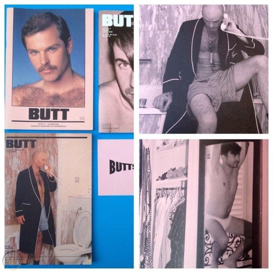
Above: My screenshot of BUTT Magazines 8-11, WorthPoint, (2019)
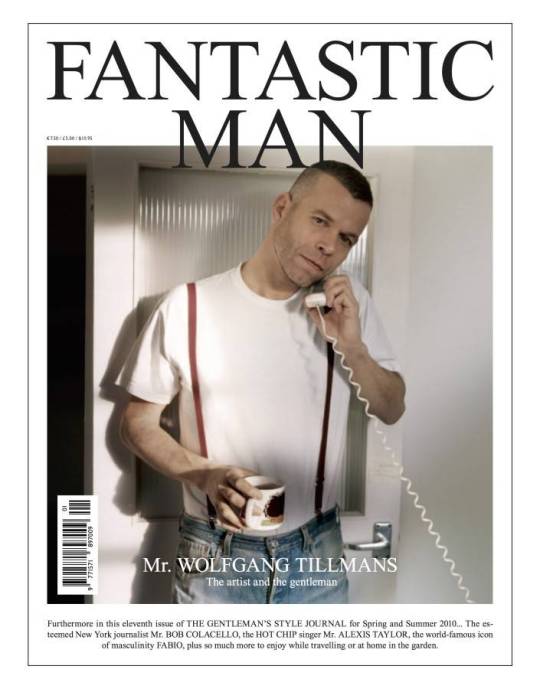
Above: My screenshot of Fantastic Man Spring/Summer 2010, #11 (2019)
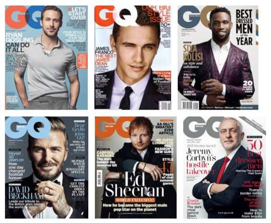
Above: My screenshot of GQ Magazine Collage, Freeport Press, (2019)
Reality proximity against intimidation
Nowadays, Jop van Bennekom and Gert Jonkers are well known for their magazines for gay people. When being asked by James Anderson from i-D Vice online about his motivations to create BUTT Magazine, Gert Jonkers responded that he wanted
‘something for the contemporary homo. A journal for and by gay men. A meeting ground, figuratively speaking. We wanted the magazine to feel like meeting an amazing man on the train or in a bar and have a great interesting conversation with him.‘(5)
Their focus was as it seems to create something relatable, something close instead of intimidatingly perfect like fashion Magazines in the mainstream are known for. Jonkers also stresses this part: people shouldn’t be living objects for fashion or beauty ads. He reflects on the rhetorical question whether the most stylish charm isn’t actually natural charm. He underlines his previous response about the motivation as BUTT should mirror real, ‘normal un-self-aware’ men.
This strategy seems to work, as the eye-magazine shows in an interview with Andrew Sloath:
‘It has given voice and visual presence to those of us who are trying to figure out our own worlds.’(6)
Bennekom sums this up perfectly:
‘I wish Butt had been around when I was 22 and insecure (…). Other gay magazines have cut-and-paste, retouched bodies unlike any you’ve ever seen in real life and certainly not like mine.’(7)
Young Bennekom, as a graphic design student, found his inspiration in the work of fashion design students at his university in the Netherlands around the 90s. With newly founded anti-fashion magazine Purple in 1992 and a shifting fashion photography rising, he started to interview his friends and published this in the style of a Q&A.
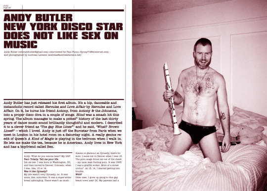
Above: My screenshot of BUTT Magazine, Summer 2008, #23, (2019)
A closer view on BUTT Magazine
For the BUTT Magazine, this kind of interdisciplinary mix of fashion and art, the eccentric way to display people around him in their natural clothing and living style, must have been a revelation to his like-minded audience. Real people with normal body types, with hair and used looking clothing, with wrinkles and real tousled hair, set in real surroundings with imperfect but familiar settings. They could be a neighbour, a person on the street, at the grocery shop, in the pub. Their stories and themes are as casual and boring as anyone’s, although it starred gay artists and celebrities as well. In this mix of content, one might find confidence about one’s outing, clothes, thoughts, about their body shape, their hair zones, and their sexuality. It seems like this kind of exhibition of normality can liberate people. And it did. People started to imitate the Q&A style interviews and photos and sent in their own content, together with stories, letters, and so on.
Maybe it was also due to its clean layout that readers could imagine to be published and to copy this style. A design that feels like ‘nothing’ can be very complex, dense and tightly controlled in its design process, as Twemlow summarises(8).
This passion and the approachable magazine team created a more significant collaboration and value than the cheapish Zine styled papers would suggest:
‘They’re something you don’t buy and read and throw away,” says Bronson. “You end up keeping them in plastic envelopes, even though they’re kind of cheap.’(9)
Following the trend with an online presence, BUTT Magazine became an even more interactive meeting platform for its readers. Looking at the page, it, however, looks like it has not been very actively moderated in recent times.
Heritage?
While researching BUTT Magazine and Fantastic Man I was reminded of other magazines that are known to me, like the ZEIT Magazin MANN. Their visual language and layout are similar.
Another example is a rather new niche magazine from the Netherlands, called MacGuffin Magazine, related to Hitchcock’s definition in film. While I could not find a proof in time whether those examples indeed found inspiration from van Bennekom and Jonkers, the visual connection is quite clear. To be decisive on this assumption this would need additional research.
ZEIT Magazin MANN was named magazine of the week by MagCulture:
‘MANN is a standalone, bi-annual that costs €8.50 and aims to fill a gap in the German market which notably lacks obvious alternatives to the big titles like GQ and Esquire.
We’ve selected it as our magazine of the week because, quite simply, this is something that would never be produced by a newspaper in the UK.’(10)
During my research I saw MacGuffin Magazine was also named magazine of the week by MagCulture:
‘The magazine’s strangely dreamy yet academic rigor is matched with soft yet crisp design (...)’(11)
My point here is that niche and eccentric looks in magazines don’t seem like a high-selling product. I believe there is an interested audience on a broad variety of topics. While ZEIT Magazin MANN seemingly found a well-balanced position due to missing supply, it could be difficult for magazines of similar niche focus. ZEIT Magazin MANN is part of a bigger company, DIE ZEIT, hence they can rather easily advertise new magazines. What about new magazines by younger people like van Bennekom and Jonkers without big starting capital? Could new niche magazines still survive in our fast-paced culture, that mainly lives online?
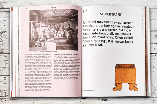
Above: My screenshot of MacGuffin Magazine Issue N° 5 14th December 2017, (2019)

Above: My screenshot of ZEIT Magazin MANN 1/2018, (2019)
Conclusion:
The printed version of BUTT Magazine ended in 2011, after 10 years. A new generation and with it a modernism shift in aesthetic and culture came with a postmodern approach. A rather hipster or emotionally one with a different approach to modern gay life. Also, the style of communication and connectivity switched from MySpace, Facebook, and websites to more fast-paced means like Twitter, Snapchat, and Tinder. At the same time, porn saw changes due to Social Media.
The question here would be if a contemporary re-make still could work or if Social Media got it all covered, no need for a printed version that could be kept for years?
As Nicholas Mirzoeff portrays it:
‘(...) ‘the postmodern is the crisis caused by modernism and modern culture confronting the failure of its own strategy of visualising. In other words, it is the visual crisis of culture that creates postmodernity, not its textuality. While print culture is certainly not going to disappear, the fascination with the visual and its effects that was a key feature of modernism has engendered a postmodern culture that is at its most postmodern when it is visual.’(12).
Notes:
Books and articles
Twemlow, A. (no date) About. Available at: http://alicetwemlow.com/about/ (Accessed on: 1st November 2019).
Armstrong, S., Dugdale, J., Gibson, J., Gibson, O., Hepworth, G., McLean, G., Tod, A., Viner, K., Wells, M. (2005) 'Covered in glory’, The Guardian, 12th December. Available at: https://www.theguardian.com/media/2005/dec/12/mondaymediasection.pressandpublishing?gusrc=rss&feed=global (Accessed on: 1st November 2019).
D&AD (2008) Available at: https://www.dandad.org/awards/professional/2008/magazine-newspaper-design/16666/fantastic-man (Accessed on: 1st November 2019).
Britt, A. (2009) ‘A quick guide to men's fashion media’, SFGATE, 15th February. Available at: https://www.sfgate.com/living/article/A-quick-guide-to-men-s-fashion-media-3171839.php?forceWeb=1 (Accessed on: 1st November 2019).
Anderson, J. (2014) ‘Forever butt: discussing the revolutionary gay magazine with founder gert jonkers’, i-D Vice, 26th November. Available at: https://i-d.vice.com/en_uk/article/kz8bam/talking-forever-butt-magazine-with-founder-gert-jonkers (Accessed on: 1st November 2019).
Twemlow, A. (2006) No muscles, no tattoos. Available at: http://www.eyemagazine.com/feature/article/no-muscles-no-tattoos (Accessed on: 1st November 2019).
ibid.
ibid.
Haskell, D. (2008) ‘Very Graphic Design’, New York Magazine. 27th December. Available at: http://nymag.com/arts/art/features/53148/ (Accessed on: 1st November 2019).
Morley, M. (2016) ‘Magazine of the week: ZEIT Magazin MANN, #1’, MagCulture. 5th October. https://magculture.com/zeitmagazin-mann-1/ (Accessed on: 1st November 2019).
Morley, M. (2015) ‘Magazine of the week: MacGuffin #1’, MagCulture. 17th June. https://magculture.com/zeitmagazin-mann-1/ (Accessed on: 1st November 2019).
Mirzoeff, Nicholas (1998, p. 21) The visual culture reader, London: Routledge.
Pictures
WorthPoint, (2019), [Screenshot]. Available at: https://www.worthpoint.com/worthopedia/butt-magazine-lot-issues-11-michael-1725891166 (Accessed on: 31st October 2019).
Magpile, (2019), [Screenshot]. Available at: https://magpile.com/fantastic-man/spring-10/(Accessed on: 28 October 2019).
Freeport Press, (2018), [Screenshot]. Available at: http://freeportpress.com/gq-stares-down-a-multi-channel-revenue-stream (Accessed on: 31st October 2019).
Larson, A., (2008), [Screenshot]. Available at: http://www.andreaslarsson.net/portraits.html (Accessed on: 31st October 2019).
MacGuffin Magazine, (2017), [Screenshot]. Available at: https://www.macguffinmagazine.com/issues/macguffin-the-cabinet (Accessed on: 28 October 2019).
Zeitungen und Zeitschriften online, (2018), [Screenshot]. Available at: https://www.zzol.de/objekt/18099/20180001 (Accessed on: 28 October 2019).
0 notes
Text
29th October 2019 Student-led seminar 2
Text: Siegel, D. (2009) ‘Designing Our Own Graves’, in: Armstrong, H. (ed.) Graphic Design Theory : Readings From the Field, Princeton Architectural Press, New York, pp. 115-118. First published: Siegel, D. (2006) ‘Designing Our Own Graves’, Design Observer, 27 June. Available at: https://designobserver.com/article.php?id=4307 (Accessed on: 27 October 2019)
Table of content:
Introduction - Have a butcher’s Main part: The butcher, the baker, the candlestick-maker The greatest thing since sliced bread - The art of self-promotion Conclusion - Digging it Notes: Books and articles Pictures
About the author: Dmitri Siegel is a Creative Executive with more than ten years of experience leading and modernising brands, building teams, making change, and driving growth. Brand strategist, marketing executive, creative director, design leader, P&L owner, whatever. Currently inspiring the world to listen better with Sonos(1).
Introduction - Have a butcher’s
Siegels essay was first published in 2006, but looking at the questions on the DIY society it seems like he had foreseen how social media, digital availability and appearance would shape our life and work these days: creating own content.
Those early signs were already visible in 2003. Back then, my arts and design tutor told us in one of our design-related courses about recessions and smaller businesses. ‘If an economy is in recession’, he said, ‘one of the first things to get cut are advertising through graphic designers.’ His cautionary tale was about a butchers who would rather create his own advertisement instead of investing in a graphic design studio. It might not look elaborate or clean but it still works. Sales would not go down drastically and he would advertise his offers with self-written promotions. The numbers would show in his favour and reassure him to go on like this, he argued.
My tutor was not totally right but also not totally wrong with his bleak prediction as the progression from Flickr and MySpace (which Siegel provided as examples) advanced to easy manageable website creation tools from companies such as Wix.com, Squarespace, GoDaddy and similar - and they are growing constantly.
The butcher, the baker and the candlestick-maker
Never was creating a website easier. And it is free on top - if you choose the smallest offer and depending on the selected provider. You do not get printed flyers and a business card, but you can even create your own logo.
For a small business it seems to be more lucrative and less complicated to build their own website. It makes sense as they are also in total control over the content and display. It seems like grammar-checking became less important as long as the layout is clean, the pictures are appealing, and the text is short enough to be read in three seconds(2).
The revenue those companies create are supporting the theory how accessible and appealing it became to build your own online appearance. Just to give one example, in 2017, Squarespace was estimated to have a value of $1.7 billion(3).
Nowadays, the challenge doesn’t seem to be a webpage anymore but rather a well thought out social media presence and a good looking portfolio. Same goes for the creatives like designers, photographers, and illustrators.
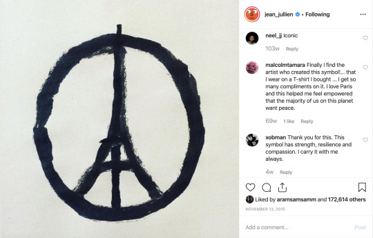
Above: My screenshot of Jullien, J., Peace for Paris, (2015)

Above: My screenshot of Jullien, J., Peace for Paris, shown by The Telegraph, (2015)
The greatest thing since sliced bread - The art of self-promotion
You are a good designer, tattoo-artist, illustrator, restaurant- or flower-shop owner if you at least have an online appearance, if you can be reached on Twitter and/or Facebook, and if you have good reviews and show your work on display over platforms like Instagram. Every self-promotion guide will tell you that.
Those guides tell about creating an own brand, a distinctive logo, a signature and especially for illustrators it seems like people want you to create new content in your signature style.
In a best case scenario, your picture goes viral and you become famous overnight, like Jean Jullien’s Eiffel Tower/Peace Symbol in 2015 (as seen above) after the terror attacks. He posted his picture on his social media accounts on Twitter, Facebook and Instagram. The image had been shared over 60,000 times on Twitter, and millions of times more via other accounts of people who had copied and shared the image(4).
Another case in point in the realm of illustration I’d like to write about is Shencomix. His Facebook account goes back to the 21st February 2013. He is known for emotional comics everyone can relate to. Since then he got himself established as an illustrator with merchandise purchasable in his online-shop. He got famous as people are posting his comics on all available social media (Tumblr, /reddit, Twitter, …) since they are little, curious snippets right out of every-day life that many people can relate to easily. From simple comics to his own brand:

Above: My screenshot of shencomix, no title, (2016)
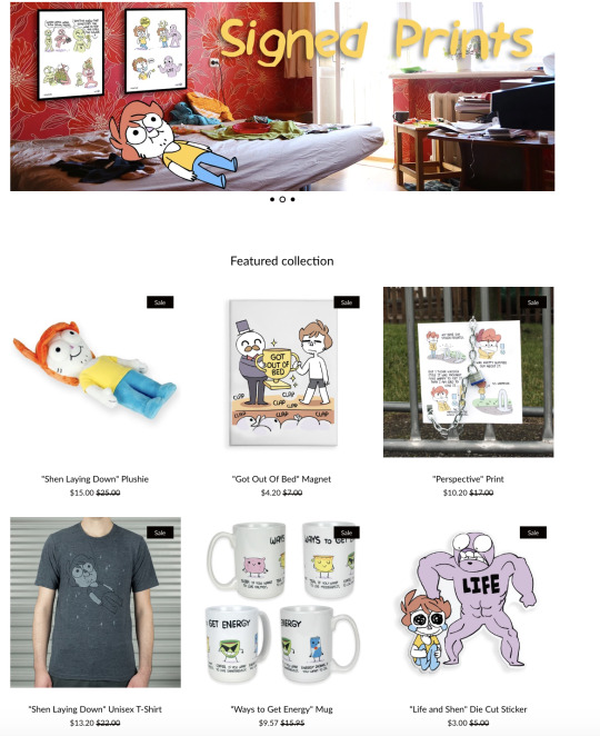
Above: My screenshot of shencomix’s online-shop, (2019)
There are numerous similar stories of equal success stories. But getting back at Siegel’s question ‘Does that coffin have your career's name on it?’, sure there are ways to undersell your work (such as Fiverr) but I would tend to disagree. It has rather shifted and with this it has also opened up new possibilities.

Above: My screenshot of aitchmade, fun at the mall, (2012)

Above: My screenshot of lisa_quine, mural, (2018)
Conclusion - Digging it
What I am getting at: social media has opened up new possibilities for illustrators but they require to be on top of them all the time and producing non-stop, ideally always in their own unique style. The AOI and agencies are constantly on social media, looking for new talents. Only if someone has a great and distinct portfolio, it is possible that they will be approached.
So are designers really digging their own graves or just following up with the changing advertising world? Companies like Wix and GoDaddy still work hard to create easily accessible websites but in fact not every small business has time or patience to create their website themselves. In the end they still need great content like photographs and text. Copy Writers and photographers might still find lots of job opportunities there while illustrators and graphic designers could still offer to create the websites. With the new emerging hype around hand-lettering and small illustrations such as Jean Jullien’s, with online short comics or long-running online graphic novels we are still in a position to find work if we make ourselves visible enough to be found.
Unrelated: I did enjoy Siegel’s Spotify lists I found on his web-page while writing.
Notes:
Books and articles
Siegel, D. (no date) Dmitri Siegel about. Available at: https://www.dmitrisiegel.com/ (Accessed on: 27 October 2019). And yes, the ‘whatever’ part is on his webpage.
The belief of a three second memory capacity of a goldfish has been busted as a myth. Cf. Simpson, A. (2009) ‘Fish’s memories last for month, say scientists’, The Telegraph, 07 January. Available at: https://www.telegraph.co.uk/news/science/science-news/4158477/Fishs-memories-last-for-months-say-scientists.html (Accessed on: 27 October 2019).
Vynck, G. (2017) ‘Squarespace Raises Funding at $1.7 Billion Valuation'. Bloomberg. 14 December. Available at: https://www.bloomberg.com/news/articles/2017-12-14/squarespace-is-said-to-raise-funding-at-1-7-billion-valuation (Accessed on: 27 October 2019).
Nudd, T. (2015) ‘How a Designer’s ‘Peace for Paris’ Sketch, Made in Minutes, Became a Global Symbol’, Adweek, 16 November. Available at: https://www.adweek.com/brand-marketing/how-designers-peace-paris-sketch-made-minutes-became-global-symbol-168150/ (Accessed on: 27 October 2019).
Pictures
Jullien, J. (2015) 'Peace for Paris' [Instagram]. 13 November. Available at: https://www.instagram.com/p/-CvRmhhFJP/ (Accessed on: 28 October 2019).
Before long, this digital image made its way into the real world from a peace vigil in Kathmandu (top left), onto the streets of Paris (bottom left) and to vigils in Hong Kong (top right). Reuters/Getty/Instagram/Twitter/Facebook (2015) [Screenshot]. Available at: https://s.telegraph.co.uk/graphics/projects/paris-attacks-tributes/index.html (Accessed on: 28 October 2019).
shencomix, (2016) no title, [Instagram]. 30 November. Available at: https://www.instagram.com/p/BNcbN6nABUo/ (Accessed on: 28 October 2019).
shencomix, (2019), [Screenshot]. Available at: https://shenstuff.com/ (Accessed on: 28 October 2019).
Aitchmade’s fun at the mal, (2012), [Screenshot]. Available at: http://aitchmade.blogspot.com/2012/03/fun-at-mall.html (Accessed on: 28 October 2019).
lisa_quine, (2018) ‘no title’ [Instagram]. 19 June. Available at: https://www.instagram.com/p/BkMPg0FFSXB/ (Accessed on: 28 October 2019).
1 note
·
View note
Text
29th October 2019 Student-led seminar 2
Text: Littler, J. (2010) 'What's wrong with ethical consumption?', in Lewis, T., Potter, E. (eds) Ethical Consumption: A Critical Introduction, Oxon: Routledge, pp. 27-39.
Table of content:
Introduction: What is Ethical Consumption anyway? Main part: About greenwashing Questions that emerged for me: Way outs - maybe? So what can I do for a start? Social Media Boycott Conclusion Notes: Books and articles Pictures
About the author: Jo Littler is a speaker at the Center for Culture and Creative Industries and Research Director in the Department of Sociology, City University London. She received her doctorate in culture and communication at the University of Sussex. Among other Universities she also taught at Middlesex University with a focus on media and cultural studies.
Her interests are within interrelations between society, politics, culture, and her research fields are mainly on meritocracy, gender, consumer culture, heritage and also celebrity.
Some of her latest works (selection): Littler, Jo (2017) Against Meritocracy. Routledge. Littler, Jo (2009) Radical consumption : shopping for change in contemporary culture . Maidenhead: Open University Press/McGraw-Hill. Littler, Jo (2008) Gendering anti-consumerism: consumer whores and conservative consumption. Palgrave MacMillan.
What is Ethical Consumption anyway?
There is a multitude of layers to this topic that it seems rather impossible to draw a straight line between what is part of it and what is not. Are we talking about animal welfare, is it the whole environment with a focus on renewable energy, is it about people ethics with a focus on code of conduct and ethical trading schemes, or human rights, modern slavery, do we include political and environmental donations, or do we check for boycott-ism, and ethical accreditation as well, just to name a few?
It gets even more complex when we look at the middlemen like delivery-drivers, people in warehouses and on cargo ships or trains, the third world farmers and helpers where poverty and child labour exists, the waste from unused groceries, textiles, outdated technology products.
In our generation we are more connected with the world than ever and trade-supplies are global. Never before in human history was the supply of consumable items greater. This makes it more difficult than ever to be an ethical consumer and to consider all the different choices and their side-effects.
Is living up to be an ethical consumer really that difficult? Is it just a way to ease a guilty conscience for those with enough money to afford it? And would this mean that poor people are excluded and cannot take part in conscious consumption?
This essay is full of questions as on the one hand I strive to be as conscious as possible and on the other hand I’m very afraid of wrong choices as I will elaborate on later.
About greenwashing
It’s not only about the consumer but the industry as well. Discussions about global governance and ethics were already high in the late 20th century(1). Following the introduction of the then United Nations Secretary-General, Kofi Annan of Global Compact during the World Economic Forum, the UN itself became a moral authority for global values and governance(2).
But even though there is regulation through the UN and following campaigns, can I trust companies that advertise a green and ethical stance? Should I be charged more for the feeling of having done something for the environment? For example, sales campaigns that promise that the added 0.10 pounds of the bill go to WWF or similar organisations - is this really being done? How can we be sure and how can we trust a corporation to do this when all the time we hear news about big companies taking shortcuts, polluting, sometimes even breaking the law in order to make a profit?
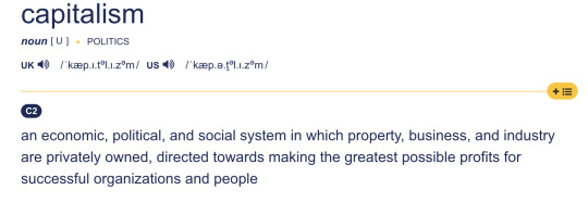
Above: My screenshot (Dictionary Cambridge, 2019) Definition of capitalism UK
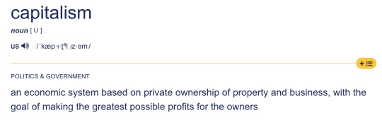
Above: My screenshot (Dictionary Cambridge, 2019) Definition of capitalism US
In our capitalistic world most companies are the victim of their own goals: the run for profit. If they are not regulated by the state or by themselves through responsible owners and shareholders, they will use all options at their disposal to sell their products. Hence the findings by Krauss are of little surprise and the statement of Littler becomes very valid:
‘(...) corporations can indeed be of progressive value, but, crucially, only at the whims of corporations themselves; and in addition corporations may hype their claims or use them to hide more exploitative aspects of their practice.’(3)
Questions that emerged for me:
Is it true that it takes great effort and time to find products and companies that are really responsible and that most of them in turn are more expensive? There does not seem to be the one “Right Way” to live responsibly but many. It’s a jungle of options and sometimes the first glance, the claims of a self-proclaimed green company, are just a sham as Littler points out with examples of Wal-Mart or Home Depot(4).
I want to add one of my personal examples, Chiquita bananas which I preferred over their competitor Dole as of 2011 when they were in a lawsuit for greenwashing and water pollution as well as other factors(5).
Chiquita, certified by the Rainforest Alliance made me believe they were growing bananas responsibly and environmentally friendly, as much as that is possible despite the distance they need to travel from. In 2014, Chiquita suddenly became known for water pollution as well which raised the question about the Rainforest Alliance’s knowledge and partnership in that. I felt guilty and betrayed by the company, and almost like an accomplice to a crime(6).
Way outs - maybe?
We cannot be Superman and save the whole world, that much is certain. What we can do is create options for ourselves. In the end it might not change much in the grand scheme of things but it might make people around us become more aware of their consumer behaviour as well.
So what can I do for a start? There are possibilities available for ethical shopping like the fair-trade seal, using recycled paper, organic cotton or to buy regional produce. There are also options for reusing unwanted items like handing them over to charities or left-over collections. You can buy second-hand and there are even opt-ins for a weekly clothing lending bank so you don’t need to buy clothes at all.
Social Media Online guides and apps can help us to make ethical choices. There are books, consumer advice hotlines, magazines, and also the new media forms offer a wide selection of advice online, like https://thegoodshoppingguide.com/(7) In their reports they distinguish between four sections giving you the option to pick parts that are more important to you. The downside is that there are only few tested companies.
Boycott Another way to make an impact might be to boycott and spread the word, similar to what happened to Uber in 2017 with #DeleteUber(8) Both Uber and Facebook are facing enormous pressure and have modified some of their practices and committed to improvements.
Conclusion
‘One of the things you can do to be more responsible is to take greater ownership of your stuff,’ says Mr. Lai(9).
Life changes all the time. Recently I read in the news about the invention of plastic bags - they were introduced as a more nature-friendly alternative to paper bags(10).
That means we need to be aware of our surroundings and sources, we need to stay informed and be flexible with choices as the industry is flexible with prices.
And at the end of the day, however, it is still about finding our own way of living a happy life since there is only this one to live. The amount of effort every single one of us puts into researching and making informed decisions is, after all, also each individuals own decision and perhaps the first one we have to think about, before even looking at more detailed decisions.
Notes:
Books and articles:
Wilkinson, R. (2005), The global governance reader, London: Routledge.
cf. Bruno, K. (2005), Bluewash, New Internationalist. Oxford: New Internationalist Co-operative, (375), pp. 26–27.
Littler, J. (2010), ‘What's wrong with ethical consumption?’, in Lewis, T., Potter, E. (eds) Ethical Consumption: A Critical Introduction, Oxon: Routledge, p. 32.
ibid. p. 31-32.
Halverson, M. (2015), Dole, chiquita sued by seattle nonprofit, SeattleMet, 6 July. Available at: https://www.seattlemet.com/articles/2015/7/6/dole-chiquita-sued-by-seattle-nonprofit (Accessed: 27 October 2019).
Shemkus, S. (2014), ‘Better bananas: chiquita settles lawsuit over green marketing, but the legal battle isn't over’, The Guardian, 19 December. Available at: https://www.theguardian.com/sustainable-business/2014/dec/19/chiquita-lawsuit-green-marketing-bananas-water-pollution (Accessed: 25 October 2019).
The Good Shopping Guide, (2002/2019), The good shopping guide, viewed on 27 October 2019. Available at: https://thegoodshoppingguide.com/ (Accessed: 24 October 2019).
Chen, B. (2018), ‘Yes, you can be an ethical tech consumer. Here’s how’, The New York Times, 12 December. Available at: https://www.nytimes.com/2018/12/12/technology/personaltech/ethical-tech-consumer.html (Accessed: 27 October 2019).
ibid.
Weston, Ph. (2019), ‘Plastic bags were created to save the planet, inventor’s son says’, The Independent, 17 October. Available at: https://www.independent.co.uk/environment/plastic-bags-pollution-paper-cotton-tote-bags-environment-a9159731.html (Accessed: 27 October 2019).
Pictures:
Capitalism UK (2019) [Screenshot]. Available at: https://dictionary.cambridge.org/de/worterbuch/englisch/capitalism (Accessed: 27 October 2019).
Capitalism US (2019) [Screenshot]. Available at: https://dictionary.cambridge.org/de/worterbuch/englisch/capitalism (Accessed: 27 October 2019).
0 notes
Text
Your thoughts about how to tackle this as an illustrator are great! In my opinion recycled paper has undergone a great overhaul and sometimes does not look like we’re used to (grey/brownish, too soft and smelly). I’ve come across another recycled material to use for some printing just recently, made from recycled T-shirt fabric!
Sometimes going digital gives even a better platform for illustrator+animator like yourself! :) Digital comics can provide options for animated parts, something that no printed comic can offer. One example might be http://thunderpaw.co/ (one of my recent findings).
:)
(Regina Mayr)
Seminar 2: What’s wrong with ethical consumption? By Jo Littler
In this article about ‘ethical consumption’ Jo Littler tries to decipher whether or not there is such a thing as this and looks at the positive and negative drawbacks. This term is coined to cover a vast array of products as more ethical and sustainable. Jo Littler, the author of this chapter, writes on a wide range of topics including culture, society, in/equality and power.
When reading the article, it evoked my own opinions on this subject I’ve previously had. The title could be considered a contradiction in terms, because perhaps what it’s really saying is ‘Is there such thing as ethical consumption?’. Littler opens with a general statement about what is meant by ethical consumption and gives a few examples that would come under this term. For example, the ethical implications of promoting organic produce, which raises concerns against not discouraging consumerism in the first place, simply suggesting a superior more ‘ethical’ (not to mention expensive) line of product. However there are areas that also come under the term ‘ethical consumption’ such as the campaign Baby Milk Action, which fights against misleading marketing of baby formula - a very ethical cause, especially for vulnerable, developing world mothers.
Littler argues against lots of forms of ethical consumption and she also touches on the subject of corporate social responsibility (CSR). The corporate companies have a lot to answer for when a question is raised about ethical consumption, because their whole idea spans from profit, therefore they are heavily invested in consumption as a concept. Without consumption, they have no profit. Littler believes instead of CSR it should be CSA (corporate social accountability), so the focus is on the corporations being held accountable by society on the issue of ethical consumption.
Littler concludes in the article that ethical consumption, although fraught with issues surrounding the subject, is a good step in the right direction and keeps the corporates in check. It is a positive way to increase our awareness of the ethics surrounding consumption and even though could be considered a way to promote wealth inequalities, it wakes us up to the possibility of a more ethical option. This has certainly raised my own awareness to the subject again, and I want to ensure I can find opportunities to choose more ethically in my practice.
On the MA in Children’s book illustration and Graphic Novels, I have thought about whether I could make a small difference in my choices - for example, the printing process. If I was lucky enough to be given the opportunity to publish a book, I would try and use recycled paper to promote re-use instead of heavy production of new paper. But I wonder how much of that decision would be mine to make and how much would be the publisher’s decision? Many people would also argue that recycled paper does not give the quality that might be desired for the artwork. It is also impossible to create gloss / coated paper that is fully recycled.
Or perhaps the best way to consume less, would be working digitally? Something I want to try anyway which is interactive stories with animated elements. I hope to research and discuss this further, throughout my Masters program.
I finish here with a few questions:
Do you believe in ethical consumption?
How would you consider ethical consumption in your practice?
1 note
·
View note
Link
Very insightful interview with Anton Kannemeyer about Bitterkomix anthology, a South-African comics magazine.
1 note
·
View note
Photo
Shaw, P., 2015, From the God-Awful to the Transcendent: Why Handlettering is Not Type, Print. New York: F & W Publications, Inc., 69(1), pp. 31–33. Available at: http://search.proquest.com/docview/1667651623/
0 notes
Text
22nd October 2019 Student-led seminar 1
Text: Garfield, S., 2011, Chapter 13: Can a font be German or Jewish?, in: Just my type, Profile Books: London, pp. 181 - 196.
Table of content:
Introduction: A Short Biography of the Author Main part: Letters all around us! Cultural Connotation or Type-ical Touch Font and Flair - The Meta-Messages // My personal conclusion Notes: Books and articles Pictures
About the author: Simon Frank Garfield (born 1960, London) is a British Journalist and author and studies cartography, illustrations of maps, and their political implications. The Guardian wrote 2013:
‘Over the last few years Simon Garfield has made it his job to remind us of what we risk losing in the rush towards a virtual world.’ (1)
Letters all around us!
We are constantly surrounded by fonts. In our day-to-day-life we might not actively question the choice of font compared to the information it conveys (or hides(2) but they are omnipresent. In a different chapter, Garfield brilliantly demonstrates this by telling the story of Cyrus Highsmith, who tries to live without Helvetica for a single day. He lives in New York however which largely embraces Helvetica(3).
Paul Watzlawick pointed out: ‘You cannot not communicate’(4). This quote work the same for fonts. Using either 'serif' (e.g., Times), ’sans-serif' (e.g., Helvetica), ’cursive' (e.g., ITC Zapf-Chancery), ’fantasy' (e.g., Western), ’monospace' (e.g., Courier), WRITE IN CAPS, italic or bold, … it changes a lot aw we are but humans and react (subconsciously) with emotions.
Every font includes some statement, similar to the clothing we choose, their color, leather or vegan, clean or shabby, you name it.
Thus, what kind of font is chosen is critical, for example for the appearance of a business. Many big corporations realise this during their growth and make strategic decisions to update their company font in order to align the appearance of their text or logo with changing times or with a different appeal they want to achieve. Simon Garfield names Ikea or Volkswagen.
But a more prominent example in the online space certainly is Google which went through a number of font changes. At first, Google used an old style serif typeface designed for the Berthold Type Foundry in 1982. After some modifications over time that made it gradually less playful, they ended up with a sans-serif font in 2015, with clearer lines and an overall more “corporate” look and feel(5).
Cultural Connotation or Type-ical Touch
Looking at fonts from a different perspective, it seems to be true that a font makes up much of the culture and appearance of a city, a nation. It would appear that a cityscape is mostly defined by architecture or language, but traveling from Tokyo through Beijing, Moscow, Bangkok or Dubai, cities are shaped by displays of fonts.

Above: Brooke, E., Seoul, South Korea, 2006.

Above: Stines, C., Court Center Store, 2009.
This effect has been much more striking in the past as Garfield points out, but from a certain point onwards, thanks to the digital age and growing globalisation this effect was lost to a degree. Nowadays, it can happen you are walking through Little Italy in San Francisco and it does not feel like San Francisco anymore. Or, thanks to the rebuilding of Berlin after the German reunion, some parts of the city are so generic they have lost their national identity.
Garfield complains about the impossibility nowadays to recognise a city by its fonts - I personally find his statement exaggerated. In countries with other alphabets, the effect is likely much less I tend to believe and there is one more factor I want to point out.
Yes, there is a blurring effect through globalisation which is mixing up everything with anything and fonts are therefore losing a certain national identity. But at the same time they are being rediscovered as a sign for quality, rather than regionality.
Restaurants offering a national cuisine for example choose certain fonts. Walking through any street with restaurants in a Western city provides plenty of evidence for fonts being used to showcase a certain cuisine and also what kind of quality to expect.
Until recent years it might have been the only option for a French restaurant owner to pick a font that was typically French, in reach, regionally closer. Today, font creation and font availability have become incredibly easy.
Question here: Does a French restaurant owner still pick the stereotypical serif font to add an additional layer of flair, or will they pick a more unique font to stick out from the crowd and attempt the appeal of exclusivity and high quality?
I do believe that much of the regional identification of fonts is still intact, although it is not bound to the region itself anymore it is still very much a discernible signal of cultural affiliation.
Font and Flair - The Meta-Messages // My personal conclusion
In conclusion, the meta-level, the meaning transferred by the appearance and not the content of text, is an important aspect - especially for designers of all kinds. Every font has a special flair, mostly decided through its look. Shapes can be hard or round, narrow, bold or light. At the same time a font is also shaped by its usage in the past, as Garfield explains in his chapter about Gutenbergs Fraktur during the Nazi regime, giving this particular font a bad reputation it likely never be relieved off again.
Text is not a simple conveyer of its content but always includes a secondary layer of information on this meta-level that can be used and should at the very least be considered.
Notes:
Books and articles
Hughes, K., 2013, To the Letter by Simon Garfield – review, The Guardian, viewed on 21 October 2019, <https://www.theguardian.com/books/2013/nov/15/letter-simon-garfield-review>
cf. Neville Brody and The Face magazine layout. He was renowned for his tribal and encrypted symbolic language.
Garfield, S., 2011, Just my type, Profile Books: London, p. 131.
Watzlawick, P., Beavin Bavelas, J., Jackson, D., 1967, Pragmatics of Human Communication; A Study of Interactional Patterns, Pathologies, and Paradoxes, New York: Norton.
Griffin, A., 2019, Google logo history: a trip through the internet giant’s changing look, The Independent, viewed on 21 October 2019, <https://www.independent.co.uk/life-style/gadgets-and-tech/news/google-logo-history-birthday-design-search-engine-a9121766.html>
Pictures:
Brooke, E., 2006, Seoul, South Korea, image, Pexels, viewed on 21 October 2019, <https://www.pexels.com/photo/assorted-color-signages-2128042/>
Stines, C., 2009, Court Center Store, image, Pexels, viewed on 21 October 2019, <https://www.pexels.com/photo/court-center-store-2919579/>
0 notes
Text
22nd October 2019 Student-led seminar 1
Text: Lefèvre, P. 2008, The Congo drawn in Belgium. The Representation of Congo, Rwanda and Burundi in French-language Belgian Comics, in McKinney, M. (ed.) History and Politics in French-Language Comics and Graphic Novels,��Jackson: University Press of Mississippi, pp.166-185.
Table of content:
Introduction: A Short Biography of the Author Main part: Tintin - An unexpected Ambassador Belgium's ninth form of art - Lefèvre's antagonistic examples A Better Representation in Contemporary Narration My personal conclusion Notes: Books and articles Picture(s)
About the author: Pascal Lefèvre, born April 15, 1963 in Belgium is a renowned Belgian comics historian and theorist. His doctorate in 2003 was about 'Willy Vandersteens Suske en Wiske in de krant' (1945-1971) which made him the first to receive a doctor's degree in comics in Flandern. Not only does he publish analytical historical essays and books but he also creates comics himself. He was a researcher with the Belgian Comics Center in Brussels and thus contributed to diverse exhibitions and documentaries.
Tintin - An unexpected Ambassador
Sindika Dokolo(1), a collector of contemporary African art, recently held the exhibition 'InCarNations - African Art as Philosophy' in Brussels, Belgium until the beginning of October this year, with classical and modern pieces chosen from his personal collection. In doing so he is raising a number of questions that do not fade in relevance, such as who gets to portray African art and culture? On this basis for discussion, Belgium is working on its colonial past, of which there is a lot in Belgium and its former colonies, as Pascal Lefèvre delineates in his tract.
Even in the so-called 9th form of art, a similar discourse, tailored to the medium and the narrative, is continuously present.
A more recent example than the one from Great Britain cited by Lefèvre is the controversy that was rekindled in Sweden in 2012. For a long time it dominated (social) media and even spread to media abroad, like The Guardian(2). Its emerged from Hergé's comic ‘Tintin in the Congo’ that was to be removed from a YA (young adult) section in a library due to its naïve and openly racially portrayal of the indigenous people of Congo as they appear cliché and thus suggest an anti-African stance(3).
Hamelberg describes In an interview with The Guardian the problem as
‘(...) there are several layers that are problematic, (...) there are the early books that are blatantly and openly racist, like ‘Tintin in the Congo’. (...) there were things that would have been considered racist today but that were quite normal in Hergé's time.’(4)
In my opinion, Hamelberg has certainly addressed an important point with this statement since the first comic publication of Tintin was in a different time and era. Nonetheless, it is important to process and learn from the past just like France tried semi-successfully with a law in 1949.
Should young readers be denied this critical argument in order to protect them, to present them with a perfect world and shielding them from reality? In my opinion, this discourse should rather be actively encouraged and supported by guardians.
Belgium's ninth form of art - Lefèvre's antagonistic examples
In my point of view, Belgium has produced a large number of fantastic comic artists and boasts openly with its long-established comic culture - yes, they call it culture. Some other more conservative nations, in my opinion, are still having a hard time accepting this, even in the 21st century. That's why I was very pleased to see The New York Times revive their bi-monthly best-seller list for graphic novels due to high demand by readers after taking a 2-year break(5).
The reason why a discourse seems to me more important than ever becomes clearer when Lefèvre compares Hergé's ‘Tintin in the Congo’ with, for example, ‘Blondin et Cirage’ created by Jijé. Here we have a boy and his adoptive brother as equal protagonists - but Cirage is depicted with clown lips that are strongly cliché-oriented and for me, at first glance, appear as a shockingly racist illustration.
There is a striking dissonance between the representation and the narrative, which portrays heroes that are needed nowadays.
But why is the imagery still so caricatural?
A possible aesthetic and representational solution, in my opinion, can be to replace humans with animal shapes, which can be used as an indirect depiction of the problems of racism without resorting to real stereotypes and clichés.
To this point I would like to mention ‘Blacksad’(6) which is similar to ‘Maus’ by Art Spiegelman(7). This graphic novel takes place in an alternative universe similar to an exaggerated post-war period in the USA where Nazi-like propaganda and racial discrimination is omnipresent. The main character, a detective in the guise of a black cat, is confronted with the very same problems of our reality but avoids most of the stereotypes associated with the depiction of human characters.

Above: Blacksad: Arctic Nation, Page 5
A Better Representation in Contemporary Narration
As an illustrator, I am often faced with the question of how to create cliché-free and ethnically correct representation in my stories. Is there ‘the’ right way? I believe not. But there are approaches to different comics, graphic novels, children’s books, and other media such as movies that can be analysed for its reason for success.
Looking at more recent depictions of Afro-ethnic protagonists and their approaches, I would like to talk about Marvel's ‘Spider-Man: Into the Spider-Verse’(8) from 2018.
The young protagonist Miles Morales is not the first black Marvel character but the first Spider-Man with an ethnic background, as you might imagine it to be a familiar representation of the typical New Yorker.
But has this raised negative headlines? On the contrary I believe. Many reviews of large-scaled and well-established newspapers spoke of this at most in a side note(9). The focus in media reviews was on the narrative, the humour, the ingenious and particularly refreshing animation, and especially the fact how effortlessly the very message comes across that everyone can be a Spider-Man(10).
In my opinion, all those awards(12) such as a Golden Globe were justified for this comic book adaptation. The humorous and encouraging portrayal of an (almost) everyday hero depicts effectively a positive role model, which just happens to be black-skinned, without that fact ever becoming a central topic.
As an artist of narrative stories it is important to always keep this message and task in mind. I always need to think about this as an illustrator while creating my stories, be it a graphic novel, a comic book, or a children’s book. At the same time, I need to be able to talk to my publisher about the best approach and their ethical stance.
What emerged in France after 1949 to be negative self-censorship, I now have to see in reverse as a task to actively counter, to examine my art for equality, gender equality, diversity, and ethnic correctness.
But what are those rules exactly? Are they written down somewhere like the French law mentioned above? Unfortunately, I will never get ‘the’ ultimate correct answer to this question, while my art is at the mercy of many viewers and views.
My personal conclusion
I need to keep the above considerations in mind when creating a narrative to address children and young adults as my target audience. For myself, I see three options:
I do not have to get involved in the discourse and could avoid it altogether. As a responsible artist and adult, I could provide material for educational purposes along with my own work.
The clear opposite would be to create work that decidedly enters the discourse and actively participates in it, which requires a strong voice and a broad-based argumentative basis.
Or I could try the middle ground to go alternative routes such as animal representations to express an opinion but simultaneously avoid direct, confrontational depictions.
All of these options could work or backfire. Due to new media and especially social media, the audience is potentially larger and opinions (whether qualified or not) spread faster than in Hergé's time. See #TintinGate(13).
Although Hergé is put in a bad light here, I will remain a fan of his comics, because even this type of art must exist as part of our culture in order to encourage a discourse, like the one right here, and to serve as a cautionary tale and exemplification.
Notes:
Books and articles
Bozar, 2019, InCarNation - African Art as Philosophy, Bozar, viewed 19 October 2019, <https://www.bozar.be/en/activities/154489-incarnations>
Palme, J. 2012, Tintin racism row puts spotlight on children's literature, The Guardian, viewed 19 October 2019, <https://www.theguardian.com/world/2012/oct/15/tintin-racism-sweden-row>
Chukri, R., 2012, Vad handlar Tintin-gate om?, Sydsvenskan, viewed 19 October 2019, <https://web.archive.org/web/20121010041224/http://www.sydsvenskan.se/kultur--nojen/vad-handlar-tintin-gate-om/>
cf. Palme, J., 2012, Tintin racism row puts spotlight on children's literature, The Guardian, viewed 19 October 2019, <https://www.theguardian.com/world/2012/oct/15/tintin-racism-sweden-row>
The New York Times updates and expands its best-sellers lists 2019, The New York Times, viewed on 19 October 2019 <https://www.nytco.com/press/the-new-york-times-updates-and-expands-its-best-sellers-lists/>
Guarnido, J., Canales, J. D., 2004, Blacksad 2: Arctic Nation, Dargaud: Paris. Also available online in english: https://viewcomiconline.com/blacksad-vol-2-arctic-nation/
Spiegelman, A., 2003, Maus : a survivor’s tale. London: Penguin.
Spider-Man: Into the Spider-Verse 2018, Blue-Ray, Sony Pictures, Hollywood, Los Angeles, directed by Ramsey, P., Persichetti, B., Rothman, R.
cf: Scott, A. O., 2018, Spider-Man: Into the Spider-Verseʼ Review: A Fresh Take on a Venerable Hero, The New York Times, viewed on 19 October 2019 <https://www.nytimes.com/2018/12/12/movies/spider-man-into-the-spider-verse-review.html?rref=collection%2Fbyline%2Fa.o.-scott&action=click&contentCollection=undefined®ion=stream&module=stream_unit&version=latest&contentPlacement=94&pgtype=collection> Here the only reference to his ethnicity is: ‘But we haven’t seen a Spider-Man like Miles onscreen, which is to say a Spider-Man who isn’t white.”
cf: Loughrey, C., 2018, Spider-Man into the Spider-Verse review: It makes the case animation beats live-action for comic book movies, The Independent, viewed on 19 October 2019, <https://www.independent.co.uk/arts-entertainment/films/reviews/spider-man-spider-verse-review-live-action-marvel-comic-book-movies-soundtrack-a8679761.html>
Bramesco, C., 2018, Spider-Man: Into the Spider-Verse review – a dazzling animated caper, The Guardian, viewed on 19 October 2019 <https://www.theguardian.com/film/2018/nov/28/spider-man-into-the-spider-verse-review-a-dazzling-animated-caper>
Spider-Man: Into the Spider-Verse was awarded with (samples): Best Animated Feature at the 91st Academy Awards, 2019, Best Animation at the 76st Golden Globe Awards, 2019, Best animated Film at the Critics’ Choice Movie Award, 2019, Best Dramatic Presentation (Long Form), Hugo Award, 2019, 46th Annie Awards, won in 6 categories, BAFTA Award for Best animated Movie, 2019, Best animated movie, at the New York Film Critics Circle Awards, 2019, Best animation Movie at the Producers Guild of America Awards, 2019,
#TintinGate: cf. Palme, J.
Picture(s):
Guarnido, J., Canales, J. D., 2004, Blacksad 2: Arctic Nation, p. 5, Dargaud: Paris.
1 note
·
View note