
Statistics
We looked inside some of the posts by wolfewaithdesn512 and here's what we found interesting.
Average Info
Notes Per Post
4
Likes Per Post
4
Reblog Per Post
0
Reply Per Post
0
Time Between Posts
22 hours ago
Number of Posts By Type
Text
17
Last Seen Tumblr Blogs


Fun Fact
28.6 is the average number of monthly visits per US mobile user.


Text
Final intentions before handing in
Static posters finished, now just need to be trimmed and pinned up
Refine animated posters - not wanting to do something too complicated, but still effective at communicating my message
final checks of pitch deck
What I've done since last class
unify typefaces on my posters - like typefaces on previous developments are now all the same
refine and unify type weight - "For a thousand years" in "Tides" is now no longer in bold, but descending type along a path has been boldened to add visual emphasis to the alteration instead
"Tides" header has had more distortion applied, in synergy with the same manner done with "Foreign"
0 notes
Text
Scrapped animation idea
I couldn't quite find a way to get the lighter blues and the dark blue to fully line up movement-wise and overall, it did not add much to further the story I sought to tell. For those reasons, I chose not to go further with this one, in search of something more dynamic with more depth of flavour to it.
0 notes
Text
Last feedback session - week 12
From emil
Simplicity might be a nice opportunity to pull back
Less blues perhaps?
"Tides" could have a "little" more emphasis
To consider an ellipsis at the end of "tides"
Red binary could be given less real estate, or completely removed, in favour of "foreign"
Whole body copy for "tides" in bold, consistent font weighting. And perhaps tides could look as though it is being more affected by said tides
0 notes
Text


First look at my pitch deck, refinement to come + working on my written deliverables.
1 note
·
View note
Text

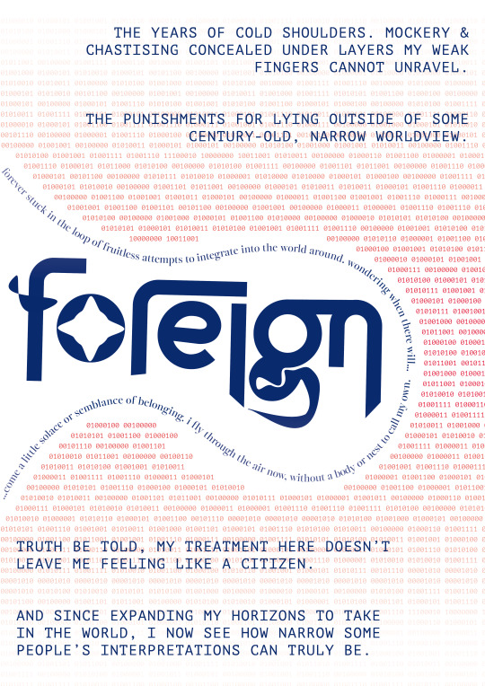
Further refinement of "FOREIGN"
This time, with binary and some touch-ups to allow it to pair better with "Tides" - mainly opposing alignment to the other poster, creating a sort of paired symmetry.
now to get to work on the pitch deck
1 note
·
View note
Text

Quick refinement of "TIDES" based on feedback.
Manual kerning is my worst enemy, but I tried to break up the body copy lying against the same point. Also after a surprisingly massive ordeal and some problem solving, I managed to add binary to the waves. This too, again, needs refinement though.
0 notes
Text

training my eyes in anticipation of some manual kerning for some development. am i up for it?
0 notes
Text
Main takeaways... so far!
How do your elements (strong alone) play well together?
How are you going to keep them balanced?
Perhaps try including binary in the waves?
0 notes

Text
Week 11 crits
With the intention of figuring out continuity & movement for "foreign"
They have to work together better
Foreign left, tides right
"Connection points"
Look at the composition, sketch out some fuckin ideas
What have we got going on, where can we connect
We have text distortion as a joiner
Typographic crafting for "foreign" very interesting, but a mixed bag consistency wise. Tie it all together. Perhaps double down on the organic, fluid aspects to represent the self.
The surrounding should continue forth as something more regimented, geometric, whereas you are the organic angel devil baby
Two very different typefaces "you make your life harder when you add more"
More relation between header type
Perhaps include a nod to binary code within the waveforms
You've got a foreign body and a tide, how do you connect them? Balance them thru a connecting thread
Subheader is xtra text, how do they relate. Your experience should be represented by movement.
You want to narrow it down to...
Binary
Keyword
expressive
0 notes
Text
Checking in, i suppose.
Today will be another crits session, maybe the most crucial before submission.
I've been working along one step at a time, putting emphasis on ample rest and doing one thing at a time. This is the craft I love, but I cannot afford to destroy myself at such a time. As much as I respect Marina Abramovich I don't particularly have the courage or gall she has.
1 note
·
View note
Text
Warming to Helvetica
Maybe it's my frequent scouring of the Swiss train network website, in preparation for my upcoming daytrip. Or the news of their recent (very much deserved) Eurovision win. Or perhaps I am reverting to minimalism and sans serif type, overwhelmed by all the niches and whatnot other forms of type have to offer. But maybe, just maybe, I'm starting to warm back up to Helvetica.
Perfection is absolutely a subjective thing, but I find that what Helvetica brings to the table, when used correctly of course, is something clean, timeless and uncompromising. In conventional use, it is almost always legible, for communicating finer prints & the kind of content found higher up in the hierarchy too.
Maybe I am just overwhelmed, and am seeking refuge in something predictable, like a bowl of chips at a fancy restaurant. But I think I am warming a little more to Helvetica.
1 note
·
View note
Text
I delivered on my next steps - here is version 2 of my "Tides" animation.
With a little bit of guesswork and maths, I managed to get this piece to loop. I find it quite satisfying to watch over and over again, but my intent for this is to represent to cycle of continually clinging to, and eventually losing a grip on, a tangible sense of identity in Aotearoa today. The "random" order in which the type is swiftly taken from the composition towards the end is representative of not knowing just what you could lose at any given moment, when your hands and your brain are so full of all else.
The next steps will most likely be towards my pitch deck. I don't mean to be gloomy, but this is my experience, and I'm determined to tell it. I would hope that I can do well enough for myself, in the bad times, and the good too.
0 notes
Text
First attempt at animating one of my own pieces, from Saturday night.
With the light blue "seafoam" I sought to portray a more literal interpretation of grappling with the depths as they come in and out.
the introduction of the text could be representative, again, of the impermanence of belonging, as it comes and goes in waves.
Although this is a first shot, I have established a sort of visual direction to travel further in, and have some areas I'm interested in exploring with animation. Perhaps I may take away pieces of the type to further drive home the feeling of impermanence, and/or find a way to let the waveforms act in a more dynamic manner.
And I do love you too.
0 notes