
Practicing light n shadows to tackle my ultimate boss: 50’s art styles
Don't wanna be here? Send us removal request.
Statistics
We looked inside some of the posts by winifredtheweirdo and here's what we found interesting.
Average Info
Notes Per Post
52K
Likes Per Post
31K
Reblog Per Post
21K
Reply Per Post
46
Time Between Posts
13 days ago
Number of Posts By Type
Text
15
Photo
2
Last Seen Tumblr Blogs


Fun Fact
Tumblr.com is the 103rd most visited website in the world.
Text
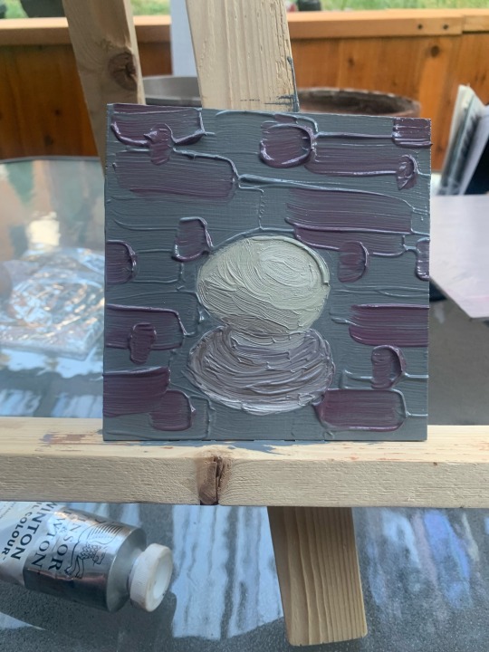
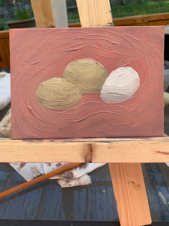
It’s been a while! Observe: some eggs
#the first I’ve been calling#a maudlin egg#and the second#a trio of eggs#yes our eggs are really green.#art#my art#oil painting
2 notes
·
View notes
Text

Doodle of a friend’s cat. NOT the cat who’s drinking wine and smoking a cigar ;)
#my art#art#okay that’s all for now folks#I have two more pieces I want to upload but one I don’t have downloaded and the other#I need to capture a process video bc the final piece isn’t getting uploaded
1 note
·
View note
Text

Still life’s in the apartment.
1 note
·
View note
Text


Aquarium still life’s from Genova.
1 note
·
View note
Text

A silly bear.
2 notes
·
View notes
Text
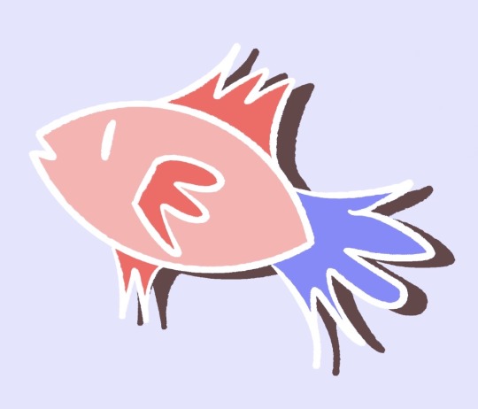
Quick fish. Shadow is the art duplicated, color flattened out, then pulled down to the right.
#my art#stylized art#art#I don’t really think any of these are precious enough to protect the full piece#but I will be protecting my girl w a pearl earring like I did nefertiti#both are really special for me
1 note
·
View note
Text


Outlines of me and my friend. I didn’t want to draw their hair, so an amorphous blob is fine.
#my art#outline#art#I don’t like drawing in this style but I do this for every piece I do now#correction: I don’t like finishing pieces in this style#fast outlines help me a lot
1 note
·
View note
Text

Only thing painted are the bottles and their shadows
1 note
·
View note
Text


My first painting in this style. Took 4 or 5 hours. First is the original, second is with some poor blending.
#still life#art study#art#my art#I was so proud of this. I still am. I appreciate the effort on the background#also now I work a lot faster now and this was very experimental for me
1 note
·
View note
Text

Photo of the model (model.sarahmarie on IG) this was my first human painting. You can see my shitty photo of my fast outline and like, internal movement and angles, below.

#sketching out a piece is a good way to warm up#also outlining is important for me to understand the shape of my subject#she’s in blue because human shades sounds awful. still kind of do#art#my art#stylized art
1 note
·
View note
Text

A quick drawing off a photo I took of a friend in Italy
#my art#art#we just broke up and I don’t really want to see his face but this drawing is still nice to me
2 notes
·
View notes
Text

Hand holding knife.
2 notes
·
View notes
Text

Based on a photo from a friend. Static lines are from my painting app crashing over and over when I tried to paint on his face :)
1 note
·
View note
Text


Hatsune Miku!
Gauche and oil pastels on brown card stock. 12.10.2022
#I edited the first image to see if I could match my friends skin tone#bc I went too dark#hatsune miku#my art
3 notes
·
View notes

Photo


First one took about 15 min, the second about 45.
Venus of Willendorf statue
8 notes
·
View notes
Text
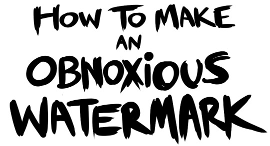
...that your audience won't hate.
This is a method I started using when NFTs were on the rise - thieves would have to put actual work into getting rid of the mark - and one that I am now grateful for with the arrival of AI. Why? Because anyone who tries to train an AI on my work will end up with random, disruptive color blobs.
I can't say for sure it'll stop theft entirely, but it WILL make your images annoying for databases to incorporate, and add an extra layer of inconvenience for thieves. So as far as I'm concerned, that's a win/win.
I'll be showing the steps in CSP, but it should all be pretty easy to replicate in Photoshop.
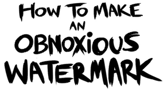
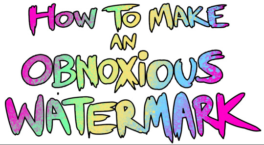
Now: let's use the above image as our new signature file. I set mine to be 2500 x 1000 pixels when I'm just starting out.
Note that your text should not have a lot of anti-aliasing, so using a paint brush to start isn't going to work well with this method. Just use the standard G-Pen if you're doing this by hand, or, just use the text tool and whichever font you prefer.
Once that's done, take your magic wand tool, and select all the black. Here are the magic wand settings I'm using to make the selections:

All selected?
Good.
Now, find a brush with a scattering/tone scraping effect. I use one like this.
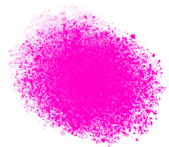
You can theoretically use any colors you want for this next part, but I'd recommend pastels as they tend to blend better.
Either way, let's add some color to the text.
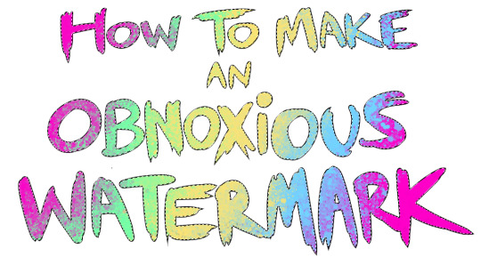
Once that's finished,
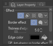
You're going to want to go to Layer Property, and Border Effect

You'll be given an option of choosing color and thickness. Choose black, and go for at least a 5 in thickness. Adjust per your own preferences.
Now create a layer beneath your sig layer, and merge the sig down onto the blank layer.
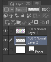
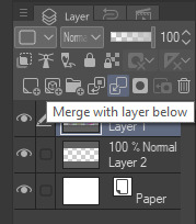
This effectively 'locks in' the border effect, which is exactly what we want.
Hooray, you've finished your watermark!
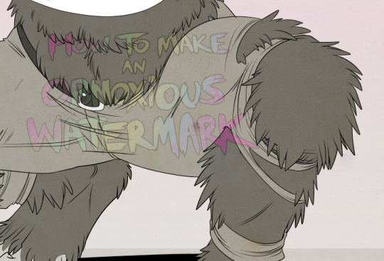
Now let's place that bad boy into your finished piece.
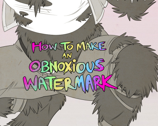
You'll get the best mileage out of a mark if you can place it over a spot that isn't black of white, since you'll get better blending options that way. My preference is for Overlay.
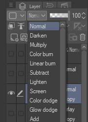

From here, I'll adjust the opacity to around 20-25, depending on the image.
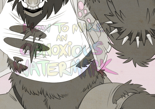
If you don't have a spot to use overlay, however, there's a couple other options. For white, there's Linear Burn, which imho doesn't look as good, but it still works in a pinch.
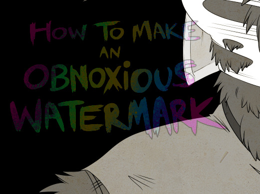
And for lots of black, you have Linear Light
Either way, you're in business!
As a note, I know it's a bummer for some people to "ruin" their work with watermarks, which is part of the reason I developed this mark in particular. Its disruption is about as minimal as I can make it while still being effective.
There's other methods, too, of course! But this is the one I use, and the one I can speak on. Hope it helps some of you!
52K notes
·
View notes