Text
Weeks of 4 & 11/10/21
I'm going to start updating this as I hit certain benchmarks as opposed to weekly. Anyway.
I've completed the treatment and first draft of the script. Also, I've contacted a friend's therapist to get a professional opinion. If she isn't able to, I'll try another. I'm also planning to ask my friends who have first-hand experience with depression and the likes. Really need to get on that.
For the second draft of the script, I'm concerned about the pacing, mainly the conclusion. I feel like it needs to be longer but I don't want to force it or make it too long in comparison to the runtime.
Had an open tutorial with Pernille, who said the protagonist, whose gender is currently (and purposefully) unspecified, should probably be male, since suicide is a massive killer of men. I knew this stat, I think it's the biggest killer of men under 50 or something horrendous like that. The reason the protagonist's gender isn't specified is to make them more universally relatable, although I do acknowledge that making them male would be more nuanced. I'll probably keep it as is for now, but I'll definitely keep it in mind. Even if I don't change it, the actor that plays the protagonist might be male.
I aimed to have the second draft done by the 17th but I've been procrastinating (what else is new), so that goal will probably carry over into the next week.
Really hope we don't have to go into uni every day.
2 notes
·
View notes
Text
Week of 27/10/21
Ah, week 1. My old "friend."
4th year, huh? Hate that. Anyway. My lack of motivation is alive and well and it had been all summer, too. Because of that I haven't worked on anything, including my script, since last semester (surprise, surprise) and now with the dissertation and degree show around the corner, I need to get my ass in gear. But I just don't feel like it. Nevertheless, I did indeed force myself to do some work this week.
I began storyboarding my unfinished script. Smart move right? Actually it's a good idea because I've got a good few shot ideas that I needed to get on paper before I inevitably forget to. I've been using Bong Joon-Ho's Parasite storyboard book/graphic novel as a guideline for what is and what isn't necessary (detail, notes, etc).
Stupidly, I didn't arrange them by scene, which I'll have to fix at some point. I'll also have to clean them up. What I'm saying is I'm planning on redoing them digitally, but I'll continue doing them physically first because it's faster.
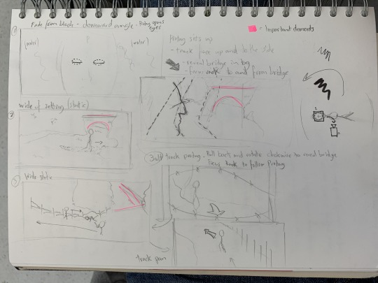
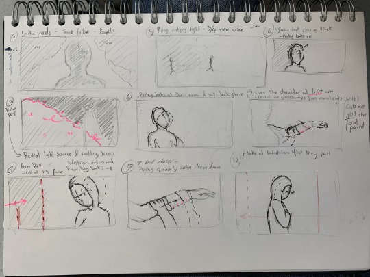
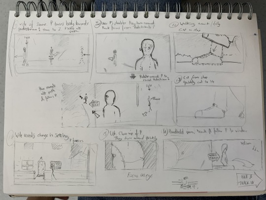
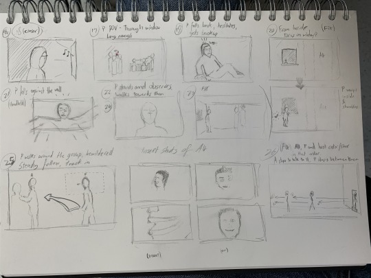
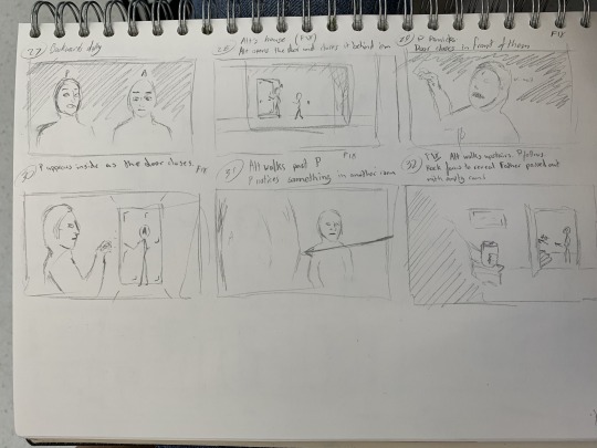
I need to 1) finish the damn script before I think it's a good idea to storyboard stuff I haven't written yet and 2) do more research into scriptwriting because I've only really looked at what we were provided with in the moving image module.
I REALLY wish I had the money for a Masterclass subscription.
Oh, and I'm able to complete ESIRTFFATU now. But it doesn't get dark enough, fast enough right now so I'll probably have to wait for winter for that one. Hope I remember.
0 notes
Text
Bystander
I began this semester wanting to focus, or at least start working, on film work. But due to mental health and motivation issues, I didn't get as much done as I would have liked to.
Last semester during the Moving Image module, I came up with a concept for a short film about someone who wakes up in what they think is a parallel universe and they find their alternate self, who seems to be a happy and extroverted person - complete opposite tot he depressed and reclusive protagonist. Over time the protagonist gets increasingly more comfortable being around their alternate self, whereas the latter's true colours start to show and the two don't seem as different after all. Just as the protagonist feels happy with them, the alternate self commits suicide and the protagonist realises they were in fact watching their last moments.
Bleak, I know, but it's an interesting concept and a nice twist on the typical parallel universe and life flashing before your eyes tropes.
My partner and I ended up not going through with the idea because they weren't feeling it and we settled with something much less interesting and artistic. No, I'm not bitter, why would you think that?
Anyway, with its themes of depression and reflection, I still really want to see it through.
At the start of the semester, I was staying back home with my parents until mid February and I couldn't do any practical work because all my materials were still in Dundee. So what I did do was develop this story idea.
The main problem I ran into was that I felt it wasn't abstract or, for a lack of a better word, arty enough for a fine art work. Because of this concern, I began thinking about what I could do to make it more fitting for the course.
I began with listing story beats and themes I had in mind and thought about how I could interpret them in a fine art context. (Apologies for my handwriting)
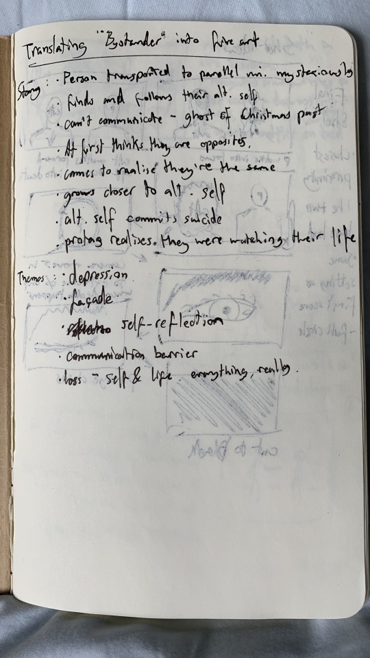
From here, I'm going to refer to the characters as P (protagonist - the one in the parallel universe) and Alt (the alternate self who lives here).
I came up with a few ideas. The first was a static shot, the composition being the two selves standing side by side. P appears sky and reluctant, Alt the opposite. Over time (I was imagining probably 2 minutes max.) their attitudes slowly switch and just as P reaches out to Alt, the latter dies/disappears. The film loops.
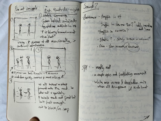
The most interesting thing about this concept was the ideas for the sound I had. It's a roadside setting so the sound of traffic was a given, but I had the idea of having it play in slow motion or reversed or both, which would give it a really interesting and eerie feel. This was influenced by my video work Strangers from last semester (link) where I had the sound of heavy breathing in normal speed and slowed simultaneously.
The execution of this would be difficult and possibly involve greenscreen, which I wanted to steer clear from in order to make it seem more real.
I also thought about using POV, kind of like Peep Show. I also thought about using over-the-shoulder shots and how either of these would work, considering P is in a Ghost of Christmas Past kind of state.
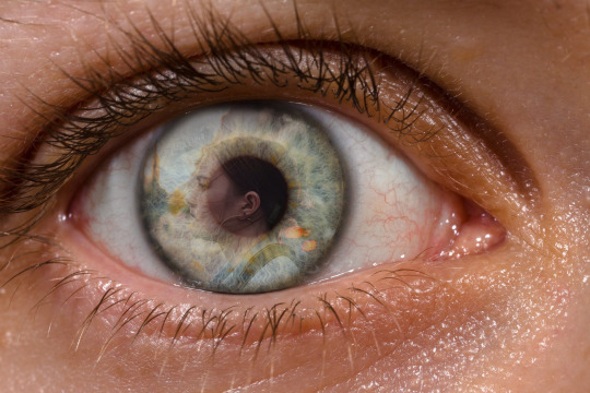
Another idea was to have the characters' eyes as the subject in each shot and have the reflections in their eyes tell the story. This would be very ambitious when I think about it and would involve a lot of post-production finikityness to get it just right. But it would also hit home the theme of reflection. I made a concept frame in photoshop of what that would look like.

At some point I just took a couple pages in my notebook to vomit thoughts and ideas onto, which was quite fun and productive.
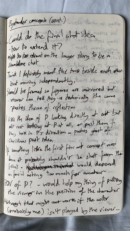
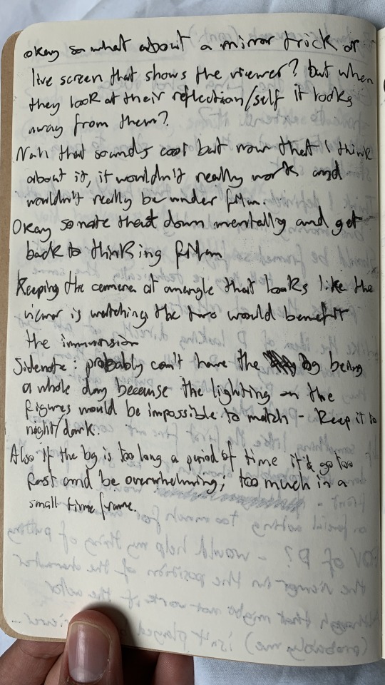
But at the end of the day, I just wasn't as into this whole idea as when I was thinking about doing a less abstract, more movie-like film. I even had a couple shot ideas for it:
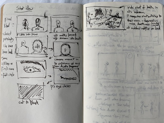
After I got back to Dundee, this project took the back seat now that I could do physical work. But in this last week, I've begun writing the script for the full version of Bystander. It's my first proper script and I'm having fun with it. I'll upload what I've got so far to my assessment folder. This might be more of a personal project rather than something I do as part of the course. I want to get into the cinematography business so I gotta get this done.
0 notes
Text
Every Summer, I Regret That Fret from a Time Unreachable
... Is a line from a poem I wrote that references my other poems called Thunder Clouds and Lightning Bolts and The Snowball Effect (the latter of which I made a piece based on last year - click here for images of that).
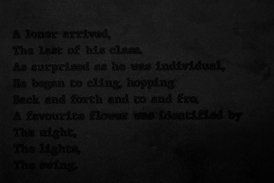
Here's the poem (in image form for formatting's sake):

That untitled poem remains unfinished, but that line really stands out to me. It's about wanting and reminiscing about something you failed to obtain before, when you now have something you should be cherishing instead.
Lead by the theme of reflection I inadvertently carried throughout this semester, I knew I wanted to use high vis reflective material - the kind traffic cones wear - in some way. At first I thought of making a kind of collage piece, inspired by the concept of a scrapbook and looking through the memories in it (reminiscing), but I still want to make less physical, more film-based work. So, I made a few concepts of what I could do.
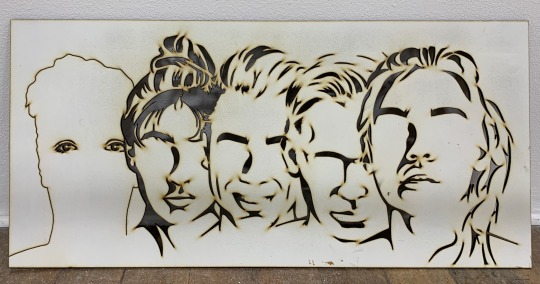
A few things to explain. One: Having the collection of off cuts from previous laser cutter work (some of which I used last semester), it would be a mistake not to use some of it, especially in what I want to be a collage or collage-esque piece. So that's what the eye and hair parts are. I used those ones in particular because the poem refers to a "she," a person (primarily because it's about a "she").
Two: I decided I wanted to use the high vis on those pieces because the idea of the eye, the person, looking back at you light bouncing off it.
Three: The flower shape refers to the flower in the poem, who The Snowball Effect was also partly about. No, you won't understand it without this knowledge, but I like how ambiguous it is. Plus, it's kind of personal. Worth noting that I got the flower shape from the source of the flower motif - a dress.
And Four: The different coloured images are junk prints I got from the print department back during Print 101 last year. These were great to use as the 'memories' in this idea due to their abstract appearance and nature. Using them instead of actual photos makes it feel more abstract and subjective.
A description of each concept underneath the image.
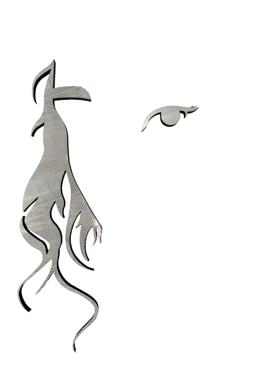
This was more of a throwaway, something to make the list longer. Without a background makes it much less visually interesting (in my opinion) but it's also way more minimal, which I kind of like. The idea of just a face - or part of a face - looking back at you is intriguing.

These next couple concepts involve having a physical flower-shaped base, probably laser cut. This one is what I first had in mind. Using the images to mimic the form of the flower itself and the layers its petals make up. This is sort of using the idea of 2D depth I explored before. Probably my second favourite concept.
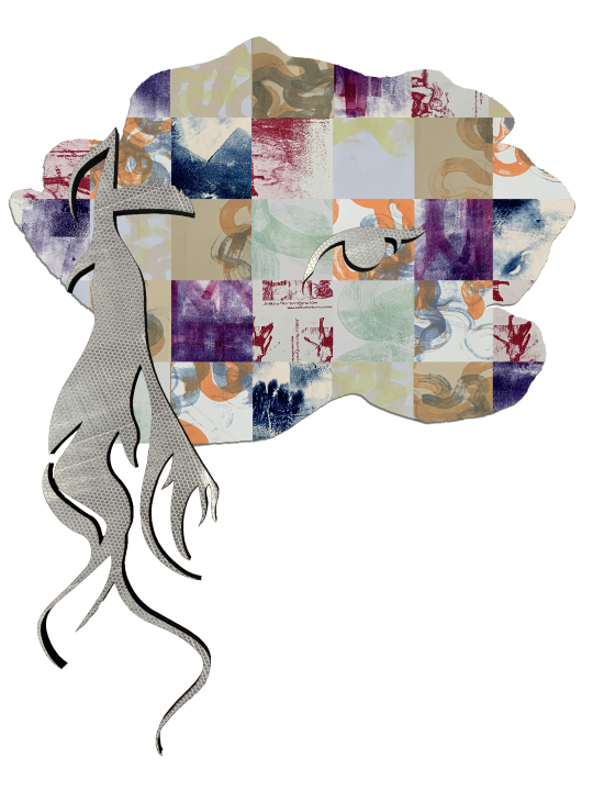
I called this one "scrapbook" in the file name because that's the idea I wanted to get across with this concept. Like a gallery of memory. However, this sounds much better on paper than in photoshop. Albeit there are other ways to go about the idea.

Moving onto the ones that involve projection. This was a better and more layered version of the scrapbook idea - having the array of images on the wall with the face on top, and the silhouette of the flower being projected onto everything like a spotlight. Quite cinematic when I think about it.

Ignore the stroke, my mistake. The idea behind this one was to have it like a fast-moving slideshow of the different images being projected onto the... face? I'll call it the face from here on. I liked this one because it's more like what you see in your head when you reminisce about memories. A series of moments.
I went with the last one. Now, by this point the last chance to loan a projector had passed, so I had to make a simulation. Here's what I did:
I had four pieces of high vis material and had to use three of them to neatly cover the face. I used the curves of the hair to dictate where each piece ended. A case of getting the outlines, cutting outside the lines and lining each part well.
After getting that in position on the wall, I took some wide angle photographs of it and took a load of macro photographs of the print images. Using depth of field and angles to my advantage, I got a variety of shots.
These were further varied in the editing process. I used Lightroom to make some of them crisper, some less so, some less vibrant, some slightly more so. And of course I masked them so they were in the shape of the flower.
From there, I took the images photos into Premiere and, after editing the perspectives and adding a slight glow to simulate an actual projection, I created this:
That's what I have so far. I won't know how the light from the projection accurately interacts with the high vis until I use an actual projector, but I'm eager to find out. I think it's turned out well do far.
As for sound, I had the idea of adding the sound of flicking book pages in time with the images, but without the visual aid of an actual book, it would just sound like a very fast metronome. I also had the idea about some ambient sound but one: I'm really not sure if it'd fit and two: I never really saw sound being part of this at all to begin with.
0 notes
Text
Reflect
I had an idea that branched off my script idea, specifically the theme of self-refection and this concept art I made:

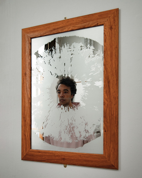
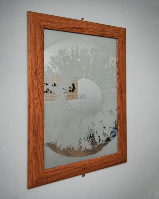
I’m honestly not sure how it came to mind, but I had the idea of engraving the image of an eye onto a mirror.
This is taking the theme of self-reflection and interpreting it quite literally. The phrase, “look into my eyes” often precedes someone asking for honesty (usually in movies but the point stands). With this in mind, the meaning of this concept is to look yourself in the eye, and your eyes, and be honest with yourself. We all have areas of our personality and experiences that we don’t like. The question is, will you bite the bullet and acknowledge it?
The initial plan was to draw it digitally like I have in my laser cut portraiture work before - solid black and white with the blacks cut out - but when I started doing it, I realised that doing the process with the human iris would not only be incredibly tedious but would also not give the kind of atmosphere I want. The curved, flowing lines I would have achieved by doing it this way go against the forceful mood I wanted this to have.
So, I turned to Photoshop’s ‘Threshold’ tool, which separates an image into solid black and white, with a slider for you to define what value you want. This treats each individual pixel, allowing for a much less abstract style than what I would have achieved if I had drawn it as initially planned. I used three different values so that I could decide which areas of each I wanted to include, and which I wanted to hide:
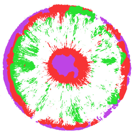
Each colour is a different layer, green with the least black, red the medium amount and purple the most.
I’ve never used Photoshop in this way before, it was quite a learning experience.
From there, I edited it a bit (mainly making the circle whole and without any gaps), bought a mirror off Facebook marketplace and made a couple mock-ups of what I had envisioned.
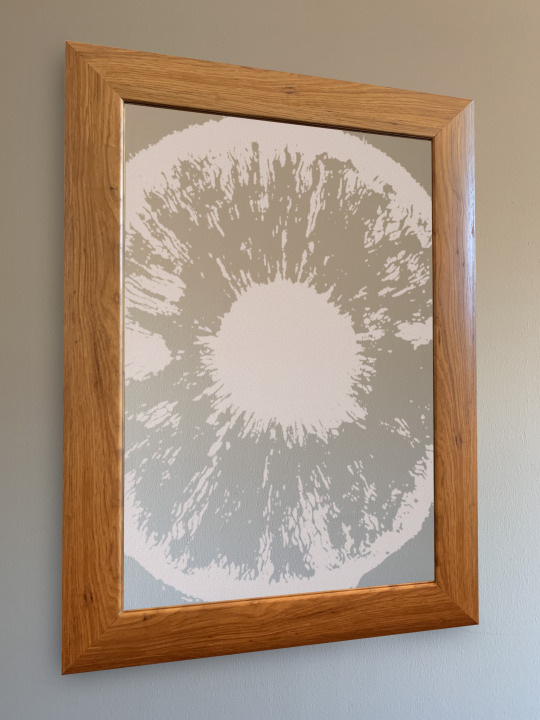
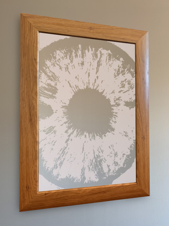
A couple things to mention here.
First, I had emailed Rob from the Make Lab about whether or not laser engraving on a mirror like this was even possible (I knew the effect I wanted was possible but wasn’t 100% sure if laser engraving was the method), and he came back to me about a few ways to use a laser cutter on a mirror: to create a misty effect (what I had in mind), removing the reflective material on the back of the mirror, and using Perspex to achieve the second option. I went with the first one because, along with the decision to go with the second version of the mock-up, it meant that you can’t see yourself clearly in the mirror unless you look into the pupil of the eye, which adds more meaning to the concept,
Second, I bought this mirror in particular because I wanted it to be more of the generic variety rather than some fancy-shaped or stylised one. This also adds to the meaning, because it makes it feel like this inner conflict of you battling your demons is something you struggle with every day. This is where this project started to relate back to my previous work of creating characters and scenarios, and putting the viewer in the shoes of the characters. In this case, YOU are the character and the scenario is so much more real.
Also, if I used a fancier mirror, the focus would partly shift to the style of the mirror itself, as opposed to the eye and its meaning.
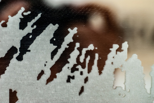
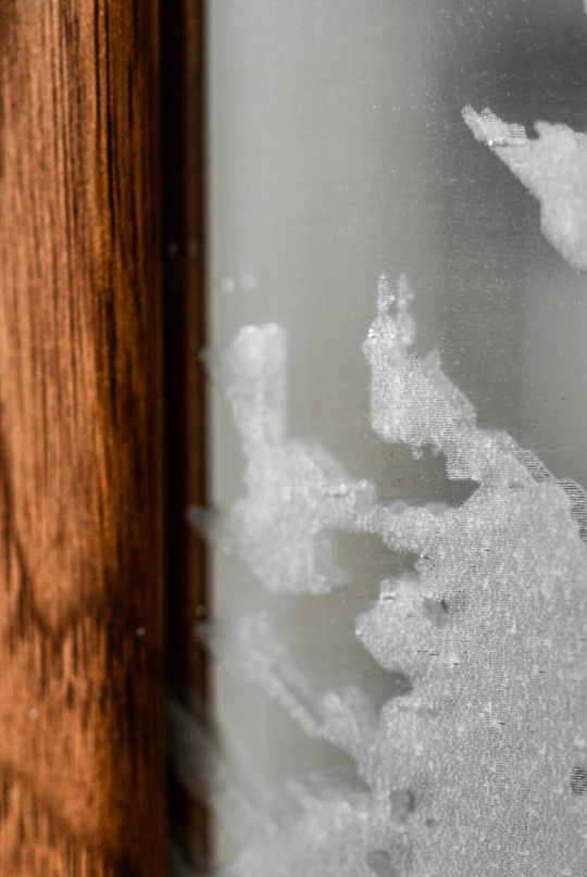
So, after that it was just a matter of getting it engraved and installed. Here are the final images:
During the group crit, an interesting question was raised about this concept: regarding the use of a mirror, where does the line between self-reflection and vanity, sit?
I answered with a story of a conversation I had with my uncle one dinner during the winter break. We were discussing selfies, and he stated that people who take selfies and post them on social media are extremely narcissistic and vain. I challenged him with the fact that for many people, selfies are a form of self-love and a good way to boost self esteem. Yes, there are absolutely people who take selfies purely because they think/know they look good and want validation, but there are also people who use the selfie as a form of encouragement and mental health boost.
So, with that in mind, I think the line between vanity and self-reflection in this piece really depends on who’s viewing it. We all know art is subjective, and I definitely know that some people won’t get the whole meaning behind this without explanation. And that’s fine.
I’ve named the piece “Reflect” as a command as opposed to the verb in itself, in effort to encapsulate the concept and to urge the viewer to adhere to the story behind it.
0 notes
Text
Weeks 1-6
Yeah I’ve been neglecting this. Although, all I’ve been able to do it explore ideas and I’ve been doing that in a notebook. So, this will be a summary of what I’ve done so far.
I’ve also been very depressed so far this year. As a result I have almost zero motivation to do anything. All I want to do is watch Netflix and play Mario Kart. There are a few reasons for this but one of them is the fact that we won’t have any access to the uni or its facilities for this whole semester. My work relies heavily on facilities like the CAP workshop and laser cutters. Without them, I can’t make any substantial or finished pieces of work. Because of this, I feel quite useless. What’s the point of taking an art course if I can’t do any art?
Now, up until a week ago, I was back home with my family while all my materials were still in Dundee. So I really couldn’t do any physical work. I’m back in Dundee now with even less motivation than what I had when I was back home, but I’ll try my best to get some work done.
Anyway, here’s what I’ve done:
Wanting to get more into film, my main focus has been trying to adapt a film idea to a fine art context. The script idea is much more conventional than the abstract films that are more common in fine/contemporary art. I’m trying to make the idea more arty and less movie-y.
The (full) story is about a person who is very depressed and lacks self confidence, and is transported to what they think is a parallel universe. After finding their parallel self, they conclude that this new universe is one where they are the opposite of their self - this new them is very confident and happy. But, as they follow and watch their parallel self, they realise that they aren’t so different. Their parallel self has moments of sadness and weakness when no one is around, making it clear to the protagonist that they both put on an extroverted persona/mask when around others. Just when the protagonist feels comfortable with their parallel self, the latter commits suicide, and the former realises that this has in fact been a replay of their final moments, not a parallel universe.
So yeah. I’ve come up with a couple concepts for adapting this idea for fine art, the details and issues for which are written in my notebook:
1: full shot of the two from behind, standing side by side as to mirror the composition. The protagonist (P) acts hesitant/nervous at first while observing their alternate self (Alt), who appears to be more confident. As (not much) time passes, the same plot points happen and just as P tries to reach out to Alt, Alt disappears. cut to black.
2: A back and forth of the two’s eyes. A reflection of Alt can be seen in P’s eye but not vice versa, because P is essentially the Ghost of Christmas Past. Emotions and time are told through the use of colour and Alt’s reflection. At the beginning, P opens their eyes and at the end, Alt closes their eyes. Looped, but with an obvious beginning and end.
Here’s an image I made as an experiment for idea 2:

The laser cuts/paintings etc have taken the back seat due to me not being able to do them. As a result I haven’t thought about them much, but I have had the idea of smashing a mirror to communicate the idea of self deprecation. That’s about it. Now that I have some materials though, I’ll probably start thinking about the prompt list and stuff more.
I think I’ll carry on using the notebook for most of my documentation because it Helps me feel like I’m doing actual work because it’s physical.
I just hope I’m able to pass this semester.
0 notes
Text
Fine art - Analyses of explored ideas
Pool of Twilight
This idea failed. My aim was to create something - installation, film or wall hung piece - that oozes tranquillity. The phrase “pool of twilight” is derived from how my mum described my room back home after we repainted it with an indigo colour. I hung a small disco ball in the window which sent light all around the room that looked like stars on the dark walls.
My idea was to project an image of a crescent moon shape onto an indigo-coloured sheet of handmade paper, with a translucent fabric in front of the paper, moving like curtains in a breeze. Being handmade, the paper had a unique texture with swirls and organic forms, which would make the image more visually interesting and intricate. I’d then have a light shining through some moving water to project the shadows of the water onto the paper. once I had all that, I’d film it face-on. Then, I would include audio of small waves lapping, or something similar.
Good concept, bad execution. I was having to manually manipulate the water and fabric simultaneously, which was a hassle but possible. The real problems came with the projection and camera combo. The camcorder I used had to be placed on top of the projector because if it were in front, it would block out the projection. But because it was so far away from the canvas, I had to zoom in a lot. Too much. The video lost so much quality and I wasn’t able to save it in Premiere. On top of that, there’s nowhere in Dundee I could get a recording of gentle water without getting background noise of traffic or wind.
I’m not done with this idea, I intend to explore it more. Follow this link for the video: https://youtu.be/c0u283uZYF0

Vacancy
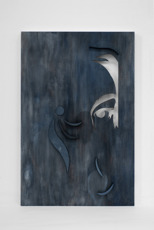
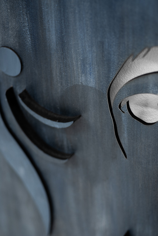
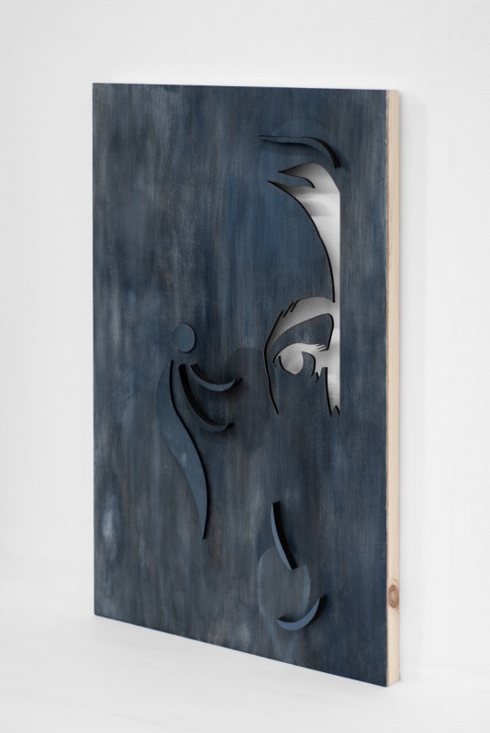
With this piece I’m telling the story and putting you in the perspective of someone who has something missing in their life and soul. In the piece, there is literally something missing in the cutout. Behind it is an emptiness which can appear infinite if the work is suspended away from a wall.
There could also something missing in the application of paint - it’s not entirely opaque. The whites and greys add to that idea of emptiness and the state of being incomplete.
The shapes that are positioned on the top layer seem to resemble tears given the melancholic atmosphere and how they seem to flow downwards from the position of an eye. Although it’s somewhat up for interpretation.
The title of Vacancy serves as a double meaning: on one hand, it helps amplify the idea that something is missing given the word’s meaning. On the other, hotels and B&Bs use the word to signify that they have a spare room and are inviting people to fill that space. In this context, the character whose perspective you are witnessing is inviting someone to fill the space, hole, void that he possesses.
I think this turned out very successfully. I don’t think that’s me done with this idea because I’m not sure what else I could do but perhaps I could interpret it differently. Either way, I’m happy with it and I’m enjoying telling stories like this through art.

‘
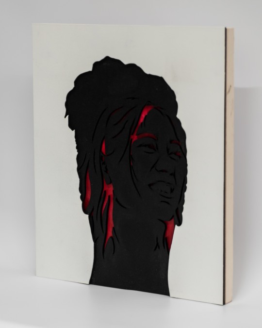
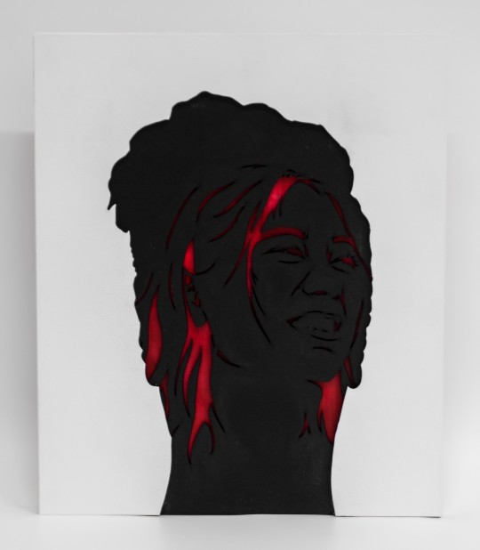
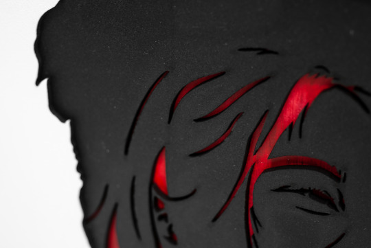
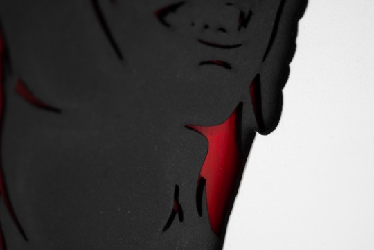
This piece, initially inspired by the Imagine Dragons lyric, “I’m an apostrophe, I’m just a symbol to remind you that there’s more to see,” puts you in the perspective of a person who, despite having someone directly in front of and facing them, decides to look through them and onto who’s behind. That person, however, is visually content without knowing or acknowledging you. And yet, you keep looking.
The top layer being plain white serves the purpose of blending into a white wall and emphasising the idea that you are looking straight through someone who is obviously right in front of you. Behind that, the black layer is to create stark contrast and amplify the white’s cutout, but invite you further into the centre of the piece.
The much more intricate application of the crimson and scarlet colours beneath are to communicate the feeling of desire and interest that you feel towards the figure in the back, who is meticulously detailed in contrast to the silhouette in front. This is to convey the idea that you, who is looking through someone that you see no detain in, look past them and onto someone whose body intrigues you so much more. The piece is sized so that the silhouette is life sized in order to make the concept more real to the viewer.
Strangers
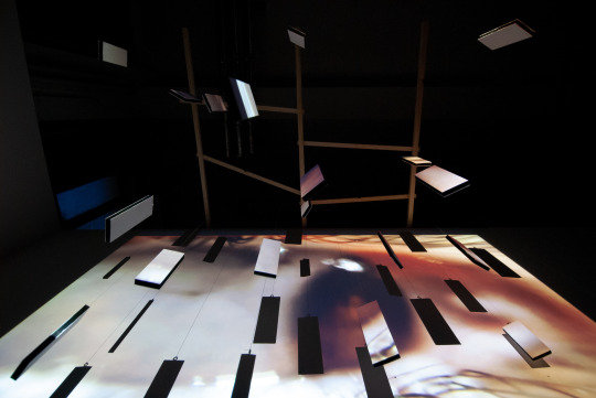
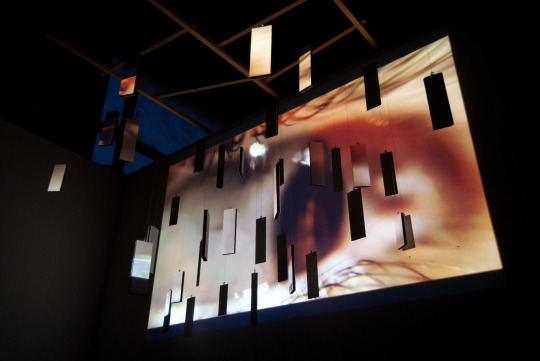
Strangers is an installation with the purpose of portraying my experience with social anxiety and difficulty communicating with people I don’t know well or aren’t comfortable around.
The projected video aims to induce the feelings of anxiety and panic, which are communicated through many aspects: i.e. the lack of vibrance, overlap of visuals and collection of audio. The use of colour gives anything but a feeling of happiness and makes the viewer feel on edge just by that alone. The overlap of video shows constant rapid movement, and along with the sound of panicked breathing, plus the sounds beneath that, the feeling of being overwhelmed is emphasised so much more.
The MDF pieces are suspended by transparent fishing wire to give the impression that they are floating. They are positioned in a way that appears random and they take up all three axes. These shapes represent uncertainty and/or people, and their positioning gives the idea that there is no escape from threes feelings of anxiety - you’re surrounded by them. They’re everywhere. These objects obstruct the projection and leave holes in it, furthering the relationship between the two elements of the installation and bringing the video forwards into the third dimension.
To see the video, click here: https://youtu.be/tAJWmACRYbY

0 notes
Text
Weeks 9&10
It’s been hectic and stressful to say the least, and a lot happened.
Firstly, concerning the “ ‘ “ idea: I made a portotype for each version (window and crowd). However, the only one I went forward with was the window one, because I feel like it’s more striking and intriguing as an image and concept, and because the crowd idea (seeing image) - although it took a while to draw - turned out to appear a lot more creepy than I imagined because of the eyes. Although I should have seen that coming, come to think of it.
For the Window prototype (first image) I used leftover painted card from last year for the background. For the end product it needs to be bright colour that communicates the feeling of desire.
For both prototypes, I used a photo of myself for the silhouette (which I had to photoshop because my jaw was still very swollen from getting my wisdom tooth removed at the time). This is my way of putting myself in the work, semi-literally. Since this concept is half-inspired by personal experience, it just makes sense for me.
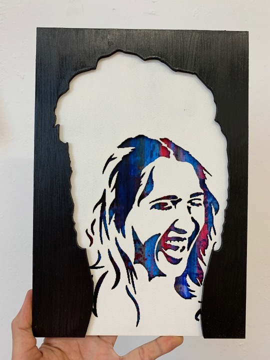
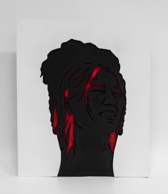
Having decided to go ahead with the window idea, I set to work to get it done. I used another image for the background figure to avoid the same pixelation issue I had with the prototype.
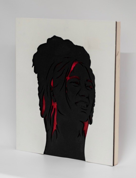
This piece, initially inspired by the Imagine Dragons lyric, “I’m an apostrophe, I’m just a symbol to remind you that there’s more to see,” put you in the perspective of a person who, despite having someone directly in front of and facing them, decides to look through them and onto who’s behind. That person, however, is visually content without knowing or acknowledging you. And yet, you keep looking.
The top layer being plain white serves the purpose of blending into a white wall and emphasising the idea that you are looking straight through someone who is obviously right in front of you. Behind that, the black layer is to create stark contrast and amplify the white’s cutout, but invite you further into the centre of the piece.
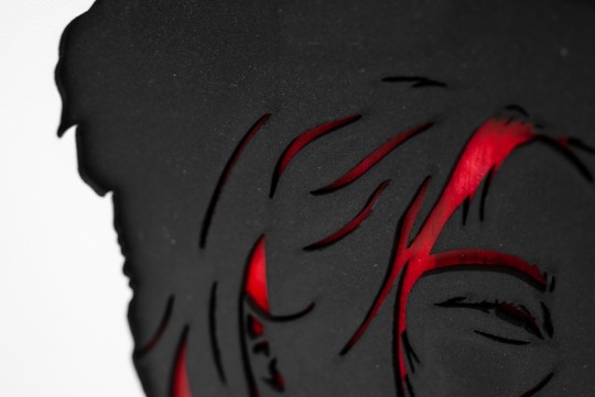
The much more intricate application of the crimson and scarlet colours beneath are to communicate the feeling of desire and interest that you feel towards the figure in the back, who is maticulously detailed in contrast to the silhouette in front. This is to convey the idea that you, who is looking through someone that you see no detain in, look past them and onto someone whose body intrigues you so much more. The piece is sized so that the silhouette is life sized in order to make the concept more real to the viewer.
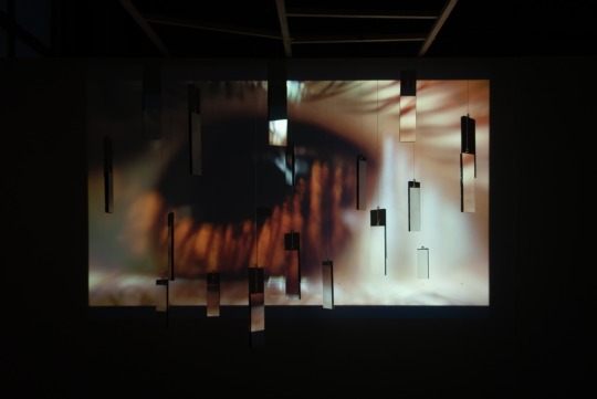
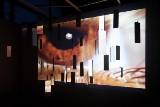
In other news, remember that floating MDF idea I had? Yeah I did that. This was very unlike anything I’ve done before and was very stressful because I was working on this and ‘ at the same time for over a week.
This started with me stealing (with permission) - bunch of lasercut rectangles from the digital making space, and the idea of “strangers,” which I came up with after a conversation with my friend about my social anxiety. After a slow back and forth with Ronnie about how to suspend them, I painted them all white on both sides and we constructed the... thing.
As I mentioned before, my first thought was to create some kind of crosshatch design - either out of assembled wood or lasercut MDF - and attach it to my studio board so that the pieces could be hung in seemingly random places, because that’s what I wanted. What Ronnie thought of was similar. We screwed a couple long, thin pieces of wood coming off the top of my studio board and I was left to play with it.
We were going to do the same thing with another piece of wood and then attach some pieces across the ones already there, parallel to the wall, but after some experimentation with hanging the MDF I realised that it would be much better if the wood parallel to the wall was completely movable. That way, I could move and swap them about freely to get what I want without the hassle of untying the thread and tying it back on in a different spot. And if I wanted to change the position of a single MDF piece, I could shimmy it over thanks to the slack on the knots, or I could loop the thread around the wood to make the MDF higher. Foolproof.
But this contraption isn’t the whole thing. To communicate the aforementioned idea of anxiety, I had the idea of projecting a video of an eye looking around restlessly, with audio of panicked breathing. Luckily, I have three things that made this possible on short notice: a phone capable of filming in 4K, a clip-on macro lens for said phone, and a willing friend.
My idea for this video was to make it very eerie and anxiety inducing. So when it came to editing it, I used Davinci Resolve to desaturate the colours and lower the temperature to make it seem cold and absolutely not uplifting. I then took it into Premiere Pro. There, I made an identical video track but reversed it and lowered the opacity to 33% so it looks like two eyes of the danger owner moving independently.
For the audio, I added a recording of my heavy breathing and upped the gain to make it loud but not deafeningly so. I also added a slowed down version of it for a creepy bass layer, and I also added a track of room time but made it louder to amplify the feeling of something being off.
So, I got a projector and a plinth, and it turned out pretty great. Without further ado:
Strangers is an installation with the purpose of portraying my experience with social anxiety and difficulty communicating with proper I don’t know well or aren’t comfortable around.
The projected video aims to induce the feelings of anxiety and panic, which are communicated through many aspects: i.e. the lack of vibrance, overlap of visuals and collection of audio. The use of colour gives anything but a feeling of happiness and makes the viewer feel on edge just by that alone. The overlap of video shows constant rapid movement, and along with the sound of panicked breathing, plus the sounds beneath that, the feeling of being overwhelmed is emphasised so much more.
The MDF pieces are suspended by transparent fishing wire to give the impression that they are floating. They are positioned in a way that appears random and they take up all three axes. These shapes represent uncertainty and/or people, and their positioning gives the idea that there is no escape from threes feelings of anxiety - you’re surrounded by them. They’re everywhere. These objects onstruct the projection and leave holes in it, furthering the relationship between the two elements of the installation and bringing the video forwards into the third dimension.
To see the video, click here: https://youtu.be/tAJWmACRYbY
youtube

Moving Image module
Editing this thing together was an experience but less tedious than I expected. I used Davinci Teeolve for the first time to colour correct and whatnot. It was a slow process because my laptop isn’t great but I got there. I tried to make it look like there was more sun, to give a warm feeling and emphasise the light-heartedness, but some locations are visually overcast so it was kind of difficult to make them seem sunnier while being realistic. In some cases I ended up just being able to boost the colour which will have to suffice.
When it came to making all the cuts in Premiere, I divided a method for including all the locations without the film being a confusing mess: start with 3 locations and cut between them. 3 minutes in, take one out and introduce a new one in the former’s place. Repeat until all locations are introduced. I had to write this down in a way that visually represented it in a simple way my feeble little brain could understand:
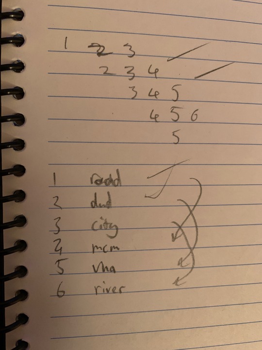
This method was derived from Creature Comforts, which did near the same thing. The difference being that they had many more settings to cut between. After I developed the method, it was a matter of singling out the moray interesting parts/monuments with potential for the voiceover, and cutting them together. It came to about 11.5 minutes, which is respectable in my opinion, as long as we can keep the energy up during recording.
Speaking of which, I think the recording went well. We started with the traffic/weather track which was going well, considering we hadn’t had any practice, until Nathan forgot we weren’t doing voices yet. He realised after that track and we gained confidence through recording the others.
Being one take and in time with the video track, the audio was easy to implement. At first I lowered the sfx and ambiance tracks to give the speech one more prominence, but Nathan advised I boost all of them. This was alright, just meant I had to adjust the volume of some parts. Also, I only ended up using the direction track once, where the speech track peaked badly. If we did this again, I’d definitely speak more clearly during recording and be more cautious about packing the mic. But of course we couldn’t do a second take, because that would go against the whole point of doing a single take.
And that’s it done. I definitely believe we could have achieved something much more impressive if we went with my initial idea or something similar. But nevertheless, this was a fun process, especially the recording. At least I learned new software and hot more experience with editing. Link to the film: https://youtu.be/BoH4mZsXRac
youtube
Now all that’s left is assessment. Please have mercy.
0 notes
Text
Weeks 7&8
I’ve been pretty depressed over the last couple weeks due to personal stuff and had my wisdom tooth taken out at the beginning of week 8 so I’ve been taking it easy lately for the sake of my own health and sanity.
Fine art module
Finished Vacancy. With this piece I’m telling the story and putting you in the perspective of someone who has something missing in their life and soul. In the piece, there is literally something missing in the cutout. Behind it is an emptiness which can appear infinite if the work is suspended away from a wall.
There could also something missing in the application of paint - it’s not entirely opaque. The whites and greys add to that idea of emptiness and the state of being incomplete.
The shapes that prettier towards the viewer seem to resemble tears given the melancholic atmosphere and how they seem to flow downwards from the position of an eye. Although it’s somewhat up for interpretation.
The title of Vacancy served as a double meaning: on one hand, it helps amplify the idea that something is missing given the word’s meaning. On the other, hotels and B&Bs use the word to signify that they have a spare room and are inviting people to fill that space. In this context, the character whose perspective you are witnessing is inviting someone to fill the space, hole, void that he possesses.
I think this turned out very successfully. I don’t think that’s me done with this idea because I’m not sure what else I could do but perhaps I could interpret it differently. Either way, I’m happy with it and I’m enjoying telling stories like this through art.

I’ve got a couple new ideas around the prompt “ ‘ ”
The prompt originates from a lyric from Imagine Dragons’ song Whatever it Takes: “I’m an apostrophe, I’m just a symbol to remind you that there’s more to see.” I’ve interpreted that in a couple different ways.
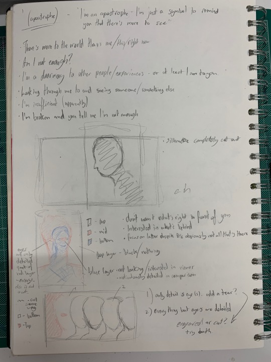
1: you are looking straight through someone at someone else. The person you are focused on is perfectly content without you in their life, but nevertheless you keep looking past what - or who - is right in front of you to focus on something different.
This would be executed with something similar to a double exposure. The person being looked through is completely cut out with only their silhouette perceivable. But even then, it’s surrounded by black - by void. As far as you are concerned, there’s nothing there but a window to see what’s beyond. On the latter below would be a person who is meticulously detailed in comparison to the silhouette. They have a gleeful expression and possess bright colour but aren’t even looking at you - they have no interest in you, but you desire them anyway.
2: similar to the above but executed differently. Many people are in front of you but you are pushing back and attempting to ignore the one who has more to offer emotionally and concentrating on those whose physical attributes you’re interested in.
This would be executed by utilising the idea that the eyes are windows to the soul. The person you’re ignoring has only their eyes detailed whereas those you’re interested in have everything but their eyes detailed. The former would possess different colours than the latter to further the distinction.
I’m leaning towards the first idea because I think it’s more interesting of a concept. Plus, it’ll be a step towards making laser cut works with a higher number of layers.
I’ve started drawing the templates on photoshop using a photo of myself for the ignored characters, and photos from unsplash.com. I might get photos of my own for the later versions of either but I think it might actually help if they’re models as I feel it would add to the meaning.
Film module
Nathan and I have finished our filming and now it’s on me to edit it together (which will be so, so tedious) and then make the audio.
In our tutorial with Gair, he pointed out the similarities to John Smith’s The Girl Chewing Gum, which I watched after and yeah, I see what he meant. It was actually one of Nathan’s influences for the idea but he forgot the name of it.
I’ve updated the treatment accordingly and with help of Nathan’s input.
Excelsior.
0 notes
Text
Week 6
Jesus Christ how are we here already? Anyway.
Fine art module
Things have progressed with Vacancy (that’s what I’m calling it now). I got the board, primed it, painted it and laser cut it throughout the week.
When it came to the painting, I used watered down acrylics to create dark and muted blues and greys for the melancholic feeling of it. I wanted to add in something like the circles I did in the experimentations to make it a bit more interesting and add more to the story of the piece. But i wasn’t sure about doing the same thing, or if it would actually look better, so I took it to photoshop.
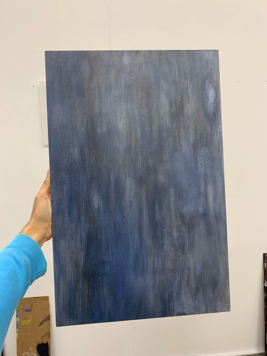
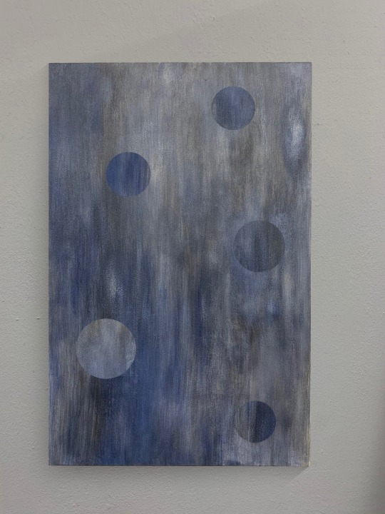
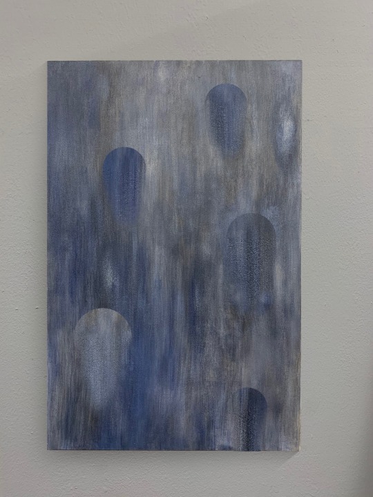
I miss admit I’m kind of proud of the board’s shadow.
To put it simply, I copy-pasted areas of the board onto a different part of it to get the circles. That’s the second image
Then, I had the idea of improving on the water idea I had before, so I extended the bottom halves of the circles and fading them out. And I really liked it. If done right, it could be nice and subtle while adding something unique to the composition.
And that’s what I did. But after I did, I was looking at it and I got the feeling that something was missing. I thought the paint was too transparent, that there weren’t enough layers. But then I realised: that actually adds to the feeling of vacancy. Something’s missing. That’s when I settled on the title of Vacancy.
I’ve laser cut it and painted the cutouts, now all I need to do is attach them. Need to book the workshop to use the woods glue.
While I was priming the board, I talked to Malcolm about the idea I had about the MDF rectangles and how to suspend them. I’ve got the idea of making some kind of wood or MDF crosshatch to hang them from.
He told me to make a model of what I want it to look like (pretend the white paper is wire/thread):
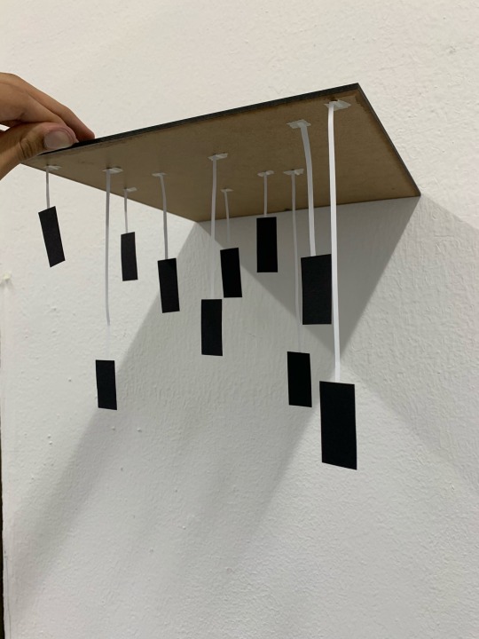
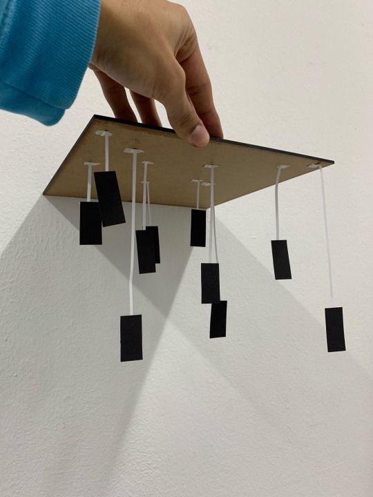
The idea is to have the shapes take up all three axes. I used the Windows screensaver Starfield as inspiration. That’s as far as I’ve got.
My open tutorial with Mark was really good. He gave me some good ideas and boosted my confidence by saying I’ve really found something with My laser cut stuff. I’m really grateful.
Here are my notes:
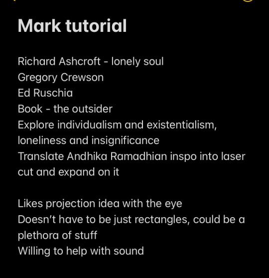
He mentioned making a series of Andhika Ramadhian-like pieces, which sounds intriguing to me but I don’t want to copy their stuff completely. Mark explained that I could use laser cut and layering techniques to my advantage.
Regarding the second to last point, I feel like the uniformity of the rectangles would be a good thing to have, and it would benefit the idea of space being taken up, in my eyes.
0 notes
Text
Week 5
Fine art module
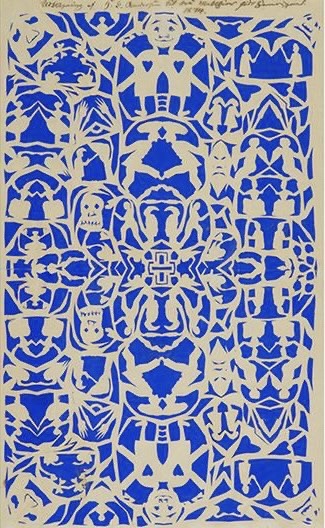
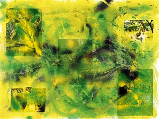
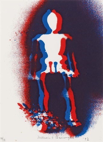
In my tutorial with Killian, he gave me a few names to research: Matias Armendaris, Hans Christian Anderson, and William S Burroughs.
Armendaris’ work really isn’t my cup of tea - it reminds me of really boring artwork I see in galleries and museums. I liked Anderson and Burroughs’ works a lot more. Anderson’s use of solid colour and contrast fit my attention. It also king is reminded me of the paper snowflakes I made as a kid:

Burroughs’ work is what I liked more, due to the collage aspects in some pieces and interesting colour combos:
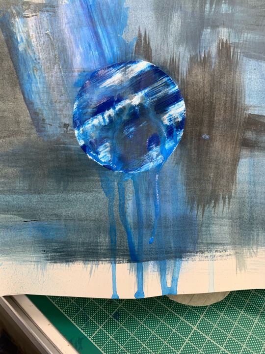
I tried to do more experimentation for the background of the collage piece I’m working on, but I wasn’t really feeling motivated so I only got one bit in. At first it was too see if what I before works when I do it inversely bc (it does), and I thought to see what it looks like if I make it run like rain (not great).
Going back to the Pool of Twilight idea, I laser cut some moon shapes of caps sizes on a reflective material as a possibility for the moon in the composition. Wasn’t sure how it was going to go but they turned out fine.
I attempted to record some water for the sound side of things. I want the sound of small, calm waves lapping so I went to the Tay, but it was way too windy and the audio was horrible. I tried again when it was calmer but the sound of traffic was to present. I think I might have to resort to finding something online.
As for the viduals, I attempted a recording. Loaned out a projector and a camcorder and made a dodgy setup - on one side of my room was the sheet of handmade paper with the fabric in front of it, with a large plastic container full of water and a light shining through the water to make the “waves.” On the other side is the room was the projector, projecting the moon onto the paper, and the camcorder on top of it. Boujee, I know.
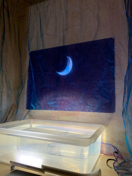
The camcorder was on top of the projector because I realised too late that if it was to be closer, it would be in the way of the projection, so it had to just be zoomed in. Which was a mistake.
The video turned out horrible quality due to the huge zoom and lack of light. The fault was partly of the camcorder which is too old to be used in these conditions, and partly because of my dodgy setup. If the projector was overhead or something so that the camcorder could get closer, it might have turned out better. But I’m really not sure this is the way to go about it. Here’s the link to the footage after I tried (and failed) to save it in Premiere: https://youtu.be/c0u283uZYF0
youtube
Film Module
Not much to report here. I wrote the treatment which I think is pretty alright for my first one, although there’s really not much I can think to include because what we’re doing isn’t scripted. All I can do is describe the concept and what I want the editing process to be like. I’ve got a page done and I’ll ask Gair if there’s anything else to add.
Nathan and I were meant to go out and record this weekend but it was way too damn foggy. If we’re going to make a lighthearted film, we want the weather to mirror that. We’ve agreed to film some settings alone to save time, though. Probably a good idea. If the weather allows it, I’ll do mine while I’ve still got camcorder loaned out.
0 notes
Text
Week 4
Fine art module
I found this A2 indigo sheet of handmade paper which is damn near the perfect colour I’m wanting for the background of Pool of Twilight. It’s texture is also a plus because it means it’s not completely flat.
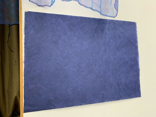
I also did a couple quick gouache experiments - similar colours on black and white - to see if I’d go with that for the background instead. I won’t. The handmade paper wins.
Remembering I had them, I gathered the mdf cutouts from previous projects, which I’ve wanted to use in collage since I got them. I realise that I really miss the process of making works like Hotheaded and at the end of the day you make better work when you enjoy it, so I’ve decided I’m going to go back to that for a couple ideas, or at least something similar.
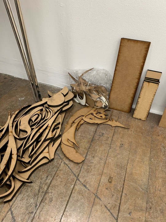
Whenever I think of college I always picture these heavily populated pieces with multitude of elements. But I need to realise that’s not necessarily what college is. So I’m going to make a collage with the cutouts, but only a few pieces.
I started messing around with the mdf pieces, making a bunch of different compositions and seeing what I like. Also had the idea of laser cutting a canvas to give the idea of emptiness/vacancy but Rob from Make advised against it, so I’m going to go with an mdf panel instead.
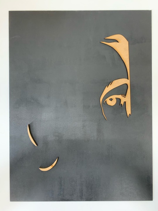
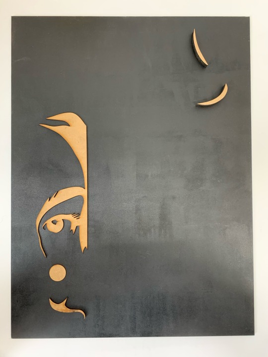
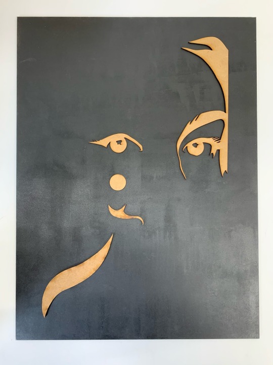
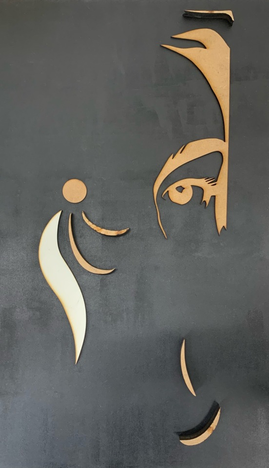
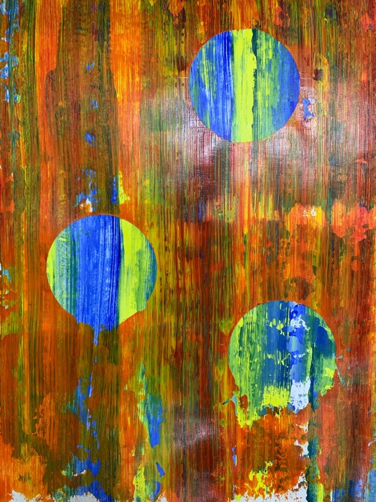
While waiting for an email reply concerning the making of said mdf panel, I started experimenting with ideas for the background of this. I want to do something like Hotheaded but more collage-y. I high got me thinking about those spray paint street artists that paint planets and stuff in seconds by having something cover the canvas while they paint.
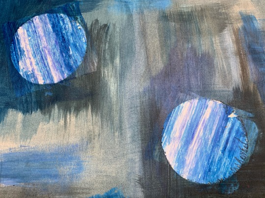
To give the bleak feelings across I want to use muted blues and a bit of greyscale. The orange one was just a proof of concept. I feel like the watered down paints help give contrast to the scraped areas and their more solid colours help give the atmosphere across better as they’re less hectic and lively.
Moving image module
Seen as though Nathan and I were interested in song something along the lines or parallel universes and such, I came up with this idea that deals with such and has themes of depression. I quite liked it and had a couple shot ideas in mind.

Nathan was quite iffy about the suicide part and suggested that a better message would be PS deciding to get hello instead, which is very reasonable and a lot less bleak. We kept talking and had basically decided on it until the week’s talk.
We both loved the stuff by Harrison and Wood, which got us talking about improv. We then had the exact same idea of setting up a camera somewhere and filming people and traffic and the likes going past but remove the audio and dub it over instead.
This idea evolved and we’ve decided on dubbing over the people, traffic, animals and whatever else in layers, each layer in one take. We’re both really excited by this. Need to write up a treatment and decide where to film.
0 notes
Text
Week 3
Open tutorial w/ Eddie
We talked about my list of prompts and how atmospheric they are, which is something I guess I’m concentrating on. Since I’m more aesthetic-oriented, atmosphere is one thing I value and I’m planning on concentrating on that more this year -atmosphere and portraying the prompt how I see fit.
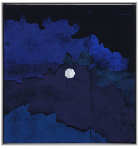
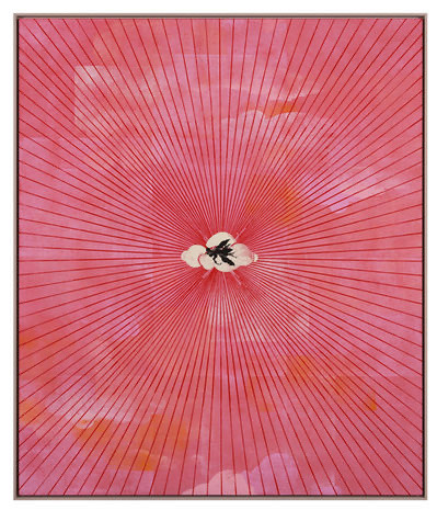
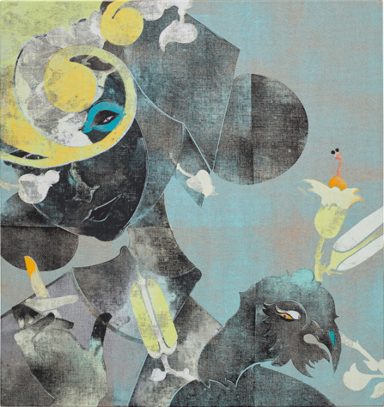
He gave me a couple names - Gert and Uwe Tobias. They work with huge woodblocks and I like how they use shape and colour:
Pool of twilight
Something else Eddie said was, regarding this idea, is there actually a pool? My answer is maybe technically. I had the idea of reflecting water onto a dark vertical surface. It would need to be constantly moving to have a constant reflection but that could be done quite easily. I still want to have a moon in it but I was thinking I could project it onto the surface or have it made of a reflective material. Basically trying to show it’s a source of light without simply painting it white.
Speaking of, my genius idea of mixing white acrylic and water and pouring it into the pocket didn’t change anything so I just painted it normally. Kind of annoying, I thought my iq was exponential for a second.
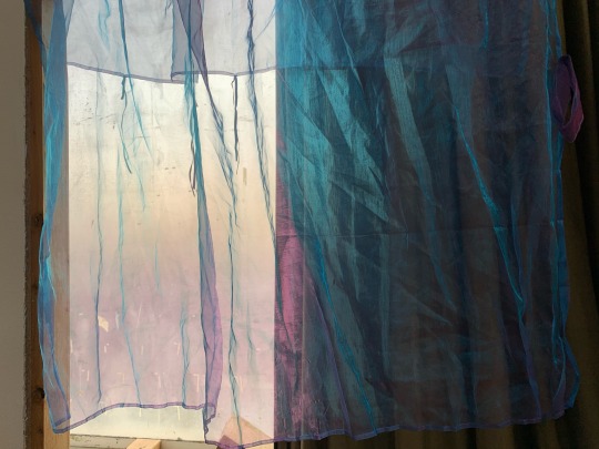
Also, going back to the water/projection idea, I have this purple/blue material that I could put in front of the dark surface. It should add colour as well as depth to the overall composition, and it could mirror the movements of the water. Like the water though, it would need to be constantly disturbed maybe with a hairdryer or something similar to what moves the water. Its colour is more pronounced when it’s layered so that while need to be taken into account.
Film module
I had a brainstorming session with myself, thinking how both me and my partner wanted to do something lighthearted and based in real life, and came up with a drug deal scenario:

Showed it to Ben and he liked it but mentioned that he works in a shop and sometimes has to wait for ages while people slowly accumulate pennies. He thought it was a good idea to further the joke and make the buyer count money for an awkwardly long amount of time, which I agreed to.
I wrote the script and we both liked it a lot. My shot directions are quite Wes Anderson inspired. I’ll link the script here:
It went down well although after saying he’d do the treatment, Ben didn’t get back to me and didn’t turn up to the meeting so I had to nervously carry the presentation 🙃
We had a couple talks about sound which were interesting and told me I need to think about sound a lot more than I do.
Anyway, my partner for the rest of the semester is Nathan Price, someone I actually know and can rely on. So far we’ve had ideas of deja vu and other concepts related to time. Nothing solid yet but it’s a starting point.
1 note
·
View note
Text
3rd year week 1&2
The first two weeks have been stressful for me, mainly due to my poor luck in teammates for the moving image module.
Moving image
Pre-term task
We were told to make notes for the task so I did so on my phone. What I didn’t know was that we were going to present our notes by sharing a document. So while the forts meeting was going on I scrambled to make a PowerPoint with my notes, but everyone else just did a word document which was very embarrassing for me, as well as my inability to talk clearly in front of a crowd. Yikes.
Instant film project
My partner and I were given the prompt “the Austrian experiment” which confused me, but my partner, Jamie Mathie, rather condescendingly said “The obvious first thought runs to famous Austrian scientist Erwin Schrodinger.”
As I said, I’ve had bad luck with teammates thus far, evident by this project. My partner didn’t respond to me for 3 days after that brief conversation, meaning 3 days without any progress done.
Eventually he did reply but we only had one day of research and one day of production. Throughout those days, he was flakey and wasn’t answering all of my questions despite reading the messages.
So, I took it upon myself to make the film individually. It was comprised of royalty free stock footage, voice recordings that I recorded under my duvet for soundproofing, and music that Jamie said was royalty free but I got copyright claims before my YouTube upload was even public. It was made in one day - the day before it was due.
That’s not like me and I wish Jamie had been more communicative so I wouldn’t go through that amount of stress. Despite that, some elements turned out well: the bookending with shots of eyes, some shots matching up bc (i.e. casino-coin-drop and couple-frames), and the monologue and music syncing at the end. Wish I could have filled something off my own though.
Scriptwriting assignment
My bad partner luck carries on. One of my teammates has moved to another module (why was he even in the list?) and another has decided to work with someone else. And so far (I’m writing this 3 days after the assignment was announced and 4 days before it’s due) my one remaining teammate and I havent even discussed it.
I think I’m going to do the rest of the term alone.
Fine art module
Has been less stressful. I haven’t done much so far due to the stress of the moving image module, but I’ve got a list of titles/ideas I want to work on. Knowing me I’ll get through about half of them throughout the year (maybe less due to corona).
So far I’ve been working on the title of “pool of twilight,” based on how my mum described the aesthetic of my room back home. Inspired by Andhika Ramadhian, I’ve laser cut a crescent moon-shaped pocket in a piece of mdf and painted deep purple’s and blues around it in gouache, like a mellow Leonid Afremov.
Then it came to painting the pocket white. I was running low on patience so I came up with the frankly quite genius idea of mixing acrylic with water and print it into the pocket. Aside from some gouache and mdf leaking into the mixture, it was quite successful in my opinion. My iq is exponential.
0 notes
Text
Journal - Final entry
Since the college closed, I’ve been unable to continue any of my projects since I required the CAP workshop to do so.
The meetings (group crit, tutorial and artist statement) have been useful: the group crit was mainly praise which was nice, but I didn’t really receive any new criticism, so it’s not really of note to me. My tutorial was mainly seeing how I was getting on and since I’m unable to do any practical work I was focusing on my essay, which I finished and handed in successfully. The statement crit was was helpful - I got a few ideas to make mine better.
I found the essay fairly challenging, partly because I was lacking motivation due to this whole situation and partly because it’s the longest essay I’ve ever had to do. But I think it turned out well and I’m hopeful.
Over the past month or so, I’ve been back home with my family. I’m helping my dad with some filming for a video series he’s doing and I’ve rediscovered Minecraft which is keeping me busy. I’m also in the process of redecorating my room which hasn’t changed since I was in primary school so it’s a fun time.
0 notes
Text
Journal - Week of 16/03/20
Monday
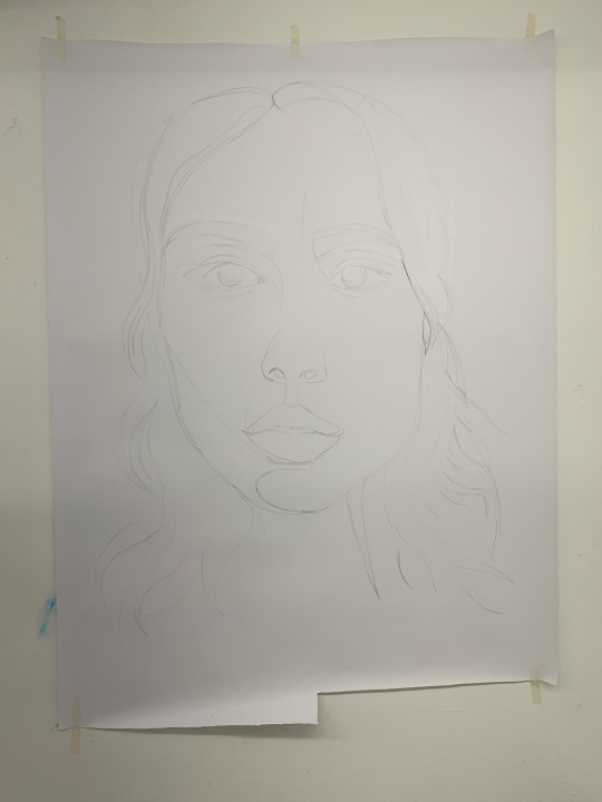
While I was waiting for the laser cutter I had the idea to make a BIG Lilo Negative-like piece. I it’s a bit off. Proportions are a bit off but it doesn’t matter that much, and it’ll be less obvious once it’s cut.
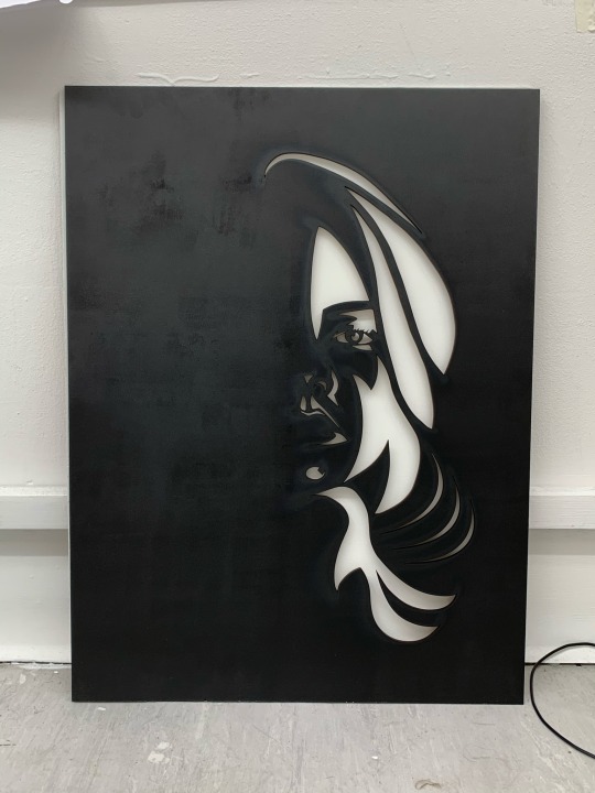
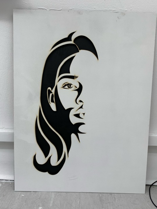
Laser cut the boards and they look smashing. Now to touch up areas and paint the inside of the black one white.
Tuesday
Did the aformentioned things, the latter of which took a while to get the paint in all the nooks and crannies as well as paint enough coats.
And then we got the email saying the buildings were closing the next day. So I started getting everything out of uni and to my flat. Stress.
Wednesday
Ooh what a day. Realised that the laser cutter offset the cut by about a centimetre so Sisters is off centre and I couldn’t get them cut because apparently the cap workshop machines were remotely powered off. Yay.
Got all my stuff out of uni which took a while. Too much stress to do anything else.
Thursday
First video meeting was very awkward but successful. Just clearing stuff up. What a time.
Friday
Painted over the stray white paint from the other day and all there is to do now is get the boats cut down, paint the sides and stick them together. But god knows when I’ll be able to do that.
0 notes
Text
Journal - Week of 09/03/20
Monday
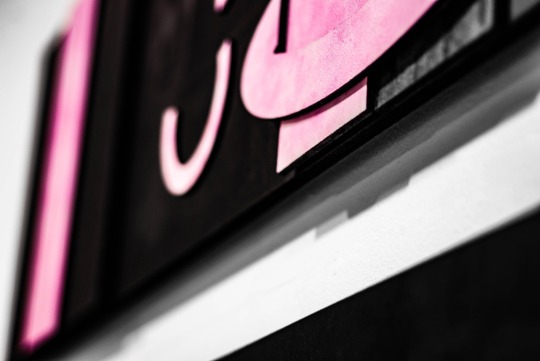
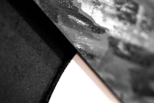
Hang up TSE! It was somewhat of a hassle but it looks very nice. No idea what I’m going to do with it after assessment.
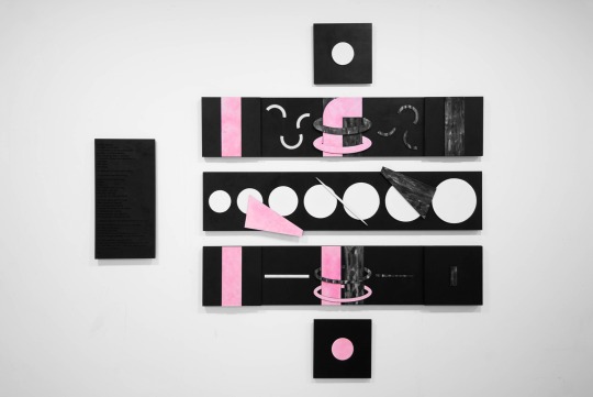
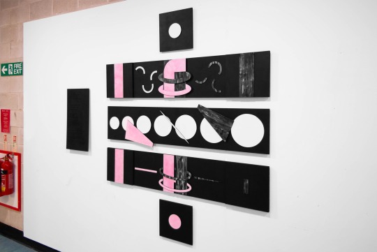
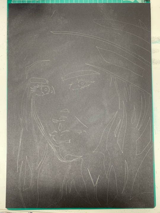
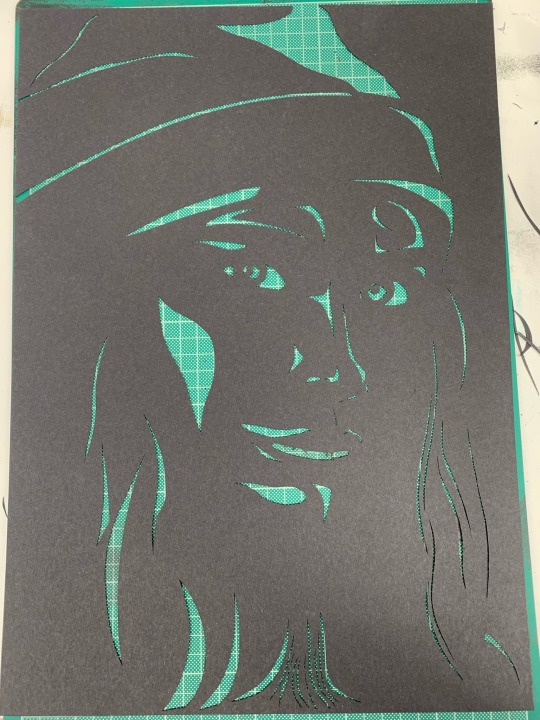
With that done, I continued in the prototype. I finished cutting the white card and realised that it would be a much better idea just to use that as a stencil for the black. So I erased what was on the black and drew straight onto it with the white. Then proceeded to cut the black. There was less to cut than the white so it didn’t take as long.
Tuesday
With a couple other pieces of card between the others, I stuck it all together and suspended it. I think it’s a rather intriguing idea with good execution. My plan for the actual thing is to make it out of mdf.
Wednesday
Got back to working on the digital drawing for the actual thing. Took the whole day and some of the next.
Thursday
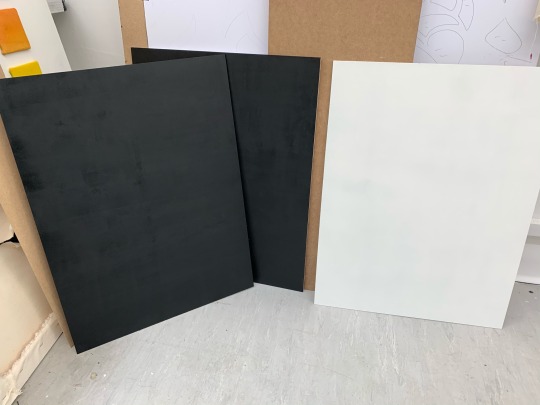
After finishing the digital drawing, I went and got some fishing wire and mdf sheets (450 x 600 cm - small enough for the smaller laser cutters but still with a decent scale). I got three - one for each side and one in the middle, which will be painted black on one side and white on the other. Gave the white sides a couple coats of primer.
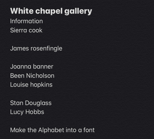
I had my open tutorial with Gair and it was very helpful, he gave me some artists to look at regarding the stuff I’m working on. He seemed to like it which was lovely. He also told me to check out a text and gave the suggestion of making my folded alphabet into an actual digital font, which I’m intrigued by and intend to follow through.
Friday
Finished painting all the sheets. Waiting until Monday to cut them. Will work on my essay over the weekend (god help me).
0 notes