
Don't wanna be here? Send us removal request.
Statistics
We looked inside some of the posts by wgterm1project and here's what we found interesting.
Average Info
Notes Per Post
2
Likes Per Post
2
Reblog Per Post
0
Reply Per Post
0
Time Between Posts
4 hours
Number of Posts By Type
Text
16
Video
1
Last Seen Tumblr Blogs


Fun Fact
Women make up for the other 50% of Tumblr’s audience.
Text
Evaluation
I this project I have learnt a lot of new skills. I used InDesign and Tumblr for the first time. I have also learnt many new technique such as Low Poly, 2D art, digital art and, even though it’s still not excellent, I have improved my drawing. The course has also give me the opportunity to write more - I haven’t been writing any long texts for about two years and it’s made me more confident with my writing.
Furthermore, I have discovered some new artists that have influenced my work hugely. That includes Saul Bass, Zdzislaw Beksinski and Timur Lysenko. All of them work in completely different styles, yet all of them have been a huge inspiration for me mainly because of how versatile they are and how recognisable their work is.
Some of my favourite designs are the “Our minds distort our mirrors” one and my poster for ”The clockwork orange’. In both of them I used my own ideas and techniques that are not conventional. Those to pieces really stand out from the rest of my work. I felt the most confident making those and I still really like them and think they are very strong pieces.
If I had more time,I wold’ve spent it on improving my Tumblr and adding posts to it more regularly and I am wishing to do that with my next project.
I enjoyed independent work on my Don’t Panic Pack the most as that has let me to unleash my creativity and do something original. I am very happy with all of the work I have produced.
0 notes
Text
Don’t Panic Pack - outcomes
1. The envelope

2. The postcards
Pink and blue
Poly art
3. The poster
0 notes
Text
Don’t Panic Pack - inspiration
Don’t Panic is a company like no other. What’s so special about them is what5 they make - Don’t Panic Packs. They are envelopes that anyone can collect for free free at the exits of choice events, from one of their dispenser stockists or buy a £3 monthly subscription. Some people might overlook them and they are truly missing out. That is because Don’t Panic Packs have some of the best artists’ art pieces inside of them - exclusive posters, stickers and other treats that are every collector’s dream! They have been operating in the UK for over a decade now.
My project about obesophobia was isnpired by Don’t Panic Packs and especially their posters:
1. Banksy’s Forgive Us Our Trespassing

Forgive Us Our Trespassing is not only a Banksy’s poster though. In 2011, he made his largest known, seven meters high piece. According to the article Banksy’s Monumental Reckoning: 'Forgive Us Our Trespassing' “The imagery itself is a potent and moving revelation of Banksy’s conflicted feelings about being a graffiti artist, speaking to deep preoccupations and pathos that underscore his artistic production. By asking for forgiveness, Banksy acknowledges the concerns of those who see his work as vandalism, but seems to convey that he ultimately means well, asking for understanding. “
This is the 7m high piece that you can find in Salt Lake City, Utah.

This poster inspired me to combine completely different techniques (realism/3d with flat illustrations)
2. Linda Zacks’ Peer Pressure
Linda Zacks is a contemporary artist, award-winning art director, and graduate of Brown University and the Rhode Island School of Design. Her powerful visual storytelling style—part paint, part poetry—hopscotches between every medium, blurring distinctions between commercial projects and fine art along the way. Growing up outside of (and throughout) the U.S. shaped her mixed-media approach to creating dynamic works, and nothing in her practice—old wood, torn paper, rusty metal, ink, duct tape, Polaroids, digital conversations, video—goes unused.

This poster, especially the type at the top, inspired me to experiment with the blending modes more and to not be afraid of colour.
3. Nik Ill’s Tri Infinity

4. Sam Ashton’s Nature
Both posters (4 and 6) have geometrical motives that gave me the idea to start generating work using geometry as well.
5. Chris Gray’s Stress

6. Kate Gibbs’s Disability

7. Gelman’s Image is Everything

All of the designs 5-7 have a very strong colour theme and are all in 2D. I really liked it and I used this technique in some of mu postcards.
8. Nick McFarlane’s City Life Amsterdam

9. Adrian Cooper’s Fear
I really like the gradient background featured in the 8-9 posters. It gives more dimension to the design. I used it in almost all of my work for this project.
10. Anna Higgie’s Culture

I think that the type on this man’s face looks immaculate and it inspired me to use an illustration from the penguin book in my poster design which was a very good decision.
0 notes
Text
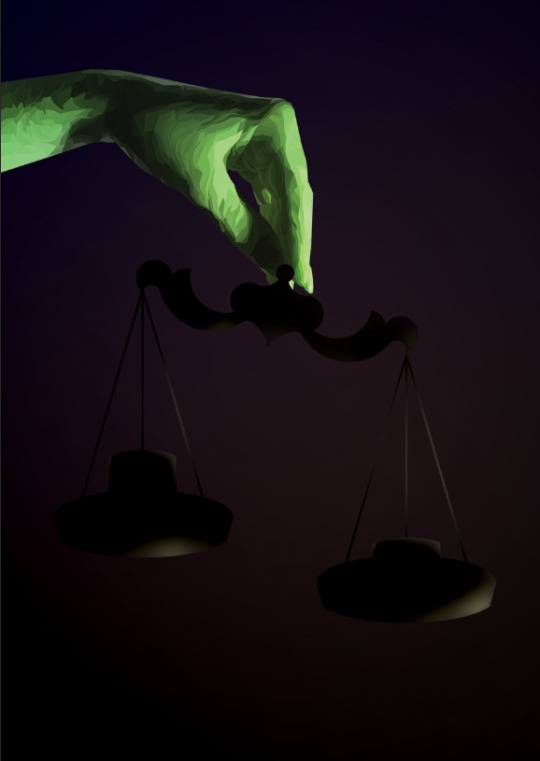
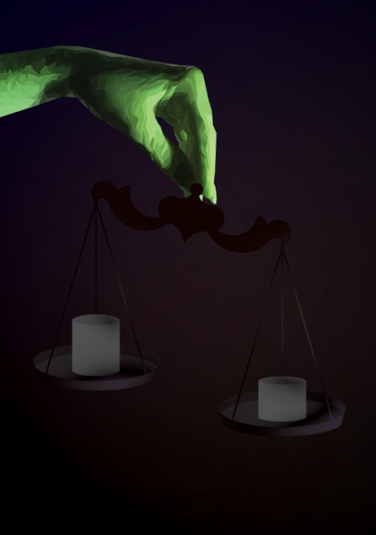
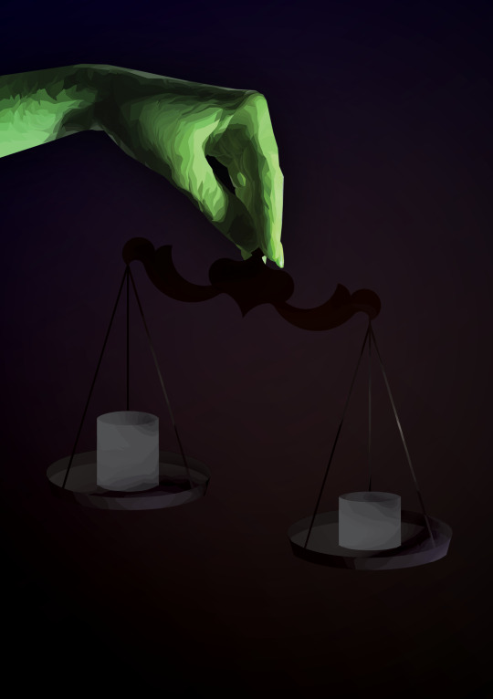
Don’t Panic Pack - postcard #6
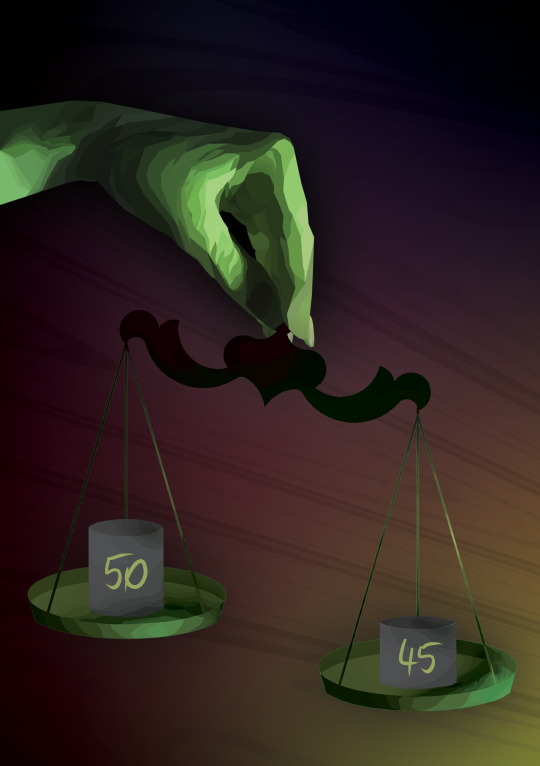
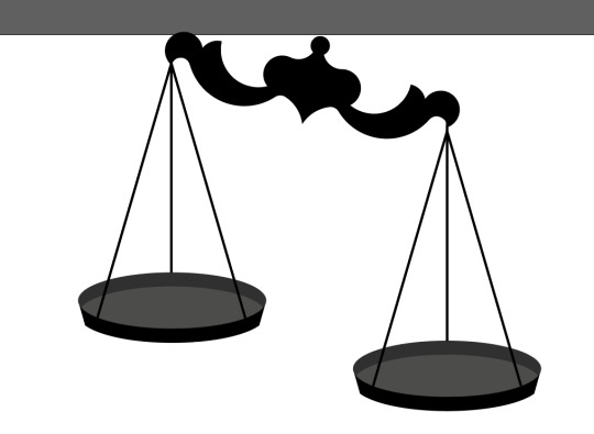
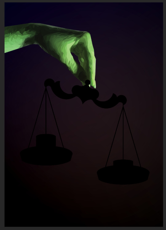
This postcard was the hardest one and the most time consuming one for me to make. I was inspired by the film The Pyramid and Anubis who was weighing hearts. By weighing the heart of a deceased person against Ma'at (or "truth"), who was often represented as an ostrich feather, Anubis dictated the fate of souls. Souls heavier than a feather would be devoured by Ammit, and souls lighter than a feather would ascend to a heavenly existence.
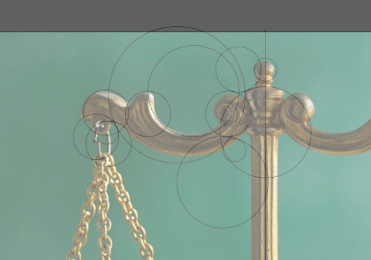
The thing I did first was to download a photo of balance scales.

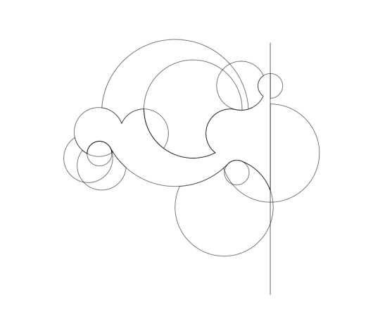
I then created an illustration of scales using the Fibonacci’s spiral.
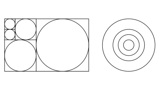
I overlapped a lot of circles to create the shape of symmetrical scales that I wanted, then I used the Shape Builder Tool to merge them into one, copied it, reflected and merged again.
Once that was finished, I needed to create the shape of the plates. I still wanted to be following the Fibonacci’s sequence proportion so I used the big circle, duplicated it, placed in the centre of the other one and then flattened one of them down.
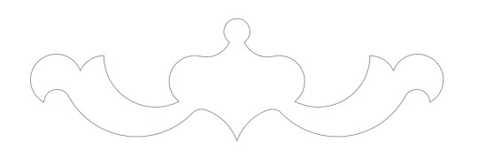
To create the plate shape, I copied the flat oval twice, put one of the ovals below the other one, connected them with straight lines and used Shape Builder Tool to change the shape. Unfortunately I didn’t screenshot this step but the result of it can be seen below.
This is what my balance scales looked liked once I finished them.
I also needed some weights - I created them in the exact same way only with a smaller size circle.
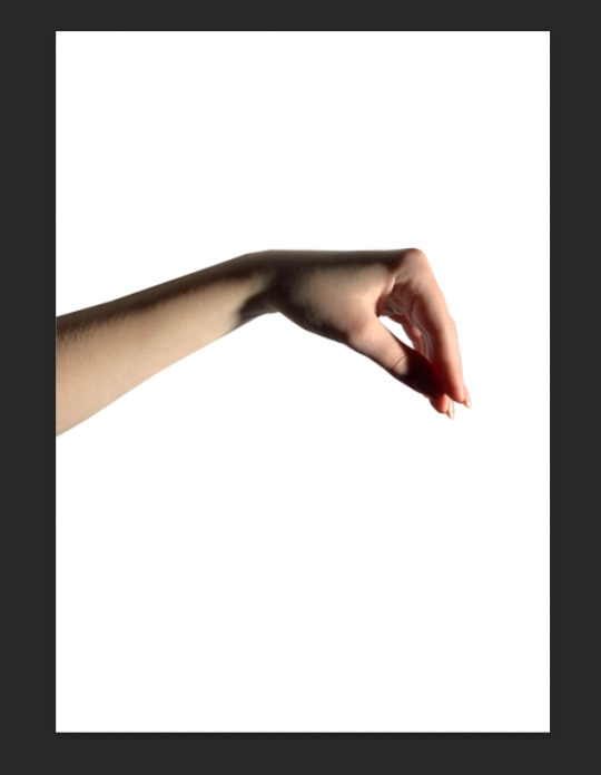
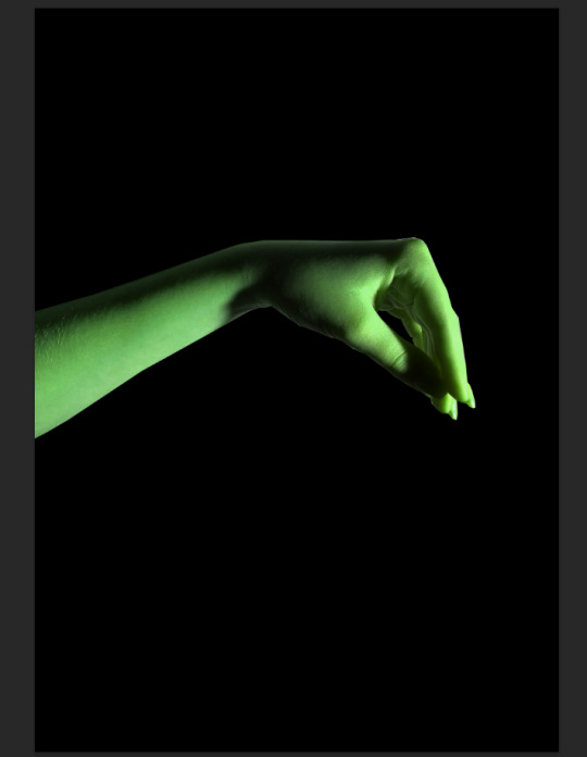
I then needed a photo of a hand that’s holding the scales so I took a picture of my own hand. I edited it in such way that the photo was green - the colour of balance.
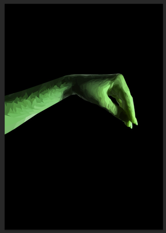
I used the poloy art technique again.
I placed the hand in such way that it looked as if it was hinging limply. I also added some brighter colour in trhe background to have an idea of what it would look like at the end and to see the dark coloured scales better.

I wanted to add shadow onto the scales and the weights to make it look more realistic and to make it possible for me to polygonise it later.
To do that, I duplicated the layer and changed the colours to black using Levels. Then, I selected all pixels within the layer and added some light colour spots where I imagined natural light streaks would have appeared.
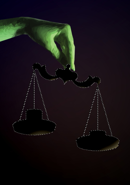
I then set the blending mode of the layer to Lighten.
At this stage, I was able to use the poly art technique on the scales.
I didn’t like the way that the scales were almost invisible when looking from a distance because of how low the contrast between them and the background was so I created a new layer with the scales where I painted them green the same way I added highlights to them earlier. I set the blending mode to Vivid Light and brightened up the weights a little bit alongside changing their hue to make them greener. At this point I was also experimenting with the background.
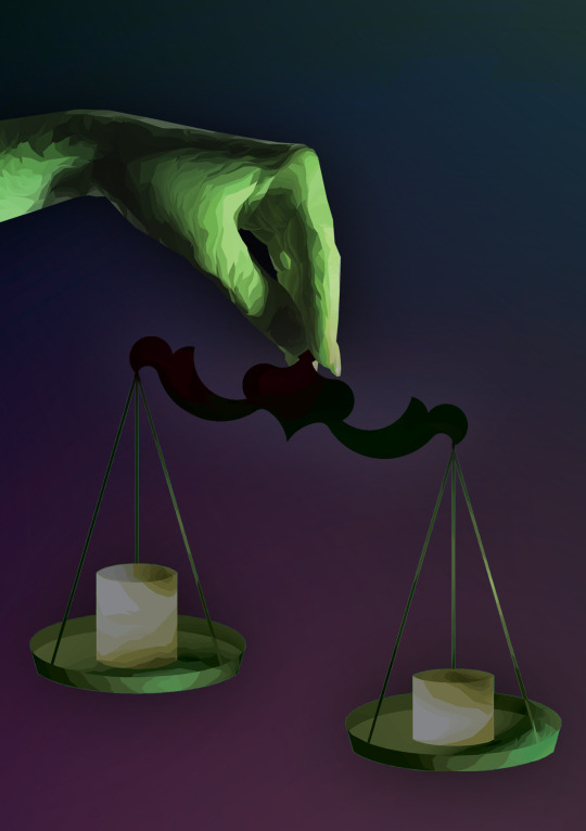
I didn’t like how small the polygons on the hand were compared to the ones on the scales so I had redone them. The background didn’t go well with my design either so I changed the colours and added a layer with type that I distorted using the Shear Filter. I also changed the colour of the weights because they looked more like candles the=an they did like weights.
I then added the final touch which was the numbers on the weighs to show how bizarre the mind of a person with an eating disorder can be. The metaphor behind this design is that the person chose to be lighter regardless of how dangerous and deadly it might be.

0 notes
Text
Don’t Panic Pack - postcard #5
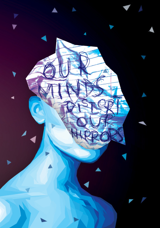
I made this postcard using the same polygon art technique as in the one with roses. I downloaded a photo of a women with very defined facial bones and with lots of highlights and shadows in it. I then changed the hue/saturation values and adjusted brightness and contrast to end up with a blue/purple photo. I did so because I wanted my final design to look like the person’s silhouette is made out of shattered glass.
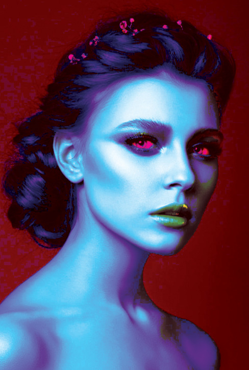
This is what it looked like once I finished making the polygonal shapes. I purposely didn’t do the woman’s face - I just didn’t need it and it would be a waste of time. I tried to place the polygons in such way that they look almost 3D.
I wrote “OUR MINDS DISTORT OUR BODIES” on a piece of paper, crumpled it and took a photo of it.

I then adjusted the brightness and contrast values, cut out the shape that I liked and placed it into the file with the woman on a new layer.
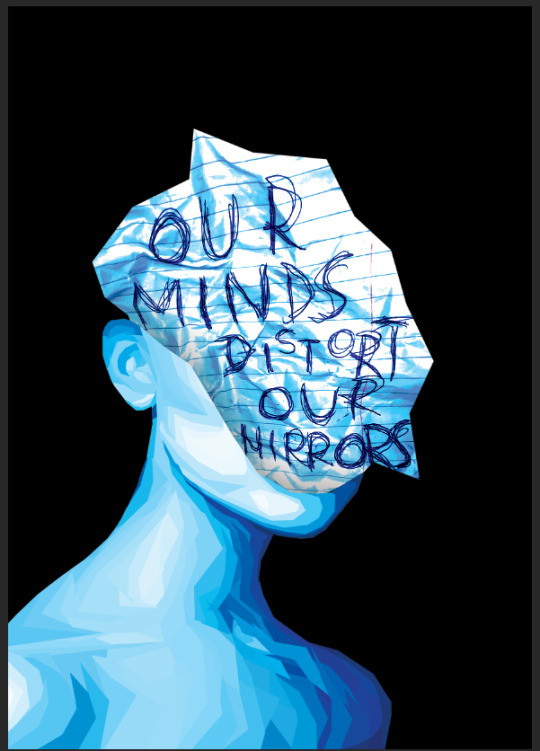
Once I’ve finished that, I added some triangles that would imitate the pieces of broken glass
I then added some more colours to the background and experimented with the blending options. I really like how it turned out. It’s definitely my favourite design from the project.
Apart from it looking beautiful, it has a very important meaning. Most of my designs were touching the subject of eating disorders. This one however is about both eating disorders and mental problems which are just as important part of the problem of obesophobia. This postcard is about body dysmorphia which is not spoken commonly about but is a very common disease that can lead to even more serious mental illnesses. A person touched by body dysmorphia doesn’t know what they look like because their mind makes their body image change even as frequently as a few times every day. As a result, an ill person doesn’t perceive their own body as beautiful and hyperbolise all of the little imperfections they have got.
0 notes
Text
Don’t Panic Pack - postcard #4
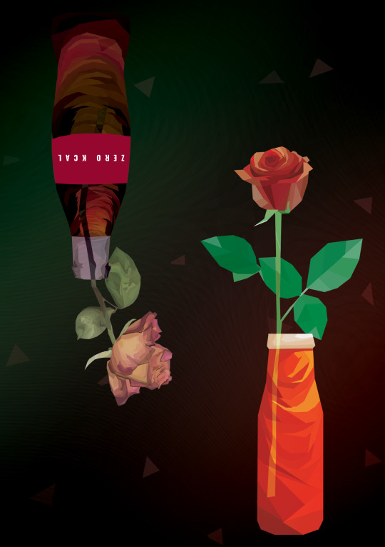
For my fourth postcard I wanted to use a motive of “good against bad” food. To do that, I decided to use one of the ideas I have used previously in the postcard with the can of a zero calorie drink. I think that it’s not a problem that I used a similar idea twice because of how different techniques I had used. I didn’t watch any tutorials and tried recreating the poly art style purely based off the Photoshop skills I have already had.
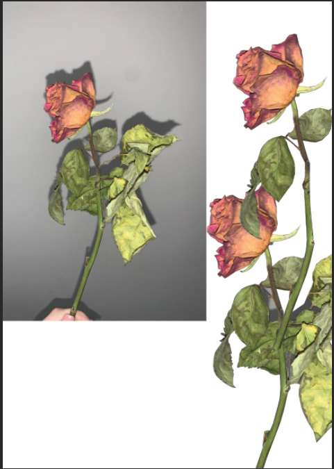
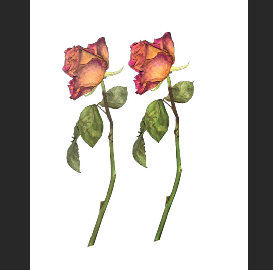
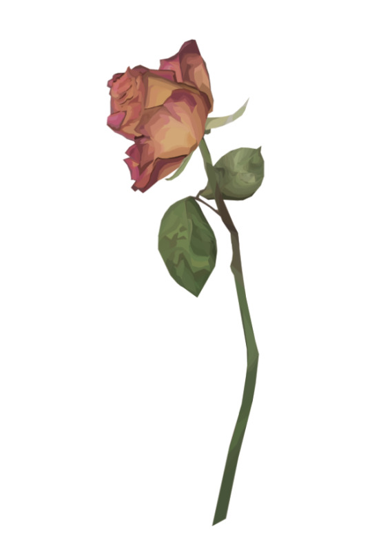
To create my illustration, I needed a photo of a dried rose, however I couldn’t find any on the internet that would be suitable for this project, so i bought some roses, waited a few days until they were completely dried and took photos of them. This is the photo I decided to use in my project. I cut out the rose from it and duplicated the layer (just to have a backup in case something doesn’t go as planned).
I selected small parts of the photo using Polygonal Lasso Tool,
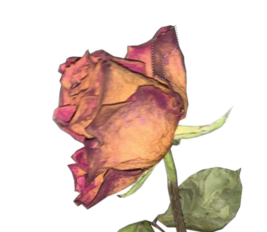
Then, I used Filter -> Blur -> Average.
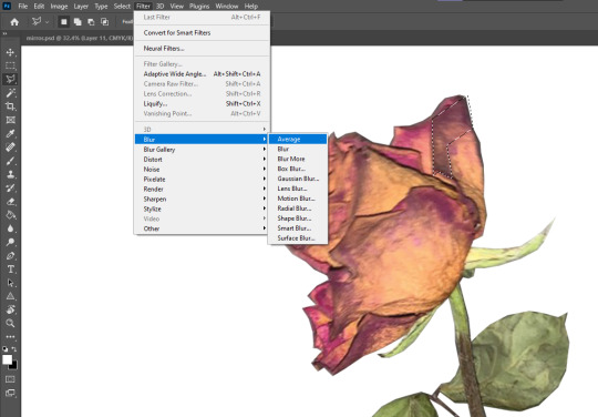
I repeated it many times and this is what it looked like during the process. I didn’t like the colours that I ended up with. They were all very similar, brownish and not what I was expecting them to be so I adjusted the photo’s brightness and contrast and started all over again.
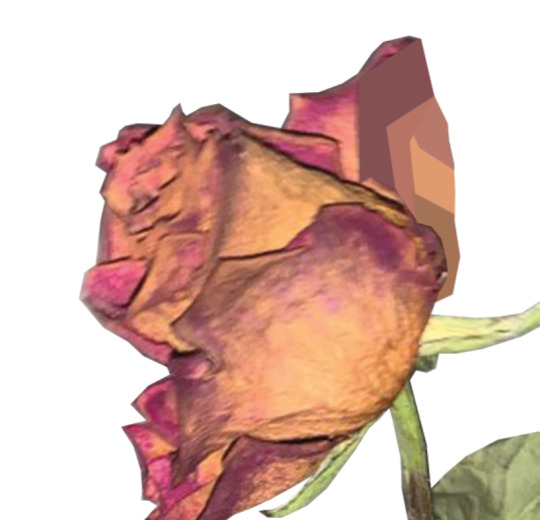
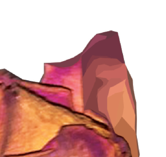
This is what I ended up with.
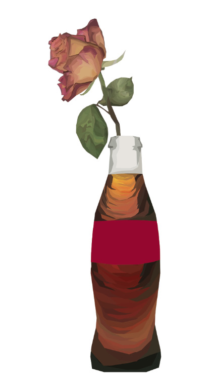
I then repeated the same steps using a photo of a very popular drink in a glass bottle with a red etiquette.
Then, I needed to create a second rose that was bewautiful, rich in colours and would be of great contrast to the dried one. I decided to do a red rose in a glass of juice inspired by this one picture I found on the internet.
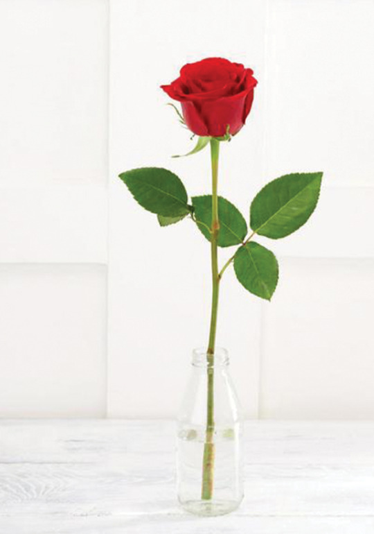
This is the red rose.
My initial idea was to have them placed side by side on an A5 document or to have a postcard that’s double-sided but I turned them down. Instead, I decided to create a postcard that you can look at from two perspectives, it doesn’t have a “top” and the “bottom”. This is what it ended up looking like.
I added some triangles in the background, green and red colour. The colours symbolise the contrast of poor diet and the effects it gives with a rich diet full of nutrition and shows exactly how mind of a person with an eating disorder perceives certain foods - even though orange juice is much healthier and better for their body, some fear drinking it just because it will give them a higher calorie intake than they would have if they’ve drunk a zero kcal drink instead,
At the end I changed the bottles’ blending mode to Hard Light. This way it looks much more realistic because the bottles and the liquid inside of them are no longer a solid colour.
0 notes
Text
PolyArt
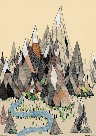
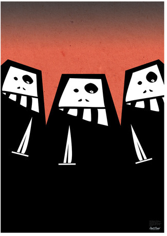
Once I’ve finished 3 of my postcards and was scrolling through pinterest, I found a style that I immediately fell in love with - poly art. Poly art is a style that incorporates very simple and angular shapes that, when looking at them from a distance, don’t look like polygons anymore. I found it really fascinating and wanted to try it out and use in my project. Here are some of the illustration that I was inspired by.


1 note
·
View note
Text
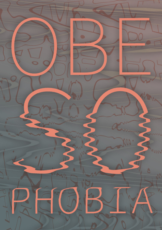
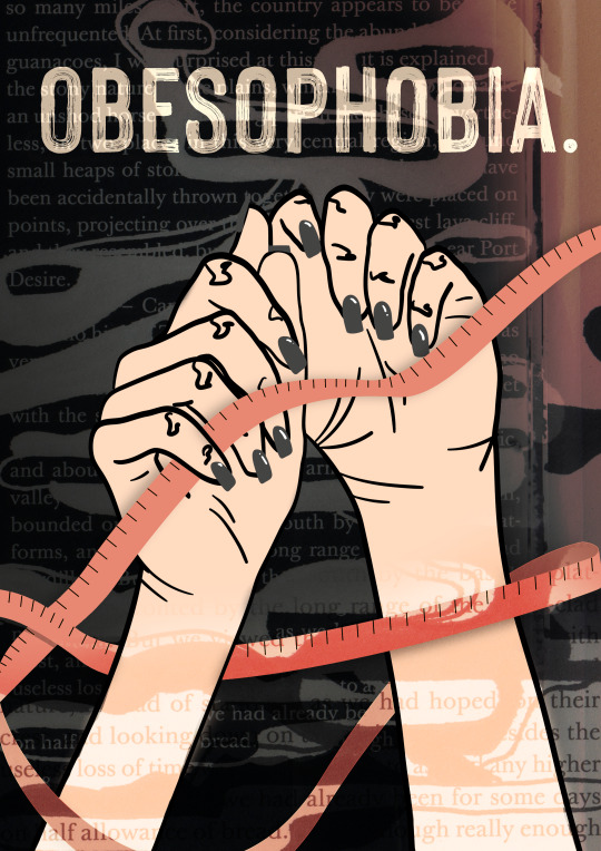
Don’t Panic Pack - postcard #3
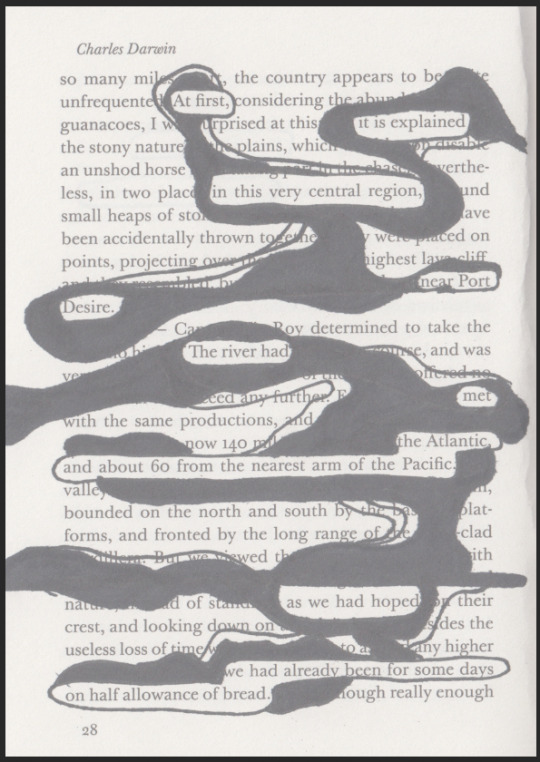
For my third postcard I wanted to use some typography to show that even though photo editing and illustration are my strengths, I am versatile and can work with type just as well.
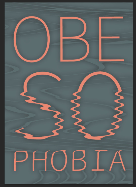
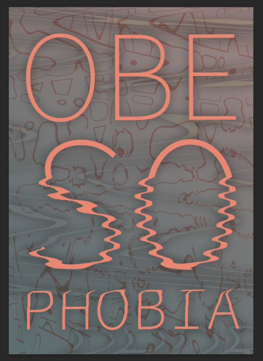
Because my other designs were very simple and minimalistic, I wanted this one to match them. I used a scan of the text that I printed out at college. I was moving the print while it was being scanned to distort my type. I only used one of the scans that I’ve made. I especially like this one because it distorted the SO part of the word OBESOPHOBIA. It subtly points out that the subject of obesophobia is very often not taken seriously.

I put this scan into a .psd file, thresholded it and changed the colour of type. I also added shadow to make the type stand out.
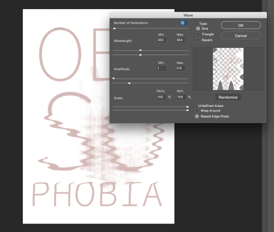
I decided to add some wavy lines in the backgound to make it look more interesting. I pasted the scan one more time into the document and used the Wave tool to create the perfectly imperfect lines that I was going for.
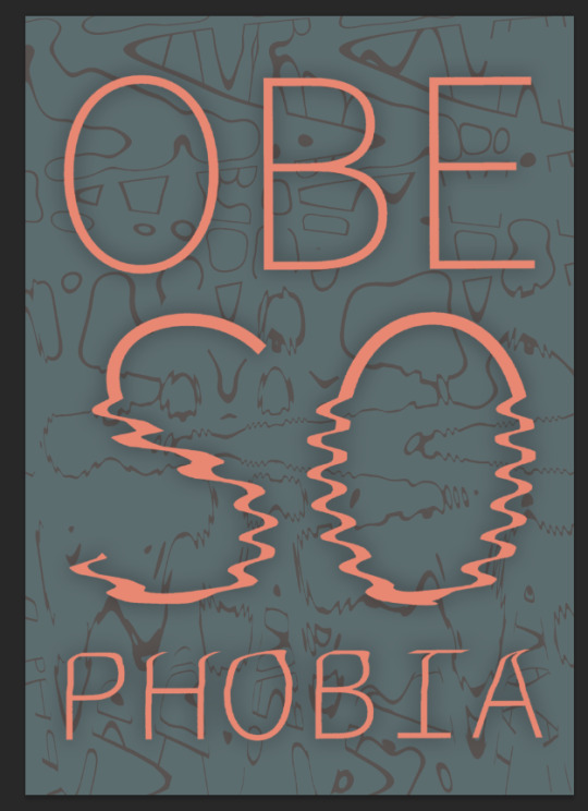
The screenshots below are not from my final design that I used but they show exactly how I used the Wave generator.
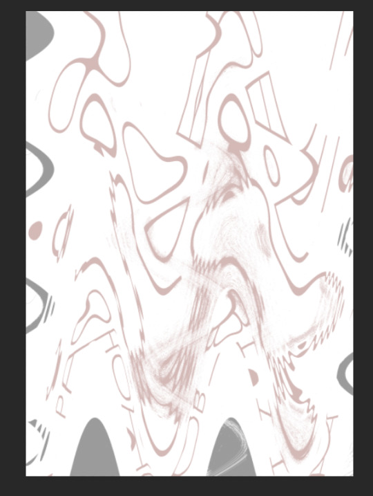
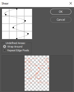
I added even more distorted lines using the Shear tool an really just experimenting with it. I set my the finished version of the layer to the Darken blending mode.
I added some more colour to the background using the Gaussian Blur technique shown in my other posts and this is my final outcome and set the layer’s blending mode to exclusion. This is my final outcome
0 notes
Text
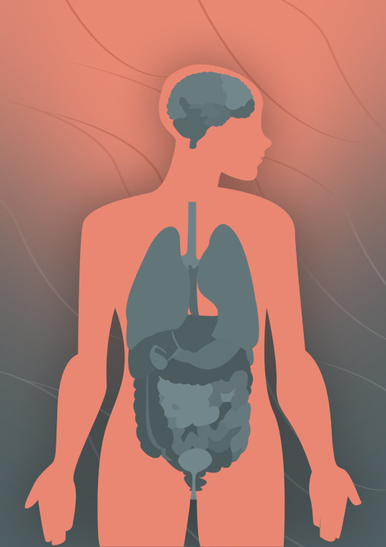
Postcard #2
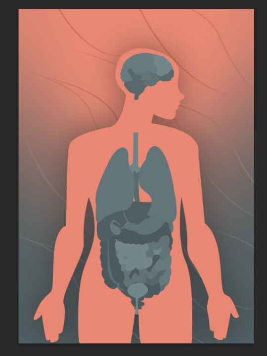
I wanted this postcard to be all about the health complications that come with having a severe eating disorder. Apart from just being underfed, they might cause some serious health problems that can eventually kill the ill person. Eating disorders have a huge impact on all of our organs even if they are not a part of our digestive system.
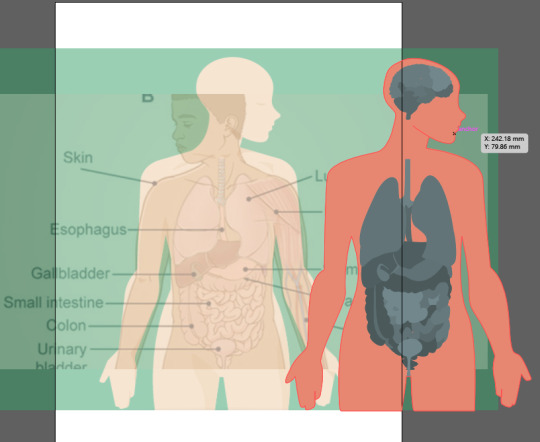
I made a “collage” using two illustrations found on the internet and traced over them in Illustrator using the pen tool. I traced over every single organ and then painted them different shades of blue to be able to actually distinguish one organ from another using the Live Paint Bucket Tool.
I copied and pasted it into a new .psd file. I then added shadow (Drop Shadow) and a background in the same colour as the body. The simplicity of the illustration has let me to have some fun and experiment a bit more doing the background,
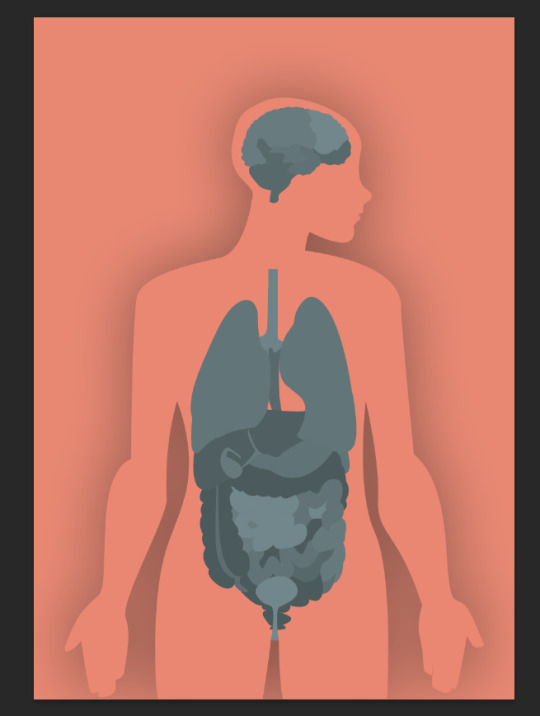
I used one of my tried and trusted techniques which was sample a blue colour from my illustration and to draw awkward shapes using the brush tool in Photoshop to later Gaussian blur them and manoeuvre in such way to achieve the desired result.
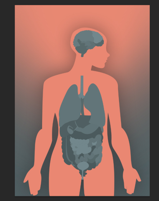
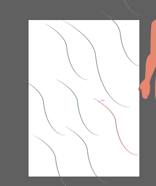
Since the background looked a little empty, I decided to add some more detail into it. I created a path in Illustrator, copied it several times and set the stroke profile of it to Width Profile 1. This way, simple lines could mimic hair. One of the most common “side effects” of having an eating disorder is extreme hair loss which happens to almost everyone who is not eating enough. I really wanted to incorporate a motif of hair in one of my designs and the one regarding health just seemed to me like the perfect one.
I set the hair’s blending mode to Luminosity because I like the way it looks as if it’s shiny just like real human hair.
0 notes
Text
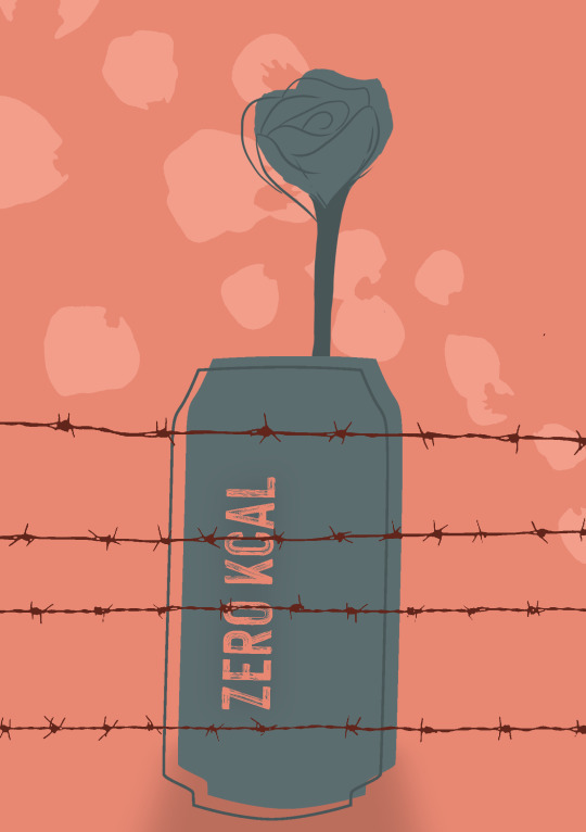
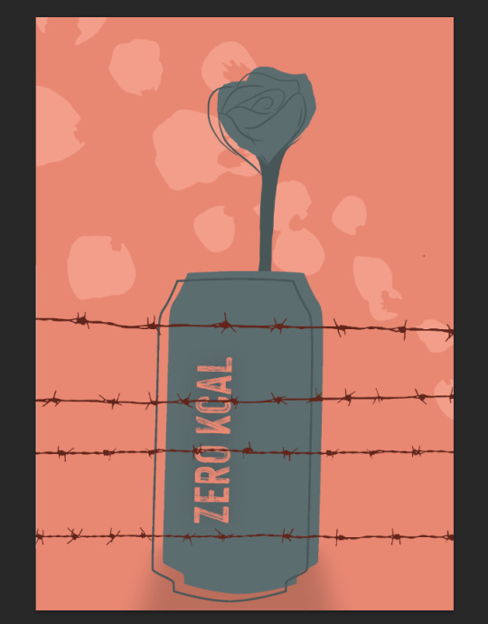
Don’t Panic Pack - postcard #1
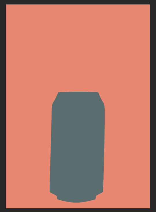
People who suffer from obesophobia often don’t give their bodies the right nutrients they need in order to grow and stay healthy. One of the classic tricks explained in most of the pro ana content is drinking a lot of zero calorie liquids. That is drinking a lot of water and the most importantly - energy drinks and fizzy drinks. If we put a lot of liquid into ur bodies, it gives us the illusion of being full. Drinks such as coke zero are even more welcome - because they are sweet, they stimulate the person’s taste buds and are just a better experience than drinking water. Because of that, it’s very common that they go days without eating (or eating minimal amounts of food) and substitute their meals with said zero calorie drinks. They are one of the things that “scream” the words “eating disorder” to me but for a person who has never experienced a serious eating disorder or hasn’t had a close one suffer from it, drinking zero kcal drinks is normal and would never be associated with a mental illness. Because one of my project goals was to raise awareness, I decided to incorporate it within my design.
The first step was to draw a can of drink in Illustrator. Once I had done that, I copied and pasted it into an A5 Photoshop document. I chose the background to be pink and the illustration to be greenish because I associate green with something bad, poisonous and possibly hazardous for your health.
The next step was to draw the rose. I am not the best at drawing so it didn’t really look like a rose and more like a triangle made with wiggly lines.
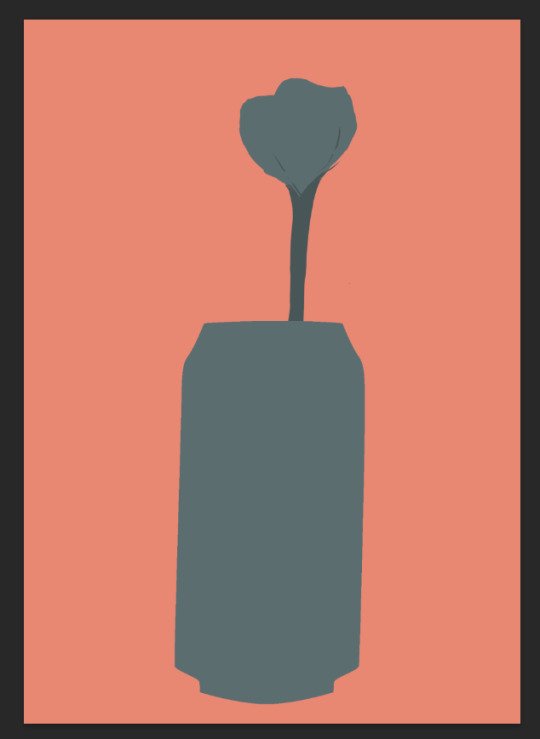
I didn’t want to be redrawing my illustration because I was not enjoying doing it, so I added more detail into it. I have drawn the outlines of a rose and a copy of the can this time using only the outlines of it as well.
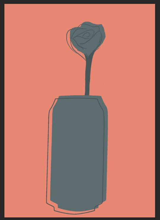
I still wanted to keep my postcard, however meaningful, as clean and minimalistic as possible. I added shadow to make the can look as if it’s on top of a table.
Double click the layer -> Drop Shadow -> right click the drop shadow from the layers menu and choose Create Layer -> move around and manipulate the shadow layer by first pressing ctrl + t and then by dragging the handles while holding the ctrl key until you achieve the effect that you are going for.
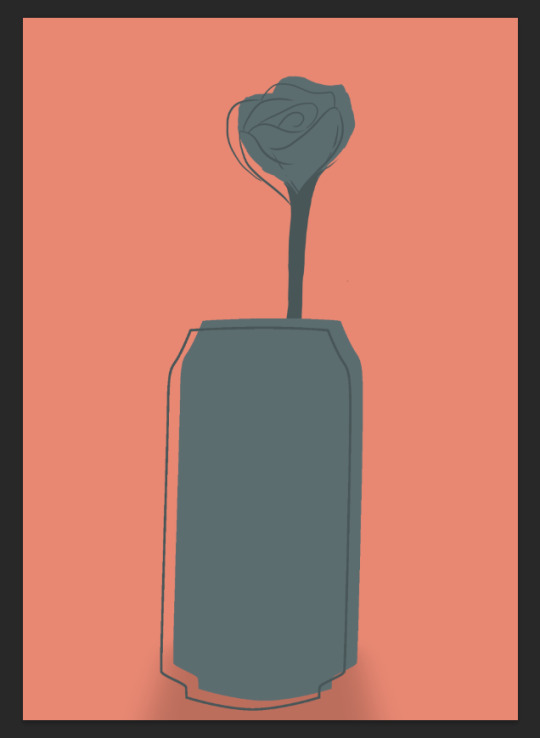
I added text to my work (I used the same font as in my poster) and petals that I had drawn in the background (blending mode set to Linear Dodge). They symbolise that even though a person who is malnutritioned will not admit it and looks fine at a first glance, is literally slowly dying.
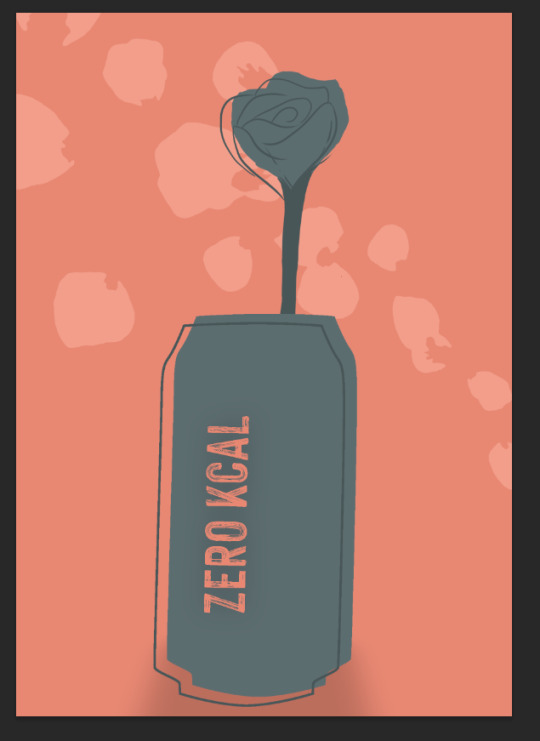
To top it all, I added an illustration of barbed wire that I found on iStock to my design. It represents the love people have for their eating disorders, how protective they are over them and that they can’t go away as easily as everyone would want them to.

1 note
·
View note
Text
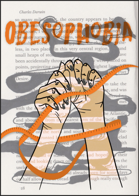
Don’t Panic Pack - poster - design #2
I first pasted the scan and lowered the layer’s opacity, inverted it and set the layer’s blending mode to Difference.
I repeated the above steps on another layer with the scan but this time I didn’t invert it. I liked the way it looked when I overlapped the layers because I wanted to use this as a background and because the colour s are so dark and muted, they wouldn’t be distracting for someone looking at the poster.
I then put another layer with the scan on top of the previous ones. I placed it in such way that the left edge of the scan was aligned with the centre of the document. I then created a layer mask and erased it into a shape that I liked using a soft brush in black. This really framed the background and looks almost like a subtle light flare which is the look I was going for.
I added the hands that I had drawn earlier but they were invisible on such a dark background so I added a new layer filled with a light colour (similar to a typical Caucasian person’s skin), created a layer mask and . I like how the light colour really contrasts with the dark background.
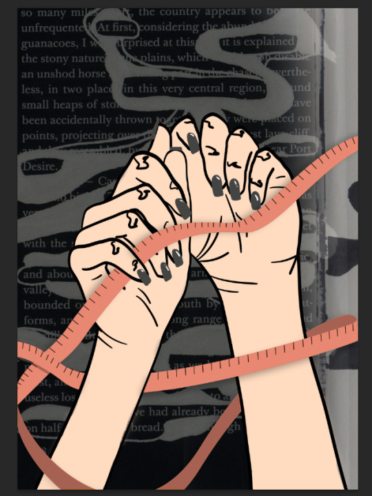
Even though I already liked my design, I felt like it was too blunt. I decided to add more details in order to make it look more engaging and intriguing. I really wanted to keep one colour theme within this piece so I used the eyedropper tool, made two thick shapes on the edges of the document and used Gaussian Blur. I then put it below the layer with the hand fill set the blending mode to Color Burn. It’s very important for me that every part of all of my pieces is well thought-out. I believe that it is the key to making the design look to look consistent.
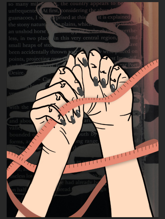
To balance all of the dark tones, I decided to brighten up the bottom of my poster just a little bit more. That’s why I added yet another layer of the scanned page, put a mask on it and erased most of it with a black brush until I was happy with the shape that I got. I then changed the blending mode to Overlay. I really like the way it looks because it makes the pink tape look like there’s blood on it. It was not intentional, however it was a very happy accident that gives a lot of room for interpretation for a person that is looking at my poster
I also added the title of my project into it. I used the Hackney font because I liked how simple the shapes of the letters are, yet there are some transparent strokes on them that give the text a lot of texture. I used a colour that I sampled from the hands’ fill and lowered the colour’s value a little, then I changed the blending mode to Linear Light.
0 notes
Text
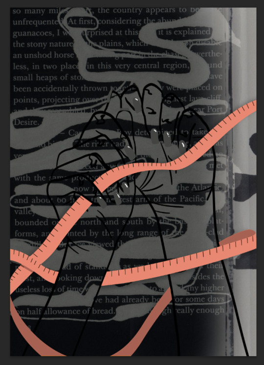
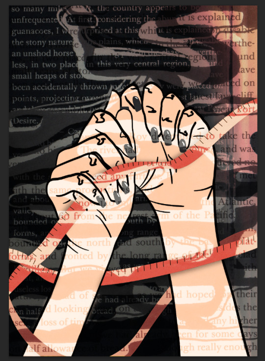
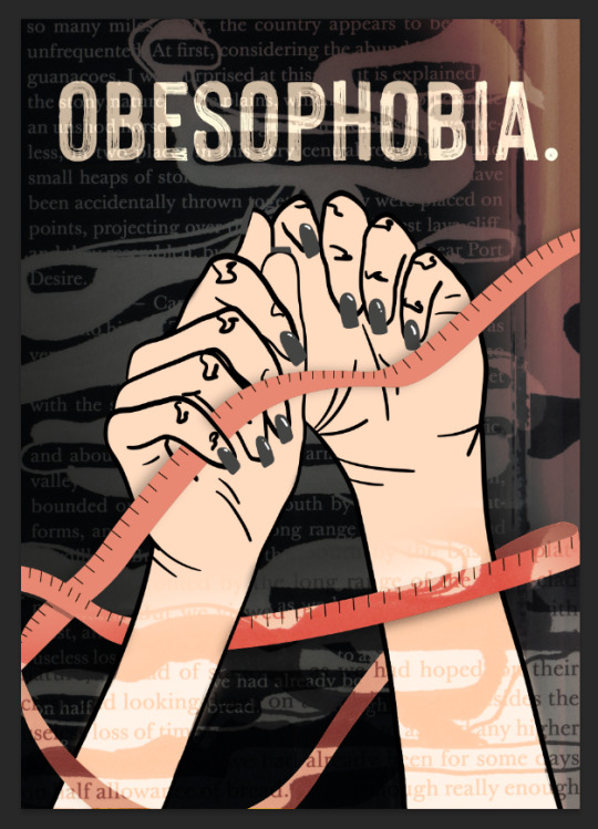
Don’t Panic Pack - poater - design #1
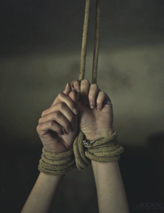
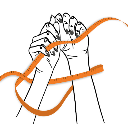
The thing that is the worst about obesophobia is the fact that once a person gets into it - it’s very unlikely they will ever get rid of it. Even though it is the reason why people develop most eating disorders, recovery is treated like a physical illness, not a mental illness. Recovery is considered complete and positive when a person’s BMI isn’t below abnormal anymore and if they no longer show signs of an eating disorder. Because of that, eating disorders are so hard to fall out of. Even years after recovery, most people still count calories and struggle with eating and are like prisoners of their distorted minds. To show that, I decided to illustrate arms that are tied with tape-measure.
At first, I had to draw the arms. I needed to trace a picture of them that I found on Pexels and placed in an A3 Illustrator document.
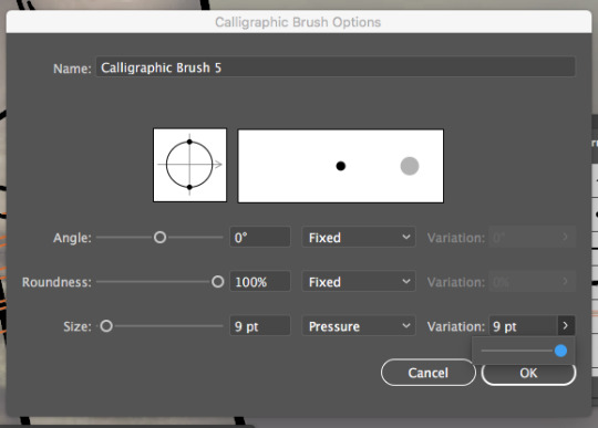
I didn’t want all of the lines to be of the same width, so I created a new brush.
New brush -> calligraphic brush -> change the size from fixed to pressure and adjust the variation. This way, the thickness of my lines was dependant on how hard I pressed my stylus on the graphic tablet.
I started creating the lines to mimic the robe from the photo above however I didn’t like the way it looked so I turned down this idea and decided to still incorporate a measuring tape within my design but I wanted it to be looser and looking as if it’s resting on the person’s arms.
I then scanned an illustration from my penguin book that I have made in one of Nicole’s workshops. At first I didn’t really like it but after a while I realised it could be a very good looking background.

I lowered the opacity and put it on the layer below of the one with arms in Photoshop.
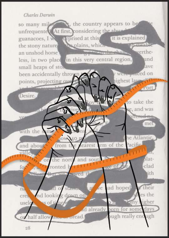
I wanted the arms to be in the first plan so I added some colour to fill them in. I also experimented a little bit more with the layer modes and added the title of my project to it.
I didn’t like the end result. It looked very simple, boring and not too ambitious. I decided to create a new design of the poster.
0 notes
Text
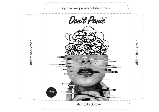
The envelope - front - inspiration
I believe that some of the best artists in the world are tattoo artists. That is because of how versatile they are. Apart from tattooing, they are often amazing graphic designers, painters, photographers with diplomas in Art and Design. Some people associate tattoos with margins of society, prisons and other pejorative connotations. Their work is not appreciated enough. Human skin is not the easiest canvas to work on because every person has different skin, it is not a flat surface and everyone reacts differently to being tattooed which results in clients moving around and makes it harder for tattooists to do their job. Tattoo artists job is especially hard because whatever they do, it will stay on people’s bodies forever.
To create the front of my envelope, I have done a lot of research and got very inspired by two tattoo artists - Miyo von D (Martyna) and Timur Lysenko.
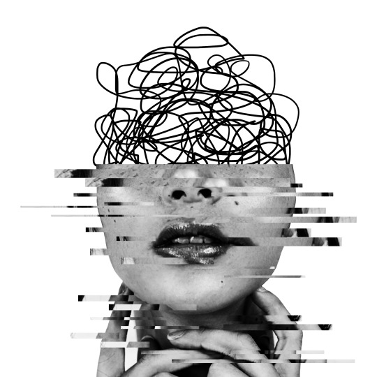
Miyo von D is a Polish tattoo artist who works at Dziarczyncy tattoo studio in Poznan. What makes her tattoos so unique is her precision and how well-thought all of the projects are. She incorporates elements of realism and very sharp line work. These styles are completely different and to be able to combine them together and create a piece of art can be very challenging. Her designs however look effortless and clean. These are the projects that had inspired me to create a “messy mind” design with one line only and combine it with a photo.


Timur Lysenko is a Ukrainian artist based in Wroclaw, Poland. His work is so recognisable, that it’s very hard to copy it or mistake with someone else’s. He combines many techniques together - abstraction, realism, geometrical shapes and many more to create a final project that’s engaging and one of a kind. He incorporates a lot of faces, roses, cross stitching and aesthetics that relate to post soviet union countries and their tradition into his designs while keeping them looking futuristic, full of colour and almost sticker-like.
Timur uses a lot of distortion in his work which has inspired me to glitch the photo of a face that I used to create the design for the front of my envelope.


0 notes


Text
The envelope - back
For the other side of my envelope, I didn’t want to do any illustrations. I wanted it to be obvious which side of the envelope is the front and which one is the back. That’s why for the back I decided to use typography. My initial idea was to write each letter of the word OBESOPHOBIA in different fonts, sizes, etc., however once I started doing it I realised it didn’t look as good as I thought it would.
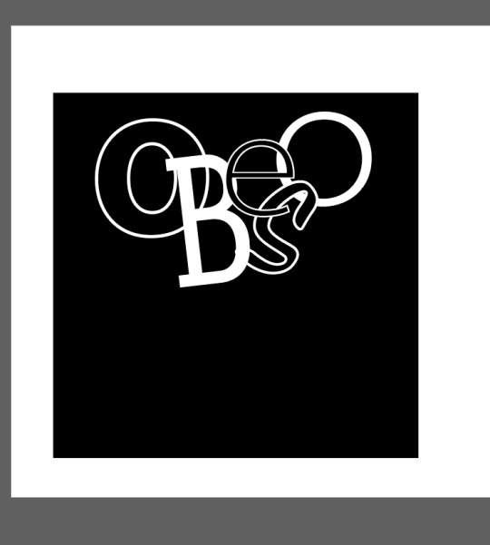
I decided to start all over again. I used a very simple font. My goal was to make it look elegant, yet imperfect. I positioned each letter in such way that they all touch each other but they are not in the straight line. All of them are different sizes and most of them aren’t straight.
I wrote OBESOPHOBIA in Illustrator, right clicked it and created outlines, then ungrouped it. This way I could move around and manipulate each letter separately. I added shadow to all of them to make them look more dimensional. The front of the envelope was made using a photo and I wanted both sides of it to not only be good pieces on their own but to match each other as well.
I then wrote the whole alphabet and repeated the steps I mentioned above. Once I have done that, I started duplicating the letters (hold alt key and drag), changing their sizes and positioning. I wanted them to be placed very irregularly as I didn’t want to follow any patterns. I also lowered the opacity of these letters to 50% so that they had a different colour value then OBESOPHOBIA because I didn’t want them to be in the first plan and I like the effect that overla[[ing letters of lower opacity create.

I purposely made the background black and the letters white to make the back of my envelope visibly contrast with the front of it. I put all of the layers below the dashed line so I knew where to cut once I had my envelope printed. I also enlarged it and treated everything outside of the dashed line as bleed.
0 notes
Text
The envelope - front - editing in photoshop and illustrator
I downloaded this photo of a woman’s face from pexels. I liked the woman’s freckles and how her skin looks like - almost as if it’s wet. To create a wet illusion in painting, we have to add white to contrast with darker colours. High level of contrast is a big advantage when printing in greyscale because it prevents the prints from looking flat and boring.
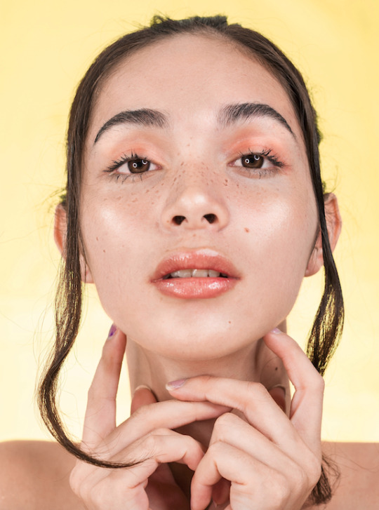
I changed the picture to black and white and then adjusted the brightness and contrast values. I wanted to be working on a black and white picture to have a better control of it than I would’ve had if I had been working on a full colour photo that would later have to be printed in greyscale anyways.
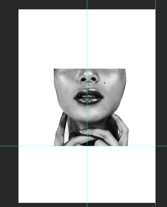
I cut out the top part of the face using the marque tool and erased the parts of the photo that I didn’t need. I decided to erase the woman’s shoulders because in the photo there is only a part of them show - if the photo wasn’t as wide as the envelope’s width, it wouldn’t look good and if it was, it would be too big. I also erased the hair strands at the front of her face - apart from the aesthetical features, I wanted my envelope to be meaningful. Long hair is usually associated with women however obesophobia can touch everyone, not just one gender and I really wanted to show that. I created two guides to see what it would look like on the printed envelope (the horizontal one is the bottom of the envelope and the vertical one shows where the middle of the envelope would be).
View -> New guide -> choose whether you want a horizontal or a vertical guide and where you want to place it in mm or px
The asymmetry in the face that I saw after erasing the background and the hair strands inspired me to make it look even more imperfect - distort the photo using glitch techniques learnt in one of Natalie’s workshops.
Using marquee tool I selected some rectangular shapes (press shift key to select multiple shapes at once) and layered them via copy twice. Then I moved the layers around to get the effect that I was going for.
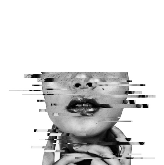
I then drew the messy lines on a different layer using a graphic tablet. I put the layer below the ones with the face and distortion.
Once I have done that, I opened the envelope template in illustrator and placed the picture in it. I needed to use the Don’t Panic logo so I downloaded it from Art Shared.
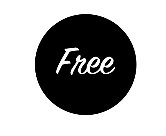
All of the Don’t Panic packs have a sticker with the word Free on them so I had to make one too. Because my design was quite dimensional and complicated, I really wanted to keep that sticker as simple as possible so that it didn’t look overdone. I created a black circle and put the word free in the very centre of it. I used the SignPainter House font as it is the most similar looking to the one from Don’t Panic logo.
To align an object in the centre of another one, select the object and then use Horizontal Align Center and Vertical Align Center from the Properties menu on the side of your ai document.
This is what the finished version of the front of my envelope looks like.

0 notes