
Don't wanna be here? Send us removal request.
Statistics
We looked inside some of the posts by weatherwax3 and here's what we found interesting.
Average Info
Notes Per Post
64
Likes Per Post
60
Reblog Per Post
1
Reply Per Post
3
Time Between Posts
3 days ago
Number of Posts By Type
Text
17
Last Seen Tumblr Blogs


Fun Fact
Tumblr is available in 18 languages.
Text


Equinox Flower is a 1958 movie directed by Yasujirō Ozu.
Its visuals stuck out to me for several reasons. For instance, it was Ozu's first colour film (he was notoriously reluctant to try colour out). The colours of the props and costumes are carefully curated and intended to serve as a subtle statement. Note the placement of the red teapot: its bright red colour breaks up the monotony of the first and third shot, but blends in really well in the second shot.
One other thing I find admirable about Ozu's work is that the low camera placement is intentional. The restricted camera height means that we see the events unfolding as if we themselves are sitting on a tatami mat. Ozu preferred a static camera, refraining from using pans or tilts in most cases. His camera remained still, allowing scenes to unfold within the frame, which created a contemplative and serene viewing experience.
He frequently composed his shots using the rule of thirds, creating a balanced aesthetic. Characters and objects were often positioned along these invisible lines or at their intersections. His sets were often sparse and meticulously arranged, reflecting the simplicity and elegance of traditional Japanese interiors.
4 notes
·
View notes
Text

Here we can see a miniature cozy room with a collection of books inside a can, which is part of the "Book CAN" project by Mizukoshi Kiyotaka from Mozu Studios.
The artist creates a detailed miniature world within a small space. This requires an understanding of scale and proportion to ensure all elements look realistic when scaled down. Utilising unconventional spaces (like a can) to create art requires imaginative thinking, turning ordinary objects into unexpected showcases for art.
Even at a glance, this small scene suggests a narrative. The design invites the viewer to imagine the kind of person who might inhabit such a space, evoking curiosity and engagement through visual storytelling. By creating this art piece in a can, the artist also allows viewers to hold and interact with the little can, giving a personal and tactile dimension to the experience.
Link:
2 notes
·
View notes
Text

This 1906 Art Nouveau storefront displays several distinctive features characteristic of the style. Art Nouveau was known for its use of organic lines and structures, which often took inspiration from natural forms. Here are some design elements present in the storefront:
Curvilinear Shapes: The most striking aspect is the large, rounded shop window, which has an elegant, asymmetric curve. It reflects Art Nouveau's affinity for flowing, naturalistic shapes that emulate the forms found in plants and flowers.
Integration with Architecture: The design of the window and door seamlessly blends with the building's facade, creating an impression that the storefront itself is a living, organic entity.
Textural Contrast: The smooth surfaces of the large window pane stand in contrast to the more textured, sculpted stone and ironwork framing it, providing a tactile dimension to the storefront.
The storefront created by Albert Pèpe is a very distinctive example of Art Nouveau's commitment to beauty and harmony in both form and function.
2 notes
·
View notes
Text
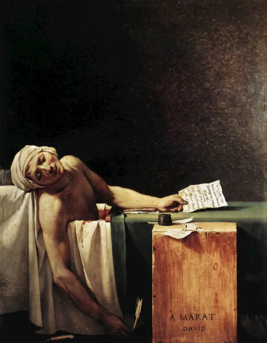
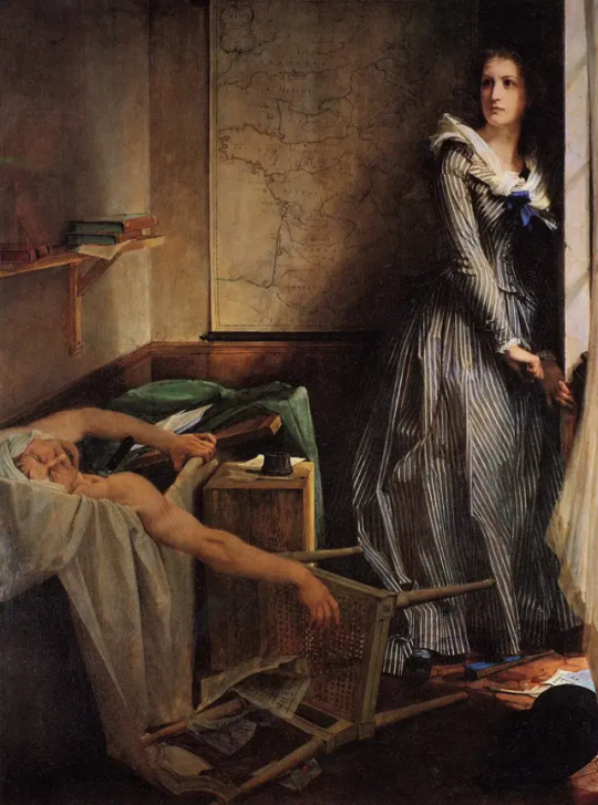

The same historical event can be portrayed differently by many artists. Charlotte Corday killed a Revolutionary Jean-Paul Marat on 13 July 1793 with a kitchen knife.
Over the years or even centuries, we can see the perspective shifting from depicting Marat as a noble fallen hero (with his likeness faithfully depicted, the evidence of his work shown to the viewers) to just a man. Instead, Charlotte got more focus. Edvard Munch in particular made the whole event feel more surreal and intimate. In my imagination, the disjointed colours and wobbly perspective represent how Charlotte felt at the time of the murder. She stares the viewers straight into the eyes as if awaiting judgement.
Jacques-Louis David, Marat Assassinated (1793)
Paul-Jacques-Aimé Baudry, The Assassination of Marat, Charlotte Corday (1860)
Edvard Munch (1863–1944), The Death of Marat II (1907)
4 notes
·
View notes
Text


For all the fans of Alice in Wonderland, I would like to share Floor Rieder's illustrations. Floor Rieder is a wonderful illustrator and artist from the Netherlands.
She has a very unusual way of drawing! For Alice, she used glass, put a layer of black paint on it, and then scratched out the drawing, then added colour in post-production. It's very similar to linocut, and it makes the illustrations more mysterious and imperfect. Which means they fit the vibe of Alice in Wonderland really well!
I also adore her use of perspective: everything seems a bit flat, out of balance, so the unexpected depth of the corridor leaves the viewer with a trippy feeling of falling down the rabbit hole.


4 notes
·
View notes
Text
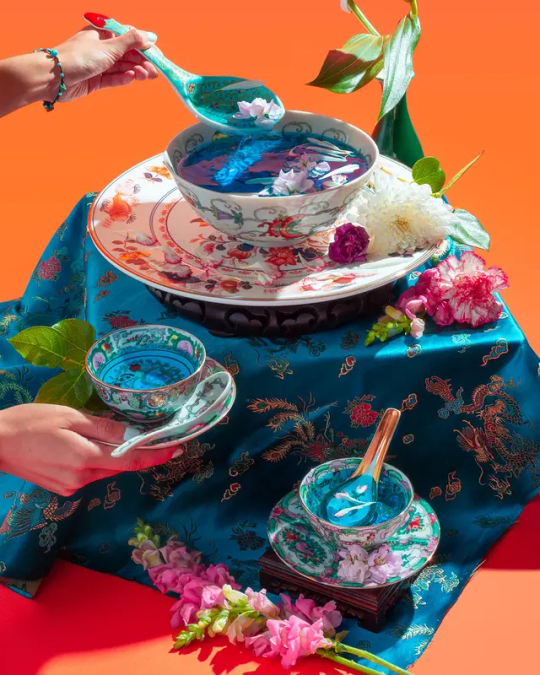
I found out about Mischelle Moy's photography on It's Nice That, and I absolutely adore her style!
It's bright, colourful, maximalist: a lot of intricate details hold your attention and make you immersed in the dreamlike world she created. She meticulously works with props, fabrics, textures, and the result is stunning. Mischelle also draws inspiration from her Chinese-American heritage. I believe that mixing in some culture-specific elements into your design can make it more relatable and personal — provided that it's a good fit for what you're trying to accomplish.
Link:
3 notes
·
View notes
Text

Do you remember what you wished for in 2020?
On my social media feed in 2020, everyone wanted The Dress. The Strawberry Dress by Lirika Matoshi.
It is a flowy tea dress adorned with hand-sewn glittery strawberries. Its silhouette invokes Disney princesses — accentuated slim waist, frills and pastels. It was a good design choice to combine pink and red, as well as a pop of neon green to balance them both out.
This dress reminds me that art and design are contextual. The Strawberry dress got so popular because people longed for a fancy occasion to go out and dress up — while being stuck in lockdown. This dress was a fantasy to many, a dream of better times, strawberry becoming a forbidden fruit (quite literally, because the dress was not cheap).
Lirika Matoshi even designed matching masks for the dress. Talk about cohesive design!

Link to the Strawberry dress:
3 notes
·
View notes
Text
youtube


Studio LAIKA, which created Coraline, showed off the costumes of the characters. They are truly stunning and an amazing example of design both from a technical point and an artistic one.
I love how evolution of Other Mother's costume from slumpy to spiky and arachnid-looking reflects the character's transformation into something scary and menacing.
In the video they say that the costume for Other Mother went through a big transitional moment in her narrative, using metallic mesh and print fabric to create a contorted and insect-like appearance.
3 notes
·
View notes
Text


Leprechauns, Irish folktale beings, can be interpreted differently even by Irish artists.
The first picture shows a leprechaun with a grim, greyish face, showing us his empty pockets. Near his feet lies an overturned pot which doesn't hold any gold. The colours are washed out, muted on purpose. It's a street art piece in Portlaoise done by adw.
In the second picture we see a small leprechaun, it seems cute, innocent and somewhat surprised. He is painted with bright neon colours, he has black stripes across his body as if he were a tiny bee. This graffiti doesn't have any signature attached to it, but it's an artist called Buzzy Bee. I crossed this little leprechaun many times on my way to Stephen's Green.
Links to the artists' pages:
http://adwart.com/
4 notes
·
View notes
Text

In terms of visual storytelling, Tarantino's iconic trunk shot is a very effective way to juggle things up and break up the monotony of a plot-heavy scene.
The director used it many times — in Pulp Fiction, Reservoir Dogs, Kill Bill and Inglourious Basterds, to name a few. However, Tarantino doesn't take credit for the invention of this shot, because it was used in many westerns and crime dramas before.
I believe it's a very compelling camera angle not only in terms of breaking up plot dynamics, but also for character characterisation: the characters appear bigger, more imposing and even threatening. It makes sense for these two gangsters in Pulp Fiction to essentially dominate the viewers (we can only imagine how much more effective this trunk shot looks in a movie theatre).
6 notes
·
View notes
Text

More about the diverse world of children's picture books!
Who knows what a "wimmelbook" is? Many of today's children first get their hands on books precisely in this genre. No wonder! Looking at all the tiny details, the child learns the world. First the child learns to distinguish colours, animals, people, then gradually begins to distinguish the stories and individuality of each character. Susanne Rotraut Berner is a very influential author in this genre, that's why I'm providing an example of her illustrations.
Wimmelbook is, to some extent, a subspecies of the "silent book", a book without words, but the fundamental difference between them is that in a quiet book there is usually some kind of a main plot, which can be interpreted differently depending on the optics of the character. A wimmelbook doesn't have a plot, it's a polyphony of stories.
The difference between a quiet book and a wimmelbook is about the same as the difference between a Titian painting and a Bruegel. I generally like the idea that the compositions of Brueghel and Bosch are invoked by wimmelbooks.
6 notes
·
View notes
Text


Here we have a fresco of a wealthy Pompeian woman, commonly referred to as Sappho, a lyric poet from Ancient Greece, even though there's little basic for this claim. It was created in Pompeii, ca. 50 CE.
The second image is a design for a Soviet first brand of potato chips, created in 1963.
We can see a similarity between the two women: both of them have a band in their hair to highlight its colour and shape, both of them hold an object close to their lips with their right hand, and they use a left hand to hold another object. The frame itself is circular.
In my opinion, these two pictures show that memorable design or art, even across centuries and cultural differences, can remain the same.
5 notes
·
View notes
Text


What techniques do designers and illustrators use to create their art? Watercolours, gouache? Pencils? Ink? Collage? Or is it all Adobe?
I've noticed that in the world of children's book illustration drawing with felt-tip pens and markers is now the new fad. Artists often try to imitate children's drawing style, and it is often just that — flat, without subtle transitions of light and shadow, without depth and perspective.
Such simplicity and clarity in the composition of the page doesn't come easy. To remove all unnecessary things, leaving only the most important things in a character, is a result of many hours of sketching.
Bright colours, exaggerated proportions and facial expressions — all this makes illustrations in a book understandable and very accessible to the main readers, children.
3 notes
·
View notes
Text

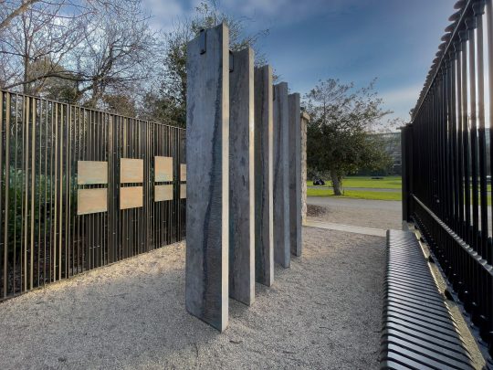


When taking a casual stroll around Iveagh Gardens, I discovered a weird cage-looking memorial that at first glance didn't fit in at all with the rest of the park.
A plaque close to the entrance said it was The Memorial to Human Rights Defenders designed by the international architecture studio Grafton Architects. In order to truly appreciate it, I needed to enter this metal screen-room. To make the spectator physically enter the space of the art object was a very powerful design choice.
First, I took to reading the metal plaques inside the room. All of them were famous words from the human rights activists around the world who, unfortunately, had lost their lives in pursuit of their noble goals. The quotes were both in Gaeilge and English. Reading them, I felt grief, sadness, awe, hope.
Nothing could have prepared me though for the words of Russian journalists and activists, Anna Politkovskaya and Natalya Estemirova. I shouldn't have been shocked to find them there — Anna and Natalya were indeed human rights defenders, working at Nobel Peace Prize-winning independent newspaper Novaya Gazeta.
I was hit hard by the realisation that Novaya Gazeta was not published in Russia anymore: following the Russian invasion of Ukraine, Novaya Gazeta's media license was revoked. And here I was, far away from my homeland, staring at words of two women that should have been alive today, whose legacy at Novaya Gazeta is not accessible to Russian people anymore without VPN.
Legacy and memory are another important element of this memorial's design. In the middle of the monument, there were 5 vertically positioned stones engraved with Ogham script, which is the written interpretation of primitive Irish, the oldest form of Gaeilge. It was deeply touching to me that this modern-looking monument invoked ancient language and art.
Perhaps, despite the sombre feeling of the monument, there is still hope. Perhaps, the words of the dead activists will not be forgotten, similar to the Ogham script.
Photo credit:
Other resourses:
3 notes
·
View notes
Text

Here's a picture of graffiti just outside of Bulgarian School in Dublin. The colours are so bright and vivid! I hope the children studying there feel a bit better every morning by seeing something like this. I believe that the artist went for the inverted colours look, although some of the colours are not opposites.
Another focus of the image are the pencils! I really got into the educational spirit and googled how they are called — apparently these are 'bollards' or 'bollard posts'. Dublin city council suggests to specifically put pencil-shaped bollards on footpaths outside schools to prevent parking and make drivers more aware of their surroundings. A neat idea!
Resourses:
3 notes
·
View notes
Text


Seeking inspiration for the photography assignment, I naturally took to Instagram.
I am mesmerised by the artistry of @summergwagner! Their use of colours and filters shows just how important post-production editing is. Check out the two photos of a man in front of a satellite antenna. One of them is edited to show a glowing ring around him, whereas the second one is framed by leaves and includes a second character, yet another spectator (apart from us). I personally prefer the second picture more, since we can apply the rule of thirds there — if we take the spectator girl as the center point of the picture.
The third picture is very appealing because it feels very whimsical and dream-like. The pastel colours are soft and airy, they draw attention to the woman's face.
5 notes
·
View notes
Text


When I think of iconic movie posters, I think about The Godfather.
Interestingly enough, it wasn't a movie poster at all in 1969, when Neil Fujita, a Hawaiian-born graphic designer, created a cover for Mario Puzo's book 'The Godfather'. Coppola used it for his film three years later, impressed by the imagery.
Unease, danger and claustrophobia — that's what I feel after looking at this brilliant design. It very much fits the mood of the story. The serifs have a sharp feel to them. The slanted ends of 'f', 'th', 'r', 'i' and 'u' are cut at the same angle. The kerning in particular is suffocating, there is no space for the letters to breathe — similar to the main character Michael, trying to find his own way in life in his father's looming shadow.
The typography for the movie poster feels less constrained, perhaps for the purpose of legibility. There is even a sort of a window in 'God', a promise of an escape.
By the way, the emphasis on 'God' was purely intentional, if we take into account Fujita's 2007 interview with art director and designer Steven Heller:
Heller: Didn’t you design the logo for The Godfather films? Fujita: Yes, I did the logo—I [originally] designed the book jacket for Putnam in 1969. By taking the “G” and extending it to the “D,” I created a house for “God.” The way the word was designed was part of the logo and so was the type design.
Link to S. Neil Fujita's works as published by The Guardian:
4 notes
·
View notes