Don't wanna be here? Send us removal request.
Video
tumblr
This is the final animatic, I’m really happy with how it turned out. I did spend a lot of time on this project which I maybe should have spread out a bit more equally among my other projects. But I am happy with the results I think it fits well with the sound and I love the cartoon look I ended up going with.
0 notes
Photo
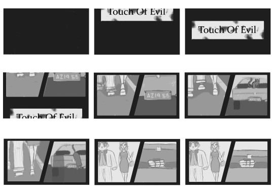
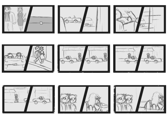

So my storyboard ended up being longer then I had planned but I wanted it to end on a clear note. I also wasn’t consistent with my storyboard as I found doing full details was taking me too long so decided to just get my ideas down and refine them for the animatic. I think my idea is clear and ties in to the original movie quite well.
0 notes
Text
Concept art
https://www.bing.com/images/search?view=detailV2&ccid=ej2Cfkxq&id=94E5F5139CDE2BFA74CFDA9770AD5C311776F2F7&thid=OIP.ej2CfkxqNaF7vvaeFSUZwQHaFj&mediaurl=https%3a%2f%2fi.pinimg.com%2foriginals%2f47%2f7e%2f79%2f477e796349dc102d1a15e85982eb4112.jpg&cdnurl=https%3a%2f%2fth.bing.com%2fth%2fid%2fR.7a3d827e4c6a35a17bbef69e152519c1%3frik%3d9%252fJ2FzFcrXCX2g%26pid%3dImgRaw%26r%3d0&exph=480&expw=640&q=1954+CADILLAC+ELDORADO+back+view&simid=608009202834999537&FORM=IRPRST&ck=6052198960A891CE6206347B09714A08&selectedIndex=48&ajaxhist=0&ajaxserp=0
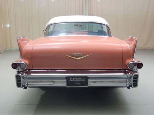
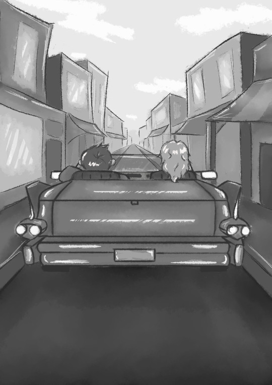
I really like how the concept art came out. My plan was to show a scene of the main characters driving away in a very 1950s cars, I think it gives a good representation of my animatic.
0 notes
Text
http://www.alexgrigg.com/
While coming up with ideas I decided I wanted to take a more cartoon approach and therefore researched into Alex Grigg who has done lots of animation and one in particular I liked was “Phantom Limb” I loved the art style and wanted to make my animatic a similar style.

0 notes
Text
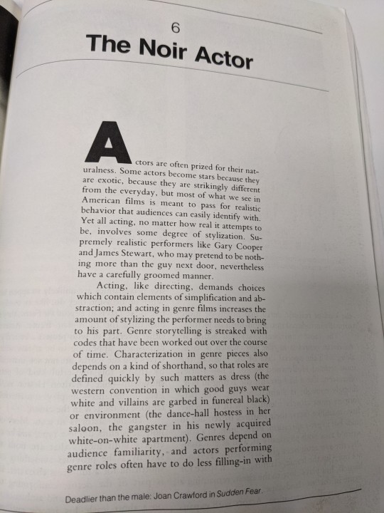
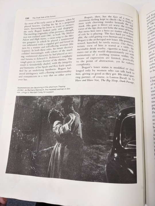


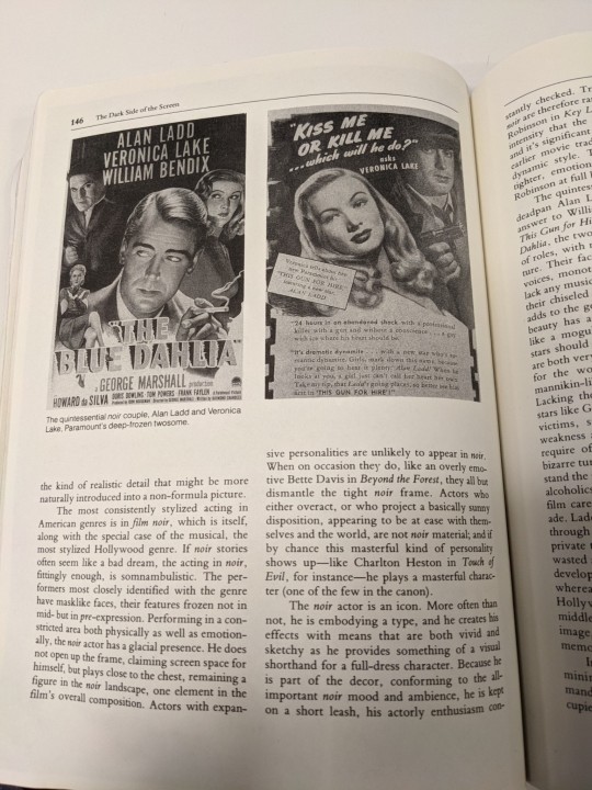
I spent some time researching Film Noir since this is what I want to focus on and keep in my animatic. I found characters and actors had a huge role in these films with many actors making film noir their whole careers. The era of film noir was mostly between 1944–54. The style of dress is very 1950s so I want to pay homage to that in my work. The style is also always black and white so I want to keep that in my work.
0 notes
Photo

this was a rough design for my animatic but when drawing up the story board I decided to change the design up a bit to make it easier to redraw over and over.
0 notes
Text
Character Design
I’ll be designing 4 main characters, 2 couples, I want them to keep the 1950s styles since film noir was very popular in the 50s. I want to keep the style while adding my own spin on it. Below are some 1950s fashion to help influence my character designs.
“Fashion in the 1950s varied greatly from the beginning to end. Maybe not quite as extreme as the ’60s, 1950s fashion saw the introduction of many new styles as well as many styles that paid homage to the 1920s.”
https://www.retrowaste.com/1950s/fashion-in-the-1950s/

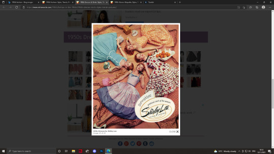
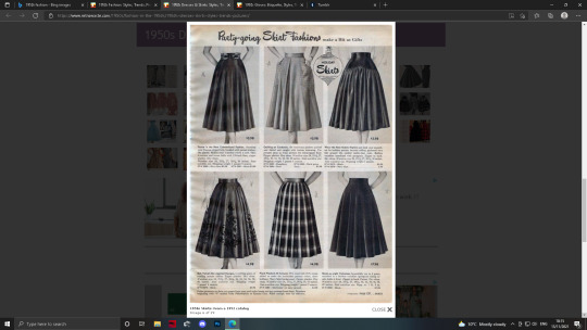
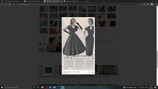
https://www.retrowaste.com/1950s/fashion-in-the-1950s/1950s-dresses-skirts-styles-trends-pictures/
“Gloves played an important role in 1950s fashion. Although glove sales weren’t quite what they used to be, they still sold well and most women had a few pairs to choose from.”
https://www.retrowaste.com/1950s/fashion-in-the-1950s/1950s-gloves-etiquette-styles-trends-pictures/
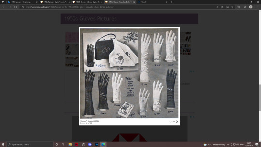
I’d like one of my characters to have very glamorous long gloves since they were a very common accessory during the 1950s.

https://www.retrowaste.com/1950s/fashion-in-the-1950s/1950s-greasers-styles-trends-history-pictures/
I’d also quite like to incorporate the greaser fashion into one of my characters, I think this will help them stand out and allow me to diverge a bit from the original opening as I don’t want it to be too similar.
0 notes
Text
Perspective pt 2:
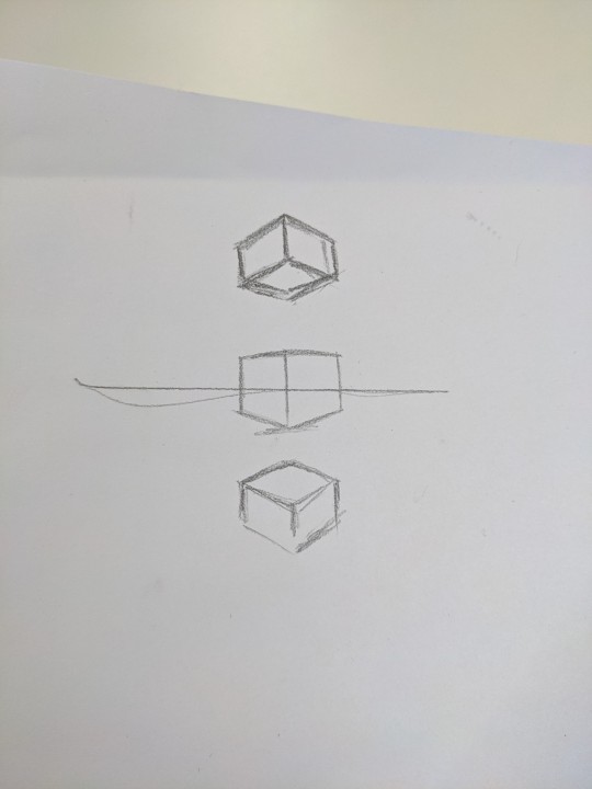

Here's the perspective drawings done in today's lesson using the map crunch images. I do like how the landscapes turned out, it’s been a long time since I’ve done perspective drawings so it did take a while to get used to again and it’s an area I may need to put some more work into and improve on.
0 notes
Text
Perspective pt 1
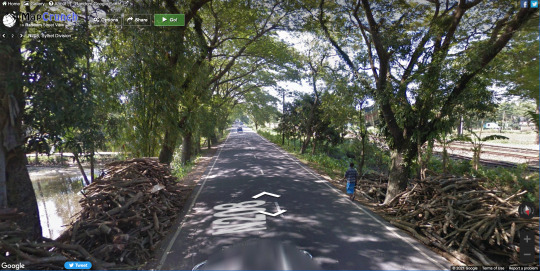
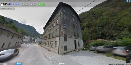

We covered perspective in todays lesson and the task involved finding places on map crunch and redrawing them showing perspective lines. Above are the 3 images I got from map crunch.
https://www.mapcrunch.com/
0 notes
Text
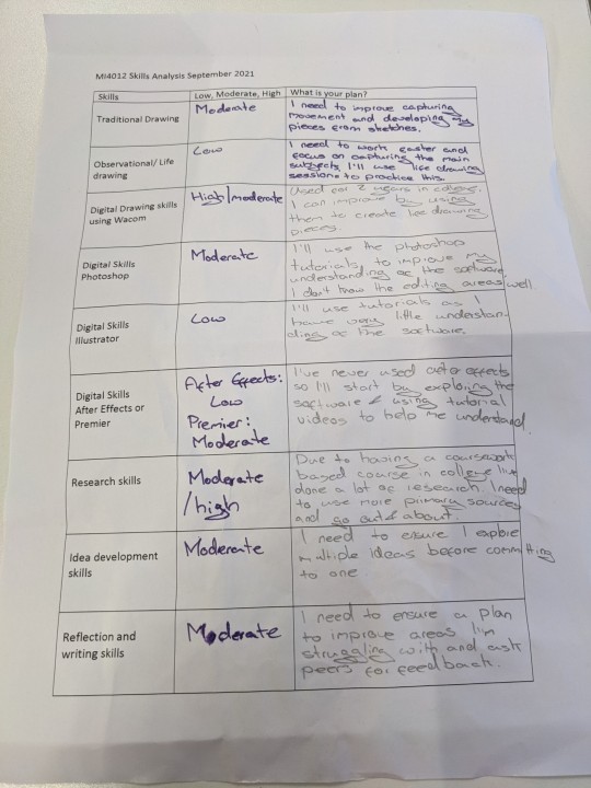
Here's my skills analysis, while completing it I realised a lot the skills I've used before and believe I'm good at are technical skills which I used in college. I also had to use a lot of research skills during college to complete course work.
Although I think I'm good at quite a few of the skills there's definitely room for improvement. I've never used After Effects before and don't have much experience with illustrator; these skills can be built on during the technical lessons and by using online tutorials.
I also need to build on my traditional skills especially my life drawing and observation skills, I could improve on these by doing more observation tasks, just trying to draw stuff around me and trying to accurately recreate them.
0 notes
Text
Black and white comics
Since film noir consists of mostly if not all black and white films I thought it would be a nice idea to incorporate into my recreation. I want it to be more modern though so thought about incorporate a comic book/graphic novel art style. Below are black and white comics I like the style of which I’ll be using as references and ideas while storyboarding. I think I am going to simplify my characters so they won’t be as detailed as the styles below, this will make it easier for me while storyboarding and making the animatic to ensure consistency between frames.

https://www.pinterest.co.uk/pin/165155511315612077/

https://www.pinterest.co.uk/pin/877779783591920737/?d=t&mt=login
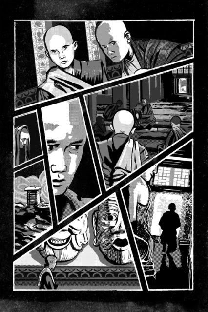
https://www.pinterest.co.uk/pin/545146729868582122/

https://www.pinterest.co.uk/pin/414190496952174856/
0 notes
Text
Touch of Evil: Idea
Split screen to follow the two main couples. In the original opening the two main couples cross each others path a lot with the camera shifting between the two every time they pass each other, I thought to change it up a bit to have a split screen with one side following one couple and the other following the other couple, potentially switching when the characters interact or merging into one when they're in the same scene. I think this would give a comic style look to my animation. I’d also like to keep the animation black and white as the film is black and white, I think it’d be a nice way to keep the noir theme as well.
0 notes
Text
Touch of Evil: Main Frames
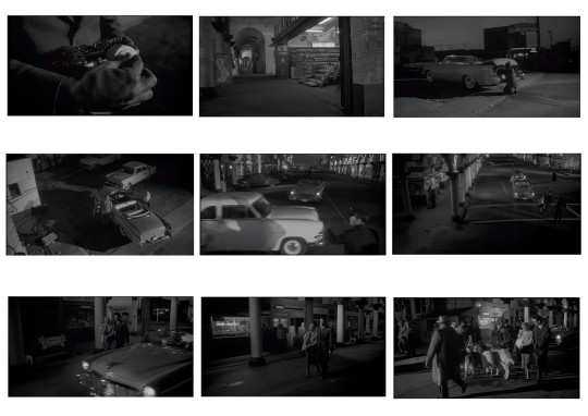

https://www.youtube.com/watch?v=EhmYY5ZMXOY
0 notes
Text
Touch of Evil: Research
“Touch of Evil is a 1958 American film noir written and directed by Orson Welles, who also stars in the film.”
https://en.wikipedia.org/wiki/Touch_of_Evil
Film noir is term used to describe stylish Hollywood crime dramas, it’s often associated with a low-key, black-and-white visual style. This can be seen in “Touch of Evil”, it’s a black-and-white film and in the beginning uses one long continuous shot which follows the main characters through the scene.
https://en.wikipedia.org/wiki/Film_noir
The plot of “Touch of Evil”;
Along the US-Mexican border, a time bomb explodes in a vehicle killing Rudy Linnekar and his stripper girlfriend Zita. Miguel Vargas, a Mexican special prosecutor, takes a special interest in the case while on his honeymoon. Sanchez, a young Mexican secretly married to the victim's daughter, Marcia, is the prime suspect. Although one of the local investigators plants evidence during the investigations.
The film is loosely based on the novel “Badge of Evil” written by Whit Masterson.
While brain storming ideas for how I wanted to recreate the opening scene, I decided I wanted to use a long tracking shot to pay tribute to the film as it’s a very well known shot in the film. Although this may be tricky to achieve as long as I plan it out well I believe I can achieve the idea I’m going for. I’d also like to keep the 1950s styles of the characters although I’m going to redesign them.
0 notes
Text
3 Little Pigs Storyboard: storyboard and evaluation


The pictures show our final storyboards, we used 2 A3 pieces of paper to create them we tried to get them as close to 16x9 as possible while keeping the lay out clear and readable. I think we captured the genre we were aiming for well, we wanted to make it creepy and unsettling which I think we portrayed well in the artwork however our timing and transitions need work to make the story flow better.
We could have added more frames, using more establishing shots to set the scenes before moving the story forward and adding frames that show movement as well as adding suggestion so the audience follows the story without it feeling rushed or becoming confusing. We also crossed the line a lot which created inconsistences between the frames and made it confusing at times to grasp the layout of the scene, this could be fixed by redesigning some of our scenes and making sure we check for inconsistency's as we go. It would also help if we referred back to our notes to help keep consistency and put more detail into our notes.
I’m going to research more into storyboards as a next step to improve my work and understanding of storyboards including what a good one consists of.
0 notes
Photo

3 Little Pigs Storyboard: Thumbnails
While planning our storyboards we created quick thumbnails to help plan out and visualise the story we wanted to tell. Once we had a rough guide of how we wanted to tell the story we began refining it into the final storyboard.
0 notes
Photo
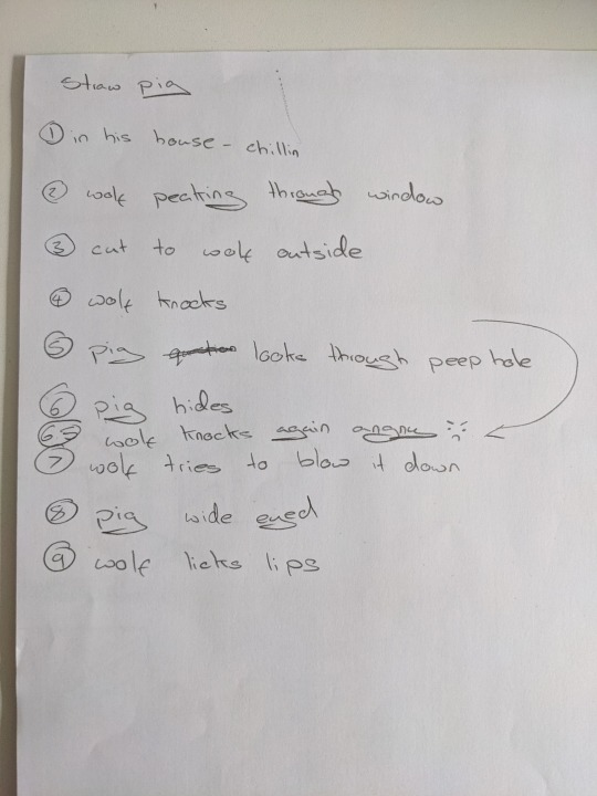
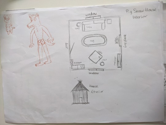
3 Little Pigs Storyboard: prep
This was a group assignment to create a storyboard for a part of the 3 little pigs fairy tale.
The first thing we needed to do to make the storyboard was decide which part of the story we wanted to cover. We agreed on the straw house pig and decided to bullet point the main points of that point of the story as well as quickly design some characters and the house.
0 notes