Don't wanna be here? Send us removal request.
Text
Week 10
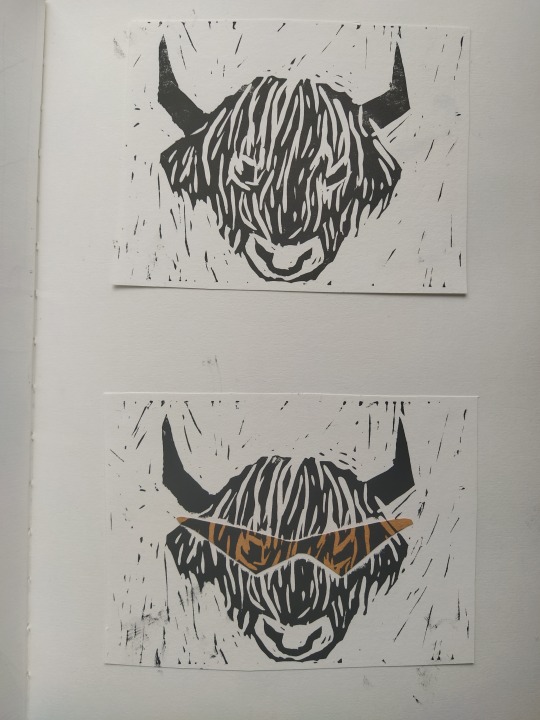
On our last lesson we covered the basics of lino cutting. I have only known about lino cutting in theory, so this was my first time trying it. The process was a bit dreadful at first no possibility of going back after using the cutting tool but in the end, I found it quite therapeutic. Towards the end I got the hang of the different outcomes when using varying pressure.


I wish I would have moved the cow more towards the centre and maybe widened the horns a bit. At first, I wanted to also add some grass, but I think since with the cow’s fur I think it would look too similar and overwhelming together. I also ended up making a decoration for one of my notebooks with the residue on the lino, which was a lot of fun. I really liked the texture of the horns it created.

The English saying “look before you leap” is even more applicable to lino cutting in the Czech version because it translates to “measure twice, cut once” which is definitely something I have to follow more in all my art making not just lino. Overall, I really enjoyed this lesson and I’m looking forward to doing some more lino cutting in the future.
0 notes
Text
Week 9
This Monday we covered the basic rules of proportions in portrait drawing. I’m used to drawing portraits the most out of all the things we’ve coverd so far so I didn’t struggle that much. The biggest challege was the size of the drawing we did which was A2. It was nice to learn that a lot of the rules of portrait drawing I learned instictively through trial and error. But I also learned some new things which I’m excited about.


The other half of the class we talked about reportage. Which is the act of reporting on events in this case through illustration. I think using illustration to report on events can be more eye catching since it’s less usual. Also when dealing with heavy themes I think drawings can be more digestable than groosome pictures. Ilustration can bring a different point of view because the artist becomes intigrated with its subject differently from a news photographer.
Examples of reportage from the book Prague Sketched


On Tuesday we went to Cardiff bay and walked around there capturing the sights along the way. Compared to the first task we did earlier during week 1 that was similar I prefer the drawing from this week I think I stopped being afraid of taking up too much space in the sketchbook, making my drawings biggger and bolder. It also feels like I picked what to draw better and overall got more confident with my drawing and even experimented little more. My hands were freezing towards the end so I ended up polishing the drawings a bit at home.


0 notes
Text
Week 8
This week’s class was all about perspective. We learened about one, two and three point perspective in Monday’s class. And on Tuesday we went out to Cardiff to draw from real life which was yet again unfortunately sbaotaged by the weather. I found learning about perspective very helpful and something I can hopefully incorporate better into my art.
One point perspective

By: Carolina Rodriguez Fuenmayor


Two point perspective

By: Vacuum


Three point perspective


By: Pari Keshtkar, Jason Hart from Prague Sketched


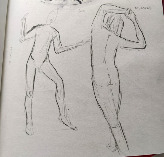
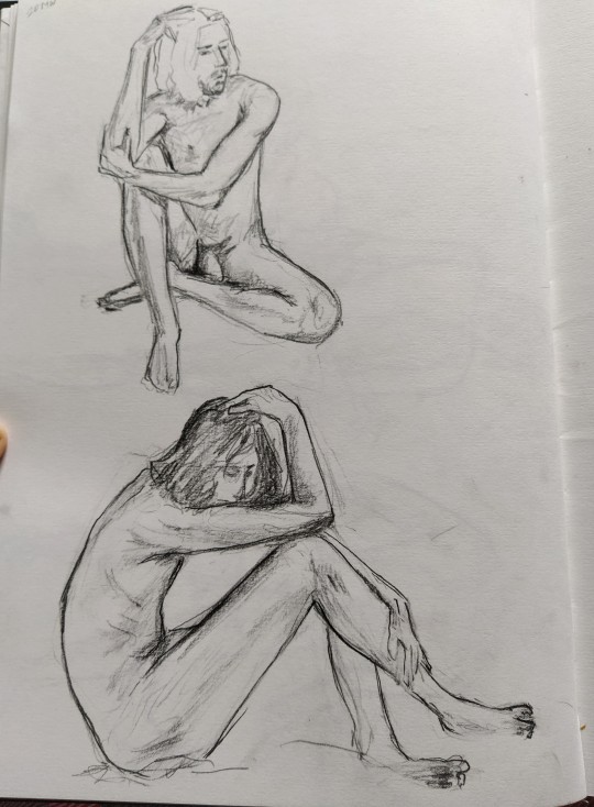
This week’s life drawing session was our last and up until this class I could definitely feel improvement in my work. Unfortunately I found this week’s class the hardest since I don’t think I have ever attempted to draw somebody so muscular. Even though it was hard I did enjoy it, definitely have to work on how muscels work. I hope we will able to do life drawing again in the second semester.


0 notes
Text
Week 7
This week we learned about composition. We covered the basic rules and explained how each of the different aspects of composition can affect its narrative and/or furthermore shape the artwork in the artist’s desired way. Then we analysed art works of our own choice.

First illustration I picked is apart of a series by Molly Stanard.

rule of thirds - the different aspects of the illustration are concentrated in separate parts of the piece

lines - the most eyecatching part for me is the lake monster character in the tub but following her (and the frog’s) line of vision you can see the other characters behind the door
shapes - I would also say there its a contrast of the two other girls behind the rectangular door versus the girl in the tub surrounded by the loose and round shapes of the fog coming from the bath, the girls behind the door being angry and her being calm

Second illustration I picked is by Dermot Flynn.

Lines - it’s obvious at first sight that the this illustration is very rectangular filled with shapes with sharp edges throught the whole piece. Not just the building but also the furniture and decoration inside. There is also rhythm to the illustration added by the patter of the windows as seen in the picture below.


I also felt like the lines lead the eyes towards the elevators (or maybe the window cleaners as well) which seem to be the elements that break up the illustration.

The last illustration I picked is by Shermstan.

Rule of thirds - the focal point of the illustration being placed on the intersections of the grid really helps make the drawing more dynamic

There is a little bit of cropping happeing with the rock being placed at the front and the horizon line also being tllted helps this illustration in being even more animated.

On Tuesday we visited The Cardiff Museum. First task was to find examples of good composition in the artworks showcased.
Leopold Pascal - Snow in Chelsea
repetition
loose lines give the feeling of wind

George Romney - Elizabeth (Warren), Viscountess Bulkeley (1757-1826) as Hebe
contrast between rounded shapes and sharp ones
possibly golden ratio from her scarf out
her position on the rock puts her to the forefront of the painting (also helped by the light colloring of her dress)

Joseph Wright - Lake Albano
Rounded horizontal lines of the mountains in the back plus the roundness of the lake give off a serene feeling.
The tree in the front gives the painting depth.

After we did several task in the natural history part of the museum. Because of the circumstances of covid restrictions some of them were done later from a photo reference. I found all the task really enjoyable, it was a nice break from drawing people and different objects even though animals are not my area of experties.


0 notes
Text
Week 6
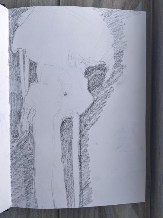
On Moday we focused on just one task which was a tonal still life drawing. Starting of with a contour drawing I feel that my lines have gotten cleaner and more precise on the first try although I did get kind of lost towards the end in all the ribs on the skeleton. I haven’t attended any proper art classes before doing this course so I can see how getting this foundation has helped me better my skills. There is still a long way to go but it is nice to feel improvement.
After the countour drawing was finished using a tracing paper shadows were created. I think focusing more on blending would’ve resulted in a better final outcome next time I do something like that. But overall I ended up being satisfied with my work.


From our Wednesday life drawing class:


0 notes
Text
week 5
Unfortunately this week the in person classes were cancelled so we recived work to do on our own time. The task was called “Drawn into reality” where we had to draw something that had to fit into a bigger picture captured in a photo. I had several initial ideas but unfortunately couldn’t execute them in the end due to the current circumstances. Instead I used a blanket to imitate a mountain. I wish I had anything more profound to say about it but I really don’t. Seeing the way the blanket folds just reminded me of mountains. The current lockdown felt discouraging and in person class being cancelled didn’t help. So I’m glad that at last I finished my task and reached my proverbial top of the mountain.
On Wednesday we had our life drawing class. I was happy with the outcome from that class. I hope I can keep a positive mindset for the upcoming one as well.


0 notes
Text
Week 4
This lesson focused on mark making so for Monday we brought various things to create interesting patterns on paper.
First task was to create the feeling from a list of several words. I choose bubbles, strong wind, stormy sea and calm water. It was the first time we incorporated a different medium apart from pencils, liners and charcoral. So I really enjoyed the task since it was something different.

After we warmed up we continued with observational drawings of fish using the different application techniques and aproaches to help with depicting not only how the fish look but how the different textures would feel.
I used a cotton bud, brush and a tissue the most. In the end I also used my fingers to imitate the scales with my finger prints. The outcome of some of these surprised me and it’s someting I would love to try doing again in my own time.


On Wednesday we also had our second life drawing class. This week we had a male model which I’m a lot less skilled at drawing than women and also a lot of the positions were standing up which is something I struggle with as well.
As we went on I was a bit frustrated with myself because I didn’t feel like I was getting better. I ended up switching from a mechanical pencil to a regular one which helped me a bit to “start fresh.”
Towards the end I was happier with my drawings but still feel like due to me being indecisive with my line placement the shading doesn't really look the way I want it to.


0 notes
Text
Week 3
For our classes on Monday as well on Tuesday we focused on drawing bigger scale drawings.
We brought our own objects on Monday and did a series of drawings gradually getting bigger from A6 to A0. Spending the longest on the last one with a guide sketch to help us with the proportions.
I liked the task since I have never drawn bigger than A3. I feel as the drawing was getting bigger I was getting the hang of it but with the biggest one I should have taken a few steps back to look how it looked as a whole to see where I was making mistakes - it ended a bit too boxy which I didn’t notice because I was up close the whole time.


When we weren’t doing the group task we walked around and drew anything around us. I think I am better at putting down one line instead of sketching under it (going straight in with a liner helps).

On Tuesday we headed to Cardiff Bay to draw a panoramatic drawing of the area in groups of 6. Each half taking turns on the collaborative drawing. It was challenging to do such a big piece in a group. One of our problems was that on each side of the paper the perspective was a bit different so we find it difficult to connect the two parts in the middle.

0 notes
Text
2nd week
On Monday we discussed negative space, the space surrounding a subject. Main part of the lecture was to draw 2 A4 drawings using a viewfinder to help us. One drawing of a bike and one of a skeleton. I found the task challenging because it’s harder to hide your mistakes on a bigger scale.
I think this exercise helps me understand composition better. And makes me focus more throughout the whole process of putting down my initial lines rather than just kind of winging it from the start. So while I didn’t particulary enjoy it I think it was a useful thing to try.


Our Tuesday class got sabotaged by the weather so we ended up studying perspective in The Cardiff Market. Since my attention span isn’t the best I struggle with things like perspective because I just start to fill the spaces myself which leads to drawings that makes no sense since I’m not really versed in drawing buildings etc.
We drew 4 smaller 5 minute drawings and then 1 A4 without a limit with which I ended up being the most satisfied. I think for me the most important part is putting down the core structure that serves me as guidlines when putting in detailes to I don’t stray away much.


0 notes
Text
1st week visual skills
In the class on Monday we did a bunch of quickly paced exercises and then some that took a little bit longer. For me the most challenging one was drawing a one minute portrait of my classmates. In that time frame I found it too hard to draw them in a way that would be easily distiungishable from one another.
During our class on Tueasday we went sketching outside. The task was to walk randomly based on rolling the dice and then drawing whatever we picked in five minutes. I struggled with picking subjects that I could nicely draw in the time given. But overall it was nice because I ended up drawing more houses and objects which I usually tend to stray away from.


Looking at the sketches in retrospect I prefer the ones done in the beggining. I think as I continued I got discouraged because I started picking the wrong subjects to draw. As well as the fact that I always sketched very loosely and never tried to put down clean lines from the start.
My favourite drawing is number four it is a bridge that had a speedometer infront of it. I liked the bush that was kind of engulfing the stairs next to it. Although I’m still not sure how to really draw plants quickly (as proved in the drawing number 11 of the flower lamp decorations back in the city center). The worst drawing is the 5th one aka the sad attempt of the carousel. I either shoud’ve simplified it or picked just a specific ornament on it.
0 notes


