
Don't wanna be here? Send us removal request.
Statistics
We looked inside some of the posts by vhendersonarts246-01 and here's what we found interesting.
Average Info
Notes Per Post
0
Likes Per Post
0
Reblog Per Post
0
Reply Per Post
0
Time Between Posts
12 days ago
Number of Posts By Type
Text
17
Last Seen Tumblr Blogs


Fun Fact
The Tumblr app for Google Glass was released on May 16, 2013.
Text
Final Course Reflection
There is so much to reflect on over the semester, I have changed a lot. I feel more in this class than others I have really grown as a graphic design student. I felt like I was given a chance, unlike in other classes. I enjoyed most the time we shared together working on projects, I really appreciated being able to work alongside my peers so we could help each other navigate our projects. I felt pushed to always improve and I through this I seriously got to focus on so many new ways to go about projects. I finally learned how to vectorize shapes, use overlays and effects, and improved my grid structure, kerning, tracking, and leading. I’m usually very quiet in my classes so it was nice to feel encouraged to speak and being able to share your work with your peers. The small class was also really helpful for this. I feel prepared to take more classes in the GD+I program next semester and look forward to being able to use what I’ve learned and continue to improve.
0 notes
Text
Blog for ch: 11 Typographic Design
Okay, so this is probably the thing I struggle with most within my major. I always have a challenging text into something like an image or another symbol. I will get better as I work on it of course, but I really appreciate clever logos for this reason. I also remember doing a project that was basically 11/6-9, where we made letters with silhouettes of flowers in my other typography class. This was one of those projects I looked back on and wish that I could’ve worked on again because I know a lot more about the software and vectoring now. A lot of the work in this chapter reminds me of Paula Scher and the way she makes type, even traditional serif typefaces, seem so silly because of the letters bouncing around and changing angles. My favorite part of this chapter was probably the last few pages but especially the last one, it’s very captivating. It uses text to make something that feels almost like a mosaic, an artistic kind of beautiful.
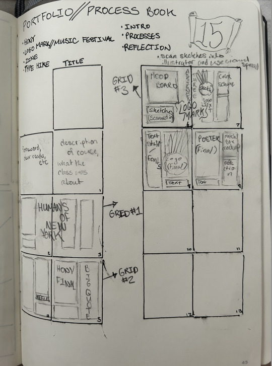
This week we finished our posters, AR type posters, and postcards for our National Park project, and then presented them in class. I’ve been working lately on my process book, and I’m enjoying it so far. Working on book and magazine layouts is one thing I enjoy more than others and it’s relaxing in a way. I hope this one will be the same. I have my layout on paper for what I want to do and have come up with a mood board and color palette which will both be applied to InDesign soon. We also began a new project where we have to design some branding based off a slang word, so I plan on starting that this weekend. Looking forward to it.
0 notes
Text

For me poster design is tricky. I find I do my best in graphic design when it comes to layouts for magazines and similar projects. I am more interested in illustration. But it’s neat to see both come together in this way. This is also something I’m learning in class now, of course I knew type and illustration went together but never could figure out how people got it to look like this and blend so perfectly on the computer. The only illustration I ever worked with was tactical or on an iPad, and it’s exciting to finally start to figure it out. After reading about each poster, it occurred to me the value they have in the advertising world, for instance the Markt Blatt piece that’s sending some sort of message about reading. It’s exciting to see artwork out in the real world used for business or other purposes other than “it’s pretty”. I think this kind of art is the most versatile and valuable in our society for that reason.
When reading about title sequences and the process it reminded me once again just how new the world of graphic design and typography we know is, and how groundbreaking technology and methods were developed not necessarily in my lifetime but in the last 30-40 years for sure. As we got to the end of the chapter a lot of questions were answered about public transportation posters, when I was travelling, I thought a lot about the people who designed the maps and signs I’d see for the metro system and other modes of transportation. I have to say then and even now that it would not be very fulfilling, but I did hear from a designer at the conference I attended this month that sometimes you have to do boring work in your career to be able to do fun work, and it helps give you a break at times from the more intense projects. I wonder if the designers who worked on these feel that way about them too, haha.
This week I have made some progress uploading my shapes into Illustrator, but as Prof. Wanco said and I agree, I have spent a lot of time on my illustration and need to focus on my typography. I am done with the illustration, so I have been working on my type poster, my animation, postcard, and designing the qr code for the poster (this is giving me such a hard time). I plan on using Procreate for my animation and would like to work frame by frame to make a small gif or short video that I could then put into Artivive. I am still really happy with this project, and it has been my favorite so far, and I am looking forward to seeing my work printed and finished.
0 notes
Text
Chapter 9 Blog Post
I think that this week was a good read, and I thought a lot about how much everything has a purpose in film from color to angles filmed to design. The sequence talked about on 160 stuck out to me for this reason, everything needs to be timed very nicely. Film syntax is another concept I never considered but that makes perfect sense in the production of something. Graphic design working with film is a new idea to me for sure. It also relates to our current project because we’re working with animation, we are considering pacing and other techniques that are being discussed.
This week in class we continued work on our National Parks projects, and spent time critiquing and gathering advice. I got a lot of good advice for mine, and was struggling with what to do at this point. I think I’m going to take a step back and really think about if I want to continue with the idea I have with the big type or try something new. I feel a little stuck in this idea. I also feel challenged with the animation aspect of the project but it will be great experience as I predict I’ll use some of those skills in the near future. By next class there should be a lot more color, a grid, and possibly a new concept of sorts.

0 notes
Text
Blog for ch: 8 Typography on Screen

Reading this chapter answered some questions I had about typography in video games and older movies I watched as a kid. When I would play a game on my Wii or DS/Gameboy I always thought the letters looked the way they did because of the screen. It’s quite interesting. I think this chapter covers a lot of UX information which I enjoy because I haven’t had that covered yet in my classes. For instance, the graphic at 8-13 is an example of a webpage and how what we’ve gathered already in our classes can be applied for that kind of job as well. You also must consider that the user will scroll, seen in the long pages with text that goes down and down. I thought the part where the grid was explained was helpful as well because there’s a little more you must consider about what you’re doing when designing the page. Unlike a poster, everything is interactive and could lead to a new page or image.
This week we began our next project after presenting our zines. TypeHike is an interactive poster we have to make with a QR code that utilizes AR to make a poster within a poster that explains the typeface we are using. We are also making a postcard, all of which will be about the National Park of our choice. I chose Channel Islands and am really excited about this one. I have made some mood board and chose my color palette, and I am working with some sketches this weekend and getting on InDesign. I want to incorporate some illustration with my work, and I have to decide what medium and how to “marry” my illustration and typography. Looking forward to this one.
0 notes
Text
Blog for ch 6: The Typographic Message

This chapter was a good read, I think with my zine project about Paula Scher this is a good place to go for inspiration and good advice on all things typography, as that was most of what she did. She played around a lot with type and letters like what is shown on 6-9 on page 115. It makes me wonder how people got all this work done and make amazing posters and layouts before adobe and the internet but even before technology in general. The history of graphic design is very cool. The work on page 120 I took the most from in this chapter and actually resembles something I would like my zine to look like after it’s complete.
As for our zines, this week I had worked from home for our first class so I spent that time choosing a sketch for the project and scanning it into photoshop and attempting to vector it into illustrator. Adobe has been not very kind to me all week so this part has been kind of a mess but I found a way to work around it. I want to print on a light green paper so I plan on making some of my letters white but I have to be careful about legibility. I plan on turning this project in early due to my trip so I will hopefully get most done this weekend which will consist of a more digital outline on InDesign and a finalized envelope design.
0 notes
Text
Blog for ch 5: Syntax + Communication

Right away after reading chapter five it reminded me of work we did last semester in ARTS 245, specifically the letter-flower project with Professor Nace. I have always struggle with displacement with shapes and negative space, but I see the appeal, as it saves space on what you’re making but also because it makes them “harmonize with one another” like stated. I also appreciate the section about columns and margins, and the importance of carefully placed text spaces that don’t overwhelm the page. The visual compensation chart (if you can call it this) is great for finding balance and tension and I will remember it when working out my grids, etc. I’m glad we had this chapter this week as there are a lot of aspects to this one that relate directly to my designer, I’m making my zine on as she specializes in creative typography.
This week in class we submitted our last project. I thought my work was good but after we had a group critique on my project and presentation I got to learn a lot on how to improve and prepare for next time. We received numbers by random after our presentations and then based off of those chose what female designer we wanted to research and create a zine about. So far we are still in the planning stage and I have done a handful of sketches and finished my moodboard for Paula Scher, my designer. I am really looking forward to working on this!
0 notes
Text
Blog for ch 4: The Typographic Grid

The golden square is something I learned about in ARTS 102 but I didn’t have much thought about it again until this class. In all of graphic design (besides navigating the software used) the thing I struggle with most is grids. I’ve improved a lot since this class but still have to much to learn, and feel like this chapter will be a great help. I think the 256-unit grid is such a good way to see the opportunity for different setups, and I really want the American Graphic Design Timelines book that was talked about. I love the idea and it seems so handy.
This week in class we’ve continued work on our logo project. I have run into SO many walls the past couple days and things are getting really frustrating. Today in class I got some good feedback and plan on changing my logotype to have handwritten text. The past week I’ve also been researching risograph posters and layouts and have gotten a lot of inspiration. At this point I am making good progress but plan on wrapping things up this weekend after I scan some new designs in. I also want to include some illustrative accents and things like leaves, plants, and fruit/vegetables.
0 notes
Text
Blog for ch 3: Legibility

This is probably my favorite chapter I’ve read in our book so far, just because as I was reading there were so many times where I thought to myself “wow that makes so much sense with what we’re working on right now” or “that’s so useful, no wonder it looks better that way.” I first thought this on pg. 52 when it explains shape, and how the word structure can change that. I think this is part of why I prefer capitals, because it can form a rectangle which is easier to work with. We are working with weight currently in our project so it was helpful for me to read pg. 55 as well, and even 56 because I’m thinking about making my font a color for my poster. My biggest takeaway might be from pg. 67 where space and text placement is discussed. It’s a lot like the presentation prof. Wanco gave last week about text and how it can be too close to the edge, etc.
Right now in class we’re making progress on our third project, which involves branding and designing for a music festival. I have a lot I still want to do on mine, but yesterday I spent some time updating my mood board and continuing the design for my poster and logotype. I’m spending the post time on the last two now and I chose a font I think is great, I just have to manipulate the text a bit to get it how I want. This weekend I plan on working on that as well as watching some tutorials and the demo provided on Thursday so I can try some new things regarding shape and color with my projects.
0 notes
Text
Week 3 Blog

On Tuesday at the beginning of this week we printed our final copies of our HONY project to turn in. I changed a lot about the design of my project after the previous week and I felt better about the way my text and grids were organized. It helped me feel a little more at peace. At the beginning of class we also began our third project, which is to design a poster, logo, and other branding for a music festival. I was nervous about this at the beginning but the more I work on it the better I feel. We started the process by randomly choosing a noun and adjective and then work from there. On Thursday we continued work with our names (I landed on The Garden Wire or Garden Wire) and sketched logos and grid patterns. Over the weekend I plan on doing more research, finalizing my logo design, and working on my mood board on InDesign that’s due next week. Excited for what’s coming next week!
0 notes
Text
Blog for ch 1: Evolution of Typography

I guess I never really thought about how the way we use typed dated back to BCE times. It of course makes sense, but it is quite interesting. The evolution of the way we use type specifically is amazing and the progression of scribble to carvings to manuscripts, etc. reiterates the fact that type plays a massive part in language and society. We learned a lot about the information shared in the book after c. 1200 in my history and art history classes and it’s nice to see the connection with the two in my typography class. In the nineteenth century with the new technology and printing it must have had such a big impact on advertising, with product being marketed in ways never seen before with these cool new machines that can make different fonts and perspectives. I kind of wish this style always stayed, but then we wouldn’t have many other styles that came from this.
This week we’ve been making progress on our HONY project, where we take an interview of someone from New York City from their website and create a graphic from it. So far I’ve been making decent progress on my work, earlier in the week I began on my paper sketches that I got inspiration for from the examples provided in Basecamp, and then scaled my favorite sketch up on InDesign where I placed fillers where I wanted text to go and then filled in the rest. I was struggling with some features I had never used in the software and got some help, so that has been a little bit of a relief. I still have some progress and I plan on looking into different fonts and experimenting with different sizes and spacings in the next day or two.
0 notes
Text
Blog Post 1

After scrolling through the posts on 99U's Youtube page I decided to watch Natasha Jen's "Design Thinking is Bullshit", and was not disappointed. Jen goes into what is wrong with typical design thinking, including stock images of designers and the problems that arise when we consider design to be just making notes on post-it notes and simple coordinated meetings. In shorter words, her definition of design thinking is "to package a designer's way of working by codifying their processes into a prescriptive approach to create problem solving that could be applied by anyone to any problem". The needed evolution of design is a conversation that needs to happen in many companies today. My favorite part of her talk has to be when she presents a collection of vegetable peels, and shows the way design has led to the change of this product from thinking about the people using it and the way it is used. I also never quite realized just how stuck in design thinking we really were, and how common these "buzz words" are that she discusses and the fact that the process of design is more like a checklist. I took the fact that it is most important to take in the needs of those you will be designing for, and to "surround yourself with evidence".
For our first week of class we worked on our tracing project, that helped us familiarize ourself with typography and handwritten lettering. It was a refresher on ARTS 245 which I took last semester, and was the first time I used a French curve. I thought this part of the project was the most challenging, as well as the lowercase G letters that needed tracing. I got to reflect on the job I did after I submitted my project and definitely feel I need more practice in the lettering and kerning category. I am, although looking forward to the next project, I enjoy InDesign and think it will be a very interesting one!
0 notes
Text
Jacksonville University Dolphins Synthesis
For the Jacksonville University brand design I want to make the logo a little brighter, I feel like the teal and “gold” (more like brown or khaki) could be a little more colorful. Not necessarily green and yellow but more of a crisp green blue with a light-yellow vibe maybe. My plan is to create three logos at the most, one being the athletic logo, one academic, and a third one that would be helpful for t shirts or promotional items. For the last promo logo I want it to look like a vintage sign, because after doing research on the city I noticed there were a lot of vintage signage that reflected the history of the city in an interesting way. It is also still colorful and beachy in a way, a feel I want to keep close to the rebranding.
I also want to change the font and feel of the academic and athletic logos for the university. I honestly wouldn’t mind if both of the logos looked a little similar.
I feel like the athletic logo which was just redone is good but still looks a little bland or dated. I also feel the “Jacksonville” on the bottom is so long and kind of thrown in on the bottom. If we could find a way to make the words and letters interact in a more fluid way it would look more visually engaging.
As for the new logo I feel I want the dolphin, letters, and possible words to interact a little more and really feel put together. like the Fell and Bell dog logo. Another idea I might go with is the stain glass type logo in the bottom. It looks interesting, still professional, and still is simple enough to be easy to replicate and recognize.
0 notes
Text
Week 8 reading response (appendix: pgs. 164-174)
In my opinion the grid being introduced to graphic designed changed the entire game. When the connection was made between math and pattern it allowed us to make work that was “foolproof”. It would be even, properly proportioned, and there would be space for more opportunity. I know how much I use typographic grids when I’ve worked in InDesign so it’s no surprise to me they became popular. As for tables and graphs I think they’re definitely useful but I wasn’t as excited about them. But I also haven’t had to made any layouts with graphs or charts in them.
This week I made some slight changes to my spread for class. I noticed the color was off on a few of the letters I already worked on so I used the eyedrop tool to make them the perfect shade, and then wrapped up how I wanted things to look for KLAE. I know Prof Nace said last time she checked out my work that things felt tight and needed to be a bit smaller, so I went ahead and shrank almost everything I had in my layouts and it looks so much better now. This week I plan on filling in the placeholder text for the KLAE pages, and double checking to make sure everything is aligned correctly and properly proportioned.

0 notes
Text
Week 7 reading response (heirarchy, web hierarchy, web accessibility: pgs. 94-102)

In “Birth of the User” the idea of readerly text is discussed, as well as the difference between seeing and hearing. I love the way the author put this because although this thought came to designers many years go it is still relevant today, especially on the internet as it also says in this paragraph. As a consumer I definitely take in media differently online than on print, and in a way they have different purposes, even if you’re doing the same thing online that you would in a magazine. I feel different when I read an article from a magazine company rather than from a paper one. I’m sure many others feel this way, and that it has created a shift in the industry and how things are marketed and shared. On page 98 when icons are brought up, it mentions the argument that icons can communicate more than actual text can. Although they communicate a lot, just like the author writes I feel they are more brand driven. Maybe this is why emojis differ so much between companies. Apple has their own, and Samsung’s is separate.
We talked about Kerning in class so I’m glad it was brought up again. I might try it in the project we’re working on if I need more space, although I’m sure that won’t or shouldn’t be an issue.
This week in class I’ve felt more than other times that I understand what is going on and can apply prior experience to my project. I enjoy working with InDesign and it actually relaxes me. It feels purposeful. I added a color scheme which I’m happy with, my biggest challenges are being afraid of a little space in my work which I’ve realized after our critique, and making my layout as unique as possible. I am excited to see where this one goes!
0 notes
Text
Week 6 reading response (anatomy, size, classification, families, big families, designing typefaces, logotypes, screen fonts, bitmap fonts: pgs. 34-58)

As I began the section for this week I was glad it was more about the anatomy of type, I would actually prefer it to be about that rather than more about paragraph designs and other topics. I need to practice my vocab and terms for the different parts of a font. When I began learning about type my freshman year of college, it seemed so complicated and intimidating because there’s so many things to consider, like baselines, point sizes, and overhang. If I’m being honest I still feel this way, but I haven’t learned about type at all since that class. I feel I’m a bit behind in my knowledge of InDesign and other Adobe software, and I think this class will help me become stronger in those areas. It is actually crazy how much a change in type can change a message of something. I loved the section about scale, where blow up type was shown and took up the entire space that the words were on. Lastly, when reading about superfamilies it answered a lot of my questions I’ve had when choosing a font.
We began class this Tuesday with going over the final sketch we had picked out from the 16 we had made the week before. The letter I decided to go with was a cross between a V and an X, but appeared to look like a W so I went with the name Dovex. I traced over my image with a pen in Illustrator, but when I presented it it was clear I needed to learn a different way to render this letter. After learning how I went back into Illustrator, turned my type into outlines, and then cut and attached letters together. I also created a black and white spread of my first two pages which we went over in class Tuesday, and I cannot include because I only have an InDesign copy that can only be accessed by the computers at McMaster and the library. I plan on improving my first two pages and creating the other four this weekend!
0 notes
Text
Week 5 Reading Response (Kerning, tracking, line spacing, alignment, vertical alignment) pgs 80-94
It is honestly new information to me that different typefaces are thought about differently by designers. I understand the idea that they communicate different feelings though, and it’s something I’ve seen many times but haven’t had the opportunity to practice in digital design. I will say I love drawing type though! It is also fascinating to me how the quality can change so much between free fonts and the ones you pay for. Almost every font I’ve ever had is free. When text is introduced it reminds me of the way I’ve learned to use text in InDesign, and how much of a difference the shape and placement of text really does make. Like when it says classic typographic pages represent the completion of a product, while alternative designs show consistency and flow between the pages, almost to keep the reader turning the page.
In the beginning of this week we finished and completed our third project, which was to create a letter that was assigned to us with an overlay of a flower whose name started with that letter. The letter also had to be in a chosen color palette and made on Illustrator. I had the letter I so I chose Iceland Poppy as my flower and worked over the weekend on my letter. I think it turned out pretty good, although the shape I chose made it difficult to add much of a silhouette or extra detail. (sorry if the photo is blurry! I couldn't figure out how to make it less fuzzy when uploading)

0 notes