Text
4 notes
·
View notes
Text
Sans soleil Chris marker
(1983)
07/05/21
Camera rarely is looking down on people, usually right next to them, eye level, or cat on a shelf level, panning up/down to look at structures
No one directly spoken to, only recorded looking it, some people looked unsure, Marker asked for permission?
Sound montages to engage viewer
not sure of some descriptions are as they sound “yellow men” in Japan
A lot of scenes ended in abrupt cuts and black outs leaving me with a feeling of unearned information, I occasionally felt like “I don’t get this reference it must be cos I’m ignorant”
So instead I began to make moral lessons on culture from scenes I saw based on my opinion.
Have to rewatch
“ponders the topics such as memory”
Discussions about why some people looked into the camera and if they were asked permission? Would it be forced after?
VoiceOver collage of imagery, loose dreamlike flashbacks
Nostalgia for something I haven’t experienced
https://www.markertext.com/sans_soleil.htm
1 note
·
View note
Text
Interview Task:
Thursday 29 April 2021
30 mins
What’s your earliest memory of drawing or being creative?
Do you draw for yourself?
What is your favorite art medium?
Acrylic, I live water cooler, ok, I’ve done most of that and I really actually enjoy that, I often mix you know like acrylic guoache, watercolor, they have things that work well
I love collage I don’t really do it do you feel something is stopping?
Collage is useful when you have magazines and materials,
Im not a spontaneous artist at all, im a terrible perfectionist
First step is a sketch, refining sketching before brio
Last year a lot of biro,
Fineliners are a it too thick with biro same textures as pencil, you can use with anything
I go over things many many times I f its digital, first sketch you know second, line work,
Unless its life drawing, im less strict I hate most of what I do
Why do you hate it?
Haha therapy session
Hate is strong word, disonent not hate, I say ok I like the element of work, sometimes is boring or not as striking
I guess people see in t things I don’t see
Benefit of the fresh eye
Do you struggle to have a fresh eye in work?
Often nearly all the time, I finish after working a lot on it, ugh whatever it exists in the world
And people say omg I love it, which is surpising and enjoyable
Its quite short lived, that grace period of liken work, lasts 5 minutes
Value your work on the comments?
Not always, if tis something I think is really awful no comment can change that
I don’t judge my work on terms comments most of the time
A warmer gaze
So yes and no haha
Fave piece you did?
When you asked me to bring I was like hmm I don’t have much on me, I’ve only been here a year so that’s all I have, my drive from years previously
So either its work have 2 years ago or work ive done this year I haven’t got omg this is amazing but ive got reasonably content about
My older works
I enjoy seeing work
What was story of work?
Extremely broad with briefs, I was terrible with following
30 minute spiel, I can’t even remenerbrief, I have wonderful fine arty ways of explaining it
Next work:
Camouflage? Transformation?
Went a completely different route SERIAL KILLERS!
The man is ind of sissapearing behind the crimes, loses human side,
Hes dead now, he used to skin people. House full of skin furniture
I used these kind of pits of material,
Do you use mixed media?
I always love mixed media
The work is childish to me, slightly naive
I haven’t evolved much since, fond memories of that, I enjoy shocking people
What I love about ill is incite emotions from people and convey a certain atmosphere and mod I ,love dark and gloomy pieces Bec very expressive, im quite happy person and bubbly or whatever
I do love creepy paintings and stuff, especially if im making them and watching them shocked and really disturbed
Very entertaining
Where did the come from to shock?
Who knows? Im nt very good at psycho.. I dint know, a bit out of the refinery and I enjoy bits out of the ordinary, I don’t know to be honest..
Least fave?
Ive got lots to choose haha…
From the poetry competition I even did sev ver of this shit hing
How did it start?
I was extreme insipid by poem, chicken town really cool grunge poem, quite rude, quite different how see the world
A bit moros e yeah and capture the essence of the poem
I mean ive captured this air of boringness
Perhaps not textured enough
Ive got this other ver frankly not any
When did yo0u decide you didn’t like?
Most of the way, usually half way through, I don’t beat myself up too much about this thing not like oh gosh I should
Internat debate?
Yes, you know Eloise you get better with time, its normal you learn dn kind of progress
Recent? (Animation)
How do you feel about it?
Days it took me to make, weeks maybe,
Comments?/
Overall im acc quite happy with it now, animation reasonably fluid, I want every scene to develop, I had a lot of constraints, small amount of frames I had, it was procreate, its ok, idk, im very harsh
Do you see a clear path how to fix?
Yeah I tell myself im only on beginning, its perfect normal im learning, I prefer showing things I actually like.
How do you feel sharing your work?
I acc not got many problems to be honest, ive never, so one of my main horrors is to appear like im boasting, I inherently hate cockiness, most of all in myself oh god is that cocky? Its not all consuming, I do enjoy showing Bec its fun people kind f like what I do, usually people have a kinder gaze than Ido, not ego stroking, soothes my critical eye
Fave food?
I love food. One of my main pleasures in life, and friends and family, lasagna, sweets ice cream, not cake always, caramel
Sweet tooth.
Pressure to be short and concise
Eloise
Extremely rarely draw for fun, I must draw, I should enjoy
How did you learn languages?
Born in England for 4 years
Mother spoke to me in French
Different language at home than out
When I have a goal in mind
Motivated to give presents
0 notes
Text
Context session 23/04/21
Primary research - unique unpublished research
Due may 14
Ethics? how do I prorate someones feelings, culture etc what do you not show? Censorship?
Expanding forms and sources of primary research
Its easy to find data to try and support your work rather than generating data and THEN making your point
How do you reach out for information on a low budget project
Weekly group work
Final: 20 min group presentation
INTERVIEWS notes:
Challenge preconceived notions
Unique insight
Intimate understanding
Building confidence in discussing own work
Nuanced topics more represented
Dialogue via call or zoom is better than a survey for in-depth understanding
Its better to not interview anyone than randomly and rushed
Has to be planned and relevant
What will they bring to the research?
Emailing the people is usually best, but not necessarily, instagram or messenger can make sense too
No more than 50 words for summary of project, even one sentence “id like to invite you to an interview” “could we conduct the interview within the next month?” - don’t push dates but mention timeframe
Make it clear you know their work and thought about their practice “can I ask you more about that?”
Don’t ask too obvious Qs, nothing that should exist already
Reach out to a few people to maximize response, wait 2 weeks for response then consider moving on if you need to carry on
Generating interview Questions:
_what are they bringing to your research?
_Go straight In after chit chat to get tempo _leave your recording to go on till very end, get all bits in
What do you want to get out of this person?
Specific claims through research
Interesting VS relevant
Send a sample of as if they prefer or you would need them to prepare more
Allow convos to meander BUT be aware of how much text is generated, control the interview somewhat
1 hour can be 10,000 words!
Transcribing: can be by hand but takes more effort. listen to recording, write timestamps as you go through of key points don’t transcribe whole thing
Be ruthless Otter.ai (3 quid a month) transcribes audio mp3 files save copy of original when editing don’t change context or content
Don’t change to ‘queens English’
other:
Pseudonyms for anonymity
Consent: its not published anywhere so should be fine good practice to share what you’ve edited from interview
Don’t interview the ‘more approachable’ people
Not all interviews have to be about Qs, can be chatting developing a point
Use initials to show who is talking VM: or AH:
Can use no names and just change text format to differentiate
Similar to essay, still using images, captions, references
Play with formatting!
Links:
Sam’s podcast:
Https://Palanga.live/archive
https://soundcloud.com/palanga_street_radio/sets/common-ground
Project Interview examples
https://www.southlondongallery.org/journal/angelica-teuta-in-conversation-with-project-leader-samantha-lippett/
http://journal.rupert.lt.nutrija.serveriai.lt/
Task:
Generate qs to ask peers based on practice
Edit recording onto blog
How do you feel interviewing vs being interviewed?
INTERVIEWING ELOISE ON Illustration:
Always read books “bookworm” caught my eye
Books for young kids had lots of illustration
Fine art before
Had you always liked fine art
No good art classes at school
Particularly bad teachers
Fair enough yeah
Idea of fine art was vague
In foundations “I want more structure”
“Accompanied images with writing
Is illustration everything you wanted
Not doing the right thing
Lost love of drawing
v: I don’t draw much either
E: I wonder what it feels like to draw daily
Ami going to enjoy this as a job
How do you express yourself?
When my creativity was higher sculptures, collage, paper mache
Perhaps our inspiration run low this year
Case of most of us
I do enjoy trying different print techniques
Draw in my bedroom
When was the last time you did sculpture?
The only time I finish a project is as a present
Adorable cat present for Jagoda
Illustration isn’t always painting
Does illustration fit into your practice
I don’t know I hmm..
I do remember, I must love art still, I always enjoy art
Do you think you have changed how you produce and consume art?
I hope so
I consume too much media, social media distractions
Task:
Arrange a time this week
3-4 qs
Record on phone
Transcribe sections, don’t change nuances of how people speak
Follow steps on pdf unihub
30 min interview
Add images to interview and discuss them
Ask to bring sounds, objects etc…
Show their/your personality
Reflect on the entire experience
0 notes
Text
SURVEILLANCE through art! by Valerie Moore
The modern world is under an imminent threat, a battle of the ‘seen’ vs the ‘unseen’. Londoners are especially at risk of non-consensual surveillance with over 500,000 CCTV cameras dotted around the mega-city. People in London are recorded, photographed, watched over 300 times a day. All of which is done without awareness or agreement.
The discovery of being recorded without permission in a world constantly fighting for human rights is disturbing. Such a fact can be overwhelming to many but a simple way to reduce this anxiety about being ‘watched’ is by gaining awareness of surveillance.
The following artists will demonstrate ways one can change their perspective on surveillance and reduce the fear of the unknown. Viewing examples of surveillance art and learning that anyone has potential to take back control is a step forward for humanity. Giving the ‘watched’ the resources to become the ‘watchers’.
Figure 1 - YOU ARE ALWAYS BEING WATCHED, SO PUT ON A SHOW
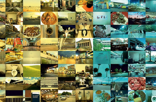
The image above is from Hasan Elahi’s 2002 “Tracking Transience” project. It started when Bangladeshi-born Hasan Elahi was wrongly associated with terrorist activities in a Detroit airport. Despite his innocence being proved, the FBI continued to follow his movements - invading his privacy. Hasan Elahi, wanting to maintain full cooperation, began to ‘self-surveil’.
Elahi began to upload photos of his every mundane move, sharing his live location via his website “http://www.trackingtransience.com”, for anyone to access - including the FBI trackers. “After all,” he says, “the FBI wanted to know everything about me and I’m all about full disclosure.” Posting over 70,000 photos, Elahi remained in control by being one step ahead of the watchers, giving out information before the FBI asked for it.
The photos range from Elahi’s home-made meals to toilet trips, exposing his most intimately dull moments through a colour-coordinated collage. Elahi acknowledges that most of the images are of “empty, desolate… outright depressing” surroundings, showing how surveillance can be dehumanising. The activist’s photography sends out a striking message: to turn injustice into a strength. His work raises awareness of the inhumanity of surveillance through the hundreds of collages, for instance he declares every flight he takes, the planes tracking number and which airports he visits, proving he is not partaking in terrorist activities. In events such as his TED talk titled “FBI, here I am!”, Elahi assures he maintains an “incredibly anonymous” life and that those images do not represent a fraction of his real existence, but they do represent the intrusive policies ‘surveillance’ follows. Elahi believes in “creative problem solving” - the FBI posed him a problem, he solved it. To this day, Hasan Elahi is sharing his location and does not plan on stopping, representing the ongoing fight between the ‘surveillers’ and the ‘surveilled’.
Figure 2 - TRY HIDING

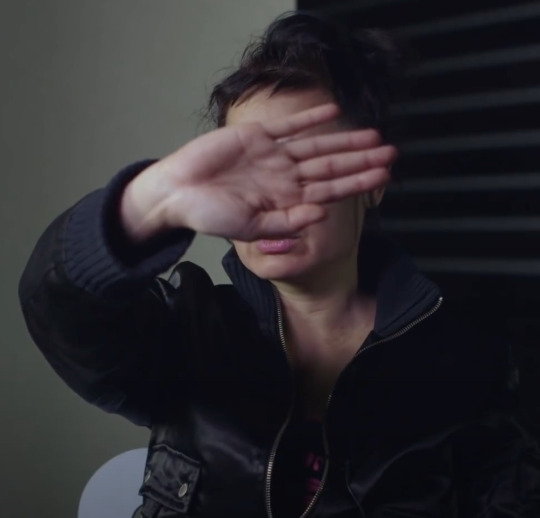
The image above is from Hito Steyerl’s 2013, 16-minute short film: “How Not to be Seen. A Fucking Didactic Educational .MOV File.” The video contains several helpful rules and factors that contribute to one’s visibility, essentially: how to be ‘hidden in plain sight’ in a world under “constant surveillance”. As green make-up is applied to Steyerl’s face, blending her into the green screen background, she explains the problems with surveillance and “being visible all the time”. Modern surveillance cameras are increasingly better at blending into scenery seamlessly, making the task of identifying surveillance more problematic, Steyerl’s work addresses this through 5 acts, 5 chapters and ‘rules’ in the ‘MOV.File.
She offers imaginative examples of instructions, including simply ‘pretending you are not there’ or covering your face with your hand – former relating to a state of mind to ease anxiety and latter showing how you can use your body to obstruct the lens.
The image of Hito Steyerl above represents a political and playful message and crucially starts a dialogue. She reminds people of their rights and that living in a society with ever-growing technological developments does not mean we must blindly comply. Replacing fear and ignorance with knowledge and power is key.
Stereyl states that people may want to “escape from… constant surveillance” but struggle to do so, which is a grim reality particularly for the ageing populations, who are susceptible to growing out of touch from technological advancements. She explains that being invisible is trait people should seek to have and use. A trait, Steyerl continues, that makes a person “deadly”. This is an empowering practise that allows the person to choose if they want to be visible.
Another human rights concern this movie addresses is the lack of disclosure on surveillance technology developments. In London summer 2020, the police introduced the use of facial recognition in street cameras, with no apparent announcement of such. Facial recognition data undoubtably sensitive, which society should have the choice of providing.
Figure 3 - Never hiding its presence, but never announcing its arrival

The image above was taken from Jon Rafman’s Nine Eyes 2008 (and ongoing) project. Jon Rafman’s project “The Nine Eyes of Google Street View” provides perspective on surveillance and context on modern day concerns.
The title of the project alone rightfully humanises the Google Street View cars, as there are a pair of eyes behind every camera lens. His collection of digital photography through Google Street View, demystify surveillance technology, showing that the world is unpredictable and bizarre – a comforting reality for some.
A suspicious clown, looking through the window directly into the ‘9 eyes’ of the camera is a surrealist comedic scene. Such a scene is an unexpected one, which is why Rafman deemed it suitable to his online collection. These visuals, Rafman argues, are something we ought to see as a civilisation to learn about our society - learning how ‘surveilling’ conglomerates operate is a crucial and useful skill.
By acquiring this awareness of Google Maps’ operations, society is less likely to demonise the technology and more likely to confront the real people in control.
Rafman does not give Google credit for the moments captured but instead to humanity, for being the weird and wonderful beings they are. Google, Rafman claims, was simply at the right place at the right time.
The project shows how simple it is to access footage online through resources such as Google Maps, encouraging the ‘viewed’ to transform into the ‘viewer’. His work encourages people to not feel like mere subjects to CCTV and camera lenses.
“Never hiding its presence, but never announcing its arrival, the Street View vehicle is a systematic pursuer of fleeting moments.” – Jon Rafman
Figure 4: “A reason to look up at the sky”

Can satellites exist to advance art solely? Trevor Paglen argues that they can, and they should; he entertains this reality through an innovative project titled Orbital Reflector (2018) where he plans to launch a satellite into space, solely as an “artistic gesture”. With help from Nevada Museum of Art, Trevor Paglen’s non-functioning satellite is an example of how art can change the way society approaches surveillance satellites.
He deconstructs the definition of a ‘satellite’ by launching one into space solely as an “artistic gesture” unlike the 2,666 military and private satellites currently in space (statistic from Union of Concerned Scientists, 2020).
The project encourages satellites to be viewed as a means of creative expression and further demonstrates that technological advancements do not have to be a ‘scary unknown’. Paglen believes technology is about promoting thought-provoking discoveries. Art gives people “permission to look at things” states Paglen, which is arguably the most effective way to learn, by encouraging people to look at the CCTV epidemic, they are more likely to establish their stance on it, stepping closer to consensual surveillance – this is a crucial step for society’s evolution.
The project encourages people to disassociate satellites from military, commercial and scientific purposes, and to associate it with beauty. By reminding people to look up at the sky, Orbital Reflector encourages humanity not to worry about constant surveillance, constantly.
-
With each project, the artists send out a pungant message, visually demonstrating the complexity of the surveillance situation and of human emotion. There is a growing alienation between the ones recorded on CCTV and the ones recording.
According to a 2020 study by Comparitech, it was found that China holds the title of having the most surveilled cities, making up 9 of the top 10 cities across the globe. London is the 3rd on that list.
Hours and hours of surveillance footage recorded across the world remain unseen by the human eye which can be a reassuring reality. Recordings are easily lost, recorded over, deleted, damaged or forgotten. As CCTVs numbers rise, so should the amount of relevant information. As a society there is a duty to stay informed on world issues, so if the officials in charge of surveillance do not release crucial information on surveillance, society must seek to obtain it in another way.
Knowing what surveillance looks like in the real world is a crucial skill and strength. When a camera is pointed at you, point one right back.
References:
Figure 1:
Elahi. H (2002) Tracking Transience v2.2. Available at: https://elahi.gmu.edu/track/ (Accessed: 20 April 2021).
Figure 2:
Steyerl, H. (2013) ‘How Not to Be Seen: A Fucking Didactic Educational .MOV File’ [video]. Tate Modern, London. Available at: https://www.tate.org.uk/art/artworks/steyerl-how-not-to-be-seen-a-fucking-didactic-educational-mov-file-t14506 (Accessed: 6 April 2021).
Figure 3:
Rafman, J. (2008) ‘Nine Eyes’. Available at: https://9-eyes.com (Accessed: 20 April 2021)
Figure 4:
Nevada Museum of Art (2018) ‘Trevor Paglen: Orbital Reflector / Updated’. Available athttps://www.youtube.com/watch?v=6iiZaWpS4no (Accessed: 17 April 2021)
Bibliography:
British Broadcasting Corporation. (2010) 'Six crimes a day' solved by CCTV, Met says. Available at: https://www.bbc.co.uk/news/uk-england-london-12080487 (Accessed 20 April 2021)
Buchholz, K. (2020) ‘The most surveilled cities in the world’. Available at: https://www.securityinfowatch.com/video-surveillance/press-release/21159928/the-most-surveilled-cities-in-the-world. (Accessed: 14 April 2021)
Datta, A. (2020) ‘How many satellites orbit Earth and why space traffic management is crucial’. Available at: https://www.geospatialworld.net/blogs/how-many-satellites-orbit-earth-and-why-space-traffic-management-is-crucial/ (Accessed: 20 April 2021)
Parliamentary Office of Science and Technology (2002) ‘CCTV’. Available at:
https://www.parliament.uk/globalassets/documents/post/pn175.pdf. (Accessed: 12 April 2021)
Rafman, J. (2009) IMG MGMT: The Nine Eyes of Google Street View. Available at:http://artfcity.com/2009/08/12/img-mgmt-the-nine-eyes-of-google-street-view/ (Accessed: 19 April 2021)
Ratcliffe, J. (2020) How many CCTV Cameras are there in London? Available at: https://www.cctv.co.uk/how-many-cctv-cameras-are-there-in-london/ (Accessed: April 18 2021)
Tate. (2016) ‘Hito Steyerl – 'Being Invisible Can Be Deadly' - TateShots’. Available at: https://www.youtube.com/watch?v=kKAKgrZZ_ww (Accessed: 21 April 2021)
TED (2011) ‘Hasan Elahi: FBI, here I am!’ Available at: https://www.youtube.com/watch?v=wAdwurHhv-I(Accessed: 21 April 2021)
Williams, G. (2014) ‘How To Write About Contemporary Art’, London, Thames & Hudson (Accessed: 21 April 2021)
0 notes
Text
SURVEILLANCE AND TRUTH
DUE ON:
Surveillance as ART!
Can we create things that Surveil for art and not just commercial.
“The idea is to build a satélite No militar, scientific or comercial value... is a work of art... can we imagine space is for art”
Trevor Paglen
https://youtu.be/1wRLpP_uuxA
we are adapting to only reveal certain snippets of ourselves to observers “remnants of his cat but no real proof
hita steyerl “hiding in plain sight”
This says that socially we love to document photograph, get nosy and intrusive even if we don’t realise it. We surveil and observe 24/7. We are surveilled and observed 24/7.
We should continue to document, film , photograph because we can.
It’s not all zoom and gloom:
Chase Jarvis once coined the phrase “the best camera is the one that’s with you”,
In 2017 According to estimates by InfoTrends, a total of 1.2 trillion digital photos will be taken worldwide this year, that is roughly 160 pictures for every one of the roughly 7.5 billion people inhabiting planet earth.
https://www.google.co.uk/amp/s/www.statista.com/chart/amp/10913/number-of-photos-taken-worldwide/
Camera being watched by humans
Set goals
Title
Visual resource, social media campaign, screen shots?
Write down summary
Put on blog
https://www.estherschipper.com/exhibitions/965-i-will-survive-hito-steyerl/
https://www.berlinartlink.com/2017/03/28/exhibition-surveillance-art-photography-at-co-berlin-and-the-museum-of-photography/
0 notes
Text
Spiritualism photo essay
I’m fascinated by death and death positivity, which essentially is being as ready as you can be for death and handling the death.
(Which is easier said than done.)
I came across an early days photographer William Mumler that, in my opinion, goes directly against helping people with that matter of death.
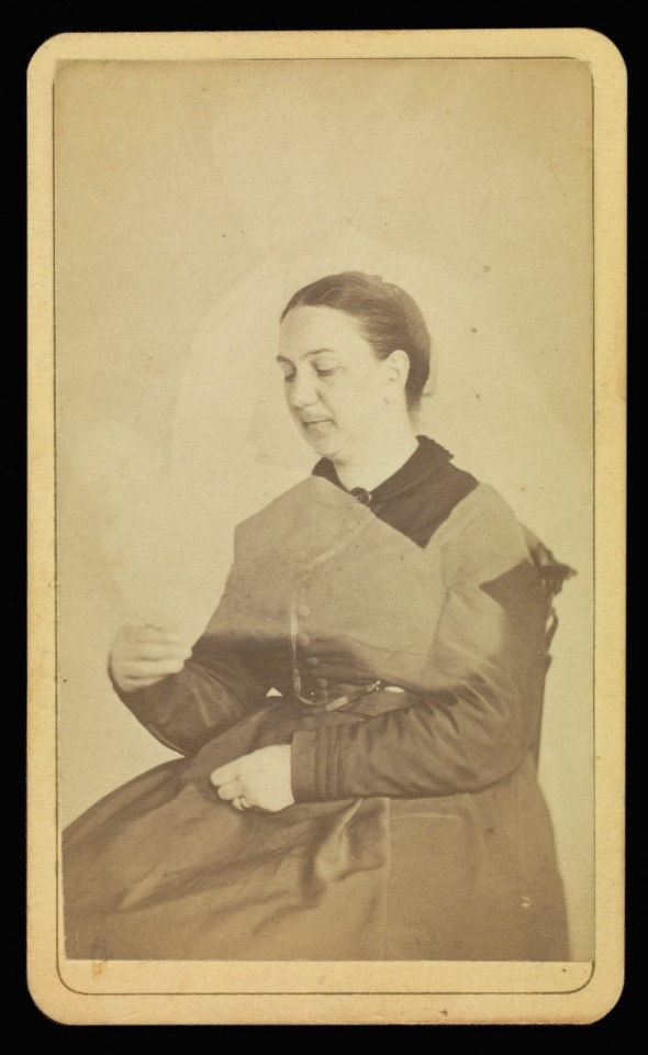
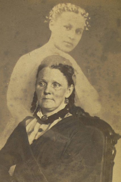
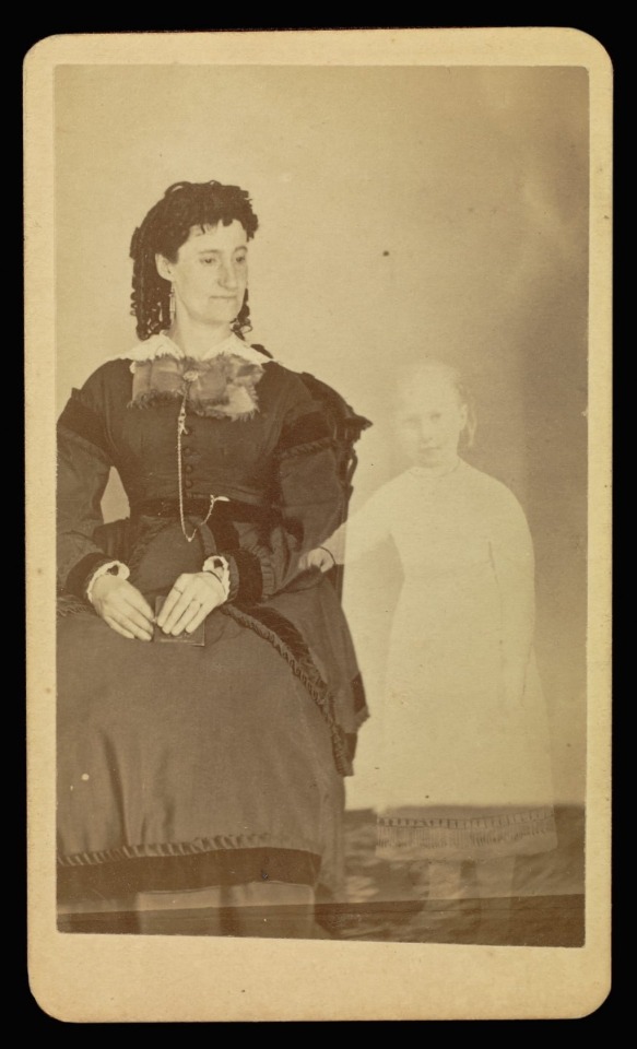
This photo shows a woman sitting down, holding her arms up, ready to embrace the spirit of her deceased baby for one last time, as promised by William Mumler a reputable photographer for his time.
The image shows the spirit of her baby floating just above her arms, forever out of her grasp.
In the 1860s after the American civil war, more than half a million people lost their lives.
Not only was this a tragic emotional loss for friends and families, soldiers died far away from home, alone and deserted, which at the time meant no guarantee of entering the afterlife as a specific ceremony was usually performed with the deceased to ensure this.
The sorrowful people clung onto anything that would ease their endless pain.
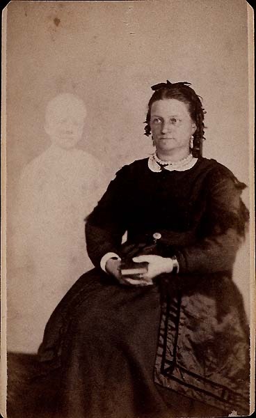
William Mumler took that opportunity and developed a bizarre photographic technique that produced these double exposed images, which at the time of early photography, was unheard of. The technique revealed an apparition of the spirits of the dead, or so he claimed they did.
The rise of spiritualism helped convince people of the authenticity of Mumlers photos, which was a fast growing movement by the Fox Sisters, who claimed they could talk to the dead through seances.
Despite their success, they eventually revealed that they had staged every single seance through tricks such as cracking their fingers and toes under the table to mimic spirits knocking.
They even went as far as demonstrating live how they lied and told the people that it started as a prank on their mother one night when they were bored (typical teens), but it was too late and spiritualism was already associated with other powerful movements such as feminism and abolitionism.
Even after the Fox sisters admitted it was all fake, Mumler the trickster photographer didn’t. Infact he comtinues to take advantage of people by charging them $1 per image, which would be $33 today.
He continued to produce deceptive images and selling false hope and comfort to many families. Here are a few more examples
The images themselves are rather eerie and unique, something that is arguable impossible to recreate today. They have a perfect balance of creepiness and comfort.
Mumler was a crook. Not for producing such images, but for selling them as a promise to many to reunite with their lost loved ones.
If the photos were created as a clearly explained memoir with no false hope or claims that their beloved deceased are living spirits, I believe the images had the potential to actually help the mourning families.
Just as Don McCullon states his photography “froze time” by romanticising horrific events, Mumlers photography lead to people obsessing over reaching out to their lost loved ones, essentially extending the excruciating healing process far beyond what it needed to be.
William Mumler was a crook but a talented crook nonetheless.

Roos, D (2019) ‘When a 19th-Century ‘Spirit Photographer’ Claimed to Capture Ghosts Through His Lens’. Available at: https://www.google.co.uk/amp/s/www.history.com/.amp/news/spirit-photography-civil-war-william-mumler (Accessed: 5 March 2021)
Kaplan, L (2008) The Strange Case of William Mumler, Spirit Photographer, University of Minesota Press, New Edition (Accessed 5 March 21)
1 note
·
View note
Text
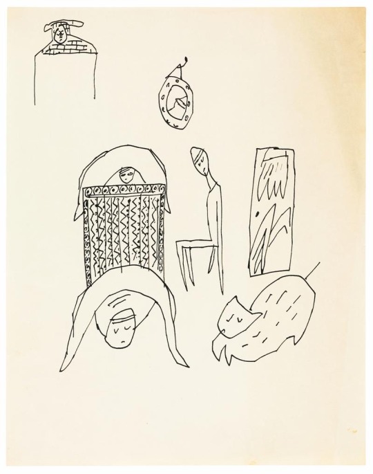
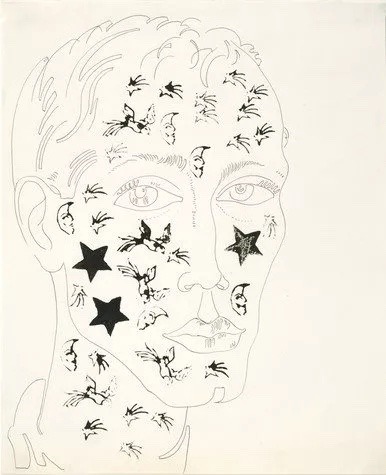
Andy Warhol’s early sketches using ink (and some rubber stamps in second image)
Web links:
https://hypebeast.com/2019/7/andy-warhol-galerie-bucholz-drawings-exhibition?amp=1
https://www.warhol.org/lessons/rubber-stamping/
0 notes
Text
Bizarre 1930s short comedy video
https://youtu.be/8CFcp2wzmEY
Gordon’s
Makes us very
DruNk
youtube
0 notes
Text
(Extra notes from previous essay I want to keep)
Poster essay research:
Vanity fair, colour schemes in movie posters explained
https://youtu.be/BEbW2fXSShc
- Red and white for comedy, light hearted
- Blue for thriller, darker movies
- Yellow indie to attract viewers cheaply
- Black white orange for action
- Blue and orange for fantasy
0 notes
Text
Notes on artists I appreciate:
Nigel Parkinson- Beano
Sent to DC Thomson [the Beano’s pub] and one to the London publisher, IPC magazines
Ghost artist work- filling in unavailabilities and copying the original
Use layout pads and markers
“That’s what you do. You just pester them until finally someone is sick and can’t do the job, or someone is late, and that’s your chance, and you have to grab it. And hopefully you get another piece of work later on. I spent 17 years asking the Beano editor for a job and eventually he relented”
Soaking in techniques at British newspaper archive
And you must be relentlessly, unapologetically persistent.
More MORE artists to see:
- Hark a Vagrant
- Walt Kelly
Marcus Oakley
John broadly
Richard Scarry
Tom Gould
Mark butifon
Roger Robertson poem on the train “And if I speak of paradise”
0 notes
Text
An Appreciation of an 80s movie poster
by Valerie Moore
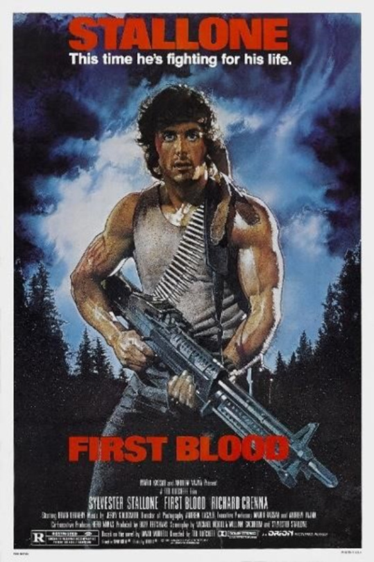
There is precisely 86 years between the first ever movie poster by the Lumiere Brothers in Paris 1896 and the 1982 First Blood movie poster by Drew Struzan. This is relevant to anyone that appreciates 80s poster art as 86 years is the amount of time it took for artists to achieve adventure movie poster perfection.
In order to explain why Drew Struzan’s First Blood movie poster was so successful, a visual investigation of the posters colour, texture and composition should be carried out.
The first element to assess is the artists use of colour. Struzan pieced this poster together using a meticulously thought out combination of hues that entices the viewer to be pulled into an atmosphere of thrilling tension, combat and peril, quintessential to the 80’s trends of “bright colours, graphic patterns, and geometric shapes” to quote the Designer Blog.
The poster reveals a story of revenge so sweet and horrors too horrid to be spoken out loud, justice to be quenched and a battle to be won. It may not be that dramatic in the real world but for a split second there is no real world – all that there is is Rambo, his gun and those intense clouds. The pastel blue day appears to be on the cusp of becoming dreary night, which is a notorious symbolism of foreboding the dangers that aren’t afraid to lurk around in the dark even in the seemingly safe town of Hope, Washington. This emotion evoking technique forces the viewer to feel that claustrophobia through clever use of colour theory. The background depicts a kind of chaos that echoes old master’s paintings, where the sky is used to reveals truths of what is yet to come. The eerie calm before the storm. It is a never ending story of good versus evil and Struzan encapsulates that flawlessly.
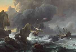
Ludolf Backhuysen Ships in Distress off a Rocky Coast, 1667

Cropped First Blood 1982 poster
Moreover, the solid black trees that blend into even gloomier clouds engulf Rambo, representing the opaqueness of the dense forest enclosing him, mercilessly providing no escape, a successful use of pathos. Struzan knew that the movie wasn’t a story of tragedy - that where there is dark, there needs to be light. The bright aura-like cloud surrounding Rambo represents not only a sign of hope in Hope, literal sunshine, but also a more metaphorical positive message – there is light at the end of Rambo’s literal and metaphorical tunnel (reference to Rambo 5, Last Blood).
The same way Backhuysen tells the tragic story of the Distressed Ships on a journey, there too will be sunlight in the sky once again. This use of chiaroscuro and hues is a clear and effective way to inject positivity into the art to balance the treachery.
James Verdesoto, the movie poster artist behind iconic posters like Pulp Fiction, explains the purpose of different colours in various genres. This is not only a financially economical approach as there is less art to create to fill the often large (roughly 1m X 70cm) posters but the artist can rely on a tried and true approach, the colour wheel. Reds, yellows and oranges are strong colours that attract human gaze throughout the history of mankind.
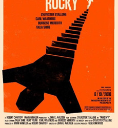
This 2010 Rocky poster by Saul Bass is a notorious example of work that backs up this claim:
It is bold and stands its ground but there is a different mood that doesn’t break the fourth wall the way Struzan’s work does. It does not divulge much information to the viewer on the contents of the film and limits the level of story-telling.
Saul Bass, Rocky movie film poster, 2010 edition
80’s posters did not typically follow this method of shocking simplicity. Clean lines and silhouette symbolism was a technique that was not too popular in the movie poster community of the 1980s decade. To achieve the particular look Struzan had perfected required filling every inch of poster space with dramatic scenery, in this case, swaying trees, stormy sky and bold text. This consideration of composition with a filled backdrop is to give the viewer all of the information that they require to grasp the mood of the film - full of action, drama and chaos – the perfect 80’s adventure escapism people crave to this day.
Furthermore, the First Blood poster has many textures that allow the art to achieve a threedimensional effect. The grainy and ‘gritty’ quality the poster possesses is typical of the 80s look. There is a worn quality to imagery that is now a classic connotation of that era. Although some of that is inevitable due to ageing paper and outdated poster printing methods, most of that is intentional. The blurry dream-like effect added was a clever stylistic choice by Sturzan. This textured ‘noise’ effect on the image instantly makes the art less precious and more raw. It is arguably this element of rawness one can feel through the art as if the rain in the forest is damaging the poster itself. This plays with all of the senses, 80’s posters are 3-Dimensional posters, and First Blood truly embodies this.
Some other honourable mentions of 80’s posters have to be:
Indiana Jones and Back to the Future by Drew Struzman
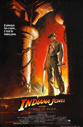
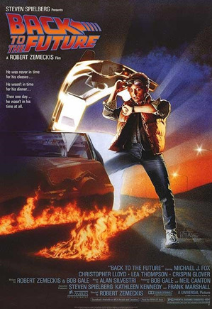
To conclude, the First Blood poster contains all of the elements to be the quintessential 80’s ‘action-adventure’ poster as shown in its use of bold colour schemes, captivating composition and textured quality. Movie posters are pieces of art that showcase another form of art - films.
The role of a movie poster is to entice the audience, inform them of key facts of the plot and grow attached to the beloved characters as they wade off evil forces. It is a rollercoaster ride that requires no effort from the audience, a spoon feeding of serotonin. Not everyone has to like the First Blood movie poster, but many have heard of it which is when it can be deemed a successful movie poster.
References:
www.nga.gov. (n.d.). Dutch Landscapes and Seascapes of the 1600s. [online] Available at: https://www.nga.gov/features/slideshows/dutch-landscapes-and-seascapes-of-the1600s.html#slide_4 [Accessed 8 Jan. 2021].
Christiaan (n.d.). 80’s Design Patterns: What Graphic Design Style was Popular in this Decade? [online] blog.designbro.com. Available at: https://blog.designbro.com/80s-graphicdesign-patterns/ [Accessed 8 Jan. 2021].
Scott, D. (2017). A Comprehensive Guide To Color Theory For Artists. [online] Draw Paint Academy. Available at: https://drawpaintacademy.com/a-comprehensive-guide-to-colortheory-for-artists/.
Fair, V. (2019). Movie Poster Expert Explains Color Schemes | Vanity Fair. YouTube. Available at: https://www.youtube.com/watch?v=BEbW2fXSShc.
Mark (2012). So It Goes...: 80s Film Posters. [online] So It Goes... Available at: http://randomramblingsthoughtsandfiction.blogspot.com/2012/07/80s-filmposters.html [Accessed 8 Jan. 2021].
Caravel. (2015). Back To The Future 30th Anniversary Poster Art Tribute. [online] Available at: http://caravel.co.il/back-to-the-future/ [Accessed 8 Jan. 2021].
Unknown (2014). Abby Peek: Saul Bass Inspired Movie Poster. [online] Abby Peek. Available at: http://abbypeek.blogspot.com/2014/04/movieposter.html [Accessed 8 Jan. 2021].
NiceArtGallery.com. (n.d.). Ships In Distress Off A Rocky Coast 1667 Oil Painting, Ludolf Backhuysen Oil Paintings. [online] Available at: https://www.niceartgallery.com/Ludolf-Backhuysen/Ships-In-Distress-OffA-Rocky-Coast-1667.html.
egoamo.co.za. (n.d.). Rambo First Blood Poster. [online] Available at: https://egoamo.co.za/products/rambo-first-blood-poster [Accessed 8 Jan.2021].
0 notes
Text
HAIRY SITUATION
Body hair - should we care?
WARNING!
This manifesto is a non-manifesto.
It is not a preach for change.
It is not calling out an existing norm and forcing a new tradition.
What is this then?
It is a set of equations that can help simplify YOUR decision-making to support INDIVIDUALITY and PREFERENCE.
This non-manifesto can be boiled down to 4 simple equations.
If you:
1) have body hair + love it = do what you want
2) have body hair + hate it = do what you want
3) don’t have body hair + love it = do what you want
4) don’t have body hair + hate it = do what you want
Minding your own business:
Body hair is still associated with topics it should not be associated with:
● politics
● gender
Mixing OPINION and FACT is a tricky business as there is a chance of imposing opinion AS fact.
OPINION ≠ FACT
The blurred lines between OPINION and FACT leads to people following other people’s opinions as facts and that leads to following opinions you don’t agree with. For instance:
● Shaving your legs when you don’t want to
● Not wearing certain clothing to hide body hair
● Wasting money on razors and waxing when you don’t want to
● Time spent when one could be doing more enjoyable or productive things
● Environmentally impacting the Earth by using disposal of razors.
(Did you know the average person who shaves daily or near-daily uses 40-50 disposable razors annually)
OPINION VERSUS FACT:
Believe it or not many individuals believe their opinion is in fact, fact.
This non-manifesto believes:
All opinions are valid
All facts are valid
Opinions are not facts
Facts are not opinion
“clean shaved woman means beautiful”
“a beardless man is not a man”
“hairy legs can’t be on display”
These are OPINIONS that are confused for FACTS.
Body hair is ART!
This manifesto exists to drive people to never conform to rituals that one does not like.
You are in control. You can make a statement. You decide how to present yourself to the world.
Your body hair is YOUR statement, it can be a weapon of self confidence, it’s taking ownership of your own body and refusing the preferences that someone else has set UPON you.
Just always be sure it's your choice and no one else’s.
Anonymous Anecdotes:
Anecdotal evidence suggests that promoting choice and following the previously mentioned equations leads to a healthier relationship with yourself.
#1Growing up in a latin household is getting used to sexist behaviours from all of your family members including your mom and sisters. From the age of 11 my parents and siblings have warned me that having any type of pubic hair was dirty. And nothing has changed to this day. As I go to the beach, I still feel the need to shave every single inch of my body. However, my brother always finds a way to judge the way I look, from finding a single hair on my armpit to squeezing my leg and commenting on how disgusting my cellulite is. This was obviously harmful to my mental health as I now never wear revealing clothing if I haven't shaved beforehand.
Issues here: shaving when she didn’t want to, opinions imposed as fact.
#2 For most of my childhood, I wasn't really aware of my appearance. I chose the clothes that I enjoyed wearing (a lot of long skirts and wellington boots) and I didn't think that my choices would matter to anyone else. This changed when I started middle school, through teasing and comments from friends and others peers. I remember vividly the first time I was told I should shave, I was around 13 years old. My first reaction was surprise that it was an issue for anyone, then acute embarrassment since it became apparent that having armpit hair was undesirable and something to be ashamed of. Years later, while I still shave my armpits, I regularly don’t bother doing it, and I never shave my legs. Not caring as much is definitely freeing.
Issues here: person knows of other people feeling unhappy with body hair. Toxic ideals AKA opinions imposed as fact.
#3 ‘Even though I think body hair is perfectly natural and I have nothing against it, I always notice when a woman (or even a man) has a lot of hair under their armpits and I think “they must get teased”. Then I remember that there is no reason why it should make a difference to their life, or the way I perceive them.”
Issues here: person subconsciously assumes negatively about body hair despite themselves being open and supportive towards it.
#4 A 14 year old found herself having to wear a bra inside her own place because her mother was jealous of the ‘attention’ she would take from her own dad.
Issues here: persons family dynamic is affected by appearance and persons choices
The Art of Not Caring:
This non-manifesto supports not caring about what others think of you if you do not VALUE them.
This mentality is the biggest power you have over yourself.
This non-manifesto supports defending yourself when you need to and not defending yourself when you don’t need to.
Analysing people's OPINIONS TOWARDS YOU is empowerment.
BORN THIS WAY… and that way… and this way… and that way...
One is not born with a set notions of what one should look like.
Notions are learned and taught.
Some people are taught through IMPOSED OPINIONS a “proper way” to conduct oneself, body hair is part of that.
It should not be.
So now you must be thinking:
ENOUGH WAFFLE, WHY SHOULD I LISTEN TO YOU?
So you have reached the end, thank you and well done. But why should any of this be of any significance to you?
It doesn’t have to, but it can be.
You may disagree with everything you have just read. That is valid.
This non-manifesto believes all opinions are valid.
Even if you don’t agree with it, it agrees with you.
I’m not saying every woman shouldn’t shave. I just want women to make informed decisions and ask themselves why they do it. It’s about self-worth and love. I don’t want there to be women shaving because they think they’re disgusting if they don’t. The fact that we’re making decisions based on toxic ideals really saddens me.”
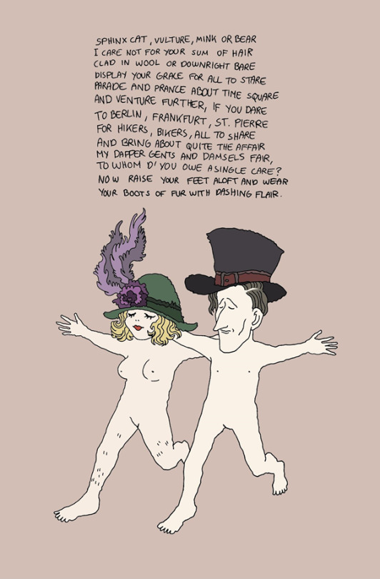
art by Marie Smith

art by Eloise Gibb
Referencing:
Leaf score, The place for green. The environmental impact of shaving products. July 3rd, 2020
https://www.leafscore.com/eco-friendly-bath-products/environmental-impact-of-shaving-products/
0 notes
Text
The Thirteenth One - 100 Artists’ Manifestos
The 1913 Futurist Manifesto for Men’s Clothing by Giacomo Balla follows two main instructions: “WE MUST DESTROY ALL PASSEIST CLOTHES” and “WE MUST INVENT FUTURIST CLOTHES”. Balla’s issue with early 1910s fashion lies with dull colour schemes, predictability and mind-numbing neutrals. He insists on wearing “hap-hap-hap-hap-happy” daring outfits with vibrant colours and embracing asymmetry, oddities and incorporating shapes, much like his paintings.

Giacomo Balla, Line of speed (1913)
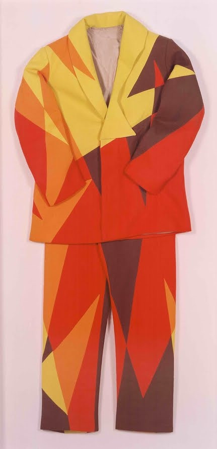
Giacomo Balla, 'Futurist Suit', 1913-1918
One cant help but admire the boldness of Giacomo Balla’s manifesto, especially considering the zeitgeist of 1910s Rome. Balla was metaphorically staring into the eyes of suited up working class men and people and demanding that they dare to be unique. However it is hard to ignore the elephant in the brightly painted room which is Balla’s constant use of the word “must”.
An artistic movement about freedom and individuality should not have rules or “musts” or the movement is self-defeating.
There should be flexibility when approaching fashion as it is so subject to change e.g. seasonal wear, cultural clothing, religious wear, uniforms, protective gear, lack of access to other clothing etc.
In Balla’s ideal world all outdated fashion would be destroyed, but what of those men that adore those “boring” suits? Should they stop wearing what makes them happy? Is that freedom? And what of the people that detest his asymmetrical style AND passeist clothing? What of the nudists? Despite the intense analysis of Balla’s manifesto his overall priorities seem to be well rooted: comfortable clothing is practical and can lead to happiness.
References: Danchev. A.,2011, 100 Artist Manifestos, Penguin https://www.wikiart.org/en/giacomo-balla/line-of-speed-1913
https://www.apollo-magazine.com/art-diary/giacomo-balla-designing-the-future-estorick-collection/?map=active
https://en.wikipedia.org/wiki/Giacomo_Balla#Notable_works
https://mateydevedzhiev.wordpress.com/2014/02/13/giacomo-ballas-futurist-manifesto-of-mens-clothing-1913-review/
1 note
·
View note
Text
A BUG ON A DERIVE:
My second walk was different to my first. It was shorter, but slower. As dramatic as that sounds please keep into consideration that I was doing my artistic derive in the comfort of my cramped, humid and slightly mouldy bathroom. Not everyone has access to the Sahara dessert, ok? Yes, I’m talking to you Mr Richard Long.
My second walk was different to my first because it wasn’t exactly a walk, it was mostly me, standing and studying my space. The order of my observations was first my little square window, then my small sink, my clean toilet, my teeny table, then my sink again, my little window again and finally my bonsai... My bonsai had been with me through some interesting times over the past 2.5 years and I sometimes forget to even look at it. I mean really look at it. When I water it I simply pour the liquid and let it get on with growing, why should I meddle with it? Yet my derive forced me to stay and study my bonsai. Analyse its condition.
There was dry soil, moist soil, brown leaves, green leaves, soft bark, solid bark. There was a small bug on it, no bigger than 1 milimetre - my bonsai must’ve been its kingdom. What would that make me? I cancelled that thought before I labelled myself as some Queen of the Bug Kingdom. The derive inspired me to read about some bonsai art and I came across an intruiging article on such a topic. Also although it had been a while since i watched Karate Kid, Mr Miyagi’s “banzai” skills haven’t escaped my memory.
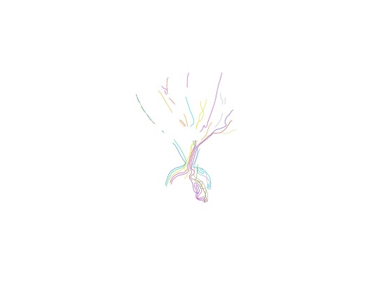
I started to wonder if i should trim and sculpt the bonsai, after all thats what they are designed to do. An interesting quote from the article that agrees with this was “You can make it into anything you can imagine." I decided I wasn’t going to put blades to the bark, but instead a map of the bug kingdom.

Ref:
Rettig, M. L. P. B. T. (2014) ‘Living sculpture; Art of bonsai can be “very Zen-like”’, Telegram & gazette, 7 March.
1 note
·
View note
Text
A VALID PLACE IN THE WORLD:
Children being “zoned” and separated from grown ups has occurred essentially since man came into existence. The weak mini versions of the socially more valuable adults simply get in the way of the busy “more valid” lives grown-ups are trying to lead.
This is an intensely cynical view of the world and it is segregation against children. This is a tragic reality.
Keg De Souza explores the idea of making structures FOR children rather than around children in a very colourful and innovative manner. Souza and her team explored the way children living in an estate interact with their living environment and how they hold value in their interpretations of their world by asking them to take part in creating these structures, showing that they are taking the kids seriously - listening seriously and playing freely. Such an experiment set up allows the audience to see not only that children can be the stars of the show but that we should listen to them as they ‘perform’.
One particular piece of art installation was a colourful “listen box” where the kids were recorded saying what they hear. This type of exercise for the children was so evidently exciting and mentally stimulating for the children as they were surrounded by amplified familiar voices - they were finally heard. This is a reality that many kids are deprived of. I am not discussing the actual ‘sense of hearing’ as we all know how loud some children are (and remain as adults) but I am discussing the prospect of being understood, valued and appreciated.
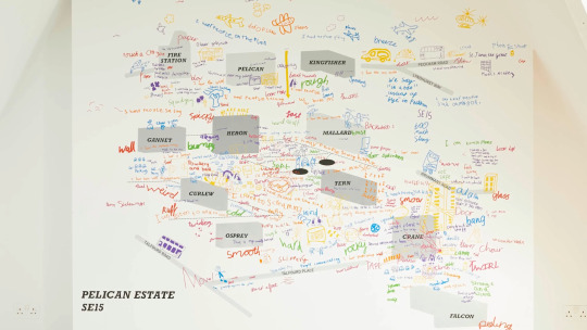
This map created by Souza and the children displays the direction, manner, speed, path, frequency in which the children move across their estate and most importantly their interpretations of those areas e.g. “smooth” “rocky” “twirl”...
It’s a stunning visually captivating piece of informative art showing the geographical mileage and foot print of children in one estate. And such a map forces us all to acknowledge that it is a microcosm.
0 notes
