Don't wanna be here? Send us removal request.
Photo

This week’s #uxcomplaint is quite hilarious. I’m sure it’s just a bug, but the conversational interface equivalent of this would be like:
Adobe: Are you coming from outside the U.S.? Visit the Canadian site instead.
Me: Yes, I am outside U.S.
Adobe: Then continue to U.S. site!
Me: umm...
Adobe: OR you can continue to the U.S. site!
Me: OK I’ll continue to U.S. site but you might as well have not told me anything.
0 notes
Video
tumblr
This week’s #uxcomplaint is brought to you by Tobii, the usability testing software.
The video above demonstrates a workaround users had to figure out on their own after clicking many times on a tablet to input a name in the form field, and no keyboard popped up.
The most likely scenario is that this program is designed for desktop use with a keyboard automatically assumed to be connected.
So, ironically on this usability testing application, if I were a UX Researcher I would do some usability testing across different devices.
0 notes
Text
Service Design!
I have a soft spot for service design because it’s what got me into ux in the first place.
I’m getting a lot out of the second Service Design Canada Conference which is based on the theme of #convergence.
Here are a few highlights:
Keynote @guyjulier situated service design within the broader perspective of the political economy: we are in the era of assetization of multiple industries. In other words, the value and outcome of what we design is tied to the market rather than the creation of better ways of doing things.
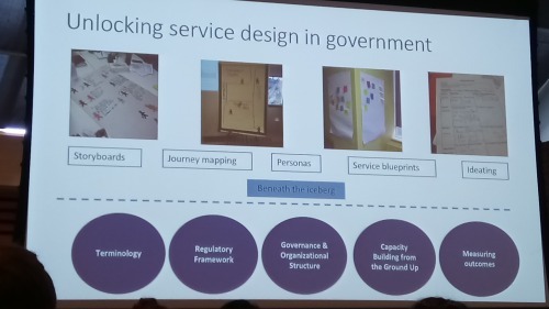
A group from the City of Toronto, working with front-line workers for social assistance/Ontario Works and recipients talked about their challenges (and opportunities) within governmental service design.
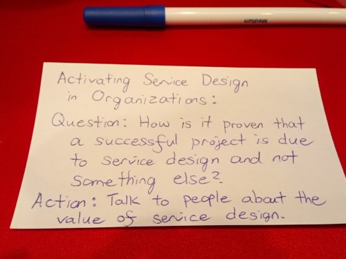
There was a plenary session on barriers to and enablers of activating service design within organizations. The table I sat at said that changing the mindset of people was the greatest barrier. One takeaway from @gorriti is that if you aren’t top management, you should get buy-in for the process, but still be responsible for the outcome.
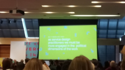
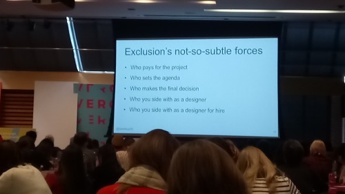
Then, design got political. Speakers talked about inclusivity, the implications of design on people and systems, and the substitution of real democratic citizenship for usership.
I also took part in a video protoyping workshop. Fun day! Lots to think about.
Within my 3-month UX career so far, this is the first time that I’ve heard people speak explicitly about the politics of design. Awesome! Designers, as Victor Papanek said, have so much power and social and moral responsibility. How to make sure that participatory design isn’t tokenizing?
I think this conference #converged my interests in social/public services, accessibility and ux. Can’t wait for next year (I hear it might be in Montreal)!
0 notes
Text
Lots of #UX happenings this week. On Wednesday I had a site visit @shopify an yesterday @karelvredenburg of IBM came to Humber College to speak about the future of tech and how this affects how design.
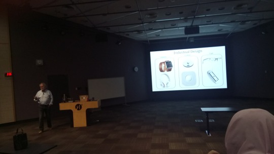
I'll post more about this later but right now I'm off to learn all about service design at the @SDNCanada converge conference!
0 notes
Text
Jobs to Be Done
I had a lovely evening learning about jobs to be done at a @UXResearchTO meetup tonight.
One of the presenters @kklawless Kim Lawless with a background in anthropology said (paraphrasing her):
At first I was skeptical of the Jobs to Be Done technique because I thought it was reductive and simplistic, but then I found that JTBD is a framework that clients, researchers and non-researchers alike can understand and that translates to powerful and meaningful action items really quickly.
It can replace personas entirely and make stakeholders empathize with users’ behaviours and emotions more than just users’ attributes like personas do.
JTBD consists of two parts (as I gleaned from this presentation):
1. The user timeline, in which a user is passively doing an activity until an event triggers the active thinking/doing of the activity and a second event triggers a decision being made

2. The four forces: a) things that push you away from your current situation, b) things that pull you towards your new situation, c) habits that keep you in your old situation and d) anxieties that keep you away from your new situation.

You then mesh all this data into main groupings of jobs that your users want to do and what isn’t working for them.
We then got a wonderful demonstration of a switch interview from @RoyOlende interview a workshop participant about hair (photo to come later because the transfer of the photo from my phone to this computer has a UX problem). This interview gets inside a user’s decision-making process to reveal what the motivation is behind switching from one product to another.
0 notes
Text
Internet Connection Webpages
My UX Complaint for this week is those public internet connections that you connect to in cafes. There are too many out there that automatically open up your web browser when you click on the internet connection. They then use one of your open tabs to go to their connection page and then have no back button. So you lose the URL of the tab that you were on. If you have multiple windows open, the connection page opens up in multiple windows.
One good public Internet connection site I experienced recently is beanfield.com - it didn’t automatically open my Internet browser when I connected, it opened up a new tab, and then it said, “You are going to be connected for one hour. You may sign on again after one hour.” It also told me that I could close the tab after I had successfully connected.
This is simple user feedback that is occurring in the system. As a researcher, I would research what frustrations people had using these services and also read best practices for services that necessarily disrupt the workflow of a user. Better yet, I would find out a way to not have to disrupt the workflow of the user (in this case, people’s Internet browsers).
0 notes
Text
Process is a dirty word in (Silicon) Valley. Rather, accessibility is part of the culture of a company and the craft of a worker. Engineers don't want to be told they should engineer accessible products, but rather that accessibility makes them a better engineer.
Jennison Asuncion of LinkedIn (I'm paraphrasing him here), at #a11yTOCamp
0 notes
Link
This is a simple and clear explanation of what UX really is, dispelling the myth that it is another form of UI: form and function, intellect and emotion.
It’s not (only) visual design, nor is it (only) information architecture and wayfinding. One thing I am confused about, though, is how every single piece of technology or website we go to each day can exceed our expectations. If every piece transcends, then won’t we just spend a lot of time in awe of every new feature? Isn’t good design supposed to be invisible?
0 notes
Photo
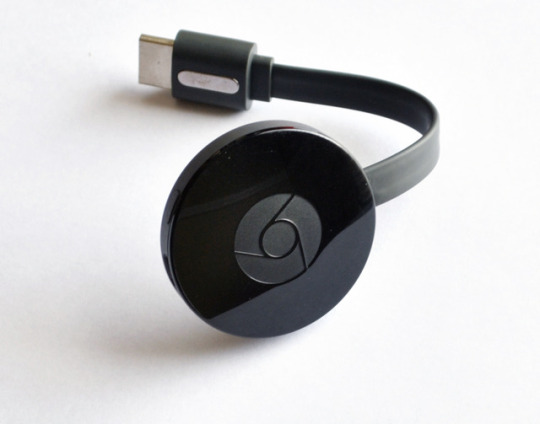
My UX complaint for this week is Android/Chromecast’s integration across multiple devices.
I have a projector setup at home that Chromecast connects to. I have an Android smartphone and my partner and I also share a Chromebook. I have a laptop that has Google Chrome (although I don’t use it on the laptop often), and I have an account on my partner’s laptop that can have Chrome.
The other day, I wanted to cast an exercise video onto the wall so I didn’t have to open my laptop, unplug it, put it on the floor and follow along in my really small apartment. When I do have my laptop open on the floor, I’m afraid I’ll hit it while doing all the exercise moves in the tight space.
I thought, great, I’ll just put the video on in my phone, which is always on, and then cast it. Well, the Internet has not been working well or at all on my phone and so I kept on getting “Retry” and “Can’t connect to server” message on my phone. I wasn’t about to start using phone data for an exercise video on my own home either, so I thought I would cast it from the Chromebook. When I found the machine, it was out of battery - I couldn’t find the power cord either. This was getting annoying. I still didn’t want to turn on my laptop. I then figured that I could cast from my partner’s laptop, which wasn’t being used at the moment. I opened the lid, which awoke from sleeping, then tried to switch to my account. It just froze and went to a black screen. The laptop is used a lot and is loaded with too much data, so switching accounts causes it to freeze and one has to reset it often. Too annoyed, I just opened my laptop and put it on the floor.
This little story had many usability problems: 1. Internet connections, 2. Battery dead machines, 3. Inability to have enough working memory to switch accounts. Integration can fix a lot of problems each one of those devices has, but it just led me further and further astray and more and more annoyed with every device I tried.
There could be similar power cords across Chrome devices, for example, so in case you misplace one you don’t have to look for it if you have other Chrome devices. Or similar things like that. If I were a UX Researcher, I would study the way people use things across multiple devices in the same platform and see what hardware problems there are. Who is using the devices in this way (the same platform across multiple devices), and why? Who isn’t using it this way, and why not? Is there some way that Google can work with Sony, HP, Samsung and so on to help users with these hardware issues?
There’s a lot of thought and flow designed into cloud-based integrations, but if people can’t even get to the cloud, then what’s the point?
0 notes
Video
youtube
Designing for edge cases benefits everyone. #wordusabilityday talk organized by @torchi_toronto hosted by
0 notes
Photo

My #UXComplaint for this week has to go to all the earbud headphones (and even the over-the-ear) headphones that break within a few hours of using them.
I use headphones a lot while I’m outside and I like to plug the phones into the smartphone, put the phone in my bag or pocket, put the other phones into my ears and walk. Any little bend or twist while walking will immediately sever the wires so that only one ear remains. Also, the earbud cords twist all over the place and it takes forever to untwist them. There are those wraparound gadgets, but not many earbuds come with those.
The ultimate planned obsolescence: I understand that the headphones I pick up might be those free ones from airplanes to be used only once. I understand that I shouldn’t expect the ones I get from the dollar store to last forever. But is it really that difficult to produce a thicker cord or wire?
To fix this, well, I’d be seeing who uses these phones and what they use them for. I’d check the business goals of the phone - are they brandless? Then most likely they’ll break within days or weeks because they’re not made to last. But imagine providing quality phones that would cost the customer two or three dollars more but would be kept for much longer than one airplane flight.
Even though the point of earbuds for flights is just to make it last as long as the flight lasts and not much longer, I would try to still manufacture quality phones that block out the noise of the plane, while still protecting ears. Some would argue that because earbuds can’t be hygienically shared among people, they don’t have to last longer, but I would say that it’s even more of a reason to make the phones last longer, because they can’t be shared.
In any case, as a UX Researcher, I would see if there is an opportunity for a company to solve this problem (perhaps someone who’s looking into engineering cheap quality headphones)? An initial analysis of this would tell me that the margins would be too low. So I would do more research into exactly how much it costs headphones to manufacture and also competitive analysis. If it still seems viable to go ahead with research, I would then do a diary study and/or survey of what people actually do with headphones, where they take them, how long they last and how annoyed people are by the time they break or get lost or something else happens to them, and what they do about that. I would then build a cheap quality prototype to see how much people are actually willing to pay for a bit more quality, say earbuds that last 5-10 years instead of three weeks (including warranty).
I’m still a student so let me know if none of this would actually be allowed to happen in the real world and we’ll always get stuck with unusable, breakable, wrangled and easily losable earbud headphones.
0 notes
Text
UX Complaint
Originally, I was going to start a blog called UX Complaint in which I complained about the UX of several different companies I came across. I then thought it would look bad to just complain and so dropped the idea.
However, today I came across this video highlighting how I can incorporate what UX I see around me into my portfolio. So I am bringing back the idea of UX Complaint, but in hashtag format and within this blog #uxcomplaint.
Here is one (hopefully polite) complaint to start us off, and how would I go about getting it to be solved. Although most of these are simple usability issues, if they would cost $500,000 each to reprogram, I better have a bunch of evidence to back up that many people are experiencing this problem.
Tumblr
I’ll start off by talking about Tumblr on Tumblr. When I wanted to type in a bunch of words and then make them a hyperlink, I highlight the words. But if I haven’t typed out the next words yet, I make a link and then it continues to make the rest of the words a link. There is no easy way to tell the post editor that the link stops 100 letters before. Sure, I just figured out that I can highlight the non-link words then click ‘remove’ or unhighlight the link button, but it’s not really intuitive. It took me a few tries to do that.
Slight usability issue? Sure. What would I do to go about solving this?
1) Assuming that I’m doing usability testing anyway, I would try to spot this within a bunch of usability tests with a) Tumblr post creators and b) talking with users who post web content in non-HTML editors.
2) I would observe if this is a symptom of a larger issue with the way things are used - remembering not to try to fix things that aren’t broken.
3) I would then rate the severity of how much this and similar types of tasks/actions affect the use of Tumblr.
4) I would weigh these factors against how much fixing this problem would cost for Tumblr.
0 notes
Photo
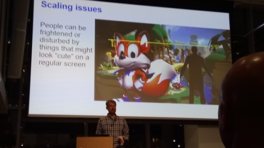
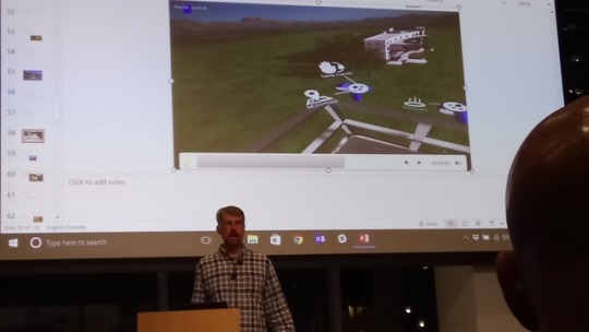
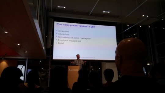
Last week I went to a talk on 'VR Beyond Gaming' by John Schrag of Autodesk. Great insights into how to design for VR. Photos clockwise from top left: a) Making characters the correct scale so that seemingly cute ones are not freakishly larger than life. b) Using visual safety cues like this balcony railing for people with acrophobia (fear of heights). c) VR design as the design of presence (akin to theatre). This is the first Toronto Region - Computer Human Interaction talk I went to and am excited to go to more.
0 notes
Photo
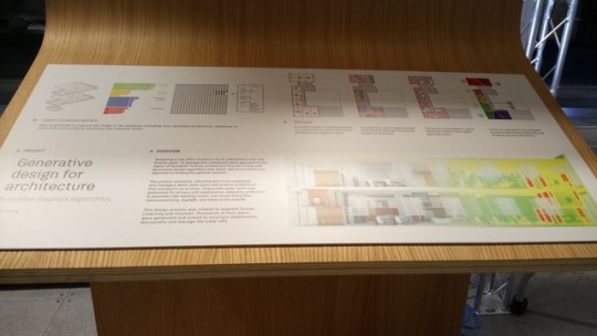
Check out Autodesk's new Toronto office! Using generative design to optimize for lighting, collaboration and other factors conducive to working on maker software.
0 notes
Photo
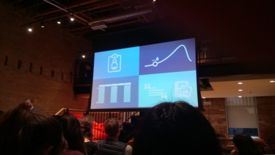
This is a slide from #UXResearchTO's session on Communicating User Research lightning talks. At Wattpad offices on October 3rd. The takeaways from this particular talk about getting executives invested in user research is: Start with a deep persona, an igniting situation, journey maps and audio/video anecdotes. Get stakeholders to workshop it, go through a design thinking activity and get people to empathize.
0 notes
Photo
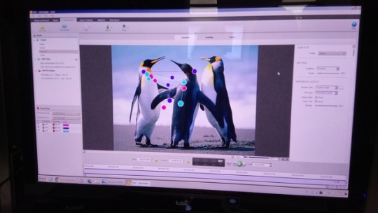
In class a few weeks back experimenting with Tobii eye tracking software. Amazing!
0 notes
Audio
On this podcast episode, Daron Acemoglu discusses work and robots and replacement of workers.
I had gotten fascinated by this topic after doing a mock-public awareness project for a media and technology course at Concordia University (in fact it’s still up). I read lots of Geert Lovink’s work around digital labour.
A year later, I watched a video by CGP Grey called Humans Need Not Apply. I am fascinated by this topic not in a standoff, theoretical armchair way but because of workers’ rights and because of how it will affect my own future and my own working conditions.
I saw that @TAPolicy tweeted a Ricochet Political Economy podcast episode - of course about work - and I absolutely had to listen. Here are my thoughts about the episode: -all the while I’m listening to this episode, I’m thinking of people from the industrial revolution era and how they thought machines would replace work -from a feminist perspective, women's work will never end, so all this does not apply -what would Geert Lovink think of this? -Acemoglu’s point about speed in cars, reminds me of Virilio's polar inertia concept. We can't be any more productive because at the end of the day the speed of productivity is at its human limit despite machine augmentation -at one point in the episode a question was asked: can there be policy to foster more jobs? yes! less free trade agreements, no outsourcing! Imagine if the Ford model T production was outsourced - actually, it did. And many, many places everywhere suffered either because of a lack of a sudden lack of employment or low wages -The talk of minimum wage and encouragement to 'participate' in labour force totally skips mention of the long histories of labour movement organizing. It also has a pro-work ethic that is at the heart of poor bashing.
0 notes