Don't wanna be here? Send us removal request.
Text
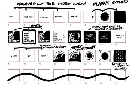
Over the past few weeks, I have had the opportunity to design and create social media typographic promos for the typeface “OPEN SANS”. I started this project by researching more about the typeface I was given, I also did sourced inspiration from other animations from other artists on Behance. By creating a brainstorm I was able to put out ideas and elements I wanted to include in the animations onto one page. I carried on my research by creating storyboards and creating some test animations. In the beginning, I struggled quite a bit with getting used to the photoshop tools. Throughout this project, I when back and forth with storyboarding and testing so that I was getting comfortable with photoshop. For the first few animations, I used the frame by frame technique which I found to be very time consuming and tedious. The process of making frame by frame animations just took too long, and there would be many imperfections. Imperfections such as misalignments, and just overall the animations weren’t flowing smoothly. After a few tests using the frame by frame process, I moved over to the video timeline. This process was much more time-efficient and created very smooth animations which was the goal. I was aware of keyframes from doing personal projects and I was confident in this process. It allowed me to better manipulate the speed of each object and overall the timeline was much easier to manage. This made my workflow much faster so that I could focus on the design elements. I went through a few developments after making solid concepts, making sure to add, subtract and move elements to get the desired look, and also to fit both aspect ratios. Overall I am very happy with the outcome of this project. I have researched, and have made both animations and a booklet that nicely introduces the “OPEN SANS” font.
1 note
·
View note
Text
ANIMATION 2 FACEBOOK FORMAT:
Tweaking size and placement of text. The inter gratin of images and graphic elements, along with the Facebook format creates a cinematic feel to the animation, i personally really like this as it feel like I’m watching a movie. It is just more entertaining to watch as it’s a change from watching social media posts.
0 notes
Text
ANIMATION 2 SQUARE FINAL:
Final little tweaks and addition of the numbers at the end. Overall I’m very happy with this end result as I think that very thing ties in and works well together.
0 notes
Text
ANIMATION 1 FACEBOOK FORMAT:
For this animation, I had to tweak a few elements to make everything fit. This means had to move the higher elements to fit into the frame and I also enlarged some elements to fill the frame.
0 notes
Text
ANIMATION 1 SQUARE FINAL:
From the developments I have refined them to make this final outcome. I did some tweaks and editing to make sure that the animation ran smoothly, for example I fixed the alignment the humanist type section. I also added the rings to further connect this project to the type specimen book. I also wanted to showcase the numbers at the end. I also really like how the the the glyphs glitch to reveal the really text, this plays with the space/ unknown idea in a fun and interesting way.
1 note
·
View note
Text
Animation two development: I changed the beginning by moving the play on the word to the start. I feel that this is a much better intro and helps tie the open concept in at the start. It’s also at a better place is gives a minimal look.
0 notes
Text
Animation two development. I combined the two concepts to make this design and I really like it. It is missing some tweaking and the showcase of numbers though. I’m not sure about the beginning of the animation as I don’t like the transition into the second design.
0 notes
Text

Final animation transition planning. I’ve decided to add the photographic element from the type specimen book, this is to create cohesion and a connection to both works. In the beginning I used the frame by frame technique, I found this to be quite tedious and something was always a little off. In my recent trials I have been using the video timeline and I love it! I find that it’s less time consuming and easier to manage. I have enjoyed playing with key frames as it makes it easy to create smooth animations. It also allows me to play around with the speed of each object by putting the key frames closer of further away.
0 notes
Text
Full 15 second second animation, it’s a good start, I may be able to combine some aspects of my first attempt
0 notes
Text
First full 15 second animation.
I really like how this one flows and the concept of space is showing through. Which helps keep my animation and type specimen book cohesive.
0 notes
Text
TEST
Showing type anatomy, resenting various weights and italics
0 notes


